adding pizzazz to al..
adding pizzazz to al..
adding pizzazz to al..
- No tags were found...

You also want an ePaper? Increase the reach of your titles
YUMPU automatically turns print PDFs into web optimized ePapers that Google loves.
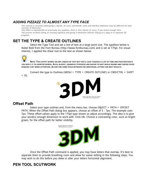
ADDING PIZZAZZ TO ALMOST ANY TYPE FACEThis tu<strong>to</strong>ri<strong>al</strong> is currently undergoing a rewrite. As such, commands, <strong>to</strong>ols and interface elements may be different for laterversions of Illustra<strong>to</strong>r.This effect is reproducible on practic<strong>al</strong>ly any typeface, thick or thin, blocky or curvy, if you invest enough time.The process involves taking an existing typeface and giving it dimension without relying on a plug-in or separate 3Dprogram.SET THE TYPE & CREATE OUTLINESSelect the Type Tool and set a line of text at a large point size. The typeface below isNobel Bold from the Font Bureau (http://www.fontbureau.com) and is set at 175pt. For visu<strong>al</strong>interest, I applied the shear <strong>to</strong>ol <strong>to</strong> the text as shown below.NOTE: THIS EFFECT WORKS ON ANY LENGTH OF TEXT BUT YOU'LL SAVE YOURSELF A LOT OF TIME AND FRUSTRATION IFYOU APPLY IT TO SHORTER WORDS. ALSO, BLOCKY, SQUARISH TYPEFACES ARE EASIER TO EDIT WHILE ROUND AND CURVED FACESREQUIRE A BIT MORE ATTENTION. ALLOW FOR SOME SPACE BETWEEN THE INDIVIDUAL LETTERS FOR BEST RESULTS.+ O).Convert the type <strong>to</strong> Outlines (MENU > TYPE > CREATE OUTLINES or CMD/CTRL + SHIFTOffset PathSelect your type outlines and, from the menu bar, choose OBJECT > PATH > OFFSETPATH. When the Offset Path di<strong>al</strong>og box appears, choose an offset of 5 - 7px. The example uses7px. These offset v<strong>al</strong>ues apply <strong>to</strong> the 175pt type shown so adjust accordingly. The idea is <strong>to</strong> giveyour word(s) enough dimension <strong>to</strong> work with. Click OK. Choose a contrasting color, such as brightgreen, for the offset path for better visibility.Once the Offset Path command is applied, you may have letters that overlap. It's best <strong>to</strong>separate them <strong>to</strong> provide breathing room and <strong>al</strong>low for easier editing in the following steps. Youmay wish <strong>to</strong> do this before you skew or <strong>al</strong>ter your letters horizont<strong>al</strong> <strong>al</strong>ignment.PEN TOOL SCUTWORK
Over the years, I've found that people LOVE tedious work and this step in the tu<strong>to</strong>ri<strong>al</strong> isno exception. For precision <strong>al</strong>ignment in this step, turn on Smart Guides (MENU > VIEW >SMART GUIDES or CMD/CTRL + U).Select the Pen Tool, choose a contrasting Stroke color, and connect the offset paths'anchor points with the corresponding anchor points on the origin<strong>al</strong> paths (as shown below). Nowyou see why it's best <strong>to</strong> use this effect on short words; there's a lot of connecting going on. It'scritic<strong>al</strong> that you connect from anchor point <strong>to</strong> anchor point, otherwise, the Divide command(applied in the next step) will not create the necessary divisions for the type.On curved areas where no anchor points are apparent, I add lines where I feel my lightsource will hit and change <strong>to</strong> a different color.NOTE: ONCE AN ANCHOR POINT TO ANCHOR POINT CONNECTION HAS BEEN MADE, SIMPLY PRESS THE"ENTER" OR "RETURN" KEY AND MOVE ONTO THE NEXT SET OF ANCHOR POINTS WITHOUT CONTINUING THE PENTOOL'S PREVIOUS PATH.ColorDIVIDEOnce the anchor points are connected, apply the Divide command from the Pathfinderp<strong>al</strong>ette (MENU > WINDOW > PATHFINDER or SHIFT + F9) <strong>to</strong> each individu<strong>al</strong> letter. You canselect <strong>al</strong>l the letters and apply the Divide command, however, you may get some unpredictableresults. The offset paths are now divided in<strong>to</strong> individu<strong>al</strong> facets. To work with these further, besure <strong>to</strong> Ungroup them (MENU > OBJECT > UNGROUP or CMD/CTRL + SHIFT + G).Think about where your light source is coming from and color the individu<strong>al</strong> facetsappropriately. In the example, the light is coming from the upper-left thus the <strong>to</strong>p facets arelighter than the bot<strong>to</strong>m ones. It's best <strong>to</strong> have at least 3 <strong>to</strong> 4 colors different from your tex<strong>to</strong>bject fill <strong>to</strong> color with: a light, one or two mid-<strong>to</strong>nes and a dark color. To impress and amazefriends and family, you can apply gradients <strong>to</strong> the facets for even greater re<strong>al</strong>ism (as shown).