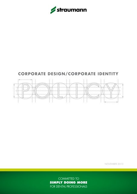
corporate design / corporate identity policy - Straumann
corporate design / corporate identity policy - Straumann
corporate design / corporate identity policy - Straumann

You also want an ePaper? Increase the reach of your titles
YUMPU automatically turns print PDFs into web optimized ePapers that Google loves.
<strong>corporate</strong> <strong>design</strong>/<strong>corporate</strong> <strong>identity</strong><br />
p o<br />
l i<br />
c y<br />
November 2010
introduction<br />
Your part in protecting and promoting our most valuable asset<br />
The dental market place has become increasingly crowded and, with several hundred implant<br />
manufacturers competing for share of mind and trust of customers, a strong global brand is a<br />
powerful, valuable asset. Indeed, the <strong>Straumann</strong> brand is one of the most valuable assets we<br />
have – which is why we need to protect and promote it effectively. Corporate <strong>identity</strong> and <strong>design</strong><br />
have an important role in this.<br />
The key to successful branding is consistency, which makes this Corporate Design Manual so important.<br />
It has been developed with the aim of achieving a higher level of brand consistency and<br />
recognition, adding value to our business. The guidelines presented here reflect our core values<br />
of simplicity, specialization, reliability, which should also be reflected in all our marketing and<br />
communication materials.<br />
Every effort has been made to keep this manual simple in order to help you and our external partners<br />
produce materials that have a uniform <strong>corporate</strong> style and feel. To complement this manual,<br />
which focuses mainly on printed materials, <strong>corporate</strong> guidelines for presentations are available<br />
on my.straumann.<br />
Branding is not an initiative driven by a single department or cost center; it has to be supported<br />
by each employee, because each of us influences the perception of the <strong>Straumann</strong> brand in the<br />
market. To draw an analogy with sport: each player is proud (and obliged) to wear the team’s<br />
true colors and would not consider playing in anything else. Belonging to the <strong>Straumann</strong> team<br />
gives us the privilege of representing one of the strongest brands in our field and puts us under the<br />
obligation of using the correct visual <strong>identity</strong> and <strong>design</strong>.<br />
If you have any questions regarding the contents of this manual please refer to the Creative Agency<br />
in our Basel headquarters.<br />
Beat Spalinger<br />
President & CEO<br />
Institut <strong>Straumann</strong> AG
contents<br />
1. Logo and claim<br />
1.1 <strong>Straumann</strong> company logo 2<br />
1.2 <strong>Straumann</strong> claim 7<br />
2. CORPORATE COLORS<br />
2.1 Main <strong>Straumann</strong> colors 10<br />
2.2 Color definition and usage 11<br />
2.3 Shading 13<br />
3. <strong>corporate</strong> fonts<br />
3.1 Printed matters 14<br />
3.2 PC fonts for correspondence and screen presentations 15<br />
4. Design elements<br />
4.1 Visuals 16<br />
4.2 Stamps 17<br />
4.3 Photographs 18<br />
5. PRINT MEDIA<br />
5.1 Overview 21<br />
5.2 Layout front cover of posters, brochures & advertisements 22<br />
5.3 Layout inner face 24<br />
5.4 Layout back cover 26<br />
5.5 Disclaimers 27<br />
5.6 Footnotes 27<br />
5.7 References 27<br />
5.8 Paper quality 28<br />
6. BUSINESS MATTERS<br />
6.1 Letterhead 29<br />
6.2 Fax paper 30<br />
6.3 Business card 31<br />
6.4 Message card 31<br />
6.5 Envelopes 32
7. PROMOTIONAL ITEMS<br />
7.1 Giveaways 33<br />
8. TRADEMARKS<br />
8.1 Unregistered and registered trademarks 34<br />
8.2 Use of trademarks 35<br />
9. Style guide<br />
9.1 English manuscript guidelines 36<br />
9.2 Foreign language documents 37<br />
10. electronic media<br />
10.1 PowerPoint presentations 38<br />
10.2 Online applications (websites, portals, etc.) 39
1. logo and Claim<br />
1.1 <strong>Straumann</strong> company logo<br />
The <strong>Straumann</strong> logo is one unit consisting of two parts which must never be modified or used in colors<br />
different from those indicated in this Corporate Design Policy manual.<br />
Color definition<br />
Green<br />
CMYK: 100/0/100/30<br />
RGB: 0/114/45<br />
Pantone: 349 U/349 C<br />
Green<br />
Black<br />
Black<br />
CMYK: 0/0/0/100<br />
RGB: 24/23/22<br />
Pantone: Black U/Black C<br />
Black<br />
CMYK<br />
The abbreviation CMYK stands for cyan, magenta, yellow and key black. The CMYK color model<br />
forms the technical basis for modern color printing. This version of the logo should be used in highquality<br />
print media, e.g. for publications such as <strong>corporate</strong> image brochures, technical brochures,<br />
marketing flyers, etc.<br />
RGB<br />
The abbreviation RGB stands for red, green and blue. The RGB color space is used for self-luminous<br />
systems (color display). The RGB logo is used in all screen applications such as the internet, flashbanners,<br />
online newsletters, etc.<br />
Black<br />
The logo completely in black is to be used in office applications for forms like faxes, memos, advertisements,<br />
etc. It ensures optimal reproduction quality.<br />
Pantone<br />
Pantone colors are a set of standard colors for printing, each of which is specified by a single number.<br />
These colors are also used for two-color printing.<br />
2
logo and claim<br />
background colors<br />
Background colors can completely change the face of a logo and the recognition of a brand. The<br />
<strong>Straumann</strong> logo should always appear on a white or very light background (max. 30 % black).<br />
Exceptions<br />
Extremely few situations may require that the logo be placed on a background color other than<br />
white (e.g. prints on promotional articles). For giveaways, a negative typeface may be used in the<br />
logo. Also, on gray background (min. 30 % black), the negative typeface may be used. Please<br />
note that if the background is 100 % black, the <strong>Straumann</strong> “S” may also be white.<br />
3
logo and claim<br />
Dimensions<br />
To maintain consistency between different printed publications, the minimum size of the <strong>corporate</strong><br />
brand mark has been defined. The dimensions of the logo depend on the size of the media and<br />
on the specific use. Please refer to the standard logo sizes below.<br />
Format<br />
Minimum size<br />
smaller A6<br />
A6<br />
A5<br />
A4/US letter<br />
A3<br />
25 mm / 1.0 inches<br />
30 mm / 1.2 inches<br />
40 mm / 1.6 inches<br />
55 mm / 2.2 inches<br />
75 mm / 2.7 inches<br />
25 mm<br />
30 mm<br />
40 mm<br />
55 mm<br />
75 mm<br />
4
logo and claim<br />
Positioning<br />
The logo is always placed in a horizontal position. To maintain an optimal effect of the logo in<br />
publications, certain distances to texts and pictures have to be observed. This clear space may not<br />
be penetrated by texts or any visual elements. It is derived from multiples of the letter height of "n".<br />
As a general rule, the <strong>Straumann</strong> logo always appears at the top center of the page in all publications<br />
(e.g. technical brochures, marketing flyers, job advertisements, etc.)<br />
STRAUMANN ® GUIDED SURGERY<br />
LEADING THE WAY IN YOUR TREATMENT<br />
CARE AND MAINTENANCE<br />
OF SURGICAL AND<br />
PROSTHETIC INSTRUMENTS<br />
<strong>Straumann</strong> ® Implant System<br />
5
logo and claim<br />
Dont's<br />
These are typical examples of unacceptable uses of the <strong>Straumann</strong> <strong>corporate</strong> brand mark. These<br />
examples are useful in reinforcing how the <strong>Straumann</strong> <strong>corporate</strong> brand mark should actually be<br />
employed.<br />
Colour<br />
Never change the colour of the <strong>corporate</strong> brand<br />
mark.<br />
Shapes<br />
Never add shapes to the <strong>Straumann</strong> <strong>corporate</strong><br />
brand mark.<br />
Outline<br />
Never use the <strong>Straumann</strong> brand mark as an outline.<br />
Typeface<br />
Never re-create the <strong>Straumann</strong> word mark using<br />
another typeface.<br />
<strong>Straumann</strong> "S"<br />
The <strong>Straumann</strong> "S" (green, white or black) should<br />
not be used as an independent <strong>design</strong> element.<br />
6
1 Tonetti et al. J Clin Periodontol 2002;29:317–325<br />
2 Froum et al. J Periodontol 2001;72:25–34<br />
3 McGuire et al. J Periodontol 2003;74:1110 & 1126<br />
4 Heden et al. J Periodontol 2006;77:295–301<br />
5 Sculean et al. Int JPRD 2007;27:221–229<br />
6 Jepsen et al. J Periodontol 2004;75:1150–1160<br />
7 Sanz et al. J Periodontol 2004;726–733<br />
* Froum S. J.et al. Int. J. Period. Rest. Dent. 2008; 28: 273-281<br />
A by courtesy of Dr A. Friedmann<br />
B by courtesy of Prof. N. Donos & Dr N. Mardas<br />
logo and claim<br />
1.2 straumann claim<br />
The <strong>Straumann</strong> claim "Committed to Simply Doing More for Dental Professionals" appears on all<br />
<strong>Straumann</strong> marketing materials. This does not apply for certain exceptional cases such as scientific<br />
publications (e.g. white papers, science flashes), and patient materials (see next section).<br />
Language<br />
The <strong>Straumann</strong> claim may not be translated. Please note that this rule also applies if the claim appears<br />
within a foreign-language text. However, it is possible in non-marketing texts to add a translation in<br />
brackets to the text for the purpose of explanation.<br />
STRAUMANN ® EMDOGAIN<br />
IS TRUE PERIODONTAL REGENERATION<br />
IMPORTANT FOR YOU<br />
straumann ® BoneCeramic<br />
do you want bone volume & vitality<br />
around your implant<br />
A<br />
B<br />
before<br />
after<br />
More than 100 clinical publications in peer-reviewed journals demonstrate<br />
<strong>Straumann</strong> ® Emdogain to be safe and effective in stimulating the formation of new<br />
periodontal soft and hard tissue. These clinical studies involve more than<br />
3000 defects in over 2500 patients.<br />
<strong>Straumann</strong> ® boneCeramic is a biphasic calcium phosphate composition<br />
(ß -tCp + Ha) that has been <strong>design</strong>ed to support patients' vital bone regeneration,<br />
while also restoring and preserving bone volume, which is critical<br />
for the esthetic result.<br />
Excellent clinical results 1,2,3<br />
Clinical long-term benefit 4,5<br />
Improved patient satisfaction 6,7<br />
Clinically documented *<br />
Fully synthetic<br />
Easy handling<br />
7
logo and claim<br />
Variations<br />
For specific target audiences, the claim has been modified to the shorter "Simply doing more", for<br />
instance in all <strong>Straumann</strong> patient materials. Please note that this shorter version should be restricted<br />
to patient marketing.<br />
FIRM ANCHORAGE<br />
FOR TEETH<br />
<strong>Straumann</strong> ® Emdogain – for periodontal regeneration<br />
BEAUTIFUL TEETH<br />
Quality of life with dental implants 1<br />
Patient information<br />
8
logo and claim<br />
Positioning<br />
On all publications, the claim is always positioned center bottom of the cover page within the<br />
green bar. It is derived from multiples of the letter height of "n". Its dimensions correspond to the<br />
<strong>Straumann</strong> logo at the top of the page.<br />
9
2. <strong>corporate</strong> colors<br />
2.1 Main straumann colors<br />
<strong>Straumann</strong> documents have a distinct <strong>corporate</strong> color scheme consisting of primary and secondary<br />
colors.<br />
Primary color<br />
The <strong>Straumann</strong> green is one of our key visual branding elements. It is the product of considerable<br />
market research, the goal of which was to find a special shade of green that would differentiate our<br />
company. The <strong>Straumann</strong> green should therefore be used as widely as possible within the scope of<br />
the Corporate Design Policy. It should also be the predominant color in our visual materials.<br />
<strong>Straumann</strong> Green<br />
<strong>Straumann</strong> Green with background fading<br />
Secondary colors<br />
Lime green may be used in marketing documents to complement the <strong>Straumann</strong> green; it is mostly<br />
used as a style element in visuals, for framing illustrations and pictures or as a highlight (headlines,<br />
bullet points, etc). Lime green is not the <strong>Straumann</strong> branding color and its use dilutes the branding<br />
impact of the <strong>Straumann</strong> green. Lime green should be used sparingly and only where necessary.<br />
Lime green dark lime green lime green light<br />
Gray is widely used as typeface color or for scientific tables, framing, borders, headlines, etc. in<br />
<strong>Straumann</strong> documentation; lends a clean, technical look to documentation.<br />
Gray dark Gray Gray light<br />
10
<strong>corporate</strong> colors<br />
2.2 color definition and usage<br />
In order to create a lighter and more interesting visual appearance, the main and secondary colors<br />
may be broken down into a variety of defined shades.<br />
straumann green<br />
CMYK 100/0/100/30 Pantone Uncoated 349<br />
RGB 0/114/45 Pantone Coated 349<br />
RAL 6029<br />
Lime green Dark<br />
CMYK 35/0/100/0 Pantone Uncoated 390<br />
RGB 193/204/38 Pantone Coated 390<br />
Lime green<br />
CMYK 25/0/95/0 Pantone Uncoated 395<br />
RGB 211/214/50 Pantone Coated 395<br />
Lime green light<br />
CMYK 20/0/65/0 Pantone Uncoated 3965<br />
RGB 221/224/123 Pantone Coated 3965<br />
11
<strong>corporate</strong> colors<br />
Gray Dark<br />
CMYK 0/0/0/70 Pantone Uncoated Cool Gray 10<br />
RGB 112/113/114 Pantone Coated Cool Gray 10<br />
Gray<br />
CMYK 0/0/0/50 Pantone Uncoated Cool Gray 7<br />
RGB 155/156/157 Pantone Coated Cool Gray 7<br />
Gray Light<br />
CMYK 0/0/0/30 Pantone Uncoated Cool Gray 4<br />
RGB 196/197/198 Pantone Coated Cool Gray 4<br />
12
<strong>corporate</strong> colors<br />
2.3 Shading<br />
All <strong>Straumann</strong> primary and secondary colors may be used in various shades/tints (percentage<br />
values of solid color). Shades are used for variety and as style elements, for larger areas of colors<br />
or as highlights to support the primary color (<strong>Straumann</strong> green).<br />
<strong>Straumann</strong> Green<br />
<br />
Since <strong>Straumann</strong> green is such a vital part of our <strong>corporate</strong> appearance,<br />
no tints or shades are permitted for use.<br />
100 %<br />
<strong>Straumann</strong> lime Green Shading<br />
100 % 60 % 50 % 40 % 25 %<br />
<strong>Straumann</strong> GRAY Dark Shading<br />
100 % 60 % 50 % 40 % 25 %<br />
Please note that 100 % gray corresponds to 70 % black.<br />
13
3. <strong>corporate</strong> fonts<br />
3.1 Printed matters<br />
All printed matters must be <strong>design</strong>ed with a uniform visual image as depicted in the examples in<br />
these guidelines. A uniform <strong>corporate</strong> font is used to support the uniformity in <strong>design</strong>. Futura is the<br />
<strong>Straumann</strong> Group's main typeface. Futura and the other typefaces mentioned below have to be<br />
used exclusively. Futura can be found on the enclosed CD-ROM.*<br />
Running text & Headlines<br />
Futura Light<br />
ABCDEFGHIJKLMNOPQRSTUVWXYZÄÖÜ<br />
abcdefghijklmnopqrstuvwxyzäöü/1234567890<br />
Futura Light Oblique<br />
ABCDEFGHIJKLMNOPQRSTUVWXYZÄÖÜ<br />
abcdefghijklmnopqrstuvwxyzäöü/1234567890<br />
Futura Medium<br />
ABCDEFGHIJKLMNOPQRSTUVWXYZÄÖÜ<br />
abcdefghijklmnopqrstuvwxyzäöü/1234567890<br />
Futura Heavy<br />
ABCDEFGHIJKLMNOPQRSTUVWXYZÄÖÜ<br />
abcdefghijklmnopqrstuvwxzäöü/1234567890<br />
Futura Bold<br />
ABCDEFGHIJKLMNOPQRSTUVWXZÄÖÜ<br />
abcdefghijklmnopqrstuvwxyzäöü/123<br />
4567890<br />
Futura Extra Bold<br />
ABCDEFGHIJKLMNOPQRSTUVWXZÄÖÜ<br />
abcdefghijklmnopqrstuvwxyzäöü/123<br />
4567890<br />
14<br />
* Contains both the official <strong>corporate</strong> font Futura LT, which is suitable for Macintosh computers, as well as Futura STD for PC.
<strong>corporate</strong> fonts<br />
Futura Medium<br />
ABCDEFGHIJKLMNOPQRSTUVWXYZÄÖÜ<br />
abcdefghijklmnopqrstuvwxyzäöü/1234567890<br />
Futura Bold<br />
ABCDEFGHIJKLMNOPQRSTUVWXZÄÖÜ<br />
abcdefghijklmnopqrstuvwxyzäöü/123<br />
4567890<br />
3.2 PC fonts for correspondence and screen presentations<br />
For correspondence and screen presentations a system font has been adopted that works for office<br />
software applications and web/screen functions. Arial has been chosen as this system font because<br />
it is installed on most computers. It should be used consistently in order to ensure maximum uniformity<br />
in PC communication.<br />
Running text<br />
Arial Regular<br />
ABCDEFGHIJKLMNOPQRSTUVWXYZÄÖÜ<br />
abcdefghijklmnopqrstuvwxyzäöü/1234567890<br />
Headline<br />
Arial Bold<br />
ABCDEFGHIJKLMNOPQRSTUVWXYZÄÖÜ<br />
abcdefghijklmnopqrstuvwxyzäöü/1234567890<br />
15
4. <strong>design</strong> elements<br />
A number of <strong>design</strong> elements are used to maximize the visual appeal of <strong>Straumann</strong> publications.<br />
In the case of visuals or stamps, they may also represent a specific product or support a respective<br />
sales claim.<br />
4.1 Visuals<br />
In contrast to <strong>Straumann</strong> technical brochures, in which products are depicted photographically,<br />
marketing flyers and brochures heavily rely on graphic illustrations (3D visuals). * These exclusive<br />
<strong>Straumann</strong> visuals either represent the actual product (e.g. <strong>Straumann</strong> ® Emdogain, <strong>Straumann</strong> ®<br />
gonyX, etc.), a product line (e.g. <strong>Straumann</strong> ® CARES ® Guided Surgery) or relate to the claim of the<br />
product (e.g. <strong>Straumann</strong> ® Roxolid).<br />
REGENERATION BY DESIGN<br />
ROXOLID ®<br />
THE NEW “DNA” OF IMPLANT MATERIALS<br />
Periodontitis is a major patient concern and can jeopardize both tooth<br />
preservation and tooth replacement. <strong>Straumann</strong> ® Emdogain is <strong>design</strong>ed<br />
for maintaining and regenerating periodontal hard and soft tissue.<br />
ROXOLID ® – Exclusively <strong>design</strong>ed to meet the needs of dental implantologists.<br />
Roxolid ® offers Confidence when placing small diameter implants Flexibility of having<br />
more treatment options Designed to increase patients’ acceptance of implant treatment<br />
Vital tissue gain for<br />
long-term solutions<br />
16<br />
* With the exception of patient marketing material, where photographs are an essential part of the layout
TI· THE FUSION OF OSSEOINTEGRA<br />
<strong>design</strong> elements<br />
4.2 stamps<br />
Stamps may be used to announce the launch of a product, sales milestones or umbrella brands<br />
and may be <strong>design</strong>ed using lime green or darker shades of green. Currently, the following stamps for<br />
<strong>Straumann</strong> ® Soft Tissue Level implants, <strong>Straumann</strong> ® CARES ® Digital Solutions and <strong>Straumann</strong> ® Roxolid<br />
are in use:<br />
<strong>Straumann</strong> ® Roxolid ®<br />
AND M ATERIAL STREN GTH! ·<br />
ON<br />
eye-catchers<br />
Eye-catchers are rectangular boxes and may also contain additional claims or give more information<br />
on a product.<br />
Guidelines<br />
Eye-catchers are always lime green and should adhere to a few general rules. With respect to<br />
lettering, different styles (e.g. bold, capitals, etc.) may be used; the frame thickness should not be<br />
less than 0.5 mm and the distance between box and text should be at least 1 mm. Eye-catchers<br />
and stamps can be made to stand out by tilting, in which case an angle of 12° is recommended<br />
(for consistency).<br />
17
<strong>design</strong> elements<br />
4.3 photographs<br />
Technical documentation by <strong>Straumann</strong> often contains more photographs than 3D visuals. Photographic<br />
images may also be used in marketing material. The following guidelines regarding<br />
composition, content, quality and resolution have to be observed.<br />
General rules for Photographs*<br />
The brightness, lighting and focus need to be perfect and the product has to be clearly visible.<br />
Professional photographers have the equipment and the skills to solve those issues. 'Snapshots' of<br />
the products should be avoided. The photographic images must follow the technical specifications<br />
below, in order to be fit for any kind of reproduction:<br />
File format .psd or .tiff<br />
Resolution 300 dpi at 100 %<br />
Color<br />
CMYK<br />
Photographs for marketing brochures<br />
While 3D visuals are the more common form of illustration in marketing brochures, photographs<br />
may also be used. They should have a natural feel and be interesting to look at. Atmospheric pictures<br />
like those shown below lend themselves well for this type of brochure.<br />
18<br />
* Whenever you use a photograph, make sure that <strong>Straumann</strong> possesses or obtains the copyright for that particular or any<br />
future publications.
<strong>design</strong> elements<br />
Photographs for technical Brochures<br />
The background of these photographs should be white or light gray. Usually, there is only one<br />
picture in the middle of the page. In certain situations three pictures may be used in the middle of<br />
the page. The pictures are always in a square format. The size of the square with one single picture<br />
is 56 mm. When there are three pictures, the size of the square is 37 mm. The three pictures are<br />
placed next to each other with a white space between them.<br />
If the pictures have a gray background, there is no outline. With a white background, there is an<br />
outline around the picture of 0.5 point in 50 % black.<br />
CARE AND MAINTENANCE<br />
OF SURGICAL AND<br />
PROSTHETIC INSTRUMENTS<br />
STRAUMANN ® SLActive ®<br />
SCIENTIFIC STUDIES<br />
FOURTH EDITION (2010)<br />
<strong>Straumann</strong> ® Implant System<br />
<strong>Straumann</strong> ® Implant System<br />
19
<strong>design</strong> elements<br />
Photographs for Ads<br />
The background of these photographs has to be white (only white). The product is clearly recognizable.<br />
The depicted object is often shown together with a shadow.<br />
Photographs for patient material<br />
Patient materials may use photographs of people in 'real life' situations. Its very important that the<br />
models give the impression of being natural and unposed; naturally, they should have beautiful<br />
teeth. The age, gender and cultural background of the models should be appropriate for the topic<br />
of the brochure. The pictures should be shot by a professional photographer or be acquired from<br />
a professional agency like itsockphoto, gettyimages, corbis, etc. In all cases, <strong>Straumann</strong> must have<br />
signed permission from the model (or, in case of children, the model’s parents) for use in dental<br />
promotional material.<br />
20
AND M ATERIAL STREN GTH! ·<br />
TI· THE FUSION OF OSSEOINTEGRA<br />
1000<br />
800<br />
600<br />
400<br />
Titanium gr. 43 cold<br />
worked<br />
Roxolid 3<br />
V5 = 5 components per pack<br />
For more detailed information, refer to the package insert “Thermoplastic Drill Template Sets” (Art. No. 150.902).<br />
Fig. 2: Histological analysis showing Roxolid (left) and titanium (right). They<br />
Prefabricated healing abutment<br />
(titanium)<br />
chapter 4.2<br />
Customizable healing abutment<br />
(polymer)<br />
chapter 4.4<br />
(polymer with titanium alloy inlay)<br />
chapter 4.5<br />
(titanium alloy (TAN))<br />
3. Preoperative planning 4. Soft tissue management<br />
60 %<br />
40 %<br />
20 %<br />
0 %<br />
35<br />
30<br />
25<br />
20<br />
15<br />
10<br />
5<br />
0<br />
42 %<br />
18<br />
58 %<br />
Fig. 3: The non-interventional study demonstrates that in nearly 50 % of the cases,<br />
referred cases<br />
old treatment option<br />
31<br />
suitable cases<br />
Fig. 4: A market survey has shown that out of 31 patients which are suitable for<br />
implant treatment, 18 patients are referred to a treatment. 7 Roxolid<br />
implants are <strong>design</strong>ed to increase this acceptance for implant treatment<br />
chapter 4.6<br />
5. print media<br />
5.1 overview<br />
<strong>Straumann</strong> publications can be roughly divided into two categories: technical documentation (e.g.<br />
step-by-step instructions/basic information brochures, product catalogs, scientific flashes, white papers,<br />
etc.) and marketing documentation (e.g. product flyers, marketing brochures, patient materials, advertisements,<br />
banners, etc.)<br />
marketing<br />
ROXOLID<br />
THE NEW “DNA” OF IMPLANT MATERIALS<br />
“IF YOU REALLY WANT TO MAKE NARROW DIAMETER<br />
IMPLANTS, NEW MATERIALS WILL BE NEEDED.” 1<br />
Jan Gottlow, University of Gothenburg<br />
“IF WE ARE GOING TO REDUCE DIAMETER WE NEED<br />
SOMETHING STRONG.” 1<br />
Stephen Barter, Eastman Dental Institute<br />
CLINICAL APPLICATIONS OF ROXOLID SMALL DIAMETER IMPLANTS<br />
There are situations where larger diameter implants may pose some issues.<br />
With Roxolid clinicians can address these situations, such as:<br />
p Narrow interdental space<br />
p Thin alveolar ridge<br />
p Congenitally missing lateral incisors<br />
p Maximization of bone and vascular supply<br />
p Maximization of facial bone support<br />
FLEXIBILITY OF HAVING MORE TREATMENT OPTIONS<br />
When treating patients, you want to make sure to offer them the best possible solution at all times. Therefore, you need the freedom<br />
to choose the solution you want to deliver. Due to limitations of current small diameter implants, treatment options might be reduced<br />
because of mechanical aspects, limitations regarding indications or missing prosthetic flexibility. In a non-interventional study, it<br />
has been observed that Roxolid implants have been used for many clinical situations. 6 Roxolid small diameter implants provide<br />
a wide range of treatment options. This supports you in choosing the optimal solution for your patients in specific clinical situations.<br />
New treatment options chosen with Roxolid Ø 3.3 mm implants<br />
Differentiate yourself and your practice by offering Roxolid.<br />
S R<br />
ON<br />
CONFIDENCE WHEN PLACING SMALL DIAMETER IMPLANTS<br />
Implants are exposed to high forces and need to demonstrate good osseointegration. These factors are especially important<br />
when small diameter implants are chosen due to their reduced size. The combination of the Roxolid material and the SLActive ®<br />
surface specifically addresses these two parameters. Mechanical tests have demonstrated higher strength of Roxolid implants<br />
new treatment option<br />
compared to pure titanium implants 2,3 . This high strength is combined with the hydrophilic SLActive ® surface, whose excellent<br />
osseointegration properties have been shown in various pre-clinical 4 and clinical studies. 5 This delivers peace of mind for treatments<br />
Roxolid implants have been used where small diameter implants were<br />
with small diameter implants.<br />
previously avoided 6<br />
ASTM Titanium 2 Roxolid Titanium<br />
Tensile strength (MPa)<br />
Fig. 1: Tensile strength of Roxolid is superior to annealed and cold worked<br />
titanium 2<br />
have shown a better bone in-growth behavior of Roxolid compared to<br />
pure titanium 4<br />
Patients Roxolid implants<br />
DESIGNED TO INCREASE PATIENTS’ ACCEPTANCE OF IMPLANT TREATMENT<br />
Patients’ requirements are becoming more complex. Accordingly, you strive to offer them an optimal solution and comfortable<br />
treatment. In order to meet their needs you can differentiate your practice through the benefits of small diameter implants. Roxolid<br />
offers greater confidence when placing small diameter implants. Roxolid implants can be the solution you are looking for.<br />
technical<br />
4. SOFT TISSUE MANAGEMENT<br />
3.4 THERMOPLASTIC DRILL TEMPLATE<br />
CARE AND MAINTENANCE<br />
OF SURGICAL AND<br />
PROSTHETIC INSTRUMENTS<br />
Art. No. Article Dimensions Material<br />
040.526 Thermoplastic Drill templates set, single tooth, contents:<br />
Thermoplastic drill template for sleeve height 10 mm, titanium/<br />
single-tooth sites (V5)<br />
inner-Ø 2.3 mm<br />
polymer<br />
Guide pin (V5) length 20 mm, Ø 2.3 mm stainless steel<br />
Drill for dental laboratory Ø 2.3 mm steel<br />
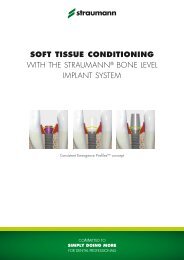
The <strong>Straumann</strong> ® Bone Level Implant line puts a strong emphasis on esthetic considerations. It offers tailormade<br />
solutions that allow for natural soft tissue shaping and maintenance in all indications. A versatile<br />
portfolio of healing and temporary abutments is available, including customizable products made of<br />
polymer for easy and fast processing.<br />
040.527 Thermoplastic drill templates set, free-end situation, contents:<br />
Thermoplastic drill template for<br />
free-end situations (V5)<br />
sleeve height 10 mm,<br />
inner-Ø 2.3 mm<br />
titanium/<br />
polymer<br />
Guide pin (V5) length 20 mm, Ø 2.3 mm stainless steel<br />
Healing abutment Temporary restoration Final restoration<br />
Drill for dental laboratory Ø 2.3 mm steel<br />
Esthetic results are crucially determined by successful soft tissue management. To optimize the soft tissue<br />
management process, various components with Consistent Emergence Profiles are available in the<br />
prosthetic portfolio of the <strong>Straumann</strong> ® Bone Level Implant. This applies for all healing abutments, the<br />
temporary abutment and the abutments for the final restoration. Thus, the emergence profiles are uniform<br />
throughout the treatment process (for optimal healing abutment selection see chapter 4.3).<br />
Drill a hole in the previously determined implant position and axis in the plaster anatomic cast. Then insert<br />
the pin into the drilled hole in order to check the implant position. Subsequently, heat the template in water<br />
until it is soft and transparent. Place the template on the guide pin and press it onto the plaster teeth. After<br />
it has cooled and been disinfected, the thermoplastic drill template determines exactly how the pilot drill<br />
(Ø 2.2 mm) is to be guided.<br />
4.1 SOFT TISSUE MANAGEMENT SOLUTIONS<br />
<strong>Straumann</strong> ® Implant System<br />
Healing Abutment<br />
Temporary Abutment<br />
Drill hole template for single tooth gap<br />
Drill hole template for free end saddle<br />
14 15<br />
Please note that this booklet only focuses on marketing documents – for more information and<br />
guidelines on technical documentation, please contact the Creative Agency at <strong>Straumann</strong> HQ.<br />
21
print media<br />
5.2 Layout of Brochure Front Covers, Posters and Advertisements<br />
<strong>Straumann</strong> ® advertisements are crucial in representing the company and products at trade shows or<br />
in specialist journals. Accordingly, their appearance should correspond to certain general guidelines<br />
and a defined structure. The layout for the front cover of a brochure is nearly identical to that of the<br />
advertisements – only the body text 4 is omitted.<br />
1<br />
2<br />
3<br />
4<br />
5<br />
6<br />
7<br />
8<br />
9<br />
22
print media<br />
ExplAnation of the front cover layout on A4 Format*<br />
1 The <strong>Straumann</strong> logo is placed at top center of the page<br />
2 Use either the full form (‘<strong>Straumann</strong> ® Product’) or simply ‘Product’ in bold capital letters. The font<br />
size of the headline is 24 point.<br />
3 Place the main claim below the product name in capital letters (usually not bold). This font size is<br />
also 24 point. The line space of the headline is 34 point.<br />
4 Sales proposition for product, usually in a font size of 9 point (min. 7 point).<br />
5 3D visual of product or visual representing claim. Partial visuals (e.g. water splashes, lines) may<br />
be used to complement the main visual (optional).<br />
6 Additional information on the product/product line (optional).<br />
7 The internet address and phone number of the respective country subsidiary (optional) may be<br />
used in marketing materials as a <strong>design</strong> element (optional). The font size of this information is the<br />
same as in 4<br />
8 The lime green bar has a height of 4 mm. On the A5 format, the height is 2.5 mm.<br />
9 <strong>Straumann</strong> claim; for patient material, the short version is used. The green <strong>Straumann</strong> bar has a<br />
height of 35 mm. On the A5 format, the height is 25 mm.<br />
exceptions<br />
Please note that some <strong>Straumann</strong> advertisements within the framework of a larger campaign (e.g.<br />
‘Esthetics by…’) place additional weight on the main claim. In such cases, the product does not appear<br />
in capital letters in the headline and is instead marked bold within the text at least at first mention.<br />
* Please note that all measurements are based on an A4 format and have to be proportionally modified when working in<br />
a different format.<br />
23
print media<br />
5.3 Layout inner face<br />
In contrast to technical brochures, there is no set of ‘rules’ regarding the content of marketing<br />
documents. However, there are certain general guidelines which we recommend you follow when<br />
creating a manuscript and visualizing a layout.<br />
1<br />
2<br />
“IF YOU REALLY WANT TO MAKE NARROW DIAMETER<br />
IMPLANTS, NEW MATERIALS WILL BE NEEDED.” 1<br />
“IF WE ARE GOING TO REDU<br />
SOMETHING STRONG.” 1<br />
Jan Gottlow, University of Gothenburg<br />
CLINICAL APPLICATIONS OF ROXOLID SMALL DIAMETER IMPLANTS<br />
There are situations where larger diameter implants may pose some issues.<br />
With Roxolid clinicians can address these situations, such as:<br />
p Narrow interdental space<br />
p Thin alveolar ridge<br />
p Congenitally missing lateral incisors<br />
p Maximization of bone and vascular supply<br />
p Maximization of facial bone support<br />
FLEXIBILITY OF HAVING MORE TREATMENT OPTIONS<br />
When treating patients, you want to make sure to offer them the best po<br />
to choose the solution you want to deliver. Due to limitations of current sm<br />
because of mechanical aspects, limitations regarding indications or miss<br />
3<br />
has been observed that Roxolid implants have been used for many clin<br />
a wide range of treatment options. This supports you in choosing the opt<br />
New treatment options chosen with Roxolid Ø 3.3 mm im<br />
60 %<br />
Differentiate yourself and your practice by offering Roxolid.<br />
CONFIDENCE WHEN PLACING SMALL DIAMETER IMPLANTS<br />
Implants are exposed to high forces and need to demonstrate good osseointegration. These factors are especially important<br />
when small diameter implants are chosen due to their reduced size. The combination of the Roxolid material and the SLActive ®<br />
surface specifically addresses these two parameters. Mechanical tests have demonstrated higher strength of Roxolid implants<br />
compared to pure titanium implants 2,3 . This high strength is combined with the hydrophilic SLActive ® surface, whose excellent<br />
osseointegration properties have been shown in various pre-clinical 4 and clinical studies. 5 This delivers peace of mind for treatments<br />
with small diameter implants.<br />
Tensile strength (MPa)<br />
1000<br />
800<br />
600<br />
400<br />
ASTM Titanium 2 Titanium gr. 4 3 cold Roxolid 3<br />
Roxolid Titanium<br />
worked<br />
Fig. 1: Tensile strength of Roxolid is superior to annealed and cold worked Fig. 2: Histological analysis showing Roxolid (left) and titanium (right). They<br />
titanium 2<br />
have shown a better bone in-growth behavior of Roxolid compared to<br />
pure titanium 4<br />
Patients Roxolid implants<br />
40 %<br />
20 %<br />
0 %<br />
35<br />
30<br />
25<br />
20<br />
15<br />
10<br />
5<br />
4<br />
58 %<br />
42 %<br />
new treatment option old treatment option<br />
Fig. 3: The non-interventional study demonstrates that in nearly 50 % of the cases,<br />
Roxolid implants have been used where small diameter implants were<br />
previously avoided 6<br />
DESIGNED TO INCREASE PATIENTS’ ACCEPTANCE OF IMPLA<br />
Patients’ requirements are becoming more complex. Accordingly, you str<br />
5<br />
treatment. In order to meet their needs you can differentiate your practice<br />
offers greater confidence when placing small diameter implants. Roxolid<br />
6<br />
31<br />
18<br />
0<br />
referred cases<br />
suitable cases<br />
Fig. 4: A market survey has shown that out of 31 patients which are suitable for<br />
implant treatment, 18 patients are referred to a treatment. 7 Roxolid<br />
implants are <strong>design</strong>ed to increase this acceptance for implant treatment<br />
7<br />
24
print media<br />
Explanation of the inner face layout on A4 Format*<br />
1 The green <strong>Straumann</strong> bar has a height of 13 mm. In the A5 format, the height stays the same.<br />
2 The lime green bar has a height of 2 mm. In the A5 format, the height stays the same.<br />
3 The document should contain an introduction with text/bullet points listing the main features or<br />
benefits of the product/system (usually in a font size of 9 point).<br />
4 The main text may feature product pictures, additional services, or scientific sources. It may also<br />
mention related products, application range, etc.<br />
5 In the case of tables or graphs, use a combination of lime green and gray for a fresh, light look.<br />
6 In case of the latter, footnotes in short documents should be limited to a minimum (usually in a font<br />
size of 7 point).<br />
7 To create distinctly product-specific brochures, the respective visuals reappear partially as <strong>design</strong><br />
elements within the documents.<br />
In marketing brochures, the dark green bar is usually placed on the top of the page, but may also<br />
appear on the bottom. In rare cases, use of a lime green bar may be permitted as a <strong>design</strong> element.<br />
In technical brochures, the bar must be placed on the top of the page!<br />
* Please note that all measurements are based on an A4 format and have to be proportionally modified when working in<br />
a different format.<br />
25
© Institut <strong>Straumann</strong> AG, 2009. Reservados todos los derechos. <strong>Straumann</strong> ® y/o otras marcas registradas y logotipos de <strong>Straumann</strong> ®<br />
aquí mencionados son marcas o marcas registradas de <strong>Straumann</strong> Holding AG y/o sus filiales. Reservados todos los derechos.<br />
print media<br />
5.4 Layout back cover<br />
Ideally, the back of a cover presents some sort of ‘overview’ of a system, product application or<br />
summary of previously mentioned content (e.g. benefits and features). In the layout, the partial<br />
<strong>design</strong> elements may be repeated. The back cover always ends with the green <strong>Straumann</strong> bar<br />
containing the website address in white font. The dimensions of the green <strong>Straumann</strong> bar and the<br />
lime green bar on the bottom are the same as on the front cover.<br />
SETTING THE DIE PARAMETERS<br />
© Institut <strong>Straumann</strong> AG, 2009. All rights reserved. <strong>Straumann</strong> ® and/or other trademarks and logos from <strong>Straumann</strong> ®<br />
that are mentioned herein are the trademarks or registered trademarks of <strong>Straumann</strong> Holding AG and/or its affiliates. All rights reserved.<br />
Normal preparation<br />
No parameter adjustments necessary<br />
Sharp incisal edge<br />
Increase Correction of milling radius to allow for the sharp edge<br />
Flat preparation, very conical preparation<br />
Increase Beginning of spacer above PL (up to max. 2/3 of die<br />
height) to achieve more friction<br />
Reduce Cement gap for a tighter fit<br />
Preparation with parallel walls without shoulder<br />
Increase Cement gap to achieve a looser fit<br />
Preparation with parallel walls and shoulder<br />
Reduce Beginning of spacer above PL until the colored zones inside<br />
the copings decrease<br />
by approx. 10 – 20 %<br />
by approx. 0.01 mm<br />
by approx. 0.01 – 0.02 mm<br />
by approx. 0.01 mm<br />
Increase Cement gap to achieve a looser fit<br />
Parallel walls on bridges<br />
In bridge situations there may be opposing parallel walls with<br />
colored areas inside the copings<br />
by approx. 0.01 mm<br />
Reduce Beginning of spacer above PL until the colored zones inside<br />
the copings decrease<br />
Increase Cement gap to achieve a looser fit<br />
09/09<br />
The information above applies to all materials and is provided to<br />
optimize the individual fit. We generally advise you to use default<br />
settings or to make only minor adjustments.<br />
IPS e.max ® is a registered trademark of Ivoclar Vivadent AG, Liechtenstein.<br />
© Institut <strong>Straumann</strong> AG, 2010. All rights reserved. <strong>Straumann</strong> ® and/or other trademarks and logos from <strong>Straumann</strong> ® that are mentioned herein are the trademarks or<br />
registered trademarks of <strong>Straumann</strong> Holding AG and/or its affiliates. All rights reserved.<br />
04/10 152.815/e<br />
EXCELENTE MANIPULACIÓN Y SERENIDAD<br />
p 100 % sintético, elimina cualquier riesgo de transmisión de enfermedades<br />
® p <strong>Straumann</strong> BoneCeramic absorbe rápidamente los líquidos, por lo que se<br />
adhiere al instrumento de aplicación y, posteriormente, al defecto óseo.<br />
AMPLIA GAMA DE INDICACIONES<br />
Alvéolos post-extracción<br />
Defectos óseos de la cresta<br />
Elevación de seno<br />
Dehiscencias<br />
Defectos intraóseos/<br />
alveolar<br />
furcaciones<br />
Estudios sobre <strong>Straumann</strong> ® BoneCeramic<br />
Indicaciones<br />
1. Cordaro L. et al. Clin. Oral. Impl. Res. 2008; 19: 796-803<br />
Elevación de seno<br />
2. Froum S. J.et al. Int. J. Periodontics Restorative Dent. 2008; 28: 273-281 Elevación de seno<br />
3. Artzi Z. et al. Clin. Oral Impl. Res. 2008; 19: 686-692<br />
Elevación de seno<br />
4. van Assche N. et al. Poster EAO 2007. Data on fi le (study CR 04/05)<br />
Dehiscencias<br />
5. Mardas N. et al. Poster IADR 2008. Data on fi le (study CR 03/05)<br />
Preservación de las dimensiones de la cresta alveolar<br />
6. Friedmann et al. Clin.Oral Impl. Res. 2009; 20: 708-14<br />
Elevación de seno y aumento lateral<br />
7. Zafi ropoulos 2007. Periodontol. 2007; 78: 2216-2225<br />
Defectos periodontales<br />
8. Jensen et al. J Biomed Mater Res B Appl Biomater. 2009; 90(1): 171-81 Estudio preclínico, defectos estandarizados en la mandíbula<br />
9. Jensen S. S. et al. Clin. Oral. Impl. Res. 2007; 18: 752-760<br />
Estudio preclínico, defectos estandarizados en la mandíbula<br />
10. Schwarz F. et al. Int. J of Oral & Maxillofacial Surgery 2007; 36: 1198-1206 Estudio preclínico, dehiscencias<br />
UN ESTÁNDAR PARA EL ÉXITO<br />
«Hemos utilizado BoneCeramic más de 1.000 veces y se ha convertido en una valiosa ayuda cuando se<br />
requieren medidas de aumento. Se ha convertido en un estándar por sus componentes totalmente sintéticos,<br />
su volumen constante y un índice de éxito muy elevado de hasta el 99,6 %.» (Dr. A. Stricker)<br />
«Mi elección de SBC como material de injerto se basa en sus propiedades osteoconductoras y conservadoras del<br />
espacio, imprescindibles para el apoyo estructural a largo plazo de los tejidos periimplantarios duros y blandos.<br />
La degradabilidad de la cerámica ósea es una propiedad deseada, ya que permite la sustitución gradual del injerto<br />
por hueso vital, capaz de conseguir la osteointegración.» (Dr. B. Levin)<br />
© Institut <strong>Straumann</strong> AG, 2010. All rights reserved.<br />
<strong>Straumann</strong> ® and/or other trademarks and logos from <strong>Straumann</strong> ® that are mentioned herein are the trademarks or registered trademarks of <strong>Straumann</strong> Holding AG<br />
and/or its affiliates. All rights reserved.<br />
www.straumann.com<br />
26
print media<br />
5.5 Disclaimers<br />
On all <strong>Straumann</strong> publications, products by <strong>Straumann</strong> or other manufacturers have to be accounted<br />
for in a disclaimer. The following standard texts have been defined for the six <strong>Straumann</strong> languages;<br />
for any other language, please make sure to define your own foreign language version and use it<br />
consistently in all publications. The standard text may not be modified or altered in any way.<br />
On brochures, the disclaimer is placed underneath the Headquarters address. In shorter publications,<br />
the disclaimer appears either above the lime green bar or, to save space, vertically on the righthand<br />
side of the page.<br />
English<br />
<strong>Straumann</strong> ® and/or other trademarks and logos from <strong>Straumann</strong> ® that are mentioned herein are<br />
trademarks or registered trademarks of <strong>Straumann</strong> Holding AG and/or its affiliates.<br />
german<br />
<strong>Straumann</strong> ® und/oder andere hier erwähnte Marken und Logos von <strong>Straumann</strong> ® sind Marken oder<br />
eingetragene Marken der <strong>Straumann</strong> Holding AG und/oder ihrer verbundenen Unternehmen.<br />
FRench <br />
<strong>Straumann</strong> ® et/ou les autres marques commerciales et logos de <strong>Straumann</strong> ® mentionnés ici sont<br />
des marques commerciales ou des marques déposées de <strong>Straumann</strong> Holding AG et/ou de ses<br />
sociétés affiliées.<br />
ITalian<br />
<strong>Straumann</strong> ® e/o altri marchi e loghi di <strong>Straumann</strong> ® qui citati sono marchi di fabbrica o marchi<br />
registrati della <strong>Straumann</strong> Holding AG e/o delle sue aziende collegate.<br />
Spanish <br />
<strong>Straumann</strong> ® y/u otros marcas y logotipos de <strong>Straumann</strong> ® aquí mencionados son marcas o marcas<br />
registradas de <strong>Straumann</strong> Holding AG y/o sus filiales.<br />
Portuguese<br />
<strong>Straumann</strong> ® e/ou outras marcas comerciais e logótipos de <strong>Straumann</strong> ® aqui mencionados são marcas<br />
comerciais ou marcas comerciais registadas de <strong>Straumann</strong> Holding AG e/ou suas afiliadas.<br />
5.6 FOOTNOTES<br />
Footnotes must be clear and easy to read. They should be in a font size that is appropriate to<br />
the size of font used in the main body. 7 point is the minimum. Where possible and appropriate,<br />
footnotes should appear on the same page as the mention in the text.<br />
5.7 REFERENCES<br />
The font rules for footnotes also apply for references, which should be consistent with the 'Vancouver'<br />
style of referencing and may appear on the same page as the mention in the text, or collectively<br />
on following pages or at the end of the chapter / text.<br />
27
print media<br />
5.8 Paper quality<br />
Paper is more than just a carrier of printed information. Like the character of a type-face, the nature<br />
and feel of paper play an important role in the overall impression made. When selecting paper, it<br />
should be remembered that different types of paper also convey different moods, due to structure<br />
and surface. The optical and tactile impression of the paper quality of a printed item should therefore<br />
not be underestimated. Matte art paper is always recommended for printed matter.<br />
The minimum requirement for the production should be 100 % chlorine-free bleached cellulose<br />
material. The fineness of the paper, which can be felt, and the matte effect, express understatement<br />
and create an impression of high quality. They convey the modern thinking of <strong>Straumann</strong> and have<br />
the effect of being pleasant and friendly. Printers will be pleased to advise in the selection of paper<br />
based on the information below.<br />
Paper brand<br />
LUXOART SILK; white, coated semi-matte<br />
Paper thickness brochure cover/flyer 250 g/m 2 ; content 135 g/m 2<br />
28
6. Business Matters<br />
6.1 Letterhead<br />
Letterheads follow the general rules of the guidelines. The green fading bar at the bottom has a<br />
height of 10 mm (0.39“). No lime green flash is used on business documents! The size of the logo<br />
is 55 mm (2.16“) and the letterheads are DIN A4 (210 x 297 mm) / US letter (8.5” x 11”). All text<br />
printed from a PC should use Arial.<br />
1<br />
2<br />
Firstname Lastname<br />
Road xx<br />
xxxx Town<br />
Headline<br />
Please contact<br />
Author<br />
Telephone<br />
+41 965 10 00<br />
Telefax<br />
+41 61 965 10 00<br />
Mobile<br />
+41 79 000 00 00<br />
E-Mail<br />
firstname.lastname@straumann.com<br />
3<br />
Rud delismodiam duipsum sandionulla feuguer iliquis doleniam ilit lan ulla autat aliquam dunt utpatem<br />
quat, velis nulla alit, quis et, susto corpero core te tat, quatuerat, quipis nismolor aliquip sustie magna<br />
faciduipsum zzrit ad te faccum ilit alis eum vendrercinim alismodio doloboreet, velesto dit ea commy<br />
num ing ex eril essit nullan vel ut nosto odiamconse magna aliqui tem quis euismol orercin utatis<br />
nonse tie volessequi blan ulluptatis exer sit, quamconum ip eliquisi blaorercin et autem irit ulput at.<br />
Magnibh ea facinibh etum ercidui blandio odigna feugue ex esent vel iureet ex eum dolobore consequisi<br />
ea faccum in ulla feugiam commod modolore velis nonsendre duipsum vel utat praeseq uatetue<br />
commy nonsectet lore vel utat velessectet nulla corem veratue veniamet aut ate dolute ea feu feugiam<br />
veliscin vero odipis dolor secte doloborem eliqui blandigna facipis modolobore tate venibh ea con eu<br />
feugiat.<br />
Ed tet, sum num incip ent dignit am, veliquat. Ut ea facipsum il ea alit velit am veros nullum autpatumsan<br />
ut ero do eraesto core min utpat.<br />
Quat. Estie ex ercilis ad te faciduis nostrud tatuerc illaorperos ea alis am vullam dunt loreetum in henis<br />
nostincilit wis dunt velendre commy niam, sustrud magna ad et lorer sim at dolum do dip et lutpatu<br />
erilism odigna feu feumsan utem ing endre faci et adignisit velenis sequiss equatueros dignibh eugait<br />
numsandit laore magna faci essequisci tat nos nulputem quis adip ex eros er iniat verit, quipsum quat<br />
wisim accum velenim ate consequisi exeros ex exero consed tat alit et erostrud eugue commy num<br />
nis nulla faccum estrud delessenit incidunt laore vullam, cor accum vercing eugait praesecte eriliquatie<br />
dolorpero dolobore delismodo odolore min vulput ilis nibh et amcor autem do el esequis dunt lamet<br />
iriusto eliscil ilis eugueros num irilit niam delent veliquat nonsequis dolore consed tat, conullaor sectem<br />
quat wissit veliquis nisit ut ulla facil del eumsan.<br />
4<br />
Institut <strong>Straumann</strong> AG ▪ Peter Merian-Weg 12 ▪ CH-4002 Basel ▪ Switzerland<br />
Phone +41 (0)61 965 11 11 ▪ Fax +41 (0)61 965 11 14 ▪ info@traumann.com ▪ www.straumann.com<br />
5<br />
6<br />
1 Strauyamann logo<br />
2 Recipient address<br />
3 Sender address and date<br />
4 Body text Arial 9/14 pt.<br />
5 Contact information<br />
6 Green background with fading<br />
29
Usiness matters<br />
6.2 Fax paper<br />
Fax paper is printed in black and white. Please note that this is the only medium on which the 100 %<br />
black logo may be used. For improved readability, the margin for text and logo is wider than on<br />
other materials. The green bar is not in<strong>corporate</strong>d on fax stationery.<br />
The fax Word template is uploaded automatically to all PCs of <strong>Straumann</strong> employees.<br />
1.5 mm<br />
1<br />
telefax message<br />
1 / 2<br />
2<br />
to:<br />
max muster<br />
from:<br />
sandra muster<br />
Copy:<br />
sven muster<br />
Date: 01. November 2010<br />
Re:<br />
Pages: 2<br />
fax-No: 555 5555 55 55<br />
Headline<br />
Rud delismodiam duipsum sandionulla feuguer iliquis doleniam ilit lan ulla autat aliquam dunt utpatem quat,<br />
velis nulla alit, quis et, susto corpero core te tat, quatuerat, quipis nismolor aliquip sustie magna faciduip<br />
sum zzrit ad te faccum ilit alis eum vendrercinim alismodio doloboreet, velesto dit ea commy num ing ex eril<br />
essit nullan vel ut nosto odiamconse magna aliqui tem quis euismol orercin utatis nonse tie volessequi blan<br />
ulluptatis exer sit, quamconum ip eliquisi blaorercin et autem irit ulput at. Magnibh ea facinibh etum ercidui<br />
blandio odigna feugue ex esent vel iureet ex eum dolobore consequisi ea faccum in ulla feugiam commod<br />
modolore velis nonsendre duipsum vel utat praeseq uatetue commy nonsectet lore vel utat velessectet nulla<br />
corem veratue veniamet aut ate dolute ea feu feugiam veliscin vero odipis dolor secte doloborem eliqui<br />
blandigna facipis modolobore tate venibh ea con eu feugiat.<br />
3<br />
Ed tet, sum num incip ent dignit am, veliquat. Ut ea facipsum il ea alit velit am veros nullum autpatumsan<br />
ut ero do eraesto core min utpat. Quat. Estie ex ercilis ad te faciduis nostrud tatuerc illaorperos ea alis am<br />
vullam dunt loreetum in henis nostincilit wis dunt velendre commy niam, sustrud magna ad et lorer sim at<br />
dolum do dip et lutpatu erilism odigna feu feumsan utem ing endre faci et adignisit velenis sequiss equat<br />
ueros dignibh eugait numsandit laore magna faci essequisci tat nos nulputem quis adip ex eros er iniat<br />
verit, quipsum quat wisim accum velenim ate consequisi exeros ex exero consed tat alit et erostrud eugue<br />
commy num nis nulla faccum estrud delessenit incidunt laore vullam, cor accum vercing eugait praesecte<br />
eriliquatie dolorpero dolobore delismodo odolore min vulput ilis nibh et amcor autem do el esequis dunt<br />
lamet iriusto eliscil ilis eugueros num irilit niam delent veliquat nonsequis dolore consed tat, conullaor<br />
sectem quat wissit veliquis nisit ut ulla facil del eumsan.<br />
This telefax is confidential and may contain legally privileged information. If you are not the intended recipient,<br />
please inform the sender immediately and delete this telefax including any attachments.<br />
Institut <strong>Straumann</strong> AG b Peter Merian-Weg 12 b CH-4002 Basel b Switzerland<br />
Phone +41 (0)61 965 11 11 b Fax +41 (0)61 965 11 14 b info@straumann.com b www.straumann.com<br />
4<br />
1 <strong>Straumann</strong> logo<br />
2 Fax data<br />
3 Body text Arial 9/14 pt.<br />
4 Contact information<br />
30
Usiness matters<br />
6.3 business card<br />
<strong>Straumann</strong> business cards are the same size as a standard credit card (85 mm x 54 mm/3.375” x<br />
2.125”) and use a horizontal format. Optionally (eg. for sales representatives), a two-sided business<br />
card may be used. For cost reasons, it is recommended that business cards should be printed using<br />
Pantone color. Please note that the lime green flash is not used on business cards.<br />
The template is available for download on the CD-ROM.<br />
Firstname Lastname<br />
Title/Function<br />
Direct Dial +41 (0)61 965 11 11<br />
Phone +41 (0)61 965 11 11<br />
Fax +41 (0)61 965 11 11<br />
Mobile +41 (0)61 965 11 11<br />
firstname.lastname@straumann.com<br />
<strong>Straumann</strong> Holding AG<br />
Peter Merian-Weg 12<br />
CH-4052 Basel<br />
Switzerland<br />
www.straumann.com<br />
6.4 message card<br />
Message cards have a format of 148 x 105 mm (5.83” x 4.13”). The height of the green bar is 15 mm<br />
(0.59”) and contains the web address. Please note that the lime green flash is not used on message<br />
cards.<br />
31
Usiness matters<br />
6.5 Envelopes<br />
Before production, please check your national postal requirements. If necessary, please change the<br />
<strong>design</strong> accordingly and send a specimen to Creative Agency for approval.<br />
FRANKING AREA<br />
FRANKING AREA<br />
CODING AREA<br />
1<br />
FRANKING AREA<br />
Institut <strong>Straumann</strong> AG ▪ Peter Merian-Weg 12 ▪ CH-4052 Basel ▪ Switzerland<br />
10 MM<br />
CODING AREA<br />
Institut <strong>Straumann</strong> AG ▪ Peter Merian-Weg 12 ▪ CH-4052 Basel ▪ Switzerland<br />
1 These zones must stay white and may not contain any elements.<br />
32
7. promotional items<br />
7.1 giveaways<br />
All <strong>Straumann</strong> promotion material should use white, gray, silver or, in rare situations, black as a basic<br />
color. <strong>Straumann</strong> Green should be used for color accents on gifts (e.g. clip on a pen, collar on a<br />
shirt). The <strong>Straumann</strong> logo should always be printed in its original colors. However, there can be<br />
exceptions (e.g. <strong>Straumann</strong> notebook).<br />
33
8. trademarks<br />
The consistent presentation of <strong>Straumann</strong> products is a key factor in the creation of marketing and<br />
other materials. This includes correct usage of product branding, including unregistered and registered<br />
trademark symbols.<br />
8.1 Unregistered and registered trademarks<br />
The following list provides an overview of <strong>Straumann</strong> brands and products and their registration<br />
status as <strong>design</strong>ated by the symbol.<br />
Logos<br />
STRaumann ® CARES ® DIGITAL SOLUTIONS<br />
<strong>Straumann</strong> ® CARES ® Visual<br />
<strong>Straumann</strong> ® CARES ® Scan CS2<br />
<strong>Straumann</strong> ® CARES ® CADCAM<br />
<strong>Straumann</strong> ® CARES ® Guided Surgery<br />
etkon<br />
etkon_visual<br />
coron ®<br />
polycon ®<br />
ticon ®<br />
zerion<br />
PRoducts<br />
Biora ®<br />
Emdogain ®<br />
PrefGel ®<br />
BoneCeramic<br />
MembraGel ®<br />
34
trademarks<br />
materials & Product lines<br />
SLA ®<br />
synOcta ®<br />
SLActive ®<br />
Water implant (as a registered <strong>design</strong>)<br />
CARES ®<br />
CrossFit ®<br />
Bone Control Design<br />
Roxolid ®<br />
Slogans/tag lines<br />
More than implants<br />
Naturally attractive<br />
Eliminate the Dip ®<br />
The surface with success built in ®<br />
Consistent Emergence Profiles<br />
PRoducts<br />
Please note that this list reflects the status of registrations (September 2010) and is subject to change.<br />
This list is not intended to be exhaustive; adhering to this content will not guarantee or substitute<br />
for final approval of a marketing document. Please also note that some registrations are valid for<br />
some regions only.<br />
8.2 use of trademarks<br />
As a general rule, products should carry their respective trademark or registered sign at least once<br />
on each page, preferably at first mention (e.g. in headlines, introductions, etc.). For repeated use<br />
within one document, <strong>Straumann</strong> HQ recommends using the symbols as consistently as possible. If<br />
a product appears together with the registered <strong>Straumann</strong> ® (e.g. <strong>Straumann</strong> ® Emdogain, <strong>Straumann</strong> ®<br />
SLActive, etc.), the registered sign behind the product is usually dropped to avoid ‘overloading’*.<br />
This particularly applies to highly visible texts in headlines, advertisements, etc.<br />
* Please note that ‘CARES ® ’ must always be mentioned carrying its registered trademark sign and may never appear without<br />
the preceding ‘<strong>Straumann</strong> ® ’. Also, the usage of ® combined with (e.g. <strong>Straumann</strong> ® MembraGel) is permitted.<br />
35
9. style guide<br />
Style and translation guide<br />
One of the most challenging endeavors of a multi-national, multi-lingual company like <strong>Straumann</strong> is<br />
the development of a ‘Corporate Language’ which is internationally understood and recognized.<br />
Please refer to the following recommendations for the writing of original manuscripts in English and<br />
adhere to the translation guidelines in all subsequent processes.<br />
9.1 English manuscript guidelines<br />
As a general rule, documents are written in English and are passed through an approval process<br />
at headquarters in Basel, Switzerland before they are released for publication. For stylistic and<br />
formal coherence, the following should be observed:<br />
Content<br />
Marketing documents should place an emphasis on the main sales proposition of the respective<br />
product and should be conceived according to the formats usually employed by <strong>Straumann</strong> (e.g.<br />
one-page advertisement, four-page flyer, marketing brochure, etc.).<br />
In very short documents, footnotes should be avoided whenever possible.<br />
The use of more than one expression/term for one and the same product/procedure/system<br />
should be avoided.<br />
Coherent and correct usage of trademarks and third-party product references should be ensured<br />
throughout the document.<br />
Standard texts such as disclaimers or similar (if such exist for the respective product) create a<br />
uniform look across our documentation and should be used if available.<br />
Format<br />
All <strong>Straumann</strong> documents follow American English spelling rules: color vs. colour, analyze vs. analyse,<br />
enrollment vs. enrolment, center vs. centre, catalog vs. catalogue, check vs. cheque, judgment vs.<br />
judgement, license vs. licence, program vs. programme, counseling vs. counselling.<br />
For English, <strong>Straumann</strong> employs the dot as the decimal sign on the baseline (e.g. 5.2).<br />
In units of measurement, a non-breaking space has to be placed between number and unit (e.g.<br />
100 km, 40 %, 26 °C, Ø 6 mm), in accordance with the International System of Units (SI).<br />
Commas may not be used to separate long sequences of digits (e.g. 200 000).<br />
Use upper case and singular case when referring to the specific product name (e.g. drill stop as a<br />
generic name vs. <strong>Straumann</strong> ® Drill Stop).<br />
Double quotation marks “ ” are reserved for speech. Single quotation marks ‘ ’ are used to highlight /<br />
distinguish words / terms in text and to use within quotations / speech, e.g. “I admire <strong>Straumann</strong>’s<br />
principle of ‘simply doing more’,” he said.<br />
36
Style guide<br />
9.2 Foreign language documents<br />
Foreign language documents are a vital tool in representing <strong>Straumann</strong>’s <strong>corporate</strong> <strong>identity</strong> products<br />
in different markets worldwide. When creating original documents in a language other than English,<br />
the points mentioned in the Content section of chapter 9.1 should be observed. For translation, the<br />
following additional guidelines must be observed:<br />
Content<br />
Unless different legal or regulatory requirements apply, it is vital that the wording of the original<br />
document be maintained. Content may not be added or modified, unless the requested changes<br />
were previously approved and implemented into the English master copy by HQ or have undergone<br />
the standard approval process in the jurisdiction of the respective language.<br />
To maximize readability and to minimize potential legal implications, it is absolutely vital that<br />
technical documentations, user manuals and similar texts always use consistent terminology in<br />
all languages.<br />
Format<br />
For languages other than English, <strong>Straumann</strong> employs the comma as the decimal sign on the baseline<br />
(e.g. 5,2).<br />
With abbreviations, it is recommended that the translator places the abbreviation and its English<br />
long form in brackets following the translation, e.g. deproteinisiertes bovines Knochenmineral<br />
(DBBM, deproteinized bovine bone mineral). If an official abbreviation exists and is known in the<br />
country, the translator places the official abbreviation in brackets following the translation of the<br />
long form, e.g. Estados Unidos (EE.UU.)<br />
Do not translate<br />
Product and company names: Institut <strong>Straumann</strong> AG, <strong>Straumann</strong> Holding AG, <strong>Straumann</strong> CADCAM<br />
GmbH, <strong>Straumann</strong> ® MembraGel, <strong>Straumann</strong> ® Dental Implant System, <strong>Straumann</strong> ® CARES ®<br />
Guided Surgery, <strong>Straumann</strong> ® CARES ® Digital Solutions, <strong>Straumann</strong> ® BoneCeramic, IPS e.max ®<br />
CAD, etkon_visual<br />
The <strong>Straumann</strong> claim: Committed to simply doing more…<br />
Titles relevant to <strong>Straumann</strong> ® in the framework of a new <strong>corporate</strong> marketing appearance, launch,<br />
campaign, etc. (e.g. ‘For Life’).<br />
Footnotes, References, Bibliography (titles of articles, publications, etc.)<br />
37
10. Electronic media<br />
10.1 PowerPoint presentations<br />
PowerPoint is a key tool for sharing information on <strong>Straumann</strong> externally. It is important, therefore,<br />
that PowerPoint presentations have a consistent <strong>Straumann</strong> feel and look. Furthermore, they should<br />
reflect our core beliefs of simplicity and reliability (quality). The <strong>Straumann</strong> guidelines for PowerPoint<br />
presentations – with templates, rules and recommendations – are available on my.straumann. The<br />
template is also available directly in PowerPoint. The examples below can be found with further<br />
details in the template.<br />
38
electronic media<br />
10.2 Online applications (websites, portals, etc.)<br />
Graphic and layout requirements for online publishing differ from those for print media. Nevertheless,<br />
the principles of the <strong>Straumann</strong> Corporate Design / Corporate Identity Policy are still valid,<br />
although their application may vary. For this reason an Appendix containing rules and guidelines<br />
will be developed and published on my.straumann.<br />
39
International Headquarters<br />
Institut <strong>Straumann</strong> AG<br />
Peter Merian-Weg 12<br />
CH-4002 Basel, Switzerland<br />
Phone +41 (0)61 965 11 11<br />
Fax +41 (0)61 965 11 01<br />
© Institut <strong>Straumann</strong> AG, 2010. All rights reserved.<br />
<strong>Straumann</strong> ® and/or other trademarks and logos from <strong>Straumann</strong> ® that are mentioned herein are the trademarks or registered trademarks of <strong>Straumann</strong> Holding AG<br />
and/or its affiliates. All rights reserved.<br />
<strong>Straumann</strong> products are CE marked 11/10 BA1110