
Create successful ePaper yourself
Turn your PDF publications into a flip-book with our unique Google optimized e-Paper software.
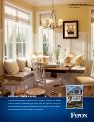
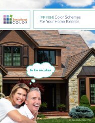
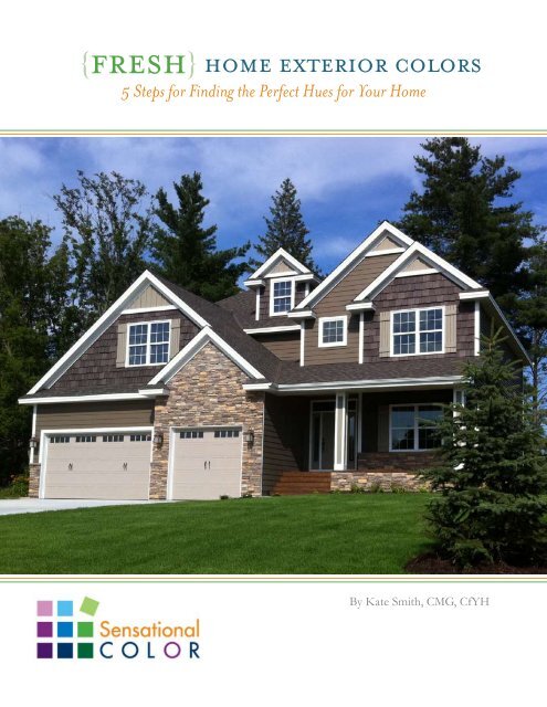
{fresh home exterior colors<br />
5 Steps for Finding the Perfect Hues for Your Home<br />
{<br />
By Kate Smith, CMG, CfYH
Copyright: © 2011 Standard Copyright License<br />
All rights reserved. No part of this publication may be<br />
reproduced or used in any form or by any means-graphic,<br />
electronic, or mechanical, including photocopying, recording,<br />
or information storage-and-retrieval systems-without the prior<br />
written permission from the publisher.<br />
The rights of Kate Smith to be identified as the author and<br />
publisher of this work have been asserted by her in accordance<br />
with the Copyright, Design and Patents Act 1988.<br />
Images may not be copied, replaced, distributed, published,<br />
displayed, modified, or transferred in any form or by any means<br />
except with the prior permission of the rights owner listed<br />
below:<br />
DaVinci Roofscapes: cover, pgs. 3, 5, 7, 8, 9, 10, 11, 12, 15, 17, 18, 25, 26<br />
Fypon: pgs. 13, 19, 24<br />
<strong>Therma</strong>-<strong>Tru</strong>: pgs. 16, 22, 23, 29<br />
Simonton Windows: pgs. 6, 10, 14, 19, 20, 21, 25, 27, 28<br />
Book Design: Melissa O’Connor<br />
Thank you to the following companies for providing images<br />
and information used in this publication.
{fresh<br />
{<br />
home exterior colors<br />
5 Steps for Finding the Perfect Hues for Your Home<br />
By Kate Smith, CMG, CfYH<br />
The FRESH Approach<br />
Introduction<br />
1 ~ Determine Your Direction<br />
Your Style Statement<br />
Keep in Mind Individuality & Personality<br />
Check Out Color Schemes<br />
Gather Information & Inspiration<br />
2 ~ Fixed Features<br />
Recognize Influential Fixed Features<br />
Begin with the Largest Fixed Features<br />
Determine Predominant Colors & Repetitive Tones<br />
3 ~ Regional Colors<br />
Look at the Geographical Location of Your Home<br />
Materials and Cultural History<br />
Natural Elements in Color Schemes<br />
4 ~ Environment & Surroundings<br />
Consider Natural Influences and Landscaping<br />
Be Considerate of Housing Styles & Cultural Influences<br />
Temper Colors to Your Home’s Setting<br />
5 ~ Style of the Home<br />
Pinpoint Your Home Style<br />
Learn About Your Home’s Origins<br />
Keep Exterior Colors <strong>Tru</strong>e to Home Style<br />
Investigate Historic Colors<br />
6 ~ Have-To-Use Colors<br />
Work Within Home Association Regulations<br />
Respect Historical Districts & Properties<br />
7 ~ Color Placement Theories & Tips<br />
Take a Hard Look at Each Exterior Element<br />
Think How You Want to Experience Your Home<br />
Reconsider Culture, Environment & Surroundings<br />
Try Out a Color Design Center or Studio Online<br />
Experience How Colors Work Together<br />
8 ~ Putting It All Together: How to Choose Your Colors<br />
Start From the Top Down with Your Roof<br />
Choose Your Main Color<br />
Frame Your Windows with Color<br />
Color Your Front Door Welcoming<br />
The Trim & Details Add the Finishing Touch<br />
Add a Perfectly Hued Garage Door<br />
9 ~ Getting It Right<br />
Sample Colors<br />
Examine Color Samples Outdoors<br />
Check Back at Differing Angles and Times of Day<br />
Use Natural Light to View Color Samples<br />
Live with Your Color Choices for a Bit<br />
Move Forward Once You Are Pleased with Your Choices<br />
You’ve Got Color!
your home<br />
makes a statement<br />
It tells the world something about the personality of the people who live inside.<br />
Whether you’re building new or renovating, each product and color choice you<br />
make is an opportunity to develop your personal style statement while enhancing<br />
the curb appeal and resale value of your property.<br />
The problem is that if you are like most homeowners, choosing the materials and<br />
products is easier than picking the color. Having to choose color for one item can<br />
be difficult; having to choose several colors can be a daunting task.<br />
The good news is that it doesn’t have to be difficult. All it takes is some FRESH<br />
thinking to select the right color for each element of your home - roofing, siding,<br />
doors, windows, shutters, trim and accents.<br />
FRESH is the approach I use as a certified color professional when selecting<br />
colors for a home exterior --- and now you can use this same process for<br />
choosing colors for your home. By following the steps in this guidebook you will<br />
be able to pick the perfect colors for your home exterior.<br />
Fixed Features<br />
Regional Colors<br />
Environment and Surroundings<br />
Style of the Home<br />
Historic and Have-to-Use Colors<br />
A well-chosen color<br />
scheme can bring out<br />
architectural details,<br />
downplay flaws and<br />
enhance the look of<br />
your home.<br />
4
determine your direction<br />
BEFORE<br />
you begin using the FRESH<br />
approach to find your perfect colors, think<br />
about the personal statement you want to<br />
make on your home’s exterior. Do you want<br />
your home to look stately and elegant, or<br />
storybook cute Does a natural, toned-down<br />
color fit your vision or is a beachy bright hue<br />
a better fit Having a clear idea of the<br />
overall style you are going for will go a long<br />
way to guiding you to the best material and<br />
color choices.<br />
Walk around your neighborhood and make note of homes that you find appealing. What is<br />
it about the color or color combination that appeals to you Do you find that you are drawn<br />
to the homes that have contrasting shutters and front door or do you prefer a scheme of<br />
closely related colors<br />
Once you have honed in on your style, the next step is to consider the five keys to FRESH<br />
exterior colors.<br />
Start by looking at the type of homes that appeal to you. Whether found in magazines, on<br />
the Internet or as close as next door, one of the easiest ways to figure out what you like is<br />
to look at other homes. Determine what it is that you like about each house. Is it the overall<br />
color scheme or historic style Maybe you like that it looks friendly and welcoming.<br />
Walking or driving around close to home is often<br />
the best place to start your search. You bought your<br />
home because you enjoyed the surroundings and<br />
neighborhood. Homes within an area are also often<br />
similar in style. Looking at what your neighbors<br />
have done with their homes can serve as inspiration<br />
for your own home’s exterior.<br />
An easy way to identify what you like is to snap<br />
pictures of the houses you like. Once you have<br />
many images, look at the homes side-by-side. You’ll<br />
begin to see similarities that you may not have<br />
noticed as you looked at them individually. These<br />
pop-out colors and features may help guide you to<br />
your own choices.<br />
Taking pictures is a good way to have<br />
an instant reference library as you begin<br />
planning how you will apply colors to<br />
your own home. You will be able to find<br />
your perfect exterior color scheme more<br />
easily if, before you even start thinking about<br />
specific colors, you figure out the types of<br />
schemes that you find most appealing.<br />
5<br />
6
fixed features<br />
Look at the fixed features of your home and more than likely you’ll begin to see some<br />
repetition of color tones. It is this repetition that allows different materials and textures to all<br />
work well together. When choosing colors for items such as your roof, find a color or variety<br />
of colors that also includes the predominate color or color cast of the existing permanent<br />
elements.<br />
{<br />
Begin With the Largest Fixed Feature<br />
Unless your home is brick or stone, the largest fixed feature is probably the roof, so start<br />
there. Roofing materials are rarely a flat or solid color. Even a standard gray roof often has<br />
a hint of blue, green, or red. Look closely and see what you can detect up close that isn’t<br />
apparent from a distance. With premium roofing products you will usually be able to see the<br />
variations in color even more clearly since they are part of the beauty of the product.<br />
{<br />
UNLESS<br />
you are building a house from the ground up, no home is a blank canvas.<br />
There are many things to consider as you select your colors, with the most influential being<br />
the fixed features. These include items such as:<br />
• Foundation materials: brick, stone, stucco, concrete, etc.<br />
• Roofing shingles: style, color, and material.<br />
• Chimney structures: brick, stone, or stucco.<br />
• Porch, steps, retaining and walkways: brick, stone, cement.<br />
• Decks and patios: wood, brick, concrete, composite, etc.<br />
Your features may be constructed of different materials but they will usually have a common<br />
color or color cast. Once you identify that common color, it is a sure bet that another<br />
element that has the same color, color cast or undertone of that fixed feature color will work<br />
well for your home’s overall color scheme.<br />
Your new colors don’t need to match existing colors, but do need to harmonize with them.<br />
Take inventory of the colors in your home’s fixed features. What color is your roof Are<br />
bricks or stones on your facade Will doors and railings remain their existing colors What<br />
about the window frames The color of each of these areas of your home will become part<br />
of your overall color plan.<br />
{<br />
Evaluate Other Fixed Features<br />
If your home is brick or has a partial brick exterior,<br />
at first glance you might think of the brick as just<br />
red. However, if you take a closer look you’ll begin<br />
to see that there is more to the surface color than<br />
first meets the eye. Many bricks are essentially red,<br />
but have a golden yellow or beige cast. Make note<br />
of both the main color and color cast. Either one or<br />
both of these colors could possibly be included in<br />
the color you choose for your roofing, siding or<br />
accents.<br />
{<br />
If stonework is prominent on or around your home look at the overall color tone first.<br />
Is it gray, brown, green, peach, etc. Next look at what colors stand out from the other<br />
stones. A deep shade of this color might work for your front door or shutters.<br />
The fixed features usually remain the same for the life of the<br />
home. This makes them a better source of color direction for<br />
your siding color, which is likely to change over the years.<br />
7<br />
8
DaVinci Shake®, Mountain Blend<br />
Consider all of the colors<br />
currently existing on your<br />
home’s exterior. Then, select<br />
a color for the roof and<br />
accent pieces that will stand<br />
out while simultaneously<br />
blending into every element of<br />
your home.<br />
By repeating the colors or color cast from the fixed<br />
features it begins to visually tie your color scheme<br />
together. If all of the permanent elements from<br />
the roof down harmonize, then you are well on<br />
your way to creating an appealing exterior color<br />
scheme. Plus you’ll have a great deal of flexibility<br />
if you decide to change the siding or accent colors<br />
on your home in the future.<br />
When all of the fixed features have a cohesive color<br />
story it opens up your options when it comes to<br />
siding color. If your fixed features are gray or have<br />
a gray color cast just about any color family will<br />
work. Brown or warmer color casts often work well<br />
with siding colors that are also warm. This doesn’t<br />
just mean tan or brown however. Any color with<br />
golden or reddish undertones can work.<br />
Warm Colors<br />
LOOK<br />
regional colors<br />
at your geography to influence the<br />
color scheme of your home’s exterior. For<br />
example, a brighter terra cotta color that would<br />
seem garish in northern climates may be an<br />
excellent choice for areas where the sunlight is<br />
intense.<br />
East Coast Midwest South Regional color<br />
preferences come from a blend of the region’s<br />
natural characteristics -- climate, topography,<br />
landscape and quality of the natural light --<br />
together with the housing styles, available<br />
materials and cultural history of the area.<br />
In the Northwest, natural gold-based and green hues that reflect the colors found in the<br />
natural environment are popular. Nature also influences home colors in the mountain states<br />
where the colors of stone, rock and natural woods are incorporated into the color schemes.<br />
The Southwest trends towards neutral sandy or sun-drenched terra cotta colors accented<br />
with coral, turquoise, brown and green. These colors are still rooted in nature but they use<br />
more vibrant hues that will not pale in the bright sunlight.<br />
Cool Colors<br />
Will your trim be a light neutral or white Looking at the mortar between the bricks or<br />
stones can help you to confirm you have found the right color. Look at your light neutrals<br />
next to the mortar. If the color seems too bright you may want to look for a neutral that<br />
is more “grayed down.” If the mortar doesn’t visually blend with your neutral, it may not<br />
blend with the brick or stonework.<br />
Across the country, homes in the Northeast tend to<br />
be clad in traditional colors with deeper or brighter<br />
accents. White with black shutters, gray with a red<br />
front door, or natural stain with green trim are<br />
examples of the schemes you might find in the New<br />
England region. In the Midwest, white, tan and gray<br />
are popular color choices. These same colors are<br />
found in the Southeast, with more emphasis on tans,<br />
greens, blues, and grays in coastal areas.<br />
{<br />
Suburban, urban or rural Wooded, desert,<br />
waterfront Balance the colors with your setting.<br />
{<br />
9<br />
10
environment & surroundings<br />
style of the home<br />
AS<br />
you determine colors for your home, you’ll want to take into consideration the<br />
overall look of your neighborhood. While you won’t want your home to be a twin of<br />
another home close by, you will want your home to blend in with the surrounding homes.<br />
Consider the context of your home within the neighborhood and choose colors that will<br />
standout while still fitting in. Find colors that express your individual style and complement<br />
the other homes in the area.<br />
The natural setting and landscaping surrounding<br />
your home are other elements to keep in mind when<br />
selecting exterior colors. If you have beautiful<br />
flowerbeds or flowering shrubs, your home should<br />
be a backdrop for their colors. A prize-winning<br />
selection of red and pink roses can help you select a<br />
cream or natural color to “frame” your horticultural<br />
creations. Keep in mind, if you use a color that is<br />
too dark, like deep blues or greens, then the plants<br />
and shrubs may go unnoticed.<br />
THE<br />
architectural style of your home is the next part of the color equation to consider.<br />
You want your color scheme to fit both your neighborhood and the design of your home.<br />
Color and materials support the home’s look and architecture, not vice versa. Determine the<br />
style of your home. Traditional, Tudor, Cape Cod, Ranch, Split Level, Colonial, Victorian,<br />
Southwestern, or Coastal<br />
What Style is Your Home<br />
Art Deco - Bungalow - Cape Cod - Colonial<br />
Contemporary - Craftsman - Creole<br />
Dutch Colonial - Federal - French Provincial<br />
Georgian - Gothic Revival - Greek Revival<br />
International - Italianate - Monterey - National<br />
Neoclassical - Prairie - Pueblo - Queen Anne<br />
Ranch - Regency - Saltbox - Second Empire<br />
Shed - Shingle - Shotgun<br />
If your lot has no trees, natural hues<br />
will work best. For a home surrounded<br />
by trees or on a wooded lot contrasting<br />
{colors will allow the home to stand out.<br />
The opposite can also be true. If your home is a mid-tone green, tan or even gray, then<br />
surrounding trees could camouflage your home most of the year. If you want your home to<br />
stand out from the trees, choose a contrasting color such as barn red or Williamsburg blue.<br />
Heavily wooded lots will make colors look darker due to being shaded. If you would like a<br />
medium color, try sampling both the mid-tone and a lighter variation of the same color. You<br />
might be surprised by how much darker the color looks when it is viewed in a shady area.<br />
Keep in mind seasonal changes when you select your colors. When leaves are off the trees,<br />
or the sun is low in the sky, these change the look of the colors on your home.<br />
{<br />
Colors can vary depending on the style: generally, trim colors for the Tudor and Craftsman<br />
style houses are dark -- brown, maroon, deep olive and green. Georgian and Colonial revival<br />
houses are generally light: white, gray, gray-blue, gray-green, or yellow on the body, with<br />
white trim and window sashes along with dark shutters and doors. You’ll find more modern<br />
houses in light neutrals with dark sashes and bold accents of bright, primary colors.<br />
The lines and forms of Federal style houses are usually painted with pale or light colors such<br />
as whites, pale gray, or off-white. Greek Revival houses are also often painted white,<br />
off-white, or gray but with shutter and window sashes painted in a dark contrasting color<br />
such as green or black.<br />
During the Victorian era, homes were most often painted with a three-color paint scheme<br />
with one color for the siding, another for the trim and a third for the door and shutters. It<br />
was only later that homeowners took to adding color to Victorian homes. With their detailed<br />
trim work, these “Painted Ladies” can stand up to elaborate multi-colored schemes with ease.<br />
11<br />
12
historic or have-to-use colors<br />
WHILE<br />
you want your home’s exterior to<br />
reflect your personality you may not have carte<br />
blanche with your color choices. Both older<br />
and newer homes may be subject to regulations<br />
of a homeowner association (HOA) or historic<br />
district. Some neighborhoods have pre-approved<br />
color palates for homeowners to use in order to<br />
keep a similar look to all areas of the community.<br />
You will want to make sure you fully understand<br />
any rules these organizations impose or any<br />
approvals you need to gain before you make your<br />
final color selections.<br />
Having to follow guidelines may limit your<br />
creativity since they are generally intended to keep<br />
some uniformity in the neighborhood or protect<br />
the historic nature of an area, but you will usually<br />
have enough options to choose from so that your<br />
home doesn’t look just like the one next door.<br />
EXPLORE HISTORIC COLOR SCHEMES<br />
(click on the links below to view historic colors)<br />
Historic Colors of America<br />
National <strong>Tru</strong>st Historic Paint Colors<br />
Exterior Preservation Palettes<br />
Historic colors inspired by 18th and 19th century U.S architecture<br />
Colors of Historic Charleston Paint Palette<br />
Carolina Lowcountry Collection Paint Palette<br />
Newport, RI Restoration Colors<br />
Classic Color Combinations<br />
Often a designer puts the approved color palette<br />
together for the HOA with colors that harmonize with one another and work well with<br />
the materials and fixed features. The colors are selected with an eye towards what would be<br />
popular with the majority of homeowners.<br />
California® Paints<br />
Raging Tide<br />
Violet Clues<br />
Baby Seal<br />
Valspar Paint®<br />
Betsy Ross House Blue<br />
Betsy Ross House Brown<br />
Betsy Ross House Moss<br />
Sherwin-Williams®<br />
Bunglehouse Gray Roycraft<br />
Bottle Green Roycraft<br />
Copper Red<br />
Whether your home is old or new, using historic colors allows you to create the same design<br />
excellence found throughout history. Traditional color schemes have a sense of stability and<br />
permanence because they have been around and feel like they will continue to be in style for<br />
years to come. The good news is that most, if not all, of the popular exterior paint<br />
colors have their roots in the past. Even if your home isn’t in a historic district, you might<br />
be inspired by the schemes, styles and elements that have stood the test of time.<br />
Sherwin-WIlliams®<br />
Roycroft Bronze Green<br />
Birdseye Maple<br />
Hammered Silver<br />
Benjamin Moore®<br />
Weston Flax<br />
White Dove<br />
Yorkstown Green<br />
Benjamin Moore®<br />
Kennebunkport Green<br />
Dunmore Cream<br />
Mink<br />
13 14
BY<br />
putting it all together<br />
following the FRESH approach you have considered the top five areas that most<br />
influence the colors that will look best on your home. You’ve begun to get ideas for your<br />
color scheme. Now it’s time to bring all of what you have learned about your home and<br />
potential color options together and create the perfect color palette for your home.<br />
{<br />
How to Choose Your Colors<br />
1. Begin by looking at your roof. The roof<br />
covers a large section of the visual field of<br />
your home’s exterior and even if you aren’t<br />
replacing it, the color needs to be part of<br />
your overall color scheme.<br />
{<br />
{<br />
Work From The Top Down<br />
Whether you are choosing one new color or completely renovating your home’s exterior, you<br />
will want to consider your options against the five FRESH factors to determine the color<br />
that is both right for you and your home.<br />
In this next section you’ll learn how to select colors for each of the individual parts of your<br />
home and how to make sure your colors will work together. Let’s get started.<br />
Begin by getting an idea about what you think you would like. Set out to find lots of<br />
information, look at all of the products and colors available, and then give yourself enough<br />
time to live with the possibilities for at least a short time before you have to make the final<br />
decision.<br />
Professionals often make selecting color look easy. What’s their secret They have a plan for<br />
how they pick colors and in what order.<br />
{<br />
2. Then move on to looking at the main<br />
body color of your house. Look for a color<br />
that harmonizes with the roof. The roof<br />
and siding cover the majority of area<br />
immediately visible on your home so these<br />
two colors must work together.<br />
Bellaforté®, Cambridge Blend<br />
3. Next, move on and find a trim color that works with both your roof and main color.<br />
Focus first on getting these three colors right. If you do, the color decisions for your window<br />
frames, entry door and accessories will fall into place much more easily.<br />
THE ORDER FOR<br />
SELECTING YOUR COLORS<br />
Roof<br />
Siding<br />
Windows<br />
It is okay to research, gather and start to think<br />
about all of your color and product choices all at<br />
once. However, when you are ready to make your<br />
final decisions you need to make them one at a<br />
time and in the order above.<br />
Front Door<br />
Trim<br />
Garage <strong>Doors</strong><br />
<strong>Therma</strong>-<strong>Tru</strong>® Classic-Craft® Canvas Collection<br />
{<br />
If you attempt to choose the colors for<br />
the front door or trim before the siding<br />
or roof color it can lead to frustration<br />
and shake your color confidence.<br />
{<br />
15<br />
16
{<br />
DaVinci Slate®, Aberdeen Blend<br />
{<br />
Start from the Top Down with Your Roof<br />
When choosing colors for your home’s exterior begin<br />
by looking at the roof. Unless you are going for a very<br />
specific style or historically accurate scheme, having<br />
the roof color blend with the other fixed features is<br />
the best approach for most homeowners because it<br />
allows for the most flexibility in choosing the color<br />
for siding, trim, accents and door.<br />
Have you determined what color or color cast your fixed features have in common If not,<br />
now is the time to take a close look at each element. Include the current roof color in the<br />
mix if you won’t be replacing it at this time. Now look for what it is that makes these<br />
elements work together on your home. Do they all have a tinge of green Is there a sandy<br />
beige cast to each surface Or maybe they are all basically variations of gray<br />
If you are selecting a new roof, select one in a color that will blend with the other fixed<br />
features of your home. Look for materials and colors that, when added to your group of<br />
fixed features, will look like it has been part of the home all along. And, make sure you look<br />
for roofing products that have a strong product warranty.<br />
Most manufacturers have images of their products on their company websites, so you can<br />
begin to get an idea of what colors are available. Some of the best companies even offer you<br />
the ability to visualize their products. For example, if you would like to get an idea how an<br />
imitation slate or shake roof tile will look on your home you can use the DaVinci Color<br />
Designer. DaVinci Roofscapes offers 49 colors and 28 standard blends. Their free Color<br />
Studio tool shows you all of your options and even allows you to customize your color<br />
blend.<br />
Bellaforté® roofing tiles are available in a full spectrum of authentic slate colors.<br />
{<br />
For example, if your home has fixed features that are all gray, you have a broad range of<br />
choices since so many roofing choices are also basically gray. Even if what your fixed<br />
features have in common is as specific as gold with a hint of burgundy, you will still be able<br />
to find more than one option that will blend well with these colors. After you have honed<br />
in on one or more colors that you think will work well on your roof you will want to think<br />
about the other elements of FRESH to narrow your selection.<br />
Color Shy<br />
Selecting a roofing blend that includes more than one color can point<br />
you to harmonious exterior colors for your home.<br />
DaVinci Slate®, Castle Gray DaVinci Shake®, Tahoe Blend DaVinci Slate®, Vineyard Blend<br />
Think about which type of roofing tile will work best for your home’s style, region and<br />
setting. If the home is a Tudor style you might decide to look only at slate tiles because they<br />
were traditionally used with that style of home. Even among the slate tiles there will be<br />
several colors or blends that could work well. This is where the other factors such as<br />
environment, region or even personal taste will influence your final selection.<br />
You might like the subtle color variations of Castle Gray, but the touch of eggplant in<br />
DaVinci’s European blend may be more appealing to your desire to add color to your home.<br />
You can carry through that burgundy tone as a great accent color for your trim or as a focal<br />
point by painting it on your front door.<br />
Cambridge Milano Sabino Sedona<br />
{<br />
Fixed Feature = Permanent Design Element<br />
Slate Black Slate Gray Verde Villa<br />
If a new roof isn’t in your plans, you still need to take a good look at the color of your<br />
existing roof. The roof color is an important fixed feature, and we will refer to it along with<br />
the color of the other permanent elements of your exterior in the next steps.<br />
17<br />
18
{<br />
Choose Your Main Color<br />
One of the reasons I recommend selecting<br />
or evaluating the fixed features of your home<br />
first is that these are the design elements that<br />
generally remain the same even when the<br />
colors of your siding, trim or front door<br />
change. Another is that fixed features such as<br />
the roof, along with stone or brick accents, are<br />
a large part of the visual field when looking at<br />
your facade. This make them an influential<br />
element in your color plan.<br />
{<br />
For example, if the brick on your facade and your roofing tiles both have a muted gray cast,<br />
the best color for your siding will be one that is slightly “grayed down” rather than bright<br />
and clear. If your stonework has a gold cast and your roof is New Cedar then golden beige<br />
will be a better choice than rose beige for the body of your home.<br />
If you have your heart set on green for example, looking at the fixed features doesn’t<br />
necessarily change your color direction but can provide you a reference that will help you<br />
decide whether Mountain Sage is perfect or if Heathered Moss would be a better green for<br />
your home. There are many shades of green … you just need to find the one that best<br />
harmonizes with your fixed features.<br />
If you don’t have a color in mind for your siding,<br />
start by thinking about which colors might work<br />
with the colors of your fixed features and look for<br />
products that will be long lasting in the weather<br />
conditions of your area.<br />
Another way you can approach this decision is to move on to another part of the FRESH<br />
equation and start there. For example, you might think about the colors that work well in<br />
your region. Think back to the colors you saw as you were driving around your<br />
neighborhood or those you see on the homes in your area. Some paint retailers and siding<br />
suppliers also offer information on colors that are popular in the area.<br />
Consider the colors of your environment. Was your home built on sandy soil, dark brown<br />
dirt or red clay Is the foliage in the area lush green or golden tan These natural colors<br />
permeate the landscape and may be one of the reasons you love the area where you’ve<br />
chosen to live. Finding a hue for your home that blends with the surroundings is another<br />
way to find your perfect colors.<br />
One fun way to find a color that suits you is to take a color personality quiz. Of course<br />
you’ll want to look at the resulting color using your FRESH thinking but it can give you a bit<br />
of insight into the type of color you might like even if you don’t go with the exact shade<br />
recommended.<br />
TRY A COLOR QUIZ<br />
(click the links below to discover a colorful you)<br />
Pratt and Lambert® Exterior<br />
Personality Quiz<br />
PPG Pittsburgh Paints®<br />
Color Sense Game<br />
{<br />
The great news is that by using<br />
the FRESH approach once you’ve<br />
narrowed your choices down this<br />
far, whichever your final decision,<br />
it will be a good choice.<br />
{<br />
House Beautiful Color<br />
Numerology<br />
19<br />
20
Energy-efficient windows with vinyl<br />
frames -- like those in the Decorum®<br />
by Simonton product line -- can come<br />
in appealing colors such as brick,<br />
pine, chocolate, bronze and driftwood.<br />
{<br />
Frame Your Windows With Color<br />
When it comes to the windows on your home, the<br />
frame colors may already be set. And, in some older<br />
homes, you may have existing frames made of wood<br />
(which are often painted) or aluminum.<br />
If you’re selecting new windows or replacement<br />
windows for your home, you have many options for<br />
harmonizing the colors of the frames with the home.<br />
If the window frames will remain as they are today,<br />
think of the color in the same way you think about<br />
any other fixed feature. You want to work the color<br />
into your overall plan. However because the color<br />
doesn’t stand out as much as the color of your roof or<br />
siding features you don’t need to give the color of your<br />
window frames as much weight in your decision<br />
making.<br />
That might be good news if you love the existing color and don’t plan to change it.<br />
However, if you are replacing your windows with a product with color that will last for the<br />
life of the window you will want to choose wisely so that the window frames blend with the<br />
other fixed features and main body color of your home.<br />
Decorum® by Simonton replacement windows and patio doors allow you to have<br />
color-coordinated frames and grids within the windows to add to the visual appeal of the<br />
home’s exterior. And, on the interior, you can select from a variety of woodgrain options and<br />
premium finishes on the locks and hardware. Some products, like Simonton ProFinish®<br />
Brickmould 600 windows for new construction projects, actually have the Brickmould built<br />
into the window frame.<br />
{<br />
Color Your Front Door Welcoming<br />
The color you choose for your front entryway system may seem like a small detail but it can<br />
impact the overall appearance of your home. Your front entrance welcomes your guests and<br />
conveys the warmth, happiness, and comfort that fill the inside of your home. It is a focal<br />
point for the front of your house. You want your entry door to standout; to clearly call<br />
attention to your front entrance.<br />
The good news is that today’s manufacturers are offering doors that can easily be painted and<br />
customized for your exact needs. <strong>Therma</strong>-<strong>Tru</strong>® offers a Classic-Craft® Canvas Collection<br />
of doors that have a smooth, paintable surface. These energy-efficient fiberglass doors come<br />
in 14 different door styles and can be matched up with 13 unique glass designs --- many of<br />
which can also add color to your entryway!<br />
If you aren’t sure about what color you want to<br />
go with this is the perfect time to get back to<br />
your FRESH thinking. Look at those fixed<br />
features again. Is there one color in the<br />
siding or roof that stands out that you’d like<br />
to accent on your entryway Often a richer or<br />
more colorful variation of that color makes a<br />
perfect color for the door. For example, if your<br />
sandy beige stone features on the front of your<br />
home have an orange tint, you might like to<br />
select a burnt pumpkin or terra cotta paint color<br />
for your door.<br />
{<br />
{<br />
For window frame and trim color,<br />
lighter colors will highlight the<br />
window while darker colors will<br />
outline and call more attention<br />
to the frame.<br />
Cream Tan Driftwood<br />
Bronze Brick Pine Chocolate<br />
Decorum® by Simonton colors<br />
For a front door that is in an alcove, shaded by a wide<br />
overhang or porch roof, lighter or brighter colors often work<br />
best; for a door in full sunlight choose rich, deep hues.<br />
<strong>Therma</strong>-<strong>Tru</strong>® Classic-Craft® Canvas Collection allows<br />
you to choose the color that is perfect for your home.<br />
21<br />
22
And, if you’d like to go a more traditional route of having a woodgrain exterior, you can still<br />
play off those stone features by selecting a stained Classic-Craft® Oak Collection door.<br />
However, if you’re matching up a brick exterior home the Classic-Craft® Mahogany<br />
Collection of fiberglass doors with the rich appeal of mahogany might be your best<br />
option.<br />
When it comes time to select a new front door consider all of the options you have for<br />
making this not just a focal point but also a strong design element for your home’s exterior.<br />
The free online Door Designer allows you to select a house style that matches your own<br />
home. You can select a door style that will be electronically inserted on the sample house.<br />
You can customize the on-screen entryway by “trying on” different door styles and glass<br />
packages, along with selecting various colors for the sample home’s exterior, roof and facade.<br />
{<br />
The Trim and Details Add the Finishing Touch<br />
Going lighter for your trim is a standard practice.<br />
White, off-white and beige are all popular trim<br />
colors, but so are light pink, yellow, blue and green.<br />
The reason light colors work well is that the eye is<br />
attracted to the lightest colors on a home first. This<br />
is why traditionally lighter colors have been used<br />
to accentuate the architectural details, trim and the<br />
features people wish to emphasize on their homes.<br />
{<br />
Trim includes window and door<br />
trim, fascias, vents, details,<br />
posts, railings, shutters,<br />
balustrade systems and louvers.<br />
{<br />
{<br />
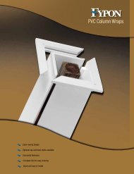
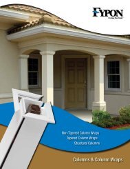
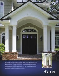
Fypon® window and door trim and column<br />
wraps<br />
<strong>Therma</strong>-<strong>Tru</strong>® Classic-Craft® Canvas Collection<br />
Using a deep, rich or even<br />
a bold color on your front<br />
door can take your home<br />
from nice to knockout.<br />
This is the time to spread<br />
your wings and go for<br />
color or a beautiful<br />
finish rather than simply<br />
default to the same color<br />
as the trim or siding.<br />
You might want to reverse the siding and trim color so that you have lighter siding and<br />
darker trim. This can be an effective way to create interest for a home without mature<br />
landscaping or one that is on a rather small parcel of land. Rather than colonial blue with<br />
cream trim go with cream-colored siding with colonial blue trim.<br />
All trim does not have to be<br />
the same color. Use a<br />
second color to call<br />
attention to interesting<br />
features or paint your trim<br />
the same color as the body<br />
in places where you want to<br />
disguise a feature.<br />
Another nifty tool you can use to actually see what your home will look like with a new entry<br />
door is to use the free My Saved <strong>Doors</strong> tool. You can upload a photo of your home to the<br />
site and then add in different door options on screen. Best of all, you can save and print out<br />
your selections to share with family and friends via e-mail, Facebook and Twitter.<br />
Fypon, a manufacturer of urethane millwork<br />
pieces such as mouldings, shutters, door<br />
and window trim, and louvers, offers lowmaintenance<br />
exterior pieces with a smooth,<br />
paintable surface that arrive pre-primed.<br />
They also offer options of urethane pieces<br />
that have a precast concrete look or timber,<br />
woodgrain look that can be stained or<br />
painted to accent your home.<br />
23<br />
24
The shutters are usually one of the darkest elements in a home’s color scheme, which helps<br />
anchor the windows in the facade. Even though they may be as dark, or darker, than the<br />
door, your front entranceway should still stand out more than the shutters.<br />
Matching your shutters to the roof color can be a good choice. If your roof is light gray,<br />
dark gray or black, use black or deep gray on your shutters. If your roof is a multi-color<br />
blend like Chesapeake choose a darker tone of one of the colors in the blend.<br />
Simonton ProFinish® Brickmould 600<br />
windows, Bronze<br />
{Tips For Color Placement<br />
To keep the windows looking as large as<br />
possible or to enlarge small windows,<br />
match the trim color to the color of the<br />
window frame.<br />
Remember that color can accent or<br />
disguise. Think about color placement<br />
that accentuates the positive features of<br />
your home and disguises features such as<br />
garage doors, gutters, downspouts, etc.<br />
Think about how you want visitors to experience your home. Their eye will travel from the<br />
strongest or brightest colors to the lightest, then the middle tones and on to the darkest<br />
colors. For this reason, you will want to place your brightest and lightest colors on the best<br />
features to catch attention and create exceptional curb appeal.<br />
{<br />
{<br />
A Perfectly Hued Garage Door<br />
Your garage doors can occupy a large portion of your home’s facade and choosing the right<br />
color can be a little tricky. Garage doors usually look best when they blend in so if you are<br />
unsure, paint your garage doors in the same color as the body of your home rather than the<br />
trim or accent colors.<br />
Painting the garage doors in the same color as the front door or shutters can draw too much<br />
attention to the garage and chop up the facade of your home.<br />
Don’t highlight the details of a standard garage door by painting it more than one color.<br />
There are historic or special doors where this may be appropriate. However, for the<br />
majority of garage doors this detracts by drawing attention away from the front door and<br />
the best features of your home.<br />
Painting the garage doors the same colors as the body<br />
of the house can make your home appear larger.<br />
{<br />
25<br />
Here are a few quick tips to help you decide which colors should go where on your home’s<br />
exterior:<br />
Your front door color should punctuate the facade of your home. Use<br />
your brightest or strongest color for your main entrance.<br />
Light colors on trim highlight your window while dark shutters or<br />
frames anchor the windows in the facade.<br />
Lighter colors on a porch can make a home feel more approachable<br />
and welcoming.<br />
Painting the upper portion of a tall house in a deeper tone than the<br />
bottom portion can scale down the height of the home. A darker color<br />
on the lower portion grounds the house to the earth.<br />
26
{<br />
getting it right<br />
DETERMINING<br />
how a color and finish are going to look on your home is difficult<br />
if not impossible when you are only looking at a small swatch or viewing the product on a<br />
computer screen. It is always best to get actual samples whenever possible to give you an<br />
idea of the full impact of the blending of colors and patterns.<br />
1. Arrange to get samples of paint options and exterior materials. If it is not possible to<br />
arrange for actual samples, visit a manufacturer showroom.<br />
2. Sample paint by applying large swatches directly on all four sides of your home. Paint<br />
each color on the section of the house where you plan to use it. Find a location that is clearly<br />
visible and gives you a view of the body, trim and accent colors that can be viewed together.<br />
Look at each side because the direction of the light, amount of shade and other elements<br />
can make the color look slightly different on each side.<br />
Once you have your<br />
samples don’t make your<br />
final color choices<br />
inside under artificial light.<br />
Colors will generally look<br />
lighter outdoors. Look at<br />
each sample outside in the<br />
natural light and location<br />
where you plan to use it.<br />
3. Look at your colors in the early part of the day<br />
because this will give you the truest idea of the color.<br />
Later in the day the more intense sun may wash the<br />
colors out and in the dimmer evening light the colors<br />
will appear toned down.<br />
4. Live with the colors for a few days, viewing them<br />
up close and at a distance during different times of<br />
day. You might discover that a color that you thought<br />
was your final selection during the morning looks entirely<br />
different in the waning afternoon light. Keep<br />
in mind colors will also vary due to weather conditions,<br />
seasons and time of day.<br />
5. Once you are pleased with the actual samples, you<br />
are ready to move forward.<br />
{<br />
Color needs to be viewed where you plan to apply it. For<br />
example, roofing tiles should be placed on a section of<br />
the roof that you can see from the ground while the front<br />
door color should be placed on the front door.<br />
27<br />
28
you’ve got color!<br />
Congratulations, you’ve selected your colors!<br />
Color has the power to communicate, to affect your mood and influence your environment<br />
so it is important to choose wisely. By following these simple steps you have<br />
made good choices and found a color scheme that works beautifully for your home and<br />
reflects your personal tastes.<br />
Doesn’t it feel great to know in advance that you are going to love your new color<br />
scheme That you are going to be happy with the colors for the life of the quality<br />
exterior products (some with warranties up to 50 years) that you are purchasing<br />
ABOUT KATE SMITH<br />
Color is her passion. Helping you to enjoy<br />
it - understand it - have fun with it - go<br />
wild with it - and use color confidently is<br />
her purpose.<br />
Kate Smith is a color expert and career<br />
color trend forecaster. Kate is a design<br />
lover, and color inspiration maven. Above<br />
all, Kate is an inspirational keynote speaker<br />
and seminar leader, blending color theory<br />
and psychology into entertaining and<br />
informative talks that bring color to life.<br />
{<br />
sensationalcolor.com<br />
{<br />
All it took was a little<br />
FRESH thinking!<br />
29<br />
30