![[melin & österlin] melbi, johan (red.): John Melin ... - Antikvariat Morris](https://img.yumpu.com/37386442/6/500x640/melin-amp-asterlin-melbi-johan-red-john-melin-antikvariat-morris.jpg)
[melin & österlin] melbi, johan (red.): John Melin ... - Antikvariat Morris
[melin & österlin] melbi, johan (red.): John Melin ... - Antikvariat Morris
[melin & österlin] melbi, johan (red.): John Melin ... - Antikvariat Morris

You also want an ePaper? Increase the reach of your titles
YUMPU automatically turns print PDFs into web optimized ePapers that Google loves.
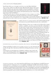
[nitsche, erik]<br />
1. Skepp och sjöfart 2. Luftfart 3. Astronomi 4. Elektricitet 5.<br />
Hjulet 6. Medicin 7. Raketer och rymdfart 8. Kemi 9. Vapen<br />
10. Ord, bild och massmedia 11. Maskinen 12. Fysik<br />
W & W, Stockholm, 1965-66. 120, 120, 112, 112,<br />
112, 112, 112, 112, 112, 112, 112, 112 pages. 4to (27 x<br />
17,5 cm). Printed laminated card covers. 12 volumes,<br />
complete, in good condition. Illustrated in colour and<br />
black and white throughout. Production and typography<br />
by Erik Nitsche. Printed in Switzerland. Text in<br />
Swedish.<br />
”Nitsche helped pioneer the concept of design authorship<br />
– and not just the navel-gazing books about and<br />
for designers (he never published a monograph) – but<br />
books that had broad audiences. Of course design was<br />
endemic to every subject he cove<strong>red</strong> and his books<br />
were designed in an elegant contemporary manner.<br />
Design was but a frame with which he presented<br />
unique themes. Nitsche’s goal with, for example, The<br />
New Illustrated Library of Science and Invention,<br />
was to avail the reader of fascinating, subjects, like<br />
“A History of Ships and Seafaring” and “A History of<br />
Archaelogical Discoveries.” Through accessible formats<br />
these books were (and still are) “reader friendly”<br />
because the typographic and graphic entry-points<br />
were conceived to provide unique sensory experiences.<br />
This may sound a bit pretentious, but Nitsche’s books<br />
were anything but. Instead their elegance was a point<br />
of pride and a selling point for the reader. Another<br />
way to describe them is “generous:” Nitsche was<br />
indeed generous with white space and pictures alike.<br />
Whether addressing physics, occult sciences, fashion,<br />
or social progress, each 112-page volume generously<br />
presented a wealth of material in a sophisticated but<br />
not haughty manner. He was passionate for images, which he personally selected for every book to<br />
heighten understanding and provide rational narrative flow. The type - he was compulsive about finding<br />
the perfect cuts of the quintessential faces - was classic, always justified, but routinely with a modern<br />
tweak in the column width and leading. Every book also contained a handsome ti<strong>melin</strong>e (he was<br />
truly the master of ti<strong>melin</strong>es) as a contextual signpost. /.../ After moving to Geneva in the early 1960s<br />
Nitsche Founded eni, s.a. (Erik Nitsche International) to produce some of the finest illustrated history<br />
books ever designed. The first series, a twelve volume The New Illustrated Library of Science and<br />
Invention, with a multilingual print run of over two million copies, cove<strong>red</strong> the histories of communication,<br />
transport, photography, architecture, astronomy, and the machine, and flight. Like Dynamic<br />
America, the pictures drove the text (although the text was written by esteemed authors). Nitsche dove<br />
headlong into the research himself and unearthed thousands of rare and never-before-seen archival images.<br />
In his mind’s eye he saw precisely how each image in concert with the next would tell the story.”<br />
Steven Heller. See also Eye No. 27, Vol. 7, Spring 1998 pp. 64–77.<br />
SEK975 / €116
![[bauer - renner, paul] Steile Futura halbfett ... - Antikvariat Morris](https://img.yumpu.com/49661110/1/184x260/bauer-renner-paul-steile-futura-halbfett-antikvariat-morris.jpg?quality=85)


![|melin & österlin]: Olika sidor Reklam ... - Antikvariat Morris](https://img.yumpu.com/17680273/1/184x260/-melin-osterlin-olika-sidor-reklam-antikvariat-morris.jpg?quality=85)