A “Noteworthy” January Meeting - The Colleagues of Calligraphy
A “Noteworthy” January Meeting - The Colleagues of Calligraphy
A “Noteworthy” January Meeting - The Colleagues of Calligraphy

You also want an ePaper? Increase the reach of your titles
YUMPU automatically turns print PDFs into web optimized ePapers that Google loves.
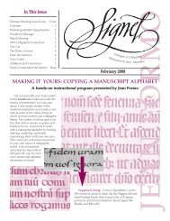
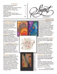
In This Issue<br />
A "Noteworthy" <strong>January</strong> <strong>Meeting</strong><br />
Front<br />
Calendar, Workshop News, President’s Message, 2<br />
<strong>January</strong> Treats, February Program 2<br />
"Twist <strong>of</strong> the Pointed Pen" Registration Form 3<br />
Featuring You on Our Web Site 3<br />
November <strong>Meeting</strong> Highlights 4<br />
Workshop Review 5<br />
Midwest <strong>Calligraphy</strong> Retreat, Lettering Tool Box 6<br />
<strong>The</strong> Missing Link, Cabin-Fever Cures 6<br />
Spotlight, One Method to the Madness 7<br />
Demo Corner<br />
Back<br />
<strong>Colleagues</strong> <strong>of</strong> <strong>Calligraphy</strong><br />
Minneapolis/St. Paul, Minnesota<br />
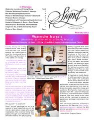
A <strong>“Noteworthy”</strong> <strong>January</strong> <strong>Meeting</strong><br />
<strong>January</strong> 2011<br />
If you were to select the ideal time <strong>of</strong><br />
year to experiment, learn something<br />
new, or try an unfamiliar process,<br />
wouldn’t it be in <strong>January</strong>? Of course it<br />
would! This is exactly the reason you and<br />
your guests are warmly invited to the<br />
first meeting <strong>of</strong> the new year on Saturday,<br />
<strong>January</strong> 15, at 12:30 PM in the Plymouth<br />
Congregational Church.<br />
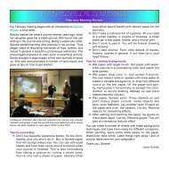
In a program titled “Note<br />
Cards—Reproducing Original<br />
Artwork,” a team <strong>of</strong> generous<br />
<strong>Colleagues</strong> members has<br />
been vigorously preparing to<br />
demonstrate and discuss the<br />
process <strong>of</strong> preparing artworks<br />
to be reproduced as standardsized<br />
note cards.<br />
Whether you’re familiar with<br />
or curious about this topic,<br />
we predict that everyone who<br />
attends this meeting will learn<br />
something new. Katie Beery<br />
will demonstrate some universal<br />
skills for using a scanner and<br />
computer. Even though most <strong>of</strong><br />
us may not have the same scanner<br />
or computer s<strong>of</strong>tware that Katie<br />
will use, her description <strong>of</strong> the<br />
process will guide us toward<br />
our own creative thinking and<br />
problem-solving when we “try<br />
this at home.”<br />
Participants for the round-table<br />
discussion are Pat Barrett, Eve<br />
Brown, Karen Eighmy, Joyce Francis,<br />
Ardie Gallant, and Sue Filbin. Each<br />
artist will explain her process for creating<br />
note cards. Adequate time toward the<br />
end <strong>of</strong> the meeting will accommodate<br />
questions and answers, an opportunity<br />
to visit with the presenters, and plenty <strong>of</strong><br />
cards to purchase.<br />
If you would like to sell your<br />
note cards at the meeting,<br />
please contact program<br />
director Louise Rogers by<br />
noon on Friday, <strong>January</strong> 7:<br />
call (651) 644-5670 or email<br />
her at lrogers_55443@yahoo.<br />
com. If you’d like to purchase<br />
note cards, please bring cash<br />
or your checkbook! We look<br />
forward to seeing you!<br />
-Article by Sue Filbin<br />
Artwork by participants, clockwise from<br />
top: Nasturtium card by Sue Filbin,<br />
monogram by Katie Beery, Artfull Life card<br />
by Joyce Francis, Christmas card by Karen<br />
Eighmy, Origami Ink Well card by Eve<br />
Brown, Gratitude card by Ardie Gallant,<br />
and Tulips card by Pat Barrett.<br />
Editor's Note: since I will not<br />
be able to participate on the<br />
panel as originally planned,<br />
my basic scanning and filesaving<br />
instructions appear on<br />
page 6.
Unless otherwise noted, all meetings<br />
will be at Plymouth Congregational<br />
Church 1900 Nicollet Avenue South,<br />
Minneapolis.<br />
Bus Routes: Nicollet/Franklin<br />
j a n u a r y s c h e d u l e :<br />
Social 12:30 PM<br />
<strong>Meeting</strong> 1:00 PM<br />
Come early to observe lettering<br />
demonstrations & browse exhibits.<br />
2010 - 2011<br />
Check out our program schedule!<br />
<strong>January</strong> 15: “Note Cards −<br />
Reproducing Original Artwork”<br />
(panel discussion and presentation)<br />
February 19: Mini Workshops (see<br />
note below)<br />
March 18: Barbara Close<br />
March 19–20: “Twist <strong>of</strong> the Pointed<br />
Pen” workshop with Barbara Close<br />
April 16: Paul Herrera - Fr. Catich &<br />
Trajans<br />
May 14: Pot Luck Lunch and All-Day<br />
<strong>Calligraphy</strong> Hands-on Workshop on<br />
the Lombardic alphabet with Harvest<br />
Crittenden<br />
<strong>January</strong> Treats<br />
Eve Brown, Mary Beth Hinrichs,<br />
Linda Borovansky<br />
February Program<br />
PLEASE NOTE: <strong>The</strong> <strong>Colleagues</strong>’<br />
February program information will<br />
be forwarded to all members as<br />
soon as plans have been finalized.<br />
d o n ' t m i s s<br />
t h i s f a n t a s t i c<br />
o p p o r t u n i t y !<br />
❧❧A 2-day workshop with<br />
Barbara Close: "Twist <strong>of</strong> the<br />
Pointed Pen", on Saturday &<br />
Sunday, March 19 & 20, at the<br />
Edina Art Center. See page 3 for<br />
more information.<br />
c l a s s e s o f f e r e d<br />
b y o u r m e m b e r s<br />
More information on the following<br />
classes is posted on the Resource<br />
Page <strong>of</strong> our web site:<br />
❧ ❧"Pen-in-Hand" is a year-long<br />
opportunity to study with Jean<br />
Formo. Call Jean at 952.486.2530<br />
or email her at letterdesign@<br />
gmail.com to receive an information<br />
packet.<br />
❧❧Kris MacDonald will be<br />
teaching Beginning Italic<br />
on Wednesdays, February<br />
2 - March 9 at the Eisenhower<br />
Community Center. For<br />
more information, visit www.<br />
HopkinsCommunityEd.org or<br />
call 952-988-4070.<br />
❧❧Judith Michalski will be<br />
<strong>of</strong>fering a Beginning Italic<br />
calligraphy class through both<br />
the St. Paul and Minneapolis<br />
Community Education<br />
programs. Evening classes will<br />
begin in St. Paul on February 8<br />
and in Minneapolis beginning<br />
<strong>January</strong> 27. For St. Paul information,<br />
contact www.commed.<br />
spps.org or call 651-293-8634;<br />
for Minneapolis, contact www.<br />
commed.mpls.k12.mn.us.<br />
Listening to public radio in the<br />
car today, I learned a new word —<br />
sprezzatura — an Italian word coined<br />
by Castiglione (16th century) in his<br />
descriptions <strong>of</strong> necessary qualities <strong>of</strong><br />
gentlemen. In essence it means the<br />
display <strong>of</strong> “a kind <strong>of</strong> graceful restraint,<br />
an effortless elegance”.<br />
I could not help but think <strong>of</strong> all the<br />
excellent lettering artists and calligraphers<br />
I have the honor <strong>of</strong> knowing<br />
(and learning from), and how this<br />
word precisely describes the effortless<br />
artistic competence I see in their work,<br />
especially when I am lucky enough to<br />
watch them demonstrate their abilities!<br />
Knowing the many continuing hours<br />
<strong>of</strong> practice and studied dedication that<br />
underlies and enables this effortlessness<br />
always humbles me. For example,<br />
I had the honor and joy <strong>of</strong> joining<br />
several <strong>Colleagues</strong> at November's<br />
workshop with Michael Clark and was<br />
able to watch and be challenged by his<br />
effortless lettering demonstrations —<br />
displaying sprezzatura at its best!<br />
I think that we all strive for this sense<br />
<strong>of</strong> sprezzatura, and when we reach it in<br />
our own focused areas <strong>of</strong> work, at least<br />
to some degree, we can justifiably feel a<br />
sense <strong>of</strong> accomplishment.<br />
Homework (you were expecting this,<br />
right?) — try a thought experiment:<br />
think <strong>of</strong> your own list <strong>of</strong> calligraphic<br />
and lettering art heroes and heroines,<br />
then try to remember and identify the<br />
sense <strong>of</strong> sprezzatura displayed in the<br />
production <strong>of</strong> their work.<br />
Here's wishing you, your loved ones,<br />
and families peace and blessings this<br />
holiday season and in the new year!<br />
See you at the <strong>January</strong><br />
meeting!<br />
Signet is a publication <strong>of</strong> the <strong>Colleagues</strong> <strong>of</strong> <strong>Calligraphy</strong>. Submission deadlines are 30 days prior to the next monthly meeting. <strong>The</strong> editor is responsible for final decision on content. Mail<br />
submissions to Signet, Lori Tews, 3200 Inglewood Ave. South #111, St. Louis Park, MN 55416 or write2lori@hotmail.com. Information and products mentioned in articles do not imply<br />
endorsement by the COC or BOD. Copyright 2010 by the <strong>Colleagues</strong> <strong>of</strong> <strong>Calligraphy</strong>. No portion <strong>of</strong> the Signet may be reproduced without the written permission <strong>of</strong> the COC. For membership,<br />
see www.colleagues<strong>of</strong>calligraphy.com or write COC, P.O. Box 4024, St. Paul, MN 55104.<br />
2
Saturday & Sunday<br />
March 19 & 20, 2011<br />
9:00AM - 4:00PM<br />
$90 Members<br />
$120 Non-Members<br />
Edina Art Center<br />
We will be taking on a wonderful, new,<br />
playful approach to using the pointed<br />
pen. Drawing and painting in somewhat<br />
realistic, fun caricatures and abstract<br />
forms will be explored as well as a freestyle,<br />
more contemporary copperplate<br />
lettering style.<br />
Introduction to geometric shapes as a<br />
base will begin our increasing confidence<br />
in pen control and building up<br />
marks.<br />
<strong>The</strong> idea is to be able to use the artist’s<br />
own expressions with the freedom to<br />
Cut & send this portion to Joyce Francis, 12200 E. 100th Street, Northfield, MN 55057.<br />
Name:<br />
Address:<br />
City/State/Zip:<br />
...A Continuing Adventure That Extends Our Approach To <strong>The</strong> Pointed Pen<br />
a 2-day workshop With barbara close<br />
PLAY! Barbara likes to call this the “Zen<br />
Pen – revealing your Muse”, too.<br />
Your own intuition has the permission<br />
to play a significant part with pen<br />
and paper—so you can dive into the<br />
mysteries <strong>of</strong> what the right part <strong>of</strong> the<br />
brain can do.<br />
Take a peek at more <strong>of</strong> Barbara's art on<br />
her web site: www.bcdezigns.com.<br />
Registration opens on <strong>January</strong> 10 and<br />
closes on February 18! Class size is<br />
limited, so act now!<br />
If you have any questions regarding this workshop, please call Dawn Darner at 651.458.3024.<br />
Phone(s):<br />
Email:<br />
I would like to help with (please number your 1st, 2nd and 3rd choices):<br />
Digital Photos Instructor’s Lunch Write workshop review<br />
Teacher's Assistant - Saturday<br />
Teacher's Assistant - Sunday<br />
Everyone will be expected to help clean up! Barbara Close 03.19.11<br />
FEATURING YOU ON OUR WEB SITE!<br />
A great benefit <strong>of</strong> being a <strong>Colleagues</strong> member is the chance<br />
to market your calligraphic and related services. <strong>The</strong><br />
<strong>Colleagues</strong> would like to help you. In addition, we want to<br />
make it easy for people visiting our web site searching for<br />
calligraphic services to connect with a Colleague member<br />
who can fulfill their needs.<br />
Use our web site to market your services by having your<br />
own COC web page on our web site, a link to your own web<br />
page, or a listing <strong>of</strong> your contact information.<br />
Visit www.colleagues<strong>of</strong>calligraphy.com/calligraphers.<br />
html to see how a web page can promote you and your<br />
calligraphic and related skills. <strong>The</strong> web page also has the<br />
necessary PDF links for you to successfully get listed on the<br />
web site.<br />
If you have questions or need additional information please<br />
contact info@colleagues<strong>of</strong>calligraphy.com.<br />
Applications for the web listing are due by <strong>January</strong> 20,<br />
2011.<br />
-Barb Makela, Communications<br />
3
november<br />
highlights<br />
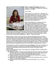
Those who braved the heavy<br />
Friday evening rush hour<br />
traffic were rewarded with a<br />
thoughtful and entertaining<br />
program by Michael Clark,<br />
calligraphic designer extraordinaire.<br />
Michael was surprised<br />
and happy to see an old<br />
colleague at the meeting—<br />
Charlie Hughes—and told<br />
us how lucky we are to have<br />
someone <strong>of</strong> Charlie's stature in<br />
our guild.<br />
Michael got started in calligraphy<br />
after buying a book by<br />
Victor Hamel, which inspired<br />
him. German calligraphers and artists<br />
also influenced his work. He started his<br />
career doing utilitarian work, addressing<br />
envelopes etc. When he developed a<br />
bone spur that made this work difficult,<br />
Michael made a career shift toward<br />
design, developing logos, cards, fonts,<br />
etc. He envisioned his career as a funnel,<br />
entering the large end and narrowing<br />
down his preferences and working in<br />
a specific niche. He discovered it was<br />
just the opposite, with many different<br />
work options at the other end. Now he<br />
receives more income from designing<br />
one word than he previously got from<br />
pages <strong>of</strong> his utilitarian calligraphy.<br />
Michael does most <strong>of</strong> his<br />
work by hand, but he does<br />
use the computer–"some."<br />
Most <strong>of</strong> his work for reproduction<br />
is done initially on<br />
a yellow legal-size pad. He<br />
likes to inject some fun into<br />
whatever work he does, but<br />
you have to look for it.<br />
Michael Clark and Charlie Hughes—a designer extraordinaire <strong>of</strong> our own.<br />
Page illustrating Michael's thought process when<br />
designing a logo..<br />
He first creates a skeleton <strong>of</strong><br />
the work, building up the<br />
design around it. He does a<br />
lot <strong>of</strong> retouching and cut and<br />
paste. If he makes a stroke<br />
or a serif that he particularly<br />
likes he will copy it, cut it out<br />
and use it on other parts <strong>of</strong> A table full <strong>of</strong> Michael's lively and elegant lettering.<br />
4<br />
the piece that he is designing.<br />
When developing and<br />
designing Michael goes into a<br />
zen state and lets the creativity<br />
flow. He says that we should<br />
do that also. Doodling with<br />
a ruling pen helps. He thinks<br />
that a lot <strong>of</strong> modern magazines<br />
are sterile, poorly done, banal.<br />
He tries to stay fresh, do<br />
new stuff. "Every discovery<br />
you make has an impact on<br />
everything else you do".<br />
Some <strong>of</strong> his favorite tools are<br />
rather non-traditional and/<br />
or used in an unorthodox<br />
manner, yielding amazing results:<br />
❧❧<br />
<strong>The</strong> ruling pen: "I write with the<br />
point and then fill in the thicks".<br />
❧❧<br />
<strong>The</strong> Speedball B #5 (round) nib, in<br />
place <strong>of</strong> a brush: "I'm wanted in three<br />
states for what I do with a Speedball".<br />
❧❧<br />
<strong>The</strong> Elegant Writer marker: he<br />
makes a custom cut in the felt tip.<br />
Michael has designed several fonts.<br />
He sometimes combines calligraphy<br />
with typefaces in his design. When he<br />
does this, he goes for contrast. When<br />
developing afont, he uses the s<strong>of</strong>tware<br />
program, Fontographer.<br />
Some <strong>of</strong> the typefaces<br />
Michael has created are<br />
named after his children:<br />
Pouty, Katytude, Pooper<br />
Black, Sting, Frenzy,<br />
Peanut, Sweepy, Sneaky,<br />
Monumental.<br />
Michael's gift to us is the<br />
permission to be creative<br />
"outside the box" without<br />
being hamstrung by all the<br />
past rules and regulations<br />
that we've learned.<br />
-Article by Joann Schulte<br />
-Photos by Gary Feyen
“a m o m e n t i n t i m e ”<br />
W o r k s h o p R e v i e w<br />
I took this workshop because<br />
I wanted to see Michael Clark<br />
use the ruling pen to make bold,<br />
contemporary letters. I certainly<br />
got my money's worth—and<br />
watching him use the ruling pen<br />
to write each class member's name<br />
was a bonus learning experience!<br />
Michael is a very generous<br />
instructor with his time<br />
for individual help, his<br />
descriptions <strong>of</strong> how he does<br />
his work, and the many<br />
examples <strong>of</strong> the cards<br />
he has made over the<br />
years—some <strong>of</strong> which<br />
became prizes for lucky<br />
winners.<br />
He demonstrated how<br />
he used the round<br />
Speedball B nib rotated<br />
on its edge for fine lines.<br />
He manipulated pen, paper and<br />
hand to get the effect he wanted.<br />
When he worked with the<br />
folded pen, we watched his<br />
slow, carefully planned<br />
downstrokes, followed by<br />
a pause while he looked<br />
where he would go next,<br />
and ending with an<br />
explosively quick upstroke.<br />
He uses a Speedball Elegant<br />
Writer after he has cut the<br />
nib at an angle to give the<br />
effect <strong>of</strong> brush lettering.<br />
Asked about his work being<br />
done with markers on a<br />
legal pad as to being archival, it<br />
only has to last from his desk to<br />
the scanner. He might write with<br />
dirty water and drop in colors<br />
with a brush or he might just<br />
scan a black and white into the<br />
computer and use Photoshop<br />
effects.<br />
He drew skeleton letters with<br />
the ruling pen and then dots<br />
to fill in the thicks where they<br />
should be. Sometimes his hand<br />
circled above the paper using air<br />
strokes to prepare before putting<br />
the loaded pen to paper. <strong>The</strong><br />
splatter created by textured paper,<br />
vibrating pen and vigorous stokes<br />
was all part <strong>of</strong> the design. <strong>The</strong><br />
ruling pen might be on its<br />
point or one <strong>of</strong> its 4 sides,<br />
from almost vertical to<br />
almost horizontal—it has so<br />
many capabilities when in<br />
the hands <strong>of</strong> a master.<br />
I learned so much by<br />
watching Michael draw<br />
letters and then experiment,<br />
all the while working<br />
towards a finished piece. His<br />
goal was to show us how<br />
to use non-traditional tools to<br />
create lettering. He achieved<br />
that and so much more with<br />
his humor, his humility and his<br />
family stories that made me feel<br />
that Michael is a person you<br />
want to know.<br />
-Article by Gary Feyen<br />
Photos, top to bottom, left to right:<br />
closeup <strong>of</strong> Michael lettering with the<br />
cut-<strong>of</strong>f Elegant Writer; closeup <strong>of</strong><br />
cut tip <strong>of</strong> Elegant Writer; closeup <strong>of</strong><br />
Michael "noodling" letters, building<br />
up their shapes with a ruling pen;<br />
"Season's Greetings" written with<br />
a cut Elegant Writer; Michael with<br />
ruling pen; "Let heaven...", written<br />
with a Speedball B nib; composite<br />
<strong>of</strong> names written with a ruling pen;<br />
classmates, back to front: Gary Feyen,<br />
Gary Berosik, Terry Kempfert; Lori<br />
Tews, Pat Barrett, Aleksandra Streeter,<br />
Dawn Darner, Christine Osman,<br />
Phyllis Stratman, JoAnn Almich, and Michael<br />
Clark. Bottom photo by Pat Barrett. Other<br />
photos by Lori Tews.<br />
Editor's Note: One <strong>of</strong> the goals<br />
<strong>of</strong> the workshop was to create a<br />
finished piece that will ultimately<br />
become a clock. Photos <strong>of</strong> the<br />
clocks will be featured in an<br />
upcoming issue <strong>of</strong> the Signet.<br />
5
MidwesT Caligraphy RetreaT<br />
" t e s t t h e d e p t h s "<br />
“Go into yourself and test the depths in which your life<br />
takes rise; at its source you will find the answer to the<br />
question whether you must create.” -Rainer Maria Rilke<br />
Join the <strong>Colleagues</strong> <strong>of</strong> <strong>Calligraphy</strong> at the first annual<br />
Midwest <strong>Calligraphy</strong> Retreat. <strong>The</strong> dates are set, the<br />
location is reserved, and teachers have been selected. We<br />
are now at the exciting point <strong>of</strong> getting the content <strong>of</strong> the<br />
classes decided!<br />
Registration will open in February when this final piece<br />
is worked out. Following are the specifics that you can<br />
ponder. Be ready to put down a deposit <strong>of</strong> $100.00 so you<br />
can secure your place.<br />
Class assignments will be given in the order in which the<br />
registrations are received.<br />
WHEN? August 11-14, 2011<br />
WHERE? Carleton College, Northfield, MN<br />
WHO CAN COME? <strong>The</strong> retreat is open to anyone<br />
interested in participating. Membership in <strong>Colleagues</strong> <strong>of</strong><br />
Lettering Tool Box<br />
a n e w g a d g e t t o t r y<br />
Current CoC President, Gary Berosik, sharing<br />
a laugh with past President, Jackie Davis, at the<br />
November meeting.<br />
Barb Makela shared a useful tool found on the internet—a<br />
Guideline Sheet Generator from the UK-based calligraphy<br />
supplier, Scribblers: www.scribblers.co.uk/cgi/gridlines.pl.<br />
You will have to enter the values you want for ascender,<br />
body, descender, and distance between the lines – all<br />
measured in millimeters. When printing your paper, tell<br />
your browser to print just the first page (“Print Page 1-1”)<br />
and set Copies to the number <strong>of</strong> sheets you want to print.<br />
(Information reprinted from <strong>The</strong> Washington Calligraphers Guild<br />
newsletter.)<br />
<strong>Calligraphy</strong> is not a requirement. Cost will be the same for<br />
all participants.<br />
WHO WILL TEACH? Annie Cicale, Sharon Zeugin,<br />
Laurie Doctor, and Denis Brown<br />
WHAT WILL THEY TEACH? This will be announced in<br />
the next newsletter<br />
WHAT WILL IT COST?<br />
❧ ❧$575.00 (4 full days <strong>of</strong> class, meals, and a single room)<br />
❧ ❧$554.00 (4 full days <strong>of</strong> class, meals, and a doubleroom)<br />
All rooms are air-conditioned.<br />
HOW MANY CAN PARTICIPATE? Registration is<br />
limited to 50 participants.<br />
A full description <strong>of</strong> the retreat and a registration form will<br />
be in the February newsletter. If you have any questions<br />
contact Joyce Francis via email: handwrittenbyjoyce@<br />
gmail.com.<br />
<strong>The</strong> Missing Link<br />
d i r e c t o r y u p d a t e s<br />
❧❧Judith Michalski has a new email address: jamichalskicalligrapher@gmail.com;<br />
❧❧from <strong>January</strong> 11– March 3, all contact with your<br />
Editor will be done via email: write2lori@hotmail.com.<br />
Cabin-Fever Cures<br />
p r o g r a m s f o r 2 0 1 1<br />
Exciting programs are scheduled for the New Year!<br />
Join us Saturday, February 19th for the popular Mini<br />
Workshops, hands on classes taught by our talented<br />
members. On Friday, March 18th, our guest will be nationally<br />
known calligrapher, Barbara Close. Saturday, April 16th<br />
features letter carver, Paul Herrera, who will talk about his<br />
studies <strong>of</strong> the Trajan Romans with Father Catich. Saturday,<br />
May 14th will be an all-day hands-on program with guest<br />
calligrapher, Harvest Crittenden, teaching Lombardic<br />
Capitals.<br />
Mark your calendars now so you don't miss any <strong>of</strong> these<br />
great programs!<br />
-Louise Rogers, Program Director<br />
6
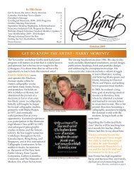
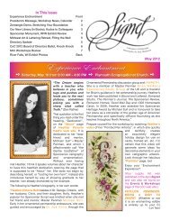
Congratulations to fellow Colleague,<br />
Marion Greene, as she was elected<br />
to a seat in the Minnesota House <strong>of</strong><br />
Representatives, representing District<br />
60A. We are happy for you, Marion,<br />
and wish you the very best!<br />
To learn more about Marion and her<br />
history <strong>of</strong> public service, you may visit<br />
her <strong>of</strong>ficial web site at http://www.<br />
mariongreene.org/. Marion also has<br />
a Facebook page that you can become<br />
a fan <strong>of</strong> at http://www.facebook.com/<br />
pages/Marion-Greene/145938178623.<br />
In a note from Marion, she shared some information that<br />
Newly-elected Representative Marion Greene.<br />
s p o t l i g h t<br />
may be <strong>of</strong> interest to other <strong>Colleagues</strong>:<br />
"I just got my committee assignments<br />
- and one <strong>of</strong> them is the Legacy<br />
Fund Division (which has to do with<br />
the money set aside in Minnesota's<br />
Constitution to be spent on the arts<br />
and the environment). My other two<br />
committee assignments are State<br />
Government Finance and Government<br />
Operations & Elections. <strong>The</strong> first day <strong>of</strong><br />
the session is <strong>January</strong> 4th."<br />
Kris MacDonald will have a show <strong>of</strong><br />
16 pieces <strong>of</strong> original art hanging at Fairview Ridges Hospital<br />
during the month <strong>of</strong> <strong>January</strong>. Congratulations, Kris!<br />
One Method to the Madness<br />
Let me start <strong>of</strong>f by saying that, in my opinion, reproducing<br />
your artwork for personal use vs. reproducing your artwork<br />
for resale purposes are similar, but different, beasts. Beasts?<br />
Yes, "beasts", because the process can<br />
be difficult to tame, to control, to<br />
replicate, to predict, to master.<br />
What I do with my lettering for resale<br />
or design purposes is a much more<br />
involved, technical process involving<br />
pr<strong>of</strong>essional s<strong>of</strong>tware and methods<br />
too detailed for this article. <strong>The</strong> equipment<br />
I use includes my iMac and an<br />
Epson scanner and printer.<br />
Assuming the artwork is done to my .tif file<br />
satisfaction, the first thing I do is<br />
clean the scanner bed. <strong>The</strong> scan is typically<br />
done at 300 dpi (dots per inch) - rarely do<br />
I scan at a higher resolution. Depending on<br />
the outcome I desire, I choose either color or<br />
black and white. That's the easy part.<br />
<strong>The</strong> "beast" part comes in now - before you've<br />
.jpg file<br />
done anything else. Decisions, decisions—<br />
does the image need color correction, sharpening,<br />
cropping, etc.? (Some <strong>of</strong> this can be done at the point<br />
<strong>of</strong> scanning, but I like to take care <strong>of</strong> that with Photoshop<br />
and get exactly what I want).<br />
How will you save the image file? <strong>The</strong> file formats I use<br />
include .tif, .jpg, .pdf, .psd, and .png. Jpg files are known as<br />
"lossy" files, because they tend to lose information—not a<br />
7<br />
good thing! Remember this: photographs = jpgs. An image<br />
with lettering and illustration (most calligraphic projects)<br />
should preferably be saved as a .tif file.<br />
(That being said, I've seen .tif scans that look<br />
terrible, with the calligraphy getting all thick and<br />
globby-looking, where the sharpness <strong>of</strong> the thicks/<br />
thins has been lost. That's when I step in with my<br />
other s<strong>of</strong>tware to clean it up and create a vector<br />
image—a mathematical rendering <strong>of</strong> my lettering<br />
separate from the illustration—that stays precise<br />
no matter how much I resize it).<br />
That's it. Now "place" or "insert" it in your<br />
document. Without explaining all the<br />
technical stuff, it just plain works better<br />
than copying and pasting.<br />
Be aware that resizing your image in your<br />
final document layout (card or other<br />
reprint) will mess with its clarity—what I<br />
call its integrity. It will get fuzzy and blurry<br />
if you keep messing with its size (especially<br />
when enlarging it—so set some guidelines<br />
and keep your resizing to a minimum!!!<br />
Here are a couple <strong>of</strong> examples <strong>of</strong> the same image in different<br />
formats. Best wishes with your scanning and remember to<br />
attend the <strong>January</strong> meeting for more information!<br />
-Lori Tews, Editor<br />
P.S. If you have any questions, email me at write2lori@<br />
hotmail.com.
P.O. Box 4024<br />
St. Paul, MN 55104<br />
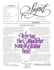
Pointed pen decoration by Gary Feyen.<br />
Coming in <strong>January</strong>...<br />
gary feyen<br />
<strong>January</strong> 15 at 12:30 p.m.<br />
“pointed pen decorated letters”<br />
Photos, from left to right: Kris MacDonald<br />
demonstrating Insular Minuscule, her example<br />
which describes the hand's characteristics.