

Tips-and-Tricks-for-Poster-Displays-APAC-2015
Tips-and-Tricks-for-Poster-Displays-APAC-2015
Tips-and-Tricks-for-Poster-Displays-APAC-2015

You also want an ePaper? Increase the reach of your titles
YUMPU automatically turns print PDFs into web optimized ePapers that Google loves.
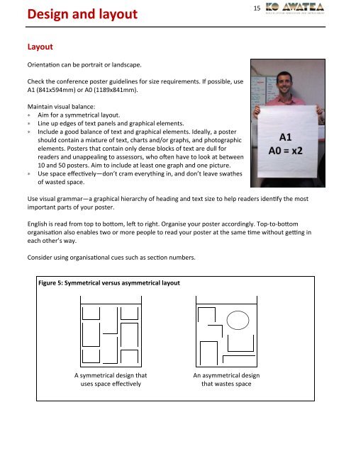
Design <strong>and</strong> layout15LayoutOrienta&on can be portrait or l<strong>and</strong>scape.Check the conference poster guidelines <strong>for</strong> size requirements. If possible, useA1 (841x594mm) or A0 (1189x841mm).Maintain visual balance:∗ Aim <strong>for</strong> a symmetrical layout.∗ Line up edges of text panels <strong>and</strong> graphical elements.∗ Include a good balance of text <strong>and</strong> graphical elements. Ideally, a postershould contain a mixture of text, charts <strong>and</strong>/or graphs, <strong>and</strong> photographicelements. <strong>Poster</strong>s that contain only dense blocks of text are dull <strong>for</strong>readers <strong>and</strong> unappealing to assessors, who o1en have to look at between10 <strong>and</strong> 50 posters. Aim to include at least one graph <strong>and</strong> one picture.∗ Use space effec&vely—don’t cram everything in, <strong>and</strong> don’t leave swathesof wasted space.Use visual grammar—a graphical hierarchy of heading <strong>and</strong> text size to help readers iden&fy the mostimportant parts of your poster.English is read from top to boom, le1 to right. Organise your poster accordingly. Top-to-boomorganisa&on also enables two or more people to read your poster at the same &me without ge?ng ineach other’s way.Consider using organisa&onal cues such as sec&on numbers.Figure 5: Symmetrical versus asymmetrical layoutA symmetrical design thatuses space effec&velyAn asymmetrical designthat wastes space