Intro to JMP.pdf - LISA - Virginia Tech
Intro to JMP.pdf - LISA - Virginia Tech
Intro to JMP.pdf - LISA - Virginia Tech
- No tags were found...

Create successful ePaper yourself
Turn your PDF publications into a flip-book with our unique Google optimized e-Paper software.
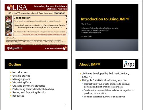
Labora<strong>to</strong>ry for InterdisciplinaryStatistical Analysis<strong>LISA</strong> helps VT researchers benefit from the use of StatisticsCollaboration:Visit our website <strong>to</strong> request personalized statistical advice and assistance with:Designing Experiments • Analyzing Data • Interpreting ResultsGrant Proposals • Software (R, SAS, <strong>JMP</strong>, Minitab...)<strong>LISA</strong> statistical collabora<strong>to</strong>rs aim <strong>to</strong> explain concepts in ways useful for your research.Great advice right now: Meet with <strong>LISA</strong> before collecting your data.<strong>LISA</strong> also offers:Educational Short Courses: Designed <strong>to</strong> help graduate students apply statistics in their researchWalk-In Consulting: M-F 1-3PM in 401 Hutcheson Hall and Wed. 1-3PM in the GLC for questions
• <strong>JMP</strong> license information• All <strong>Virginia</strong> <strong>Tech</strong> students may download <strong>JMP</strong> freeof chargeby going g<strong>to</strong> the Software DistributionOffice's Network Software page and logging onusing your PID and password▪ http://www2.ita.vt.edu/software/student/products/sas/jt / / t d t/ d t / /jmp/index.html• <strong>JMP</strong> 9 is available now for both Windows and Mac• Unzip the <strong>JMP</strong> 9 file, click on the ‘setup’ icon, andfollow the instructions for installation• Before you begin using <strong>JMP</strong>, note thefollowing information:• You can use many <strong>JMP</strong> features, such as datamanipulation, graphs, and scripting features,without t any statistical ttiti knowledge• A basic understanding of basic statistical concepts,such as mean and variation, is recommended• Analytical features require statistical knowledgeappropriate for the feature5• <strong>JMP</strong> platforms ltf use these windows:• Launch windows where you set up and run youranalysis• Report windows showing the output of your analysis• Report windows normally contain the followingitems:• A graph of some type (such as a scatterplot or ahis<strong>to</strong>gram)• Specific reports that you can show or hide using thedisclosure but<strong>to</strong>n• Platform options that are located within red trianglemenus• <strong>Intro</strong>duction• Getting Started• Managing Data• Visualizing Data• Creating Summary Statistics• Performing Basic Statistical Analysis• Saving and Exporting Results• Resources8
• Tab + Alt <strong>to</strong> switch among different windows• Ctrl + Q <strong>to</strong> quit• You can enter, view, edit, and manage datausing data tables• In a data table, each variable is a column, andeach observation is a row• To create a new data table:• Select File > New > Data Table• Ctrl + N• Click on the first icon below the File menu9• This shows an empty data table with no rowsand one numeric column, labeled Column 1• Manually:• Move the cursor on<strong>to</strong> a cell, click in the cell and enter avalue• Construct a formula <strong>to</strong> calculate column values• Open the formula edi<strong>to</strong>r by right‐clicking the columnname <strong>to</strong> which you want <strong>to</strong> apply the formula andselecting Formula…• Or Double‐click the column name <strong>to</strong> which you want <strong>to</strong>apply the formula, Column Properties > Formula >Edit Formula• Select an empty formula element in the formula editingarea by clicking it11
• You can import many file formats in<strong>to</strong> <strong>JMP</strong> bydefault. For example:• Comma‐separated (.csv)• .dat files that consist of text• Microsoft Excel 1997–2003 (.xls)• Plain text t (.txt)t)• SAS versions 6–9 on Windows (.sd2, .sd5, .sd7, .sas7bdat)• SPSS files (.sav)• Other files, such as Microsoft Excel 2007 files,require specific Open Database Connectivity(ODBC)• File > Open or Ctrl + O or• Or, select all data in the excel spreadsheet,copy, switch <strong>to</strong> <strong>JMP</strong>, create a new data table,Edit > Paste with Column Names• Exercise:• Open the SAT.xls excel file in <strong>JMP</strong>• In the Open Data File window, change ‘All <strong>JMP</strong> Files’ <strong>to</strong>‘All Files’• Copy and paste data in SAT.xls <strong>to</strong> a <strong>JMP</strong> data table14• There are three datatable panels• Table panel• Columns panel• Rows panel• The data tablepanels are arranged<strong>to</strong> the left of thedata grid• These panelscontain informationabout the table andits contents• The modeling dli type of a variable ibl can be one of thefollowing types, shown with its corresponding icon:• Continuous• Ordinal• Nominal• When you import data in<strong>to</strong> <strong>JMP</strong>, it predicts whichhmodeling types <strong>to</strong> use• Character data is considered nominal• Numeric data is considered continuous• To change the modeling type, click on the modelingtype icon next <strong>to</strong> the variable and make your selection
• All of the examples in the <strong>JMP</strong> documentation ti suiteuse sample data. To access <strong>JMP</strong>’s sample data tables,• Select Help > Sample Data. From here, you can:• Open the sample data direc<strong>to</strong>ry• Open an alphabetized list of all sample data tables• Search for a sample data table within a category• Alternatively, the sample data tables are installed in thefollowing direc<strong>to</strong>ry:• On Windows: C:\Program Files\SAS\<strong>JMP</strong>\9\Support Files\Sample Data• On Macin<strong>to</strong>sh: \Library\ApplicationSupport\<strong>JMP</strong>\9\\Sample Data• A saved session can help get you back <strong>to</strong> aprevious state without having <strong>to</strong> manually reflfiles and re‐run analyses• Select File > Saveopen• By df default, <strong>JMP</strong> asks whether h you would like lk <strong>to</strong>save the state of your session each time youexit the program• Saving session upon exiting:17• <strong>Intro</strong>duction• Getting Started• Managing Data• Visualizing Data• Creating Summary Statistics• Performing Basic Statistical Analysis• Saving and Exporting Results• Resources• To add one or multiple l new empty rows, you cantake one of the following actions:• Select Rows > Add Rows• Double‐click an empty row number area below the lastrow <strong>to</strong> add that many empty rows• Double‐click the gray lower triangular area in the upperleft corner of the data grid. In the Add Rows… window,▪ Enter the number of rows <strong>to</strong> add▪ Specify where you would like <strong>to</strong> add them• Right‐click in an empty row below the last row, andselect Add Rows…▪ Enter the number of rows <strong>to</strong> add19
• To delete rows from the data grid, you can doone of the following:• Highlight the rows that you want <strong>to</strong> delete, thenselect Rows > Delete Rows• Right‐click on the row numbers and select DeleteRows• To add one or multiple l new empty columns, youcan take one of the following actions:• Select Cols > New Column• Double‐click the empty space <strong>to</strong> the right of the lastdata table column• Select Cols > Add Multiple Cols… (or double‐click thegray upper triangular area in the upper left corner ofthe data grid). In the Add Multiple Cols… window,▪ Enter the number of columns <strong>to</strong> add▪ Specify if they are <strong>to</strong> be grouped▪ Select a data type▪ Enter their location▪ Select the initial data values• To delete columns from the data grid, you cando one of the following:• Highlight the columns that you want <strong>to</strong> delete, thenselect Cols > Delete Columns• Right‐click on the column numbers and selectDelete Columns• Select Sl or deselect rows:• Select Rows > Row Selection > Go <strong>to</strong> Row… <strong>to</strong>select a certain row number• Select Rows > Row Selection > Select All RowsSelect Rows > Clear Row States• Hold down Shift and click the gray lower triangulararea in the upper left corner of the data grid <strong>to</strong>select all rows. Click again <strong>to</strong> deselect• To clear all highlights in the data table, press theESC key on your keyboard
• Select or deselect columns:• Select Cols> Go … <strong>to</strong> select a certain columnnumber or name• Hold down Shift and click the gray upper triangulararea in the upper left corner of the data grid <strong>to</strong>select all columns. Click again <strong>to</strong> deselect• To clear all highlights hli ht in the data table, press theESC key on your keyboard• Selecting cells that match the currentlyhighlighted cell• Highlight the cells that contain the value(s) that youwant <strong>to</strong> locate• Select Rows > Row Selection > Select MatchingCells• Sl Selecting cells that t contain ti specific values• Select Rows > Row Selection > Select Where• You suppress (hide) rows and columns so theyare included in analyses but do not appear inplots and graphs. To do so, you• Select Hide/Unhide from the Rows menu or Colsmenu• A mask icon appears beside the hidden rownumber or the column name, indicating that therow or column is hidden• To unhide rows or columns, you selectHide/Unhide again• You can exclude data from calculations l inanalyses. For most platforms, excluded data arenot hidden in plots. To do so, you• Select Exclude/Unexclude from the Rows menu orCols menu• A circle with a strikethrough appears beside eitherthe row number or the ecolumn name, indicating dcat gthatthe row or column is excluded and not analyzed• To un exclude rows or columns, you selectExclude/Unexclude again
• The Data Filter gives you avariety of ways <strong>to</strong> identifysubsets of data• Using Data Filter commandsand options, you interactivelyselect complex subsets ofdata, hide these subsets inplots, or exclude them fromanalyses• Select Rows > Data Filter• Exercise: Select data for <strong>Virginia</strong>• Open SAT data in <strong>JMP</strong>• Select Rows > Data Filter• Select State and click Add• Lt’ Let’s check Select tf for <strong>Virginia</strong>i i• Can also check Show or Include• De‐select? Click Clear• Choose another variable?Click Start Over30• To select/show/include continuous variablessuch as time or weight,• Use sliders <strong>to</strong> control selection• Drag the end sliders <strong>to</strong> select the range you want• Need specific end points?Click on those values• <strong>Intro</strong>duction• Getting Started• Managing Data• Visualizing Data• Creating Summary Statistics• Performing Basic Statistical Analysis• Saving and Exporting Results• Resources3132
• His<strong>to</strong>grams visually display the distribution ofyour data• For categorical (nominal or ordinal) variables, thehis<strong>to</strong>gram shows a bar for each level of the ordinalor nominal variable ibl• For continuous variables, the his<strong>to</strong>gram shows abar for grouped values of the continuous variable• Select Analyze > Distribution• Exercise: Create a his<strong>to</strong>gram for SAT Math• Open SAT data in <strong>JMP</strong>• Select Analyze > Distributionib i• In the Select Columns box, select SAT Math > Y,Columns, then click on OK• Interacting with the his<strong>to</strong>gram• Change the orientation:▪ Click on the ▼ red triangle menu > His<strong>to</strong>gram Options > Vertical• Display the count of within each bar:▪ Click on the ▼ red triangle menu > His<strong>to</strong>gram Options > Show Counts• Rescaling the axis (continuous variables only):▪ Click and drag on an axis <strong>to</strong> rescale it▪ Hover over the axis until you see a hand, double‐click on the axis and setthe parameters in the XAxis Specification window• Resizing i his<strong>to</strong>gram bars (continuous variables ibl only): l)▪ Click on the ▼ red triangle menu > His<strong>to</strong>gram Options > Set BinWidth▪ Hover over the axis until you see a hand, double‐click on the axis and setthe increment in the XAxis Specification window• Interacting with thehis<strong>to</strong>gram• Clicking on a his<strong>to</strong>grambar highlights the barand selects thecorresponding rows inthe data table• The appropriateportions of all othergraphical displays alsohighlight the selection
• Select Analyze > Fit Y by X• Exercise:Plot SAT Verbal vs. SAT Math• Select Analyze >Fit Y by X• Click SAT Verbal in SelectColumns box > Y, Response• Click SAT Math in SelectColumns box > X, Fac<strong>to</strong>r but<strong>to</strong>n• Click OK• Interacting with thescatterplots• Suppose we are interested inthe points with both SAT Mathand SAT Verbal greater than600▪ Point at this point and click on it▪ The point gets highlighted▪ The corresponding row (row 274)is also highlighted hli h in the datatable• Interacting with thescatterplots• Suppose we are interested inall the points with both SATMath and SAT Math > 580▪ Shift‐click on all the points thatsatisfied this condition• Or, drag a box over all thesepoints▪ To deselect, Ctrl‐click• Interacting with thescatterplots• Color the selected points redand change the symbol <strong>to</strong> anempty circle▪ Right click on the scatterplot▪ Row Colors▪ Row Markers▪ etc.
• Interacting with thescatterplots• Suppose those highlightedpoints are considered as‘outliers’ and need <strong>to</strong> beremoved from the plot (or theanalysis)▪ Right click on the scatterplot▪ Row Hide▪ Row Exclude▪ ▼ Red triangle menu > Script >Redo Analysis <strong>to</strong> update the plot• Using the Scatterplot Matrix platform,you can assess the relationships betweenmultiple variables simultaneously• A scatterplot matrix is an orderedcollection of bivariate graphs• Select Graph > Scatterplot Matrix• Select Analyze > Multivariate Methods >Multivariate (continuous data only)• Exercise:• Help > Sample data > Iris• Select Sepal length, , Sepal width, ,Petal length, and Petal width and clickY, Columns• Select Species and click Group• Click OK• To make the groupingsstand out, you can:• From the ▼ red trianglemenu, select DensityEllipses• From the ▼ red trianglemenu, select ShadedEllipses• The Scatterplot t3D platform ltf shows the values ofnumeric columns in the associated data table in arotatable, 3D view• Select Graph > Scatterplot 3D• Exercise:• Help > Sample data > Iris• Select Graph > Scatterplot 3D• Select Sepal length, Sepal width,Petal length, and Petal widthand click Y, Columns• Click OK
• InformationDisplayed onthe Scatterplot3D Report• Normal Con<strong>to</strong>ur Ellipsoids• Exercise: Grouped normal con<strong>to</strong>ur ellipsoids• The ellipsoids cover 75% of the data points and are 50% transparent• The con<strong>to</strong>urs are color‐coded ddbased on species• Help > Sample data > Iris• Select Graph > Scatterplot 3D• Select Sepal length, Sepal width, Petal length, and Petal width and clickY, Columns• Click OK• ▼ Red triangle menu > Normal Con<strong>to</strong>ur Ellipsoids• Select Grouped by Column• Select Species• Type 0.75 next <strong>to</strong> Coverage• Type 0.5 next <strong>to</strong> Transparency• Click OK• Example ofGroupedNormal Con<strong>to</strong>urEllipsoids• If we selectNonpar DensityCon<strong>to</strong>ur insteadof NormalCon<strong>to</strong>urEllipsoids, wecan createnonparametricdensitycon<strong>to</strong>urs
• The variability charts areused when we havemultiple categorical xvariables ibl and one y variable ibl• Select Graph >Variability/Gauge Chart• Exercise:• Help > Sample data > Car PhysicalData• Select Graph > Variability/GaugeChart• Select Weight as Y, Response,Country and Type as X, Grouping• Click OK• From the ▼ redtriangle menu, youcan• Connect Cell Means(blue lines are added)• Uncheck Show RangeBars (easier <strong>to</strong> seepoints)• Show Group Means(purple lines are added)• A bubble bbl plot is a scatter plot that represents itspoints as circles, or bubbles. You can use bubbleplots <strong>to</strong>:• dynamically animate bubbles using a time variable, <strong>to</strong>see patterns and movement across time• use size and color <strong>to</strong> clearly distinguish betweendifferent e variablesabes• Bubble plots can produce dramatic visualizationsand readily show patterns and trends• Select Graph > Bubble Plot• Exercise:• Open SAT data in <strong>JMP</strong>• Graph > Bubble Plot▪ Select SAT Verbal for Y▪ Select SAT Math for X▪ Select Region, State for ID▪ Select Year for Time▪ Select SAT % Taking (2004)for Sizes▪ Select ACT % Taking (2004)for Coloring▪ Click OK▪ Click on one bubble > ▼ red triangle menu > Trail Lines▪ ▼ Red triangle menu >Save for Adobe Flash platform (.SWF)…
• Graph Builder provides a platform where youcan interactively create and modify graphs• Graph types include points, lines, bars,his<strong>to</strong>grams, etc.• It allows you <strong>to</strong> explore relationships betweenseveral variables on the same graph• Select Graph > Graph Builder• Exercise:• Open SAT data• Create a his<strong>to</strong>gram for SAT Math• Exercise:• Open SAT data• Create a his<strong>to</strong>gram forSAT Math by Region• Exercise:• Open SAT data• Create a his<strong>to</strong>gram for SAT Verbal by Region▪ Drag SAT Verbal and drop it on <strong>to</strong>p of SAT Math▪ Where <strong>to</strong> drop matters
• Exercise: Interaction plot• Open Car Physical Data• Select Graph > Graph Builder• Click, drag and drop Weight <strong>to</strong> Y• Click, drag and drop Type <strong>to</strong> X• Click, drag and drop Country <strong>to</strong> Overlay• Right click on the plot > Add > Line• Exercise: Car Physical Data• <strong>Intro</strong>duction• Getting Started• Managing Data• Visualizing Data• Creating Summary Statistics• Performing Basic Statistical Analysis• Saving and Exporting Results• Resources• To general numerical summaries of data, youcan:• Create a table that contains columns of summarystatistics• Tabulate data so it is displayed in a tabular format59
• The Tables > Summary command calculatesl various summary statistics, including the meanand median, standard deviation, minimum andmaximum value, etc.• Select Tables > Summary• Select the columns you want <strong>to</strong> summarize in theSelect Columns box• A new data table is created <strong>to</strong> s<strong>to</strong>re all thesummary statistics requested but it is not savedwhen you close it unless you select File > Save As<strong>to</strong> give it a name and location• Exercise: Create summary statistics for SAT Verbal• Open SAT data• Select Tables > Summary• Click SAT Verbal near upper left• Click Statistics but<strong>to</strong>nand choose Mean• Can choose any statistic• Can choose more thanone statistic ttiti – clickStatistics again• Click OK• Use the Tables > Tabulatecommand for constructingtables of descriptivestatistics• The tables are built fromgrouping columns, analysiscolumns, and statisticskeywords• Through its interactiveinterface for defining andmodifying tables, theTabulate commandprovides a powerful andflexible way <strong>to</strong> presentsummary data in tabularform• Examples of summary tables:• To create a summary table using the Tabulateblcommand is an iterative process:• Click and drag the items (column name from thecolumn list or statistics from the keywords list) fromthe appropriate p list• Drop the items on the dimension (row table orcolumn table) where you want <strong>to</strong> place the items’lbl labels• After creating a table, add <strong>to</strong> it by repeating theabove process
• When you drag and drop a variable, ibl <strong>JMP</strong>populates the table au<strong>to</strong>matically for it if its role isobvious, such as keywords or character columns• Otherwise, a popup menu lets you choose the rolefor the variable• Add Grouping Columns –if you want <strong>to</strong> use thevariables <strong>to</strong> categorize the data. For multiple groupingcolumns, Tabulate creates a hierarchical nesting of thevariable• Add Analysis Columns –if you want <strong>to</strong> compute thestatistics of these columns• Exercise: Create descriptive statistics ttiti for SATMath by Region• Open SAT data• Select Tables > Tabulate• Click Region and drag and drop it in<strong>to</strong> the Drop zone forcolumns• Select Add Grouping Columns• Click Mean and drag and drop it in<strong>to</strong> the first blank cellon the third row• Click Std Dev and drag and drop it just below Mean• Exercise: Create descriptive e statistics for SATMath by Region• <strong>Intro</strong>duction• Getting Started• Managing Data• Visualizing Data• Creating Summary Statistics• Performing Basic Statistical Analysis• Saving and Exporting Results• Resources68
• One variable ibl (univariate)i • Distribution• Two variables (bivariate)• Fit Y by X• More than two variable• Fit Model• More advanced features• Modeling• One‐Sample t‐TestT t• Data: Help > Sample Data > Fitness• Linneruds Fitness data:fitting oxygen uptake <strong>to</strong> exercise and othervariables. The original is in Rawlings (1988), butcertain values of MaxPulse and RunPulse werechanged for illustration. Names and Sexcolumns were contrived for illustration6970• One‐Sample t‐TestT t• Example: Fitness▪ Select Analyze > Distribution▪ Select RunPulse > Y, Columns▪ Click OK▪ ▼ Red triangle menu next <strong>to</strong> RunPulse > Normal Quantile Plot▪ ▼ Red triangle menu next <strong>to</strong> RunPulse > Continuous Fit >Normal▪ ▼ Red triangle menu next <strong>to</strong> Fitted Normal > Goodness of Fit▪ ▼ Red triangle menu next <strong>to</strong> RunPulse > Test Mean▪ Enter 170 for Specify Hypothesized Mean <strong>to</strong> test if RunPulse equals 170▪ Click OK▪ Prob >|t| is 0.8485, there is not enough evidence <strong>to</strong> reject the nullhypothesis• Paired t‐Test – used when you have two relatedmeasurements• Create a new column for ‘difference’▪ Select Cols > New Column▪ Type Difference in the Column Name box▪ Select Cols > Formula▪ Sl Select col 1▪ Select the subtraction sign▪ Select col 2▪ Click OK▪ Click OK• Then perform the same procedures as for One‐Sample t‐Test• Or, select Analyze > Matched Pairs7172
• Two‐Sample t‐Test – used when you compare themeans of two populations• Example: Fitness▪ Select Analyze > Fit Y by X▪ Choose Sex > X, Fac<strong>to</strong>r▪ Choose RunPulse > Y, Response▪ Click OK▪ ▼ Red triangle menu next <strong>to</strong> Oneway Analysis of RunPulse by Sex>Normal Quantile Plot▪ ▼ Red triangle menu next <strong>to</strong> Oneway Analysis of RunPulse by Sex> UnEqual Variances▪ ▼ Red triangle menu next <strong>to</strong> Oneway Analysis of RunPulse by Sex> Means/Anova/Pooled t (for unequal variance select t‐test)▪ Prob b>|t| is 0.1835, there is not enough evidence <strong>to</strong> reject the nullhypothesis• One‐Way ANOVA with ih two groups – usedwhen you compare the means of twopopulations• Same as Two‐Sample t‐Test7374• One‐Way ANOVA with ih more than two groups –used when you compare the means of more thantwo populationsp• Example: Help > Sample Data > Car Physical Data▪ Select Analyze > Fit Y by X▪ Select Country > X, Fac<strong>to</strong>r▪ Select Weight > Y, Response▪ Click OK▪ ▼ Red triangle menu next <strong>to</strong> Oneway Analysis of Weight byCountry > Normal Quantile Plot▪ ▼ Red triangle menu next <strong>to</strong> Oneway Analysis of Weight byCountry > UnEqual Variances• One‐Way ANOVA with ih more than two groups• Example: Car Physical Data (cont.) ‐ Residuals▪ ▼ Red triangle menu next <strong>to</strong> Oneway Analysis of Weight byCountry > Save > Save Residuals▪ Rename Weight centered by Country as residual▪ Sl Select Analyze > Distribution ib ti > residual > Y, Columns > OK▪ Select Continuous Fit > Normal > Goodness of Fit▪ ▼ Red triangle menu next <strong>to</strong> Oneway Analysis of Weight byCountry > Means/ANOVA▪ Prob > F is 0.0001, this is strong evidence for concluding that atleast one mean is statistically different from one of the othermeans7576
• One‐Way ANOVA with ih more than two groups• Example: Car Physical Data (cont.) – Contrasts▪ ▼ Red triangle menu next <strong>to</strong> Oneway Analysis of Weight byCountry > Compare Means > Each Pair Student’s t▪ The diamonds for 1 and 2 overlap –they probably are notdifferent; 2 and 3 do not overlap – probably different▪ The circles cannot be interpreted unless you interact with them– select a comparison circle <strong>to</strong> highlight it▪ ▼ Rd Red triangle menu next <strong>to</strong> Comparisons for each pair usingStudent’s t > Different Matrix▪ ▼ Red triangle menu next <strong>to</strong> Comparisons for each pair usingStudent’s t’ t > Detailed Comparisons Report• One‐Way ANOVA with ih more than two groups• Example: Car Physical Data (cont.) – Contrasts▪ ▼ Red triangle menu next <strong>to</strong> Oneway Analysis of Weightby Country > Compare Means > All Pairs, Tukey HSD▪ Use this test <strong>to</strong> control the experimentwise error rate at thesignificance level α (e.g. α=0.05) 05)7778• N‐Way ANOVA – used when there are more than onecategorical fac<strong>to</strong>r• Example: Car Physical Data▪ Select Analyze > Fit Model▪ Select Weight > Y▪ Select Country, Type > Macros > Full Fac<strong>to</strong>rial▪ Click Run▪ ▼ Red triangle menu next <strong>to</strong> the response > Fac<strong>to</strong>r Profiling >Interaction Plots▪ ▼ Red triangle menu next <strong>to</strong> the two‐way interaction > LSMeans Plot▪ p‐values for the interactions is smaller than 0.05;not all the lines in interaction plots are parallel –conclude there is a significant interaction between the fac<strong>to</strong>rs• N‐Way ANOVA• Example: Car Physical Data – Contrasts▪ ▼ Red triangle menu next <strong>to</strong> Country*Type > LSMeans Contrast▪ Select the plus sign for USA, Compact; the minus sign for USA,Sporty > Done▪ Prob > F is 0.03 – A US made sporty car is heavier than a US madecompact car▪ ▼ Red triangle menu next <strong>to</strong> Country*Type > LSMeans Contrast▪ Select the plus sign for Japan, Sporty; the minus sign for USA,Sporty > Done▪ Prob > F is 0.01 –A US made sporty car is heavier than a Japanmade sporty car7980
• Simple Linear Regression – used <strong>to</strong> assess thesignificance of the predic<strong>to</strong>r in explaining thevariability in the response• Example: Help > Sample Data > Fitness▪ Select Analyze > Distribution▪ Select Age, Shift‐click MaxPlus > Y, Columns > OK▪ Hold down Ctrl and click ▼ Red triangle menu next <strong>to</strong> Age >Display Options > More Moments▪ Hold down Ctrl and click ▼ Red triangle menu next <strong>to</strong> Age >Normal Quantile Plot▪ Hold down Ctrl and click ▼ Red triangle menu next <strong>to</strong> Age >Continuous Fit → Normal• Simple Linear Regression• Example: Fitness (cont.)▪ Select Analyze > Fit Y by X▪ Select Oxy > Y, Response▪ Select Age and hold down Shift and click MaxPulse > X, Fac<strong>to</strong>r▪ Click OK▪ Select Oxy, Remove from X, Fac<strong>to</strong>r▪ Click OK▪ Hold down Ctrl and click ▼ Red triangle menu next <strong>to</strong> Bivariate Fit ofOxy By Age > Density Ellipse > 0.95▪ Hold down Ctrl and click ▼ Red triangle menu next <strong>to</strong> Bivariate Fit ofOxy By Age > Fit Mean▪ Hold down Ctrl and click ▼ Red triangle menu next <strong>to</strong> Bivariate Fit ofOxy By Age > Fit Line8182• Multiple Linear Regression – used <strong>to</strong> model therelationship between many continuous predic<strong>to</strong>rs anda single continuous response• Example: Help > Sample Data > Fitness▪ Select Analyze > Fit Model▪ Select Oxy > Y▪ Select Age and Shift‐click MaxPulse > Add▪ Select Oxy, Remove from Model Effects▪ Run▪ ▼ Red triangle menu next <strong>to</strong> Response Oxy > Save Columns >Residuals▪ Rename Residual Oxy as residual▪ Select Analyze > Distribution > residual > Y, Columns > OK▪ Select Continuous Fit > Normal > Goodness of Fit• Multiple l Linear Regression• Example: Fitness (cont.) –Model selection▪ ▼ Red triangle menu next <strong>to</strong> Response Oxy > Model Dialog▪ Select RstPulse from the Model Effects list and select Remove▪ Run▪ Select Weight from the Model Effects list and select Remove▪ Run8384
• Multiple l Linear Regression• Example: Fitness (cont.) –Model selection▪ Select Analyze > Fit Model▪ Select Oxy > Y▪ Select Age and Shift‐click MaxPulse > Add▪ Select Oxy, Remove from Model Effects▪ Select Standard Least Squares > Stepwise▪ Run▪ Direction: Forward > Go▪ Run Model▪ Direction: Backward > Enter All > Go▪ Run Model85• Multiple l Linear Regression• Example: Fitness (cont.) –Add interaction and higher orderterms▪ Select Analyze > Fit Model▪ Select Oxy > Y▪ Select Age and Ctrl‐click Runtime and RunPulse > Macro >Fac<strong>to</strong>rial <strong>to</strong> degree (2 is used here)▪ Run▪ Select Analyze > Fit Model▪ Select Oxy > Y▪ Select Age and Ctrl‐click Runtime and RunPulse > Macro >Polynomial <strong>to</strong> Degree (2 is used here)▪ Run86• A model dlrelating a categorical predic<strong>to</strong>r and a continuouscovariate <strong>to</strong> a single continuous response is known as ananalysis of covariance (ANCOVA) model• ANOVA with categorical and continuous predic<strong>to</strong>rs• First of all, need <strong>to</strong> identify if there is interaction betweenpredic<strong>to</strong>rs• Example 1: DrugLBI –no interactions• Data:▪ Help > Sample Data > DrugLBI• Notes:▪ From Snedecor and Cockran, Statistical Methods, 1967▪ Use Fit Model with 'LBS' as response (Y), 'Drug' and 'LBI' as effects(Xs)• Example 1: DrugLBI – no interactionsi▪ Select Analyze > Fit Model▪ Select LBS > Y▪ Select Drug, LBI > Macros > Full Fac<strong>to</strong>rial or Fac<strong>to</strong>rial <strong>to</strong>Degree▪ Click Run▪ P‐value for Drug*LBI = 0.5606, greater than 0.05, indicatingthat Drug*LBI is not significant, thus can be removed fromthe model▪ Examine the interaction in the Regression Plot:A linear regression line is drawn with a different color foreach level of Drug. It may be difficult <strong>to</strong> interpret this graphfor statistical significance of the interaction8788
• Example 1: DrugLBI – no interactions• Re‐do the analysis without including the interactionterm▪ Select Analyze > Fit Model▪ Select LBS > Y▪ Select Drug, LBI > Add▪ Click Run▪ Effect Tests report that Drug is not significant (p‐value =0.1384), and LBI is significant (p‐value < 0.0001);it appears that there is no difference among Drug types in theresponse LBS• Example 2: Sawblade – model with interaction• Data:▪ Import Sawblade.xls l file <strong>to</strong> <strong>JMP</strong>• Notes:▪ Fit a model <strong>to</strong> study the effect of blade material and bladespeed on heat generation8990• Example 2: Sawblade – model dl with ih interactioni▪ Select Analyze > Fit Model▪ Select Heat > Y▪ Select Material, Speed > Macros > Full Fac<strong>to</strong>rial or Fac<strong>to</strong>rial<strong>to</strong> Degree▪ Click Run▪ p‐value for the interaction term Material*Speed < 0.0001,which is significant▪ When there is a significant interaction, we cannot make aconclusion about Material or Speed along; the effect ofMaterial depends on the Speed of the blade▪ To interpret the interaction, look at the Regression Plot:A linear regression line is drawn with a different color foreach level of Material91• To re‐produce the previous analysis when youre‐open the data table, you can:• ▼ Red triangle menu > Script> Save Script <strong>to</strong> Data Table• Re‐produce the analysis from Data Table by▼ Red triangle menu > Run Script92
• <strong>Intro</strong>duction• Getting Started• Managing Data• Visualizing Data• Creating Summary Statistics• Performing Basic Statistical Analysis• Saving and Exporting Results• Resources• You can save data tables in multiple formats:• <strong>JMP</strong> data table (.jmp)• SAS Transport File (.xpt)• Excel File (.xls)• Text File (.txt, .dat)• etc.• Select File > Save As9394• <strong>JMP</strong> saves reports in the following formats :• <strong>JMP</strong> report (.jrp)• Hypertext markup language (.htm, .html)• Joint pho<strong>to</strong>graphics expert group(.jpg)• Microsoft Word (.doc)• Portable Document Format (.<strong>pdf</strong>)• Portable Network Graphics (.pgn)• Text File (.txt)• etc.• Sl Select File > Save As95• When you need <strong>to</strong> use <strong>JMP</strong> reports or data tables in anotherprogram, you can copy and paste parts of it in<strong>to</strong> thedocument, such as Microsoft Word or PowerPoint file.• Click the selection <strong>to</strong>ol• Click and drag (or hold down Shift and click) <strong>to</strong> select items in areport window or data table• Click the selected items and drag them from <strong>JMP</strong> <strong>to</strong> the otherprogram• Or, copy the selected items in <strong>JMP</strong> and paste them in<strong>to</strong> the otherprogram• Note:• To copy all text (no graphs) from the active report window asunformatted text, select Edit > Copy As Text• To copy only the graph (no text), right‐click the graph and selectEdit > Copy Picture96
• Exercise:• Bring up any analysis in <strong>JMP</strong>• Press Alt and chooseselection <strong>to</strong>ol• Click on plot• Copy (Ctrl + C) from <strong>JMP</strong>,Paste (or Paste Special) in<strong>to</strong>the desired program• <strong>Intro</strong>duction• Getting Started• Managing Data• Visualizing Data• Creating Summary Statistics• Performing Basic Statistical Analysis• Saving and Exporting Results• Resources9798• Help menu• Indexes• Tu<strong>to</strong>rials• Books – <strong>JMP</strong> documentations▪ Discovering <strong>JMP</strong>▪ Using <strong>JMP</strong>▪ Basic Analysis and Graphing▪ DOE Guide• Sample Data• On‐line resources• http://www.jmp.com/about/events/webcasts/for webcasts and recorded demos• http://www.jmp.com/academic/check out Learning Library▪ <strong>JMP</strong> 9 Quick Guide99100
• On‐line resources• http://www.lisa.stat.vt.edu/Welcome <strong>to</strong> <strong>LISA</strong>!• http://www.lisa.stat.vt.edu/?q=short_courses<strong>LISA</strong> short courses• <strong>JMP</strong> Sample Data• Car Physical Data• DrugLBI• Fitness• Iris• SAT• Saw Blade• <strong>JMP</strong> Documentation• Using <strong>JMP</strong>• Basic Analysis and Graphing• <strong>JMP</strong>® Software: ANOVA and Regression Course Notes101102103