Package 'openair'
Package 'openair'
Package 'openair'
You also want an ePaper? Increase the reach of your titles
YUMPU automatically turns print PDFs into web optimized ePapers that Google loves.
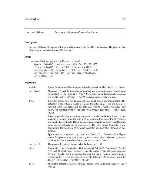
percentileRose 79percentileRoseFunction to plot percentiles by wind directionDescriptionUsagepercentileRose plots percentiles by wind direction with flexible conditioning. The plot can displaymutiple percentile lines or filled areas.ArgumentspercentileRose(mydata, pollutant = "nox",type = "default", percentile = c(25, 50, 75, 90, 95),cols = "default", fill = TRUE, intervals = NULL,angle.scale = 45, auto.text = TRUE, key.header = NULL,key.footer = "percentile", key.position = "bottom",key = TRUE, ...)mydatapollutanttypeA data frame minimally containing wd and a numeric field to plot — pollutant.Mandatory. A pollutant name corresponding to a variable in a data frame shouldbe supplied e.g. pollutant = "nox". More than one pollutant can be suppliede.g. pollutant = c("no2", "o3") provided there is only one type.type determines how the data are split i.e. conditioned, and then plotted. Thedefault is will produce a single plot using the entire data. Type can be one ofthe built-in types as detailed in cutData e.g. “season”, “year”, “weekday” andso on. For example, type = "season" will produce four plots — one for eachseason.It is also possible to choose type as another variable in the data frame. If thatvariable is numeric, then the data will be split into four quantiles (if possible)and labelled accordingly. If type is an existing character or factor variable, thenthose categories/levels will be used directly. This offers great flexibility for understandingthe variation of different variables and how they depend on oneanother.Type can be up length two e.g. type = c("season", "weekday") will producea 2x2 plot split by season and day of the week. Note, when two types areprovided the first forms the columns and the second the rows.percentile The percentile value(s) to plot. Must be between 0–100.colsColours to be used for plotting. Options include “default”, “increment”, “heat”,“jet” and RColorBrewer colours — see the openair openColours functionfor more details. For user defined the user can supply a list of colour namesrecognised by R (type colours() to see the full list). An example would becols = c("yellow", "green", "blue")fill Should the percentile intervals be filled (default) or should lines be drawn (fill =FALSE).


