Color in Office Environments: Vol. 5, Issue 1 - InformeDesign
Color in Office Environments: Vol. 5, Issue 1 - InformeDesign
Color in Office Environments: Vol. 5, Issue 1 - InformeDesign

Create successful ePaper yourself
Turn your PDF publications into a flip-book with our unique Google optimized e-Paper software.
Implications<br />
VOL. 05 ISSUE 01<br />
cover image<br />
goes here - fit<br />
image to the<br />
black box<br />
us<strong>in</strong>g the<br />
guidel<strong>in</strong>es<br />
IN THIS ISSUE<br />
<strong>Color</strong> <strong>in</strong> <strong>Office</strong><br />
<strong>Environments</strong><br />
Related Research<br />
Summaries<br />
www.<strong>in</strong>formedesign.umn.edu<br />
A Newsletter by <strong>InformeDesign</strong>. A Web site for design and human behavior research.<br />
<strong>Color</strong> <strong>in</strong> <strong>Office</strong> <strong>Environments</strong><br />
Nancy Kwallek, Ph.D.<br />
Popular Beliefs About <strong>Color</strong><br />
In 1666, Sir Isaac Newton raised a triangular<br />
glass prism, <strong>in</strong>tercepted a beam of<br />
sunlight, and proved that white light is<br />
composed of all visible colors of the spectrum.<br />
This event <strong>in</strong>itiated a fasc<strong>in</strong>ation<br />
with the qualities of color.<br />
Writ<strong>in</strong>gs on the effects and fleet<strong>in</strong>g nature<br />
of color <strong>in</strong> art, culture, psychology, and<br />
religion are extensive. Just as it is difficult<br />
for most <strong>in</strong>dividuals to hum middle<br />
C without the aid of a piano, it is difficult<br />
for one to def<strong>in</strong>e an exact color from<br />
a few feet away due to the overall context,<br />
<strong>in</strong>clud<strong>in</strong>g surround<strong>in</strong>g surfaces and light<br />
conditions. Like the deep blue of an August<br />
sky or the warm glow of a fire, color<br />
can be impermanent. It is an element of<br />
design that is subject to change based on<br />
the natural and/or artificial light <strong>in</strong> an <strong>in</strong>terior<br />
environment, as well as on the surface<br />
qualities of materials <strong>in</strong> the space.<br />
There is extensive writ<strong>in</strong>g on the supposed<br />
psychological effects of color, such<br />
as that red is energetic and aggressive,<br />
blue is tranquil, and yellow is uplift<strong>in</strong>g.<br />
But numerous myths and preconceptions<br />
exist about the effects of colors. Though<br />
empirical evidence <strong>in</strong> this area is limited,<br />
the prevail<strong>in</strong>g view is that warm colors<br />
are more arous<strong>in</strong>g than cool colors, that<br />
red, and to a lesser extent the other warm<br />
hues of orange and yellow, speed up motor<br />
reactions and impair the efficiency of<br />
work performance. The experimental evidence<br />
to support these views is sparse,<br />
contradictory, and of limited usefulness<br />
<strong>in</strong> predict<strong>in</strong>g the effect of color <strong>in</strong> the <strong>in</strong>terior<br />
environment on office workers’ productivity<br />
and mood.<br />
Perhaps the most <strong>in</strong>famous study on how<br />
color can have a positive effect on one’s<br />
psyche is the p<strong>in</strong>k prison experiment from<br />
the late 1970s (Schauss, 1979). Accord<strong>in</strong>g<br />
to the study, when <strong>in</strong>mates <strong>in</strong> Seattle,<br />
Wash<strong>in</strong>gton, were placed <strong>in</strong> bright p<strong>in</strong>k<br />
prison cells, they exhibited less aggressive<br />
traits. The f<strong>in</strong>d<strong>in</strong>gs became so widely<br />
accepted that many prisons <strong>in</strong> Canada<br />
and the U.S. immediately pa<strong>in</strong>ted their<br />
cells the same bright p<strong>in</strong>k color. However,<br />
when the same experiment was repeated<br />
a couple of years later by a researcher at<br />
York University <strong>in</strong> Toronto, the same tranquiliz<strong>in</strong>g<br />
effects were not detected. The<br />
new conclusion was that the novelty of the<br />
color change generated the less aggressive<br />
effect.<br />
Yet, the popular notion about the sooth<strong>in</strong>g<br />
effect of p<strong>in</strong>k persists. In the 1990s, a<br />
major university sports team pa<strong>in</strong>ted the<br />
visit<strong>in</strong>g team’s lockers p<strong>in</strong>k believ<strong>in</strong>g that
Implications www.<strong>in</strong>formedesign.umn.edu<br />
the color would <strong>in</strong>hibit the oppos<strong>in</strong>g players’ aggressiveness.<br />
A few years ago, England jumped on the<br />
bandwagon by pa<strong>in</strong>t<strong>in</strong>g their prisons p<strong>in</strong>k (Sample,<br />
2003). And, as recently as October 2006, a popular<br />
news source described a sheriff of a small (five prisoner),<br />
100-year-old, Texas jail who dyed or pa<strong>in</strong>ted<br />
everyth<strong>in</strong>g p<strong>in</strong>k—uniforms, shoes, towels, <strong>in</strong>terior<br />
walls—to humiliate his prisoners and discourage<br />
their return to the jail.<br />
These f<strong>in</strong>d<strong>in</strong>gs are questionable; many of the notions<br />
about colors mak<strong>in</strong>g people feel calm or depressed<br />
are outdated. Although color is an <strong>in</strong>tegral part of<br />
design, very little empirical evidence exists to support<br />
some of the popularly held ideas about the effects of<br />
color on task performance, worker productivity, and<br />
human psychology.<br />
Does p<strong>in</strong>k reduce aggression?<br />
Where Research Informs Design®<br />
A Body of <strong>Color</strong> Research<br />
The realization that <strong>in</strong>dividuals exist with<strong>in</strong> enclosed<br />
structures for most of their lives has become <strong>in</strong>creas<strong>in</strong>gly<br />
important. Creat<strong>in</strong>g office work spaces that are<br />
<strong>in</strong>vit<strong>in</strong>g, uplift<strong>in</strong>g, and energetic is a worthy design<br />
goal. Designers need to understand how spaces affect<br />
<strong>in</strong>dividuals so they can design spaces that counterbalance<br />
the chaos and stress of everyday life and create<br />
environments of personal well-be<strong>in</strong>g.<br />
The research presented here was undertaken with the<br />
goal of understand<strong>in</strong>g more fully how color with<strong>in</strong> the<br />
work environment affects occupants. Over the last 15<br />
years, <strong>in</strong> a series of experiments, a body of work has<br />
been developed from a number of studies <strong>in</strong> closed<br />
office spaces to determ<strong>in</strong>e the possible effects of color<br />
on worker well-be<strong>in</strong>g, productivity, performance,<br />
and satisfaction (Kwallek, 1988; 1990; 1996). Several<br />
phases have <strong>in</strong>volved workers perform<strong>in</strong>g various office<br />
tasks (e.g., typ<strong>in</strong>g, proofread<strong>in</strong>g, answer<strong>in</strong>g the<br />
telephone, fil<strong>in</strong>g) and then methodically test<strong>in</strong>g the<br />
effects of various office colors and color schemes on<br />
the workers.<br />
One objective has been to predict which colors or comb<strong>in</strong>ation<br />
of colors enhance worker performance and<br />
well-be<strong>in</strong>g <strong>in</strong> conf<strong>in</strong>ed office spaces. Lessons about<br />
conf<strong>in</strong>ed spaces, which are part of daily work on<br />
earth, are also relevant for astronauts on long-term<br />
space flights <strong>in</strong> the habitation module of the International<br />
Space Station (ISS), as well as for the projected<br />
<strong>in</strong>flatable habitation module used when NASA travels<br />
to the Moon and/or Mars. Traditionally, NASA has<br />
only used white for the <strong>in</strong>terior of any of its habitation<br />
modules. With significant f<strong>in</strong>d<strong>in</strong>gs about color, NASA<br />
may be more amenable to greater variation <strong>in</strong> the color<br />
palette with<strong>in</strong> its conf<strong>in</strong>ed habitation module.
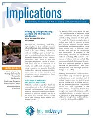
Implications www.<strong>in</strong>formedesign.umn.edu<br />
Interior view of proposed Moon and Mars Transfer Habitation Space<br />
Module ISS, NASA.<br />
A Groundwork Study<br />
Impact of Three <strong>Color</strong> Schemes on Worker Performance<br />
and Mood Relative to Individual Environmental<br />
Sensitivity<br />
Background<br />
This follow<strong>in</strong>g research, supported by Interface Floor<strong>in</strong>g<br />
Systems, Inc., BASF Corporation, and the International<br />
Interior Design Association (formerly the Institute<br />
of Bus<strong>in</strong>ess Designers), took a broader approach<br />
than previous research to the question of color <strong>in</strong> the<br />
work environment.<br />
Where Research Informs Design®<br />
Most color research has studied s<strong>in</strong>gle, bright, monochromatic<br />
colors with subjects hav<strong>in</strong>g only limited<br />
exposure to color <strong>in</strong> an actual environment. Because<br />
the effects of <strong>in</strong>terior colors on workers would have<br />
differed substantially if office workers had been tested<br />
for longer periods of time, it was decided to <strong>in</strong>vestigate<br />
workers over a full eight hour workday for four<br />
consecutive days (Kwallek, 1997). S<strong>in</strong>ce a comb<strong>in</strong>ation<br />
of colors form<strong>in</strong>g a color scheme with<strong>in</strong> the office<br />
might generate different results than what a s<strong>in</strong>gle<br />
vivid color might generate, it was decided to use more<br />
realistic variation <strong>in</strong> color to represent what might be<br />
found <strong>in</strong> actual offices. Furthermore, contrast of value,<br />
saturation, and the <strong>in</strong>terrelationship of adjacent<br />
colors are what office workers perceive. Such color dimensions<br />
and their relationships with<strong>in</strong> the environment<br />
may be more important than the color itself.<br />
In addition, few researchers have considered differences<br />
<strong>in</strong> <strong>in</strong>dividual responses to color and light. Individual<br />
differences <strong>in</strong> the ability to screen out irrelevant<br />
stimuli may <strong>in</strong>teract with how different colors<br />
affect an <strong>in</strong>dividual’s mood and performance. Researchers<br />
suggest <strong>in</strong>dividual differences <strong>in</strong> arousal<br />
response (i.e., an activated response to the environment<br />
that causes physiological changes) may be the<br />
central reason why <strong>in</strong>dividuals respond to the environment<br />
<strong>in</strong> a particular way (Mehrabian, 1976). Studies<br />
have found that some <strong>in</strong>dividuals are more easily<br />
distracted by irrelevant stimuli, lead<strong>in</strong>g to decrement<br />
<strong>in</strong> performance. Other <strong>in</strong>dividuals actually improved<br />
their performance on task when irrelevant stimuli<br />
were <strong>in</strong>troduced. These differences may be associated<br />
with an <strong>in</strong>ability to automatically screen out less important<br />
stimulation. Individuals who are most adept<br />
at screen<strong>in</strong>g out the less relevant stimuli of their environments<br />
are referred to as high screeners, while<br />
<strong>in</strong>dividuals who typically cannot screen out <strong>in</strong>com<strong>in</strong>g<br />
stimuli are referred to as low screeners.
Implications www.<strong>in</strong>formedesign.umn.edu<br />
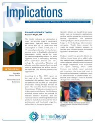
The three office color schemes employed.<br />
<strong>Color</strong> Selection<br />
Several years ago, NASA funded an extensive review<br />
of literature on color to determ<strong>in</strong>e which colors and<br />
color comb<strong>in</strong>ations would create the most seem<strong>in</strong>gly<br />
spacious, pleasant, and productive environment for<br />
the habitation module. NASA’s research f<strong>in</strong>d<strong>in</strong>gs <strong>in</strong>formed<br />
the selection of the office colors we tested.<br />
The qu<strong>in</strong>tessential office color is white and <strong>in</strong> a prior<br />
study the workers were less productive <strong>in</strong> a white office<br />
than <strong>in</strong> any other office color; therefore monochromatic<br />
white was selected as one of three office<br />
color schemes to be exam<strong>in</strong>ed. Also, a monochromatic<br />
white office was of <strong>in</strong>terest for the additional reason<br />
of <strong>in</strong>form<strong>in</strong>g NASA of the effects of white on worker<br />
productivity and mood over a long period of time <strong>in</strong> a<br />
relatively conf<strong>in</strong>ed space.<br />
For a second office, a predom<strong>in</strong>antly bright red color<br />
scheme (contrasted with medium blue-green) was selected<br />
as a color scheme because it has frequently<br />
been associated with negative effects. From summaries<br />
drawn from NASA’s report, it was predicted that<br />
an office color scheme with the largest surface area<br />
of a vivid color would create an environment which<br />
would seem more conf<strong>in</strong>ed, unpleasant, and less conducive<br />
to productivity.<br />
Conversely, a third office employed a predom<strong>in</strong>ately<br />
light pastel color scheme for the room. The <strong>in</strong>tention<br />
was to test NASA’s prediction that productivity would<br />
Where Research Informs Design®<br />
be enhanced and the worker would believe the room<br />
to be pleasant (<strong>in</strong> contrast to the red office). The colors<br />
were selected based on NASA’s conjecture that the<br />
largest surface area should be high <strong>in</strong> value (light),<br />
low <strong>in</strong> saturation (dull), that the second largest area<br />
should be medium <strong>in</strong> value and saturation, and, f<strong>in</strong>ally,<br />
that the trim and accents should be high <strong>in</strong> saturation<br />
(bright) and either high or low <strong>in</strong> value (light<br />
or dark). Thus, a light blue-green office was chosen<br />
for comparison of a predom<strong>in</strong>antly cool color scheme<br />
with a predom<strong>in</strong>antly warm color scheme. Also, literature<br />
citations on color preference <strong>in</strong>dicate that office<br />
workers prefer a light blue-green office color (Brill,<br />
1984, 1985).<br />
The purpose was to determ<strong>in</strong>e the effects of these<br />
three color schemes on mood, speed <strong>in</strong> performance<br />
of clerical tasks, and accuracy on proofread<strong>in</strong>g clerical<br />
tasks adm<strong>in</strong>istered to office workers. The effects<br />
of the color schemes were exam<strong>in</strong>ed for 90 workers<br />
tak<strong>in</strong>g <strong>in</strong>to account <strong>in</strong>dividual differences <strong>in</strong> environmental<br />
sensitivity (high screeners vs. low screeners).<br />
F<strong>in</strong>d<strong>in</strong>gs<br />
Workers <strong>in</strong> the red office reported higher negative<br />
mood characteristics compared with workers <strong>in</strong> the<br />
blue-green office. However, when consider<strong>in</strong>g screen<strong>in</strong>g<br />
ability, greater negative mood aspects were reported<br />
for low screeners compared with high screeners <strong>in</strong><br />
the red and white offices. Possibly the starkness of<br />
the white office (lack<strong>in</strong>g contrast) was more
Implications www.<strong>in</strong>formedesign.umn.edu<br />
disturb<strong>in</strong>g for low screeners than high screeners who<br />
could more easily ignore the starkness of that office.<br />
Low screeners were less productive <strong>in</strong> the red office<br />
than <strong>in</strong> the blue-green office. On the other hand, high<br />
screeners were more productive <strong>in</strong> the red office than<br />
<strong>in</strong> the blue-green office. An explanation for this may<br />
be that as an <strong>in</strong>dividual’s level of arousal <strong>in</strong>creases,<br />
so does performance. If red is <strong>in</strong>herently arous<strong>in</strong>g,<br />
then high screeners may perform better than low<br />
screeners <strong>in</strong> the red office while low screeners may<br />
feel overwhelmed and their performance may subsequently<br />
deteriorate. By contrast, if the blue-green<br />
office environment is <strong>in</strong>herently more relax<strong>in</strong>g, then<br />
high screeners may not experience enough arousal to<br />
reach a high level of productivity.<br />
In exam<strong>in</strong><strong>in</strong>g the effects on productivity of the three<br />
different color schemes, the results suggest that color<br />
scheme alone may not have a discernible impact on<br />
productivity. By themselves, the three different color<br />
schemes did not impact productivity differently. Only<br />
when <strong>in</strong>dividual differences <strong>in</strong> the ability to screen<br />
irrelevant environmental stimuli were taken <strong>in</strong>to account<br />
did the color schemes exhibit a differential impact<br />
on productivity.<br />
Future<br />
This groundwork study helps determ<strong>in</strong>e how color<br />
might affect people’s mood <strong>in</strong> the workplace and if<br />
mood affects their productivity. The f<strong>in</strong>d<strong>in</strong>gs suggest<br />
that color scheme alone may impact mood. Surpris<strong>in</strong>gly,<br />
though, mood and productivity were not related<br />
to each other, suggest<strong>in</strong>g that the impact of colors and<br />
stimulus screen<strong>in</strong>g on both mood and productivity<br />
are <strong>in</strong>dependent. No l<strong>in</strong>k was found between worker<br />
mood and worker performance. Positive mood characteristics<br />
did not lead to higher productivity. A prevalent<br />
assumption <strong>in</strong> study<strong>in</strong>g employee performance<br />
is that the employee’s mood is related to productivity.<br />
However, the results did not support this notion,<br />
which could have implications for workplace design.<br />
Where Research Informs Design®<br />
The impact of color on a given <strong>in</strong>dividual’s mood may<br />
not be relevant <strong>in</strong> maximiz<strong>in</strong>g performance.<br />
Furthermore, <strong>in</strong>dividual screen<strong>in</strong>g ability may <strong>in</strong>fluence<br />
how people experience the color of a particular<br />
<strong>in</strong>terior. These results may <strong>in</strong>dicate that <strong>in</strong>dividual<br />
characteristics should be exam<strong>in</strong>ed more closely to<br />
understand the impact of various colors on an <strong>in</strong>dividual’s<br />
experience. An important implication for the<br />
future is that employers may need to be more concerned<br />
with screen<strong>in</strong>g employees for similar relevant<br />
characteristics. Creat<strong>in</strong>g a one-size-fits-all ideal <strong>in</strong>terior<br />
environment for <strong>in</strong>dividuals with differ<strong>in</strong>g characteristics<br />
may be impossible. Alternatively, <strong>in</strong>teriors<br />
could be designed with maximum flexibility to allow<br />
for variations with<strong>in</strong> the same general space accord<strong>in</strong>g<br />
to each <strong>in</strong>dividual’s characteristics. Each study is<br />
a short step toward f<strong>in</strong>d<strong>in</strong>g answers, and each might<br />
lead, <strong>in</strong> some small way, to protect<strong>in</strong>g the long-term<br />
well-be<strong>in</strong>g of office workers.<br />
About the Author<br />
Nancy Kwallek, Ph.D., is professor<br />
and director of the <strong>in</strong>terior<br />
design program <strong>in</strong> the School of<br />
Architecture at the University of<br />
Texas at Aust<strong>in</strong>. She holds the<br />
Gene Edward Mikeska Endowed<br />
Professorship <strong>in</strong> <strong>in</strong>terior design<br />
and received her doctorate from<br />
Purdue University. Dr. Kwallek<br />
has been study<strong>in</strong>g the psychological<br />
effects of color <strong>in</strong> the <strong>in</strong>terior environment and the<br />
effects of color on office workers’ health, well-be<strong>in</strong>g,<br />
performance, and job satisfaction for over 15 years.<br />
5
Implications www.<strong>in</strong>formedesign.umn.edu<br />
References<br />
—Brill, M., Margulis, S., Konar, E., & BOSTI. (1984,<br />
1985). Us<strong>in</strong>g office design to <strong>in</strong>crease productivity<br />
(<strong>Vol</strong>s. 1 & 2).<br />
—Kwallek, N., & Lewis, C. (1990). Effects of environmental<br />
colour on males and females: A red or white or<br />
green office. Applied Ergonomics, 21(4) 275-278.<br />
—Kwallek, N., Lewis, C., L<strong>in</strong>-Hsiao, J., & Woodson, H.<br />
(1996). Effects of n<strong>in</strong>e monochromatic office <strong>in</strong>terior<br />
colors on office clerical tasks and worker mood. <strong>Color</strong><br />
Research and Application, 21, 448-458.<br />
—Kwallek, N., Lewis, C., & Robb<strong>in</strong>s. A. (1988). Effects<br />
of office <strong>in</strong>terior color on workers’ mood and productivity.<br />
Perceptual and Motor Skills, 66, 123-128.<br />
—Kwallek, N., Woodson, H., Lewis, C., & Sales, C.<br />
(1997). Impact of three <strong>in</strong>terior color schemes on<br />
worker mood and performance relative to <strong>in</strong>dividual<br />
environmental sensitivity. <strong>Color</strong> Research and Application,<br />
22, 121-132.<br />
—Mehrabian, A., & Russell, J. (1976). Manual for<br />
the questionnaire measure of stimulus screen<strong>in</strong>g and<br />
arousability. Los Angeles: UCLA.<br />
—Sample, I. (2003, October 9). Will p<strong>in</strong>k cells make<br />
prisoners feel happier? The Guardian Unlimited. Retrieved<br />
May 9, 2004 from http://www.guardian.<br />
co.uk/life/thisweek/story/0,12977,1058574,00.html<br />
—Schauss, A. (1979). Tranquiliz<strong>in</strong>g effect of color<br />
reduces aggressive behavior and potential violence.<br />
Journal of Orthomolecular Psychiatry, 8, 218-221.<br />
Creator: Found<strong>in</strong>g Sponsor:<br />
© 2002, 2005 by the Regents of the University of M<strong>in</strong>nesota.<br />
Related Research Summaries<br />
“<strong>Color</strong> Appearances <strong>in</strong> Rooms”<br />
—<strong>Color</strong> Research and Application<br />
“<strong>Color</strong> and Scenic Images <strong>in</strong> Workspaces”<br />
—Journal of Environmental Psychology<br />
“<strong>Color</strong> Aids Wayf<strong>in</strong>d<strong>in</strong>g for Young Children”<br />
—Early Childhood Education Journal<br />
“Effects of <strong>Office</strong> <strong>Color</strong> Scheme on Workers”<br />
—<strong>Color</strong> Research and Application<br />
“Impact of <strong>Office</strong> Workers Hav<strong>in</strong>g Environmental<br />
Control”—Journal of Environmental Psychology<br />
“Mood and Performance Associated with <strong>Office</strong><br />
<strong>Color</strong>”—<strong>Color</strong> Research and Application<br />
“<strong>Color</strong>, Mean<strong>in</strong>g, Culture, and Design”<br />
—Journal of Interior Design<br />
“Improved Productivity Through <strong>Office</strong> Design”<br />
—Build<strong>in</strong>g Research & Information<br />
Photos Courtesy of:<br />
Cary Wol<strong>in</strong>sky/Trillium Studios,<br />
all rights reserved 2001 (p. 1)<br />
Cycolor (p. 2)<br />
NASA (p. 3)<br />
Nancy Kwallek, University of Texas, Aust<strong>in</strong> (rema<strong>in</strong>der)<br />
The Mission<br />
The Mission of <strong>InformeDesign</strong> is to facilitate designers’<br />
use of current, research-based <strong>in</strong>formation as a decision-<br />
mak<strong>in</strong>g tool <strong>in</strong> the design process, thereby<br />
<strong>in</strong>tegrat<strong>in</strong>g research and practice.