Cartographic design and the quality of climate change maps
Cartographic design and the quality of climate change maps
Cartographic design and the quality of climate change maps

You also want an ePaper? Increase the reach of your titles
YUMPU automatically turns print PDFs into web optimized ePapers that Google loves.
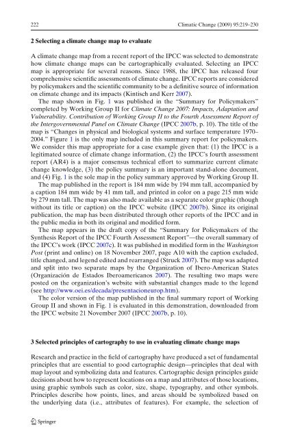
222 Climatic Change (2009) 95:219–230<br />
2 Selecting a <strong>climate</strong> <strong>change</strong> map to evaluate<br />
A <strong>climate</strong> <strong>change</strong> map from a recent report <strong>of</strong> <strong>the</strong> IPCC was selected to demonstrate<br />
how <strong>climate</strong> <strong>change</strong> <strong>maps</strong> can be cartographically evaluated. Selecting an IPCC<br />
map is appropriate for several reasons. Since 1988, <strong>the</strong> IPCC has released four<br />
comprehensive scientific assessments <strong>of</strong> <strong>climate</strong> <strong>change</strong>. IPCC reports are considered<br />
by policymakers <strong>and</strong> <strong>the</strong> scientific community to be a definitive source <strong>of</strong> information<br />
on <strong>climate</strong> <strong>change</strong> <strong>and</strong> its impacts (Kintisch <strong>and</strong> Kerr 2007).<br />
The map shown in Fig. 1 was published in <strong>the</strong> “Summary for Policymakers”<br />
completed by Working Group II for Climate Change 2007: Impacts, Adaptation <strong>and</strong><br />
Vulnerability. Contribution <strong>of</strong> Working Group II to <strong>the</strong> Fourth Assessment Report <strong>of</strong><br />
<strong>the</strong> Intergovernmental Panel on Climate Change (IPCC 2007b, p.10).Thetitle<strong>of</strong><strong>the</strong><br />
map is “Changes in physical <strong>and</strong> biological systems <strong>and</strong> surface temperature 1970–<br />
2004.” Figure 1 is <strong>the</strong> only map included in this summary report for policymakers.<br />
We consider this map appropriate for a case example given that: (1) <strong>the</strong> IPCC is a<br />
legitimated source <strong>of</strong> <strong>climate</strong> <strong>change</strong> information, (2) <strong>the</strong> IPCC’s fourth assessment<br />
report (AR4) is a major consensus technical effort to summarize current <strong>climate</strong><br />
<strong>change</strong> knowledge, (3) <strong>the</strong> policy summary is an important st<strong>and</strong>-alone document,<br />
<strong>and</strong> (4) Fig. 1 is <strong>the</strong> sole map in <strong>the</strong> policy summary approved by Working Group II.<br />
The map published in <strong>the</strong> report is 184 mm wide by 194 mm tall, accompanied by<br />
a caption 184 mm wide by 41 mm tall, <strong>and</strong> printed in color on a page 215 mm wide<br />
by 279 mm tall. The map was also made available as a separate color graphic (though<br />
without its title or caption) on <strong>the</strong> IPCC website (IPCC 2007b). Since its original<br />
publication, <strong>the</strong> map has been distributed through o<strong>the</strong>r reports <strong>of</strong> <strong>the</strong> IPCC <strong>and</strong> in<br />
<strong>the</strong> public media in both its original <strong>and</strong> modified form.<br />
The map appears in <strong>the</strong> draft copy <strong>of</strong> <strong>the</strong> “Summary for Policymakers <strong>of</strong> <strong>the</strong><br />
Syn<strong>the</strong>sis Report <strong>of</strong> <strong>the</strong> IPCC Fourth Assessment Report”—<strong>the</strong> overall summary <strong>of</strong><br />
<strong>the</strong> IPCC’s work (IPCC 2007c). It was published in modified form in <strong>the</strong> Washington<br />
Post (print <strong>and</strong> online) on 18 November 2007, page A10 with <strong>the</strong> caption excluded,<br />
title <strong>change</strong>d, <strong>and</strong> legend edited <strong>and</strong> rearranged (Struck 2007). The map was adapted<br />
<strong>and</strong> split into two separate <strong>maps</strong> by <strong>the</strong> Organization <strong>of</strong> Ibero-American States<br />
(Organización de Estados Iberoamericanos 2007). The resulting two <strong>maps</strong> were<br />
posted on <strong>the</strong> organization’s website with substantial <strong>change</strong>s made to <strong>the</strong> legend<br />
(see http://www.oei.es/decada/presentacioneurop.htm).<br />
The color version <strong>of</strong> <strong>the</strong> map published in <strong>the</strong> final summary report <strong>of</strong> Working<br />
Group II <strong>and</strong> shown in Fig. 1 is evaluated in this demonstration, downloaded from<br />
<strong>the</strong> IPCC website 21 November 2007 (IPCC 2007b, p. 10).<br />
3 Selected principles <strong>of</strong> cartography to use in evaluating <strong>climate</strong> <strong>change</strong> <strong>maps</strong><br />
Research <strong>and</strong> practice in <strong>the</strong> field <strong>of</strong> cartography have produced a set <strong>of</strong> fundamental<br />
principles that are essential to good cartographic <strong>design</strong>—principles that deal with<br />
map layout <strong>and</strong> symbolizing data <strong>and</strong> features. <strong>Cartographic</strong> <strong>design</strong> principles guide<br />
decisions about how to represent locations on a map <strong>and</strong> attributes <strong>of</strong> those locations,<br />
using graphic symbols such as color, size, shape, typography, <strong>and</strong> o<strong>the</strong>r symbols.<br />
Principles describe how points, lines, <strong>and</strong> areas should be symbolized based on<br />
<strong>the</strong> underlying data (i.e., attributes <strong>of</strong> features). For example, <strong>the</strong> selection <strong>of</strong>