Our silhouettes - Macmillan Cancer Support
Our silhouettes - Macmillan Cancer Support
Our silhouettes - Macmillan Cancer Support

You also want an ePaper? Increase the reach of your titles
YUMPU automatically turns print PDFs into web optimized ePapers that Google loves.
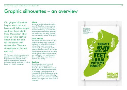
<strong>Macmillan</strong> <strong>Cancer</strong> <strong>Support</strong> – Brand identity guidelines – October 2011 27Graphic <strong>silhouettes</strong> – an overview<strong>Our</strong> graphic <strong>silhouettes</strong>help us stand out in abusy world. When peoplesee them they instantlythink ‘<strong>Macmillan</strong>’. Theyallow us to be abstractabout ideas, but alsotell real stories withcase studies. They arestraightforward, honest,and real.We like to use objects (as opposed topeople) wherever possible becausethey can express concepts reallystrongly, and generally are moreinclusive to a wide audience, as well asbeing very visually engaging.IdeasBy combining our <strong>silhouettes</strong> and apowerful headline, we can expressideas that wouldn’t be possible, orappropriate literally. Eg on a leafletabout cancer and children we mightuse a silhouette of a teddy bear tocommunicate the idea of childhood.Case studiesWe can tell personal stories with realpeople, but these need to be casestudies to be believable. Combinedwith a direct quote or personalstatement, they can bring to life theemotional side of what we do – makethings more tangible. Eg on a booklettalking about radiotherapy we mightuse a silhouette of a radiotherapist(then we’d find out more about herand her role inside).Realism<strong>Our</strong> <strong>silhouettes</strong> come from realphotos, they have detail insidethem, but should still be kept simple.About 70% (or more) should remainin silhouette. They should have arecognisable, identifiable shape, eitherfrom their outline or a key detail. Egthe laces on a pair of trainers would bedetailed, leaving the rest of the shoe insilhouette.
<strong>Macmillan</strong> <strong>Cancer</strong> <strong>Support</strong> – Brand identity guidelines – October 2011 31Graphic <strong>silhouettes</strong> – <strong>silhouettes</strong> of peopleTaking a case study photo• The person must be someone whofeatures in the communication• Consider appropriateness ofexpressions and subject matter• Faces should be clearlyvisible and evenly lit• Avoid images where the eyes or theface are in heavy shadow• You should be able to see thereal person (we’re not removingblemishes etc)• Always start with a photograph• Select images with plain or lightbackgrounds (this makes it easier tosilhouette)• Find images that are very flat in tone(no harsh shadows as these will beaccentuated)• Look for areas of detail that willstand out and add interest• Consider the composition or pose– flat on isn’t always the mostinterestingPhotography set-up• Two stops underexposed• Use a white background or sheet• Use even spot lighting from front leftand rightShoot even skin tones avoiding strong shadowsPeople don’t need to look directly into the camera to feelengaging. Try to keep them feel real and honest instead.Carefully consider expressions and gestures. And NEVER usestock models. Yes this means you! The blur on the hand and thedark shadows on the face and hand don’t help eitherLook for areas to paint in (here we painted in the stripes in thejumper to simplify)
<strong>Macmillan</strong> <strong>Cancer</strong> <strong>Support</strong> – Brand identity guidelines – October 2011 32Graphic <strong>silhouettes</strong> – <strong>silhouettes</strong> of peopleGraphic crop and dynamic layout creates impactLook for areas of detail to keep when silhouetting – the wrinkleson this mans face tell a rich story of who he is. We don’t want tolose this.Underexposed images work well to keep tone – about two stopsshould do itTry to avoid strong shadows, these will be accentuated (theexample here would lose most of his face to shadow)Watch out for areas of detail. Too much (eg patterns in clothing)lessens the impact of <strong>silhouettes</strong>. They are made from highlightsand shadows, not patterns.
<strong>Macmillan</strong> <strong>Cancer</strong> <strong>Support</strong> – Brand identity guidelines – October 2011 33Graphic <strong>silhouettes</strong> – how to make themIn detailOpen your image in Photoshop.Here’s a breakdown of whata complicated Layers palettemight look like.123Add a ‘Hue/Saturation’ adjustmentlayer, desaturate the image (make itgreyscale).Add a ‘Levels…’ adjustment layer.Increase the contrast from theimage by moving the shadow/highlight sliders together. Focus ongetting the outline of the silhouette.We want to end up with nomidtones so no grey in the image,just black and white.If you’ve lost detail specific areas ofthe silhouette, repeat the process.Creating masks to pull out thedifferent areas of tonality. (Herewe’ve masked everything but theface as this needed to be muchlighter than the clothing.)Select image with even toneand without strong shadowsConvert image to greyscaleand isolate skin areas443We’ve created groups oflayers and masked themto reveal the detail in theface.4At this point you might like to createtwo layers (paint in white and black)to tidy up the image.Select all layers and convert to aSmart object (this preserves all thelayers).21Convert this to greyscale and saveas a Tiff so colour can be applied inlayout applications.You can download examples from:be.macmillan/examplesIncrease the contrast in themid and dark tonesAdjust the skin areas to highcontrast, reducing shadowsand mid tonesSave image as greyscale tifand apply colour in layoutapplication
<strong>Macmillan</strong> <strong>Cancer</strong> <strong>Support</strong> – Brand identity guidelines – October 2011 34Graphic <strong>silhouettes</strong> – do’s and don’tsDo think about where to putour logo (be clever/witty)Don’t let the logo (or anyother element) overpower thesilhouetteDo use as few colours aspossible (keep things simple)Don’t be tempted to use lots ofcolours. Silhouettes are morepowerful in their simplicityDo reverse the image (whiteon green) - if it works (or else itmight look like an x-ray)Literal <strong>silhouettes</strong> aren’t alwaysthe best solution, they can feelfake and hackneyedGet the detail right. Thereshould be no mid-tones……only highlights and shadowfor maximum contrast. Aim forabout 70% in silhouetteBread/toast’s a greatsilhouette for money, but canyou tell what it is?……consider if you’rehighlighting the right details.Small and floaty, fairly straighton, yawn……big, bold and a nicedynamic angle adds to thecomposition
<strong>Macmillan</strong> <strong>Cancer</strong> <strong>Support</strong> – Brand identity guidelines – October 2011 35Graphic <strong>silhouettes</strong> – do’s and don’ts£15will payfor a nurse£50will payfor a nurse£100will payfor a nurseAvoid (or paint out) existingtext in <strong>silhouettes</strong> (it getsconfusing)……ahhh much better, and youcan still see what it isGreat silhouette, you can tellPete loves swimming. Evenbetter he’s a real a case study!Don’t use them as clipart –they lose their immediacy andimpactKeep them ‘human’ in scale– huge things eg bridges andmountains look like toysDo think about expressions– great silhouette, but a bitpassiveNice silhouette, just way toomuch detail……ahhhh, much better.Don’t forget these are still<strong>silhouettes</strong>, they should stillremain mostly dark.
<strong>Macmillan</strong> <strong>Cancer</strong> <strong>Support</strong> – Brand identity guidelines – October 2011 36Golden rule:number five(top ways to stay in our good books)Don’t use loads of <strong>silhouettes</strong>or use them smallHate to say it, but this justlooks like poor design.Nothing more, nothing less.
<strong>Macmillan</strong> <strong>Cancer</strong> <strong>Support</strong> – Brand identity guidelines – October 2011 37Graphic <strong>silhouettes</strong> – examples: challenge events
<strong>Macmillan</strong> <strong>Cancer</strong> <strong>Support</strong> – Brand identity guidelines – October 2011 38Graphic <strong>silhouettes</strong> – examples: case studies
<strong>Macmillan</strong> <strong>Cancer</strong> <strong>Support</strong> – Brand identity guidelines – October 2011 39Graphic <strong>silhouettes</strong> – examples: fundraisers
<strong>Macmillan</strong> <strong>Cancer</strong> <strong>Support</strong> – Brand identity guidelines – October 2011 40Graphic <strong>silhouettes</strong> – examples: affected by cancer
<strong>Macmillan</strong> <strong>Cancer</strong> <strong>Support</strong> – Brand identity guidelines – October 2011 41Graphic <strong>silhouettes</strong> – examples: couples/groups
<strong>Macmillan</strong> <strong>Cancer</strong> <strong>Support</strong> – Brand identity guidelines – October 2011 42Graphic <strong>silhouettes</strong> – examples: couples/groups
<strong>Macmillan</strong> <strong>Cancer</strong> <strong>Support</strong> – Brand identity guidelines – October 2011 43Graphic <strong>silhouettes</strong> – examples: objects
<strong>Macmillan</strong> <strong>Cancer</strong> <strong>Support</strong> – Brand identity guidelines – October 2011 44Graphic <strong>silhouettes</strong> – examples: situations/activities