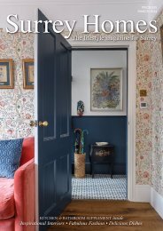
Surrey Homes | SH22 | August 2016 | Wedding supplement inside
The lifestyle magazine for Surrey - Wedding Supplement, Fabulous Fashion, Delicious Dishes
The lifestyle magazine for Surrey - Wedding Supplement, Fabulous Fashion, Delicious Dishes

You also want an ePaper? Increase the reach of your titles
YUMPU automatically turns print PDFs into web optimized ePapers that Google loves.
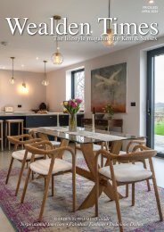
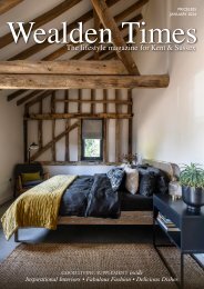
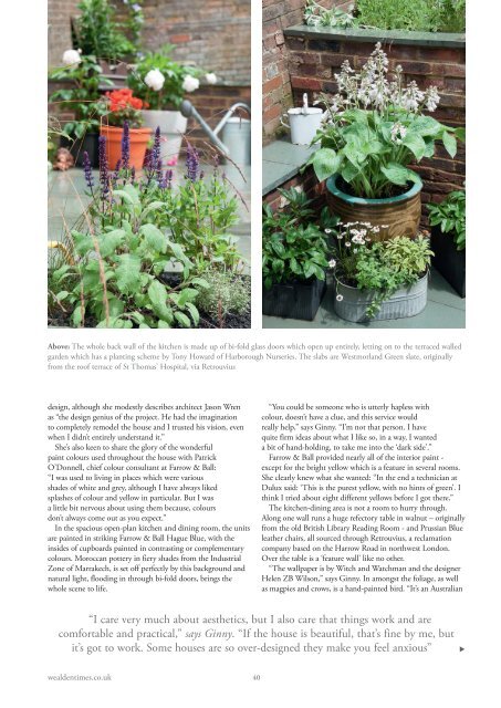
Above: The whole back wall of the kitchen is made up of bi-fold glass doors which open up entirely, letting on to the terraced walled<br />
garden which has a planting scheme by Tony Howard of Harborough Nurseries. The slabs are Westmorland Green slate, originally<br />
from the roof terrace of St Thomas’ Hospital, via Retrouvius<br />
design, although she modestly describes architect Jason Wren<br />
as “the design genius of the project. He had the imagination<br />
to completely remodel the house and I trusted his vision, even<br />
when I didn’t entirely understand it.”<br />
She’s also keen to share the glory of the wonderful<br />
paint colours used throughout the house with Patrick<br />
O’Donnell, chief colour consultant at Farrow & Ball:<br />
“I was used to living in places which were various<br />
shades of white and grey, although I have always liked<br />
splashes of colour and yellow in particular. But I was<br />
a little bit nervous about using them because, colours<br />
don’t always come out as you expect.”<br />
In the spacious open-plan kitchen and dining room, the units<br />
are painted in striking Farrow & Ball Hague Blue, with the<br />
<strong>inside</strong>s of cupboards painted in contrasting or complementary<br />
colours. Moroccan pottery in fiery shades from the Industrial<br />
Zone of Marrakech, is set off perfectly by this background and<br />
natural light, flooding in through bi-fold doors, brings the<br />
whole scene to life.<br />
“You could be someone who is utterly hapless with<br />
colour, doesn’t have a clue, and this service would<br />
really help,” says Ginny. “I’m not that person. I have<br />
quite firm ideas about what I like so, in a way, I wanted<br />
a bit of hand-holding, to take me into the ‘dark side’.”<br />
Farrow & Ball provided nearly all of the interior paint -<br />
except for the bright yellow which is a feature in several rooms.<br />
She clearly knew what she wanted: “In the end a technician at<br />
Dulux said: ‘This is the purest yellow, with no hints of green’. I<br />
think I tried about eight different yellows before I got there.”<br />
The kitchen-dining area is not a room to hurry through.<br />
Along one wall runs a huge refectory table in walnut – originally<br />
from the old British Library Reading Room - and Prussian Blue<br />
leather chairs, all sourced through Retrouvius, a reclamation<br />
company based on the Harrow Road in northwest London.<br />
Over the table is a ‘feature wall’ like no other.<br />
“The wallpaper is by Witch and Watchman and the designer<br />
Helen ZB Wilson,” says Ginny. In amongst the foliage, as well<br />
as magpies and crows, is a hand-painted bird. “It’s an Australian<br />
“I care very much about aesthetics, but I also care that things work and are<br />
comfortable and practical,” says Ginny. “If the house is beautiful, that’s fine by me, but<br />
it’s got to work. Some houses are so over-designed they make you feel anxious”<br />
<br />
wealdentimes.co.uk<br />
40