

2016 TLK Brand Guidelines v.16.10.03 Flipbook

You also want an ePaper? Increase the reach of your titles
YUMPU automatically turns print PDFs into web optimized ePapers that Google loves.
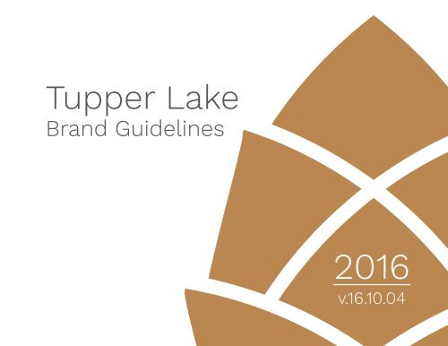
Tupper Lake<br />
<strong>Brand</strong> <strong>Guidelines</strong><br />
<strong>2016</strong><br />
v.16.10.04
Table of Contents<br />
Introduction 4<br />
Logo 10<br />
Slogan 12<br />
Logomark 14<br />
Typography 16<br />
Colors & Shapes 18<br />
<strong>Brand</strong> <strong>Guidelines</strong> 24<br />
Usage Examples 34
Tupper Lake, New York<br />
The Tupper Lake brand is based on data and research resulting from a<br />
comprehensive, collaborative study, along with the vision shared by Tupper<br />
Lake’s stakeholders and residents. Research conducted over the course of a<br />
year included a series of public meetings, a survey of residents, a survey of<br />
visitors, and a virtual focus group of local stakeholders.<br />
The brand logo, colors, and fonts reflect the experiences and characteristics<br />
that make Tupper Lake a unique and compelling travel destination.<br />
This guide is meant as a reference for the use of the Tupper Lake brand colors,<br />
fonts, and logo. The consistent implementation of these brand identity tools<br />
will help others quickly recognize, understand, and identify with the Tupper<br />
Lake experience.<br />
4
5
Vision Statement<br />
Tupper Lake has a clear vision statement for the future, as expressed in the<br />
community’s 2007 Economic Development Strategy and 2013 Revitalization<br />
Strategy:<br />
...Tupper Lake will be a nationally recognized center for education<br />
in environmental and natural sciences and a vibrant four-season<br />
Adirondack destination attracting families, businesses and visitors<br />
looking for a unique place balancing nature and technology, history<br />
and progress, work and play.<br />
6
7
Image<br />
Tupper Lake is characterized by ample waterways and accessible mountains.<br />
This natural landscape is complemented by a cultural landscape comprised<br />
of authentic small-town businesses, natural science institutions, and rich<br />
heritage. As a result of research and public meetings, the primary elements that<br />
are associated with Tupper Lake can all be connected with one overarching<br />
concept: Tupper Lake is a place of authentic connection and discovery.<br />
Through the course of the brand image study it was revealed that one of<br />
Tupper Lake’s strongest attributes is the unique opportunity it provides both<br />
residents and visitors alike to connect with and learn about nature.<br />
The Tupper Lake brand is built on four key concepts: authenticity, nature,<br />
connection, and discovery.<br />
8
9
10<br />
Logo
Logo Variants<br />
11
Slogan<br />
Connect<br />
Tupper Lake is a community of real, hard-working, creative, and adventurous<br />
people who thrive in their natural surroundings, and it has been ever since its<br />
founding as one of the highest-producing lumber communities in the world.<br />
Whether over coffee in a local diner at the break of dawn, or a cold beer at<br />
the end of a long day, travelers will find it easy to connect with locals as they<br />
share stories, experiences, and advice.<br />
Discover<br />
Tupper Lake is a center for learning via both self-guided discovery and today’s<br />
version of the classic Adirondack guide. The Wild Center, the Adirondack<br />
Public Observatory, and professional paddling and hiking guides all support<br />
learning about the Adirondacks and its surroundings. Tupper Lake is a place<br />
for discovering the natural environment, authentic culture, seemingly limitless<br />
recreational opportunities, and the secrets of the dark skies overhead. With<br />
accessible trails, rich heritage, and real people who live and work here, Tupper<br />
Lake is a natural place to connect and discover.<br />
12
The font “ Boutique Script<br />
” communicates an intimate, personal touch, like a<br />
journal entry or hand-scrawled notes on a map.<br />
13
In 1890, Mayor Joe Gokey, a prominent and colorful local businessman, was<br />
asked about the population of Tupper Lake. His unique response, “Mostly<br />
spruce and hemlock,” has carried on through the years in many different forms.<br />
The hemlock cone, with its scales beginning<br />
to open, signifies not only the natural<br />
environment and rich heritage but also the<br />
seeding of a bright future for Tupper Lake.<br />
14
Logomark<br />
15
Creating a brand as unique as Tupper Lake required a typeface that was unique<br />
to the community. Tupper Lake is presented in a completely custom, handdesigned<br />
typography. The letters are solid and elegant. The descenders of<br />
the letters R and K represent the movement<br />
of water. The shape of the U is reflected in<br />
the shape of the A to give the typography<br />
balance.<br />
16
Typography<br />
This typography can be arranged in several ways, depending on the situation.<br />
17
<strong>Brand</strong> Colors<br />
Foundation<br />
CMYK - 61/56/57/30<br />
RGB - #5B5755<br />
Effort<br />
CMYK - 61/56/57/30<br />
RGB - #BC8852<br />
Heritage<br />
CMYK - 61/56/57/30<br />
RGB - #7C2F1F<br />
18
Foundation<br />
This elegant gray is a solid base for the brand and works well for<br />
text, providing weight, clarity, and high contrast.<br />
Effort<br />
From work boots to hiking shoes, this tan color ties the hardy<br />
nature of Tupper Lake to its abundance of outdoor experiences.<br />
Heritage<br />
Red is traditionally recognized as a stimulating color that<br />
encourages action, enthusiasm, and confidence. This red accent<br />
provides a splash of color and alludes to Tupper Lake’s rich history.<br />
19
Horizon<br />
Part of the uniqueness of Tupper Lake is its wide-open views by day and dark<br />
skies by night. This makes it an ideal place to watch sunsets, as mountains<br />
reflected in the water provide a beautiful frame for the sun’s last rays. Through<br />
the focus groups and open ended responses in the brand image survey, this<br />
observation proved to be a common conclusion.<br />
The skyline within the text uses two tones to depict the view from Tupper<br />
Lake Municipal Park looking west over Raquette Pond, as the sun sets behind<br />
Mount Arab.<br />
20
21
Shape<br />
The hexagon is one of the many geometric shapes<br />
that occurs in nature. It is often associated with bees<br />
and their co-operative, hard-working nature. Tupper<br />
Lake is a strong community due to its residents<br />
rising together to undertake massive community<br />
projects over the years. The hexagon used in the logo<br />
is intended to represent both these past and future<br />
community-driven initiatives.<br />
Here it is used to give the logo a cohesive feel (left)<br />
and in an icon with the logomark (below).<br />
22
<strong>Brand</strong> Pairing<br />
The inclusion of the adirondacks, usa brand with Tupper Lake branding ties Tupper<br />
Lake to the regional brand, indicating its place as part of the Adirondacks, a name<br />
that is known as an important visitor attractor and international destination.<br />
23
<strong>Brand</strong> <strong>Guidelines</strong><br />
The goal of Tupper Lake’s new brand identity is to communicate the essence<br />
of Tupper Lake to travelers and residents. Maintaining a strong and effective<br />
identity means the brand elements must be presented in a consistent manner.<br />
By adhering to the following guidelines, this brand can effectively be used to<br />
promote Tupper Lake. All of the elements are specific to Tupper Lake and<br />
cannot be used for any other purpose. This includes the logomark, typography,<br />
colors, and slogan.<br />
Any questions regarding the usage of the Tupper Lake brand may be forwarded<br />
to the Regional Office of Sustainable Tourism at www.roostadk.com.<br />
Main Office: (518) 523-2445 Tupper Lake Office: (518) 621-3689<br />
24
25
This is the primary logo for Tupper Lake. It should be used<br />
in this form whenever possible. It can be presented with<br />
white text, as well as in white, foundation (gray), or black.<br />
The logo should never be covered by other logos or designs.<br />
It is preferred that the logo be placed on a solid white or<br />
gray background, though the one color white logo can be<br />
used to brand images.<br />
The logo should not be stretched or presented in any off<br />
brand colors.<br />
The logo should never be placed on top of other images<br />
or design elements with a white box around it.<br />
The logomark should not be<br />
placed with typefaces other<br />
than the official Tupper Lake<br />
typography.<br />
26
Tupper Lake<br />
Seriously. Don’t do this.<br />
27
Logomark Usage<br />
The logomark can be used independently from the rest<br />
of the brand elements. It can stand alone or be placed<br />
in the hexagon, and it can be presented in the brand<br />
colors or in white.<br />
Its shape cannot be altered.<br />
The pieces should not be moved or resized in relation<br />
to each other.<br />
It cannot be used as a logo for businesses or organizations.<br />
28
Frank’s Bait & Tackle<br />
Stop it, Frank.<br />
29
Slogan Logo<br />
The slogan “Connect & Discover” should be used when writing about Tupper Lake. When it comes<br />
to presenting it with the official Tupper Lake brand, it should only appear with the official logo as<br />
seen above. The color variants follow the same pattern as the full logo.<br />
30
Logo Variants<br />
These official variants can be used as needed.<br />
They should follow the same presentation<br />
guidelines as the primary logo.<br />
31
<strong>Brand</strong> Colors<br />
Foundation<br />
CMYK - 61/56/57/30<br />
RGB - #5B5755<br />
Foundation is the primary color of the Tupper Lake<br />
brand. When presenting on a white background, the<br />
color should be used for all fonts, typefaces, and the<br />
Tupper Lake typography.<br />
Effort<br />
CMYK - 61/56/57/30<br />
RGB - #BC8852<br />
Effort is the secondary color of the brand. It is also the<br />
preferred color for the logomark. Fonts, typefaces, and<br />
the Tupper Lake typography should not be presented<br />
in this color.<br />
Heritage<br />
CMYK - 61/56/57/30<br />
RGB - #7C2F1F<br />
Heritage is meant to be used as a highlight color.<br />
Preferably, the logomark and typography should not be<br />
presented in this color.<br />
32
33
Usage Examples<br />
Beer List<br />
34
35
121 Park Street, Tupper Lake<br />
The Fund for<br />
TUPPER LAKE