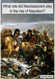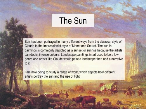
Sun

Create successful ePaper yourself
Turn your PDF publications into a flip-book with our unique Google optimized e-Paper software.
The <strong>Sun</strong><br />
<strong>Sun</strong> has been portrayed in many different ways from the classical style of<br />
Claude to the Impressionist style of Monet and Seurat. The sun in<br />
paintings is commonly depicted as a sunset or sunrise because the artists<br />
can depict intense colours. Landscape paintings in art used to be a low<br />
genre and artists like Claude would paint a landscape then add a narrative<br />
to it.<br />
I am now going to study a range of work, which depicts how different<br />
artists portray the sun and the use of light.
Classicism<br />
Classicism started during the Renaissance and it dominated the most of western art. The term<br />
classicism came around during the 17 th century. Classicism work was defined by its use of Ancient<br />
Greek and Roman concepts. The Baroque period brought about many changes and gave way for new<br />
ideas and concepts. When the Baroque period came around it also led to more developments and a<br />
wider range of art produced in the style of classicism.<br />
Classicism paintings are refined and detailed. They focused a lot onto elegance and perfection, they<br />
also commonly used symmetry in their paintings. They also contain idealised figures and used correct<br />
proportions with the use of perspective. The colour in Classicism paintings tends to be more subtle and<br />
neutral.<br />
One of the most famous classicism artists was Claude Lorraine along side another artist called<br />
Poussin. Claude became famous because even though he had no classical education or training he<br />
seemed to develop and create the “Classical Landscape”.<br />
I would now like to look at Claude Lorraine’s work and his use of the style classicism ; his work also<br />
strongly focuses on the use of light and sun light.
Claude Lorraine<br />
Claude was believed to have been born around 1600. He was a<br />
famous Landscape painter in the Baroque era but was well known<br />
for his use of Classicism. Claude’s paintings were often turned into<br />
the superior genre of history paintings typically by adding small<br />
figures and narratives. Claude made many paintings in which he<br />
was paid a high price, however his artwork was not deemed as<br />
innovative for Landscape paintings. Claude was well known for<br />
introducing the sun into landscape paintings as they were not often<br />
portrayed before him.<br />
Claude had four brothers and spent most of his life<br />
living in Italy. Both of his parents were believed to<br />
have died when he was a very young age, therefore<br />
he went to live with one of his older brothers Jean<br />
Gellée.<br />
Hagar and the<br />
Angel,<br />
1646,<br />
52 x 42cm,<br />
Oil on Canvas.
Claude Lorraine,<br />
1639,<br />
Oil on Canvas,<br />
103 x 131 cm.<br />
Seaport at <strong>Sun</strong>set
The seaport depicted in this<br />
painting is not of a specific<br />
place but merely just a<br />
landscape painting upon<br />
which Claude has<br />
demonstrated his<br />
meticulous technique for<br />
painting the sky.<br />
In this painting the<br />
orthoganals can be seen<br />
at the waters edge and<br />
on the buildings. This is<br />
then echoed on the right<br />
hand side of the painting<br />
with th alignment of the<br />
boats.<br />
In this painting Claude<br />
has created his horizon<br />
line a third up the canvas<br />
this leaves a vast amount<br />
of space for him to paint<br />
the sun setting in the<br />
background and use<br />
atmospheric perspective<br />
to create depth. In this<br />
painting you can also see<br />
the use of one point<br />
perspective where the<br />
orthoganals lead the<br />
viewers eye towards the<br />
sun.<br />
In this painting Claude has depicted many figures in the foreground talking and interacting with one another. The<br />
foreground of the painting is made up of a small slither of land before the waters edge. Claude has used a technique<br />
called repoussior which brings the painting into the viewers space. He has created this by bringing the land right up to<br />
the edge of the canvas which makes the viewer feel as if they could step into the painting.
The sun in this painting is<br />
clearly setting because the<br />
colours Claude has used<br />
signifies an orange sunset<br />
compared to a yellow<br />
sunrise. Claude has<br />
achieved a bright sunset<br />
in this painting by<br />
illuminating the area<br />
around the sun and then<br />
also highlighting the sun<br />
itself with a lemon yellow.<br />
Many aspects of this painting<br />
have been created at drawing<br />
the viewers eye towards the<br />
sunset. The sun itself in this<br />
painting is the vanishing point<br />
of the one point perspective,<br />
which leads the viewers eye to<br />
looking at it. The sun is the<br />
only source of light in this<br />
painting and Claude has<br />
carefully depicted the shadows<br />
it would cast.<br />
In this painting Claude hasn’t included many signs of movement which creates a very calm and relaxed atmosphere<br />
to the painting. In this painting subtle movements can be seen between the people in the foreground and the rippling<br />
of the water. The rippling movement of the water catches the sunlight perfectly and reflects a mirror image. The slow<br />
gentle movement of the water also creates a call atmosphere compared to that of a storm would create.<br />
In this painting Claude<br />
has also used<br />
complementary colours<br />
of the oranges and blues.<br />
This is aesthetically<br />
pleasing to the eye and<br />
again draws the viewers<br />
attention to the sky.
Seaport with the Embarkation<br />
of St Ursula<br />
Claude Lorraine,<br />
1641,<br />
Oil on Canvas,<br />
113 x 149 cm.
This painting depicts the story of St Ursula. The story of St Ursula has been told in many ways but this is the story according to<br />
Jacopo da Varagine's Golden Legend. St Ursula was to be married to a pagan man however she was devoted to her virginity and<br />
couldn’t go through with it. St Ursula then declared that she was going to tour around Europe with a lot of virgins, first she stopped of<br />
in Rome and the carried on to Cologne. However at the time it was under attack by the Huns. The King of the Huns was believed to<br />
have fallen in love with St Ursula but at her refusal to marry him resulted in him slaughtering the virgins and shooting St Ursula in the<br />
heart.<br />
We can identify which person St Ursula is by the<br />
golden dress and the fan she is carrying, compared<br />
to her maidens who are carrying bows and arrows.<br />
The bows and arrows are supposed to be symbolic<br />
of the martyrdom.<br />
The boats in the<br />
background are to<br />
depict that St Ursula<br />
and her maidens are<br />
about to set sail. This<br />
can be shown by the<br />
people preparing in<br />
the foreground.<br />
The rising sun could also be allegorical of St<br />
Ursula’s death. That as the sun rises this is the<br />
beginning of her end as she leaves.<br />
Compared to Carpaccio and<br />
Caravaggio’s depiction of this<br />
story Claude has created a very<br />
serene atmosphere. This is<br />
because he has depicted the<br />
beginning of the story where she<br />
is setting sail rather than after the<br />
tragedy.
In this painting Claude has framed the sunrise with the<br />
buildings to the left and the boats to the right. This technique<br />
draws are attention to the landscape. Claude loved to paint<br />
landscapes, however they were a low genre in art. Therefore<br />
he was quoted to have said “you can pay for the landscape<br />
and I’ll add the figures for free”.<br />
Claude<br />
painted the<br />
Embarkation<br />
of the Queen<br />
of Sheba<br />
after this<br />
painting.<br />
Claude’s<br />
style<br />
developed<br />
by making<br />
his paintings<br />
more<br />
symmetrical.<br />
In this painting Claude has drawn the viewers<br />
into the image with his use of atmospheric<br />
perspective. The cropping of the figures in the<br />
foreground, to the left hand side also brings the<br />
viewers into the image by the use of repoussior.<br />
In Claude's paintings he always depicted the sky at dawn<br />
or twilight this was because he believed these were the<br />
most poetic of skies to paint. He technique for painting the<br />
sky was very meticulous, but he achieved an atmosphere<br />
in all of his paintings which captured the viewers attention.
Romanticism<br />
Romanticism started to develop during the late 18 th century and developed until its end in the mid 19 th<br />
century. Romanticism contrast to that of the Classicism work because the artist decided to focus more<br />
on the power of emotion and imagination. Therefore all the work produced was very unique and<br />
individual, where as Classicism focused on order and symmetry.<br />
The style and technique used during the Romantic period was much looser and the rivalry between<br />
Classicism and Romanticism grew. Romanticism was a large era of change and artist like Delacroix,<br />
Constable and Gericault were among this movement. The style of a Romantic painting was seen in<br />
the eyes of Classicism painters as unfinished, merely sketches.<br />
During the Romantic era the subject matter for the paintings changed vastly. Many paintings were<br />
based upon horror, violence and even the supernatural. The paintings often depicted historical events<br />
and scenes.<br />
Romanticism spread throughout many different countries but the style started to vary. Artists from<br />
different countries portrayed very different images due to the fact that Romanticism was based upon<br />
emotions and British artists like Turner and Constable based there paintings on their surroundings. I<br />
am now going to look at Turners work and how he was influenced by the Classic work of Claude.
JMW Turner <br />
I am now going to look at Turner and his use of sunlight. I was inspired to do this<br />
because in Turners will he asked for the Claude painting Seaport with the<br />
Embarkation of St Ursula to be hung next to his Dido Building Carthage.<br />
Self portrait on canvas,<br />
circa 1799.<br />
Turner was born in 1775 and was an English Romantic Landscape Painter. His<br />
mother was from a family of butchers, where as his father was a barber and wig<br />
maker. Turner had a younger sister but she died at the age of 5. A couple of years<br />
after this event his mothers mental health started to deteriorate and she was<br />
institutionalized in a house for “Lunatics”. Turner went to live with his uncle which is<br />
where he started to create his first artworks. Turner went on to travel across Europe<br />
and study in the Louvre (France).<br />
In his artwork Turner studied the use of light. He created many<br />
oil paintings but was also famous for his water colours. Turner<br />
didn’t have many friends during his life time but he was believed<br />
to have a very close relationship with his father. Turners father<br />
used to help around in his studio and was his assistant for<br />
roughly 30 years. When Turners father died he suffered from<br />
depression and mental illness before dying, but was not<br />
institutionalized.<br />
Dido Building Carthage, 1815,<br />
Oil on canvas, 155.5 x 230 cm
1815,<br />
Oil on canvas,<br />
155.5 x 230 cm<br />
Dido Building Carthage
This painting contains a<br />
narrative which comes from<br />
the Aeneid poem by Virgil.<br />
The style of this painting is<br />
Romanticism which is<br />
typical of a Turner painting.<br />
Dido was broken, she felt<br />
guilty for loving another<br />
man after her late first<br />
husband. So Dido built a<br />
tomb to remember and<br />
honor him by. She then<br />
committed suicide by<br />
throwing herself onto the<br />
fire in which she was<br />
burning Aeneas’ items and<br />
stabbed herself with the<br />
sword that Aeneas gave<br />
her. (a Romantic idea).<br />
The narrative is<br />
about a woman<br />
named Dido, who<br />
fled from Tyre<br />
after her husband<br />
was murdered.<br />
A man called Aeneas was<br />
shipwrecked at Carthage and<br />
he and Dido fell in love.<br />
However Aeneas was<br />
destined by Jupiter to found<br />
the city of Rome and he<br />
abandoned Dido.<br />
Once Dido had fled from<br />
Tyre she founded a city<br />
name Carthage.<br />
Carthage was founded<br />
on the coast of North<br />
Africa.<br />
Once the population had<br />
grown considerably the<br />
people encouraged the<br />
rise of a city. Therefore<br />
foundation were dug and<br />
placed and the city was<br />
growing.<br />
Dido had made and<br />
agreement with the King<br />
Larbas that she could<br />
temporarily set up camp<br />
there before moving on.<br />
The agreed upon amount<br />
of land was what she<br />
could encircle with an ox<br />
hide. So Dido cut the ox<br />
hide into thin strips and<br />
surround an entire hill.<br />
Many people joined her<br />
settlement, the people<br />
within which fled Tyre<br />
with her, some prostitutes<br />
they picked up while<br />
resting in Cyprus and<br />
nearby villagers who<br />
decided to move.
In the centre background of this<br />
painting Turner had painted a<br />
bright and intense, yellow sunrise.<br />
This sunrise could represent the<br />
dawn of the new empire and the<br />
growth of the city. Turner painted<br />
the skyline similarly to the Claude<br />
painting which inspired him.<br />
The figure seen to be wearing white<br />
and blue on the left hand side of the<br />
painting is believed to be Dido. The<br />
large masculine figure in front of her is<br />
then believed to be Aeneas<br />
In this painting Turner<br />
has successfully<br />
created aerial<br />
perspective and used<br />
impasto brushwork.<br />
The way this image<br />
has been cropped<br />
frames the sun in the<br />
centre adding more<br />
intensity to the image.<br />
On the right hand side of the painting<br />
you can see the Tomb which was<br />
erected for Dido’s husband. This side<br />
of the painting could represent the<br />
doom of the city, with its dark shadow.
The Fighting Temeraire, Tugged to her Last Berth to be<br />
Broken Up.<br />
The sun in Turners<br />
Paintings are made up<br />
of vivid and bright<br />
colours. Turner based<br />
his sun’s on the work of<br />
Claude Lorrain.<br />
JWM Turner,<br />
1839,<br />
Oil on canvas,<br />
91 x 113cm
In this painting Turner has depicted an old war ship called the Temeraire.<br />
Temeraire was an name that meant fearless and this ship once fought in<br />
the battle of Trafalgar. The Temeraire was famous for saving Admiral<br />
Nelsons ship the Victory and took down two French ships. However the<br />
ship took a beating and had to be towed away as depicted in this image.<br />
The positioning of the masts and the<br />
steam from the funnel have been<br />
carefully positioned. Turner actually<br />
altered the style of the steam boat so<br />
he could create the effect of the steam<br />
covering the ship in an upwards<br />
diagonal movement. This diagonal line<br />
leads the viewer into the forward<br />
movement of the two boats.<br />
In this painting Turner has depicted<br />
the Temeraire with its sails.<br />
However when the old warship<br />
was actually tugged to be broken<br />
up it would have already been<br />
without its sails.<br />
Seen to the right<br />
of the<br />
Temeraire, in<br />
the background,<br />
you can see<br />
another ship in<br />
the background<br />
with its sails<br />
open. This ship<br />
in all its glory<br />
could be to<br />
remind the<br />
viewer of the<br />
glory days of the<br />
Temeraire
Seen very faintly in<br />
the sky, top left<br />
hand corner, Turner<br />
has painted a<br />
crescent moon. This<br />
is believed to<br />
symbolize the<br />
changing of an era<br />
from sail to steam<br />
ship.<br />
In 1824 Turner painted Nelson’s ship<br />
HMS Victory waving the British Flag<br />
signifying the victory of the British. It<br />
is Believed that Turner could have<br />
been inspired to paint his image after<br />
seeing Clarkson Stanfield’s the Battle<br />
of Trafalgar, 1805.<br />
Turner shows the ship being towed<br />
by one tug boat when in reality it<br />
would have been tugged by two, he<br />
also had the ship being tugged east<br />
so he could have the sunset in the<br />
background. However the ship<br />
would have be tugged west to the<br />
breakers yard. This technique was<br />
to capture and show the finality of<br />
the ship.<br />
This painting was exhibited a year after the<br />
Temeraire was broken up and it received many<br />
compliments. This painting was one of Turners<br />
most loved paintings and he refused all offers for it<br />
to be bought. In this painting Turner has depicted<br />
the realistic scene but created it in respect to the<br />
magnificent ship.
The sunset in this painting<br />
could depict the end of the<br />
ships time. As it is the end of<br />
the day it is symbolic of the<br />
end of the ship life. This fits<br />
in well with the painting being<br />
Romantic because it’s a<br />
Romantic idea.<br />
Turner was inspired to create<br />
works of art around the sun<br />
after seeing Claude Lorrain’s<br />
work. He was very much<br />
influenced by Claude’s use of<br />
sun light. However Turner<br />
applied his paints much more<br />
loosely and less<br />
meticulously.<br />
Turner in this painting has used thin<br />
translucent glazes and then once<br />
they had dried he applied a thick<br />
layer of paint called Impasto paint.<br />
Turner commonly painted using a<br />
palette knife to apply large amount<br />
of paint, however in this painting it<br />
appears he has used a thick brush,<br />
loaded with paint. In this painting he<br />
has used a lemon yellow which is a<br />
very intense colour combined with<br />
chrome yellow. This creates a<br />
bright sunset combined with the<br />
oranges and the reds. Turner very<br />
successfully mixed these colours to<br />
create the effects of the clouds in<br />
the sky.<br />
In this painting Turner has achieved an even more intense<br />
sunset by reflecting it in the water. This makes the sunset<br />
even more intense because the colours of the sunset fill<br />
the canvas and catches the viewers attention. The<br />
reflection in the water is darker and harsher maybe<br />
suggesting that this is a dark time with the boat being<br />
broken up.
JMW Turner,<br />
1840,<br />
Oil on canvas,<br />
91 x 123cm<br />
Slave Ship
This image is almost depicting a real event. It is believed<br />
that it is based upon the Zong massacre. The Zong<br />
massacre was a tragic event that took place in the<br />
November of 1781. the Zong was a British ship which was<br />
carrying slaves back from Africa. However the Africa slaves<br />
upon the ship were ill and rife with disease, therefore the<br />
captain of the ship ordered his crew to throw them over<br />
board. By throwing them over board the Captain still got paid<br />
the insurance money for his troubles.<br />
Turner was thought to be influenced to the this<br />
painting because during the mid 17 th century antislavery<br />
was growing popular. In 1850 the British had<br />
forcibly ended the Atlantic Slave Trade in all nations.<br />
Turner Exhibited this painting and the Royal Academy in<br />
1840. This coincided with the meeting of the Anti-slavery<br />
league in which Prince Albert was speaking. It is though<br />
that Turner Painting and exhibited it then to impress him.<br />
In the bottom right hand corner of the painting you<br />
can just see the arms and hands of the drowning<br />
slaves reaching up out of the water. Turner has made<br />
there death even more brutal with the birds flying<br />
above the water waiting for them to die and the fish<br />
swimming around them, again waiting for them die to<br />
so they can eat them. This could suggest that<br />
everyone is just waiting for the slaves to die.
In this painting Turner<br />
has depicted an<br />
intense sunset. The<br />
sunset is the main<br />
focus for the viewer as<br />
it is painted centrally<br />
and the use of bright<br />
Chrome yellow and<br />
Vermillion red. This<br />
intense sunset is<br />
thought to represent<br />
that nothing is more<br />
powerful than nature<br />
and these slave traders<br />
are playing Mother<br />
Nature by choosing<br />
when people should<br />
die.<br />
Turner painted this image with rapid<br />
and loose brush strokes this<br />
creates the effect of chaos and<br />
disorder for the viewer.<br />
In this painting Turner has precariously placed the<br />
ship in the background with a huge wave coming<br />
towards it. The ship has been painted in dark reds<br />
maybe suggesting that the ship is funded on blood<br />
money. This is thought to suggest that all the<br />
people involved in the slave trade will get their<br />
punishment.<br />
The use of having the sun the main focus in this<br />
painting is believed to be that Turner wanted to<br />
depict the Sublime. The sublime is to represent<br />
the power of nature and the terror of man. Turner<br />
also created this effect with the use of the strong<br />
crashing waves and the small size in which he<br />
painted the drowning slaves and the ship.<br />
A Victorian art critic called John Ruskin owned this painting<br />
and he loved Turners work. Ruskin increased the desirability<br />
of Turners work and he emphasized the punishment shown<br />
towards the Slave traders.
Carl Spitzweg<br />
Spitzweg was born 1808, he has one older and one younger<br />
brother. He trained to become a Pharmacist and gained his<br />
qualification in Munich. After falling ill himself, he took up painting.<br />
Spitzweg was a self taught painter, who learnt by copying Flemish<br />
masters. During the Biedermeier era his German Romantic works<br />
were seen to be among the most important. His work commonly<br />
portrayed Middle-class people engaging in their hobbies. Later in<br />
life he travelled around Europe to further his painting style by<br />
copying more masters of art.<br />
During the 1930’s art forgeries where plentiful and<br />
Carl Spitzweg was imitated many times. An artist<br />
called Toni used to copy his work and sign them with<br />
his own name and saying after Spitzweg. This made<br />
it easy for forgers to erase this writing, age the<br />
painting and re sell them as an original Spitzweg.<br />
Many of these forgers where however caught and<br />
sentenced up to 10 years in jail.<br />
Newspaper<br />
reader in his<br />
backyard,<br />
1845-58.
Carl Spitzweg,<br />
1845-58,<br />
Oil on Canvas,<br />
Newspaper Reader in his Backyard
In this painting Spitzweg<br />
has painted a simple<br />
middle class man in a<br />
garden reading the<br />
newspaper. This subject<br />
matter was common for<br />
Spitzweg, he enjoyed<br />
painting the middle class<br />
engaging in their hobbies.<br />
In the foreground Spitzweg has used repoussior<br />
with the use of cropping the steps. This repoussior<br />
pulls the viewer into the painting. This technique<br />
makes the viewer feel the mood and atmosphere<br />
of the painting, this along side with the sun and the<br />
mans stance calms the viewer.<br />
This painting depicts a<br />
cropped composition.<br />
The man is the centre of<br />
attention for this painting<br />
as he is framed by the<br />
wall to the left and the<br />
tree to the right. This<br />
painting is a closed<br />
composition as the wall<br />
in the background brings<br />
the painting to a halt.<br />
The atmosphere in this painting also feels relaxed<br />
because Spitzweg has showed no suggestions to<br />
things moving rapid and quickly. In this painting it<br />
shows a person living in the moment and not<br />
worrying about rushing around as time passes.<br />
The stance in which the man is stood reflects the<br />
atmosphere created by the lighting in the image.<br />
He appears to be content and relaxed, with his<br />
hand in his pocket and shoulders relaxed.
Spitzweg has included a detailed image with light flowing diagonally across<br />
the canvas in the form of raking light. In this painting the light is coming from<br />
the sun but it is unseen as the image is cropped. The light is coming from the<br />
top left hand corner and diffuses across the canvas naturally.<br />
Spitzweg has also used<br />
atmospheric perspective in the<br />
background to create a sense<br />
of depth. In this background<br />
you can see the bright blue sky<br />
which again creates a sense of<br />
tranquility because it is a clear<br />
day.<br />
The use of the sun in this painting has<br />
been used to create a sense of<br />
tranquility and a clam atmosphere.<br />
Spitzweg has created this effect by using<br />
natural colours that aren’t to bright and<br />
intense. This style and the use of sun<br />
contrasts to the style of Turner and his<br />
loose brushwork and intense colours.<br />
The natural light can also be<br />
represented in Spitzweg’s<br />
use of shadows. Distinct<br />
shadows can been seen in the<br />
bottom half of the painting.
The Bookworm<br />
Carl Spitzweg,<br />
1850,<br />
Oil on Canvas,<br />
27 x 50cm.
This painting by Spitzweg is typical of the<br />
Biedermeier era similarly to his painting the<br />
Newspaper Reader in His Backyard. The<br />
Biedermeier era was when artists in Germany<br />
during the Napoleonic wars decided to paint<br />
mundane people going about their hobbies and<br />
pleasures rather than focusing on wars and<br />
events.<br />
The scholar in this painting is precariously<br />
stood upon the top of a step ladder. Balanced<br />
under his arms and in between his legs are<br />
even more books. Spitzweg has depicted this<br />
figure very similarly to his newspaper reader,<br />
with relaxed shoulders, stood up facing towards<br />
the left hand side of the painting and not<br />
engaging with the viewer. In both paintings they<br />
are also engrossed in what they are reading.<br />
This composition creates a tranquil and calm<br />
atmosphere as it depicts no movement or<br />
danger.<br />
In this painting Spitzweg has<br />
depicted an old scholar in a musty<br />
library. This painting is characteristic<br />
of the Biedermeier because the<br />
scholar doesn’t have care in the<br />
world for what is going on in other<br />
peoples lives. This painting very<br />
much depicts a man living in the<br />
moment and enjoying this time he<br />
has.<br />
The composition of this painting is closed<br />
due to the background being book shelves.<br />
This technique pushes the figure forward and<br />
again into the viewer space.<br />
In the foreground of this painting a<br />
pipe can be seen in the bottom left<br />
hand corner. The cropping of this<br />
object adds depth to the image pulls<br />
the viewer with the technique of a<br />
repoussior. This technique makes the<br />
viewer feel the atmosphere of the<br />
painting.
The light in this painting is raking light which travels diagonally<br />
across the canvas like Spitzweg's other painting. The light is<br />
coming from an unseen light source. However, the colours and<br />
diffusion of the light suggests that the light is natural and is coming<br />
through a window above the scholars head.<br />
The colours in this painting are very warm<br />
and inviting to the viewer. The use of subtle<br />
variations of yellow produces stream of light<br />
that encases the scholar. This use of light<br />
creates a calm atmosphere in the painting<br />
because it could represent a bright time in<br />
life. The light in this painting also adds<br />
depth to the painting creating a space upon<br />
which the viewer is drawn in. The depth is<br />
created with the use of shadows which is<br />
visible on the bookshelf, he scholars<br />
shadow.<br />
In the bottom right hand corner there is dust<br />
rising in the light. This technique is good at<br />
depicting the light because it represents the<br />
reflections of the particles as they catch the<br />
light. The dust slowly settling to the ground<br />
also indicates subtle movements as the<br />
scholar is moving books.
Frederic Edwin Church<br />
Church is an American artist who is well known for painting<br />
dramatic natural events. He was born in 1826 and attended the<br />
Hudson River School for American Landscape painters. Church<br />
was taught directly by the founder of the school Thomas Cole, who<br />
was a British painter who moved to America. Many pupils of<br />
Hudson River School focused of the effect of light and had a very<br />
Romantic way of painting.<br />
Churches family was wealthy, which was from his<br />
fathers family. This wealth allowed Church to<br />
pursue his interest in art from a very early age. By<br />
the age of 18 Church had already established<br />
places in art schools. He went on to be the<br />
youngest elected to be an associate of the<br />
National Academy of design. Afterwards Church<br />
sold his first major work.<br />
Aurora Borealis (Northern Lights), 1865, oil on<br />
canvas.
Frederic Edwin<br />
Church,<br />
1862,<br />
Oil on Canvas,<br />
122 x 216cm.<br />
Cotopaxi
In this painting Church depicts a stratovolcano erupting.<br />
The painting has been named after the volcano Cotopaxi.<br />
A stratovolcano is known for erupting with lava of a high<br />
viscosity therefore the lava cools and hardens before it<br />
can travel far. These eruptions tend to cause many<br />
craters surrounding the volcano if it doesn’t collapse<br />
itself.<br />
In this painting Church has used aerial perspective<br />
which can been seen has the land and sky fades<br />
into the background. This technique adds depth to<br />
the image and adds a greater sense of the scale of<br />
the volcano into the painting. By depicting the<br />
volcano in the background church can capture the<br />
tremendous effect this natural occurrence has on<br />
its surroundings.<br />
This subject matter is typical of a Church painting<br />
because he enjoyed painting Romantic scenes of Natural<br />
disasters or events.<br />
In the background of the painting the volcano is visible<br />
with white ash covering the sides of it as the lava erupts<br />
out of the top. Covering the skyline to the right hand side<br />
of the painting Church has painted a mass of clouds of<br />
ash. The sun setting can been seen piercing through the<br />
ash clouds.
In 1855 Church painted his first version of<br />
Cotopaxi which contrasts completely to his later<br />
fiery version. In both versions however, Church<br />
depicts an illuminated sky of natural light.<br />
In the background of this painting Church has created an intense<br />
sunset, which he has then reflected in the pool of water before it.<br />
This sunset is so intense because the bright and vivid colours he<br />
has used to create it. In this scene he has used very deep<br />
vermillion red and some oranges. The sun stands out so well itself<br />
due to the crisp circle he ahs created using yellow. The sun is then<br />
highlighted itself by the colours being mimicked in the background<br />
behind it, but in a paler shade. The sun has been depicted in this<br />
painting to be very strong. The light the sun is generating in this<br />
painting adds a sense of danger to the painting due to the darker<br />
colours, in contrast to Carl Spitzweg’s more subtle use light.<br />
In the bottom of the image you can see a<br />
rushing waterfall crashing through the craters<br />
made by the previous eruptions. This shows to<br />
the viewers the danger of this landscape and<br />
also its beauty.<br />
The trees and rocks in the bottom<br />
of the painting are also cropped<br />
and frame the painting. The trees<br />
show deep shadows which again<br />
creates a sense of depth for the<br />
viewer.
Albert Bierstadt<br />
Bierstadt was an American artist born in 1830. He was a Romantic painter<br />
and like Frederic Edwin Church he attended the Hudson River School.<br />
Bierstadt was one of the last pupils from the school has he work clearly<br />
depict the techniques of the school and there use of light. The Hudson<br />
River School focused on the artists native land in the paintings and glowing<br />
light, both of which Bierstadt depicts in his paintings.<br />
Bierstadt was actually born in Germany but in the early years of<br />
his life his family moved to America. Bierstadt always showed<br />
signs of becoming an artist. When he was very young he used to<br />
create sketches with crayon and by 1851 he had started painting<br />
in oil paint. During the 1860s Bierstadt’s work took off and<br />
became very sought after. This funded him for a very comfortable<br />
and luxurious lifestyle, along with many trips abroad. Most of<br />
Bierstadt’s inspiration came from the west of America even<br />
though he used to travel widely. However by the 1880s his<br />
Romantic style was going out of fashion and was no longer<br />
sought after because it was considered old fashioned.<br />
Rocky Mountain Landscape, 1870,<br />
oil on canvas.
Among the Sierra<br />
Nevada Mountains<br />
Albert<br />
Bierstadt,<br />
1868,<br />
Oil on Canvas,<br />
183 x 305cm.
In this painting Bierstadt has framed the<br />
image on both the left and right hand side.<br />
He has done this by having the mountains<br />
on the left and the trees on the right. This<br />
use of framing highlights the centre of the<br />
image and the landscape in the middle.<br />
This painting was actually shown in Europe<br />
before be shipped back to the United States. It<br />
was a well received and popular image<br />
because Bierstadt captured the beauty of the<br />
landscape and was emphasising that America<br />
was the “promise land”. This was a popular<br />
notion towards European people because they<br />
wanted to leave their countries for a better life.<br />
In the foreground of this painting Bierstadt has painted animals moving around in the shallow water. To the bottom<br />
left he has depicted birds in mid flight across the water. This sense of movement captures the viewers eye and pulls<br />
them into the image along with his use of Repoussior. Repoussior has been used in this painting clearly to the right<br />
hand side, where he brings the land right up to the edge of the painting.
In this painting Bierstadt has created a picturesque<br />
landscape, which includes a glowing luminosity behind the<br />
clouds depicting the sun. The sun in this painting can’t be<br />
seen however the light and yellow warmth of the clouds<br />
indicates that its there.<br />
The mountains in the background creating echoing<br />
forms across the canvas entrancing the viewer with<br />
a subtle use of symmetry. This symmetry again<br />
pulls the viewers sight towards the centre of the<br />
painting and the glowing light.<br />
The colours used in this<br />
painting aren’t very bright but<br />
are still warm due to the yellows<br />
in the sky. Bierstadt uses a vivid<br />
green on the right hand side of<br />
the painting which is<br />
complemented well by the<br />
darker greys on the left hand<br />
side.<br />
Bierstadt has<br />
carefully modeled<br />
the light in this<br />
painting so that it<br />
flows down the<br />
sides of the<br />
mountains casting<br />
shadows which<br />
adds depth to the<br />
painting. He has<br />
also added more<br />
light by reflecting it<br />
in the water.<br />
In this painting you can also see the use of atmospheric<br />
perspective towards the background, making the viewer<br />
see the great monumentality of the landscape. This is<br />
created by the depth Bierstadt has achieved and creates<br />
a sense of awe.
Albert<br />
Bierstadt,<br />
1869,<br />
Oil on Canvas,<br />
79 x 125cm.<br />
The Oregon Trail
The scene depicted in this painting is that of the Oregon trail. The Oregon trail was a long road that lead from Missouri<br />
to Oregon. This trail was made by fur traders and was used from 1811-40. the trail was just a track carved into the<br />
earth and at the beginning was only passable on foot or horse. This track was then developed to be accessible to<br />
wagons and carts.<br />
In this painting Bierstadt<br />
has depicted it in the<br />
later years where carts<br />
where able to travel<br />
along it. He as also<br />
included a wide range of<br />
cattle and horses in this<br />
painting to depict what<br />
would have pulled the<br />
carts.<br />
In this painting<br />
Bierstadt has also<br />
used echoing<br />
forms in the<br />
background. This<br />
can be seen by<br />
the rounded the<br />
shape the tops of<br />
the trees and<br />
mountains create.<br />
The luminosity of this painting<br />
is intense which is a typical<br />
feature of Bierstadt because<br />
this is what the Hudson River<br />
school taught.<br />
In this painting Bierstadt<br />
has created a very low<br />
horizon line, which<br />
similarly to Claude<br />
allowed him to add more<br />
emphasis on the sky and<br />
the suns luminosity. The<br />
low horizon line in this<br />
painting also shows a<br />
vast amount of the<br />
landscape and it depicts<br />
the grandeur of its scale.
The sun in this painting<br />
has been painted behind<br />
trees. This technique<br />
really enhances the<br />
luminosity of the sun<br />
because the dark trunks<br />
and leaves of the trees<br />
contrast well to the bright<br />
glow of the sun.<br />
Bierstadt has created a<br />
picturesque painting with<br />
a strong use of light in<br />
the painting.<br />
The sky in this painting uses<br />
complementary colours, golden<br />
yellows are well complimented by<br />
the, blues which draws the<br />
viewers attention towards it.<br />
The sun in this painting<br />
appears to be created by a<br />
lemon yellow. This yellow is<br />
very bright add highlights<br />
the circular shape of the<br />
sun, making it clearly<br />
distinct in front of the<br />
background.<br />
The sun in this painting is<br />
positioned just setting<br />
above the horizon line. This<br />
draws the viewers attention<br />
towards it because<br />
Bierstadt has placed the<br />
sun where the vanishing<br />
point is for the perspective.
Inspired by Albert Bierstadt’s The Oregon Trail I have taken some photos of the sun myself. I like these photos because similarly to<br />
Bierstadt they depict intense orange and yellows in the sky adding depth and definition to the clouds. Unlike Bierstadt’s painting I have<br />
depicted the sun itself as it was shrouded by clouds. However in the bottom image I have taken I wanted to recreate the effects of the<br />
light passing through the tree which clearly shows a distinct silhouette of the tree.<br />
This work has now inspired me to create a poster that<br />
includes a silhouette of and object or figure with the light<br />
shining through behind them.
Impressionism<br />
Impressionism was a 19 th century art movement. During this movement artists focused on loose brushstrokes and<br />
capturing the light in a scene. Impressionism developed after the works of Gustave Courbet and the Realists.<br />
Impressionism was influenced by the bold work of Japanese block prints and the developing world of photography.<br />
During the 19 th century people believed that impressionist work was unfinished and that the choice of their subject<br />
matter was poor. Impressionist artists deemed that the subject matter in their paintings was less important than the<br />
style in which it was painted, the artists just painted landscapes of the urban and suburban to depict their portrayal<br />
of light.<br />
Later in the 19 th century Impressionism developed into Neo and Post Impressionism. Neo and Post Impressionism<br />
both Kept the style of Impressionism with the use of loose brushstrokes, however these two styles didn’t want to be<br />
restrained by the limitations of Impressionism.<br />
The term Neoimpressionism came from the French art critic Felix Fénéon when he reviewed the final Impressionist<br />
exhibition. Neoimpressionism was well known for its use of dots “Pointillism”. Seurat depicts this clearly in <strong>Sun</strong>day<br />
Afternoon on the Island of la Grand Jatte.<br />
The name post impressionism was coined by a British art critic Roger Fry. Post Impressionism developed from<br />
Impressionism by using a wider variety of brushstrokes. They also used a wider variety of subject matter and a wider<br />
variety of colours.<br />
Due to the disapproval of Impressionists work they didn’t display their work in the Salon. Instead they opened their<br />
own exhibition in 1874 and had 8 exhibitions which took place between then and 1886.
Monet<br />
Monet was a French artist who was born in 1840. Monet was<br />
considered to be a founder of the Impressionist art movement. In<br />
Monet’s early life he show created many charcoal sketches which he<br />
sold in the streets around where he lived. His dad disapproved of his<br />
choice to go into an art career as he wanted him to continue the<br />
family business. 1851 was the year Monet joined his first art school,<br />
Le Havre secondary school of arts. An artist by the name of Eugene<br />
Boudin met Monet on a beach in Normandy. He then taught Monet<br />
how to use oil paints and even the technique of painting en plein aire,<br />
outside.<br />
In his later life Monet became a part of the group known as the<br />
anonymous society, who are now known as the Impressionists.<br />
During the Franco-Prussian war Monet and his family took refuge<br />
in England. Here he studied the works of Constable and Turner<br />
which seen in his works were very influential on him. Monet<br />
submitted his work into the Royal academy but was rejected as<br />
well as impressionist work in the Salon. So in 1874 when the<br />
Impressionists held their own exhibition he showed Impression<br />
<strong>Sun</strong>rise.<br />
Impression <strong>Sun</strong>rise, 1872-73,<br />
Oil on Canvas.
Claude Monet,<br />
1872-73,<br />
Oil on Canvas,<br />
48 x 63 cm.<br />
Impression sunrise
This painting was exhibited in<br />
the very first Impressionist<br />
exhibition in 1874. this was<br />
because his work was seen to<br />
be to radical to be displayed in<br />
the Salon.<br />
Monet has used Complementary<br />
colours of orange and blue. Which<br />
he then went on to use in his<br />
Autumn effect at Argenteuil.<br />
In this painting Monet has<br />
depicted the changing effects<br />
of light, throughout Monet’s life<br />
this has been his paintings<br />
subject matter.<br />
The scene depicted isn’t the usual picturesque image associated with<br />
landscape paintings. Instead Monet has depicted a modern harbor<br />
with big chimneys and smoke rising into the air in the background.<br />
With the rapid a loose brushwork see in<br />
this painting its suggestive that this<br />
painting would have been painted in one<br />
sitting and en plein aire. This painting<br />
we know was also painted en plein aire<br />
because of it small scale which made it<br />
possible for Monet to carry around with<br />
him.<br />
During the 19 th century artists were able to<br />
paint en plein aire because the industrial<br />
revolution saw the invention of ready<br />
made paint sold in portable metal tubes<br />
and ready made canvases. This allowed<br />
artists to be able to carry a minimal<br />
amount of materials around with them.
Even though we know this painting depicts a<br />
sunrise scene at the port of Le Havre, Monet<br />
has not depicted an image upon which we<br />
could associate Le Havre. This is due to his<br />
loose brush strokes. This painting is unusual<br />
for Monet because in this painting the<br />
horizon line isn’t clearly visible and the<br />
reflections in the water start to merge with<br />
the scenes in the sky.<br />
The sun in this painting is<br />
very intense due to Monet’s<br />
use of complementary<br />
colours. The complementary<br />
colours highlight this sun<br />
because they are contrasting<br />
with the bright orange to a<br />
dull blue. The sun also<br />
stands out because the clear<br />
circular shape of the sun<br />
stands out compared to the<br />
loose brushwork of all the<br />
other shapes. The sun in this<br />
painting is surrounded by<br />
echoing forms above and<br />
below with the reflection in<br />
the water and the sky.<br />
Monet has depicted minimal detail in this painting for the viewer to<br />
see. This is because he wanted to depict the light of the scene rather<br />
than the landscape itself. In the middle of this painting Monet has<br />
depicted two small row boats which are barley recognizable. These<br />
boats accentuate Monet’s use of light with the reflection in the<br />
foreground with the sparkling use of lines in the water.<br />
When Monet exhibited<br />
this painting it was<br />
seen by art critic Louis<br />
Leroy and he said that<br />
they’re just a bunch of<br />
impressionists based<br />
on the title if this<br />
painting, however it<br />
was intended as an<br />
insult but it stuck.
Georges Seurat<br />
Seurat was a French Pointillism artist born in Paris, 1859. He had a<br />
short lived career but was extremely successful. Seurat started his<br />
career in art at the École Municipale de Sculpture et Dessin before he<br />
attended the École des Beaux-Arts. He learned to painting through the<br />
traditional methods, by studying the old masters and creating paintings<br />
from objects.<br />
Seurat’s style of pointillism was about letting the viewers<br />
eye mix the colours he paints on the canvas. Pointillism<br />
consisted of a series of small dots of colour positioned<br />
correctly on the canvas to achieve this illusion. Seurat was<br />
a post Impressionist painter however his paintings where<br />
said to be the development and the initial paintings of Neo-<br />
Impressionism movement. Seurat’s career was short lived<br />
because of his sudden death in 1891, which left his last<br />
painting The Circus unfinished. The cause of his death was<br />
unknown but two weeks later his son also died. Le Chahut, Oil on Canvas, 1889-90.
<strong>Sun</strong>day Afternoon on the Island of La<br />
Grande Jatte<br />
Georges<br />
Seurat,<br />
1884-86,<br />
Oil on Canvas,<br />
208 x 308cm.
This painting was Seurat’s most famous and well received<br />
paintings. For this painting he did a vast amount of sketches and<br />
preparatory drawings. One of Seurat’s final sketches was this<br />
same image without any figures, he did this because he wanted<br />
to depict the landscape setting of the island in his painting.<br />
When in actual fact the Island containing drinking and dinning<br />
establishments along side a ship builders yard.<br />
Seurat painted this painting with a bored of red<br />
and blue, contrasting colours. The colour variation<br />
of the border changes as you go around the<br />
painting because Seurat wanted to achieve the<br />
best contrast at every point on this painting.<br />
When Seurat was sketching designs for this<br />
painting he changed the amount of figures<br />
numerous times. He started off with five figures<br />
sat in the bottom left hand corner in the shade,<br />
however he later changed in to three.<br />
When Seurat painted this image in his studio an artist and a<br />
friend Paul Signac said the canvas was too large for the image.<br />
This is said to be why Seurat’s figures are out of proportion and<br />
perspective. The figures fit slightly better if you viewer the<br />
painting diagonally while standing to the right hand side of it.<br />
Seurat’s pointillism<br />
technique can be clearly<br />
seen in this painting with<br />
the use of tiny little dots.<br />
Seurat actually finished<br />
this painting in 1885, but<br />
then later that year he<br />
decided to go back to it<br />
and add all the little dots.<br />
This technique is to allow<br />
the viewers eyes to do<br />
the mixing rather than<br />
mixing it on the canvas.
In the foreground of this painting you<br />
can clearly see a monkey being walked<br />
on a lead by a the woman in blue. At<br />
this time Monkeys were fashionable to<br />
have as pets, however a female<br />
monkey was also to be Known as a<br />
woman who is a prostitute. <br />
In the foreground of this painting three<br />
unlikely figures from different social classes<br />
are positioned sitting next to each other in<br />
the shade. At the front is a muscular man<br />
smoking a pipe while laid back, in cheaper<br />
clothing. Positioned behind him is an<br />
educated lady reading her book and finally<br />
there is a business man sat up right with his<br />
cane and top hat. Even though Seurat has<br />
position this figures in close proximity on the<br />
canvas none of them are intellectually<br />
engaging with one another.<br />
The woman in the orange dress on the left hand<br />
side is fishing. In the French language the word<br />
to fish and to sin are very similar with only an<br />
accent different. During Seurat’s time puns were<br />
a popular thing and so it is believed that Seurat<br />
is depicting this woman as a prostitute because<br />
she is fishing for men. Further in the<br />
background two men can be seen walking away<br />
which appear to look like Toy Soldiers which is<br />
thought to be a possible “catch” of the woman in<br />
orange.
Seurat’s use of colour theory<br />
In this painting Seurat has<br />
meticulously used the colour<br />
theories from Charles Henry’s book<br />
Introduction à une Esthétique<br />
Scientifique. In this painting you<br />
can see Seurat has recreated the<br />
colour with the orange to the top<br />
left hand corner and the purples to<br />
the bottom right hand corner. he<br />
has also included a young girl in<br />
the centre of the painting wearing<br />
white, reflecting the centre of the<br />
colour wheel.<br />
This little girl wearing white is a<br />
point of resolution because<br />
white is the union of the three<br />
primary colours. The use of the<br />
central positioning also creates<br />
the sense of complete stillness<br />
which is then echoed around<br />
the canvas as Seurat has<br />
positioned his figures not in<br />
movement.<br />
In this painting Seurat has not used one single<br />
point of perspective for the viewer to look at the<br />
image from.<br />
Seurat’s use of pointillism in this painting was very meticulous<br />
and this was because of Seurat’s knowledge of the colour<br />
wheel. Seurat knew that if he positioned small dots of yellow<br />
and blue on the canvas next to each other he would get a<br />
brighter more intense colour than if he mixed the paint and<br />
then applied it to the canvas.
This painting actually mirrors one of<br />
Seurat’s other paintings, Bathers at<br />
Asnieres. The Bathers depicts the left side<br />
of the bank where working class people<br />
are relaxing by the side of the River Siene<br />
and the <strong>Sun</strong>day Afternoon on the Island at<br />
La Grande Jatte represents the right side<br />
of the bank where the higher class are<br />
said to be relaxing.<br />
The use of more pale and subtle colours Seurat has used in<br />
this painting depict the colours of light that would be<br />
produced for a warm summers day. This can also be shown<br />
by the fact that most of the figures in the painting are sat in<br />
the shade, wearing hats or holding umbrellas to stay cooler.<br />
In this painting the light<br />
is coming from an<br />
unseen source however<br />
because it is outside we<br />
know that the light is<br />
natural from the sun.<br />
The light in this painting<br />
comes from the top left<br />
hand corner of the<br />
painting with the sun<br />
assumed to be<br />
positioned slightly<br />
behind the viewer if you<br />
look at the angle of the<br />
shadows cast on the<br />
ground.<br />
The orange headscarf<br />
positioned in this painting is<br />
distinctive of a wet nurse,<br />
however Seurat has given<br />
this “character” no form but<br />
is seen to be just an object<br />
in this painting, with her<br />
back turned to us.<br />
This painting doesn’t use atmospheric<br />
perspective but with the open area of<br />
grass at the front of the painting and<br />
having figures so close in the<br />
foreground is the use of repoussior. This<br />
technique allows the viewer to feel as if<br />
they could step into the paintings, which<br />
adds a sense of depth to the painting<br />
alongside the overlapping of figures.
Camille Pissarro<br />
Pissarro was a French-Danish artist who was born in 1830. He<br />
studied the works of Courbet and Corot and his work became<br />
Impressionism. Pissarro’s father own a hardware store and when he<br />
turned 17 he wanted him to join the business. Camille spent most of<br />
his holidays and breaks practicing art. At the age of 21 he met<br />
another artist called Fritz Melbye. Melbye inspired Pissarro to change<br />
his career and study art full time. Pissarro and Melbye moved to<br />
Caracas for two years, here he creating hundreds of drawings and<br />
sketches, his subject matter ranged from landscapes and villages to<br />
people.<br />
Later in his life Pissarro went on to study along side Seurat and<br />
Signac. This is went his style changed from Post-Impressionism to<br />
Neo-Impressionism. The Impressionist work was not considered to<br />
be finished art therefore there work was not able to be exhibited in<br />
the Paris Salon. This lead to the creating the own exhibition, called<br />
the Impressionist exhibition. Pissarro is well know for leading and<br />
encouraging other Impressionist artists and he was the only one to<br />
exhibit in all eight Impressionist exhibitions.<br />
Hay harvest at Eragny, 1901,<br />
Oil on Canvas.
Camille Pissarro,<br />
1888,<br />
Oil on Canvas,<br />
61 x 74cm.<br />
Apple Picking at Eragny
None of the figures in this painting are interacting with the<br />
viewer, however the way Pissarro had brought the ground right<br />
to the bottom edge of the canvas pulls the viewer into the<br />
image.<br />
The style used in this painting is pointillism, which is created<br />
by a series of closely placed dots. However if you look closely<br />
at this image you will see that very few are actually round but<br />
more like little squares. To then make the figures stand out<br />
from their background Pissarro subtly changed the shape of<br />
his dots which gives the characters a more rounded form.<br />
In this painting Pissarro<br />
has depicted a warm<br />
summers day with<br />
working class people<br />
picking apples. His<br />
paintings composition<br />
appears to be<br />
symmetrical with four<br />
evenly placed figures in<br />
the foreground, a tree<br />
behind them and then a<br />
rolling hill lined with more<br />
trees.<br />
The background in this image is very simple which draws the viewers attention to the<br />
foreground and the movement of the figures. Pissarro has positioned these figures with<br />
echoing forms across the front of the canvas. Two of the figures are bending down to the<br />
ground, while the other two are looking up to the apples still on the tree.<br />
Pissarro has created depth in this<br />
painting with the overlapping of<br />
objects and shadows cast across<br />
the ground. He has also used<br />
foreshortening which is visible on<br />
the figures and in the background<br />
you can see a subtle use of<br />
atmospheric perspective as well.
The light in this painting<br />
comes from an un seen<br />
source but seeing as they are<br />
outside we know that it is the<br />
sun. The large shadow<br />
Pissarro has cast in the<br />
foreground is an indicator that<br />
the sun is in the background.<br />
This shadow adds depth to the image, however there is no tonal modeling of the shadow<br />
due to the style of pointillism, which is to let your eyes do the mixing. This appears to<br />
make the shadow appear quite flat.<br />
The horizon line in this painting is very high up which<br />
leaves very little view of the sky. However this<br />
allowed Pissarro to add more detail to the people and<br />
objects in the foreground. With such horizon line the<br />
sun isn’t visible in the sky but the colours Pissarro<br />
has used in this image is suggestive of a clear sky.<br />
Pissarro has used complementary colours in this<br />
painting with the use of reds and green, orange and<br />
blues. This is aesthetically pleasing for the viewer.<br />
This image is made up of a wide variety of yellows<br />
this is suggestive of the natural light from a warm<br />
summer sun. the use of warm oranges alongside this<br />
is also suggestive that this is later in the afternoon<br />
compared to a bright morning sun.<br />
Pissarro's use of the tree at the<br />
top of the painting frames the<br />
image and draws the attention<br />
down towards the scene in the<br />
foreground because it is blocking<br />
the majority of the background.<br />
The tree covering the skyline<br />
also creates a good silhouette<br />
upon which Pissarro has used to<br />
shine through the sun light.
My Intentions<br />
I have now looked at a number of key examples and my intention is to now<br />
produce an exhibition based on the depiction of the sun in my chosen images<br />
The sun in these paintings commonly reflected an intense use of colour and<br />
light which created a sense of awe in these paintings. The use of sunlight in<br />
paintings is also portrayed by the use of shadows and more yellow colours<br />
reflecting its natural light.<br />
I now intend to further develop my exploration into the exhibition by creating a<br />
poster, booklet and exhibition room design. I am also going to analyse existing<br />
poster, booklet and exhibition designs. I intend to incorporate the ideas and<br />
elements I have seen in the examples I have analysed. In my posters I would<br />
like to reflect the intensity of the sun and I think this could be created by the use<br />
of bold, bright colours and similarly to the work of Albert Bierstadt incorporating<br />
and image to overlap the sun and cast deep shadows.
I now intend to look at book covers to gain inspiration for a font style that I could use for my poster and gallery exhibition. I have decided<br />
to look at book covers first and then when I come to develop my own poster I will look into poster fonts. I have chosen to look at book<br />
fonts to also analyse where they have positioned their text and the colours they used for it.<br />
On this book they have positioned the text so that it is overlapping the imagery on the top half<br />
of the cover. However the imagery on the cover then appears to extend back in front of the<br />
writing. The writing on this cover has been placed on a plaque which accentuates the writing.<br />
Positioning the writing on the plaque is an effective technique which allows the designer to<br />
make the writing stand out without having to change the background. The title of this book is<br />
also the framed with a border each end which I would like to use in my font development on<br />
my poster.<br />
On this book cover they have created an interaction between the text and the imagery.<br />
This has been created with the overlapping with the butterfly in the foreground. The font<br />
stands out on this cover because the text has been positioned on top of a flat purple<br />
which then contrasts to the tone and colour, silver, of the writing. The title included on<br />
this cover has also been positioned at the top of the cover, alongside the use of a large<br />
font it makes the text stand out to the viewer. The font on this cover has tonal shading<br />
which adds depth to the writing and creates repoussior to bring it into the viewers<br />
space. The font on this cover also stands out because the accentuation of the letters K<br />
and A appear to be reaching out over the cover. This draws the viewers attention<br />
towards the title with the use of the movement overlapping a still background scene.
I really like the cover of this book because the writing stands out so clearly against the<br />
background. This has been achieved because the only colour on this cover is blue which<br />
highlights the shadows and light. Therefore the font has been created in flat white and is<br />
positioned in the foreground to make it stand out. The shape of the font in this cover echo's the<br />
forms created by the arch in the background of the imagery. This technique is effective at<br />
emphasising the writing and making the font and the imagery work harmoniously. The text of<br />
this cover is written completely in capitals even the less important text. This effect creates unity<br />
on the cover linking all the text together, along with the use of the text all in white. On this<br />
cover I like that the font for the title is larger than the rest of the font on this cover, also they<br />
have depicted the less important information in decreasing font size.<br />
The cover of this book has been solely focused on the text rather than the imagery which has<br />
been positioned in the background and is a small scale. The font on this cover has also been<br />
framed by an illustrative pattern which draws the viewers attention towards it. I like this cover<br />
design because if I create a poster in this design I could create a similar effect that Albert<br />
Bierstadt created in The Oregon Trail and have the sun shine through the font. The font on<br />
this cover is very unusual because the words are symmetrical and have been the letters have<br />
been positioned at all different heights. The font on this cover is also irregular because the text<br />
has been written with letters randomly being in capitals or not. The writing on this cover is still<br />
easy to read though because the font colour is light which contrast to the dark background<br />
colours. When I create my poster I would like to use this effect because it is common place in<br />
all the fonts I have analysed so far.
Creation of Exhibition title<br />
and Font Creation<br />
• The <strong>Sun</strong><br />
• Incandescence<br />
• Luminosity<br />
• Romantic Light<br />
• Luminous Landscapes
Finalising My Font Style<br />
On this page I am now going to analyse my four favorite font designs to narrow the choice down to two. I want to<br />
have two favorite fonts because I can then compare how well they work on my poster.<br />
This font is very eye catching with the irregularity of the shape<br />
of each letter. I like this font because the style appears to be<br />
like impasto paint and brush like with the use of the tone. This<br />
would link well into be exhibition because it is similar to the<br />
brushwork of the Impressionist painters I looked at.<br />
I really like this font design because it reflects light with the<br />
use of tone. I also like the spacing and width of the font<br />
because it would be clear to see on a busy background.<br />
However this font would not be suitable for a clipping mask<br />
because the image would be to distorted.<br />
The width of this font is quite large therefore this would be<br />
perfect for a clipping mask. This font is also slightly different<br />
from the rest of the fonts I have chosen because it has serifs<br />
on the letters. I like this font because of the uniformity to it<br />
however it is to simple and I’m not going to continue with this<br />
one.<br />
The design of this font is very simple with a thin letter width.<br />
This font would not be suitable for a clipping mask, however I do<br />
like this font because it appears to look like a signature. This<br />
would work well on a poster because it would be as if an artists<br />
has signed the poster.<br />
Now that I have looked at these fonts in more detail the two below are the ones I intend to develop and use further. I have<br />
chosen these because they link better to my theme of the sun and light.
I have decided to edit this font in Photoshop before continuing with it to<br />
develop a clipping mask. I have done this because the tone in the font would<br />
have made it very difficult for the letters to be clearly distinct and the image<br />
wouldn’t show up properly. The font looks much better now because I have<br />
created more definition to each letter and the font itself isn’t as blurry when I<br />
zoom in.<br />
On this font I love the<br />
white highlights in the<br />
letters. Now that I<br />
have used Photoshop<br />
on them they look<br />
even more defined.<br />
On this font I also like the<br />
spine on the S because<br />
the width of it is an even<br />
thickness and it contrasts<br />
well to the rest of the linear<br />
letters.<br />
With both of these fonts I love that the even though the y should be a descender and go below the rest of the letters it doesn’t. this<br />
makes the font look very uniformed and symmetrical. After looking at both of these fonts in more detail I can see they would both be<br />
suitable for a clipping mask because the width of the font text is large. These fonts both attract the viewers attention because of<br />
how clean looking they are, with smooth edges at the top and bottom. Both of these fonts are also sans serif which makes the<br />
shape of the letters more simplified, this is good because it draws your attention to the writing more than the shape.<br />
This font is greatly<br />
different to the rest of<br />
the fonts I looked at<br />
because the letters<br />
are very uniform and<br />
square.<br />
This font is very simplistic in shape<br />
because it has no ascenders or<br />
descenders.<br />
I really like this font because of the separation of the lines in<br />
each letter and the use of vertical tone. This makes the font<br />
really stand out and capture your attention, which would<br />
work well on a poster.
Clipping Masks<br />
With my two chosen font<br />
designs I now intend to<br />
create clipping masks as a<br />
further development for my<br />
font.<br />
Next I found roughly the position upon which my clipping<br />
mask would take place in the painting. In this painting I<br />
wanted to include the bright yellow light and if possible<br />
the sun itself.<br />
I have started my choosing a suitable image from the paintings I analysed.<br />
In this case I chose Slave Ship by Turner. I picked this painting because to<br />
me the sun in the background is so intense it clearly represents luminosity<br />
and I thought the tone would show up well in my font letters.<br />
The font I have chosen is suitable for a clipping mask because the width<br />
of the letters is large and there is a suitable amount of spacing between<br />
each. It is key to have large width letters because ever wise you won’t be<br />
able to see any of the image and the font will become distorted.<br />
On Photoshop I then had to remove the background of<br />
my font to make sure I had just the letters left behind.<br />
With this font it was even more difficult because if I<br />
wanted the lines to show up through my clipping mask I<br />
had to edit out each white line in the letters.<br />
Finally I merged the painting and the font together to create this clipping mask. This effect was successful because the lines in the letters<br />
and the shapes of the letters came out really clearly. In this clipping mask I also love the luminosity of the colours across the word.
In my second clipping mask I<br />
chose to use Albert Bierstadt’s the<br />
Oregon Trail. I chose this painting<br />
because I loved the way the light<br />
shone through the branches of the<br />
tress and illuminated the sky.<br />
Next I cropped the image so I had the text roughly over the part of the image<br />
that I wanted. I made sure that the sun would be in my text and I also<br />
wanted to depict the animals in the painting so it didn’t look to similar to my<br />
last clipping mask.<br />
I am using my other chosen font for this clipping<br />
mask but I am going to use the one I<br />
Photoshopped. I am doing this because the tone<br />
in the font would not be visible so I only need the<br />
shape of the letters.<br />
Finally I merged the painting<br />
and the font again. I prefer<br />
this clipping mask to the last<br />
one because the shape of<br />
the font works much better<br />
and adds movement to the<br />
text. The colours in this<br />
clipping mask worked<br />
perfectly and I could capture<br />
the sun and its light, while<br />
still being able to read the<br />
text.<br />
Then I removed the background<br />
to my font text and cleaned up<br />
the shape of the text again. I did<br />
this by smoothing the edges and<br />
sharpening them and then I<br />
increased the space between the<br />
letters I and M slightly so you<br />
could still read the word.
Logo Analysis<br />
I am now going to analyse other companies Logo designs to help me gain inspiration and insight into what my logo<br />
should aim to look at. I have decided to analyse not just art galleries logo’s because I wanted a wider range of ideas<br />
and techniques to work with.<br />
I like this logo design because of the<br />
symmetry of the shape. The circular<br />
shape of this logo help unify all the<br />
different components and would<br />
make it stand out against almost<br />
any background. This idea I would<br />
like to use in the design of my own<br />
logo because I like its unity.<br />
The colours used in this design are<br />
very simple because it is just red<br />
and white. This colour scheme is<br />
effective because when you see the<br />
simple colour scheme it makes your<br />
brain associate with the company.<br />
However in my logo design I would<br />
like to include more colours because<br />
I would like to depict the sun light.<br />
The coffee beans in this logo clearly<br />
depict to the viewer that this is a café.<br />
The beans in the centre are also<br />
simple line drawings which simplifies<br />
the design making it more easy to<br />
recognise at a distance. This simple<br />
line drawing I would like to take<br />
further and use in my own design<br />
because it compliments the style.<br />
Finally the text used on this logo<br />
design is very minimal to keep in with<br />
the theme of simplicity. I also like that<br />
in this design the font mirrors the<br />
shape of the logo design itself. For<br />
this logo design they have used very<br />
little text which lets the viewer focus<br />
of the imagery. When I create my logo<br />
I am going to do this.
The text and imagery in this logo design have been unified with the use of just one colour. This<br />
also works well because when people see this colour they will think of the company. For example<br />
people associate Coca-Cola with red. When I create my own logo design I would however like to<br />
use multiple colours to reflect the light of the sun.<br />
For a logo a silhouette design works well<br />
because it simplifies the design, which is<br />
what is needed for a viewer to easily<br />
associate that design with the company.<br />
I like the imagery used<br />
in this logo design. To<br />
draw the viewers<br />
attention towards the<br />
logos imagery the<br />
drawing is the only part<br />
of the logo design with<br />
tonal shading. I really<br />
like this effect because<br />
it adds emphasis of the<br />
shape of the imagery<br />
rather than the details.<br />
The text in this logo design compliments<br />
the imagery well with its irregular shape.<br />
I like the style of text used in this logo<br />
with having some of the letters at<br />
different heights. I also like the use of<br />
two lines of text rather than trying to fit it<br />
all on one line, this brings the design<br />
co=loser together. I would like to achieve<br />
a closely linked and tight design like this<br />
for my logo because it keeps the text<br />
and imagery unified.
Logo design<br />
I now intend to start developing a logo design for my gallery exhibition. I was inspired by the work the produced by Albert Bierstadt<br />
therefore I have created a simplified line drawing of the mountains from one of his paintings. I wanted to simplify the style because<br />
logos tend to be simple making it easy for a person to associate a product or company with it. I created this line drawing in Photoshop,<br />
this I then further developed by adding some tonal shading to represent the shadows cast by the sun.<br />
The shape of the mountains in this simple sketched<br />
was successful as they fluidly roll into one another<br />
creating an aesthetically pleasing mountain range.<br />
Next I added I border to surround my mountains<br />
because I would like to incorporate a sunset in the<br />
background and this shape unifies my logo design.<br />
The shading on my mountain range I then edited<br />
further in Photoshop by smudging and blurring it<br />
subtly to merge it into the background with a slow<br />
gradient.
For the sunset in the background of my logo I used<br />
my own photos that I captured, when I was inspired<br />
by Albert Bierstadt’s The Oregon Trail. The image I<br />
chose was one which capture the intense yellows and<br />
oranges of the sky with a minimal amount of objects<br />
blocking the view. This photo will work really well in<br />
the background because it clearly depicts the sun<br />
which links with my theme.<br />
I was inspired to use a photo of the bright intense<br />
sunlight shinning through from behind my mountain<br />
range from the works I analysed earlier. The photo I had<br />
to edit in Photoshop to fit behind my mountain range<br />
perfectly. I started with cropping out the silhouettes that I<br />
didn’t want I then duplicated the layer twice and merged<br />
the layers. Once this had been completed I move on to<br />
filling the gaps with content aware.<br />
Finally I cropped the sunset skyline into the oval shape<br />
of my logo. I also cropped it to be positioned behind my<br />
mountain range, to and depth to my logo design. The<br />
Logo looks really good however the mountains seem to<br />
be the viewers main focus which I don’t want. Therefore<br />
I intend to add my gallery name to overlap my imagery<br />
and attract the viewers attention.
When adding my gallery name to the logo<br />
the first font I used was my favourite from<br />
my font development. I loved the way the<br />
font looked like a paintings brushstrokes<br />
which works well for gallery logo. However<br />
the font on this logo design doesn’t work<br />
well with the imagery in the background<br />
because of the contrast between the sharp<br />
brushstrokes and the rolling mountains.<br />
This font design I also no longer think<br />
works well because of the deep bold line of<br />
the L which was not so prominent in my<br />
clipping masks.<br />
I have therefore developed my logo to have a<br />
different font. The font I have chosen was<br />
inspired by my previous font. However the<br />
shaping of the letters isn’t as harsh and bold. The<br />
font on this logo works better with the imagery<br />
because the rounded edges of the font<br />
compliment the rounded edges of the mountains<br />
and the oval. This font looks more aesthetically<br />
pleasing than the last one because the brush<br />
marks are more defined and the font is sharper. I<br />
also like this font because only the first letter of<br />
each word is a capital.
Final Logo Design<br />
I really like my final logo design because the font compliments the imagery well, with the echoing of the rounded<br />
forms. The sunset in the background of my logo was very successful at merging together in Photoshop and it<br />
gives a strong visual connection to the sun. To finalize this logo design I removed the grey background around<br />
the outside of the oval. This unifies my logo inside the logo and will help it stand out better on the majority of<br />
poster designs.
Poster Mood Board<br />
On this page I have created a mood board<br />
of poster ideas. This is to help me decided<br />
what time of poster effects I would like to<br />
explore when creating my own. On this<br />
board I have included posters that have<br />
been digitally manipulated because that is<br />
the type of poster I would like to create.
I like the Photoshop effect used in this<br />
poster, with the use of having selected<br />
parts of the image showing. This effect is<br />
successful at highlight the part of the<br />
photo you want to be seen, it is also<br />
aesthetically pleasing with the symmetry<br />
and regularity of the shapes. The effect<br />
works well because of the contrast<br />
between the flat black background and<br />
the light grey colour of the photo<br />
background. The rectangles are uniformly<br />
spaced between the horizontals which<br />
enhances the effect by adding the<br />
emphasis on the gaps to the side. This<br />
technique is cropping the image but in an<br />
artistic and original way. I would like to try<br />
and use this effect in one of my poster<br />
designs because it will allow me to refine<br />
the amount of imagery included in my<br />
poster.<br />
Poster Analysis<br />
In this poster design I like the style<br />
of how they include the title in the<br />
middle of the cropped squares.<br />
This really emphasises and<br />
highlights the writing, it also<br />
captures the viewers attention<br />
because of the contrast between<br />
the black background and the<br />
white writing. The font style in this<br />
poster is very simple with using a<br />
basic font in capitals. However the<br />
contrast between the simple font<br />
and the busy background<br />
compliments each other well<br />
capturing the viewers attention.<br />
In this poster they haven’t included all<br />
the information that I would include on<br />
my exhibition poster because this is a<br />
poster for a movie. Therefore the<br />
information at the bottom of the actors<br />
name I would replace with contact<br />
information and my gallery logo. I lie<br />
that they have placed all the text in the<br />
bottom half of the poster because it<br />
doesn’t detract attention away from<br />
the imagery and Photoshop effects of<br />
the poster.
In this poster my eyes are<br />
immediately drawn towards the<br />
figure in the centre with the<br />
Photoshop effect and the flowers.<br />
The colours in this poster are<br />
what captures the viewers<br />
attention because of the deep<br />
contrast between the reds and<br />
blacks. The red stands out in this<br />
poster so much because the rest<br />
of the poster isn’t in colour. This<br />
effect works really well at<br />
highlighting the part of the poster<br />
you want peoples attention to be<br />
drawn to. I would like to develop<br />
my poster with the consideration<br />
of this development because it<br />
would work well at depicting the<br />
light of the sun. The colours in the<br />
poster would be different from this<br />
poster as I would use yellow<br />
which would represent the light of<br />
the sun. The Photoshop effect<br />
used in this poster would also be<br />
a good development in my poster<br />
because at the figures lower back<br />
it deforms the image of the figure<br />
allowing for a bright white to shine<br />
through the gap imitating what<br />
sun light would do.<br />
In this poster depth has been created with<br />
chiaroscuro which also links in well with my theme<br />
of the sun and it light, shadows. The colour and<br />
tone in this poster is definitely something I would<br />
like to explore. Depth has also been created in this<br />
painting with the use of overlapping this can be<br />
seen with the petals and the writing overlapping<br />
the figure. In my poster I would like to overlap the<br />
edge of my imagery with my exhibition to create<br />
depth in my poster. Similarly to this poster I will<br />
then include the rest of necessary information in<br />
the lower half of the poster so it doesn’t detract the<br />
viewers attention.<br />
The font in this poster has shadows and tonal modeling on it to add depth to the poster. The<br />
font colour used in this poster is suitable because the white is the best contrast for the black<br />
and grey background. This makes it easy for the viewer to read what the text says. When<br />
considering the text on my poster I would like to consider the most appropriate font colour.<br />
However I would also like to makes sure it doesn’t detract the attention from my imagery.
The contrast of the complementary<br />
colours orange and blue work really well<br />
in this poster at making it stand out to the<br />
viewer. I love this direct split in this poster<br />
because the symmetry of the background<br />
then emphasises this effect. This<br />
Photoshop effect is successful because<br />
the merge between the colours is so<br />
smooth. I would like to consider using this<br />
in my development because it clearly<br />
depicts my theme of the sun. In my poster<br />
I would also use the colour yellow to<br />
depict the sun. However rather than<br />
having the contrast of complementary<br />
colours I could have the contrast of a dark<br />
sunset and a bright sunrise. The colours<br />
in this poster are very intense and use<br />
chiaroscuro, deep shadows and<br />
highlighting to depict depth. Depth in this<br />
poster has been created in many ways<br />
with the use of the foreshortening path,<br />
tonal modeling and overlapping of figures<br />
and objects.<br />
In this poster the effect I love the most is the use of repoussior created by the bird<br />
flying toward the viewer in the foreground. This effect works really well because the<br />
bird is appears to be coming into the viewers space. This technique makes the<br />
viewer feel as if they are part of the scene that is shown before them. I would like to<br />
try and develop my poster to incorporate the use of repoussior because it is<br />
successful and captivating the viewer. The positioning of the bird soaring above the<br />
viewers head creates a sense of awe and is aesthetically pleasing with its level of<br />
detail.<br />
The text in this poster is very<br />
minimal with only including the film<br />
title. However in my poster there is<br />
more information that is required,<br />
like the exhibition dates and location<br />
along side contact details. The font<br />
of the writing in this poster is<br />
overlapping the imagery which<br />
creates depth. The font in this<br />
poster is also created with a design<br />
which appears similar to a clipping<br />
mask. This inspires me to include<br />
one of my clipping mask, which I will<br />
also include over the top of a less<br />
busy background like this one to<br />
make it stand out.
The layout of this poster is simple with<br />
one piece of imagery in the foreground<br />
of the poster. The background of this<br />
poster is plain white with no tone which<br />
highlights and emphasises the imagery<br />
in this poster because of its contrast.<br />
The contrast works well in this poster<br />
because of the detail that is created in<br />
the silhouette. In my poster I would like<br />
to experiment with using a plain<br />
background to create the best contrast<br />
to my imagery.<br />
The text in this poster is very minimal with<br />
the incorporation of the title and the<br />
company logo. The information included in<br />
this poster is suitable for its purpose.<br />
However for my gallery exhibition I will<br />
need to include more information. From this<br />
poster I would like to incorporate the idea of<br />
including a gallery logo .<br />
In this poster I love the design of the<br />
silhouette being filled with a scene of<br />
another imager. This effect is very<br />
captivating and aesthetically pleasing. I<br />
would like to experiment with the design<br />
because I could fit in really well with my<br />
theme of the sun, imitating a shadow.<br />
Having busy imagery would thus result in a<br />
plain background which would be perfect to<br />
apply a clipping mask to. This poster also<br />
stands out due to its limited colour palette.<br />
The only colour they have used in this poster<br />
is blue which creates a cool feel to the<br />
image. When I develop my own poster I<br />
would like to experiment with using yellow to<br />
depict the sun and create a warmth. The<br />
limited colour palette would also work well<br />
for my design because I could then clearly<br />
depict light and shadowing similarly to how it<br />
has been achieved here. This effect is also<br />
very successful because the imagery inside<br />
the silhouette is minimal in detail but<br />
incorporates elements of the silhouette, for<br />
example the moon is the bears eye.
I started my poster by<br />
sketching an image of<br />
the sun. when<br />
creating this sketch I<br />
made it as a bold line<br />
drawing because I<br />
then wanted to scan it<br />
into the computer and<br />
edit it on Photoshop. I<br />
chose to make the<br />
sketch to appear as<br />
the light spreads out<br />
from the sun when<br />
you look at it. This<br />
sketch worked really<br />
well when I edited on<br />
Photoshop to a<br />
silhouette. I loved the<br />
thin streaks that<br />
come out of the<br />
centre. This sketch of<br />
the sun has been<br />
cropped because I<br />
wanted it to fill most<br />
of the canvas and my<br />
poster is going to be<br />
A3 portrait.<br />
Poster design<br />
For my poster I wanted to design it from the inspiration I had<br />
gathered from my poster analysis and painting analysis.<br />
Inspired by the posters I analysed I decided to create my<br />
poster using a silhouette because this design worked really<br />
well at creating depth and focus on the imagery.<br />
Next I wanted to<br />
add one of the<br />
painting I<br />
analysed inside<br />
my silhouette. I<br />
chose the<br />
Oregon Trial<br />
because I loved<br />
the bright intense<br />
sun light as it<br />
shone through<br />
the trees. I<br />
achieved this<br />
effect by creating<br />
a clipping mask<br />
on Photoshop.
I then added text to my poster design. I considered about adding my<br />
clipping mask however I had used the same image in that which made it<br />
very difficult to read the writing and the text didn’t create a<br />
complementary contrast with the imagery. I decided to use the same<br />
font that I used in my clipping mask but I chose to use it as just plain<br />
black. This contrasted well to the busy imagery in the background.<br />
However the writing still didn’t stand out as much as I like because of<br />
the contrast between the shadows and highlights. Therefore I chose to<br />
mimic this in the text and overlay the black text on top of a white version<br />
of it. This effect I really liked because it pushed the exhibition title<br />
forward and added more depth to the poster.<br />
Next I wanted to change the<br />
background because the plain white<br />
didn’t highlight the imagery well, but I<br />
didn’t want to change the colour or add<br />
a pattern because it would then detract<br />
the attention away form the imagery. I<br />
decided to add shadows to the<br />
background which was successful and<br />
highlighting the image.
To complete my poster I added my logo design in the bottom left hand<br />
corner. My logo fitted in really well with this poster design due to its<br />
unified form and shape. I kept the size of my logo design small<br />
because it didn’t want this detracting from the imagery of the poster,<br />
this is also why I positioned it in the bottom corner.<br />
In this poster design I really<br />
like the positioning of my<br />
components because I have<br />
minimal overlapping of my<br />
main silhouette apart from<br />
the exhibition title and I<br />
have not crammed to much<br />
information into this design.<br />
Inspired by the other<br />
posters I analysed I chose<br />
to keep the text to a minimal<br />
so I only put my logo rather<br />
than having the web<br />
address and telephone<br />
number.<br />
This poster isn’t what I feel my poster design should look like because it is<br />
missing components that I would like to add. For example I would like some<br />
of my own imagery incorporated into the central silhouette. Therefore I am<br />
going to develop another poster with the similar aspects as this one. I am<br />
going to continue with the design of the silhouette because I think this is<br />
successful at depicting my theme of the sun.
I completed this design by<br />
moving the text around a bit<br />
because I didn’t like having<br />
the date and address at the<br />
bottom. Having it under the<br />
title in a smaller font size<br />
looks much better and is<br />
something I would like to use<br />
in my next poster design.
Second Poster Design<br />
For my second poster design I have decided to include more<br />
of my own imagery. I wanted to incorporate the same<br />
silhouette of the sun that I used in my previous poster design<br />
because it was very successful. However I wanted to include<br />
more of my own imagery, so with inspiration from the poster I<br />
analysed I am going to have a silhouette inside a silhouette.<br />
I have decided to use trees as my second silhouette because I was inspired By the painting The Oregon Trail. I loved<br />
how Bierstadt depicted the sun shining through the trees. I started by gathering images of trees so that I could pick a<br />
silhouette I liked. I decided to go with a tree that didn’t have any leaves because it created a clearer silhouette.<br />
I then chose a different image<br />
to include inside my sun<br />
silhouette because I wanted<br />
a brighter and more intense<br />
sun in the background than<br />
the last poster I created.<br />
Therefore I decided to use<br />
Slave ship, this painting will<br />
also work better because of<br />
the loose brushwork which<br />
helps the viewer focus on the<br />
shapes and not the details of<br />
the painting.
When I added the tree it looked out of<br />
place because it was floating. So again I<br />
took inspiration from the posters I<br />
analysed and I added the black silhouette<br />
of land at the bottom and this work really<br />
well. The black silhouette made the trees<br />
fit it but it also drew the attention towards<br />
the sun in the background by obscuring<br />
the imagery at the bottom.<br />
I started by creating a clipping<br />
mask of slave ship inside my sun<br />
silhouette. My aim for this poster is<br />
to depict the sun therefore I have<br />
zoomed in and cropped the image<br />
of Slave Ship that the sun is the<br />
main focus. This worked really well<br />
because the loose brushwork<br />
meant the image didn’t look blurry.<br />
I then added in the image of my<br />
tree silhouette to experiment with<br />
where I was going to position it.<br />
After I made the tree silhouette work<br />
well inside the sun silhouette it still<br />
looked odd because it was the only<br />
one. Therefore I added more trees<br />
to the image inspired by The Oregon<br />
Trail. This brought the image<br />
together really well and added<br />
emphasis on the horizontal, due to<br />
the new horizon line I have created.
I have now added a background to my poster design. I didn’t<br />
want to keep the background white because it made the poster<br />
look flat and I wanted to add emphasis on the depth and light.<br />
For my background I used the burn tool to create shadows<br />
around my sun silhouette to highlight it this effect worked well<br />
but still didn’t look complete so I further developed the<br />
background by using a brush to add tonal shading to reflect the<br />
shadows that the sun would create. I really like this background<br />
because its monotone draws the viewers attention to the center<br />
of the poster and the colour. This background<br />
complimented the<br />
imagery well because<br />
it appeared to be<br />
shadows which adds<br />
depth. Also the darker<br />
tones in the<br />
background highlighted<br />
the light shape of the<br />
silhouette at the top<br />
which was barely<br />
visible on a white<br />
background.<br />
Finally I completed this poster design with my logo in the bottom left hand<br />
corner because this size and positioning worked well on my last poster design. I<br />
have also continued to used the overlay of the black exhibition title on top of the<br />
white one because again this worked well at making the font clearer. In this<br />
poster design I have included the website because it brought the poster<br />
together like the posters I analysed.
I really like my poster<br />
design because the<br />
imagery and the fonts work<br />
well in harmony by<br />
complementing each other<br />
with the use of the same<br />
colours. This poster design<br />
was successful for me and<br />
portraying my theme of the<br />
sun and its light.
Now I am going to analyse tickets for events because I want to see a wider range of tickets than just art galleries. I<br />
intend to gain inspiration from these design to help me create my own gallery ticket. From these design I will also<br />
analyse what information I should be including on my design and what is unnecessary.<br />
The shape of this ticket is a<br />
simple quadrilateral. This shape<br />
fits well to the function of a ticket<br />
because it is easy to mass<br />
produce and is suitable to create<br />
a visually appealing layout. I<br />
intend to create my ticket with in<br />
a similar shape to this because I<br />
think it is the most suitable for its<br />
function.<br />
On this ticket design the main<br />
focus is the writing and the text<br />
rather than the imagery and<br />
design. This is important<br />
because it makes sure the visitor<br />
has all the information they need<br />
to attend the event. The text has<br />
been separated in this design<br />
away from the imagery creating<br />
a contrast and making it easy to<br />
read and understand.<br />
Ticket Analysis<br />
The volume of text of this ticket<br />
is quite larger because there is<br />
a lot of necessary information<br />
that needs to be included. The<br />
information included on this<br />
ticket is important and I intend<br />
to add on my gallery ticket. For<br />
example:<br />
Date<br />
Time<br />
Exhibition Title<br />
Location<br />
Price<br />
Gallery<br />
Telephone/ Website<br />
The imagery and design used for this ticket is very simple with the use of a plain<br />
white background and only one image. Down the center of the ticket they have<br />
included a red separating line which clearly distinguishes the design from the<br />
text. When I create my ticket I intend to keep my imagery separated from the text<br />
because they compliment each other better with the contrast and it makes it<br />
easier to understand.
Similarly to the last ticket I analysed the layout of this ticket is very simple along with its quadrilateral shape. I prefer<br />
the shape of this ticket because the length allows the writing to be written across clearer horizontally. This idea I will be<br />
using in my ticket design because the composition works better. The horizontality of this design also allows the viewer<br />
to easier associate it with a ticket because tickets commonly tend to be landscape compared to the portrait layout of<br />
posters. This ticket again similarly to the last one is very basic and lacks in colour. The only colour on this ticket is the<br />
exhibition title and date which emphasises these. I like the use of minimal colour in this design, however the flat, plain<br />
white background is un appealing and doesn’t emphasize the writing in the foreground. Therefore when I create my<br />
ticket I intend to add some design to my ticket rather than just a cropped image.<br />
The text in this ticket design is the main attention and focus due to the lack of design and imagery, however this does<br />
fulfill the criteria of a ticket being function over design. On a ticket the most important part is the text to ensure the<br />
visitor is in the right place at the right time. On this ticket design I like how the gallery name is the largest font and is<br />
also bold on the ticket because alongside the red title it stands out well. To add some intrigue to the ticket they have<br />
included the font in all different size making the more important text larger and bolder. This is a technique that I would<br />
like to use when creating my own ticket design because it shows the priority of the information.
Ticket Design<br />
On this page I am now designing a concept for my ticket because I would like to insure that my design contains all the<br />
necessary and relevant information. The ideas I have gathered for this ticket concept I was inspired from the previous<br />
tickets I have analysed and seen. The shape of my ticket was inspired from the second ticket I analysed because the<br />
landscape layout made the composition of the imagery and work flow better, making it more visually appealing to the<br />
viewer. I have added the dashed line because I was inspired by I ticket that I saw, this dashed line helps prevent<br />
people from using a ticket twice or forging them. Because of the dashed line I have therefore decided to include the<br />
date twice because the sections will be separated. I also decided to include a barcode on my ticket design because<br />
this again deters people from forging tickets. This concept is very helpful because it shows what information I need to<br />
fit on the ticket therefore allowing me to concentrate on the layout and design to create the most visually appealing<br />
aesthetic.<br />
• Date <br />
• Exhibi,on Title <br />
• Time <br />
• Loca,on, Address, Postcode <br />
• Gallery <br />
• Price <br />
• Website <br />
• Phone Number <br />
• General Instruc,ons, Informa,on <br />
Date
£3.50<br />
Visit our website:<br />
www.VisionGalleries/art.co.uk<br />
Telephone: 01793 284018<br />
£3.50<br />
Visit our website:<br />
www.VisionGalleries/art.co.uk<br />
Telephone: 01793 284018<br />
I have now gained<br />
inspiration from the poster I<br />
analysed because I want<br />
them to be unified and<br />
visually compliment each<br />
other with the design. To<br />
achieve the unity I want<br />
between ticket and poster I<br />
have decided to use the<br />
same silhouette of the sun<br />
that was used.<br />
The sun silhouette works really well with the shape of the ticket design because the the contrast between the regular<br />
and irregular shapes catches the viewers attention. The silhouette also works well because the negative space is well<br />
balanced, creating plenty of room to place the necessary information and even a barcode and my gallery logo. I have<br />
placed the logo on this ticket because I wanted to keep the text to a minimum and the logo replaces the need to add<br />
the gallery name.<br />
I have then further developed<br />
the silhouette on my ticket<br />
design to also have a clipping<br />
mask using the same image<br />
that I used for my poster.<br />
This image works well in the<br />
clipping mask because the<br />
section highlighted clearly<br />
represents and intense sun<br />
light, representing the gallery<br />
theme.
£3.50<br />
5 th – 12 th April<br />
@9091 International Drive Florida<br />
Visit our website:<br />
www.VisionGalleries/art.co.uk<br />
Telephone: 01793 284018<br />
My final ticket design I really like because the intense colour of the sun contrasts well with the grey background. This<br />
ticket design also links well with the poster because I have decided to keep the same design elements. The<br />
composition of this ticket design also works well because I like the balance between text and imagery. When creating a<br />
ticket I focused strongly on the positioning of my text and planning the design around it. I decided to do this because<br />
the previous tickets I analysed focused mainly on the information over design. For this design I like the use of the<br />
barcode and the rip of tab because it clearly shows to the viewer that the product that they holding is a ticket. Finally on<br />
this design I also like that the colours of the texts are suitable for the background they are positioned on so that the<br />
texts is legible and still compliments the design.
The inside cover of this booklet is composed of<br />
background information about the artist. This gives the<br />
reader context about his life, which helps them<br />
understand his thought process for creating the works.<br />
I like this idea because it sums up the work and his<br />
life, this technique I would like to use in my own<br />
booklet. However my booklet is about multiple artists<br />
so therefore I will instead include a page about the sun<br />
and its representation in artworks. The page next to<br />
this is the booklet is a full page image of the artist<br />
himself which links well to the information. In my<br />
booklet I would like to incorporate full page images to<br />
enhance the aesthetics.<br />
Booklet Analysis<br />
I am now going to analyse existing booklets that have been created for gallery<br />
exhibitions. I have decided to do this because I want to gain inspiration for the<br />
design of my own gallery booklet. While analyzing these booklets I will be looking at<br />
their design and the compositional layout. The cover design of this booklet is very<br />
simple with the use of a plain background and one of the pieces of artwork being<br />
displayed in the center of the page. This technique emphasises the title of the<br />
gallery exhibition. The title of the gallery exhibition captures the viewers attention<br />
because of the contrast between the background and the font colour. I like this<br />
technique and would like to use it in my booklet cover design because I want the<br />
gallery title to be centre of focus which will unify my ticket, poster and booklet.
Over the next couple of pages the booklet contains an image<br />
covering half the page and then writing on the other half. I<br />
like this design because it create a complimentary contrast in<br />
the design. The design of this booklet is very simple because<br />
it is unified with the use of monotone throughout because<br />
the booklet is black and white. However in my booklet I<br />
would like to incorporate colour because it will suit my theme<br />
of the sun better and the use of similar colours will unify it to<br />
my poster and ticket. I do like the layout of this booklet with<br />
the use of a lot of images to balance ou the amount of text<br />
provided. I also like how they have use each page for a<br />
different piece of artwork, so not to over power the viewer<br />
visually with a lot of work on one page.<br />
The middle section of this booklet is comprised of detailed<br />
information about the artworks and which room they are<br />
being shown in. The page on the left hand side contains a<br />
small passage of information which is then complimented<br />
by a full page image on the right. On the bottom of the left<br />
hand page there is also information about the picture that<br />
was on the previous page. I like the idea of full page<br />
images however when creating my own booklet I would like<br />
to have the small section of information overlapping it and<br />
not on a different page, this stops confusion for the reader.<br />
On the left hand page they have also included a small<br />
inspirational quote across the center of the page however<br />
they haven’t included who said it which just leaves the<br />
reader to assume it was the artist.
At the back of the booklet they have<br />
incorporated a double page spread of extra<br />
information. I like this design because it is a<br />
page containing all the information a viewer<br />
could need for other events . This<br />
information I would like to incorporate in my<br />
booklet on a page to itself like this booklet<br />
because it is easier for the reader to find.<br />
For this page spread I also like their layout<br />
because they have created smaller<br />
columns down the page which makes the<br />
composition of the page flow better and<br />
easier to read. The display of the text has<br />
also been displayed with the same font that<br />
has been used throughout the rest of the<br />
booklet this unifies the design along side<br />
the continuous lack of colour.<br />
Throughout my booklet I would like to use the idea of using the same font size and colour where possible because it<br />
links the pages together and helps the reader flow through the booklet easily. In my booklet I am going to include a<br />
page of other events that my gallery is offering however I don’t have has many planned events so I am therefore<br />
going to include this on a page with the general information. The positioning of this page in my booklet I would also<br />
like to make it the inside back cover therefore easy to flick to for the reader. The information they have included on<br />
this page that I would like to include is:<br />
• Talks<br />
• Guided tours<br />
• Online<br />
• Study Days<br />
• Performances<br />
On my page of other events I would also like to include the idea of<br />
audio guided tours and prices so people have all the information<br />
required to have the best experience.
For the back inside cover they have included the a general<br />
information page which includes dates and times of upcoming<br />
events and gallery opening times. I would like to include this page<br />
as my inside back cover because it is easy to access. On this page I<br />
am going to include prices of other books for sale and audio tapes.<br />
My general information page is also going to include the contact<br />
information for the gallery so if people need more information they<br />
can either go online or ring up. Finally I like the idea again of having<br />
a full page image to compliment my general information page<br />
because the vast amount of writing won’t look so daunting against<br />
the image which looks like an aesthetically pleasing design.<br />
On the back cover of this booklet they have placed a<br />
map of the the gallery. This idea is one that I would<br />
like to use because it is practical positioning for the<br />
reader because they won’t have to flick through the<br />
book. I also like the idea of having a map on my<br />
booklet because it shows the flow of the gallery and<br />
people won’t get lost as easily.
The next booklet I am going to analyse is a fold out so therefore it opens<br />
differently. I don’t like how this booklet opens because they layout is<br />
confusing, I therefore intend to not use this idea but use the layout of the<br />
previous booklet I analysed. The cover of this booklet is also simple like the<br />
last booklet with a piece of artwork form the gallery as the background and<br />
then the title of the gallery as the centre of attention. The gallery title has<br />
been made the center of attention by overlapping the imagery and the bold<br />
lettering.<br />
I like this cover for the<br />
booklet because it stands<br />
out for the viewers eye<br />
with the use of the<br />
contrasting colours of<br />
writing and the<br />
background. The use of<br />
the full colour<br />
background also<br />
captures the viewers<br />
attention compared to a<br />
plain background.<br />
The second page in this booklet is a introduction into the works that<br />
they are going to be showing in the gallery. I like this idea and I am<br />
going to include it in my gallery booklet. I also like the positioning of this<br />
page because having this as the first page gives the reader a<br />
background understanding before reading the rest of the booklet. The<br />
layout of information on this page flows well with the use of columns<br />
and paragraphs, this compliments the imagery in the corner and makes<br />
the page appear more aesthetically pleasing.
The next four pages of this booklet are comprised<br />
of images and information about the artworks that<br />
are going to be displayed in this gallery. For each<br />
A5 page they have included one image per page.<br />
However I intend to create my booklet on A4<br />
therefore I would like to compliment my greater<br />
volume of information with more images. I like the<br />
layout of these pages because the writing has<br />
been placed in columns rather than stretching<br />
across the width of the page this technique makes<br />
the design look more aesthetically pleasing for the<br />
reader. This is an idea that I would like to include<br />
in my own booklet. The design for this booklet is<br />
minimal because they haven’t included any type of<br />
pattern or background that runs throughout the<br />
booklet. In my booklet I intend to incorporated a<br />
design to un throughout this will help unify the<br />
design. In this booklet the design has been unified<br />
with the use of the same font and colours<br />
throughout, I like this idea and I intend to also use<br />
the same font size where possible. On these<br />
information pages they have only included<br />
information about the painting because it is the<br />
same artist for all of them. In my booklet I however<br />
intend to include small passages about the artists<br />
alongside their paintings because I am displaying<br />
multiple artists work.
For the design on this page they have kept it to a minimal because it<br />
focuses the viewers attention on the writing. When I create my booklet I<br />
intend to keep this pages focus on the information as well. I don’t like the<br />
use of having these pages on a dark background because it makes the<br />
writing harder to read. I therefore to intend to have black writing on a pale<br />
coloured background that incorporates with the rest of my booklet. I do<br />
like the layout of the writing on these pages because the columns make<br />
the page look more aesthetically pleasing and easier to read.<br />
The last two pages in this booklet are comprised of information about<br />
events and other general information that is needed for the gallery. I intend<br />
to create a page like this in my gallery booklet because it is helpful to have<br />
all important information in the same place. I also like the positioning of this<br />
page because it is at the back of the booklet which makes it quickly and<br />
easily accessible. The information I intend to include on this general<br />
information page is:<br />
• Audio Books<br />
• Exhibition Books<br />
• Events<br />
• Evening activities<br />
• Eating, Drinking<br />
• Opening times and dates<br />
• Gift shop<br />
• Donors and members<br />
• Workshops<br />
• Contact details
Booklet Design<br />
I'm now designing my own gallery booklet with inspiration from the other<br />
booklets I have anaylsed. For the cover of my booklet I have decided to<br />
focus on the imagery rather than the information. I was inspired to do this<br />
because the booklet itself is going to contain all the necessary information,<br />
therefore I could focus on making the booklet eye catching and<br />
aesthetically appealing. The cover for the booklet is a simplified version of<br />
my poster, I have done this because I wanted all my work to link together<br />
appear to be unified.<br />
For the inside cover I have created a double<br />
page spread of the image that was use of the<br />
covers clipping mask. I have then used<br />
Photoshop to fade the image out into a general<br />
information page. This technique I really like<br />
because it is eye catching and looks<br />
aesthetically appealing. I was inspired to<br />
create the general information page from the<br />
other works I analysed I I like the positioning of<br />
the page in the booklet because it is easy for<br />
the reader to find.
For the layout of the<br />
middle page I have<br />
decided to have one artist<br />
per page where possible.<br />
This made the booklet flow<br />
better and easier for the<br />
reader to understand. On<br />
each artist page I have<br />
included the images that<br />
are going to be displayed<br />
in my gallery. This makes it<br />
easier for the reader to<br />
associate each piece of<br />
artwork with the right artist.<br />
On these pages I have<br />
given a brief background<br />
on the life and the style in<br />
which the artist was living.<br />
This idea I was inspired to<br />
do by one of the booklets I<br />
have analysed and it<br />
works really well visually.<br />
The background of these pages I have decided to use the same background as my ticket and poster. This design works<br />
really well at unifying all my works, making it easier for the reader to visually associate them together. The background<br />
of these pages also works well because it adds depth to the pages and emphasises the the imagery and text in the<br />
foreground making the pages look visually appealing. The text throughout my booklet I have decided to keep as the<br />
same font, size and colour. This unifies the booklet well and makes the layout more attractive.
For the artists Carl Spitzweg and Fredric Edwin<br />
Church I have decided to incorporate these artists<br />
on the same page because there is less known<br />
information about them and the layout of the booklet<br />
looked more appealing to have them on the same<br />
page rather than surrounded in negative space on<br />
their own. Even though they are on the same page I<br />
have still included the images that will be displayed<br />
in the gallery exhibition and the layout is still<br />
highlighted by the background design.<br />
Next I decided to incorporate one of my gallery<br />
paintings as a full page image. I like this design<br />
because it is visually appealing and shows the reader<br />
the painting in greater detail. I was inspired to do this<br />
by the Brancusi booklet that I analysed. The next<br />
page I then decided to create a double page spread<br />
of one of my images. This technique works well<br />
because the use of imagery balances the vast<br />
amount of text displayed on the pages, which attracts<br />
the viewer to the booklet. The double page spread<br />
also worked well because the image didn’t need to<br />
be cropped and it was also possible to add the<br />
paintings information on the same page.
I decided to put each of these artists on a page on<br />
their own because each of their artworks are<br />
memorable and I wanted this to be portrayed<br />
through a larger scale. I also placed each of these<br />
artists on a page on their own because there was<br />
more information that would be relevant to the<br />
exhibition which I wanted to show. I liked these artist<br />
pages because they are relevant to my gallery and<br />
the information gives a detailed background<br />
knowledge for the reader to learn.<br />
For the next four artists I have kept the layout the<br />
same because it worked well at emphasising the<br />
imagery but it also separated the writing making it<br />
less daunting for the reader. This technique I was<br />
again inspired to do from the existing booklets I<br />
analysed because the text broken into sections<br />
looked more appealing. The design of these<br />
pages I have also kept the same as the last<br />
pages I have created because I still wanted to<br />
keep the booklet unified even after the double<br />
page image spreads. The background works well<br />
with the layout of these pages also highlighting<br />
the images.
For my final double page spread I have included a detailed road map of<br />
how to get to the gallery. I was inspired to do this by the booklets I have<br />
analysed. On this page I also included the galleries contact details, so if<br />
needed they could get more information. On the back inside cover I have<br />
decided to incorporate my poster for a different gallery exhibition because<br />
it is good free advertising for an upcoming event. This idea I was also<br />
inspired to do by one of the booklets I analysed. I like the positioning of<br />
this poster because it is clearly separate from the rest of the booklet.<br />
Finally the back cover of my booklet<br />
displays the the map of the gallery<br />
itself. I like the positioning of this<br />
page because the reader doesn’t<br />
have to flick though the pages to find<br />
it, they can simply turn the booklet<br />
over. I wanted to include a map of<br />
the gallery on my booklet because it<br />
will help visitors find where they want<br />
to go and keep the gallery flowing.
Exhibition analysis<br />
I am now going to look at and analyse other art galleries to see how<br />
their buildings are laid out and what type of the design they have used<br />
in the interior. I then intend to use the designs as inspiration for when I<br />
design my own gallery exhibition.<br />
The first gallery I’m looking at is the Rijksmuseum, Amsterdam,<br />
Netherlands. I have gathered some panoramic views of how they have<br />
displayed their paintings and their layout.<br />
In this gallery they have design the interior with a really simple scheme<br />
because throughout the building they have used one colour for the walls<br />
and a plain wooden floor. Having wooden floor throughout the art gallery<br />
is practical because it can been easily cleaned. The grey walls in the<br />
design works really well because it doesn’t darken the gallery and it<br />
doesn’t detract the attention away from the art works. When I create my<br />
gallery exhibition I intend to use this idea because patterned wall paper<br />
would become a piece of art work in its self. I do like the use of the grey<br />
throughout because it unifies the building so the viewer can flow from<br />
one art work to another. However I would like to experiment and see<br />
how another colour on the walls looks to compliment the grey. The plain colour scheme in this design is complimented by the more<br />
complicated architectural designs with the arches. I really like this<br />
technique because the rooms flow into one another because of the lack<br />
of doors, however it still allows for plenty of wall space to hang the<br />
paintings from. This arch design also looks good because they have<br />
arches framing some of the paintings which draws the viewers<br />
attention towards them. In this design all the rooms are quadrilateral<br />
shaped which keeps the layout simplified so the viewers can see all the<br />
artworks. When I create my design I intend to use this idea and I also<br />
like their use of the benches in the rooms because its thinking about<br />
the viewers needs.
The next gallery I intend to analyse is the<br />
Vancouver Art Gallery in Canada. Compared to the<br />
last art gallery I analysed this one displays modern<br />
artworks and sculpture. However their layout<br />
design are very similar and they both keep the<br />
main focus on the art work at all times. In this<br />
gallery they had multiple rooms that contained only<br />
one piece of art work due to its grand scale and<br />
they didn’t want pieces of art work being ignored or<br />
overpowered. I like this idea because artworks are<br />
then shown together if they are of a similar impact.<br />
In this gallery design they have also created a very simple layout with the use of their rooms only being quadrilateral or regular shapes.<br />
This helps the building flow from one room to another. Similarly to the other design this one also doesn’t have doors going from one<br />
room to another but arches. This is an idea I intend to use in my design because it unifies the building and helps the art work flow, it<br />
also shows to the viewers where to head to next once they finished in one room. In my design I also intend to have my rooms flow<br />
around so that there is a start and an end going through a gift shop like this one did. I want to do this because then people wont miss<br />
rooms and it is a good marketing tool to have them go through the gift shop. From looking at these design I have noticed some things<br />
that I have to put in my gallery like fire exits and toilets, however both of these galleries don’t have windows in the rooms the artwork is<br />
displayed.<br />
In my design I intend to not have windows<br />
because as seen by these designs, the lack of<br />
windows means more space on the walls for<br />
the artworks. Not having windows in these<br />
galleries is designed to protect the paintings<br />
from the rays of sunlight and also it is easier to<br />
break in and steal when you can fit through a<br />
window. Similarly again to the last design the<br />
interior has a limited colour palette for the walls<br />
with a subtle cream and plain hard wood floors.<br />
So in my design I intend to use this scheme.
Exhibition Design 1<br />
For my exhibition designs I am using an online software called 3D Room Styler.<br />
With this software I intend to create three designs that would be suitable for my<br />
gallery. When I am creating these designs I also intend to use some of the ideas I<br />
have gathered from the galleries I have previously analysed.<br />
For my first design I started by creating a simple floor plan of the layout and<br />
checking the room size so that they are also suitable for my art works to fit. From<br />
my analyse I made sure to include bathrooms which I have included on the left<br />
hand side.<br />
When it comes to the layout of this design, I designed all of my rooms so that<br />
they are regular shapes. I wanted to do this because the design flows from one<br />
space to another better and there will be more sufficient wall space to place the<br />
paintings on. In this design I also have included any widows for the purpose of<br />
function, therefore I will again have more wall space for paintings. The layout of<br />
this design also works well because to get to the exit you have to go through<br />
every room and the gift shop, this makes the design work better because you can<br />
aim which paintings the viewer look at first and last.
I was inspired by the<br />
national gallery to include<br />
benches inside my<br />
gallery where people can<br />
sit down and relax,<br />
therefore I have<br />
positioned these inside to<br />
demonstrate how many I<br />
would have. In this<br />
design I have also made<br />
sure that the viewers are<br />
greeted at the door my a<br />
receptionist because I<br />
learnt from my analyse<br />
galleries don’t just go<br />
straight into rooms of<br />
artwork. Th colour scale<br />
for this design I have<br />
decided to go with grey<br />
because the monotone<br />
colour scheme will<br />
highlight the colourful<br />
artworks placed upon the<br />
wall. I have used two<br />
tones of grey to add<br />
some contrasts to the<br />
room however in my next<br />
design I will intend to<br />
include a pastel wall<br />
colour instead alongside<br />
the grey.<br />
This design revolves around the flow of visitors so I<br />
have made sure that when they are exiting they<br />
have to pass through the gift shop first, which is<br />
what the other galleries had done. The floor I have<br />
chosen to keep hard a simple light hard wood floor<br />
throughout and this works really well in compliment<br />
to the simple colour scheme on the wall, so intend<br />
to use this idea in my final design.
Exhibition Design 2<br />
In this design I have chosen to use<br />
archways from one room to another<br />
rather than doors because I was<br />
inspired by the other galleries I<br />
analysed. This idea worked really<br />
well at opening up the space inside<br />
the gallery and is definitely a<br />
concept I am going to use in my<br />
final design because the rooms flow<br />
better. I have also continued to use<br />
the light coloured wooden floors. In<br />
this design I have added skirting<br />
board to the rooms as the soft made<br />
me unable however I do intend to<br />
add small white ones around the<br />
walls to brighten up the rooms.<br />
For my second design I have taken inspiration both from the exhibitions I analysed and my previous design idea. In this design I<br />
wanted to brighten up the colours on the wall because the grey was to monotone. I have therefore decided to include a pastel green<br />
as a wall colour instead of another grey. This colour scheme works well because it brightens up the interior and the green being a<br />
pastel doesn’t detract attention away from any of the artwork on the walls. In this design I have chosen to create a regular shaped<br />
building because I wanted to see how it would flow. However through this design I have found that I loose room and wall space which<br />
I didn’t want, therefore in my final design I will design the layout around how big the rooms are and how well they flow around each<br />
other. In this design I did like that I have incorporated the idea of going in the entrance and having to go around the whole gallery and<br />
the gift shop before exiting. This idea I intend to use in my final exhibition design. Similarly to my first design I have included the<br />
benches in my rooms of artwork for people to sit at to demonstrate how big the rooms are and how many benches would be needed.
In this design I have added<br />
two small toilets halfway<br />
around the exhibition. I like<br />
this positioning and intend to<br />
incorporate in my final design<br />
because the design becomes<br />
more symmetrical which<br />
would allow people to easily<br />
find the toilets whatever part<br />
of the exhibition their in. in this<br />
design I have also included a<br />
courtyard garden inside the<br />
middle of my gallery as I saw<br />
inspired from a gallery I<br />
visited. However I don’t like<br />
this concept because it isn’t<br />
practical and doesn’t enhance<br />
my gallery design. Therefore<br />
in my final design I will not<br />
include a courtyard garden. In<br />
this design I have included a<br />
window to the reception room<br />
which I like because it<br />
brightens the entrance to the<br />
gallery up and is still practical<br />
because no art work will be<br />
displayed in this room. I have<br />
continued to have no windows<br />
around the rest of my<br />
exhibition though and it still<br />
works well.<br />
In this design I have also incorporated a fire exit<br />
halfway around the gallery because this is a<br />
necessity. I have included it halfway around<br />
from the main entrance because that is the best<br />
positioning for safety. I like this design the way<br />
the rooms flow into each other however it has<br />
some flaws like the garden which in my next<br />
design I would like to improve. In my next<br />
design I am also going to consider the amount<br />
of rooms I need to create a suitable sized<br />
gallery because this one is a bit to small.
Exhibition Design 3<br />
For my final design I have incorporated all the ideas that worked really well in my previous<br />
2 designs and the ideas from the galleries I have analysed, however in this design I have<br />
also excluded the design flaws that occurred in my past to designs. This design I started<br />
with creating a layout that flowed around the gallery by starting at the reception and<br />
finishing at the gift shop. In this design that worked really well because with the use of<br />
minimal archways I have directed the flow of visitors in the direction that I want.<br />
In this design the archways I have still<br />
used in stead of doors because they<br />
worked so well in my past two<br />
designs. From my past two designs I<br />
have also decided to not included<br />
windows throughout my gallery.<br />
However inspired from my second<br />
design I did incorporate windows to<br />
the reception room, which did work<br />
well. In this design I changed the<br />
paint colour scheme to a cool blue<br />
and grey rather than the green<br />
because these tow colours<br />
compliment each other better. I<br />
decided to use the blue less than the<br />
grey because it was a more powerful<br />
colour and the ratio worked out really<br />
well at keeping the rooms bright but<br />
not detracting the attention from the<br />
artwork. The layout of this design isn’t<br />
symmetrical but the layout does flow<br />
well due to the positioning of the<br />
rooms and their shapes which I really<br />
like as my final concept.
In this design I incorporated the<br />
idea of having two toilets<br />
positioned halfway around my<br />
gallery exhibit and having the fire<br />
exit halfway around as well. The<br />
bathrooms in this design I<br />
separated because they fitted into<br />
the shape of the building better.<br />
I have also included the benches<br />
in this design however I have<br />
minimalized how many I have<br />
used because I don’t want them<br />
to be in the way when people are<br />
walking around the gallery<br />
therefore I have positioned them<br />
in the center of the rooms so<br />
people can walk around them and<br />
see the art work. In this design I<br />
specifically designed the rooms<br />
so that they have larger walls so<br />
that the bigger paintings will look<br />
better and fit. This design I really<br />
like because of how well it flows<br />
and hew well it fits the function of<br />
the gallery.<br />
In this design there are no points in which I<br />
would want to improve apart from adding a<br />
white skirting board around the rooms<br />
which I will do, however it was not possible<br />
with this software. I have included the use<br />
of the wooden floors in this design and also<br />
the subtle grey colour scheme which<br />
compliment each other well. I also used the<br />
arches instead of doors because of how<br />
well it worked in all the other gallery<br />
designs I looked at,
In Photoshop I have now edited my final exhibition design to include the paintings I have analysed. This is really helpful because it<br />
depicts whether or not the gallery is fulfilling its function. The paintings I have added in perspective to make the design more realistic.<br />
This design was successful at fulfilling its function because all the paintings fit neatly on the walls. The colour scheme of this design also<br />
works really well because it doesn’t detract attention from the paintings but it compliments them. The blue in this design also brightens<br />
the room with the compliment of the yellow in the paintings.
Checklist <br />
• Write about the ar,st…you may include other work. <br />
• Write the context of the ,me period and art <br />
movement. You may include images by other ar,sts <br />
which are similar or different. <br />
• Formally analyse the composi,on of the artwork. <br />
• Try to make the slides as full as possible and neat. <br />
• Ten examples <br />
• Then add your inten,on <br />
• External font analysis <br />
• Exhibi,on ,tle <br />
• Font analysis <br />
• Then font design <br />
• Poster mood board <br />
• Primary sourced photos <br />
• Logo analysis <br />
• Logo design <br />
• Then poster analysis <br />
• Create a poster x2 <br />
• Booklet analysis <br />
• Booklet design <br />
• Exhibi,on analysis <br />
• 3d room design <br />
• Add works to the walls <br />
• Ticket analysis <br />
• Ticket design <br />
• Pdf/ issuu <br />
• Present final poster, ,cket, booklet, exhibi,on <br />
• Extend further by anima,ng the poster