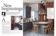
interior+ / Issue 2 / January 2018
A PUBLICATION FROM FURNISH INTERIOR DESIGN
A PUBLICATION FROM FURNISH INTERIOR DESIGN

You also want an ePaper? Increase the reach of your titles
YUMPU automatically turns print PDFs into web optimized ePapers that Google loves.
UP AND COMING COLOUR<br />
TRENDS FOR THE NEXT<br />
TWELVE MONTHS<br />
1<br />
2<br />
3<br />
It’s that time of the year again and the colour wheel is spinning.<br />
Where will we land in <strong>2018</strong>?<br />
Powder blues, pinks and subtle greens will<br />
make an appearance this season, drawing<br />
on a minimalist palette of pastels. Subtlety<br />
will be key, opening the way for calming<br />
environments that allow us to disconnect<br />
and recharge.<br />
In a stark contrast (don’t panic!), feature<br />
metallics as neutrals are going to be heavily<br />
used next year. Metallics have been popular<br />
for a long time now but they will take on a<br />
new form in <strong>2018</strong>. We predict that they will<br />
be seen at large scale or even on all four<br />
walls of a room. Scary you might think but<br />
watch this space for some interesting takes<br />
on the concept. Metal finishes aren’t going<br />
away. Copper and gold were big this year<br />
and we think they’ll remain in close second<br />
with polished bronze taking lead in the<br />
coming seasons.<br />
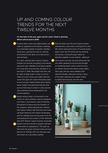
Nature always plays a strong part in the<br />
choice of colour palettes used by designers.<br />
Let’s face it, who doesn’t want to feel the<br />
enticement of nature and the freedom of<br />
the outdoors whilst enjoying the comforts<br />
that indoors offers? We think the next trend<br />
will draw influence from desert landscapes<br />
and hot climates and moving away from the<br />
oversized prints and colours of the rainforest<br />
that 2017 offered. Camel neutrals, terracotta<br />
browns and the warmth of eastern climates<br />
will all make an appearance. This said, we<br />
think that the green and blue tones we have<br />
become so friendly with over the past year<br />
will remain as a secondary palette.<br />
4<br />
5<br />
Pink will shine over the next twelve months<br />
and become a solo artist, coming into its own.<br />
We will be seeing the return of fuchsia bursts,<br />
baby tones and off-white with its warming<br />
personality running through subtly, all<br />
blended together in one scheme - delicious!<br />
Tech greens are also up and coming and we<br />
are rather pleased as we love the thought<br />
of combining these colours with the array<br />
of warmer neutrals the desert scape offers.<br />
Next year will see colour palettes that<br />
welcome fluidity. Starkness will be a thing<br />
of the past, allowing one organic shade<br />
to blend harmoniously into the next.<br />
2<br />
26 | <strong>interior+</strong>