interior+ / Issue 2 / January 2018
A PUBLICATION FROM FURNISH INTERIOR DESIGN
A PUBLICATION FROM FURNISH INTERIOR DESIGN

You also want an ePaper? Increase the reach of your titles
YUMPU automatically turns print PDFs into web optimized ePapers that Google loves.
interior<br />
A publication from<br />
Furnish Interior Design<br />
<strong>interior+</strong>, issue 2, january <strong>2018</strong><br />
<strong>interior+</strong> | 3
HELLO,<br />
WELCOME TO INTERIOR+<br />
#interiordesign<br />
#architecturaldesign<br />
#interiordesigninspiration<br />
#interiordesigntrends<br />
#moderninteriordesign<br />
#interiordesignideas<br />
2 | <strong>interior+</strong>
ABOUT<br />
Interior+ is a biannual publication by Furnish Interior<br />
Design, Cheltenham. It aims to guide you through<br />
the journey when hiring an interior designer.<br />
Through the various projects illustrated we have<br />
described how some of the key decisions were arrived<br />
at in discussion with our clients. We hope the images<br />
and words stimulate thinking and ideas, and show<br />
that you can create your own perfect space,<br />
with our professional help at your side.<br />
We have also outlined some of the processes involved<br />
throughout and highlighted some useful design tips.<br />
WHO<br />
EDITOR | Daniel Cook<br />
MANAGING EDITOR | Laura Styler<br />
DESIGNER | David Spencer<br />
COPYWRITER | Victoria Fergusson<br />
PHOTOGRAPHER | Adam Carter - www.adamcarterphoto.com<br />
Furnish Interior Design<br />
Royal House<br />
Parabola Road<br />
Cheltenham<br />
GL50 3AH<br />
01242 323828<br />
enquiries@furnishid.co.uk<br />
furnishid.co.uk<br />
@FurnishInteriorDesign<br />
@furnishstudios<br />
@furnishinterior<br />
@furnishinteriordesign<br />
Furnish Interior Design<br />
<strong>interior+</strong> | 3
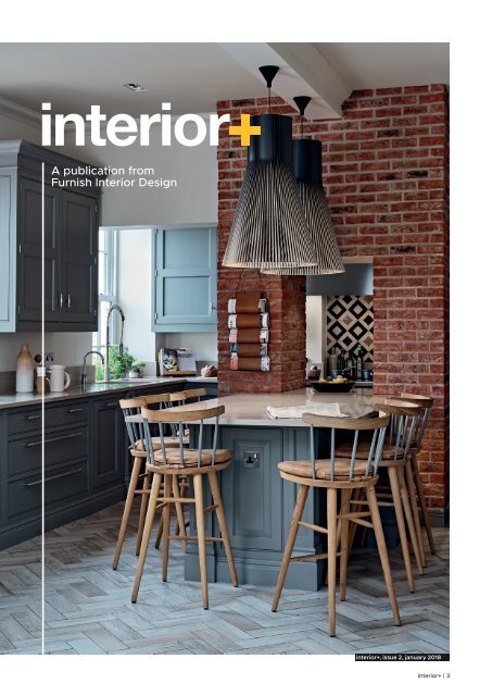
1<br />
TOM HOWLEY KITCHEN<br />
OVER, GLOUCESTERSHIRE<br />
A unique and functional kitchen mixing old world skills with industrial style and new world technology.<br />
The owners of this beautiful<br />
Victorian school house with lots<br />
of original detail wanted a new<br />
kitchen to both complement and<br />
challenge their period home. <br />
They are busy people who love<br />
to cook and entertain. Alex required<br />
a professional kitchen which also<br />
looked homely and Zoe wanted lots<br />
of warmth and space to entertain.<br />
The wall between the kitchen and<br />
the conservatory was removed<br />
(image 1) allowing more light to<br />
enter the space as well as improving<br />
the flow between the two rooms.<br />
The floor is an over-sized ceramic<br />
wood effect from MANDARIN<br />
STONE which was laid in a<br />
traditional herringbone pattern,<br />
creating a modern twist on parquet.<br />
All cabinetry is from TOM HOWLEY.<br />
By adding our own cornicing and<br />
industrial handles from BUSTER<br />
AND PUNCH and hand-painting<br />
in Mole’s Breath, it became a<br />
bespoke design.<br />
The dated and austere chimney<br />
breast cladding was removed<br />
and original Victorian brick slips<br />
sourced to lend an industrial effect.<br />
This also provided warmth whilst<br />
retaining the feel of the original<br />
fabric of the building.<br />
The lights and many of the<br />
dressings are made of natural<br />
materials, providing contrast<br />
with the steel appliances.<br />
Continuing our custom-made<br />
approach to the scheme, stools<br />
were adapted from the CHRIS<br />
ECKERSLEY Tottenham Court<br />
Mod Chair. Leather cushions were<br />
designed with a wooden toggle and<br />
the spindles were painted in Mole’s<br />
Breath to complete the look.<br />
4 | <strong>interior+</strong>
CLIENT<br />
Zoe<br />
// PROJECT<br />
19 Horseshoe Drive<br />
// STAGE<br />
Initial Theme<br />
// CLIENT<br />
Zoe<br />
// PROJECT<br />
19 Horseshoe Drive<br />
// STAGE<br />
Initial Theme<br />
// NOTES<br />
Kitchen design - mood board<br />
// NOTES<br />
Kitchen design - mood board<br />
// JOB NUMBER<br />
0316/08<br />
// VERSION<br />
01<br />
// DATE<br />
27/04/16<br />
// JOB NUMBER<br />
0316/08<br />
// VERSION<br />
01<br />
// DATE<br />
27/04/16<br />
HERRINGBONE OR CHEVRON CERAMIC -<br />
FACILITATES EXCELLENT HEAT TRANSFER.<br />
LOOKS DEFINED AND OF QUALITY,<br />
HAS HISTORY BUT IS MODERN<br />
// ADDRESS<br />
Royal House<br />
Parabola Road<br />
Cheltenham<br />
Gl50 3AH<br />
// ADDRESS<br />
Royal House<br />
Parabola Road<br />
Cheltenham<br />
Gl50 3AH<br />
// contact<br />
01242 323 828/07904 676 814<br />
daniel@furnishid.co.uk<br />
rob@furnishid.co.uk / marcus@furnishid.co.uk<br />
mike@furnishid.co.uk<br />
// contact<br />
01242 323 828/07904 676 814<br />
daniel@furnishid.co.uk<br />
rob@furnishid.co.uk / marcus@furnishid.co.uk<br />
mike@furnishid.co.uk<br />
INTERIOR DESIGN<br />
INTERIOR DESIGN<br />
2<br />
BARE BRICK -<br />
WARM BUT INDUSTRIAL.<br />
OPTIONS FOR LIGHTING<br />
rebecca@furnishid.co.uk<br />
david@furnishid.co.uk / tori@furnishid.co.uk<br />
TIMBER WORK TOP -<br />
PROVIDES WARMTH AND<br />
A SOFTER/QUIETER EXPERIENCE<br />
IN THE SOCIALISING AREA<br />
PROCESS | Our brief was traditional<br />
with a hint of modernity/industrial,<br />
whilst ensuring warmth.<br />
We proposed a variety of space plans<br />
but decided to keep the original layout,<br />
deeming it the optimum use of the space.<br />
Our preliminary process ensures that clients<br />
completely understand our ideas. Scheme<br />
Boards (images 2 & 3) and renders were<br />
presented as well as samples of flooring,<br />
CAESARSTONE MARBLE EFFECT -<br />
OFFSETS GREY BRILLIANTLY<br />
HERRINGBONE<br />
CERAMIC IN EITHER<br />
TIMBER OR SLATE<br />
bricks, handles, colours and ceramics.<br />
3<br />
rebecca@furnishid.co.uk<br />
david@furnishid.co.uk / tori@furnishid.co.uk<br />
TIP | Flooring finishes are a very<br />
effective way of defining different areas<br />
within a greater space. For example, the<br />
same design ceramic but in different colours<br />
can be used to distinguish between a dining<br />
room and kitchen in an open plan scheme.<br />
Alternatively, a greater sense of flow and<br />
space can be achieved by using one design<br />
across an entire area.<br />
<strong>interior+</strong> | 5
#bespokekitchendesign<br />
#brickslips<br />
#timbereffectceramic<br />
#kitchendressings<br />
#featurependants<br />
LIGHTS | A number of twin, adjustable commercial halogen spotlights were<br />
plastered into the ceiling to provide both an industrial feel and directional task lighting.<br />
The pendants are in a prominent position, centrally located. It was important for them to fill<br />
this high space and be of a distinctive design that fitted the brief – warm with industrial hints.<br />
These are an original design by SECTO, called the Magnum 4202.<br />
6 | <strong>interior+</strong>
HANDLES | The ‘T-bar’ and ‘pull bar’ handles by Buster and Punch chosen<br />
for the cabinetry gave this kitchen the unique and bespoke design required. The physical feel and<br />
sense (or experience) of products is just as important to us as their aesthetic and these beautiful<br />
pieces of hardware live up to expectation. They are heavy, solid and fine quality with every detail<br />
highly considered. The steel finish was chosen to tie in with the appliances and extraction hood.<br />
<strong>interior+</strong> | 7
“Very impressed by the whole ambience.<br />
A lovely transformation.”<br />
#commercialinteriordesign<br />
#architecturaldesign<br />
#publicspaceinteriordesign<br />
#locallysourced<br />
#functionalinteriors<br />
8 | <strong>interior+</strong>
THE BARREL STORE,<br />
YHA, CIRENCESTER<br />
“This boutique hostel offers a rare budget accommodation option on<br />
the edge of the Cotswolds. The hostel occupies a former 19th-century<br />
brewery barrel store which has been beautifully restored and renovated<br />
with environmental, eco-friendly standards. It’s clean, comfortable and in<br />
an excellent central location.” Caroline Mills -<br />
New Brewery Arts and Furnish<br />
Interior Design transformed the<br />
under-utilised and decrepit Niccol<br />
Building into The Barrel Store –<br />
residential accommodation for<br />
schools and groups, families<br />
and individuals.<br />
“The hostel has been finished<br />
with local, handcrafted furnishings<br />
- the communal entrance area,<br />
for example, displays a focal oakfaced<br />
staircase.” Caroline Mills -<br />
The Daily Telegraph<br />
The Barrel Store welcomes new<br />
visitors to Cirencester, fulfilling<br />
the need to provide affordable<br />
accommodation in the greater<br />
area and benefiting the town.<br />
At the same time The Barrel Store<br />
provides for more people than<br />
before to take part in activities<br />
at New Brewery Arts.<br />
Since its renovation the building<br />
is reputed to be the first public<br />
Passivhaus (low carbon) in<br />
Gloucestershire and one of a<br />
handful in the UK, with many<br />
environmental credentials.<br />
<strong>interior+</strong> | 9
1<br />
This project was incredibly involved.<br />
Furnish had responsibility for many<br />
different areas including provision of<br />
space planning, interior design and<br />
source, as well as the design and<br />
fabrication of bespoke elements.<br />
The design of the staircase was a<br />
pleasure to produce.<br />
The building was once a cooper’s<br />
factory where barrels were made<br />
and stored. We decided on a spiral<br />
staircase taking inspiration from a<br />
classic barrel. The structure features<br />
horizontal cladding aping a barrel’s<br />
construction, made from oak and<br />
clad in cedar. A black iron handrail<br />
indicative of the barrel’s hoops<br />
was expertly shaped on site by<br />
a local blacksmith.<br />
“A unique crafted oak ‘barrel’ stair well<br />
leads down to the residents’ room”<br />
10 | <strong>interior+</strong>
“Rooms are basic but exceptionally<br />
clean with bespoke metal-framed<br />
beds and linoleum floors. Bed linen,<br />
including wonderful, high quality<br />
Cotswold-made throws<br />
are provided.” Caroline Mills -<br />
The Daily Telegraph<br />
The throws were sourced from<br />
the amazing Cotswold Woollen<br />
Weavers, picked in 2 colour-ways<br />
to reflect the rooms. The chairs<br />
are an original design by CHRIS<br />
ECKERSLEY and the fabric for the<br />
curtains is a design by local creative<br />
VANESSA ARBUTHNOTT; all in<br />
keeping with a desire to find locally<br />
sourced materials and crafts.<br />
PROCESS | A requirement of this project<br />
was for the beds to feel unique to the<br />
building. New Brewery Arts wanted<br />
something that felt intrinsic, possibly<br />
even produced internally.<br />
We identified that all the available<br />
standard bunk and bed designs were<br />
made from round metal, powder coated<br />
tubes which to us looked and felt dated<br />
and cheap. We designed the beds<br />
(image 1) with integral USB charging and<br />
lights and sourced production in mild steel<br />
rectangular tube. We left the tube bare<br />
and had it matt coated for protection<br />
and a finished feel.<br />
<strong>interior+</strong> | 11
PROJECTED INTERIOR DESIGN<br />
TRENDS FOR <strong>2018</strong><br />
We’re excited to delve into what might be in our clients’ homes next year.<br />
Read on to discover what we’ll be watching in <strong>2018</strong> for our inspiration and direction.<br />
1<br />
Whether you reside in a city apartment,<br />
own a beach hut retreat, live it up in a manor<br />
house in the Cotswolds or chill out in a ‘60s<br />
bungalow in Lands End, home is where the<br />
heart is. Elements of our homes’ interiors<br />
quite often showcase our lifestyles and<br />
capture our aspirations; extensions to our<br />
personalities, desires and dreams.<br />
So with 2017 nearing an end, the team at<br />
Furnish are looking towards the trends and<br />
styles projected for <strong>2018</strong>.<br />
TEXTURE - This is going to play a big<br />
role in next season’s Interior Design. Large<br />
contemporary woven metallic weaves, jumbo<br />
knits coupled with embossed surfaces and<br />
3-dimensional wall finishes will make headway.<br />
Overlay, overlay and more overlay is where<br />
interior finishes are heading for <strong>2018</strong>.<br />
Ostentation is out and understated elegance<br />
is in. Eclecticism took centre stage in previous<br />
years but <strong>2018</strong> will see the resurgence of<br />
a more structured design practice with<br />
movement away from the decorative.<br />
There will be progression towards highly<br />
functional design that facilitates great<br />
storage ideas for possessions in smaller<br />
spaces allowing for greater mindfulness.<br />
More and more, our homes are becoming<br />
places of sanctuary away from the<br />
fast-paced, social-media filled lifestyles<br />
most of us have adopted. With the increase<br />
in working hours, there has never been a<br />
better time for an Interior Design that enables<br />
relaxation and time to switch off and dream.<br />
COLOUR PALETTES INSPIRED BY TRAVEL<br />
Social media over the past few years has also<br />
opened our minds to a whole other world,<br />
to destinations we could perhaps only have<br />
2<br />
3<br />
dreamed of seeing in the past. We can<br />
now be sitting in an office in Barnsley looking<br />
at high-resolution photography of dream<br />
destinations at the click of a button, all<br />
without leaving our desks. This is proving to<br />
have a significant effect on the colours and<br />
patterns the design world is drawing on.<br />
<strong>2018</strong> will see palettes inspired by the organic<br />
deserts of the Sahara, architectural render<br />
colours of tropical destinations, the blues<br />
and greens found in the oceans. Holidays<br />
and travelling are becoming more precious<br />
to us when we do get the chance to take<br />
some time out so why not have reminders of<br />
these switch off moments around our homes?<br />
Momentos, cultural keepsakes and prints<br />
from around the world will all feature in the<br />
desirable interiors of the future.<br />
DECORATIVE FIREPLACES - With the<br />
cost of energy rising we have seen a huge<br />
return to the open fireplace and wood<br />
burners. Next year’s fireplace design will<br />
connect to the warmth and tradition that<br />
real fire offers coupled with decorative oldfashioned<br />
surrounds that take on a more<br />
contemporary personality. Finished in matt<br />
paints and block colours they will serve as<br />
contemporary reminders of the past.<br />
BLACK IS BACK - 2017 saw huge popularity<br />
for the dark accent colours of blues and<br />
greys acting as a backdrop to secondary<br />
bursts of colours. Our clients particularly<br />
favoured navy blue for their wall colours<br />
this year and we loved the results.<br />
This look won’t be going away in <strong>2018</strong> but<br />
instead will be taken to another other level<br />
with the introduction of black. Entirely black<br />
rooms will juxtapose metallics, in particular<br />
polished brass.<br />
12 | <strong>interior+</strong>
4<br />
MARBLE’S NOT ROLLING AWAY! - Carrara marble<br />
took the interior design industry by storm back in<br />
2016 and remained in 2017. We are pleased to<br />
hear it’s not going anywhere.<br />
We will be seeing marbling with broader colour<br />
and patterns next year, especially picking up on<br />
camel browns and powder pinks and blues.<br />
We can’t wait!<br />
1 2<br />
3 4<br />
<strong>interior+</strong> | 13
A STYLISH, PRETTY AND UNIQUE<br />
NURSERY, THE COTSWOLDS<br />
Nurseries and Children’s Bedrooms<br />
are always a joy to design. They<br />
really speak to our creative passion,<br />
providing a blank canvas to be<br />
spontaneous and fun.<br />
With the imminent arrival of a first<br />
baby, Sam and Lucy wanted a very<br />
special and feminine nursery for their<br />
little girl. The brief was simple: create a<br />
scheme that was warm and individual<br />
14 | <strong>interior+</strong>
with the ability to grow with their baby into childhood.<br />
The palette consists of blue-greys, pinks, and gold.<br />
The baby’s wardrobe and toy collection was already<br />
large and due to expand in the future; storage needed<br />
to be a primary consideration.<br />
<strong>interior+</strong> | 15
Lucy did not want “just a suite<br />
of furniture”. Her brief was for<br />
everything to feel connected whilst<br />
retaining a feeling of individuality.<br />
This was a great chance to really<br />
push the boundaries with colour and<br />
texture. Through discussion and the<br />
use of style and content Scheme<br />
Boards, we gained a full understanding<br />
of what Lucy wanted to achieve.<br />
This was followed by the development<br />
and sourcing phase of the design.<br />
#stylishnurserydesign<br />
#origamipaperpendants<br />
#ercolrockingchair<br />
Space planning and Mechanical and<br />
Electrical (M+E) plans were created<br />
to ensure best placement of the<br />
furniture and disbursement of ambient<br />
lighting at varying levels. The lighting<br />
was extremely important to get right<br />
as this room would facilitate multiple<br />
activities such as bedtime, nappy<br />
changing, playtime and the morning<br />
routine, all requiring differing light fall.<br />
The origami lamp shades from Sweden<br />
are made from card. Old bobbins were<br />
attached to the ceiling to create two<br />
bespoke light clusters and this origami<br />
theme followed through into other<br />
areas of the design, inspiring lamps<br />
and patterns.<br />
All the furniture and soft furnishings<br />
were sourced from separate suppliers<br />
to achieve the eclectic look Lucy<br />
wanted. The chest of drawers by<br />
OLIVER BONAS and the wardrobes<br />
by MAISON DU MONDE strengthen<br />
the ethnic style she loves.<br />
The fantastic curtain fabric is by<br />
MATTHEW WILLIAMSON, providing a<br />
burst of colour and a young fresh feel<br />
to the room. They are blackout lined<br />
and paired with roller blinds to assist<br />
a peaceful night’s sleep for both the<br />
baby and mum and dad!<br />
16 | <strong>interior+</strong>
The walls and ceiling, painted in shades<br />
of blue-grey and blush pink from FIRED<br />
EARTH add an element of softness and<br />
relate to the colours on the inside of<br />
the wall boxes and lampshades.<br />
Carpet was sourced from our partner,<br />
DESIGN FLOORING CIRENCESTER for<br />
its easy clean quality and soft nature to<br />
ensure falls are softly cushioned whilst<br />
those first steps are taken!<br />
WALL BOXES | These bespoke wall box shelves were designed by Furnish and made by Alan at<br />
STYLER WOODWORK. Constructed from plywood, the beautiful layering detail is used as part of the<br />
design. The coloured back panels are detachable to ensure that they can be easily re-painted in the<br />
future and the brackets are concealed, allowing them to float.<br />
For more information on creative bespoke joinery, please email us direct: enquiries@furnishid.co.uk<br />
<strong>interior+</strong> | 17
18 | <strong>interior+</strong>
PROCESS | After working with a client for a while any good interior designer will gain<br />
an understanding of your requirements and in turn, you’ll learn to trust your designer’s<br />
professional judgement. It’s a great situation to be in and Scheme Boards can become<br />
more general, proposing an overall feel instead of focussing on every detail.<br />
<strong>interior+</strong> | 19
GUEST ROOM/<br />
TWIN ROOM<br />
A requirement for a bedroom to<br />
be both a guest room on occasion<br />
as well as a bedroom for<br />
teenage daughters.<br />
20 | <strong>interior+</strong>
<strong>interior+</strong> | 21
A client’s brief to design a spare<br />
bedroom for a Regency apartment<br />
in Cheltenham.<br />
#boldcolourschemes<br />
#blushpinkbedroom<br />
#ziplinkbeds<br />
#bedroomfeaturewall<br />
Richard and Caroline wanted to<br />
achieve a contemporary but edgy<br />
bedroom with a feminine undertone -<br />
a challenging but exciting dual<br />
purpose space.<br />
It had to present as a bedroom<br />
with two single beds for the client’s<br />
teenage daughters, whilst additionally<br />
providing a room to sleep guests in a<br />
super-king bed.<br />
The concept for the design stemmed<br />
from the ornate detail of the original<br />
cornicing. Conscious to enhance the<br />
architecture and tie in the old with the<br />
new, period ceiling roses were selected<br />
for mounting on the wall. This created<br />
a stunning focal feature and provided<br />
three-dimensional texture which helped<br />
the smaller proportions of the room.<br />
The colour scheme of greys,<br />
gentle pinks and blue provides both<br />
masculine and femine cues. The plain<br />
natural linen bedding (from ADA &<br />
INA) and blush pink curtains accent<br />
the scheme and allow the wall and<br />
headboard to sing.<br />
The bespoke headboard was designed<br />
specifically for this project. It’s made<br />
from grey felt suspended on an oak<br />
dowel which was stained to match<br />
the chest of drawers. It also features<br />
leather straps and brass studs allowing<br />
it to hang on the wall. It’s a specific<br />
length to work with the zip and link<br />
divan beds from FEATHER AND BLACK<br />
so that when they are separated,<br />
it fills the total width.<br />
Original artwork by CHRIS STONEMAN<br />
from Rise Art set the tone for the<br />
modern geometric shapes that<br />
appear within the chest of drawers<br />
by SWOON, as well as the accessories.<br />
CURTAINS | This pair of pinch pleat headed curtains hang elegantly,<br />
framing the architecture of the original Georgian window.<br />
Blackout lining ensures an uninterrupted night’s sleep in<br />
the city for Richard and Caroline’s children and their guests.<br />
TIP | It’s incredibly important to select the<br />
correct fabrics for window treatments.<br />
You should consider whether a fabric<br />
is appropriate for exposure to light,<br />
its durability and weight to<br />
ensure it hangs correctly.<br />
22 | <strong>interior+</strong>
<strong>interior+</strong> | 23
24 | <strong>interior+</strong>
TIP | Paint samples on lining paper. This allows you to see the colour in a<br />
large format without creating a mess on the existing walls. It also ensures the<br />
colour can be positioned in various areas of the room or even throughout<br />
the building to check it works with varying light sources.<br />
CEILING ROSES | Ceiling Centres or plaster Ceiling Roses were originally installed to<br />
protect the ceiling from the heat and charring caused by candle or gas lighting.<br />
This way the owner of the property had only to re-decorate the plaster<br />
Centre Piece as opposed to the entire ceiling, saving time and effort.<br />
<strong>interior+</strong> | 25
UP AND COMING COLOUR<br />
TRENDS FOR THE NEXT<br />
TWELVE MONTHS<br />
1<br />
2<br />
3<br />
It’s that time of the year again and the colour wheel is spinning.<br />
Where will we land in <strong>2018</strong>?<br />
Powder blues, pinks and subtle greens will<br />
make an appearance this season, drawing<br />
on a minimalist palette of pastels. Subtlety<br />
will be key, opening the way for calming<br />
environments that allow us to disconnect<br />
and recharge.<br />
In a stark contrast (don’t panic!), feature<br />
metallics as neutrals are going to be heavily<br />
used next year. Metallics have been popular<br />
for a long time now but they will take on a<br />
new form in <strong>2018</strong>. We predict that they will<br />
be seen at large scale or even on all four<br />
walls of a room. Scary you might think but<br />
watch this space for some interesting takes<br />
on the concept. Metal finishes aren’t going<br />
away. Copper and gold were big this year<br />
and we think they’ll remain in close second<br />
with polished bronze taking lead in the<br />
coming seasons.<br />
Nature always plays a strong part in the<br />
choice of colour palettes used by designers.<br />
Let’s face it, who doesn’t want to feel the<br />
enticement of nature and the freedom of<br />
the outdoors whilst enjoying the comforts<br />
that indoors offers? We think the next trend<br />
will draw influence from desert landscapes<br />
and hot climates and moving away from the<br />
oversized prints and colours of the rainforest<br />
that 2017 offered. Camel neutrals, terracotta<br />
browns and the warmth of eastern climates<br />
will all make an appearance. This said, we<br />
think that the green and blue tones we have<br />
become so friendly with over the past year<br />
will remain as a secondary palette.<br />
4<br />
5<br />
Pink will shine over the next twelve months<br />
and become a solo artist, coming into its own.<br />
We will be seeing the return of fuchsia bursts,<br />
baby tones and off-white with its warming<br />
personality running through subtly, all<br />
blended together in one scheme - delicious!<br />
Tech greens are also up and coming and we<br />
are rather pleased as we love the thought<br />
of combining these colours with the array<br />
of warmer neutrals the desert scape offers.<br />
Next year will see colour palettes that<br />
welcome fluidity. Starkness will be a thing<br />
of the past, allowing one organic shade<br />
to blend harmoniously into the next.<br />
2<br />
26 | <strong>interior+</strong>
1<br />
5<br />
3 4<br />
<strong>interior+</strong> | 27
GEORGIAN APARTMENT,<br />
CHELTENHAM<br />
#mirandacarter<br />
#largeceilingpendant<br />
#abstractcushions<br />
#fireplacestyling<br />
28 | <strong>interior+</strong>
TIP | Ground a very tall ceiling. You can create a more defined and intimate space by painting<br />
the lower proportion of a room a darker colour. Dado rails provide a natural break<br />
but it’s not essential. Aim for one quarter of any height, a hard line between<br />
colours has just as much impact and is a modern adaption.<br />
ART | These large 120cm x 120cm pieces of art work were commissioned from artist Miranda Carter<br />
to work with the colours and textures of the room. They are made up of multiple layers of pigment,<br />
ink and drawn lines. Blending rich raw colour with soft diffusing washes. Abstract art can<br />
create a greater level of depth to a room, providing subtle shifts in<br />
view without the constraints of a figurative piece.<br />
<strong>interior+</strong> | 29
Interior design is an extremely<br />
collaborative process. Any design<br />
company you’re thinking of using<br />
will want to get to know you and<br />
require your input extensively.<br />
The owners of this stunning<br />
Georgian apartment in Cheltenham<br />
are based in Bermuda. Therefore,<br />
the majority of the communication<br />
around design and budgeting had<br />
to be done via Skpe calls and email.<br />
The use of detailed and exacting<br />
mood boards, material swatches<br />
and technical plans shared and<br />
discussed can help you and your<br />
designer reach an understanding<br />
whatever the distance. Considered<br />
feedback is essential and allows a<br />
designer to clearly determine and<br />
successfully achieve the look and<br />
feel you desire. The client’s request<br />
was a scheme that would be both<br />
luxurious, rich and calming but also<br />
wanted modernity and edge.<br />
The scheme was a delight<br />
to produce. The apartment’s<br />
architectural details presented<br />
the perfect backdrop to modern<br />
furnishings and dynamic patterns.<br />
The tall ceilings, room proportions<br />
and original features such as the<br />
fireplace and decorative hand<br />
crafted coving all helped to provide<br />
a rich and considered juxtaposition.<br />
These are elements that needed<br />
to be celebrated and ultimately<br />
work within the design.<br />
Alex and Antonia had a desire<br />
to create a total space with a<br />
connection between each room<br />
and environment. They also wanted<br />
visual and sensual differences to<br />
create individuality and a sense<br />
of intrigue whilst moving through<br />
the greater space.<br />
The colour scheme in the reception<br />
sets the scene for the rest of the<br />
apartment where the punches of<br />
colour and geometric shapes can<br />
be seen throughout.<br />
Earthy grey tones for the walls<br />
were inspired by those that exist<br />
in the marble fireplace.<br />
The neutral walls and organic<br />
nature of the sisal carpet helped<br />
to set a calming backdrop. As a<br />
direct contrast bursts of blues,<br />
mustard yellows and magenta<br />
showcase as signature colours<br />
in the sofa, rug, cushions and<br />
accessories throughout.<br />
Calm and softness in the living<br />
space is juxtaposed by the<br />
monotone, angular dining and<br />
kitchen area with its geometric<br />
table, chairs and floor lamp.<br />
The Saba New York sofa sitting<br />
in front of the black sculptural<br />
character of the TOM FAULKNER<br />
furniture in the dining area adds<br />
the perfect injection of beautiful<br />
mustard yellow.<br />
Artwork by MIRANDA CARTER<br />
was commissioned especially to<br />
subtly pick up on the ochre tones<br />
and to add gentle blues, reflected<br />
in the cushions by JESSICA ZOOB<br />
and rug by RIVIERE RUGS.<br />
A huge bespoke antique mirror<br />
rests on the fireplace allowing<br />
the details of the ceiling and<br />
large-scale gliding pendant light<br />
by MARTIN HUXFORD to be<br />
bounced back into the room.<br />
mirandacarter.com<br />
30 | <strong>interior+</strong>
CROCKERY | It is important for us to source products of the<br />
highest quality whilst also finding pieces that are unique.<br />
Deborah from FEBBIE DAY CERAMICS makes individual pieces<br />
in her studio in East Yorkshire and we are huge fans!<br />
The lightweight hand crafted porcelain rests<br />
delicately on the heavy dining table.<br />
<strong>interior+</strong> | 31
interior<br />
Furnish Interior Design was founded with the<br />
inherent belief that interior design should be<br />
accessible to everyone.<br />
We design for residential and commercial spaces<br />
throughout The Cotswolds, London and beyond.<br />
Furnish Interior Design<br />
Royal House<br />
Parabola Road<br />
Cheltenham<br />
GL50 3AH<br />
01242 323828<br />
enquiries@furnishid.co.uk<br />
furnishid.co.uk<br />
@FurnishInteriorDesign<br />
@furnishstudios<br />
@furnishinterior<br />
@furnishinteriordesign<br />
Furnish Interior Design<br />
32 | <strong>interior+</strong>