Illinois College of Nursing Corporate Style Guide

You also want an ePaper? Increase the reach of your titles
YUMPU automatically turns print PDFs into web optimized ePapers that Google loves.
ILLINOIS COLLEGE OF NURSING<br />
WE WANT TO LOOK GOOD ALL THE TIME,<br />
So take time to consider how to apply our logo.<br />
We don’t want to come across<br />
all doom and gloom, but there<br />
is a right way and a wrong<br />
way to present our logo.<br />
01<br />
03<br />
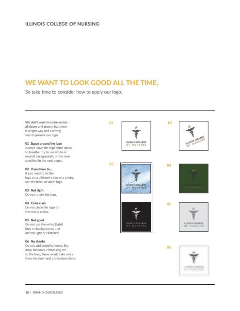
01 Space around the logo<br />
Always leave the logo some space<br />
to breathe. Try to use white or<br />
neutral backgrounds, or the ones<br />
specified in the next pages.<br />
02 If you have to...<br />
If you need to sit the<br />
logo on a different color or a photo,<br />
use the black or white logo.<br />
02<br />
04<br />
03 Not right<br />
Do not rotate the logo.<br />
04 Color clash<br />
Do not place the logo on<br />
the wrong colors.<br />
05<br />
05 Not good<br />
Do not use the white (light)<br />
logo on backgrounds that<br />
are too light or cluttered.<br />
06 No thanks<br />
Do not add embellishments like<br />
drop-shadows, embossing etc.<br />
to the logo, these would take away<br />
from the clean and pr<strong>of</strong>essional look.<br />
06<br />
10 | BRAND GUIDELINES