Illinois College of Nursing Corporate Style Guide

Create successful ePaper yourself
Turn your PDF publications into a flip-book with our unique Google optimized e-Paper software.
ILLINOIS COLLEGE OF NURSING<br />
OUR LOGO IS VERY PRECIOUS TO US.<br />
We took our time developing our brand so please be nice to it.<br />
RATIONALE<br />
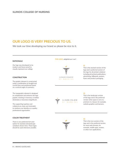
THE LOGO, delightful am I not?<br />
Our logo was developed to be<br />
modern and future-pro<strong>of</strong> to<br />
visually represent our college.<br />
CONSTRUCTION<br />
The graphic element is constructed<br />
using a combination <strong>of</strong> straight and<br />
curved lines and positioned based<br />
on a vertical angle <strong>of</strong> symmetry.<br />
01<br />
This is the stacked version <strong>of</strong> the<br />
logo and is preferred version <strong>of</strong><br />
the logo for all printed collateral<br />
including all printed publications,<br />
advertising, billboards, posters,<br />
flyers and product packaging.<br />
The typographic element is designed<br />
to complement and enhance the logo<br />
graphic. Existing in harmony, it neither<br />
dominates or becomes insignificant.<br />
The supporting typeface and<br />
collateral are clean and minimalist<br />
to reinforce our identity as a quality,<br />
pr<strong>of</strong>essional organization.<br />
02<br />
This is the landscape version<br />
<strong>of</strong> the logo and is the preferred<br />
version when space is not at a<br />
premium in a layout, for example,<br />
website graphics and banners.<br />
COLOR TREATMENT<br />
There is one preferred full-color<br />
option for stacked and landscape<br />
variations shown here. These logos<br />
should be used whenever possible.<br />
03<br />
This is the icon version <strong>of</strong> the<br />
logo and is the preferred version<br />
for most web formats, for<br />
example, mobile apps, avatars,<br />
or other icon applications.<br />
8 | BRAND GUIDELINES