LoveEast.46

Create successful ePaper yourself
Turn your PDF publications into a flip-book with our unique Google optimized e-Paper software.
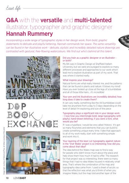
East life<br />
Q&A with the versatile and multi-talented<br />
illustrator, typographer and graphic designer<br />
Hannah Rummery<br />
Incorporating a wide range of typographic styles in her design work, from bold, graphic<br />
statements to delicate and playful lettering, Hannah commands her space. The same versatility<br />
can be found in her illustrative work - delicate, stylistic and incredibly detailed nature drawings are<br />
contrasted with gestural, free-flowing watercolours. We find out who's behind all this talent.<br />
Image right: courtesy of Dalziel and Pow; all others courtesy of the artist<br />
10 LOVEEAST<br />
Did you train as a graphic designer or an illustrator -<br />
or both?<br />
My BA was in Graphic Design at Sheffield Hallam<br />
University, but we were encouraged to explore so many<br />
different processes and approaches to our work which<br />
lead me to explore illustration as part of my work. That<br />
was where it started really.<br />
What inspires your drawings?<br />
Natural forms are what really interest me, and the patterns<br />
that can be found in plants and nature. It blows my mind!<br />
Have you ever looked up close at the legs of a bumblebee<br />
and all of those little hairs....it's incredible!<br />
Your pen and ink illustrations are incredibly detailed; how<br />
long does it take to create them?<br />
It can vary really, something like the A4 bumblebee could<br />
take me anywhere from a day to 3 days depending on the<br />
level of detail I'm exploring and size of the piece<br />
Typography plays a significant role in your design work<br />
- I love how you intermingle bold, large typography with<br />
playful, hand-drawn lettering; if you were a font, what<br />
would you be?<br />
If I was a typeface, I would be one called 'History'. It's got<br />
so many flourishes and elements that you can build to<br />
create something unique every time. I take that approach<br />
to all of my work really, start with something simple<br />
and work into it.<br />
Your layering of the laser cut typography against nature<br />
in the 'Visit Wales' project is so interesting; how did you<br />
come about that idea?<br />
The idea behind the Wales map was to find a way<br />
for people who didn't know much about the place and<br />
help show them how much it had to offer. The research<br />
for that project was so interesting, there were so many<br />
things that I had no idea Wales housed in relatively small<br />
area. That's where the combination of the map and<br />
typography idea came from. I used a sheet of acrylic so<br />
that the reflection was what you'd think of when you<br />
imagine Wales, but the map told another layer of the