NZPhotographer Issue 23, September 2019
As of December 2022, NZPhotographer magazine is only available when you purchase an annual or monthly subscription via the NZP website. Find out more: www.nzphotographer.nz
As of December 2022, NZPhotographer magazine is only available when you purchase an annual or monthly subscription via the NZP website. Find out more: www.nzphotographer.nz

Create successful ePaper yourself
Turn your PDF publications into a flip-book with our unique Google optimized e-Paper software.
EXPOSURE<br />
This has to be in accordance with the message of the<br />
photo; it should compliment your imagination and<br />
intention for the shoot. Ask yourself Did I adopt the best<br />
exposure or lighting for this photo? Does the lighting or<br />
exposure compliment the context of this photo?<br />
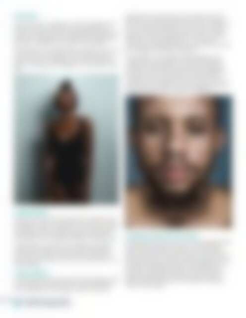
For example, in the image below, the idea of the photo<br />
shoot was to lay emphasis on the model’s skin and<br />
body structure so I needed to use a moderately harsh<br />
light to create specular highlights on the model’s dark<br />
skin.<br />
apportioning enough space to the main elements in<br />
the picture, it is about allowing the viewer to capture<br />
the most important element in the picture at a glance.<br />
This can be done through the use of colour, (using a<br />
particular colour for that element to ensure it catches<br />
attention), focusing, lightning etc. It can also be<br />
achieved by intensifying the artistic element that drives<br />
the message for example, the texture.<br />
An example of visual weight misappropriation is an<br />
image that has the subject in front while putting the<br />
complementary element at the back but adjusting<br />
the focus so that that the element in the background<br />
is sharper than the main subject. The element that<br />
catches the most attention in the picture has the most<br />
visual weight so make sure you know where the visual<br />
weight is, and should be, if there’s a difference.<br />
COMPOSITION<br />
This has to do with how the elements in the photo are<br />
arranged in order of importance or in sequence. There<br />
could be as many as 5 elements or more. Ask yourself<br />
the questions; Did I properly arrange the elements?<br />
Did I make the most important element conspicuous?<br />
For example, in a photo that has elements that look<br />
similar on both sides, using a symmetry composition<br />
(so that when split into two halves the elements on<br />
both sides are similar) can be very accurate like in the<br />
picture below.<br />
VISUAL WEIGHT<br />
Another thing that falls under technical judgment is the<br />
visual weight of the photo which is often overlooked<br />
and underrated. Visual weight is about more than<br />
SHARPNESS AND DEPTH OF FIELD<br />
It is important to review if you have used the right depth<br />
of field for the image. For instance, in a landscape<br />
photo where there are mountains and several other<br />
natural elements, if the photo is taken so that just a few<br />
elements are sharp versus having every element sharp<br />
by using a wide depth of field, it would defeat the<br />
purpose of that particular photo. On the other hand,<br />
newborn photography essentially requires shallow<br />
depth of field to be used so as to express the tender<br />
nature of the subject.<br />
56 <strong>NZPhotographer</strong>