
Create successful ePaper yourself
Turn your PDF publications into a flip-book with our unique Google optimized e-Paper software.
A conversation with<br />
Carla Bianchet<br />
11<br />
EN<br />
EN<br />
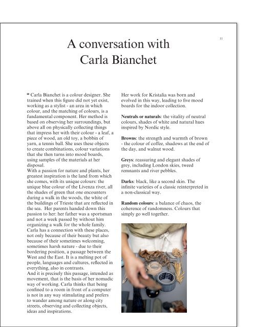
Carla Bianchet is a colour designer. She<br />
trained when this figure did not yet exist,<br />
working as a stylist - an area in which<br />
colour, and the matching of colours, is a<br />
fundamental component. Her method is<br />
based on observing her surroundings, but<br />
above all on physically collecting things<br />
that impress her with their colour - a leaf, a<br />
piece of wood, an old toy, a bobbin of<br />
yarn, a tennis ball. She uses these objects<br />
to create combinations, colour variations<br />
that she then turns into mood boards,<br />
using samples of the materials at her<br />
disposal.<br />
With a passion for nature and plants, her<br />
greatest inspiration is the land from which<br />
she comes, with its unique colours: the<br />
unique blue colour of the Livenza river, all<br />
the shades of green that one encounters<br />
during a walk in the woods, the white of<br />
the buildings of Trieste that are reflected in<br />
the sea. Her parents handed down this<br />
passion to her: her father was a sportsman<br />
and not a week passed by without him<br />
organizing a walk for the whole family.<br />
Carla has a connection with these places,<br />
not only because of their beauty but also<br />
because of their sometimes welcoming,<br />
sometimes harsh nature - due to their<br />
bordering position, a passage between the<br />
West and the East. It is a melting pot of<br />
people, languages and cultures, reflected in<br />
everything, also in contrasts.<br />
And it it is precisely this passage, intended as<br />
movement, that is the basis of her nomadic<br />
way of working. Carla thinks that being<br />
confined to a room in front of a computer<br />
is not in any way stimulating and prefers<br />
to wander among nature or along city<br />
streets, observing and collecting objects,<br />
ideas and inspirations.<br />
Her work for Kristalia was born and<br />
evolved in this way, leading to five mood<br />
boards for the indoor collection.<br />
Neutrals or naturals: the vitality of neutral<br />
colours, shades of white and natural hues<br />
inspired by Nordic style.<br />
Browns: the strength and warmth of brown<br />
- the colour of coffee, shadows at the end of<br />
the day, and walnut wood.<br />
Greys: reassuring and elegant shades of<br />
grey, including London skies, tweed<br />
remnants and river pebbles.<br />
Darks: black, like a second skin. The<br />
infinite varieties of a classic reinterpreted in<br />
a non-classical way.<br />
Random colours: a balance of chaos, the<br />
coherence of randomness. Colours that<br />
simply go well together.