The Communications of the TEX Users Group Volume 27 ... - TUG
The Communications of the TEX Users Group Volume 27 ... - TUG
The Communications of the TEX Users Group Volume 27 ... - TUG
You also want an ePaper? Increase the reach of your titles
YUMPU automatically turns print PDFs into web optimized ePapers that Google loves.
Would Aldus Manutius have used TE TE X X?<br />
ANDRÁS VIRÁGVÖLGYI<br />
hi� orian, designer<br />
www.sequens.hu<br />
ABSTRACT<br />
Traditional Typography · Golden Mean · Linear Reading · � e Siege <strong>of</strong> Con� antinople ·<br />
Aldus Manutius · His Ambitious Publishing Program · � e Mo� Beautiful Book <strong>of</strong> <strong>the</strong> World<br />
· Fe� ina Lente · Would Aldus have used TE TE X X?<br />
It might be <strong>of</strong> intere� to <strong>the</strong> participants attending <strong>the</strong><br />
16�� EuroTE T X conference to<br />
hear about <strong>the</strong> golden age <strong>of</strong><br />
traditional typography in <strong>the</strong> 16�� century and get to know<br />
one <strong>of</strong> <strong>the</strong> mo� famous book publishers <strong>of</strong> all times, Aldus<br />
Manu tius <strong>of</strong> Venice.<br />
� e word typography is a compound <strong>of</strong> Greek elements.<br />
Typos means engraved illu� ration and grapho means to<br />
write.¹ Scrivere sine penne (to write without a pen), as <strong>the</strong>y<br />
called it in <strong>the</strong> 16�� century. century Typography uses predefi ned<br />
shapes, letters, texts and sometimes illu� rations as well.<br />
As fi nal output it creates <strong>the</strong> printed page, which represents<br />
ano<strong>the</strong>r level <strong>of</strong> visual quality. After <strong>the</strong> new types <strong>of</strong><br />
books <strong>of</strong> <strong>the</strong> 16�� century left behind <strong>the</strong> poor readability<br />
and ponderousness <strong>of</strong> old codices, typographers, who at<br />
<strong>the</strong> time were <strong>the</strong> printers <strong>the</strong>mselves, followed <strong>the</strong> rules <strong>of</strong><br />
<strong>the</strong> retro� e� ively labeled “traditional “ typography”. It was<br />
a combined outcome <strong>of</strong> Renaissance modern � yle and <strong>the</strong><br />
la� ing e� e� <strong>of</strong> medieval lettering. “Traditional typography”<br />
determined <strong>the</strong> encounters <strong>of</strong> many generations with letters<br />
and enjoyed a consciously or unconsciously accepted<br />
� atus in <strong>the</strong> eyes <strong>of</strong> readers throughout <strong>the</strong> centuries.²<br />
According to <strong>the</strong> traditional � yle <strong>the</strong> design <strong>of</strong> books � arts<br />
with choosing <strong>the</strong> right proportions for page margins. Setting<br />
<strong>the</strong> inside, outside, top and bottom margins will give<br />
us <strong>the</strong> type area. � e height, width and carefully chosen<br />
position <strong>of</strong> <strong>the</strong> type area infl uences overall proportions and<br />
balance <strong>of</strong> <strong>the</strong> book. Not everyone and not every workshop<br />
took <strong>the</strong> time and <strong>the</strong> trouble to carry out this kind <strong>of</strong> precision<br />
work and fi ne tuning. As time went by well-te� ed<br />
1 Péter Virágvölgyi: � e Art <strong>of</strong> Typography. [Osiris Handbooks] Budapest, 2002,<br />
Osiris Kiadó.<br />
2 Suzanne West: Working with Style. Traditional and Modern Approaches <strong>of</strong> Page<br />
Design. Budapest, 1998, UR Könyvkiadó. p. 54.<br />
<strong>TUG</strong>Boat, volume 24 (2006), No. 3 – Proceedings <strong>of</strong> Euro TeX 2006<br />
recipes � arted to form, incorporating certain elements <strong>of</strong><br />
antique archite� ure and epigraphy. � e golden mean for example,<br />
very popular among Renaissance arti� s also found<br />
its way to book design. It � ated that <strong>the</strong> smaller portion<br />
should compare to <strong>the</strong> bigger as <strong>the</strong> bigger compares to <strong>the</strong><br />
whole, as in <strong>the</strong> series 3 : 5 : 8. � e relevance <strong>of</strong> <strong>the</strong>se proportions<br />
could be observed in nature or in antique archite�<br />
ure. Like sculptors, painters or archite� s before <strong>the</strong>m,<br />
typographers also wanted to take advantage <strong>of</strong> this noble<br />
rule when designing letters, margins or title pages.<br />
After <strong>the</strong>y made <strong>the</strong>ir decision about margin sizes, <strong>the</strong>y<br />
could begin to compose <strong>the</strong> text. Information was organized<br />
according to a tight hierarchy, � arting with <strong>the</strong> bigge� type<br />
size used on title pages through <strong>the</strong> opening pages <strong>of</strong> chapters<br />
and <strong>the</strong> type <strong>of</strong> <strong>the</strong> body text to <strong>the</strong> smaller fonts <strong>of</strong><br />
marginal notes and indices. � e rhythm was provided by<br />
<strong>the</strong> repeating order <strong>of</strong> chapter headings, subheads and paragraphs,<br />
all indicated by traditional typographic methods.<br />
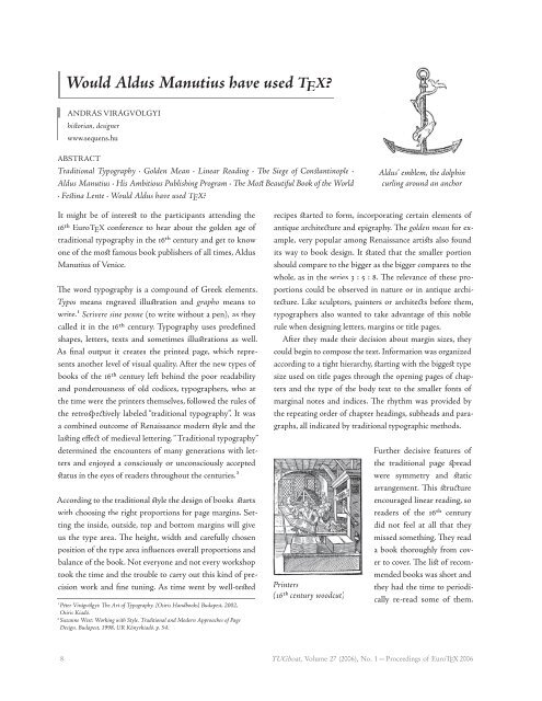
Printers<br />
(16�� century woodcut)<br />
Aldus’ emblem, <strong>the</strong> dolphin dol<br />
curling around an anchor<br />
Fur<strong>the</strong>r decisive features <strong>of</strong><br />
<strong>the</strong> traditional page � read<br />
were symmetry and � atic<br />
arrangement. � is � ru� ure<br />
encouraged linear reading, so<br />
readers <strong>of</strong> <strong>the</strong> 16�� century<br />
did not feel at all that <strong>the</strong>y<br />
missed some thing. � ey read<br />
a book thoroughly from cover<br />
to cover. � e li� <strong>of</strong> recommended<br />
books was short and<br />
<strong>the</strong>y had <strong>the</strong> time to periodically<br />
re-read some <strong>of</strong> <strong>the</strong>m.<br />
8 <strong>TUG</strong>boat, <strong>Volume</strong> <strong>27</strong> (2006), No. 1 — Proceedings <strong>of</strong> Euro<strong>TEX</strong> 2006<br />
1


