Get (Un)Comfortable: Process Book
Process book for Get (Un)Comfortable: Systemic Racism in Design by Jelissa May Prado for the 2021 Cornish College of the Arts Design BFA Capstone Project
Process book for Get (Un)Comfortable: Systemic Racism in Design by Jelissa May Prado for the 2021 Cornish College of the Arts Design BFA Capstone Project
- No tags were found...

You also want an ePaper? Increase the reach of your titles
YUMPU automatically turns print PDFs into web optimized ePapers that Google loves.
cornish college of the arts<br />
2021 design bfa capstone project<br />
written and designed by jelissa may prado
the process book for<br />
<strong>Get</strong> (<strong>Un</strong>)<strong>Comfortable</strong>: Systemic Racism in Design<br />
a workbook for white designers<br />
written and designed by jelissa may prado
Copyright © 2021 by Jelissa May Prado<br />
Written and Designed by Jelissa May Prado<br />
jelissamay.design@gmail.com<br />
Seattle, Washington<br />
Scanning, reproducing or copying of this book in any way is<br />
prohibited unless given written permission from the creator.
table of contents<br />
introduction<br />
discovery + ideation<br />
visual identity<br />
the book cover<br />
final outcome<br />
retrospective<br />
02<br />
04<br />
14<br />
26<br />
32<br />
42<br />
01
02
get (un)comfortable — process book<br />
This project has become a gift to my 18 year-old self. It’s<br />
something that I wish existed when I started my journey<br />
as a designer of color. Although the target audience for<br />
<strong>Get</strong> (<strong>Un</strong>)<strong>Comfortable</strong> is white design students, teachers<br />
and professionals, it has been created with the intention<br />
to make the field a more understanding, welcoming and<br />
proactive place for the BIPOC artists and designers that<br />
will come after me. We need them.<br />
03
04
get (un)comfortable — process book<br />
section title<br />
05
an anti-social-media-campaign project<br />
This past year, white people have become more aware of<br />
the discrimination and brutality that Black, Indigenous<br />
and people of color experience everyday in this country.<br />
People and companies have made social media posts<br />
standing in solidarity with the Black community, along<br />
with including them in their feed more often. However,<br />
in most cases this has become performative. Activism<br />
has become “trendy.” People are doing this to make<br />
themselves look better online, rather than putting in<br />
work behind the scenes to make genuine changes with<br />
their own thinking and behaviors. There’s a lot of saying<br />
and not doing. The same is true for Cornish, as well as<br />
other art schools in America. Art, design and college as<br />
an institution has a history (and a current presence) of<br />
racism that is rarely addressed by the white people that<br />
dominate it. I decided to fill this need.<br />
06
Initially, I intended to create and design a book that simply<br />
presented the information. When we went through our<br />
first round of panel reviews for our project proposals, it was<br />
suggested that I consider including reflection prompts<br />
to make the experience more engaging. This direction<br />
would be more dynamic and lean into the market of self<br />
improvement journals that have been gaining popularity.<br />
It would not only introduce white designers to the effects<br />
of systemic racism on the field, but also give them work<br />
to do on their own. The analog approach would provide<br />
a break from our countless hours being on a screen, as<br />
well as social media or having to download another app.<br />
get (un)comfortable — process book discovery + ideation<br />
07
08
workbook content<br />
get (un)comfortable — process book discovery + ideation<br />
As this project became more and more real, the more<br />
intimidated I got to actually start it. How could I even<br />
begin to explain this huge systemic issue to people?<br />
Let alone write, research and design a whole book in<br />
one semester. Pair this with the emotional toll of the<br />
pandemic and I was overwhelmed. Nothing like this<br />
really existed yet and I wanted it to be perfect. With the<br />
deadline slowly approaching, I needed to decide what<br />
to focus my research and writing on. I did this through<br />
the mind map to the left. I started with the question,<br />
“What do I want people to know?”<br />
09
workbook sections<br />
Once I decided what to focus my research and writing on,<br />
I grouped these topics into different sections. In the<br />
final version of my writing, they are titled Dear Fellow<br />
Designer, Let Me Introduce Myself, “Design,” Socioeconomic<br />
Barrier, (Dis)Connections, Conclusion, and (Re)Sources.<br />
The book begins with a letter to the designer in which I give<br />
an overview of the issue at hand. This is followed by introducing<br />
myself to help provide a more personal aspect<br />
for the reader to understand and connect with before I<br />
delve into the research. First, “Design” is meant to open up<br />
our view of design history and what is even considered<br />
design. The next section discusses the socioeconomic<br />
barrier that prevents BIPOC from easily pursuing design.<br />
We see how this barrier affects the diversity of the field<br />
in (Dis)Connections and understand the importance of<br />
inclusion. The book is concluded with a recap, closing<br />
statements and opportunities to continue research once<br />
the reader has made it to the end. Throughout the book<br />
are places for both research and reflection.<br />
10
get (un)comfortable — process book discovery + ideation<br />
11
title breakdown<br />
get (un)comfortable: systemic racism in design<br />
A play on the phrase “get<br />
comfortable” when you’re<br />
telling someone to get<br />
ready to listen and learn;<br />
but the topic of racism can<br />
be uncomfortable to talk<br />
about when you’ve never<br />
experienced it firsthand<br />
or if you refuse to believe<br />
it exists. The intention is<br />
to get people to be more<br />
comfortable with being<br />
uncomfortable.<br />
No aspect in our lives<br />
has been untouched or<br />
unaffected by racism and<br />
design is no exception.<br />
12
a workbook for white designers<br />
This book not only presents<br />
information, but also<br />
provides opportunities to<br />
research and reflect — it<br />
is created specifically for<br />
white designers.<br />
get (un)comfortable — process book discovery + ideation<br />
13
14
get (un)comfortable — process book<br />
section title<br />
15
16
leaning into “getting uncomfortable”<br />
I decided for the book to be uncomfortable not only<br />
conceptually, but also visually. I chose for the visual<br />
language to challenge design standards, as well as the<br />
style of my own work. We’re taught to stick to a grid<br />
and to never stretch our type. This book breaks those<br />
rules. Initially, the dimensions of the book were going<br />
to be 5.5" × 8.5" — a common size for non-fiction books.<br />
However, if I were going to challenge the norm this<br />
needed to be changed as well. I rotated it 90°, making<br />
the dimensions 8.5" × 5.5" — a size that would now stick<br />
out awkwardly on a bookshelf.<br />
get (un)comfortable — process book visual identity<br />
17
thumbnails<br />
Before working digitally, I created thumbnail sketches<br />
for the book cover, title pages and spreads throughout<br />
the book. I was experimenting and ideating different<br />
ways to distort the text and pages for reflection.<br />
18
get (un)comfortable — process book visual identity<br />
19
soft black #2D2D2D<br />
off white #F3F1EA<br />
sage green #9EB0BA<br />
taupe #B3A093<br />
20
color palette discovery<br />
For the color palette, I chose to go with a soft black and<br />
off white. These are a step away from the usual pure black<br />
and white, while still providing contrast as the primary<br />
colors of the project. I then looked at different variations<br />
of green — a color I picked for its symbolism of growth<br />
and harmony. From these six options I went with the<br />
sage green because of its similar tone to the soft black<br />
and off white. As a supplementary color, I chose a taupe<br />
which would complement the sage green’s earth tone.<br />
get (un)comfortable — process book visual identity<br />
21
22
get (un)comfortable — process book<br />
visual identity<br />
type experiments<br />
During my type experiments I worked with a serif, sans-serif<br />
and more embellished serif font. I tested the book title<br />
with each; using different warp options in Illustrator and<br />
varying capitalization conventions. Since the book is<br />
intended for print, the body copy text from Acumin Pro<br />
wouldn’t be as easy to read compared to a serif. Operetta<br />
18 has a more embellished serif that becomes difficult to<br />
read once it’s warped. I went forward with IvyPresto. It<br />
was still legible to read once warped, has multiple weights<br />
for headers and body copy, and its serifs make it easier<br />
to read for print.<br />
23
IvyPresto Text | Regular<br />
soft black<br />
#2D2D2D<br />
off white<br />
#F3F1EA<br />
sage green<br />
#9EB0BA<br />
taupe<br />
#B3A093<br />
24
final type + color palette<br />
The visual identity for <strong>Get</strong> (<strong>Un</strong>)<strong>Comfortable</strong> uses a warped<br />
IvyPresto Headline in semibold for titles and headers,<br />
and IvyPresto Text in regular for the body copy. The color<br />
palette primarily uses a soft black, off white and sage<br />
green; with taupe as an extra option when designing.<br />
get (un)comfortable — process book visual identity<br />
25
26
get (un)comfortable — process book<br />
section title<br />
27
28<br />
initial text<br />
warping<br />
experiments<br />
for the<br />
cover
type + book cover experiments<br />
Using the title variations in IvyPresto, I experimented with<br />
possible book covers. I created versions using the sage<br />
green, off white and soft black as background colors. After<br />
getting feedback that the type was too warped, I dialed<br />
back the warping feature to make it more legible. In the<br />
background, I intentionally left the grid to highlight the<br />
fact that it’s being broken and emphasize that the text<br />
has been warped.<br />
get (un)comfortable — process book the book cover<br />
alternate<br />
covers in<br />
off white<br />
and sage<br />
green<br />
29
30<br />
back cover
front cover<br />
final design, 8.5" × 5.5"<br />
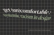
I went forward with the black background for the final<br />
book cover design. Compared to the off white and sage<br />
green versions, this one provides greater contrast. As I<br />
stated before, the grid was intentionally left to highlight<br />
it being broken with warped and misplaced text. We’re<br />
taught that “good design” goes unnoticed. Instead, this<br />
book demands the designer’s attention because it breaks<br />
rules that aren’t supposed to be broken. I’ve utilized visual<br />
cues that designers have a tendency to notice and desire<br />
to fix. (Cool detail: if you scan the barcode on the back<br />
cover, it reads “jelissa may”).<br />
31
32
get (un)comfortable — process book<br />
section title<br />
33
34
about the final outcome<br />
<strong>Get</strong> (<strong>Un</strong>)<strong>Comfortable</strong>: Systemic Racism in Design is<br />
currently in a digital format and available to read<br />
as a pdf. It is nearly 100 pages and intended to be printed<br />
at 8.5" × 5.5" in the future.<br />
This project is a culmination of my skills in:<br />
• Typography<br />
• Composition<br />
• Layout<br />
• <strong>Book</strong> Cover Design<br />
• Color Theory<br />
• Writing<br />
• Research<br />
• Critical Thinking<br />
get (un)comfortable — process book final outcome<br />
35
36<br />
front cover + spine
get (un)comfortable — process book final outcome<br />
37
38<br />
front + back cover + spine
get (un)comfortable — process book final outcome<br />
39
40<br />
pages 20 + 21
get (un)comfortable — process book final outcome<br />
41
42
get (un)comfortable — process book<br />
In an ideal and pandemic free world, this book would be<br />
much more expansive in terms of what it covers and I’d<br />
love to interview BIPOC designers to incorporate their<br />
own stories in addition to my own. However, given the<br />
timeframe and the emotional toll this past year has had<br />
on all of us, I feel proud of what I’ve created. It’s become<br />
a gift to not only my 18 year old self, but the BIPOC<br />
designers that will come after me who are struggling to<br />
navigate a field that prides itself on having empathy, yet<br />
falls short on its empathy for non-white issues. My hope<br />
is that this book will help the design field take a much<br />
needed step in being not only aware of its historical and<br />
current issue of racism, but also in dismantling it.<br />
43
colophon<br />
This book was written and designed by Jelissa May Prado to fulfill<br />
the Cornish College of the Arts 2021 Design BFA Capstone Project<br />
requirements. It is set in IvyPresto, a typeface designed by Jan Maack.<br />
It was created with Adobe Illustrator and InDesign.