Alessandro Mendini, estetica e poetica del ... - Istituto Del Colore
Alessandro Mendini, estetica e poetica del ... - Istituto Del Colore
Alessandro Mendini, estetica e poetica del ... - Istituto Del Colore

Create successful ePaper yourself
Turn your PDF publications into a flip-book with our unique Google optimized e-Paper software.
<strong>Alessandro</strong> <strong>Mendini</strong><br />
Nella pagina precedente:<br />
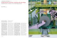
<strong>Alessandro</strong> <strong>Mendini</strong>, Mobili per Uomo,<br />
produzione Bisazza, 2005.<br />
Da sinistra a destra:<br />
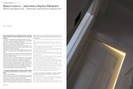
<strong>Alessandro</strong> e Francesco <strong>Mendini</strong>,<br />
Centro natatorio Bruno Bianchi, Trieste,<br />
2000.<br />
Atelier <strong>Mendini</strong>, Groninger Museum,<br />
Groningen, Olanda.<br />
Architetti invitati: Michele De Lucchi<br />
(progetto degli interni <strong>del</strong> padiglione<br />
di Archeologia e Storia), Philippe<br />
Starck (progetto degli interni <strong>del</strong><br />
padiglione di Arti Decorative), Frank<br />
Stella (Padiglione di Arte dal 1500 al<br />
1950, progetto non realizzato), Coop-<br />
Himmelblau (Padiglione di Arte dal<br />
1500 al 1950).<br />
On previous page:<br />
<strong>Alessandro</strong> <strong>Mendini</strong>, Furniture for Men,<br />
Bisazza production, 2005.<br />
From left to right:<br />
<strong>Alessandro</strong> and Francesco <strong>Mendini</strong>,<br />
Bruno Bianchi swimming centre,<br />
Trieste, 2000.<br />
Atelier <strong>Mendini</strong>, Groninger Museum,<br />
Groningen, The Netherlands.<br />
Architets invited: Michele De Lucchi<br />
(interior project of the Archeology<br />
and History pavilion), Philippe Starck<br />
(interior project of the Decorative Arts),<br />
Frank Stella (Art pavilion from 1500 to<br />
1950, unaccomplished project), Coop-<br />
Himmelblau (Art pavilion from 1500<br />
to 1950).<br />
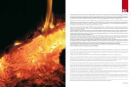
tà. Certamente vedo il mondo dei<br />
miei oggetti come un mondo legato<br />
alle colorazioni, quasi come se<br />
dovessi dire che si tratta di fiori<br />
mineralizzati nel senso che i fiori<br />
hanno <strong>del</strong>le gradazioni, non sono<br />
mai completamente monocromi,<br />
e a me piace trattare i miei oggetti,<br />
appena possibile, con più di un<br />
colore e con più di una materia.<br />
via <strong>del</strong>le ombre, e a che cosa è destinato.<br />
In generale mi piacciono i<br />
lilla, i rosa, i colori salmone, i giallini,<br />
ma soprattutto mi interessa<br />
che messi insieme i colori non si<br />
presentino armonici ma creino un<br />
certo grado di stridore.<br />
Quando il rapporto tra due colori è<br />
legato alla logica si ha una percezione<br />
un pó addormentata, quando<br />
faccio un oggetto mi interessa<br />
che quell’oggetto produca attenzione<br />
e pertanto produca pensiero,<br />
che ogni oggetto esprima una<br />
comunicazione che fa pensare,<br />
che sia produttore di pensiero o di<br />
spiritualità. Se uso due colori che<br />
stanno un po’ male invece che beman,<br />
that is everything I do with<br />
various techniques and sizes and<br />
with various functionalities. I definitely<br />
see the world of my objects<br />
as something linked to colouring,<br />
as if I said it were a matter of mineralized<br />
flowers in the sense that<br />
flowers do have some gradations,<br />
they are never entirely monochrome,<br />
and I like treating my objects<br />
with more than one colour<br />
and more than one material when<br />
it is possible.<br />
Recentemente Atelier <strong>Mendini</strong><br />
ha curato la nuova linea di colori<br />
per Seves Glassblock, analogamente<br />
nel corso <strong>del</strong>la lunga collaborazione<br />
con Bisazza Mosaici,<br />
accanto ad un progetto di rivisitazione<br />
<strong>del</strong>l’immagine <strong>del</strong> mosaico,<br />
vi siete occupati anche di studiare<br />
nuovi colori e decorazioni.<br />
Il colore quindi non è solo un’importante<br />
componente dei suoi<br />
progetti ma diventa, come in<br />
questi casi, occasione stessa di<br />
progetto.<br />
Abbiamo progettato colori in varie<br />
occasioni. Un progetto piuttosto<br />
interessante è stato quello per<br />
Sikkens che in tre anni successivi<br />
ha editato tre libri di collezioni di<br />
colori: il primo era mio, il secondo<br />
di Norman Foster e il terzo di Rem<br />
Koolhaas, caratterizzati proprio<br />
dai nostri diversi approcci al colore.<br />
Io avevo studiato dei colori,<br />
a cui avevo dato anche un nome<br />
Recently Atelier <strong>Mendini</strong> supervised<br />
the new line of colours for<br />
Seves Glassblock, analogously<br />
during the long-lasting collaboration<br />
with Bisazza Mosaici,<br />
alongside a revisiting project of<br />
the image of mosaic, you were<br />
also active in studying new colours<br />
and decorations. Therefore<br />
colour is not only an important<br />
part of your projects but it becomes,<br />
like in these cases, an<br />
occasion of project itself.<br />
We designed colours in several occasions.<br />
A rather interesting project<br />
was the one made for Sikkens<br />
which on three consecutive years<br />
has edited three books of colours<br />
collections: the first one was mine,<br />
the second one was Norman Foster’s<br />
and the third one was Rem<br />
Koolhass’, characterized precisely<br />
simbolico, in cui c’erano lucentezze<br />
diverse, una tattilità opaca<br />
e una lucida e anche una specie<br />
di granulato. In quell’epoca mi ero<br />
detto “finalmente ho fatto 30 colori<br />
che userò tutta la vita”, in realtà<br />
credo di non averne mai usato<br />
uno, e non perché rinnego quei<br />
colori, ma perché ogni situazione<br />
richiede una reinvenzione <strong>del</strong>la<br />
caratteristica coloristica, piccole<br />
sfumature, lievi varianti.<br />
Quindi vuol dire che ogni progetto<br />
ha dei colori che nascono per<br />
quel progetto...<br />
Sì, se è grande, se è piccolo, se è<br />
rotondo, tutto cambia, anche per<br />
by our different approaches to colour.<br />
I had studied some colours to<br />
which I had also given a symbolic<br />
name, in which there were a different<br />
brightness, a dull and polished<br />
tactility and also a kind of grainy.<br />
At that time I said to myself “finally<br />
I made 30 colours I will use for<br />
life”, in reality I think I have never<br />
used one, not because I disown<br />
those colours, but because every<br />
situation needs a reinvention of<br />
the colour characteristic, slight<br />
shades and changes.<br />
So it means that every project<br />
has colours which are born for<br />
that project...<br />
If it is big or small or round everything<br />
changes, also because of<br />
shades and to what it is designed<br />
for. In general I like lilac, pink,<br />
salmon pink, yellowish, but most<br />
of all I want colours to be put together<br />
without looking well-proportioned<br />
yet creating a certain<br />
degree of screech.<br />
When the relationship between<br />
two colours is connected to logic,<br />
you have a half-dull perception,<br />
when I make an object I want<br />
that object to generate interest<br />
and therefore generate a way of<br />
thinking, I want every object to<br />
express a message which makes<br />
people think, to be a thought and<br />
42 COLORE COLORE 43