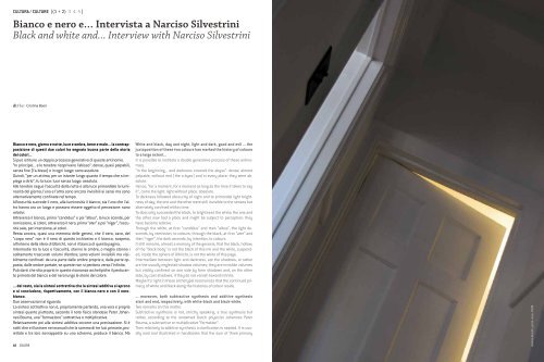
Bianco e nero e⦠Intervista a Narciso Silvestrini ... - Istituto Del Colore
Bianco e nero e⦠Intervista a Narciso Silvestrini ... - Istituto Del Colore
Bianco e nero e⦠Intervista a Narciso Silvestrini ... - Istituto Del Colore

Create successful ePaper yourself
Turn your PDF publications into a flip-book with our unique Google optimized e-Paper software.
CULTURA / CULTURE [(1 + 2) 3 4 5 ]<br />
<strong>Bianco</strong> e <strong>nero</strong> e… <strong>Intervista</strong> a <strong>Narciso</strong> <strong>Silvestrini</strong><br />
Black and white and... Interview with <strong>Narciso</strong> <strong>Silvestrini</strong><br />
di/by : Cristina Boeri<br />
<strong>Bianco</strong> e <strong>nero</strong>, giorno e notte, luce e ombra, bene e male... la contrapposizione<br />
di questi due colori ha segnato buona parte della storia<br />
dei colori...<br />
Si può istituire un doppio processo generativo di queste antinomie.<br />
“In principio... e le tenebre ricoprivano l’abisso”: dense, quasi palpabili,<br />
senza fine (l’a-bisso) e in ogni luogo: sono assolute.<br />
Quindi, “per un attimo, per un istante lungo quanto il tempo che si impiega<br />
a dirlo”, fu la luce: luce senza luogo: assoluta.<br />
Alle tenebre segue l’oscurità della notte e alla luce primordiale la luminosità<br />
del giorno; l’una e l’altra sono ancora invisibili ai sensi ma sono<br />
alternativamente confinate nel tempo.<br />
All’oscurità succede il <strong>nero</strong>, alla luminosità il bianco; sia l’uno che l’altro<br />
hanno ora un luogo e possono essere oggetto di percezione: sono<br />
relativi.<br />
Attraverso il bianco, prima “candidus” e poi “albus”, la luce scende, per<br />
remissione, ai colori; attraverso il <strong>nero</strong>, prima “ater” e poi “niger”, l’oscurità<br />
sale, per intenzione, ai colori.<br />
Resta ancora, quasi una memoria delle genesi, che il <strong>nero</strong>, cavo, del<br />
“corpo <strong>nero</strong>” non è il <strong>nero</strong> di questo inchiostro e il bianco, sospeso,<br />
all’interno della sfera di Ulbricht, non è il bianco di questa pagina.<br />
Intermedie tra la luce e l’oscurità, stanno le ombre, o meglio stanno i<br />
solitamente trascurati volumi d’ombra; sono volumi invisibili ma visibilmente<br />
confinati: da una parte dalle ombre proprie e, dalla parte opposta,<br />
dalle ombre portate, se queste non si perdono verso l’infinito.<br />
Può darsi che stia proprio in queste risonanze archetipiche il perdurante<br />
primato del bianco e del <strong>nero</strong> lungo le storie del colore.<br />
... del resto, sia la sintesi sottrattiva che la sintesi additiva si aprono<br />
e si concludono, rispettivamente, con il bianco-<strong>nero</strong> e con il <strong>nero</strong>bianco.<br />
Due osservazioni al riguardo.<br />
La sintesi sottrattiva non è, propriamente parlando, una vera e propria<br />
sintesi quanto piuttosto, secondo il noto fisico olandese Peter Johannes<br />
Bouma, una “formazione” sottrattiva o moltiplicativa.<br />
Relativamente poi alla sintesi additiva occorre una precisazione. Si è<br />
soliti dire e illustrare nei manuali che la somma di tre luci primarie, proiettate<br />
e tra loro sovrapposte su uno schermo, produce il bianco. Ma<br />
10 COLORE<br />
White and black, day and night, light and dark, good and evil ... the<br />
juxtaposition of these two colours has marked the history of colours<br />
to a large extent...<br />
It is possible to institute a double generative process of these antinomies.<br />
“In the beginning... and darkness covered the abyss”: dense, almost<br />
palpable, without end (the a-byss) and in every place: they were absolute.<br />
Hence, “for a moment, for a moment as long as the time it takes to say<br />
it”, came the light: light without place: absolute.<br />
To darkness followed obscurity of night and to primordial light brightness<br />
of day; the one and the other were still invisible to the senses but<br />
alternately confined within time.<br />
To obscurity succeeded the black, to brightness the white; the one and<br />
the other now had a place and might be subject to perception: they<br />
have become relative.<br />
Through the white, at first “candidus” and then “albus”, the light descends,<br />
by remission, to colours; through the black, at first “ater” and<br />
then “niger”, the dark ascends, by intention, to colours.<br />
It still remains, almost a memory of the genesis, that the black, hollow,<br />
of the “black body” is not the black of this ink and the white, suspended,<br />
inside the sphere of Ulbricht, is not the white of this page.<br />
Intermediate between light and darkness, are the shadows, or rather<br />
are the usually neglected shadow volumes; they are invisible volumes<br />
but visibly confined: on one side by form shadows and, on the other<br />
side, by cast shadows, if they do not vanish toward infinite.<br />
Maybe it’s right in these archetypal resonances that the continued primacy<br />
of white and black along the histories of colour reside.<br />
... moreover, both subtractive synthesis and additive synthesis<br />
start and end, respectively, with white-black and black-white.<br />
Two remarks on this matter.<br />
Subtractive synthesis is not, strictly speaking, a true synthesis but<br />
rather, according to the renowned Dutch physicist Johannes Peter<br />
Bouma, a subtractive or multiplicative “formation”.<br />
Then relatively to additive synthesis a clarification is needed. It is usually<br />
said and illustrated in handbooks that the sum of three primary<br />
Andrea Rovatti, porta+luce, 2008
<strong>Bianco</strong> e <strong>nero</strong> e… <strong>Intervista</strong> a <strong>Narciso</strong> <strong>Silvestrini</strong> / Black and white and... Interview with <strong>Narciso</strong> <strong>Silvestrini</strong><br />
“Qui è il problema:<br />
non bianco; non<br />
bianchi; ma bianco<br />
generalizzato,<br />
perché il bianco<br />
generalizzato<br />
- la bianchezza -<br />
è astratto, isolato<br />
e aperto alla<br />
contaminazione<br />
con termini come<br />
‘puro’.<br />
<strong>Bianco</strong> puro:<br />
questo è<br />
certamente<br />
un problema<br />
occidentale, e<br />
non c’è modo di<br />
liberarsene”.<br />
“Here is the<br />
problem: not<br />
white; not whites;<br />
but generalized<br />
white, because the<br />
generalized white<br />
- the whiteness -<br />
is abstract,<br />
isolated and open<br />
to contamination<br />
by terms like<br />
‘pure’.<br />
Pure white: this<br />
is certainly a<br />
western problem,<br />
and there is no<br />
way to get rid<br />
of it”.<br />
David Batchelor, Cromofobia. Storia della paura<br />
del colore, Mondadori, 2001, p. 6<br />
questo avviene solo se lo schermo di proiezione era già bianco perché,<br />
se fosse stato, ad esempio, verde, la zona di sovrapposizione dei tre<br />
primari sarebbe apparsa verde; se gialla, gialla; se nera, nera e così via.<br />
Solo convenzionalmente, in fisica, si parla di “luce bianca”; luce (radiazione)<br />
che, invisibile in sé, consente poi, all’osservatore la miglior<br />
discriminazione cromatica.<br />
In verità, l’effettivo bianco di sintesi è quello della “sintesi ottica”; è quello<br />
che risulta dallo schermo video quando, a partire dal <strong>nero</strong>, dallo “spento”,<br />
vi siano attivati, contemporaneamente, tutti e tre i primari RGB.<br />
Parlando di bianco e <strong>nero</strong> non si può fare a meno di chiedere... ma<br />
sono davvero dei colori?<br />
Si e no. Se il colore è caratterizzato dai tre parametri percettivi tinta,<br />
chiarezza, saturazione, allora anche il bianco, il <strong>nero</strong> e gli interposti<br />
grigi possono essere chiamati colori; sono colori ai quali manca la componente<br />
tinta; sono colori cosiddetti “acromatici” per distinguerli dalle<br />
tinte denominate, nel sistema NCS, colori “cromatici”.<br />
Se invece per tonalità cromatica si intende “l’equivalente psicosensoriale<br />
di una determinata lunghezza d’onda dominante” allora il bianco,<br />
il <strong>nero</strong> ed i grigi, non avendo una loro corrispondente lunghezza d’onda<br />
elettromagnetica, non possono essere denominati colori. Ma in questo<br />
caso neanche i magenta o porpora sarebbero colori dal momento che<br />
non rispondono ad alcuna loro specifica lunghezza d’onda.<br />
Se poi ogni tonalità la si può ottenere per opportuna mescolanza di tre<br />
tinte primarie, allora anche i porpora sono tinte e sono colori: ancora il<br />
porpora, il bianco, i grigi, il <strong>nero</strong>, pur risultando da operazioni differenti:<br />
chi per addizione, chi per attenuazione, chi per sottrazione.<br />
In altre parole, tutto dipende da cosa si intende per colore, per tinta,<br />
per chiarezza.<br />
Nella nostra cultura si è andata sviluppando quella che Manlio Brusatin<br />
definisce una sorta di cultura intellettuale e ideologica del<br />
bianco e <strong>nero</strong> rispetto alla superficialità del colore. Una sorta di “cromofobia<br />
diffusa che è diventata una trincea estetica, perfino letteraria,<br />
davanti all’aggressione del colore...” 1 .<br />
Nessuna tinta può essere tradotta in un’altra tinta a lei equivalente.<br />
Ogni tinta, invece, può essere convertita in un grigio a lei corrispondente<br />
per chiarezza; biunivocamente, vale anche il contrario.<br />
Nessuna tinta però può essere equiparata, sempre per chiarezza, al<br />
bianco e al <strong>nero</strong>.<br />
Dunque il bianco e il <strong>nero</strong> sono “oltre” e sono “altro”.<br />
Quasi a riprova, è da notare che, quando siano nella loro pienezza, le<br />
tinte sono dette “sature” (verde saturo, blu saturo, etc.) mentre al bianco<br />
e al <strong>nero</strong> è riservato il termine “assoluto” (bianco assoluto, <strong>nero</strong> assoluto).<br />
In quanto assoluti, il bianco e il <strong>nero</strong> sono delle invarianti per cui prevalgono<br />
sulle variazioni contingenti delle tinte e, più estesamente di queste,<br />
possono avvicinare l’immanenza e la trascendenza fino a divenire<br />
e porsi come veri e propri assunti “intellettuali e ideologici”.<br />
Spesso nel corso delle tue lezioni ti si sente dire che in fondo preferisci<br />
insegnare il colore in bianco e <strong>nero</strong>...<br />
Io non sono né un artista né un color designer; l’aspetto del colore che<br />
lights, projected and overlapped among each other on a screen, produces<br />
white. But this will happen only if the projection screen already<br />
was white because if it had, for example, been green, the overlap area<br />
of the three primary colours would have appeared green, if yellow, yellow,<br />
and if black, black and so on. Only conventionally, in physics, we<br />
speak of “white light”, light (radiation) that, invisible in itself, then allows<br />
to the observer the best colour discrimination.<br />
In truth, the actual white colour of synthesis is the one of “optical<br />
synthesis”; it is the one resulting from the screen video when, starting<br />
from black, from the “off” state, all three RGB primary colours are<br />
simultaneously activated.<br />
Speaking of black and white one can not help but ask ... but are they<br />
really colours?<br />
Yes and no. If the colour is characterized by the three perceptual parameters,<br />
hue, lightness, saturation, then also white, black and intermediate<br />
grey shades may be called colours; they are colours who lack<br />
the hue component; they are so-called “achromatic” colours to distinguish<br />
them by the hues denominated, in the NCS system, “chromatic”<br />
colours.<br />
If we are instead meaning with colour tone “the psychosensory equivalent<br />
of a given dominant wavelength” then white, black and grey<br />
shades, not having their own corresponding length of electromagnetic<br />
wave, can not be named colours. But in this case not even magenta or<br />
purple would be colours as they do not respond to any specific wavelength.<br />
Then if each shade could be obtained through an appropriate mixture<br />
of three primary hues, then even purple would be hues and would be<br />
colours: still purple, white, grey shades, black, despite resulting from<br />
different operations: some from addition, others for attenuation, some<br />
for subtraction.<br />
In other words, everything depends on what you mean by colour, hue,<br />
and lightness.<br />
In our culture something that Manlio Brusatin defines a sort of intellectual<br />
and ideological culture of black and white versus the superficiality<br />
of colour has been developing. A sort of “widespread chromo<br />
phobia that has become an aesthetic trench, even literary, towards<br />
the aggression of colour...” 1 .<br />
No hue can be translated into another equivalent hue. Each hue, instead,<br />
can be converted into a correspondent, for lightness, grey; in a<br />
one-to-one way, it applies also to the opposite.<br />
However no hue can be equated, again for lightness, with white and<br />
black.<br />
So the white and black are “beyond” and “other.”<br />
Almost as proof, we note that when they are in their fullness, hues<br />
are called “saturated” (saturated green, saturated blue, etc.), while to<br />
white and black we reserve the term “absolute” (absolute white, absolute<br />
black).<br />
In absolute terms, white and black are invariants which take precedence<br />
over the contingent variations of hues and larger than these last<br />
ones, they can approach immanence and transcendence to become<br />
and act as real “intellectual and ideological” assumptions.<br />
COLORE 13
CULTURA / CULTURE [ 1 2 3 4 (5)]<br />
più mi intriga è una sua qualche dualità con la geometria e il loro affacciarsi<br />
l’uno verso il sensibile, il visibile, e l’altra verso l’astrazione, verso<br />
l’invisibile.<br />
Per questo, io posso andare solo poco oltre la figurazione, poco oltre<br />
qualche argomentare primario, prossimo al bianco-<strong>nero</strong> dove le tinte<br />
sono un corollario seppure non accessorio.<br />
Secondo la tesi di Berlin e Kay 2 rispetto a una teoria transculturale<br />
dei termini di colore, nella percezione del colore la luminosità ha una<br />
funzione prioritaria rispetto alla tonalità, da qui forse l’importanza<br />
della coppia bianco e <strong>nero</strong>...<br />
Lo schema evolutivo prospettato da Berlin e Kay può essere percorso<br />
anche in senso opposto: non a partire dal, ma risalendo verso il bianco<strong>nero</strong>.<br />
Vorrei, per questo, utilizzare alcuni enunciati generali formulati da Claude<br />
Paul Bruter in Topologie et perception.<br />
“Ogni oggetto possiede una doppia polarità”.<br />
“Ogni oggetto evolve verso uno stato di massima entropia”.<br />
“Ogni oggetto non è stabile se non presenta una qualche proprietà di<br />
estremalità” (un massimo e un minimo).<br />
“L’evoluzione va di pari passo con un accrescimento delle libertà”.<br />
La polarità “bianco-<strong>nero</strong>” ed il relativo asse dei grigi si possono intendere<br />
anche come stati di entropia cromatica e, proprio perché tali, costituiscono<br />
luoghi di passaggio da una tinta ad altra tinta a lei contrapposta<br />
o non adiacente.<br />
Gli stessi modelli di colore (Colour Order Systems) possono essere<br />
istruiti come modelli delle relazioni tra entropia (l’acromatico) e negentropia<br />
(il cromatico).<br />
Se così intesi, il bianco e il <strong>nero</strong>, posti da Berlin e Kay all’inizio della loro<br />
sequenza evolutiva, sono stati di necessità strutturale: primordiali ma<br />
anche terminali, generativi e insieme consuntivi.<br />
Il bianco e il <strong>nero</strong>, la chiarezza, sono il nodo che tiene tra loro legate le<br />
tinte e mi sembra emblematico che siano finiti per essere bianco-neri<br />
sia il tavoliere degli scacchi che i cubetti dei dadi: il campo strategico<br />
delle mosse ragionate e il rotolare aleatorio e travolgente della sorte; un<br />
tempo, scacchi e dadi venivano giocati insieme.<br />
Often in the course of your lessons we hear you say that on the whole<br />
you prefer to teach colour in black and white ...<br />
I am neither an artist nor a colour designer, the aspect of colour that<br />
most intrigues me is its some duality with geometry, and their overlooking<br />
the one to the sensible, the visible, and the other towards abstraction,<br />
towards the invisible.<br />
For this reason, I can only go a little beyond the figuration, little more<br />
than a few primary key areas, near white-black where hues are a corollary<br />
if not an accessory.<br />
According to the thesis of Berlin e Kay 2 respect to a trans-cultural<br />
theory of colour terms, brightness plays a primary role in colour<br />
perception compared to hue, hence perhaps the importance of the<br />
couple black and white ...<br />
The evolutionary scheme proposed by Berlin and Kay can also be<br />
tracked in the opposite direction: not from, but going back to the whiteblack.<br />
I would, therefore, like to use some general statements formulated by<br />
Claude Paul Bruter in Topologie et perception.<br />
“Every object has a dual polarity”.<br />
“Every object evolves toward a state of maximum entropy”.<br />
“Every object is not stable if it has not any properties of extremality” (a<br />
maximum and a minimum).<br />
“Evolution goes hand in hand with an increase of freedom”.<br />
The polarity “white-black” and its relative axis of grey can also be understood<br />
as states of chromatic entropy and, because such, they constitute<br />
moving places from one hue to another hue as opposed to it or<br />
not adjacent.<br />
The same colour models (Colour Order Systems) can be set up as models<br />
of the relations between entropy (the achromatic) and negentropy<br />
(the chromatic).<br />
If so construed, the white and black, posed by Berlin and Kay at the beginning<br />
of their evolutionary sequence, they are necessary structural<br />
states: primordial but also terminal, generative and at the same time<br />
consumptive.<br />
The black and white, the lightness, are the knot that holds together the<br />
hues and it seems emblematic to me that both the chess board and<br />
the cubes of dice ended up being black and white: the strategic field of<br />
deliberated moves and the unpredictable and overwhelming roll of fate;<br />
once upon a time, chess and dice were played together.<br />
Note<br />
1. Brusatin Manlio, “Un colore mai visto. Il colore nell’epoca della sua riproducibilità tecnica”,<br />
in Bisson Mario, Boeri Cristina, a cura di, Variazioni sul colore, Franco Angeli, Milano, 2006, pp.<br />
84-85.<br />
2. Berlin B., Kay P., Basic Color Terms. Their Universality and Evolution, 1969.<br />
Notes<br />
1. Brusatin Manlio, “Un colore mai visto. Il colore nell’epoca della sua riproducibilità tecnica”, in<br />
Bisson Mario, Boeri Cristina, ed., Variazioni sul colore, Franco Angeli, Milano, 2006, pp. 84-85.<br />
2. Berlin B., Kay P., Basic Color Terms. Their Universality and Evolution, 1969.<br />
14<br />
COLORE<br />
Andrea Rovatti, Centrale Montemartini, 2009