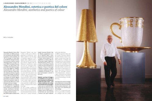
Alessandro Mendini, estetica e poetica del ... - Istituto Del Colore
Alessandro Mendini, estetica e poetica del ... - Istituto Del Colore
Alessandro Mendini, estetica e poetica del ... - Istituto Del Colore

Create successful ePaper yourself
Turn your PDF publications into a flip-book with our unique Google optimized e-Paper software.
IL COLORE SECONDO / COLOUR ACCORDING TO [ (1 + 2) 3 4 5 6 7 8 9 10 11 12 13 ]<br />
<strong>Alessandro</strong> <strong>Mendini</strong>, <strong>estetica</strong> e <strong>poetica</strong> <strong>del</strong> colore<br />
<strong>Alessandro</strong> <strong>Mendini</strong>, aesthetics and poetics of colour<br />
di/by : Cristina Boeri<br />
<strong>Alessandro</strong> <strong>Mendini</strong> è nato a Milano<br />
nel 1931 e nel 1959 si è laureato<br />
in architettura. Dal 1970 al 1976<br />
ha diretto la rivista Casabella, nel<br />
1977 ha fondato la rivista Modo<br />
e nel 1979 Gio Ponti gli ha lasciato<br />
la direzione di Domus. Accanto<br />
all’impegno teorico, che gli è valso<br />
nel 1979 il Compasso d’oro per<br />
il design, una volta entrato a far<br />
parte <strong>del</strong>lo Studio Alchimia progetta<br />
con ironia oggetti di “redesign”<br />
reinventando con colori e materiali<br />
nuovi poltrone e sedie classiche.<br />
L’opera più famosa di questo<br />
processo di re design è la poltrona<br />
Proust, 1979, una classica poltrona<br />
imbottita che diventa oggetto<br />
postmoderno mediante una decorazione<br />
per macchie di colore, divisionista.<br />
Nel 1982 vince un altro<br />
Compasso d’oro per il design.<br />
È stato professore di design alla<br />
Hochschule für Angewandte<br />
Kunst a Vienna. Ha ricevuto le più<br />
svariate onorificenze internazionali<br />
e i suoi lavori si trovano in vari<br />
musei e collezioni private.<br />
Nel 1989 ha aperto a Milano con il<br />
<strong>Alessandro</strong> <strong>Mendini</strong> was born<br />
in Milan in 1931 and in 1959 he<br />
graduated in architecture. From<br />
1970 to 1976 he was the editor<br />
of Casabella magazine, in 1977<br />
started Modo magazine and in<br />
1979 Gio Ponti left him the editing<br />
of Domus. Together with the<br />
theoretical commitment, which<br />
won him the “Compasso d’Oro”<br />
award for design in 1979, once he<br />
joined Studio Alchimia he designs<br />
with irony objects of “redesign”<br />
reinventing armchairs and classic<br />
chairs with new colours and<br />
materials. The most famous work<br />
of this redesign process is the<br />
Proust armchair in 1979, a classic<br />
padded armchair which becomes<br />
a post modern object by means<br />
of a decoration with splashes of<br />
colour, pointillist. In 1982 he wins<br />
another “Compasso d’Oro” award<br />
for design.<br />
He was a design professor at<br />
the Hochschule für Angewandte<br />
Kunst in Vienna. He received several<br />
international honours and his<br />
works are in various museums<br />
fratello, Francesco <strong>Mendini</strong>, l'Atelier<br />
<strong>Mendini</strong>, progettando, tra altro,<br />
le Fabbriche Alessi a Omegna,<br />
la nuova piscina olimpionica<br />
a Trieste, alcune stazioni di metropolitana<br />
e il restauro <strong>del</strong>la Villa<br />
Comunale a Napoli, il Byblos Art<br />
Hotel-Villa Amistà a Verona, i nuovi<br />
uffici di Trend Group a Vicenza<br />
in Italia; una torre ad Hiroshima in<br />
Giappone; il Museo di Groningen<br />
in Olanda; un quartiere a Lugano<br />
in Svizzera; il palazzo per gli uffici<br />
Madsack ad Hannover, un palazzo<br />
Commerciale a Lörrach in<br />
Germania.<br />
Vedendo i suoi lavori di design e<br />
di architettura non si può fare a<br />
meno di pensare che <strong>Alessandro</strong><br />
<strong>Mendini</strong> ami molto i colori... e che<br />
il colore costituisca una componente<br />
fondante dei suoi progetti.<br />
I colori sono un materiale fondamentale<br />
<strong>del</strong> mio lavoro sia di architetto<br />
che di designer che di<br />
artigiano, ossia di tutte quelle cose<br />
che faccio con varie tecniche<br />
e misure e con varie funzionali-<br />
and private collections.<br />
In 1989 he opened in Milan with<br />
his brother, Francesco <strong>Mendini</strong>,<br />
the Atelier <strong>Mendini</strong> where he designed,<br />
among other things, the<br />
Alessi factories in Omegna, the<br />
new Olympic-size swimming pool<br />
in Trieste, some underground stations<br />
and the restoration of the<br />
town hall in Naples, the Byblos Art<br />
Hotel-Villa Amistà in Verona, the<br />
new offices of Trend Group in Vicenza,<br />
Italy; a tower in Hiroshima,<br />
Japan; the Groningen Museum<br />
in the Netherlands; a district in<br />
Lugano, Switzerland; the building<br />
for Madsack offices in Hannover,<br />
a commercial building in Lörrach,<br />
Germany.<br />
If we look at his works of design<br />
and architecture we cannot help<br />
but think that <strong>Alessandro</strong> <strong>Mendini</strong><br />
loves colours very much... and<br />
that colour is an essential part<br />
of his design.<br />
Colours are a fundamental material<br />
in my job both as architect,<br />
as a designer and as a crafts-<br />
40 COLORE
<strong>Alessandro</strong> <strong>Mendini</strong><br />
Nella pagina precedente:<br />
<strong>Alessandro</strong> <strong>Mendini</strong>, Mobili per Uomo,<br />
produzione Bisazza, 2005.<br />
Da sinistra a destra:<br />
<strong>Alessandro</strong> e Francesco <strong>Mendini</strong>,<br />
Centro natatorio Bruno Bianchi, Trieste,<br />
2000.<br />
Atelier <strong>Mendini</strong>, Groninger Museum,<br />
Groningen, Olanda.<br />
Architetti invitati: Michele De Lucchi<br />
(progetto degli interni <strong>del</strong> padiglione<br />
di Archeologia e Storia), Philippe<br />
Starck (progetto degli interni <strong>del</strong><br />
padiglione di Arti Decorative), Frank<br />
Stella (Padiglione di Arte dal 1500 al<br />
1950, progetto non realizzato), Coop-<br />
Himmelblau (Padiglione di Arte dal<br />
1500 al 1950).<br />
On previous page:<br />
<strong>Alessandro</strong> <strong>Mendini</strong>, Furniture for Men,<br />
Bisazza production, 2005.<br />
From left to right:<br />
<strong>Alessandro</strong> and Francesco <strong>Mendini</strong>,<br />
Bruno Bianchi swimming centre,<br />
Trieste, 2000.<br />
Atelier <strong>Mendini</strong>, Groninger Museum,<br />
Groningen, The Netherlands.<br />
Architets invited: Michele De Lucchi<br />
(interior project of the Archeology<br />
and History pavilion), Philippe Starck<br />
(interior project of the Decorative Arts),<br />
Frank Stella (Art pavilion from 1500 to<br />
1950, unaccomplished project), Coop-<br />
Himmelblau (Art pavilion from 1500<br />
to 1950).<br />
tà. Certamente vedo il mondo dei<br />
miei oggetti come un mondo legato<br />
alle colorazioni, quasi come se<br />
dovessi dire che si tratta di fiori<br />
mineralizzati nel senso che i fiori<br />
hanno <strong>del</strong>le gradazioni, non sono<br />
mai completamente monocromi,<br />
e a me piace trattare i miei oggetti,<br />
appena possibile, con più di un<br />
colore e con più di una materia.<br />
via <strong>del</strong>le ombre, e a che cosa è destinato.<br />
In generale mi piacciono i<br />
lilla, i rosa, i colori salmone, i giallini,<br />
ma soprattutto mi interessa<br />
che messi insieme i colori non si<br />
presentino armonici ma creino un<br />
certo grado di stridore.<br />
Quando il rapporto tra due colori è<br />
legato alla logica si ha una percezione<br />
un pó addormentata, quando<br />
faccio un oggetto mi interessa<br />
che quell’oggetto produca attenzione<br />
e pertanto produca pensiero,<br />
che ogni oggetto esprima una<br />
comunicazione che fa pensare,<br />
che sia produttore di pensiero o di<br />
spiritualità. Se uso due colori che<br />
stanno un po’ male invece che beman,<br />
that is everything I do with<br />
various techniques and sizes and<br />
with various functionalities. I definitely<br />
see the world of my objects<br />
as something linked to colouring,<br />
as if I said it were a matter of mineralized<br />
flowers in the sense that<br />
flowers do have some gradations,<br />
they are never entirely monochrome,<br />
and I like treating my objects<br />
with more than one colour<br />
and more than one material when<br />
it is possible.<br />
Recentemente Atelier <strong>Mendini</strong><br />
ha curato la nuova linea di colori<br />
per Seves Glassblock, analogamente<br />
nel corso <strong>del</strong>la lunga collaborazione<br />
con Bisazza Mosaici,<br />
accanto ad un progetto di rivisitazione<br />
<strong>del</strong>l’immagine <strong>del</strong> mosaico,<br />
vi siete occupati anche di studiare<br />
nuovi colori e decorazioni.<br />
Il colore quindi non è solo un’importante<br />
componente dei suoi<br />
progetti ma diventa, come in<br />
questi casi, occasione stessa di<br />
progetto.<br />
Abbiamo progettato colori in varie<br />
occasioni. Un progetto piuttosto<br />
interessante è stato quello per<br />
Sikkens che in tre anni successivi<br />
ha editato tre libri di collezioni di<br />
colori: il primo era mio, il secondo<br />
di Norman Foster e il terzo di Rem<br />
Koolhaas, caratterizzati proprio<br />
dai nostri diversi approcci al colore.<br />
Io avevo studiato dei colori,<br />
a cui avevo dato anche un nome<br />
Recently Atelier <strong>Mendini</strong> supervised<br />
the new line of colours for<br />
Seves Glassblock, analogously<br />
during the long-lasting collaboration<br />
with Bisazza Mosaici,<br />
alongside a revisiting project of<br />
the image of mosaic, you were<br />
also active in studying new colours<br />
and decorations. Therefore<br />
colour is not only an important<br />
part of your projects but it becomes,<br />
like in these cases, an<br />
occasion of project itself.<br />
We designed colours in several occasions.<br />
A rather interesting project<br />
was the one made for Sikkens<br />
which on three consecutive years<br />
has edited three books of colours<br />
collections: the first one was mine,<br />
the second one was Norman Foster’s<br />
and the third one was Rem<br />
Koolhass’, characterized precisely<br />
simbolico, in cui c’erano lucentezze<br />
diverse, una tattilità opaca<br />
e una lucida e anche una specie<br />
di granulato. In quell’epoca mi ero<br />
detto “finalmente ho fatto 30 colori<br />
che userò tutta la vita”, in realtà<br />
credo di non averne mai usato<br />
uno, e non perché rinnego quei<br />
colori, ma perché ogni situazione<br />
richiede una reinvenzione <strong>del</strong>la<br />
caratteristica coloristica, piccole<br />
sfumature, lievi varianti.<br />
Quindi vuol dire che ogni progetto<br />
ha dei colori che nascono per<br />
quel progetto...<br />
Sì, se è grande, se è piccolo, se è<br />
rotondo, tutto cambia, anche per<br />
by our different approaches to colour.<br />
I had studied some colours to<br />
which I had also given a symbolic<br />
name, in which there were a different<br />
brightness, a dull and polished<br />
tactility and also a kind of grainy.<br />
At that time I said to myself “finally<br />
I made 30 colours I will use for<br />
life”, in reality I think I have never<br />
used one, not because I disown<br />
those colours, but because every<br />
situation needs a reinvention of<br />
the colour characteristic, slight<br />
shades and changes.<br />
So it means that every project<br />
has colours which are born for<br />
that project...<br />
If it is big or small or round everything<br />
changes, also because of<br />
shades and to what it is designed<br />
for. In general I like lilac, pink,<br />
salmon pink, yellowish, but most<br />
of all I want colours to be put together<br />
without looking well-proportioned<br />
yet creating a certain<br />
degree of screech.<br />
When the relationship between<br />
two colours is connected to logic,<br />
you have a half-dull perception,<br />
when I make an object I want<br />
that object to generate interest<br />
and therefore generate a way of<br />
thinking, I want every object to<br />
express a message which makes<br />
people think, to be a thought and<br />
42 COLORE COLORE 43
IL COLORE SECONDO / COLOUR ACCORDING TO [ 1 2 3 4 (5 + 6) 7 8 9 10 11 12 13 ]<br />
<strong>Alessandro</strong> <strong>Mendini</strong><br />
ne induco chi guarda a domandarsi<br />
che cosa stia succedendo,<br />
a scuotersi. Sono aspetti legati al<br />
mio interesse per il kitsch, cioè al<br />
fatto che un oggetto comunichi<br />
un genere di <strong>estetica</strong> sentimentale<br />
legata alla memoria, al romanticismo<br />
<strong>del</strong>la persona, piuttosto<br />
che a una <strong>estetica</strong> fredda. Il<br />
kitsch ha <strong>del</strong>le regole: l’estraneazione<br />
<strong>del</strong>l’oggetto dalla funzione<br />
primitiva, il suo rimpicciolimento,<br />
l’errore nei colori ... ecco queste<br />
cose se usate da un progettista<br />
colto, con la coscienza di quello<br />
che vuole fare, si trasformano in<br />
ingredienti che rendono l’oggetto<br />
un racconto. E a me interessa che<br />
i miei oggetti raccontino.<br />
Un altro colore speciale molto interessante<br />
è l’oro, un altro sistema<br />
di colori assolutamente fantastici<br />
è quello <strong>del</strong>le pietre preziose,<br />
la natura nel momento <strong>del</strong>la sua<br />
massima purezza.<br />
Nel suo rapporto con il design e<br />
con l’architettura, come ha messo<br />
in evidenza, prevale un approccio<br />
poetico, artistico e spirituale<br />
con l’oggetto rispetto ad<br />
una caratterizzazione tecnicista<br />
e funzionalista. Anche per il<br />
colore l’aspetto che le interessa<br />
di più è quello comunicativo,<br />
rispetto alle valenze psicologiche,<br />
fisiologiche, ergonomiche o<br />
funzionali <strong>del</strong> colore?<br />
La capacità <strong>del</strong>l’oggetto di mettersi<br />
in rapporto psicologico con<br />
la persona mi interessa molto, per<br />
esempio in un ambiente mi interessa<br />
che la persona che vi entra<br />
abbia una reazione psichica più<br />
che geometrico spaziale e questo<br />
lo si ottiene anche attraverso<br />
il colore, ma non con un colore ergonomico<br />
bensì con un colore visto<br />
sub specie estetico. In definitiva<br />
i colori di Goethe ma non i<br />
colori <strong>del</strong>lo spettro ottico.<br />
Lavoro sull’<strong>estetica</strong> <strong>del</strong> colore, come<br />
un pittore, tanto è vero che un<br />
spirituality maker. If I use two colours<br />
which do not match well I<br />
persuade who is watching to ask<br />
himself/herself what is happening,<br />
in order to be moved. These<br />
are aspects connected with my<br />
interest in kitsch, that is to the<br />
fact that an object conveys a kind<br />
of emotional aesthetics linked to<br />
memory, to the romanticism of<br />
man, rather than linked to cold<br />
aesthetics. Kitsch has got its own<br />
rules: the alienation of the object<br />
from its primary function, its<br />
shrinking, the mistake in colours...<br />
well, if these things are used by<br />
an educated designer, who is fully<br />
aware of what he wants to do, they<br />
turn into ingredients which make<br />
the object a story. And I want my<br />
objects to tell a story.<br />
Another special and very interesting<br />
colour is gold; another system<br />
of absolutely fantastic colours is<br />
that of precious stones, nature at<br />
its moment of greatest purity.<br />
mio oggetto lo considero dipinto,<br />
e così anche una mia facciata anche<br />
se poi è fatta di piastrelle industriali.<br />
Mi piace molto il pixel o la pennellata<br />
di tipo impressionista perché<br />
dal punto di vista ottico è molto<br />
coinvolgente, si tratta di una comunicazione<br />
quasi psicoanalitica<br />
nel senso che ci fa entrare in rapporto<br />
con un certo tipo di movimento<br />
<strong>del</strong>l’atmosfera, quello che<br />
si chiama pulviscolo. Io sono attratto<br />
dai pulviscoli anche perché<br />
sono dimostrativi <strong>del</strong> mio modo di<br />
lavorare per piccoli elementi che<br />
interagiscono tra di loro e non per<br />
visioni grandi, io vado sempre dal<br />
piccolo al grande.<br />
Come interagisce il decoro con il<br />
colore...<br />
Il colore contiene implicita la decorazione,<br />
magari “micronica”, il<br />
solo fatto che una plastica abbia<br />
una lieve opacatura vuol dire che<br />
vi sono dei granellini e quei granellini<br />
sono una decorazione, ingrandendoli<br />
ci si ritrova a fare dei<br />
giochi di decoro e di colore oppure<br />
anche di lucido e opaco all’interno<br />
di uno stesso colore.<br />
Il mio approccio al colore è sempre<br />
stato di tipo pittorico, se non esistessero<br />
le avanguardie storiche io<br />
non esisterei, sono debitore a Depero,<br />
al Futurismo, a Oskar Schlemmer,<br />
alla Secessione Viennese.<br />
Continuo in una specie di sperimentalità<br />
che riguarda anche la<br />
decorazione. Certamente quando<br />
dico che ho lavorato molto con<br />
le avanguardie e le neo avanguardie<br />
parlo di cose che hanno a che<br />
fare con la pittura, oggi la decorazione<br />
è legata a materiali molto diversi<br />
da quelli usati venti e trenta<br />
anni fa. I nuovi decoratori, inglesi<br />
o olandesi, fanno dei pattern che<br />
talvolta sono una specie di ritorno<br />
all’immagine <strong>del</strong>la natura, per<br />
esempio la foglia ingrandita oppure<br />
“scheletrificata”, su plastiche<br />
In your relationship with design<br />
and architecture, as you have<br />
pointed out, a poetic, artistic<br />
and spiritual approach prevails<br />
rather than a technical and functionalist<br />
characterization. Even<br />
in the field of colour are you more<br />
interested in the communicative<br />
aspect rather than the psychological,<br />
physiological, ergonomic<br />
or functional values of colour?<br />
I am really interested in the object<br />
ability to relate to somebody<br />
else psychologically, for example<br />
I want a person who goes into an<br />
environment to have a psychic<br />
reaction rather than a geometrical-spatial<br />
one; you can get that<br />
through colour, but not with an<br />
ergonomic colour, rather with a<br />
colour seen sub specie aesthetic.<br />
In the end I am talking about<br />
Goethe’s colours but not those of<br />
the visible spectrum.<br />
I work on colour aesthetics like a<br />
painter, so much so that I consider<br />
my objects painted as well as<br />
one façade of mine even though<br />
it is made of industrial tiles. I am<br />
very fond of the pixel or the impressionist-like<br />
stroke because it<br />
is very fascinating from the optical<br />
point of view. It is a matter of<br />
a communication almost psychoanalytic,<br />
in the sense that it let us<br />
get in contact with a certain kind<br />
of movement in the atmosphere,<br />
what we call dust particles. I like<br />
them also because they are an<br />
example of my way of working<br />
for small elements which interact<br />
with each other and not for<br />
big pictures, I always go from the<br />
small to the great.<br />
How decoration interacts with<br />
colour...<br />
Colour implicitly contains decoration,<br />
maybe “micronic”, the only<br />
fact that plastic is slightly dull<br />
means that there are some grains<br />
and those ones are a decoration,<br />
and enlarging them we can play<br />
with the decoration and the colour<br />
or also with the gloss and the<br />
dull inside the same colour. With<br />
regard to colour I have always had<br />
a pictorial approach, if historical<br />
avant-garde did not exist I would<br />
not exist, I am indebted to Depero,<br />
to Futurism, to Oskar Schlemmer,<br />
to the Vienna Secession.<br />
I keep working on a kind of testability<br />
which affects decoration<br />
as well. Obviously when I say I<br />
worked hard with avant-gardes<br />
and neo-avantgardes I am talking<br />
about things which deal with<br />
painting. Today decoration is connected<br />
with materials far from<br />
those used twenty or thirty years<br />
ago. New decorators, English<br />
or Dutch, make patterns which<br />
sometimes are a return to the<br />
image of nature, for example a<br />
magnified or a “skeleton” leaf, on<br />
hyper glossy plastics, are very interesting<br />
things on which I make<br />
a certain kind of job.<br />
44 COLORE
IL COLORE SECONDO / COLOUR ACCORDING TO [ 1 2 3 4 5 6 (7 + 8) 9 10 11 12 13 ]<br />
Nella pagina precedente:<br />
<strong>Alessandro</strong> <strong>Mendini</strong>, Poltrona di Proust, 1978.<br />
Da sinistra a destra:<br />
<strong>Alessandro</strong> <strong>Mendini</strong>, Anna G, produzione<br />
Alessi, 1994-1996.<br />
<strong>Mendini</strong> Collection, Seves, 2008.<br />
On previous page:<br />
<strong>Alessandro</strong> <strong>Mendini</strong>, Proust armchair, 1978.<br />
From left to right:<br />
<strong>Alessandro</strong> <strong>Mendini</strong>, Anna G, Alessi<br />
production, 1994-1996.<br />
<strong>Mendini</strong> Collection, Seves, 2008.<br />
iperlucide, sono cose molto interessanti<br />
sulle quali faccio un certo<br />
tipo di lavoro anche io.<br />
In questo momento stiamo lavorando<br />
a <strong>del</strong>le pellicole autoadesive<br />
di rivestimento per una grossa<br />
società <strong>del</strong>la Corea che vengono<br />
sovrapposte al mobilio, agli elettrodomestici<br />
di vario genere. Si<br />
tratta di un materiale estraniante<br />
che sembra rimandare a uno strano<br />
senso di metallo vagamente<br />
cangiante, quando lo si guarda<br />
non si sa proprio cosa sia, e questo<br />
lo rende interessante.<br />
Now we are working on covering<br />
self-adhesive films for a big Korean<br />
company which are used to<br />
cover furniture and all kinds of<br />
electrical appliances. It is a strange<br />
material which seems to remind<br />
of a strange sense of vaguely iridescent<br />
metal: when you look at it<br />
you do not know what it is and this<br />
makes it interesting.<br />
The Naples Underground project<br />
has seen the participation of<br />
various designers and many<br />
artists giving rise to an aesthetic<br />
operation as a result of<br />
integration between art and architecture.<br />
As you could see, the<br />
success of this operation is due<br />
to the fact that works, closely<br />
related to spaces, have been<br />
studied and positioned from the<br />
beginning together with the designers.<br />
I think that the risk in<br />
these kinds of operations is that<br />
architecture must be done in a<br />
“discrete” way in order to set the<br />
most accurate artistic interventions<br />
off; and actually in Materdei<br />
station (2003) by Atelier<br />
<strong>Mendini</strong> the colour of interiors<br />
seems strangely sparing...<br />
Yes, it is true. At some points of<br />
these stations there is a sort of<br />
use of the space on the sly in<br />
comparison with the work which<br />
is presented. In the Naples Underground<br />
project every architect is<br />
linked to one or more artists and<br />
I had the task with Achille Bonito<br />
Oliva of choosing architects and<br />
artists. In some stations there<br />
is precisely a couple, i.e. an architect<br />
with an artist. In the two<br />
stations designed by our team,<br />
in that of Salvator Rosa there is<br />
the participation of about thirty<br />
artists. Many. The station is extremely<br />
complex from the point of<br />
view of the distance of the exits,<br />
of the ground articulation and of<br />
the squares which form around.<br />
Therefore it is like a patchwork<br />
and it is not possible to consider<br />
it as a terse element. For that<br />
reason we have transformed it<br />
into points –a thing I rather liked–<br />
characterized by the presence<br />
of various artists. The bid –that<br />
every now and then is true and<br />
sometimes is just theoretical– to<br />
put the artist to work from the beginning<br />
has requested in certain<br />
cases a “calm surrounding”, while<br />
in other cases dialectics could<br />
have been stronger.<br />
It is like what happens inside a<br />
museum. For example, now we<br />
are designing with Karim Rashid,<br />
always in Naples, the station Università.<br />
In this case the project<br />
has been done without the intervention<br />
of an artist since we<br />
could not set anything else above<br />
Karim Rashid’s work, who is considered<br />
an architect and an artist<br />
Il progetto <strong>del</strong>la Metropolitana di<br />
Napoli ha visto il coinvolgimento<br />
di diversi progettisti e di molti<br />
artisti dando luogo ad una operazione<br />
<strong>estetica</strong> frutto di una riuscita<br />
integrazione tra arte e<br />
architettura. Come lei ha avuto<br />
occasione di osservare il successo<br />
di questa operazione è dovuto<br />
al fatto che le opere intimamente<br />
integrate agli spazi sono<br />
state studiate e posizionate fin<br />
dall'inizio insieme ai progettisti.<br />
Mi pare che il rischio in questo tipo<br />
di operazioni sia che l’architettura<br />
si debba fare in qualche<br />
modo “discreta” per valorizzare i<br />
più puntuali interventi artistici; e<br />
in effetti nella stazione Materdei<br />
(2003) firmata da Atelier <strong>Mendini</strong><br />
il colore degli spazi interni appare<br />
stranamente misurato...<br />
Sì è vero, in certi punti di queste<br />
stazioni c’è una sorta di messa<br />
in sordina <strong>del</strong>lo spazio rispetto<br />
all’opera che viene presentata.<br />
Il progetto <strong>del</strong>la Metropolitana di<br />
Napoli è una formula che vede legato<br />
un architetto ad un artista<br />
oppure un architetto a più artisti<br />
e pertanto ho avuto il compito<br />
insieme a Achille Bonito Oliva di<br />
scegliere gli architetti e gli artisti.<br />
In certe stazioni è proprio un binomio,<br />
cioè un artista con un architetto.<br />
Nel caso <strong>del</strong>le due stazioni<br />
che abbiamo progettato noi, quella<br />
di Salvator Rosa vede la presenza<br />
di una trentina di artisti. Tanti.<br />
La stazione è estremamente<br />
complessa dal punto di vista <strong>del</strong>la<br />
distanza <strong>del</strong>le uscite, <strong>del</strong>l’articolazione<br />
<strong>del</strong> terreno, <strong>del</strong>le piazze<br />
che si formano attorno, pertanto<br />
si presenta come un patchwork e<br />
non è possibile considerarla come<br />
un elemento sintetico. L’abbiamo<br />
quindi trasformata in punti, cosa<br />
che non mi dispiace, caratterizzati<br />
dalla presenza di diversi artisti.<br />
Il tentativo, che ogni tanto è vero<br />
e ogni tanto è solo teorico, di far<br />
lavorare l’artista fin dall’inizio ha<br />
richiesto in certi casi un “intorno<br />
calmo” mentre in altri la dialettica<br />
ha potuto essere più forte.<br />
È un po’ come succede all’interno<br />
di un museo. Adesso per esempio<br />
stiamo facendo con Karim<br />
Rashid, sempre a Napoli, la stazione<br />
<strong>del</strong>l’uscita Università, in<br />
questo caso il progetto è stato fatto<br />
senza intervento di artista poiché<br />
non si poteva sovrapporre altro<br />
al lavoro di Karim Rashid che è<br />
considerato architetto-artista.<br />
Pertanto è un gioco di rapporti molto<br />
complesso fra architetti e artisti<br />
di varia estrazione, con vari linguaggi,<br />
con varie ideologie, che nella sua<br />
generalità si presenta come la metropolitana<br />
<strong>del</strong>l’arte, di fatto è un<br />
grande patchwork di scultura, di<br />
pittura, di performance, di interni,<br />
di arredo urbano e di elementi che<br />
escono come architettura.<br />
Nella stazione di Materdei, c’è una<br />
guglia con dentro un grande mosaico<br />
di Sandro Chia, di fianco c’è<br />
un’opera purista bianca e nera,<br />
fredda, di Ettore Spalletti, poi c’è,<br />
nella discesa, una grande quadrettatura<br />
ceramica di Luigi On-<br />
at the same time.<br />
So it is a very complex play on relationships<br />
between architects and<br />
artists of different backgrounds,<br />
with different languages, with<br />
different ideologies, which in its<br />
universality it looks like the underground<br />
of art, in fact it is a big<br />
patchwork of sculpture, painting,<br />
performance, interiors, street furniture<br />
and elements which come<br />
out as architecture.<br />
In Materdei station there is a spire<br />
with inside a big mosaic by Sandro<br />
Chia; next to it there is a purist<br />
work in black and white, cold, by<br />
Ettore Spalletti, and then, on the<br />
way down, there is a big ceramic<br />
grid by Luigi Ontani. Well, there<br />
you can see our element of unification<br />
of works so different from<br />
each other: we used a mosaic with<br />
a mimetic colouring, military-like,<br />
46 COLORE COLORE 47
IL COLORE SECONDO / COLOUR ACCORDING TO [ 1 2 3 4 5 6 7 8 (9 + 10) 11 12 13 ]<br />
<strong>Alessandro</strong> <strong>Mendini</strong><br />
Da sinistra a destra:<br />
Atelier <strong>Mendini</strong>, Metropolitana di Napoli,<br />
Stazione Materdei, 2007.<br />
Atelier <strong>Mendini</strong>, Metropolitana di Napoli,<br />
Stazione Salvator Rosa.<br />
From left to right:<br />
Atelier <strong>Mendini</strong>, Naples Underground,<br />
Materdei station, 2007.<br />
Atelier <strong>Mendini</strong>, Naples Underground,<br />
Salvator Rosa station.<br />
tani, ecco lì il nostro elemento di<br />
unificazione di opere così diverse<br />
tra loro è stato usare <strong>del</strong> mosaico<br />
con una testurizzazione mimetica<br />
quasi militare, abbiamo usato<br />
un bianco-marrone-verde con<br />
una texture mimetica.<br />
E ancora ci sono i rilievi in ceramica<br />
che rivestono l’ascensore<br />
esterno di Lucio <strong>Del</strong> Pezzo, una<br />
specie di viale pedonale con i giochi<br />
per terra di Luigi Serafini... lavori<br />
veramente molto complessi.<br />
we used a white-brown- green<br />
with a mimetic texture.<br />
There are also relieves in ceramic<br />
which face the lift by Lucio <strong>Del</strong><br />
Pezzo, a kind of pedestrian walk<br />
with games on the ground by Luigi<br />
Serafini... really complex works.<br />
Sembra quindi ricorrere l’idea<br />
<strong>del</strong> patchwork non solo come miscela<br />
di colori, materiali, decori,<br />
ma, come in questo caso, di contributi<br />
di diversi artisti il cui lavoro<br />
viene organizzato o diretto<br />
come se fosse un regia.<br />
Il mio cognome deriva da “rammendini”<br />
che nella Valle di Fiemme<br />
in Trentino nel Medioevo era<br />
un mestiere secondario: il rammendatore<br />
di abiti vecchi, questo<br />
è il mio mestiere, io rammendo.<br />
Ottenere immagini molto nuove<br />
dall’esistente...<br />
È un periodo quanto mai propizio<br />
per parlare di colore, decoro...<br />
So it seems there is the idea of<br />
patchwork not only as a mixture<br />
of colours, materials, decorations,<br />
but, like in this precise<br />
case, as different contributions<br />
of different artists whose work is<br />
organised as it were a direction.<br />
My surname derives from “rammendini”<br />
(darner) which was a<br />
secondary craft during the Middle<br />
Ages in Val di Fiemme in Trentino<br />
Alto Adige, Italy: the darner of old<br />
clothes, this is my job, I darn. Get<br />
very new images from what exists...<br />
It is the most suitable time for<br />
talking about colour, decoration...<br />
On the one hand these special<br />
fields –also due to the huge possibilities<br />
of technology– run the<br />
risk of becoming an excess of information<br />
and possibilities which<br />
create redundancy, while on the<br />
Queste specialità dovute anche<br />
all’enorme possibilità sopravvenuta<br />
<strong>del</strong>le tecniche, rischiano da<br />
un lato di diventare un eccesso<br />
di informazione e di possibilità<br />
che creano ridondanza e dall’altro<br />
di deviare dai contenuti, ci si fissa<br />
sulle possibilità <strong>del</strong>la tecnologia<br />
e si perde di vista magari completamente<br />
l’ecologia. È lo stesso<br />
problema <strong>del</strong>la quantità di notizie<br />
che può arrivare ad un cervello,<br />
se uno non è capace di sfrondare<br />
e di assumere una direzione<br />
annega nell’informazione. Siamo<br />
in un eccesso di progetto, il mio<br />
other hand they risk of getting off<br />
the point, you focus on the possibilities<br />
of technology and maybe<br />
you completely put ecology on<br />
one side. It is the same problem<br />
of the quantity of news which can<br />
get to your brain, if you are not<br />
able to prune it and to take a direction<br />
you drown in the information.<br />
There is an excess of design, my<br />
patchwork is trying to have on the<br />
one hand an aesthetic content and<br />
on the other hand a moral one. A<br />
patchwork untied by morality and<br />
by the sense of direction of future<br />
scenarios is very harmful.<br />
48 COLORE COLORE 49
IL COLORE SECONDO / COLOUR ACCORDING TO [ 1 2 3 4 5 6 7 8 9 10 (11 + 12) 13 ]<br />
<strong>Alessandro</strong> <strong>Mendini</strong>, <strong>Alessandro</strong> M.<br />
cavatappi, produzione Alessi, 2005.<br />
Nella pagina accanto:<br />
<strong>Alessandro</strong> <strong>Mendini</strong>, Cucine Agreste,<br />
Geometrica, Sinuosa, Trasparente,<br />
produzione Alessi Valcucine, 2006.<br />
A pagina 52:<br />
Atelier <strong>Mendini</strong>, Metropolitana di Napoli,<br />
Stazione Materdei, 2007.<br />
<strong>Alessandro</strong> <strong>Mendini</strong>, <strong>Alessandro</strong> M.<br />
cavatappi, Alessi production, 2005.<br />
On the next page:<br />
<strong>Alessandro</strong> <strong>Mendini</strong>, Kitchens: Agreste,<br />
Geometric, Sinuous, Trasparent,<br />
Alessi Valcucine production, 2006.<br />
On page 52:<br />
Atelier <strong>Mendini</strong>, Naples Underground,<br />
Materdei station, 2007.<br />
patchwork tenta di avere da un lato<br />
un contenuto estetico dall’altro<br />
morale. Un patchwork slegato dalla<br />
morale, slegato dal senso <strong>del</strong>la<br />
direzione degli scenari <strong>del</strong> futuro<br />
è dannosissimo.<br />
Questa possibilità di giocare, di<br />
dimenticare la funzione, di osare<br />
con il colore, può diventare rischiosa...<br />
Quando facevo il Politecnico l’unico<br />
insegnamento che ho ricevuto<br />
era quello di Ponti che diceva “diventerai<br />
un bravo architetto se fai<br />
tutto l’opposto di quello che ti dicono<br />
di fare”.<br />
Io non mi riferisco ad un moralismo<br />
legato alla funzionalità. Uno<br />
passa tre anni a ingegnerizzare<br />
ergonomicamente una sedia, dopodiché<br />
la persona che ci si siede<br />
lo fa di traverso, allora il famoso<br />
diagramma <strong>del</strong>la spina dorsale<br />
serve a poco. Ci sono dei virtuosismi<br />
inutili nel precisare la funzionalità<br />
o l’ergonomia degli oggetti,<br />
io credo che gli oggetti stiano<br />
bene anche se un pó si rompono,<br />
se sono un pó scomodi, se hanno<br />
quello che io chiamo contenuto.<br />
Mi riferisco invece all’eccesso<br />
This possibility of playing, of<br />
losing the purpose, of daring<br />
with colour, can become risky...<br />
When I was attending the Politecnico<br />
the only teaching I received<br />
was that of Ponti who said: ”you<br />
will become a good architect if<br />
you do the exact opposite of what<br />
they ask you”.<br />
I am not referring to a moralism<br />
linked to functionality. If one<br />
takes three years to ergonomically<br />
engineer a chair and then<br />
the person who is seated does it<br />
across, so the backbone curve is<br />
of little avail. There are unnecessary<br />
virtuosities when you specify<br />
objects functionality and ergonomics.<br />
I think that objects are<br />
suitable even if they break down,<br />
if they are a little uncomfortable,<br />
if they have what I call content. On<br />
the contrary, I am referring to the<br />
excess of information, the excess<br />
of possibility, this is very harmful<br />
because it is like hyper democracy,<br />
when democracy becomes<br />
so dilated it becomes fog and in<br />
this way is no longer able to communicate;<br />
over a certain limit you<br />
enter in a kind of fog because of<br />
an excess of information.<br />
50 COLORE COLORE 51
IL COLORE SECONDO / COLOUR ACCORDING TO [ 1 2 3 4 5 6 7 8 9 10 11 12 (13) ]<br />
Andrea Moscardi, AM07 [IKB] (particolare), 2009, 70 x 50 cm.<br />
Bibliografia / Bibliography<br />
Annicchiarico S., a cura di, Pulviscoli. Disegni<br />
e parole di <strong>Alessandro</strong> <strong>Mendini</strong>, La Triennale<br />
di Milano- Charta, Italia, 2005.<br />
Casciani S., Haks F., Bonito Oliva A.,<br />
<strong>Alessandro</strong> <strong>Mendini</strong>, Politi, Milano, 1988.<br />
<strong>Mendini</strong> A., Design Interviews. <strong>Alessandro</strong><br />
<strong>Mendini</strong>, Corraini, Mantova, 2008.<br />
di informazione, l’eccesso di possibilità,<br />
questo è molto dannoso<br />
perché è come l’iperdemocrazia,<br />
quando la democrazia diventa dilatatissima<br />
diventa nebbia cioè<br />
non comunica, oltre un certo limite<br />
si entra in una specie di nebbia<br />
per eccesso di comunicazione.<br />
Over the years have you changed<br />
the colours which mark your<br />
projects out or do you have a<br />
sort of chromatic identity?<br />
I am very open to working in<br />
groups even when colour is involved.<br />
When I designed the Groningen<br />
Museum we entrusted Peter<br />
Struycken –an artist who works<br />
also as colour engineer– with a<br />
palette of colours to be used on<br />
the inside walls with the intention<br />
of redecorating them according to<br />
the exhibition. It is about six colours,<br />
very beautiful, which adapt<br />
to different mountings and works<br />
which are exhibited, and we occasionally<br />
have used them somewhere<br />
else too.<br />
There is also a historical precedent,<br />
during the 19 th century or<br />
in the days of Morris, baroque and<br />
Flemish paintings were exhibited<br />
in museums against red or blue<br />
walls, the historical painting was<br />
often hung on walls with golden<br />
or striped tapestry. Afterwards<br />
Negli anni i colori che contraddistinguono<br />
i suoi progetti sono<br />
cambiati oppure esiste una sorta<br />
di identità cromatica?<br />
Sono molto aperto a lavorare in<br />
gruppo anche quando si tratta <strong>del</strong><br />
colore.<br />
Quando ho fatto il museo di Groningen<br />
abbiamo affidato a Peter Struycken,<br />
un artista che lavora anche<br />
come specialista di colori, una palette<br />
di colori da usare nelle pareti<br />
interne con l’intenzione, e viene<br />
fatto, a seconda <strong>del</strong>la mostra di ridipingere<br />
le pareti. Si tratta di sei<br />
colori, molto belli, che si adattano<br />
ai diversi allestimenti e alle opere<br />
che vengono esposte, e noi talvolta<br />
li abbiamo usati anche altrove.<br />
Esiste anche un precedente storico,<br />
nell’Ottocento oppure all’epoca<br />
di Morris, nei musei venivano esposti<br />
quadri barocchi oppure fiamminghi<br />
contro pareti rosse o blu, il<br />
quadro storico spesso è stato poggiato<br />
su pareti di tappezzeria dorata<br />
o a righe. Poi c’è stata questa sublimazione<br />
<strong>del</strong>lo spazio bianco che<br />
ha avuto e ha le sue ragioni.<br />
Questa adattabilità <strong>del</strong> colore in<br />
funzione <strong>del</strong>l’opera è stata voluta<br />
anche per creare novità nel visitatore,<br />
poiché in una piccola città<br />
non è facile richiamare nello stesso<br />
museo le persone tre o quattro volte<br />
all’anno.<br />
Ogni volta che scelgo dei colori per<br />
me sono diversi, ogni progetto ha<br />
un progetto di colore, la sua palette,<br />
in un certo senso è un progetto<br />
di colori per un progetto. Chi li<br />
guarda da fuori però dice “quelli<br />
lì sono i colori di <strong>Mendini</strong>”, per cui<br />
non so proprio rispondere a questa<br />
domanda.<br />
there has been this sublimation<br />
of white space which has had and<br />
still has its own reasons.<br />
This flexibility in the use of colour,<br />
depending on the work, was desired<br />
in order to create a changeable<br />
environment for the visitor,<br />
because in a small town it is not<br />
easy to find people returning to<br />
the same museum three or four<br />
times per year.<br />
Every colour scheme I choose<br />
is different, every project has a<br />
colour plan, its palette, in a sense<br />
it is a plan of colours for a plan.<br />
However who looks them from the<br />
outside says “those are <strong>Mendini</strong>’s<br />
colour”, so I really do not know<br />
how to answer to this question.<br />
52 COLORE