Intervista a Giovanni Brino - Istituto Del Colore
Intervista a Giovanni Brino - Istituto Del Colore
Intervista a Giovanni Brino - Istituto Del Colore

You also want an ePaper? Increase the reach of your titles
YUMPU automatically turns print PDFs into web optimized ePapers that Google loves.
61<br />
<strong>Colore</strong> rappresenta da oltre 10 anni l’unica rivista in Italia a trattare il tema del colore in modo trasversale e multidisciplinare. Il 2009 segna un momento<br />
di trasformazione importante per <strong>Colore</strong> che da rivista di informazione auspica a diventare uno strumento, unico in Italia, di divulgazione della cultura<br />
del colore, offrendo, ritengo, un indispensabile terreno di confronto e dibattito, oltre che di informazione, rispetto ai diversi aspetti connessi al colore.<br />
Un cambiamento che si palesa a partire dalla nuova titolazione che la rivista assume: <strong>Colore</strong>. Quaderni di Cultura e Progetto del <strong>Colore</strong>.<br />
Oggi più che mai il mercato, la produzione, la ricerca e il progetto sono caratterizzati da un processo di “contaminazione”, ovvero un continuo e proficuo<br />
sconfinamento e travaso di saperi, competenze e tecnologie da un settore all’altro. <strong>Colore</strong> vuole rafforzare la sua tradizionale valenza interdisciplinare,<br />
ponendosi come strumento di confronto e di scambio – sempre con una portata internazionale – tra le realtà estremamente diversificate che<br />
compongono lo scenario del colore e che spesso hanno poche occasioni di incontro.<br />
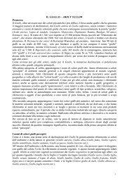
Il primo numero di questo nuovo <strong>Colore</strong> è legato al ROSSO, il colore per eccellenza! Come ci ricordano Pastoureau e Simonnet nel loro Le petit livre des<br />
couleurs certi termini come coloratus in latino o colorado in spagnolo, significano tanto rosso quanto colorato, a testimonianza della grande forza<br />
cromatica che questo colore esprime.<br />
Quando nel 1969 Berlin e Kay, nel loro ormai celeberrimo studio, tentarono di stabilire un ordine universale con il quale si sviluppa il vocabolario coloristico<br />
nelle diverse culture, rilevarono come dopo la distinzione tra chiaro e scuro, bianco e nero, il primo termine cromatico basilare a comparire è il rosso.<br />
In Occidente fin dall’antichità il rosso rappresenta i simboli del potere, della religione, della guerra, ma è anche il colore più bello per il vestito più bello,<br />
quello da sposa che fino al XIX secolo sarà, appunto, rosso.<br />
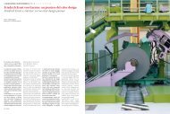
Il rosso è stato ampiamente utilizzato in architettura. A partire dalla strutturazione dei colori primari (rosso, giallo, blu) del movimento De Stijl o<br />
Neoplasticismo fino al recentissimo Chilometro Rosso di Jean Nouvel: un muro lamellare metallico di colore rosso che fiancheggia l’autostrada per un<br />
chilometro diventando la quinta architettonica dietro la quale si dispongono gli edifici del parco scientifico-tecnologico.<br />
Ma il rosso ha decretato anche il successo di molti prodotti di design entrando in maniera sempre più diffusa negli oggetti di consumo che ci circondano.<br />
La bottiglia del Campari Soda disegnata nel 1930 da Fortunato Depero sigla il successo di questa bevanda rossa. La macchina per scrivere Valentine<br />
che Ettore Sottsass progettò per Olivetti nel 1968, in Italia è conosciuta soprattutto come la rossa portatile. Il rosso della Valentine si lega così<br />
indissolubilmente all’immagine del prodotto da connotare fortemente anche la campagna pubblicitaria ideata da Sottsass stesso.<br />
Senza dilungarci oltre sui tanti esempi di design connotati da questo colore scopriamo invece il racconto parallelo che accompagna questo numero di<br />
<strong>Colore</strong> e che attraverso immagini e frasi vuole evocare appunto il ROSSO.<br />
For more than 10 years, <strong>Colore</strong> has represented the only Italian magazine which deals with the theme of colour in a transverse and multi-disciplinary<br />
manner. 2009 marks a moment of important transformation for <strong>Colore</strong> which from a magazine of information it seeks to become an instrument, one of<br />
its kind in Italy, for the divulgation of the culture of colour, offering, I believe, an essential field of comparison and debate, as well as information, with<br />
respect to the different aspects related to colour.<br />
A change which is made obvious starts with the new title which the magazine takes: <strong>Colore</strong>. Quaderni di Cultura e Progetto del <strong>Colore</strong>.<br />
Today, more than ever, the market, production, research and projects are characterised by a process of “contamination”, that is a continuous and<br />
profitable trespassing and pour off of know-how, competence and technology from one field to another. <strong>Colore</strong> wants to reinforce its traditional<br />
interdisciplinary value, proposing itself as an instrument of confrontation and exchange – always with an international prospective – through the<br />
extremely diversified realities which compose the scenario of colour and which often have very few occasions to meet.<br />
The first issue of this new <strong>Colore</strong> is tied to RED, the colour for excellence! As Pastoureau and Simonnet remind us in their Le Petit livre des couleurs,<br />
certain words such as coloratus in latin or colorado in Spanish, mean as much red as coloured, proof of the chromatic power that this colour expresses.<br />
When in 1969 Berlin and Kay, in their today’s famous study, tried to establish a universal order with which the vocabulary of colours is developed in<br />
different cultures, they found that after the distinction between light and dark, white and black, the first basic chromatic term to appear is red.<br />
In the western countries, ever since ancient times, red represented the symbols of power, of religion, of war, but also the most beautiful colour for the<br />
most beautiful dress, that of the bride which until the XIX century was, in fact, red.<br />
Red has been very much used in architecture. Starting from the structuring of primary colours (red, yellow, blue) of the De Stijl or neo-Plasticism<br />
movement till the very recent Red Kilometre by Jean Nouvel: a red metallic lamellar wall which extends along the highway for a kilometre becoming<br />
the architectural scene which behind it are disposed the buildings of the scientific-technological park.<br />
But red has also declared the success of many design products entering consumer objects which surround us in an always more widespread manner.<br />
The Campari Soda bottle designed in 1930 by Fortunato Depero signs the success of this red drink. The Velentine type-writer which Ettore Sottsass<br />
designed for Olivetti in 1968, in Italy is especially known as the portable red. The red of the Valentine indissolubly ties itself to the image of the product,<br />
so much as to strongly connote even the advertisement thought up from the same Sottsass.<br />
Without stretching ourselves too much over the many examples of design connected to this colour we discover instead the parallel story which<br />
accompanies this issue of <strong>Colore</strong> and which through images and phrases it wants to evoke the colour RED.<br />
Cristina COLORE Boeri 9<br />
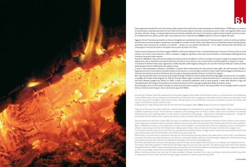
Andrea Rovatti - “Fuoco”
CULTURA / CULTURE [(1 + 2) 3 4 5 6 7 8 9 ]<br />
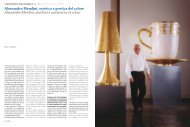
Rosso e… <strong>Intervista</strong> a <strong>Giovanni</strong> <strong>Brino</strong><br />
Red and… Interview with <strong>Giovanni</strong> <strong>Brino</strong><br />
Il primo numero della nuova rivista <strong>Colore</strong> si apre con il rosso,<br />
il colore per eccellenza…<br />
The first issue of the new magazine <strong>Colore</strong> opens with red, the<br />
colour of excellence…<br />
Piano di colorazione del Comprensorio Tecnico della Metropolitana Torinese (2005)<br />
Colour plan of the Technical Comprensorio of the Turin Metropolitan (2005).<br />
Come forse si noterà nel corso dell’intervista, non sono un “colorista”,<br />
ma un architetto educato all’insegna del “bianco e nero” che, appena<br />
dopo laureato, si è immerso quasi per caso, e per il resto della sua<br />
vita professionale ed accademica in un universo di colori fino a quel<br />
momento a lui assolutamente ignoti. Questa avventura, lunga ormai<br />
30 anni, ha stimolato tra l’altro la ricerca senza fine di un “dizionario<br />
dei colori” ormai giunto a oltre 15.000 nomi (16.825 per l’esattezza),<br />
cercando di stabilirne le definizioni, la storia, la geografia, il riferimento<br />
ai sistemi di notazione Munsell e NCS e alla denominazione standard<br />
ISCC.NBS, le ricette, i sinonimi, i luoghi di impiego ecc.<br />
Di questi 16.825 nomi, il “Rosso”, con le sue più varie declinazioni ne occupa<br />
725 (apparentemente molti, ma pochi rispetto ai 1.190 del “Verde”).<br />
Come avviene in genere per gli altri colori, le declinazioni del rosso<br />
hanno riferimenti al mondo vegetale (“rosso geranio“, “rosso mela”,<br />
“rosso mandarino”, “rosso mogano”, “rosso papavero”, “rosso peperoncino”,<br />
“rosso pesca”, “rosso pomodoro”, “rosso ribes” ecc), al mondo<br />
As you will deduce during the course of this interview, I am not a “colourist”,<br />
but an architect educated to “black and white”, who, right after<br />
obtained my degree, almost by chance and for the rest of his professional<br />
and academic life plunged himself into a universe of colours,<br />
which, up until that moment, were absolutely unknown to him. This<br />
adventure, which lasted almost thirty years, has fostered, among<br />
other things, the endless research of a “Colour Dictionary”, which so<br />
far has classified over 15 thousand names (16.825, to be precise), trying<br />
to establish their definitions, history, geography, their reference to<br />
the Munsell’s and NCS’s colour-modelling systems and to the ISCC.NBS<br />
standard denomination, the formulas, the synonyms, the places where<br />
they have been employed, etc.<br />
Of these 16.825 names, “Red”, with all of its most various declinations,<br />
takes up 725 (they seem many but only a few if compared to the 1.190 of<br />
“Green”).<br />
As it generally happens with the other colours, the red declinations<br />
10 COLORE<br />
COLORE 11
CULTURA / CULTURE [ 1 2 (3 + 4) 5 6 7 8 9 ]<br />
Rosso e...intervista a <strong>Giovanni</strong> <strong>Brino</strong> / Red and...Interview with <strong>Giovanni</strong> <strong>Brino</strong><br />
minerale (“rosso minerale”, “rosso rubino”, “rosso terra”, “rosso rame”<br />
ecc.), al mondo animale (“rosso salmone”, “rosso volpe” ecc.), all’ambiente<br />
(“rosso aurora”, “rosso tramonto” ecc.), alla geografia (“rosso di<br />
Corinto”, “rosso di Parigi”, “rosso di Spagna”, “rosso Pozzuoli”, “rosso<br />
prussiano”, “rosso inglese”, “rosso Sudan”, “rosso svedese”, “rosso<br />
marocchino”, “rosso pompeiano”, “rosso toscano”, “rosso turco”, “rosso<br />
veneziano”, “rosso Verona” ecc.), alla storia (“rosso Lincoln”, “rosso<br />
Magenta”, “rosso Ming”, ”rosso Solferino”, “rosso Vittoria ecc. ), al nome<br />
degli inventori dei vari colori (“rosso Harrison”, ecc), all’arte (il “rosso<br />
Tiziano”, il “rosso Tiepolo“,“rosso Van Dyck” ecc.), ai cibi (“rosso bordeaux”,<br />
“rosso vino” ecc.), alla moda (“rosso Principe di Galles” ecc.).<br />
In architettura ho incontrato naturalmente tutti i rossi, dal “rosso primario”<br />
impiegato da Owen Jones nella colorazione del Palazzo di Cristallo<br />
per l’Esposizione di Londra del 1851, al colore “rosso passione erotica”<br />
negli interni dell’architetto Carlo Mollino, al “rosso mattone” nelle facciate<br />
di Siena, di Asti ecc., al rosso generico o declinato in tutte le sue sfumature<br />
(“rosso chiaro”, “rosso leggero”, “rosso scuro” ecc.) o associato<br />
ad altri colori (“rosso bruno”, “rosso granata”, “rosso violaceo”, ecc).<br />
Come si vede anche da questi pochi esempi, il mondo dei colori è complesso,<br />
ambiguo e a volte inafferrabile, ma per questo interessante. Nel<br />
caso del Piano del <strong>Colore</strong> di Torino, tutto fondato sulla denominazione<br />
dei colori riportati nei documenti d’archivio per le facciate a volte ripetute<br />
con lo stesso modello per oltre due chilometri, la loro ricostruzione<br />
precisa aveva posto problemi difficili a livello di definizione e soprattutto<br />
di notazione e di ricette. Nomi obsoleti come “giallo molera”, “persichino”,<br />
“verdastro di malanaggio”, “nanchino oscuro”, “colore vapore”,<br />
“foglia morta”, ecc., riprendevano il loro colore grazie ad una approfondita<br />
ricerca nei manuali, nei dizionari dei colori, nelle riviste di moda<br />
dell’epoca e nei documenti d’archivio, utilizzando i pigmenti adatti e<br />
restituendo così l’immagine di una città policroma sepolta per oltre un<br />
secolo sotto il monotono “giallo Torino”.<br />
Professor <strong>Brino</strong>, Lei è noto soprattutto come l’autore del “Piano del <strong>Colore</strong><br />
di Torino” del 1978, ossia il primo piano del genere in Italia, peraltro<br />
tuttora operativo. Come è nata questa esperienza?<br />
Il Piano del <strong>Colore</strong> di Torino affonda le sue radici 10 anni prima della sua<br />
realizzazione, in due esperienze parallele, una di ricerca e una professionale<br />
e di ricerca al tempo stesso, che mi avevano fortemente impressionato,<br />
dal momento che la mia formazione presso la Facoltà di Architettura<br />
del Politecnico di Torino, tra il 1955 e il 1960, era stata tutta in “bianco<br />
e nero” o al massimo all’insegna dei colori dei materiali naturali.<br />
La prima esperienza è rappresentata dalla ricerca sul Crystal Palace<br />
per l’Esposizione di Londra del 1851, pubblicata inizialmente nel 1968<br />
e poi riedita in modo più approfondito nel 1991. Dalla ricerca sul Crystal<br />
Palace, emergeva che il Crystal Palace (l’edificio era in realtà una<br />
“città di cristallo” capace di contenere contemporaneamente 100.000<br />
persone ossia la popolazione di New York dell’epoca) era stato dotato<br />
di un vero e proprio “piano di colorazione”, operato dal geniale colorista<br />
Owen Jones. In questo piano, venivano utilizzati i colori primari giallo,<br />
azzurro e rosso, distribuiti in base alle teorie dello Chevreul, il grande<br />
chimico francese, che esponeva nella sezione francese il proprio “Cerchio<br />
Cromatico”, il primo sistema scientifico di notazione dei colori. Uno<br />
dei visitatori scienziati e tecnologi piemontesi inviati da Cavour per ag-<br />
make references to the vegetable world (“geranium red”, “apple red”,<br />
“mandarin red”, “mahogany red”, “poppy red”, “hot pepper red”, “apricot<br />
red”, “tomatoes red”, “red currant” etc), to the mineral world (“mineral<br />
red”, “ruby red”, “earth red”, “copper red” etc.), to the animal world<br />
(“salmon red”, “fox red” etc.), to the environment (“aurora red”, “sunset<br />
red” etc.), to geography (“Corinth red”, “Paris red”, “Spanish red”,<br />
“Pozzuoli red”, “Prussian red”, “English red”, “Sudan red”, “Swedish red”,<br />
“Moroccan red”, “Pompeian red”, “Tuscan red”, “Turkish red”, “Venetian<br />
red”, “Verona red” etc.), to history (“Lincoln red”, “Magenta red”, “Ming<br />
red”, ”Solferino red”, “Vittoria red” etc. ), to the names of the inventors<br />
of various colours (“Harrison red”, etc.), to art ( “Tiziano red”, “Tiepolo<br />
red”, “Van Dyck red” etc.), to food & wine (“Bordeaux red”, “wine red”<br />
etc.), to fashion (“Prince of Wales red” etc.).<br />
In architecture, I have obviously met all the red declinations, from the<br />
“primary red” employed by Owen Jones in the colouring of the Crystal<br />
Palace for the Great Exhibition of 1851 in London, to the “erotic passion<br />
red” colour in architect Carlo Mollino’s interiors, to the “brick red” in the<br />
façades of Siena, Asti etc., to the generic red or to all its declined nuances<br />
(“pale red”, “light red”, “dark red” etc.) or combined with other<br />
colours (“brown red”, “garnet red”, “purple red” etc.)<br />
As you can see from these few examples, the colour world is complex,<br />
ambiguous and sometimes elusive, but interesting precisely for this<br />
reason. In the Torino’s Colour Plan, entirely founded on the denomination<br />
of the colours reported in the archive documents for the façades<br />
– sometimes repeated with the same model for more than two kilometres<br />
(see the chromatic map attached) – their precise reconstruction<br />
caused some serious problems in terms of definition and especially of<br />
colour-modelling and formulas. The colour of obsolete names – such<br />
as “molera yellow”, “persichino”, “greenish malanaggio”, “dark Nanking”,<br />
“vapour colour”, “dead leaf” etc. – was restored thanks to a meticulous<br />
research carried out on colour handbooks and dictionaries, on<br />
the fashion magazines of the time and on the archive documentations,<br />
employing the proper pigments and thus giving back the image of a<br />
polychromatic city, buried for more than one century under the repetitive<br />
“Torino yellow”.<br />
Professor <strong>Brino</strong>, you are renowned as the author of “Torino’s Colour Plan”<br />
(1978), the first colour plan to be established in Italy, which is currently<br />
operative. Could you please tell us how did this experience start?<br />
The project for “Torino’s Colour Plan” was conceived ten years before<br />
it was actually carried out and it was founded on two parallel experiences:<br />
one concerned a research and the other was at the same time<br />
a professional and research experience, which greatly impressed me,<br />
since my education at the Architecture Faculty of Torino’s Politecnico,<br />
between 1955 and 1960, had all been about “black and white”, or, at<br />
the most, about the natural material colours.<br />
The first experience was about the research on the Crystal Palace for<br />
the Great Exhibition of 1851 in London, published at first in 1968 and<br />
then reissued in a more exhaustive version in 1991. From the Crystal<br />
Palace’s research came out that the Crystal Palace (the building was<br />
actually a “crystal city” which could accommodate at the same time<br />
100 thousand people, that is New York’s population at that time) had<br />
been provided with a real “colour plan”, carried out by the brilliant col-<br />
12 COLORE<br />
COLORE 13
Rosso e...intervista a <strong>Giovanni</strong> <strong>Brino</strong> / Red and...Interview with <strong>Giovanni</strong> <strong>Brino</strong><br />
Nella pagina precedente: piano del colore del quartiere Panier di Marsiglia con<br />
cantiere-scuola realizzato con il “Laboratorio mobile” (1992).<br />
In questa pagina: banca dati dei restauri della Villa Medici a Roma, con cantiere-pilota<br />
di restauro di uno dei tempietti nel giardino della Villa (1985).<br />
On previous page: the colour for the Panier district in Marseille with<br />
construction site-school carried out with the “Mobile laboratory” (1992).<br />
On this page: database of the restorations of Villa Medici in Rome, with<br />
construction site-pilote project for the restoration of one of the small temples<br />
in the Villa’s garden.<br />
ourist Owen Jones. This plan employed the primary colours yellow, blue<br />
and red, distributed according to the theories of Chevreul, the famous<br />
French chemist, who in the exhibition’s French section displayed his<br />
own “Chromatic Wheel”, the first scientific system of colour classification.<br />
One of the visiting scientist and technologist sent from Piemonte<br />
by Cavour in order to keep up to date with the new scientific progresses<br />
was the dyer Giangiacomo Arnaudon (renowned in the history of dyes<br />
as the creator of “Arnaudon green”), who for ten would attend the Parisian<br />
factory directed by Chevreul, translating in Italian his treatise on the<br />
colour classification system. Owen Jones’ colour plan had impressed<br />
visitors so much that it triggered about twenty projects of alternative<br />
colouration, which I have reconstructed and published.<br />
The second experience, which was more directly connected to the Torino’s<br />
Colour Plan, concerned the restoration works for Casa Antonelli in<br />
Torino, a house/laboratory built between 1846 and 1851 from its designer<br />
and owner, the architect Alessandro Antonelli, who built Torino’s<br />
“Mole”, an experience published in 1972, together with Franco Rosso,<br />
the most important expert of Antonelli’s architecture. From the restoration<br />
of the façades and from the archive research carried out by his<br />
friend, Franco Rosso, it came out that the façades of Casa Antonelli,<br />
which had been re-dyed at the time – as, for that matter, had been all<br />
the city’s façades with the so-called “Torino yellow” colour – were actually<br />
polychromatic, as clearly shown by the same chromatic traces<br />
which emerged under the decayed yellowish colouration and especially<br />
by the original colour plan kept in the Civic Museum’s Archive.<br />
giornarsi sui progressi scientifici era il tintore Giangiacomo Arnaudon<br />
(noto nella storia della tintura come autore del “verde Arnaudon”), che<br />
frequenterà per dieci anni la manifattura parigina diretta da Chevreul,<br />
traducendo in italiano il suo trattato sul sistema di codifica dei colori. Il<br />
piano di colorazione di Owen Jones aveva impressionato talmente i visitatori<br />
da scatenare una ventina di progetti di colorazione alternativa,<br />
che ho ricostruito e pubblicato.<br />
La seconda esperienza, che è stata più direttamente alla base del Piano<br />
del <strong>Colore</strong> di Torino, è costituita dal restauro della Casa Antonelli in<br />
Torino, una casa-laboratorio realizzata tra il 1846 ed il 1851 dal suo<br />
progettista e proprietario, l’architetto Alessandro Antonelli, autore della<br />
“Mole” di Torino, un’esperienza pubblicata nel 1972, in collaborazione<br />
con Franco Rosso, il massimo specialista dell’architettura antonelliana.<br />
Dal restauro delle facciate e dalla ricerca condotta in archivio dall’amico<br />
Franco Rosso, emergeva che le facciate della Casa Antonelli, all’epoca ritinteggiate,<br />
come del resto tutte le facciate della città, con il colore “giallo<br />
Torino”, erano in realtà policrome, come dimostravano chiaramente le<br />
stesse tracce delle tinte che affioravano sotto la colorazione giallastra<br />
degradata e soprattutto il progetto di colorazione originaria conservato<br />
presso l’Archivio del Museo Civico. I colori impiegati per la decorazione<br />
della Casa erano infatti il “giallo molera” per le parti strutturali, il “rosso<br />
mattone” per gli sfondati e il “bigio ceruleo”, assimilabile alla pietra, per<br />
le parti ornamentali: una vera e propria declinazione in chiave locale dei<br />
colori puri adottati nello stesso anno a Londra da Owen Jones.<br />
Stimolato da queste scoperte, iniziava una ricerca sistematica in archivio<br />
attraverso una prima tesi di laurea, nell’ambito del corso di “Decorazione”<br />
che tenevo a partire dal 1970, che conduceva alla scoperta<br />
di centinaia di progetti di colorazione di singole facciate e soprattutto<br />
del Piano di Colorazione di Torino in epoca ottocentesca. Alla fine del<br />
1978, questo piano veniva proposto all’allora assessore Biffi Gentili ed<br />
accettato dall’Amministrazione Comunale. Il piano è attualmente in vigore<br />
e si può dire che è stato realizzato ormai completamente, almeno<br />
per quanto riguarda la colorazione delle facciate degli assi principali e<br />
comunque per quanto riguarda la metodologia di restauro consistente<br />
nel ripristino delle colorazioni storiche.<br />
Una delle obiezioni poste a questo piano era che si trattava della ricostruzione<br />
del piano ottocentesco di una città barocca e dunque in contraddizione<br />
con l’immagine originaria della città.<br />
Le ricerche d’archivio condotte contemporaneamente dimostravano<br />
che il piano ottocentesco non solo non era in contraddizione con l’immagine<br />
che emergeva dall’iconografia barocca, dal settecentesco Theatrum<br />
Sabaudiae ai dipinti del Graneris della metà del ‘700 e alle stampe<br />
d’epoca, ma ne era stata la più autentica continuazione negli ambienti<br />
realizzati in epoca ottocentesca negli ampliamenti della città.<br />
Un’altra obiezione era costituita dal fatto che le colorazioni delle facciate<br />
negli anni in cui il Piano <strong>Colore</strong> veniva proposto erano effettuate con<br />
tinte acriliche e non con le tinte a calce.<br />
Per rispondere all’esigenza di ripristinare i colori a calce, veniva creata<br />
nel 1982 una Scuola di Restauro Urbano con l’obiettivo di reintrodurre<br />
tutti quei materiali e quelle tecniche tradizionali che il boom edilizio degli<br />
anni ’50-’60 aveva abbandonato a favore dei materiali moderni nelle<br />
facciate, nelle pavimentazioni, nelle vetrate, nelle insegne ecc. Mentre<br />
per le pavimentazioni, gli stucchi, le vetrate colorate, le insegne, venivano<br />
reperiti dei laboratori e delle botteghe artigiane capaci di accogliere<br />
giovani desiderosi di apprendere un mestiere, secondo una formula<br />
di “alternanza scuola-lavoro”, per il restauro delle facciate non esisteva<br />
più alcuna impresa che facesse uso della calce negli intonaci e nelle coloriture.<br />
Per ovviare a questo limite, veniva immediatamente creato un<br />
“Laboratorio mobile” con cui sono state effettuate esperienze pratiche<br />
su facciate da restaurare in ogni parte d’Italia, in Francia e in Svizzera.<br />
Mentre la “Scuola di Restauro Urbano” veniva chiusa poco tempo dopo<br />
la caduta della Giunta Comunale nel 1983, questo “Laboratorio mobile”,<br />
tuttora in piena attività, ha al suo attivo oltre 85 corsi di formazione<br />
professionale, condotti in collaborazione con la Cna, la Confederazione<br />
Nazionale degli Artigiani, con oltre un migliaio di partecipanti. Questa<br />
struttura di formazione professionale, condotta per lo più in collaborazione<br />
con i Comuni che si dotavano dei piani del colore da me realizzati<br />
e con la Cna, ma anche con università italiane e straniere, centri<br />
di formazione, scuole edili, musei ecc., recentemente sta creando, in<br />
collaborazione con il Comune di Sassello in Liguria (una Genua Picta in<br />
miniatura, in cui tutte le facciate sono dipinte in trompe-l’oeil) un vero<br />
e proprio “Borgo-laboratorio” con la prospettiva di restauro di diecine di<br />
facciate decorate come il fondale di un teatro.<br />
Dopo il Piano <strong>Colore</strong> di Torino quanti altri piani di colorazione ha finora<br />
effettuato e quale evoluzione hanno subito in questi anni?<br />
The colours employed for the house decoration were precisely “molera<br />
yellow” (greyish yellow), used in the structural parts, “brick red” in the<br />
trompe-l’oeil, and “light blue gray”, similar to stone, in the ornamental<br />
parts: a real declination on a local scale of the pure colours, adopted in<br />
London by Owen Jones that same year.<br />
Driven by these discoveries, I began a systematic archive research,<br />
starting from a graduation thesis, within the “Decoration” course I had<br />
been teaching since 1970, which led to the discovery of hundreds of<br />
colour projects for single façades and mostly of the Torino’s 19th century<br />
Colour Plan. At the end of 1978, this plan was submitted to the then<br />
councillor Biffi Gentili and approved by the municipal administration,<br />
which adopted the system still currently in use. We could say it has<br />
been almost fully realized, at least for what concerns the colouring<br />
of the façades of the principal axis and the restoration methodology<br />
which focused on restoring the historical colours.<br />
One of the first objections to this plan was that it dealt with the 19 th century<br />
restoration of a baroque city, therefore contradicting its original<br />
image.<br />
The archive researches, carried out simultaneously, revealed that<br />
the 19 th century plan not only wasn’t contradicting the image emerging<br />
from the baroque iconography – from the 18 th century Theatrum<br />
Sabaudiae to Graneris’ paintings belonging to the first half of the 18 th<br />
century and the period prints – but it also represented the most genuine<br />
continuation of the decors carried out in the city extension works<br />
in the 19 th century.<br />
Another objection was that the colourings of the façades, in the years in<br />
which the Colour Plan was in practice, were carried out with acrylic and<br />
not with lime colours.<br />
In 1982, a “School for Urban Restoration” was established to answer<br />
the needs of reintroducing the lime colours, with the purpose of bringing<br />
back all those traditional materials and techniques which were<br />
abandoned during the building boom of the Fifties and Sixties and replaced<br />
with the employment of modern materials in the façades, in the<br />
floorings, in the stained glass windows, in the signs, etc. While for the<br />
floorings, the stuccos, the stained glass windows and the signs, artisan<br />
laboratories and workshops were founded – which would welcome<br />
young people eager to learn a profession, following the “alternating<br />
school-work” formula – for the façades restoration it was impossible to<br />
find any company still using the lime in the plaster and in the colouring.<br />
In order to remedy this limit, a “Travelling Laboratory” was immediately<br />
created, which carried out practical experiences on façades to be<br />
restored all over Italy, in France and in Switzerland. While the “School<br />
of Urban Restoration” was shut down shortly after the fall of the town<br />
council in 1983, this “Travelling Laboratory” – which still exists today<br />
and is in full activity – boasts over 85 professional training courses,<br />
carried out in collaboration with the CNA, the National Confederation for<br />
the Craft Sector, with over a thousand people attending them. Recently,<br />
this structure of professional training – carried out mostly in collaboration<br />
with the municipality districts, which employed the colour plans I<br />
developed, and with CNA, but also with Italian and foreign universities,<br />
training centres, construction schools, museums, etc. – has created,<br />
14 COLORE<br />
COLORE 15
CULTURA / CULTURE [ 1 2 3 4 5 6 (7 + 8) 9 ]<br />
Rosso e...intervista a <strong>Giovanni</strong> <strong>Brino</strong> / Red and...Interview with <strong>Giovanni</strong> <strong>Brino</strong><br />
Il Piano del <strong>Colore</strong> di Torino ha stimolato la realizzazione di una cinquantina<br />
di altri piani, fra cui quelli dei vari quartieri di Marsiglia, di molte<br />
città e villaggi in Piemonte e in altre città italiane, in Francia, in Svizzera<br />
e in Australia. I piani del colore hanno subito naturalmente una evoluzione,<br />
nel senso che sono stati sempre più orientati a diventare uno<br />
strumento di restauro conservativo delle facciate, grazie anche ai corsi<br />
di formazione ad essi collegati. In questo senso, il Piano del <strong>Colore</strong> di<br />
Torino è stato unico e irripetibile, trattandosi del ripristino, sia pure con<br />
i dovuti adattamenti e aggiornamenti, di un piano preesistente, in base<br />
a precisi documenti d’archivio, con i nomi dei colori delle facciate delle<br />
principali vie e piazze.<br />
Quali ricadute hanno avuto i “piani del colore” sul piano didattico, della<br />
ricerca, della professione e della formazione professionale?<br />
I piani del colore, le esperienze professionali di restauro di facciate<br />
storiche e di formazione professionale sui colori dell’architettura sono<br />
stati stimolati ed a loro volta hanno stimolato tutta una serie di ricerche<br />
sui colori condotte per quasi 40 anni con i miei studenti, nei corsi<br />
da me tenuti presso la Facoltà di Architettura di Torino e i cui elaborati<br />
sono gelosamente custoditi nel mio archivio. Le ricerche storiche e archivistiche<br />
(come si è visto nel caso del restauro della Casa Antonelli o<br />
del Piano del <strong>Colore</strong> di Torino, nelle “banche dati” dei restauri della Villa<br />
Medici a Roma o dei colori di altre città come Marsiglia, dove ho lavorato<br />
per 17 anni presso l’Atelier du Patrimoine, o la banca dati dei colori della<br />
Regione Piemonte o della Regione Liguria, solo per fare qualche esempio)<br />
sono sempre state sperimentate attraverso realizzazioni pratiche<br />
che, a loro volta, hanno generato e stimolato ulteriori approfondimenti.<br />
Come risultato di questi approfondimenti e ricadute, mi piace ricordare<br />
tre esperienze attualmente in corso.<br />
La prima ricaduta delle ricerche sui colori delle città e dell’architettura<br />
è costituita dal “Dizionario dei colori”, condotto con mia moglie Dominique,<br />
che a partire dalla fine degli anni ’70 ha sempre collaborato con<br />
me, e con Tom Porter. Questo dizionario è stato allestito a partire dalle<br />
ricerche d’archivio sui colori delle città indagati nel corso dei vari piani<br />
o banche dati o attraverso le ricerche universitarie o nelle tesi di laurea<br />
dei miei studenti.<br />
La seconda ricaduta riguarda le banche dati sui colori del Piemonte e<br />
della Liguria, di cui è in progetto la riedizione aggiornata dei libri sui<br />
colori di queste regioni, in cui si sono massimamente concentrate le<br />
ricerche archivistiche, le esperienze di restauro di facciate attraverso<br />
l’attività professionale ed i corsi di formazione.<br />
La terza ricaduta, infine, è rappresentata dalla sezione del “Prezzario<br />
della Regione Piemonte” sui materiali e prodotti tipici piemontesi, condotta<br />
in collaborazione con la Regione Piemonte e la CNA.<br />
Al di fuori dei piani del colore e dei restauri di facciate storiche, ha avuto<br />
anche qualche esperienza di colorazione di ambienti moderni?<br />
Come si è visto dall’esposizione delle esperienze da me condotte in questi<br />
40 anni, dal 1968 al 2008, non sono un “colorista”, come gli amici Jean<br />
Philippe Lenclos, Tom Porter o Jorrit Tornquist, tanto per fare dei nomi di<br />
personaggi che ho conosciuto personalmente e che stimo, facendo ormai<br />
parte della storia del colore, raccontata dagli stessi protagonisti.<br />
Come architetto, sono contento di aver avuto la possibilità di fare rina-<br />
together with the Sassello town council in Liguria (a miniature Genua<br />
Picta, in which all the façades are painted with the trompe-l’oeil technique),<br />
a real “Small village-Laboratory”, aimed at restoring ten or so<br />
façades, decorated as a theatre backdrop.<br />
How many colour plans have you carried out, after the Torino’s Colour<br />
Plan? And which evolution have they undergone in these last thirty<br />
years?<br />
The Torino’s Colour Plan has fostered the realization of about fifty other<br />
plans, among which those of Marseille’s various districts, of many<br />
cities and villages in Piemonte and in other Italian cities, in France, in<br />
Switzerland and in Australia. The colour plans have naturally undergone<br />
an evolution as they were more and more oriented towards becoming<br />
a tool for restoring the façades in a conservative way, also thanks to<br />
the training courses associated with them. In this sense, the Torino’s<br />
Colour Plan has been unique and exclusive, since it restored – although<br />
properly adjusted and updated – a pre-existing plan, following precise<br />
archive documents, with the colour names of the façades of the main<br />
streets and squares.<br />
Which type of repercussions had the “colour plans” on the educational,<br />
research, professional and training level?<br />
The colour plans, the professional experiences of the historical façades<br />
restoration and of the professional training on the architecture colours<br />
have been fostered by and, in turn, have fostered a whole series<br />
of colour researches, carried out along with my students for almost<br />
forty years, in the classes I have been teaching at Torino’s Architecture<br />
Faculty, and whose papers are jealously cherished in my archive. The<br />
historical and archive researches – as we have seen in the restoration<br />
of Casa Antonelli, in the Torino’s Colour Plan, in the “database” of the<br />
restoration of Villa Medici in Roma, in the colours of other cities such as<br />
Marseille, where I have worked for 17 years at Atelier du Patrimoine, or<br />
in the chromatic data base of the Piemonte or Liguria Region, to name<br />
just a few – have always been experimented through practical realizations<br />
which, in turn, have generated and promoted further in-depth<br />
studies. As a result of these closer examinations and repercussions, I<br />
like to mention three experiences currently in progress.<br />
The first repercussion of the colour researches of the cities and of the<br />
architecture is the “Colour Dictionary”, carried out with my wife Dominique,<br />
who has been working with me all these years since the late<br />
Seventies, and with Tom Porter; the project has been organized starting<br />
from the archive colour researches of the cities, carried out during the<br />
different plans or through databases or university researches or my<br />
students’ graduations thesis. This “Colour Dictionary” currently classifies<br />
over 15 thousand colour names, with their relative definitions, history,<br />
formulas, the Munsell’s and NCS’s colour-modelling system and<br />
the scientific denominations with the ISCC.NBS system, the synonyms,<br />
the places where they have been employed, etc.<br />
The second repercussion concerns the colour data bases of Piemonte<br />
and Liguria Region, through which we are working on an updated reissue<br />
of the books on colours in those regions, where the archive researches,<br />
the experiences of façades restoration through the professional<br />
activity and the training courses were concentrated.<br />
16<br />
COLORE
CULTURA / CULTURE [ 1 2 3 4 5 6 7 8 (9)]<br />
scere i colori di città storiche come Torino, Marsiglia, Alessandria, Asti<br />
e tante altre cittadine e persino di borghi come Sassello, di complessi<br />
storici come la Villa Medici a Roma e di centinaia di facciate storiche, dall’epoca<br />
barocca a quella neoclassica, dal liberty al “moderno” (come nel<br />
caso della “Capanna Lago Nero” di Carlo Mollino del 1946-47, restaurata<br />
nel 1999-2005), attraverso un’opera attenta di studio e di restauro, evitando<br />
o comunque cercando di evitare qualunque personalizzazione.<br />
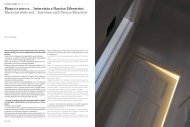
L’unica mia esperienza di “colorazione” di un complesso moderno è<br />
costituita dal “Comprensorio Tecnico” della Metropolitana di Torino,<br />
progettato con Tom Muirhead nel 1999-2002 e inaugurato nel 2004. In<br />
questo complesso, destinato al controllo della rete e al ricovero e manutenzione<br />
dei treni della Metropolitana Torinese, realizzato con strutture<br />
in cemento prefabbricato a vista, il colore è stato impiegato con<br />
finalità rigorosamente funzionali, segnaletiche e normative. In questo<br />
caso, il colore non è stato applicato a posteriori, ma è nato col progetto<br />
stesso − anche se ovviamente è stato definito nella sua fase terminale<br />
− e in coerenza con il resto dell’opera, facendo tesoro di quanto<br />
abbiamo appreso dai grandi maestri dell’architettura moderna come Le<br />
Corbusier, Bruno Taut, Carlo Mollino, ecc.<br />
Finally, the third repercussion is represented by “Piemonte Region<br />
Price List” section on the characteristic Piemonte materials and products,<br />
carried out together with the Piemonte region and CNA.<br />
Other than the colour plans and the restoration of historical façades,<br />
have you had any colouring experience with modern environments?<br />
As you can see from the experiences I have carried out over these past<br />
forty years, precisely from 1968 to 2008, I am not a “colourist”, as<br />
are my friends Jean Philippe Lenclos, Tom Porter or Jorrit Tornquist, to<br />
name just a few artists I have personally met and whom I admire, since<br />
they now belong to colour history, told by the characters who played a<br />
major role in it.<br />
As an architect, I am happy to have had a chance to restore to life the<br />
colours of historic cities, such as Torino, Marseille, Alessandria, Asti<br />
and many other cities and even small villages, as Sassello; of historical<br />
complexes, such as Villa Medici in Roma; and of hundreds of historical<br />
façades, from the Baroque to the Neoclassicism, from the Liberty to the<br />
“Modern” architecture (as in the Carlo Mollino’s “Capanna Lago Nero”<br />
(1946-47), restored between 1999 and 2005) through a scrupulous<br />
work of study and restoration, avoiding or, nonetheless trying to avoid,<br />
any personalization.<br />
My only “colouring” experience of a modern complex has been the<br />
“Technical Area” of the Torino’s Subway, designed with Tom Muirhead<br />
between 1999 and 2002 and opened in 2004. In this complex, planned<br />
for the system control, recovery and maintenance work of the Torino’s<br />
Subway trains, carried out in prefabricated concrete, the colour has<br />
been employed with strictly functional, identification and regulatory<br />
purposes. In this very case, the colour wasn’t applied after, but it was<br />
born within the project itself, although it was defined in its final stages,<br />
harmonically blending with the rest of the work, cherishing what we<br />
had learnt from the great artists of modern architecture, such as Le<br />
Corbusier, Bruno Taut, Carlo Mollino etc.<br />
Nella pagina precedente: “Colour workshop” organizzato nell’ambito del Piano<br />
del <strong>Colore</strong> di Subiaco, alla Curtin University in Australia (1990).<br />
On previous page: “Colour workshop” organized within the ColourPlan of Subiaco,<br />
at the Curtain University in Australia (1990).<br />
18<br />
COLORE<br />
Lisa Lardo - “Deep_red_ll”