Photoshop Projects Volume 14
Photoshop knows no boundaries. Whether it’s age, skill or training, you’re only limited by your imagination. In this issue, we talk to young guns like Sebastian Andaur, who’s making a name for himself as a freelance art director while still in high school. Then there are the illustrators and lettering masters who maximise the tools and techniques of Photoshop to suit their own needs. Check out Gabriela Fuente’s patterns, designed for high-end fashion clients and created in Photoshop. The beauty of Photoshop is that it has almost limitless possibilites. Use it to take ordinary photos into the realm of the extraordinary. Shane Monopoli and Mark Gardner show us how to composite a gothic drama at Windsor Castle, while Rachel Lewis goes behind the scenes to create highenergy cosplay images. There are also loads of tips and tricks, interviews and inspirational articles on everything from lettering and 3D work to complex layers and high-end retouching. Happy Photoshopping!
Photoshop knows no boundaries. Whether it’s age, skill or training, you’re only limited by your imagination. In this issue, we talk to young guns like Sebastian Andaur, who’s making a name for himself as a freelance art director while still in high school. Then there are the illustrators and lettering masters who maximise the tools and techniques of Photoshop to suit their own needs. Check out Gabriela Fuente’s patterns, designed for high-end fashion clients and created in Photoshop. The beauty of Photoshop is that it has almost limitless possibilites. Use it to take ordinary photos into the realm of the extraordinary. Shane Monopoli and Mark Gardner show us how to composite a gothic drama at Windsor Castle, while Rachel Lewis goes behind the scenes to create highenergy cosplay images. There are also loads of tips and tricks, interviews and inspirational articles on everything from lettering and 3D work to complex layers and high-end retouching. Happy Photoshopping!

Erfolgreiche ePaper selbst erstellen
Machen Sie aus Ihren PDF Publikationen ein blätterbares Flipbook mit unserer einzigartigen Google optimierten e-Paper Software.
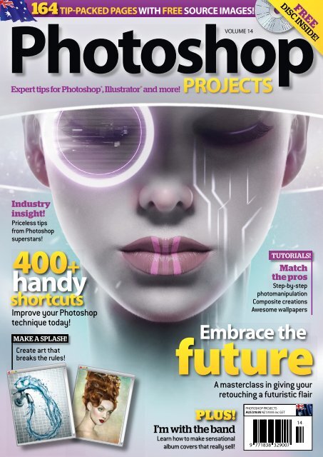
164<br />
TIP-PACKED PAGES WITH FREE SOURCE IMAGES!<br />
<strong>Photoshop</strong><br />
VOLUME <strong>14</strong><br />
Expert tips for <strong>Photoshop</strong> ® , Illustrator ® and more!<br />
PROJECTS<br />
FREE<br />
DISC INSIDE!<br />
Industry<br />
insight!<br />
Priceless tips<br />
from <strong>Photoshop</strong><br />
superstars!<br />
400+<br />
handy<br />
shortcuts<br />
Improve your <strong>Photoshop</strong><br />
technique today!<br />
MAKE A SPLASH!<br />
Create art that<br />
breaks the rules!<br />
TUTORIALS!<br />
Match<br />
the pros<br />
Step-by-step<br />
photomanipulation<br />
Composite creations<br />
Awesome wallpapers<br />
Embrace the<br />
future<br />
PLUS!<br />
I’m with the band<br />
Learn how to make sensational<br />
album covers that really sell!<br />
A masterclass in giving your<br />
retouching a futuristic flair<br />
PHOTOSHOP PROJECTS<br />
AUS $19.95 NZ $19.95 inc GST
GAMEs ARE<br />
IMAGINATION<br />
IN ACTION<br />
GAMEon<br />
DEGREE COURSES IN:<br />
GAMES DESIGN<br />
GAMES PROGRAMMING<br />
EXCITING CAREER OPTIONS:<br />
CHARACTER DESIGNER<br />
COMPOSER<br />
GAMES DESIGNER<br />
SCRIPT WRITER<br />
GAMES TESTER<br />
CONCEPT ARTIST<br />
LEVEL DESIGNER<br />
ENVIRONMENT ARTIST<br />
PROJECT MANAGER<br />
QUALITY ASSURANCE<br />
SAE’s Games courses have been developed with local industry partners to ensure you get the most<br />
relevant skills and knowledge you need, to forge the career you want. It’s game on at SAE.<br />
REGISTER NOW AT:<br />
sae.edu.au OR CALL 1800 SAE EDU<br />
Brisbane | Byron Bay | Sydney | Melbourne | Adelaide | Perth<br />
SAE CRICOS Provider Codes QLD 03204G | NSW 00312F | VIC 02047B | WA 02431E
EDITOR’S WELCOME<br />
The Snake<br />
For more from Faroe Islandsborn<br />
photographer Jonfrid<br />
Eliasen, see page 80<br />
Editor’s<br />
welcome<br />
<strong>Photoshop</strong> knows no boundaries. Whether it’s age, skill or training,<br />
you’re only limited by your imagination. In this issue, we talk to<br />
young guns like Sebastian Andaur, who’s making a name for<br />
himself as a freelance art director while still in high school. Then<br />
there are the illustrators and lettering masters who maximise the tools and<br />
techniques of <strong>Photoshop</strong> to suit their own needs. Check out Gabriela Fuente’s<br />
patterns, designed for high-end fashion clients and created in <strong>Photoshop</strong>.<br />
The beauty of <strong>Photoshop</strong> is that it has almost limitless possibilites. Use it<br />
to take ordinary photos into the realm of the extraordinary. Shane<br />
Monopoli and Mark Gardner show us how to composite a gothic drama at<br />
Windsor Castle, while Rachel Lewis goes behind the scenes to create highenergy<br />
cosplay images. There are also loads of tips and tricks, interviews<br />
and inspirational articles on everything from lettering and 3D work to<br />
complex layers and high-end retouching. Happy <strong>Photoshop</strong>ping!<br />
Lisa Perkovic<br />
Editor<br />
PHOTOSHOP PROJECTS | 3
Contents<br />
<strong>Photoshop</strong> <strong>Projects</strong>: Issue <strong>14</strong><br />
6 Creative Insights<br />
<strong>Photoshop</strong> art designed to inspire<br />
Features<br />
10 Photomanipulation Tips<br />
Ben Foertsch shares his tips for taking<br />
on photomanipulation and doing it well<br />
16<br />
16 Calvin Hollywood<br />
Germany’s superstar photographer and<br />
master retoucher on making your mark<br />
28 The Money Shot<br />
Professional retoucher Anthony Pugh goes<br />
behind the scenes of the advertising game<br />
40 The Glamour King<br />
A look at award-winning photographer<br />
Shane Monopoli’s portfolio<br />
54 The Letter Player<br />
Inside the world of lettering with Spanish<br />
graphic designer Baimu<br />
74 Texture Truths<br />
Texture and pattern designer Gabriela<br />
Fuente talks shop<br />
80 Faroe Princess<br />
Emerging photographer Jonfrid Eliasen<br />
takes us inside her world<br />
88 The Queen of Punch<br />
In the studio and inside the new reality<br />
of photographer Rachel Lewis<br />
94 French Toast<br />
Inside the studio of Antoine Collignon<br />
54 108<br />
96 Starting Young<br />
Young gun Sebastian Andaur is still in<br />
high school but that’s not stopping him<br />
108 Otherworldly<br />
Marta Bielsa’s images capture the imagination<br />
Tutorials<br />
12 Photomanipulation<br />
Ben Foertsch takes the ordinary and makes<br />
it extraordinary<br />
22 Capturing the Mob<br />
Professional photographer Lisa Saad goes to<br />
the track to get the best results<br />
36 Wallpaper<br />
Create a wallpaper that hops with artist<br />
Vlad Gerasimov<br />
46 Composite creations<br />
Shane Monopoli and Mark Galer create a<br />
period drama with a perfect composition<br />
60 Lettering<br />
Artist and lettering master Baimu shows us his tips<br />
on mastering lettering<br />
68 Metal Taste<br />
Bernardo Henriques puts the wow factor into<br />
sketching in <strong>Photoshop</strong><br />
4 | PHOTOSHOP PROJECTS
94<br />
CONTENTS<br />
THE TEAM<br />
EDITOR<br />
Lisa Perkovic<br />
COMMISSIONING EDITOR<br />
Ewa Samulska<br />
SUB EDITOR<br />
Adam Scroggy<br />
ART DIRECTOR<br />
Carol Tang<br />
120<br />
CREATIVE DIRECTOR<br />
Paul Cook<br />
GROUP EDITOR<br />
Alex Mead<br />
CONTRIBUTORS<br />
Lisa Saad, Shane Monopoli, Mark Galer,<br />
Calvin Hollywood, Anthony Pugh, Rachel<br />
Lewis, Jonifred Eliasen, Antoine Collignon,<br />
Sebastian Andaur, Diego Penuela, Denitsa<br />
Toshirova, Moe Pike Soe, Hugo Ceneviva,<br />
Nicolas Andrade, Galima Akhmetzyanova,<br />
Timothy Meakins, Quinny Vu, Kristina Alegro,<br />
Baimu, Bernardo Henriques, Vlad Gerasimov,<br />
Ben Foertsch<br />
ADVERTISING<br />
Alex Brereton (02) 9186 9109<br />
96<br />
102 Life’s a Beach<br />
Lisa Saad takes Barbie to the beach and<br />
plays with perspective<br />
106 Painterly Way<br />
Diego Penuela defines digital painting<br />
1<strong>14</strong> Breathe in the Air<br />
Denitsa Toshirova flips art on its head<br />
120 Utopia<br />
Beauty retouching by Moe Pike Soe<br />
126 Flying Island<br />
Nicolas Andrade constructs fantasy<br />
worlds with his word<br />
134 Tap’s On<br />
Digital Artist Hugo Ceneviva’s water works<br />
<strong>14</strong>2 RAW Pop Colour<br />
Using RAW techniques to take your image<br />
to the next level, with Quinny Vu<br />
<strong>14</strong>8 Trophy Beer<br />
Packaging design by Galima Akhmetzyanova<br />
154 Album Covers<br />
Creating album art with Timothy Meakins<br />
158 Soul Transmission<br />
Kristina Alegro makes a splash<br />
162 Editor’s Choice<br />
126<br />
MANAGEMENT<br />
DIRECTOR<br />
Jim Flynn<br />
FINANCIAL CONTROLLER<br />
Stuart Harle<br />
EDITORIAL DIRECTOR<br />
Richard Ryan<br />
PRODUCTION MANAGER<br />
Ian Scott<br />
Distributed by Network Services Company<br />
in Australia and Netlink in New Zealand.<br />
Printed by Paramount Printing.<br />
PUBLISHED BY<br />
Citrus Media<br />
PO Box 20154<br />
World Square NSW 2002<br />
© 2013 Citrus Media. All rights reserved. No article<br />
or images may be reproduced wholly or in part<br />
without prior written permission from the publisher.<br />
Citrus Media is a division of Media Factory Pty Ltd.<br />
While every care was taken during the preparation<br />
of this magazine, Citrus Media cannot be held<br />
responsible for the accuracy of the information or any<br />
consequence arising from it. All judgements are based<br />
on equipment available to Citrus Media at the time<br />
of review. ‘Value for money’ comments are based on<br />
prices at the time of publication. Citrus Media takes<br />
no responsibility for the content of external websites<br />
whose addresses are published.<br />
PHOTOSHOP PROJECTS | 5
Creative<br />
insights<br />
Broaden your horizons with these inspirational images<br />
6 | PHOTOSHOP PROJECTS
RIO TYPE<br />
This is a tribute to the city of Rio in Brazil! It’s a<br />
personal work with an Artist from Brazil called Ots.<br />
Artist: Hugo Ceneviva<br />
Website: behance.net/hugoceneviva<br />
PHOTOSHOP PROJECTS | 7
IN CORPO<br />
I did this piece in an inspirational rush in<br />
just three hours. It represents the point<br />
where two lovers become one; from that<br />
way forward there’s nothing you can do<br />
to go back.<br />
Artist: Bernardo Henriques<br />
Website: behance.net/BeBernard<br />
CORONA<br />
Artist: Diego Peñuela<br />
Website: Diegoillustration.com<br />
CITY<br />
Artist: Jane Mendes<br />
Website: regular-jane.com<br />
8 | PHOTOSHOP PROJECTS
THIS IS NOT SIMPLY<br />
a <strong>Photoshop</strong> project. All pieces were<br />
put together like that with strings<br />
and metal. <strong>Photoshop</strong> was used to<br />
get rid of these countless lines.<br />
Artist: Daniel von Stephani<br />
Website: art.Davonstart.com<br />
PHOTOSHOP PROJECTS | 9
PROFILE<br />
BEN FOERTSCH<br />
Tips and Tricks for<br />
PHOTOMAN<br />
Photographer and<br />
graphic designer<br />
Ben Foertsch on<br />
making the most of<br />
photomanipulation<br />
Beginnings<br />
I started out using <strong>Photoshop</strong> back<br />
in 2006 during the year I spent living<br />
in New Zealand for high school. Back<br />
then I’d just started photographing and<br />
learnt how to use <strong>Photoshop</strong> (self-taught)<br />
to improve my (amateur) photography.<br />
Now I do freelancing as a photographer<br />
for various local businesses and business<br />
portraiture for private clients.<br />
Style<br />
I keep it minimalistic and straightforward.<br />
After years of using <strong>Photoshop</strong>, I realised<br />
the artworks that stand out are the ones<br />
that are so simple and straightforward<br />
that you can easily recognise them<br />
amongst the ocean of artworks.<br />
What do I wish I could do in<br />
<strong>Photoshop</strong>?<br />
Convert **** into gold? Well, there’s so<br />
much you can do, I just don’t have the<br />
IMAGES<br />
BRAND PICTURE<br />
» (LEFT) A personal<br />
project that has<br />
become my business<br />
card picture: “You are<br />
what you eat”<br />
BOXED<br />
THINKING<br />
» (FAR LEFT) They<br />
always say “think<br />
outside the box”.<br />
I took this “problem”<br />
and visualised it<br />
RESIZED KEY<br />
» (TOP RIGHT) Losing<br />
your keys makes<br />
quite an impact. It<br />
was very difficult<br />
combining huge<br />
objects with really<br />
small ones!<br />
PICK IT<br />
» (MIDDLE RIGHT) If<br />
you had all the<br />
money in the world,<br />
you could pick<br />
anything you liked<br />
BITTERSWEET<br />
» (RIGHT) Love and<br />
affection, what a<br />
bittersweet feeling.<br />
The background of<br />
this is an actual bed<br />
10 | PHOTOSHOP PROJECTS
PHOTOMANIPULATION<br />
IPULATION<br />
Top 5 tips to<br />
creating an effective<br />
photomanipulation<br />
time to learn it all… but I’ve always<br />
wanted to try using Matte Painting<br />
in <strong>Photoshop</strong>.<br />
Three key elements to a<br />
good photomanipulation<br />
1. A clear overall light structure<br />
(shadow/light/contrast).<br />
2. A perfect colour balance between<br />
the layers.<br />
3. The alignment of textures<br />
and transitions.<br />
The three <strong>Photoshop</strong><br />
techniques I use the most:<br />
01. Brushing on layer masks<br />
02. Converting and adjusting RAWs<br />
03. Colour balance adjusting<br />
If you’re just starting out, take time<br />
to master the art of brushing transitions<br />
and edges on a layer mask<br />
Check out more of Ben’s work at art.<br />
davonstart.com and davonstart.com<br />
DON’T OVERDO IT<br />
01 The fewer steps/filters you need, the more<br />
real it will usually look.<br />
LAYER MASKS, LAYER MASKS, LAYER<br />
02 MASKS!<br />
Using layer masks with an interesting brush is perfect<br />
for blending layers.<br />
A BRUSH FOR EVERY SITUATION<br />
03There are endless brushes so take the time<br />
to look for some good, high-quality ones. It will make<br />
working easier and your work look better.<br />
WORK ON YOUR CONCEPT<br />
04 If you want to stand out, you need something<br />
in your artwork to do so. Think about what would be<br />
nice to see or how it will be remembered. Funny sayings<br />
are always a good start.<br />
KNOW WHEN TO STOP<br />
05 Sometimes the idea just might not work out<br />
as expected. Sometimes it’s better to stop working<br />
on it and pick it up some other time.<br />
PHOTOSHOP PROJECTS | 11
TUTORIAL<br />
Eating Orange<br />
PHOTO<br />
MANIPULATION<br />
Level: MEDIUM | Time: 1 HOUR<br />
CREATE AN EASY<br />
PHOTO MANIPULATION<br />
with great impact. Ben shows<br />
how to convert an idea into an<br />
artwork without needing many<br />
layers, filters or a lot of time. You’ll<br />
be left with something timeless<br />
and memorable – like this orange.<br />
12 | PHOTOSHOP PROJECTS
TUTORIAL<br />
BEN FOERTSCH IS A FREELANCE PHOTOGRAPHER, VIDEOGRAPHER AND GRAPHIC<br />
DESIGNER. HE EXHIBITS WORK UNDER THE NAME DANIEL VON STEPHANI IN HONOUR<br />
OF HIS DECEASED GRANDFATHER. HE HAS HAD SEVERAL EXHIBITIONS DESPITE BEING<br />
ONLY 24. CHECK HIM OUT AT ART.DAVONSTART.COM.<br />
01<br />
Convert<br />
from RAW<br />
If you shoot your own<br />
photographs, it’s best to use<br />
RAW as you can easily adjust<br />
colours and light without<br />
decreasing quality. In this<br />
case, a bit of brightness and<br />
contrast is needed.<br />
02<br />
Replace and repair<br />
The background needs to be<br />
replaced to get one white<br />
backdrop. Create a new layer and<br />
use the Brush Tool (B) in white to<br />
paint over all unwanted<br />
background. Use a brush with a<br />
large diameter and no hardness to<br />
get a good transition.<br />
03<br />
Adjust brightness<br />
As you can see, the background<br />
is not as bright as the white<br />
replacement layer. Select the layer<br />
with the orange on it and carefully<br />
change the brightness using<br />
Levels (ctrl/cmd + L) until you<br />
see no hard transition.<br />
PHOTOSHOP PROJECTS | 13
TUTORIAL<br />
EATING ORANGE<br />
04<br />
Insert mouth<br />
Copy your picture of the mouth into<br />
<strong>Photoshop</strong> as a new layer. Change the<br />
layer’s transparency to 70%. Use the<br />
Transform Tool (ctrl/cmd + T) to adjust size<br />
and position of the ‘mouth’ layer. Then<br />
change transparency back to 100%.<br />
05<br />
Integrate mouth<br />
Create a Layer Mask (Layer > Layer<br />
Mask > Reveal All) for the ‘mouth’<br />
layer and select it. Erase all<br />
unnecessary parts of the layers by<br />
painting over it with a large brush<br />
with medium hardness.<br />
06<br />
Adjust colour balance<br />
Using the Colour Balance Tool (ctrl/cmd<br />
+ B) you can tint the layer a bit more<br />
with yellow and red to make it look<br />
more realistic.<br />
<strong>14</strong> | PHOTOSHOP PROJECTS
TUTORIAL<br />
07<br />
Alter orange<br />
Now you need to get rid of the<br />
unnecessary part of the orange. First,<br />
change the transparency of the ‘mouth’<br />
to 50%. This will help you to see where<br />
to work. Select the ‘orange’ layer and<br />
use the Stamp Tool (S) to copy the<br />
background onto the orange.<br />
Finish up<br />
Change the transparency<br />
of the ‘mouth’ back to 100%<br />
and you should be done.<br />
Repair any unwanted dark<br />
spots on the orange if<br />
necessary or adjust the<br />
colours and crop the way<br />
you like. And don’t forget<br />
to save it.<br />
08<br />
PHOTOSHOP PROJECTS | 15
PROFILE<br />
CALVIN HOLLYWOOD<br />
MR<br />
HOLLY<br />
WOOD<br />
Calvin Hollywood is Germany’s superstar<br />
photographer and master retoucher.<br />
Travelling the world to teach workshops<br />
and shoot stars, he takes some time to tell<br />
Lisa Perkovic a few secrets to his success.<br />
When did you first start retouching?<br />
I first started using <strong>Photoshop</strong> in 2005.<br />
In 2006 I realised I needed to buy myself<br />
a camera because I wanted photos to<br />
retouch. My photography got better<br />
and better, and I noticed my retouching<br />
was getting better too. People were<br />
suddenly interested in my retouching<br />
technique and by the end of the year<br />
I was doing coaching and seminars.<br />
In 2011 I left the military, where I’d been<br />
as an instructor for a decade. Since then<br />
photography and retouching have<br />
become main job. I live near Heidelberg<br />
in Germany, I have a wife and two kids.<br />
My life is my family and my job.<br />
Why did you choose to specialise<br />
in portraiture?<br />
I love to work with people and I love<br />
strong, unique characters. I do a lot of<br />
landscape shots just for myself, and street<br />
photography too, but I don’t publish it. I’m<br />
more interested in working with humans.<br />
Do you already know what you’ll do in<br />
<strong>Photoshop</strong> when you’re photographing?<br />
Yes, most of the time before I take the<br />
picture in the camera, I know what I’d like<br />
to do later in retouching. I’m not that guy<br />
that likes to play around all the time, yes<br />
at the beginning to see what’s possible,<br />
but then I have a plan and I work with that.<br />
16 | PHOTOSHOP PROJECTS
MR HOLLYWOOD<br />
IMAGES<br />
BATTER<br />
» (LEFT) A shot for<br />
a German baseball<br />
team who were<br />
playing in the first<br />
league. This is a<br />
compositing of two<br />
images for an edgy<br />
look. The background<br />
is an HDR shot.<br />
GOLFER<br />
» (BOTTOM LEFT)<br />
For this shot of a<br />
German golfer I used<br />
a three-light setup.<br />
Two lights coming<br />
from the back<br />
(striplights) and<br />
one main light<br />
(beauty dish).<br />
Gear<br />
I shoot with a Canon 5D Mark II and two<br />
lenses, an 85mm f/1.2 and a 25-105mm<br />
f/4.0 lens. For lighting I use gear from<br />
Hensel, a great German company. I’m<br />
not a technical freak; I don’t care too<br />
much about the technical stuff so I’m<br />
not the best person to ask which camera<br />
to buy. I know what works for me.<br />
I definitely recommend having a plan,<br />
a goal and then doing the retouching.<br />
Who are your major clients?<br />
In seminars there’s a mix of professional<br />
photographers and people who take<br />
photos for fun, but it’s mostly industry;<br />
Adobe, advertising agencies, companies<br />
etc. My photographic clients are usually<br />
artists, singers and actors. I occasionally<br />
work on big advertising campaigns.<br />
Why do you think clients choose you?<br />
The images are one part, but I think they<br />
choose me because of my personality and<br />
the way I handle things. Of course, first<br />
impressions are always made based on<br />
my images – that makes me interesting –<br />
but you still have to be able to talk budget<br />
and logistics. Other people can create the<br />
same images I do, but the personality is<br />
unique. I try to increase my personality<br />
as much as I can because my clients want<br />
to have me, not my competitors.<br />
What do you want your images to say?<br />
My images have a strong impact. There<br />
isn’t always a message, but I want people<br />
to look at an image and feel like they have<br />
to look at it, like they’re being drawn in.<br />
It’s not necessarily a message, it’s more of<br />
a thought process: “Wow, so many details,<br />
look at the colour and harmony, I like that.”<br />
My goal is always to make people look<br />
longer than five seconds. I don’t like to<br />
apply too much, because everyone sees<br />
something unique in an image.<br />
Can you explain your “Calvinize”<br />
technique?<br />
Somebody called my style Calvinize, and<br />
it stuck, but it’s not my overarching style.<br />
I think you could define it as working with<br />
a lot of details and doing everything just<br />
a little bit more than necessary. There are<br />
a lot of people using a similar style. I don’t<br />
want to be bound by one style. I don’t care<br />
about rules, I just do it. My pictures are<br />
PHOTOSHOP PROJECTS | 17
PROFILE<br />
CALVIN HOLLYWOOD<br />
Workflow<br />
I open my images in Bridge<br />
then I make a decision on<br />
which image I want to<br />
retouch. Sometimes I make<br />
this decision with the client,<br />
otherwise I’ll send through a<br />
few suggestions. I then open<br />
my image in Camera RAW,<br />
where I only do necessary<br />
adjustments like sharpness,<br />
adding detail, brightness,<br />
colour corrections. In<br />
<strong>Photoshop</strong> I think about who<br />
is looking at this picture. Is it<br />
a picture with a cold mood,<br />
warm mood, strong, soft?<br />
I have keywords in my mind<br />
and with these keywords<br />
I can give the retouching a<br />
direction. The workflow is<br />
always the same. Making the<br />
decision, RAW conversion,<br />
retouching on blemishes,<br />
maybe a little liquefying, then<br />
adding the look. The look is all<br />
about colour, contrast and<br />
adjusting the lighting.<br />
What is the longest time you’ve spent<br />
working on one image?<br />
I once spent around 60 hours on an image<br />
for another photographer. It was a<br />
composition of 10-12 shots so the first part<br />
was bringing them together and then there<br />
was a lot of adjusting; colour, contrast,<br />
light. I try not to spend more than an hour<br />
on an image but that was a bit different.<br />
noisy and grainy; it’s something many<br />
people don’t like in their images, but I don’t<br />
care. I do it my way, the way I like it, and<br />
that’s my style. If you want to develop your<br />
own style, do it your own way and don’t<br />
listen to other people. Listen to a few good<br />
friends who have a good knowledge<br />
of photography but ultimately do what<br />
you want. That works best.<br />
Do you have a favourite <strong>Photoshop</strong><br />
technique you use?<br />
I don’t have a special <strong>Photoshop</strong> technique,<br />
years ago I guess I did a lot of dodging and<br />
burning. Now I enjoy colour corrections.<br />
Any kind of colour corrections. You can<br />
give an image so much impact by adding<br />
a Colour Cast. Again, some people don’t<br />
like Colour Casts but I love applying them.<br />
My favourite tool for this technique is the<br />
Selective Colour Adjustment layer.<br />
18 | PHOTOSHOP PROJECTS
MR HOLLYWOOD<br />
IMAGES<br />
I WILL<br />
» (LEFT)<br />
This shot was taken<br />
in a studio on a grey<br />
background. I added<br />
the texture of the<br />
wall and floor in<br />
the blend mode<br />
soft light. A very<br />
easy way to create<br />
fast compositings.<br />
FACE<br />
» (BELOW) I wasn’t<br />
happy with the<br />
beauty image so<br />
I added a texture<br />
of water reflections<br />
and blurred them.<br />
I used the blend<br />
mode screen and<br />
was very happy<br />
with the final result.<br />
SLAVE<br />
» (RIGHT) This is one<br />
of my most popular<br />
images. There isn’t<br />
a lot of retouching.<br />
I added the golden<br />
colour cast with a<br />
selective colour<br />
adjustment layer.<br />
You can change the<br />
neutrals to get very<br />
cool colour looks.<br />
PHOTOSHOP PROJECTS | 19
PROFILE<br />
CALVIN HOLLYWOOD<br />
Five Tips<br />
for Portraits<br />
My portraits aren’t realistic, they’ve<br />
got a more arty look. However, if<br />
you’re trying to create a realistic<br />
portrait, here are a few tips.<br />
LESS IS MORE<br />
01 Don’t spend too much<br />
of your time retouching<br />
IN CAMERA<br />
02 Do as much as you can<br />
during the shoot<br />
03 PLAN<br />
Don’t change<br />
backgrounds. Each time you<br />
change a background, your<br />
portrait looks more like a painting.<br />
Use what you have on the shoot<br />
GET ADVICE<br />
04 Show the pictures to<br />
other people – trusted people – to<br />
get opinion. Sometimes you can<br />
lose perspective on your own<br />
TAKE A STEP BACK<br />
05 Sleep one night and the<br />
next day your image will look<br />
different. You’ll go “wow, I did a<br />
little too much last night”<br />
What’s your opinion on plug-ins?<br />
I like plug-ins, I use them at the end<br />
of the retouching process, sometimes<br />
a little at the beginning to add detail,<br />
but I never use them very heavily. I use<br />
Topaz Detail to add more detail to my<br />
images and I use Nik Software’s Colour<br />
Efex Pro 4. I definitely recommend them<br />
because they make things a lot faster.<br />
Your works have amazing texture –<br />
how do you achieve that?<br />
I’m using a technique called Freaky,<br />
Amazing Details. I’ve done a free YouTube<br />
video that explains it. It works really well<br />
with my portraits, where I need power.<br />
I need strong contrast, a lot of detail and<br />
plenty of texture. People love it because<br />
“I need a strong contrast, a whole lot of<br />
detail and plenty of texture”<br />
they’re naturally more interested<br />
in images with strong highlights and<br />
contrasts. This is what works for me<br />
but there’s plenty of different techniques<br />
out there for you to experiment with.<br />
What’s the most important element<br />
to get right during post-production?<br />
Time, take your time. Think about it.<br />
Don’t just retouch. That’s what I did years<br />
ago. I started with retouching and ended<br />
with retouching, and the result was just<br />
an image. These days I start retouching,<br />
but I think a lot while I do it. What kind of<br />
person will see this picture? What will<br />
they think? Once I have an answer, I can<br />
support my answer by retouching with<br />
colour, contrast and lighting.<br />
Check out more of Calvin’s work and<br />
online tutorials at: Calvintraining.com<br />
<strong>Photoshop</strong>freaks.com,<br />
YouTube: Calvin Hollywood<br />
20 | PHOTOSHOP PROJECTS
MR HOLLYWOOD<br />
IMAGES<br />
TION-LEE<br />
» (LEFT)<br />
This is the face<br />
of my son Tion-<br />
Lee when he wants<br />
something and I say<br />
no. This shot was<br />
taken on a lighter<br />
grey background:<br />
you can easily add<br />
colour with the<br />
blend mode colour.<br />
MISS YOU<br />
» (ABOVE) Another<br />
shot of my son,<br />
taken with available<br />
light. I added some<br />
warm colours and<br />
detail to get the<br />
gritty look.<br />
PHOTOSHOP PROJECTS | 21
TUTORIAL<br />
Capture the Mob<br />
PHOTO<br />
MANIPULATION<br />
Level: INTERMEDIATE | Time: 1 HR<br />
I TRULY BELIEVE THAT in order to change your point of view, you need to change your<br />
perspective. The brief was to photograph the dogs racing from the rabbit’s point of view at<br />
the track. This image demonstrates my tenacious attitude towards my craft and also life.<br />
I love the fact that I have the ability to create something from nothing and to continually<br />
push the boundaries past my wildest imagination.<br />
PRO TIP<br />
Something as simple as CHANGING PERSPECTIVE<br />
can make a huge difference to a subject. Try<br />
experimenting with different angles in camera<br />
22 | PHOTOSHOP PROJECTS
TUTORIAL<br />
LISA SAAD IS A MELBOURNE-BASED, AWARD-WINNING<br />
PHOTOGRAPHER WITH 25 YEARS EXPERIENCE IN COMMERCIAL<br />
PHOTOGRAPHY. CHECK OUT LISASAADPHOTOGRAPHY.COM.AU<br />
01<br />
Getting the shot ‘The Mob’ was shot at the<br />
greyhound track in Lara, Victoria. The image was a year-long<br />
project to shoot and complete, including all post-production.<br />
This is a constructed image. Each dog was photographed<br />
individually. The technical challenge was to shoot each dog<br />
in motion whilst the camera (Kodak DCS 35mm digital SLR)<br />
was travelling backwards at 40-50 km/h firing on a<br />
programmed time of eight seconds with an approximate<br />
delay at the start. The eight seconds of shooting could only<br />
be on the straight just before the first turn as the lure the<br />
camera was attached to became too shaky and violent after<br />
that point. The camera was mounted in the position of the<br />
rabbit and was controlled by the lure operator so it sat at<br />
a distance of approximately 1.2 meters from the lead dog.<br />
Each group of greyhounds, around four to five dogs per<br />
group, were suited up in race gear and started in the gate<br />
in a simulated race. The lure was fired up at different starting<br />
points until we could work out the correct sequence. Time<br />
management was crucial as the greyhounds could only run<br />
once around the track and I had six starts with about 30<br />
dogs available each time and could only stretch the owners’<br />
helpfulness to experimenting with their greyhounds on<br />
four occasions. The first day was a disaster, with the camera<br />
dropping to the bottom of the lure and being dragged in<br />
the sand. The second day was not any better and I felt very<br />
frustrated as the rigging on the lure was failing. It couldn’t<br />
deal with the weight of the camera verses a fluffy bunny.<br />
After much thought we arrived at day three, which involved<br />
numerous phone calls to the owners, track management and<br />
a few engineers. We managed to secure the camera but the<br />
images weren’t pin sharp and the greyhounds were too far<br />
away in the distance. On day four I was extremely nervous<br />
because this was the last chance. And it worked!<br />
(There were six months between day one and day four.)<br />
Original images<br />
Images of the dogs from test shots<br />
PHOTOSHOP PROJECTS | 23
TUTORIAL<br />
PHOTOSHOP<br />
02<br />
Composition<br />
Each dog was removed from its background<br />
and then placed on a blank canvas. As you can<br />
see below, my first attempts at the grouping<br />
weren’t successful. It took me four days to arrive<br />
at the final composition. When a friend saw this<br />
attempt she asked, “What is it that you truly see?”<br />
PRO TIP<br />
One thing I realised from this shoot is<br />
the importance of having a good plan at<br />
the beginning and a CLEAR END GOAL.<br />
I knew I wanted to “photograph the dogs<br />
racing from the rabbit’s point of view”<br />
but it still took me a few days to pull the<br />
composition of the dogs together.<br />
03<br />
Background<br />
removal<br />
The removal of the background<br />
is pretty straightforward. I used<br />
the Pen Tool (P) to draw around<br />
each dog and then made a mask<br />
to delete the background. This<br />
left only the subject visible and<br />
the background transparent.<br />
24 | PHOTOSHOP PROJECTS
TUTORIAL<br />
04<br />
Shadows<br />
Once the final grouping was created,<br />
a shadow was added to the dogs. Each<br />
shadow is the individual dog image<br />
flipped, grey scaled, blurred slightly then<br />
reduced in opacity on a separate layer.<br />
05<br />
Backgrounds<br />
The original background image is a frame from the<br />
lure/camera set up from one of the days we shot so<br />
the motion blur is natural. I added a new sky to the<br />
background by placing another version on top of the<br />
existing image. I used a mask and brush to add/remove<br />
areas I didn’t want and to blend the two skies together.<br />
06<br />
Adjustments<br />
Using the Burn tool (O)<br />
I darkened areas to help<br />
with composition.<br />
PHOTOSHOP PROJECTS | 25
TUTORIAL<br />
PHOTOSHOP<br />
07<br />
Light beams<br />
To help with composition, I added<br />
a beam of light to each of the flood<br />
lights on the right-hand side. This<br />
was achieved by drawing a cone<br />
shape on a blank canvas with the Pen<br />
(P) tool. The shape I drew needed to<br />
represent a beam of light, so smaller<br />
at the top and wider at the bottom.<br />
PRO TIP<br />
Adding elements<br />
like artifical light<br />
can help an image<br />
make an impact.<br />
Think about how<br />
the light would fall<br />
and how the beam<br />
strength will change<br />
08<br />
Creating light I filled the shape using the Gradient Tool (G),<br />
and then blurred the shape using Filter-Blur-Gaussian Blur set to about<br />
30%. I then erased out (E) the bottom right-hand corner of the beam so<br />
it wouldn’t fall onto the line of the dogs or on the railing.<br />
09<br />
Layer tweaks<br />
For each light I then<br />
changed the layer mode<br />
to screen and the opacity<br />
to 11%.<br />
10<br />
The Layer palette<br />
You’ll see here the order of my<br />
layers palette. I kept the image<br />
structure organised. That’s very<br />
important with any image.<br />
26 | PHOTOSHOP PROJECTS
TUTORIAL<br />
11<br />
The blending<br />
and adjustments<br />
Turning to the dogs and their<br />
shadow layers, I adjusted the opacity<br />
of each shadow layer and did a few<br />
final repositions to each dog.<br />
12<br />
Lighting layers<br />
For this piece I’ve used a technique<br />
I call “lighting layers”. They add some<br />
contrast and also help with the<br />
blending of the layers within the<br />
image. I use this: Knoll Light Factory:<br />
redgiant.com/products/all/knolllight-factory/<br />
and make light shapes<br />
again using the layer blending<br />
modes to incorporate them into<br />
the final image.<br />
13<br />
Final<br />
adjustments<br />
Using Adjustment layers,<br />
I adjusted the Hue/<br />
Saturation and also the<br />
Brightness/Contrast. I also<br />
used a Levels adjustment<br />
to change the overall<br />
exposure slightly.<br />
The final image<br />
PHOTOSHOP PROJECTS | 27
PROFILE<br />
ANTHONY PUGH<br />
THEMONEY<br />
Creative digital retoucher Anthony Pugh<br />
transforms everyday images into something<br />
extra special. Lisa Perkovic goes behind the<br />
scenes in the advertising world and finds out<br />
what Anthony does to create the money shot.<br />
How did you get started in the<br />
industry?<br />
I started my career in a pre-press studio<br />
in England as a scanner operator, where<br />
I formed a strong knowledge base for<br />
tone and colour values.<br />
After four years I was given the<br />
opportunity to learn retouching on what<br />
was then state-of-the-art retouching<br />
high-end stations from companies such as<br />
Hell, Dainippon and Scitex. I went from<br />
strength to strength and was soon<br />
leading the entire department.<br />
When Apple Mac computers first came<br />
on the scene with a little-known program<br />
called <strong>Photoshop</strong>, I relished the<br />
environment. When layers came along<br />
in version 3, my world changed. I taught<br />
myself through video tutorials.<br />
After 10 years of retouching I was<br />
introduced to web development, where<br />
I developed online image libraries. The<br />
work was interesting but after looking at<br />
code all day, every day, I was glad to get<br />
back into retouching.<br />
I migrated to Australia where I worked<br />
in one of the first digital photographic<br />
studios in the country. I was involved<br />
directly with photographers, creative<br />
directors, art directors and the end<br />
clients. The work was far more creative<br />
as it was agency work with higher<br />
budgets. Before long I was freelancing<br />
– I’d built up a great network and wanted<br />
the challenge of working for myself.<br />
I created my own website,<br />
anthonypugh.com, and started to learn<br />
Internet marketing. I continue to network<br />
and to build strong relationships with<br />
photographers, art directors, Studio/<br />
IN DETAIL<br />
Title: Sewed Lips<br />
Brief: To sew up lips using a cotton thread. Funny story – I was on my<br />
way to Byron Bay when a client called with this brief. I really wanted<br />
to do the job and didn’t want to let down the client. Luckily I had my<br />
laptop and Canon 5D with me, which left me needing a Wacom, so I<br />
bought one en route. Unfortunately I was camping so I had to do the<br />
entire job from my powered tent site using my mobile to upload and<br />
download the images. I think the client would have been horrified to<br />
know their work was being produced in a tent. I bought some cooking<br />
string from the local supermarket and coloured it with a red marker.<br />
I then traced the outline of the lips on white paper directly from my<br />
screen and sewed across the mouth. I shot this and etched it onto the<br />
stock shot and added shading and bruising for effect.<br />
Agency: Cabana Boys<br />
Photographer: Stock Image<br />
Client: Mission Australia<br />
28 | PHOTOSHOP PROJECTS
THE MONEY SHOT<br />
SHOT<br />
IN DETAIL<br />
Title: Absolut<br />
Brief: To create the Absolut Vodka bottle<br />
morphing into a squeezed paint tube with<br />
finger prints in the three colours of the<br />
vodka flavours. I took a shot of a squeezed<br />
tube and retouched it onto the stock shot.<br />
I then liquified the bottle text through the<br />
tube alpha channels so the text wrapped<br />
around the folds of the tube. I used 3D<br />
to create the main label text. The<br />
fingerprints were coloured and warped<br />
onto the bottle in the same way.<br />
Agency: Totem Communications<br />
Photographer: Stock Image<br />
Client: Absolut Vodka<br />
PHOTOSHOP PROJECTS | 29
PROFILE<br />
ANTHONY PUGH<br />
Favourite<br />
<strong>Photoshop</strong><br />
plugins?<br />
Liquify<br />
Vanishing Point<br />
Alien Skin<br />
IN DETAIL<br />
Title: Dalmatians<br />
Brief: To produce a series of three images<br />
of dalmatians replacing their black spots<br />
with the colours of the inks the client<br />
produces. There was a sniffing, a<br />
balancing, and in this one, a smiling pose. I<br />
used several shots of the dog in each case<br />
to create the final images along with<br />
human eyes and teeth for that comic look.<br />
The spots were created through<br />
colourising the black spots and randomly<br />
painting them in.<br />
Agency: Blood Sweat and Tears<br />
Photography: Hugh Hamilton<br />
Client: Calidad Inks<br />
production managers and clients alike.<br />
I don’t specialise in a particular type<br />
of retouching as there isn’t enough work<br />
out there to specialise. Having said that,<br />
most of my work is fashion, beauty and<br />
jewellery followed by alcohol.<br />
What are the main characteristics<br />
of advertising briefs?<br />
01 DESIGN<br />
There’s usually less images on a campaign than editorial.<br />
02 DETAILS<br />
You’ll be expected to show a lot more attention to detail and quality.<br />
03 BUDGETS<br />
The budgets are higher so you’ll spend more time on one image.<br />
CREATIVE ELEMENTS<br />
There’s a lot more creative functions involved, maybe even other software packages, 3D, etc.<br />
04<br />
How much of what we see in the<br />
media has been retouched?<br />
Everything in the media has been<br />
retouched, even the images some<br />
companies maintain are not. Some<br />
more than others, but absolutely<br />
everything is retouched. Not a single<br />
image you see in the media is<br />
definitively true to life.<br />
Unless I’m doing a composite image,<br />
which is clearly a constructed piece,<br />
most of my work is delicate. The clients<br />
don’t want it known that their images<br />
are retouched at all. I like to think my<br />
work for those clients isn’t noticeable,<br />
although sometimes I am asked to push<br />
the images past that point.<br />
What’s the most popular element<br />
you’re asked to retouch?<br />
Next to general clean ups, it would be<br />
colour correcting and fitting garments,<br />
along with skin tone.<br />
30 | PHOTOSHOP PROJECTS
THE MONEY SHOT<br />
What are the standard post-processing<br />
techniques clients expect you to do?<br />
Clean up, correct colour and tone, correct<br />
sharpness, stick to the brief and deliver<br />
work on time.<br />
Do you receive specific instructions<br />
on what to modify or are you given<br />
artistic licence when retouching?<br />
Mostly it’s specific instructions, but it’s<br />
up to me how I get there. I’m able to<br />
make suggestions if I see a way of<br />
improving the creative. Occasionally the<br />
brief is loose and I take on more of the<br />
creative process. This doesn’t happen<br />
often as the client needs more control<br />
over the budget.<br />
Is there an extra cost for a specific<br />
type of retouching?<br />
If the retouching requires a lot of<br />
illustration or a higher level of creative<br />
skill, it costs more. I don’t charge extra<br />
for last minute or late work, although I do<br />
introduce a hidden a-hole tax for awkward<br />
or late paying clients. Luckily I haven’t had<br />
to use that yet.<br />
Do you need special equipment?<br />
These days an iMac with full RAM and<br />
hard drives is more than adequate.<br />
I do have a Canon 5D and small studio<br />
lighting, and of course a Wacom. Clients<br />
never ask for proofs as most images are<br />
going online.<br />
Your client list includes a lot of<br />
photographers, how does that<br />
relationship work?<br />
It’s a win, win relationship. I get work<br />
before anyone has altered it and I get<br />
to have a say in the photography, which<br />
saves money on the retouching. Also if<br />
I need to select another image, it’s quick<br />
and I haven’t got to go through several<br />
people to get it.<br />
How many of your clients are using<br />
medium format cameras? Can you see<br />
a difference in quality?<br />
Very few as the majority of work is online<br />
and medium format would be overkill.<br />
IN DETAIL<br />
Title: Baileys<br />
To create a silky smooth image of Baileys<br />
dripping into someone’s mouth. This was<br />
basically a composite of images<br />
distorted and liquified into position. The<br />
liquid coming out of the glass was<br />
illustrated as it couldn’t be shot.<br />
Agency: David Chambers Creative<br />
Photographer: Zahn Pithers<br />
Client: Baileys<br />
PHOTOSHOP PROJECTS | 31
PROFILE<br />
ANTHONY PUGH<br />
Five tips for<br />
retouching<br />
LESS IS MORE<br />
01Consider this for composition<br />
STAY SUBTLE<br />
02<br />
Don’t overcook the image;<br />
simplify. Remember, you’re not<br />
supposed to be there!<br />
SAVE TIME<br />
03 Automate as much as<br />
possible and save all presets, actions,<br />
curves, etc.<br />
SAVE FILES<br />
04It’s an old one, but save<br />
regularly, even with CS6.<br />
BE PREPARED<br />
05 Remember to back up<br />
and archive.<br />
“Most of my work is delicate.<br />
The clients don’t want it known<br />
that their images are retouched”<br />
IN DETAIL<br />
Title: Stop Spoon<br />
Brief: To create a stop sign from cough syrup in a spoon.<br />
The liquid was shot on a flat surface and I used liquify through<br />
a hexagonal alpha mask and retouched it into the hero spoon.<br />
Agency: Fame Advertising<br />
Photographer: Chuck Bradley<br />
Client: Duro Tuss<br />
IN DETAIL<br />
Title: Bundy<br />
Brief: To combine various shots of the three<br />
subjects and blend fur and feathers naturally.<br />
Shooting it was fun, the emu didn’t want to<br />
play ball! As the animals wouldn’t stay still<br />
on their own, let alone stand together,<br />
it became a rather large composite of heads,<br />
bodies and limbs.<br />
Agency: Leo Burnett<br />
Photographer: Chuck Bradley<br />
Client: Bundaberg Rum<br />
32 | PHOTOSHOP PROJECTS
THE MONEY SHOT<br />
IN DETAIL<br />
Title: Dell Computer<br />
Brief: To create an image of a Dell computer which faded from a wire-mesh 3D effect into<br />
the original picture. The wires were to take on the look and feel from the film Tron. I deepetched<br />
the computer onto black with a blue grid behind it. I then created the wire mesh<br />
frame around the computer in Illustrator using the path tool and blending shapes together.<br />
This was then imported into <strong>Photoshop</strong> and masked away to reveal the original. The lines<br />
were applied using various layering techniques such as screen and softlight.<br />
Agency: Euro RSG<br />
Photography: Client supplied stock<br />
Client: Dell<br />
IN DETAIL<br />
Title: Diageo<br />
Brief: To create the second step in a three-step series of images.<br />
Ice only Ice, Spirit and Mixer and Final Cocktail.<br />
I achieved this by using a combination of shots at different stages<br />
along with illustration where the liquids met in the middle.<br />
Agency: Station Agency<br />
Photographer: Ben Rollison<br />
Client: Diageo<br />
PHOTOSHOP PROJECTS | 33
PROFILE<br />
DAMIEN BREDBERG<br />
34 | DIGITAL PHOTOGRAPHY
THE MONEY SHOT<br />
Are you ever asked to salvage a<br />
photographic disaster? How do you<br />
go about that?<br />
Usually the disasters are clients trying<br />
to save money and doing it themselves.<br />
Often it’s faster and cheaper to start all<br />
over again. If there’s no time and little<br />
budget, I’ll try and help where possible.<br />
I’m hesitant – after all, my name is on<br />
this. Other than that, you get people<br />
missing from group shots, or constraints<br />
on the photography, which leads to<br />
composite retouching work.<br />
How much batch processing do you do?<br />
As much as I possibly can, my time is my<br />
money. If I do the same thing more than<br />
once then I automate it (within reason).<br />
What’s your backup strategy for files?<br />
Ever since my computer was struck by<br />
lightning through my studio window,<br />
I’ve become anal about backing up.<br />
I mirror archive to two drives and store<br />
onsite and offsite in fireproof cases. I use<br />
Apple Time Machine to back up regularly.<br />
Anything I’m working on which is really<br />
important syncs with Cloud backup.<br />
To see more of Anthony’s work, check out<br />
anthonypugh.com<br />
IN DETAIL<br />
Title: Cuban Text Removal<br />
Brief: To delete the text from a painted<br />
Cuban poster. I created the texture of the<br />
paper and used it as a layer above the<br />
image in overlay mode. This enabled me to<br />
smear out the text and maintain the<br />
texture of the original image.<br />
Agency: Amanda Rollison<br />
Photographer: Stock Image<br />
IN DETAIL<br />
Title: Yellowtail<br />
Brief: To repair the creased foil top to the<br />
bottles, delete the air bubbles and deep<br />
etch. The labels were supplied by the client<br />
as vector files and I warped them into<br />
position before liquifing them the rest of<br />
the way. I then used dodge and burn to<br />
create the appropriate highlights and<br />
shadows.<br />
Photographer: Dario Gardiman<br />
Client: Yellow Tail<br />
PHOTOSHOP PROJECTS | 35
TUTORIAL<br />
Frog Shadow<br />
WALLPAPER<br />
DESIGN<br />
Level: MEDIUM | Time: 30MINS<br />
CREATE A WALLPAPER BY<br />
following these simple steps.<br />
Design an impressive artwork<br />
that looks like a macro photo.<br />
36 | PHOTOSHOP PROJECTS
TUTORIAL<br />
VLADSTUDIO IS THE PROJECT OF RUSSIAN DIGITAL ARTIST VLAD GERASIMOV.<br />
IN 1998 HE STARTED TO DESIGN USER INTERFACES FOR WEBSITES AND<br />
SOFTWARE APPLICATIONS. HOWEVER, WHEN HE HAS SOME FREE TIME,<br />
HE CREATES DESKTOP WALLPAPERS. CHECK OUT VLADSTUDIO.COM<br />
01<br />
Open new<br />
document<br />
Start with a new document,<br />
fill the background with solid<br />
green. Apply the following layer<br />
effect: Gradient overlay, 150%,<br />
white-to-black, radial, blend<br />
mode = colour burn, effect<br />
opacity = about 25-30%.<br />
02<br />
Foreground<br />
Set the foreground colour to<br />
a very dark green (almost<br />
black but not entirely), select<br />
the Pen tool, and draw a very<br />
thin curve, like this. Resize the<br />
curve (Ctrl-T) so it takes up a<br />
bit more than half the image.<br />
03<br />
Path selection tool<br />
Duplicate this vector several times,<br />
similar to what’s shown here. There<br />
are several ways to do so. One way<br />
is to select a path with Path Selection<br />
Tool (A) and hit the Down arrow<br />
while holding the Shift and Alt keys.<br />
PHOTOSHOP PROJECTS | 37
TUTORIAL<br />
CREATE A WALLPAPER<br />
04<br />
Duplicate<br />
When ready, duplicate this set of<br />
shapes and flip them horizontally.<br />
05<br />
Layer effect<br />
Set the following layer effects for these shapes:<br />
blend mode = screen, black drop shadow with<br />
blend mode = overlay and size = 2-3px.<br />
06<br />
Pen tool<br />
In a new layer, select the Pen tool and create<br />
a shape with the silhouette of a frog. When<br />
ready, duplicate the layer (you’ll need two<br />
copies of silhouette). Hide one of the duplicates.<br />
38 | PHOTOSHOP PROJECTS
TUTORIAL<br />
07<br />
Leaf<br />
Create a layer mask (Layer<br />
menu > Layer mask > Hide all).<br />
Then, with a large soft white<br />
brush, draw inside the mask<br />
to reveal parts of the frog<br />
silhouette touching the leaf.<br />
08<br />
Gaussian Blur<br />
Next hide this layer, select<br />
duplicated silhouette, rasterize<br />
it, apply Gaussian Blur (with<br />
large radius, 10-30 px), and<br />
set layer opacity to 80%.<br />
09<br />
Final touches<br />
The last touch is<br />
creating a new layer<br />
between the frog<br />
silhouettes and the leaf<br />
background. Set layer<br />
blend mode to overlay,<br />
select a very large<br />
white brush (300px<br />
or more) and make<br />
a very big dot – it<br />
will be our light source.<br />
PHOTOSHOP PROJECTS | 39
PROFILE<br />
SHANE MONOPOLI<br />
The<br />
Glamour<br />
King<br />
IMAGE<br />
EXTREME<br />
GLAMOUR<br />
» (RIGHT)This image<br />
is an example of<br />
perfection and<br />
beauty. I’ve used<br />
a lot of reflectors<br />
in the image to<br />
give it the glow<br />
I was after.<br />
40 | PHOTOSHOP PROJECTS
THE GLAMOUR KING<br />
Award-winning photographer Shane<br />
Monopoli has carved out a nationwide niche in<br />
glamour photography, transforming everyday<br />
Aussies into their alter egos. He chats to Lisa<br />
Perkovic about his special skill set.<br />
There’s quite a strong fantasy element<br />
in your work – where does that come<br />
from? What inspires your work?<br />
I love the unbelievable, and creating<br />
images people think are just impossible<br />
to do drives me. Even watching a movie,<br />
my choice would always be one with a<br />
fantasy element, like magic or time travel,<br />
anything that is impossible in normal life.<br />
This is what makes life exciting for me<br />
and keeps me motivated.<br />
Paris-based retoucher Cristian<br />
Girotto lives and breathes the world<br />
of high fashion. Here’s his path to<br />
high-end retouching and how you<br />
can get there too.<br />
You had been photographing for a long<br />
time before <strong>Photoshop</strong> was released.<br />
When did you start using it? What did<br />
you think of it at first?<br />
I began using <strong>Photoshop</strong> pretty much<br />
as soon as Canon brought out the first<br />
1DS back in the late 1990s. I waited until<br />
then as I wanted to be able to edit the<br />
best-quality image in <strong>Photoshop</strong> and felt<br />
at the time this was the perfect camera to<br />
do so. When I first started using <strong>Photoshop</strong>,<br />
I was blown away. All my dreams were<br />
coming true. Being a lover of fantasy and<br />
fiction, <strong>Photoshop</strong> enabled me to do the<br />
impossible – with no more dodging and<br />
burning in the dark room to get there.<br />
I just loved it, anything was possible!<br />
How important a role does <strong>Photoshop</strong><br />
play in your work now?<br />
Without <strong>Photoshop</strong> I am only half the<br />
man. Obviously as a skilled professional<br />
photographer, and a photographer that<br />
has won many awards pre-<strong>Photoshop</strong>,<br />
I can still take amazing images using the<br />
correct lighting, etc. But <strong>Photoshop</strong> is the<br />
PHOTOSHOP PROJECTS | 41
PROFILE<br />
SHANE MONOPOLI<br />
icing on the cake; it enables me to make<br />
a good image great. It also enables me<br />
to achieve the things that would definitely<br />
be impossible without it. Another very<br />
important factor is that it keeps most<br />
of my clients very happy. With it I can<br />
remove those unwanted lines and<br />
wrinkles, blemishes, even birthmarks.<br />
How much do you try to capture<br />
in camera and how much do you<br />
add in later?<br />
It’s really important that when I’m<br />
shooting, I still aim to get the perfect<br />
shot when it comes to lighting,<br />
composition, expression, etc. Sometimes<br />
I do already know what I’m going to do<br />
in <strong>Photoshop</strong>, like dropping in another<br />
background, scene or texture, but<br />
<strong>Photoshop</strong> will also help me give an<br />
image the edge that’s required for it to<br />
be an award-winning shot, and<br />
sometimes it’s more subtle<br />
adjustments that you think of later.<br />
Do your clients come to you for<br />
a specific style of work?<br />
A lot of our clients know exactly<br />
what they want, they might have<br />
seen something in a magazine, on<br />
a TV show, or even our website. We<br />
provide the look they want.<br />
How much do you use <strong>Photoshop</strong><br />
for clients? Do they request it?<br />
We use <strong>Photoshop</strong> for every client,<br />
without fail. Everyone can use a little<br />
enhancement. The skill is in how you<br />
use <strong>Photoshop</strong>. We try to keep it<br />
looking real, ensuring it doesn’t look<br />
like it’s been <strong>Photoshop</strong>ped. That’s<br />
key to what we do.<br />
“The skill is in how you use <strong>Photoshop</strong>.<br />
We try to keep it looking real...”<br />
IMAGES<br />
INTENSE<br />
MOMENT<br />
» (ABOVE) This image<br />
shows how to create<br />
drama and mood<br />
using studio lighting.<br />
OLD PAREE<br />
» (TOP RIGHT) Shot in<br />
studio and placed at<br />
La Louvre in Paris,<br />
thanks to <strong>Photoshop</strong>.<br />
FORMIDABLE<br />
FOE<br />
» (FAR TOP RIGHT)<br />
Windsor Castle<br />
in the 16th Century,<br />
all subjects shot<br />
in studio and placed<br />
in the setting.<br />
GHOST<br />
WHISPERER<br />
» (BOTTOM FAR RIGHT)<br />
Shot in the studio,<br />
overlaid with clouds<br />
to create the look of<br />
the heavens.<br />
42 | PHOTOSHOP PROJECTS
THE GLAMOUR KING<br />
Pro Tip<br />
Creating the perfect image<br />
I like to create drama and mood from my<br />
lighting, have an open mind about the end<br />
shot and nail the exposure. And with<br />
<strong>Photoshop</strong>, the possibilities are endless.<br />
You’re only limited by your imagination<br />
How long do you usually spend on<br />
one image in <strong>Photoshop</strong>?<br />
The amount of time we spend on images<br />
in <strong>Photoshop</strong> varies from image to image,<br />
sometimes hours, sometimes days. I’ve<br />
personally spent weeks on award-winning<br />
images. It really depends on what needs<br />
to be done to achieve the required result.<br />
You’ve won almost too many awards<br />
to count – what do you think makes<br />
your photographs really stand out?<br />
I think for me, every award I have ever<br />
won has been a personal project. I have<br />
a vision of how I want an image to look<br />
and I won’t stop working on it until<br />
I achieve that look.<br />
What tool do you use the most in<br />
<strong>Photoshop</strong> and why?<br />
Layers play a huge part in my workflow,<br />
and because I photograph a lot of women<br />
who want to look more beautiful than<br />
they are in real life, the cloning and<br />
healing brush tool get a work out.<br />
PHOTOSHOP PROJECTS | 43
PROFILE<br />
SHANE MONOPOLI<br />
IMAGES<br />
BLUE BAYOU<br />
» (BELOW)<br />
A fashion magazine<br />
asked me to do<br />
something different<br />
with one of their<br />
journalists. They<br />
were pleasantly<br />
surprised.<br />
PARISIAN<br />
MOMENT<br />
» (TOP RIGHT)<br />
Shot in studio.<br />
Background<br />
Palace of<br />
Versailles<br />
and sky from<br />
another shot.<br />
TAKE ME<br />
AWAY<br />
» (BOTTOM RIGHT)<br />
This image<br />
expresses<br />
freedom and<br />
weightlessness,<br />
and the use<br />
of silhouette<br />
lighting.<br />
44 | PHOTOSHOP PROJECTS
PATH TO PERFECTION<br />
“I definitely consider <strong>Photoshop</strong><br />
as a creative tool. We are artists<br />
and this is our paintbrush”<br />
What do you wish you could do<br />
in <strong>Photoshop</strong> that the program<br />
isn’t capable of?<br />
I don’t think there is anything I can’t<br />
already do in <strong>Photoshop</strong>. I think the<br />
software already lets you do everything<br />
imaginable, but I guess in time they will<br />
surprise me with something I hadn’t<br />
even thought of doing.<br />
How big are the finished file sizes?<br />
The final <strong>Photoshop</strong> sizes do vary a<br />
lot but normally they’re around 200 to<br />
300 MB. I shoot mainly with the<br />
Hasselblad H4D; most of my final<br />
images are 1 GB plus.<br />
Is the way you use <strong>Photoshop</strong> a<br />
creative or more technical process?<br />
I definitely consider <strong>Photoshop</strong> as<br />
a creative tool, and feel that’s how<br />
everyone should use it. We are artists<br />
and this is our paintbrush.<br />
High Drama<br />
The Parisian series was done all in<br />
one day. Each of the three models<br />
spent an hour and a half with my<br />
amazing hair stylist. It’s their own<br />
hair – no wigs were used at all. A foam<br />
mould is made and she arranges the hair<br />
around it to create amazing Marie<br />
Antoinette styles. I then <strong>Photoshop</strong>ped<br />
them onto Versailles backgrounds.<br />
One of the models was my daughter’s<br />
best friend. The work hangs on her wall<br />
like a painting. If you go to the Louvre<br />
and see the size of the paintings on the<br />
wall, you’ll understand why it’s okay to<br />
do huge prints of photographs. They<br />
look like art.<br />
To see more of Shane’s work, check<br />
out shanemonopoli.com.au or visit his<br />
professional photographic studios in<br />
Melbourne, Sydney, Brisbane and Perth<br />
exclusivephotography.com.au<br />
Five tips for<br />
working with<br />
models<br />
During a shoot I always try to stay calm,<br />
cool and relaxed. I try to be inspiring,<br />
I talk to the person and encourage them.<br />
I show them the back of the camera. It’s<br />
about getting their confidence up and<br />
helping them feel good. None of the<br />
people I photograph are models, they’re<br />
just people, friends, family, with the<br />
characteristics or looks I wanted. I talk<br />
to them and show them what I’m doing.<br />
STAY COOL AT ALL TIMES<br />
01 The subject can sense your mood<br />
ALWAYS KEEP A SMILE<br />
Again, the mood has to stay<br />
02<br />
positive if you want a good shoot<br />
KEEP THEM AT EASE<br />
03 Make sure the subject feels<br />
comfortable, try using music<br />
SHOW THAT NOTHING<br />
04 IS A PROBLEM<br />
Whatever you do, don’t let them know<br />
if there’s anything wrong<br />
TELL THEM HOW GOOD<br />
05 THEY LOOK<br />
Don’t forget, they’ll be worried about<br />
how they look as well<br />
PHOTOSHOP PROJECTS | 45
TUTORIAL<br />
Refine Edge<br />
CREATE A<br />
COMPOSITE<br />
Level: ADVANCED | Time: 2+ HRS<br />
A common task in professional<br />
digital image editing is to strip<br />
out the subject and place<br />
it against a new background –<br />
the simplest form of composite<br />
image. The effectiveness of<br />
such a composite image is<br />
often determined by whether<br />
the image looks authentic<br />
and not manipulated. In order<br />
to achieve this, the digital<br />
photographer often needs<br />
to modify the edge of any<br />
selection so that it is seamless<br />
against the new background.<br />
A crude or inappropriate<br />
selection technique will make<br />
the subject appear as if it has<br />
been cut out with garden<br />
shears and is floating above<br />
the new background. A few<br />
essential masking skills can<br />
turn the proverbial sow’s ear<br />
into the silk purse. Mark Galer<br />
shows you the essential skills<br />
you need to complete the task.<br />
46 | PHOTOSHOP PROJECTS
TUTORIAL<br />
AWARD-WINNING PHOTOGRAPHER SHANE MONOPOLI AND RMIT LECTURER,<br />
RETOUCHER AND ADOBE AMBASSADOR MARK GALER TEAM UP TO CREATE A<br />
COMPOSITE. TAKEN FROM SHANEMONOPOLI.COM.AU, MARKGALER.COM<br />
PHOTOSHOP PROJECTS | 47
TUTORIAL<br />
COMPOSITE<br />
01<br />
Combine files<br />
In a non-destructive professional<br />
workflow it is preferable to hide<br />
or mask the background pixels rather<br />
than delete them. In this project we<br />
are going to learn how to make an<br />
accurate selection in order to create<br />
a layer mask. We will then need to<br />
modify and refine the edge of the<br />
mask so that is suited to its new<br />
location. To start the project I have<br />
opened my background image and<br />
then dragged the subject file onto the<br />
image preview (this can be from your<br />
desktop, a folder of images or directly<br />
from Mini Bridge). Hold down the Shift<br />
key as you drag the image to centre<br />
the image in the host file.<br />
02<br />
Scale and position<br />
Your subject will appear as a Smart Object<br />
and you have the option to scale or move<br />
the image at this point. You can temporarily<br />
lower the opacity of the layer if you need<br />
to see how the subject interacts with the<br />
background layer. Hit the Commit transform<br />
icon in the Options bar when you have<br />
resized and positioned your subject. The<br />
final position of the subject is to move it<br />
to the right slightly so that the centre of<br />
the castle is visible.<br />
Note: A Smart Object is a non-destructive<br />
container for an image file that allows the<br />
file to be re-scaled multiple times without<br />
progressive loss of quality. The downside<br />
to using Smart Objects is that the pixels<br />
cannot be directly adjusted.<br />
03<br />
Make initial selection<br />
Select the Quick Selection tool in the Tools<br />
panel and a 125 pixel hard-edged brush.<br />
Deselect the Auto-Enhance option in the<br />
Options bar and select the Sample All Layers<br />
option. The Auto Enhance option is best left off<br />
in this step if you intend to use the Pen tool or<br />
Magic Wand to complete this selection. Make an<br />
initial selection of the background rather than<br />
the subject by dragging the tool over an area<br />
of the background (it is easier to select areas<br />
with fewer differences in tone and colour).<br />
48 | PHOTOSHOP PROJECTS
TUTORIAL<br />
04<br />
Perfect selection<br />
Continue to stroke all the areas of the black<br />
background behind the subject and any areas of the<br />
background layer that may be visible either side of<br />
the subject layer. Hold down the Alt key (PC) or<br />
Option key (Mac) and stroke any areas that you want<br />
to remove from the selection until only the black<br />
background is selected. When the background<br />
selection is complete, go to Select > Inverse so that<br />
the subject is selected rather than the background.<br />
Quick Mask<br />
You can perfect a selection using the<br />
Quick Mask feature. Set the foreground<br />
and background colours to their default<br />
setting in the Tools panel (press the D key).<br />
Double-click on the Edit in Quick Mask<br />
Mode icon to open the Quick Mask<br />
Options. If needed, you can click the colour<br />
swatch to open the Colour Picker and select<br />
a colour that contrasts with those found in<br />
the image you are working on. If you<br />
cannot easily see some of the dark edges<br />
of your subject you can add a temporary<br />
Levels adjustment layer and drag the<br />
White input slider to the left so that it<br />
reveals the edge.<br />
You can modify a Quick Mask by painting<br />
directly into the mask or by making a<br />
selection and then filling the selection with<br />
either the foreground or background colour.<br />
Zoom in on areas of fine detail and reduce<br />
the size of the brush when accuracy is called<br />
for. Editing the mask will change the<br />
resulting selection when you exit the Quick<br />
Mask feature. If the initial selection was made<br />
using the Magic Wand or the Quick Selection<br />
tool (with the Auto Enhance option switched<br />
off) it is important to paint into the Quick<br />
Mask with the Brush set to maximum<br />
hardness and/or make selections with the<br />
Feather radius set to 0 in the Options bar<br />
(this will ensure these modifications match<br />
the current edge quality). Painting or filling<br />
with black will add to the coloured mask,<br />
while painting/filling with white will<br />
remove the mask colour.<br />
Modifying a mask<br />
using the pen tool<br />
Making a path and then turning the path<br />
into a selection will create the smoothest<br />
edges and is often the easiest method for<br />
modifying the curved edges of a mask.<br />
Right-click after creating a path to access<br />
the Make Selection option from the context<br />
menu. Choose a Feather Radius of 0 pixels<br />
and then select OK. Fill the selection with<br />
Black to add to the mask or with White to<br />
remove a section of the mask (Edit > Fill).<br />
PHOTOSHOP PROJECTS | 49
TUTORIAL<br />
COMPOSITE<br />
05<br />
Scattering<br />
Now click on "scattering". I have<br />
chosen to scatter at 1000% with a<br />
count of one and count jitter of 0%.<br />
Select Refine Edge<br />
When the mask is complete press<br />
the letter Q on the keyboard or<br />
click on the Quick Mask icon again<br />
in the Tools panel. The selection<br />
is now ready to be refined or<br />
enhanced so that it is a<br />
comfortable fit with the new<br />
background. If you have used<br />
a temporary Levels adjustment<br />
layer you can now delete this layer<br />
by dragging it to the trash can in<br />
the Layers panel. If you have a<br />
Selection tool selected, click on<br />
the Refine Edge button in the<br />
Options bar. If you have another<br />
tool selected you can access this<br />
feature from the Select menu.<br />
06<br />
Refine Edge: stage one<br />
In the Refine Edge dialog select the<br />
On Layers option from the View menu.<br />
This subject has a mixture of sharp<br />
edges (the face) and soft edges (the<br />
feathers on the hat). To optimise the<br />
sharp edge quality I have raised the<br />
Smooth slider to +5 (usually required<br />
when working with selections created<br />
by the Magic Wand or Quick Selection<br />
tool) to smooth out the ragged edge<br />
quality. I have raised the Feather slider<br />
to 0.5 to soften the edge (essential<br />
when using either the Magic Wand,<br />
Pen tool or Quick Selection tool with<br />
Auto Enhance switched off). Contrast<br />
can be added if some edges appear<br />
semi-opaque and move the Shift Edge<br />
slider to the left to hide any remnants<br />
of the old background.<br />
Note > When using the Refine Edge<br />
with very different edge qualities<br />
the outcome is often a compromise<br />
between achieving fine detail in the<br />
softer edges and high quality sharp<br />
edges. The Refine Edge dialog box<br />
works globally (on the entire edge)<br />
so compromises are often necessary<br />
if you want to refine a complex edge<br />
in a single step. It is possible, however,<br />
to process images that have edges that<br />
are both soft and sharp twice, and<br />
avoid the compromise.<br />
50 | PHOTOSHOP PROJECTS
TUTORIAL<br />
07<br />
Refine Edge: stage two<br />
Select the Refine Radius tool and paint over the feathers. When using the Refine Radius tool it is important to paint into the areas of transition<br />
(where you can see the new background) but not extend into areas of the subject that should be 100% opaque. Any remaining evidence of the<br />
old black background can be removed by checking the Decontaminate Colours option, in the Output section of the dialog, and then by raising<br />
the Amount slider (approximately 75% for this project image). The Decontaminate Colours option requires <strong>Photoshop</strong> to adjust the colour of the<br />
pixels as well as refining the edge of the selection. Select OK to create a new layer and refined layer mask.<br />
Note > When using the Decontaminate option the subject should be in approximately the final location as <strong>Photoshop</strong> will be using the<br />
background information to calculate the changes to the pixels required to hide the old background colours.<br />
08<br />
Apply a blend mode<br />
Select the original Andre layer in the Layers panel, switch on the visibility of the layer and set the mode of the layer to Screen. This action will<br />
provide the maximum detail in the feathers and will avoid the need to refine the edge of the mask a second time in order to optimise them.<br />
Note > If the black background is not absolutely black you will need to clip a Levels adjustment layer to this Screen layer and raise<br />
the Black Input slider until no evidence of the old background is visible in the composite file.<br />
PHOTOSHOP PROJECTS | 51
TUTORIAL<br />
COMPOSITE<br />
09<br />
Restore fine detail<br />
Where the brightest feathers on the side of the<br />
hat have been placed over a bright area of the sky,<br />
the decontaminate option in the Refine Mask dialog<br />
has not been successful. This is where the Screen<br />
layer below is useful. Select the layer mask on the<br />
Andre copy layer and then select the Brush tool<br />
from the Tools panel and set black as the foreground<br />
colour (hit the D key to set the Defaults and then the<br />
x key to switch the Foreground and Background<br />
colours). Paint into the mask with a small soft edged<br />
brush to hide the feathers on this layer so that the<br />
feathers on the screen layer are visible. Although<br />
the Decontaminate feature is very good at hiding<br />
the old background it cannot work with extreme<br />
differences, e.g. although the feathers on the top<br />
of the hat are OK, the feathers on the side of the<br />
hat still show remnants of the old background.<br />
Scattering<br />
Now click on "scattering". I have<br />
chosen to scatter at 1000% with a<br />
count of one and count jitter of 0%.<br />
10<br />
Masking<br />
Although the Screen layer improves<br />
the fine detail in the feathers, it also<br />
compromises some of the harder edges<br />
that were previously refined. We can<br />
mask these problematic edges to create<br />
the perfect composite. Select the original<br />
Andre layer and click on the Add layer<br />
mask icon at the base of the Layers<br />
panel. Select the Brush tool and paint<br />
over any hard edges to mask them<br />
on this screen layer.<br />
11<br />
Adjust Hue/Saturation<br />
Add a Hue/Saturation adjustment layer<br />
from the Adjustments panel and clip this<br />
adjustment layer to the layer below using<br />
the clipping icon at the base of the<br />
Properties panel. Lower the saturation<br />
until the subject and its background sit<br />
comfortably together. The white point<br />
and contrast of the subject matches<br />
the background image, so no further<br />
adjustments are required. In other<br />
compositing projects it may be<br />
necessary to make further colour<br />
and/or tonal corrections to achieve<br />
a good match.<br />
52 | PHOTOSHOP PROJECTS
TUTORIAL<br />
Adjusting a section<br />
of a layer mask after<br />
refine edge<br />
There are a number of ways we can<br />
modify the position or quality of the<br />
edge of a mask in localised areas if<br />
required (remember the Refine Edge<br />
is a global adjustment). Click on the<br />
layer mask that you want to edit to<br />
make it active. Make a selection of<br />
the edge you wish to modify. When<br />
a selection crosses an edge of a mask<br />
be sure to use a small amount of Feather<br />
(in the Options bar) so the changes to<br />
the edge do not result in a step. You<br />
can now modify the selected edge by<br />
applying a Levels adjustment. Go to<br />
Image > Adjustments > Levels and<br />
then in the Levels dialog box move the<br />
central Gamma slider to the right or left<br />
to expand or contract the mask edge. The edge of the mask can be made harder by moving the white and black Input Levels sliders in from the<br />
edges of the histogram.<br />
Note > You can also use the Minimum and Maximum filters to adjust the position of the edge of the mask. Go to Filter > Other ><br />
Minimum to expand the mask (the Maximum filter contracts the edge of the mask by moving it in the opposite direction).<br />
12<br />
Add a border<br />
To complete this project we can add a creative border<br />
(available from markgaler.com). Select the top layer in the<br />
Layers panel and then drag a creative border onto<br />
the composite project preview. This will add the file as a<br />
Smart Object above the group that can then be scaled to<br />
suit the composite image. After dragging the handles of the<br />
Transform bounding box out to cover the composite image<br />
you can then proceed to hit the Commit transform icon in<br />
the Options bar. When the blend mode of the layer is changed<br />
to Screen only the white border remains visible. If you would<br />
prefer a black border you could rasterise this new smart object,<br />
invert the layer (Ctrl + I [PC] or Command + I [Mac]) and set the<br />
mode to Multiply instead of screen.<br />
This is an excerpt from<br />
<strong>Photoshop</strong> CC Essential Skills<br />
Concept and photography by<br />
Shane Monopoli of Exclusive<br />
Photography (edited by Mark Galer).<br />
<strong>Photoshop</strong> CC Essential Skills<br />
by Mark Galer is available from Focal Press:<br />
focalpress.com/books/<br />
details/9780415715713/ and Amazon.com<br />
Mark Galer is a Senior Lecturer at RMIT,<br />
the Adobe Ambassador for <strong>Photoshop</strong> and<br />
the Sony Alpha Ambassador for Australia.<br />
PHOTOSHOP PROJECTS | 53
PROFILE<br />
BAIMU<br />
54 | PHOTOSHOP PROJECTS
THE LETTER PLAYER<br />
Spanish graphic designer Baimu loves letters.<br />
He takes us inside the world of lettering.<br />
THE<br />
I’m a graphic designer, illustrator<br />
and lettering lover, born and raised<br />
in Barcelona. I don’t really consider myself<br />
a typographer, I prefer to think I’m a<br />
typography modeller, a letter player.<br />
I’ve been involved in this exciting<br />
world since 2002 and try to keep<br />
evolving; always looking for challenges<br />
that allow me to further develop my<br />
creativity and test my skills. I love<br />
experimenting with different styles<br />
and learning new techniques.<br />
Getting started in lettering<br />
Designing type graphics led me to<br />
develop my passion towards lettering.<br />
Since I was a child I’ve loved to draw but<br />
back then I had pretty bad handwriting<br />
and I was forced to do some writing<br />
exercises in a booklet. Over and over<br />
again, the same letters and phrases,<br />
I think it was my first contact with<br />
calligraphy. Later, during adolescence,<br />
I discovered graffiti. It opened up a<br />
thousand and one possibilities, and<br />
got me interested in graphic design.<br />
Finding your style<br />
I love mixing typography with<br />
illustration. I wouldn’t say I have a<br />
defined style, and that’s good because<br />
you need to be as versatile as possible.<br />
Trying to make the result as aesthetically<br />
pleasing as possible and striving to give<br />
your best with each project means you<br />
need to be flexible.<br />
Design production<br />
I always carry a small notebook with me.<br />
It’s where I write down or sketch ideas that<br />
come to mind – you never know where<br />
you’re going to have that moment of<br />
clarity. You always need to be prepared.<br />
From these annotations enters the<br />
computer game, where I finish polishing<br />
and shaping those ideas.<br />
The tools I use the most by far are<br />
Illustrator and <strong>Photoshop</strong>. It really depends<br />
on the type of project, but I usually spend<br />
a lot of time on the computer. I’m quite<br />
a perfectionist and sometimes I have<br />
trouble knowing when to stop retouching.<br />
I started with <strong>Photoshop</strong> V7 at school.<br />
I’d discovered an incredible tool, where<br />
I could draw directly on the computer with<br />
an overwhelming amount of resources. At<br />
first I didn’t use a table and the mouse was<br />
somewhat awkward to draw with.<br />
Skills<br />
I always try to stay motivated and excited<br />
about what I do, I always try to be aware<br />
PLAYER<br />
PHOTOSHOP PROJECTS | 55
PROFILE<br />
BAIMU<br />
IMAGES<br />
FROM THE OLD<br />
TO THE NEW<br />
» This project is a<br />
tribute to my tools of<br />
work. The first thing I<br />
do is to take a pencil<br />
and white paper. I start<br />
to draw something.<br />
The next step is to<br />
take my Wacom<br />
tablet and start the<br />
digital process.<br />
GOLD DIGGER<br />
» (OPPOSITE, TOP) My<br />
version of Kanye<br />
West and Jamie<br />
Fox’s song<br />
THE DEAD<br />
WORDS<br />
» (OPPOSITE, BOTTOM)<br />
My contribution<br />
to a project called<br />
‘The Dead Words’,<br />
a collective of<br />
lettering for<br />
omitted words<br />
56 | PHOTOSHOP PROJECTS
THE LETTER PLAYER<br />
PHOTOSHOP PROJECTS | 57
PROFILE<br />
BAIMU<br />
IMAGES<br />
SELF PORTRAIT<br />
» Made entirely in<br />
<strong>Photoshop</strong> with my<br />
trusty Intuous 5 for<br />
the Wacom talent<br />
audition: PIONEERS<br />
OF NOW.<br />
xxxxxxxxxxxxxxxx<br />
xxxxxxxxxxxxxxxxx<br />
HOP<br />
» (OPPOSITE) The<br />
premise was<br />
a modern and<br />
colourful image that<br />
had some movement<br />
in reference to urban<br />
dance and the name<br />
of the event (Hop).<br />
58 | PHOTOSHOP PROJECTS
THE LETTER PLAYER<br />
Getting started<br />
Believe in yourself. It may seem like a cliché, but without trust in<br />
yourself you’ll find things a lot harder. Above all, hard work is<br />
what you need to do. No work, no result. Our profession is based<br />
on what we can show we do, and for that we must do – and that<br />
means work. You have to be passionate about what you do.<br />
Remember to have dedication and patience – you need the<br />
ability to work every detail with care and detail because that’s<br />
where it makes a difference.<br />
of the influences of my surroundings, but I<br />
try to always go further as well and seek<br />
inspiration in other fields. You need to<br />
stimulate your imagination and constantly<br />
think about personal projects or simple<br />
sketches that might serve on any project.<br />
I think it’s very important to always have<br />
your eyes open.<br />
Working with clients<br />
There are plenty of scary stories about<br />
clients being too demanding or ones that<br />
don’t let you work effectively, but at the<br />
end of the day the customer experience is<br />
the most important. I like to hear what the<br />
customer has to say, because if you can<br />
understand what they want to<br />
communicate, and if they know you’re<br />
listening, everything will be easier. I always<br />
try to give my point of view so we can reach<br />
a consensus, a balance between functional<br />
and artistic. That’s what you need.<br />
There’s no easy or difficult project – it’s<br />
all about whether you’re in a moment<br />
of inspiration or not. Fortunately, when a<br />
customer comes looking for my work, it’s<br />
because they like what I do and want just<br />
that. Then it’s easier.<br />
I’ve had the experience of having a<br />
commission from a project with a lot<br />
of time to complete it, and the more<br />
sketches I did or more ideas I had, the less<br />
results I got. It’s easy to fall into<br />
discouragement and that’s the worst of our<br />
enemies, so in those moments I’d suggest<br />
shutting down the computer and going out<br />
to do some exercise. It’s in those moments<br />
when the mind disconnects and the best<br />
ideas come to mind. I’m not saying it’s<br />
a magic formula, but it works for me.<br />
Check out more of Baimu’s work at<br />
be.net/baimu, or<br />
Twitter: @baimu_studio<br />
Five<br />
favourite<br />
<strong>Photoshop</strong><br />
tools<br />
01 BRUSHES<br />
Obviously, I love creating my<br />
own brushes because they give my<br />
work a personal touch.<br />
SMUDGE TOOL<br />
02 I rediscovered this tool<br />
recently and I must say it’s quite<br />
funny, my self-portrait is made with<br />
brush and smudge tool.<br />
PEN TOOL<br />
03 This tool allows me to draw<br />
vectorially and create better ways<br />
to define.<br />
FREE TRANSFORM<br />
04 TOOL<br />
A great ally when you want to<br />
generate fake 3D lettering.<br />
NOISE FILTER<br />
05 It’s amazing how you can<br />
lift a flat image with a touch of noise.<br />
PHOTOSHOP PROJECTS | 59
TUTORIAL<br />
Always<br />
CREATE<br />
AMAZING LETTERS<br />
Level: ADVANCED | Time: 2 HRS<br />
60 | PHOTOSHOP PROJECTS
TUTORIAL<br />
BAIMU IS A GRAPHIC DESIGNER, ILLUSTRATOR AND LETTERING LOVER.<br />
BORN IN BARCELONA. ALWAYS EVOLVING, LOOKING FOR CHALLENGES<br />
THAT ALLOW HIM TO DEVELOP HIS CREATIVITY AND TEST HIS SKILLS.<br />
CHECK OUT BE.NET/BAIMU<br />
MAKE AMAZING LETTERS using a<br />
graphics tablet. It is more convenient<br />
and useful and it allows to use the<br />
pressure to change both the thickness<br />
and the intensity of our tracing lines.<br />
PHOTOSHOP PROJECTS | 61
TUTORIAL<br />
CREATE AMAZING LETTERS<br />
01<br />
Sketching<br />
After scanning the sketch, place it<br />
on a layer and adjust the opacity to<br />
50% so it’s visible but more subtle.<br />
02<br />
Creating shapes<br />
Create a new layer and select the Pen<br />
Tool (P). Trace the outline of the sketch<br />
carefully – take special care to ensure<br />
the curves are as smooth as possible.<br />
Try to use low number of clicks. This<br />
will give a smoother look and feel.<br />
03<br />
Colour basis<br />
It is preferable that each path element occupies a<br />
separate layer for subsequent amendments and<br />
selections give us that. To colour the basis for the<br />
various layouts use the tool “new fill”, located in<br />
the “Layer” window, located at the lower end.<br />
With our selected path, click on the tool and<br />
select “solid colour”.<br />
62 | PHOTOSHOP PROJECTS
TUTORIAL<br />
04<br />
Gradient glass<br />
Similarly, in the case of the<br />
glass of Coke from which the<br />
liquid of our lettering<br />
emerges, we will make a<br />
selection with the pen tool (P)<br />
and give a gradient fill with<br />
different levels of red.<br />
05<br />
Volumizing<br />
To start Volumizing lettering, create a new<br />
layer and select a golden hue and adjust the<br />
flow of our brush (B) to 50%. To be able to<br />
paint more comfortably go to the path you<br />
want to layer colour and, positioning the<br />
cursor over the thumbnail of the layer, the<br />
select using the command “Cmd + click on<br />
the layer.”<br />
06<br />
More details<br />
We will create a new layer<br />
and apply a red tint with<br />
the same flow in our brush<br />
(B) and varying the size<br />
(ctrl+alt+drag your mouse)<br />
as we are interested in each<br />
case. It is highly<br />
recommended to go<br />
looking at reference<br />
images – in this case, of a<br />
cola drink – to orient better<br />
in colours and shapes.<br />
PHOTOSHOP PROJECTS | 63
TUTORIAL<br />
CREATE AMAZING LETTERS<br />
07<br />
Ice<br />
We started with the ice. As in previous steps, start by creating a base layer and select the pen<br />
tool of our ice forms. In this case I’ve cast two layers, one for the ice in front of the liquid and a<br />
different layer to the ice in the background. In both cases we will give a white base and adjust<br />
the layer opacity to 8%. Select the contour using the command “cmd + click on the layer” and<br />
carefully painted selections edges to delimit the form of ice.<br />
08<br />
Ice inside<br />
Create a new layer to define the<br />
interior of the ice cube: Layer<br />
Opacity to 70% and Softlight<br />
layer mode. Brush Tool (B)<br />
select white base with a brush<br />
opacity of 10%. The interior of<br />
the cube is quite irregular, so<br />
you have to paint in a circular<br />
motion, planning on giving<br />
depth to the cube.<br />
09<br />
Lights<br />
Now we will focus on giving a light to the whole. This<br />
point is very delicate, poor lighting can take harmony<br />
from the final result.<br />
64 | PHOTOSHOP PROJECTS
TUTORIAL<br />
10Lights II<br />
Create a new layer and with the pen tool (P) we<br />
will create the shapes most like. Click “Make<br />
selection”. Fill the selection with white, and<br />
switch to the Erase tool (E). Fill the selection with<br />
white colour and erase tool (E) with a flow of<br />
22% to subtly delete both ends of the stain.<br />
11<br />
Bubble time<br />
Create a layer above all<br />
the layers we already<br />
have to add the details<br />
of the gas bubbles.<br />
PHOTOSHOP PROJECTS | 65
TUTORIAL<br />
CREATE AMAZING LETTERS<br />
12<br />
Creating a custom rush<br />
Cmd + N to create a new file of 500 x 500px.<br />
With the Elliptical Marquee Tool (M), create a<br />
Circle holding the Shift button + drag to<br />
create a perfect round circle and fill it with<br />
black colour. Now go to the top menu and<br />
Select > Modify > Contract current selection<br />
30px to create a circle within the one we have<br />
already drawn. Erase the content of that new<br />
circle to obtain something like a ring. Now to<br />
create our brush, with the layer selected go to<br />
the top menu and we click on Edit > Define<br />
Brush Preset. Put the name that we like, in my<br />
case “bubble_brush”.<br />
13<br />
Preparing the gas<br />
Select the brush tool (B) and go<br />
down on the window to locate<br />
your custom brush (“bubble_<br />
brush”). Adjust the flow to 30%<br />
and resize the brush to a small<br />
enough size.<br />
<strong>14</strong><br />
Brush<br />
Before you start drawing, select<br />
the Brush panel from the tools<br />
column on the right. Once here<br />
do small changes to make the<br />
brush work properly. With the<br />
Brush Panel open, select the<br />
following sections:<br />
- Shape Dynamics> Size Jitter><br />
100%<br />
- Scattering> Scatter> 1000%<br />
66 | PHOTOSHOP PROJECTS
TUTORIAL<br />
15<br />
Blur<br />
Select the desired amount of<br />
blur. I’ve chosen 95.8 pixels, as it<br />
gives the edges a soft feathering<br />
effect. With this we will make our<br />
brush draw bubbles in a more<br />
random way, and it will be more<br />
easy and fast to draw.<br />
16<br />
Adding textures to<br />
the background<br />
Finally add some noise in our<br />
background with the Filter > Noise ><br />
Add Noise and select an amount of 5%.<br />
And then on a new layer on the bottom<br />
will draw some shadows cast from<br />
our objects with a “soft round brush<br />
opacity” and playing with the flow<br />
and opacity of the layer to get the<br />
right result.<br />
17<br />
More depth<br />
To give a little depth to our lettering, add a<br />
radial gradient from black to transparent in a<br />
new layer multiplied over the background<br />
and adjust the opacity of the layer to 40%.<br />
PHOTOSHOP PROJECTS | 67
TUTORIAL<br />
Metal Taste<br />
DIGITAL PAINTING<br />
SIMPLE CONCEPT<br />
Level: MEDIUM| Time: 4 HOURS<br />
68 | PHOTOSHOP PROJECTS
TUTORIAL<br />
BERNARDO HENRIQUES IS A STUDENT AT THE FACULTY OF FINE<br />
ARTS IN LISBON, PORTUGAL. HE IS EXPLORING ALL THE FORMS<br />
DIGITAL ARTWORK CAN TAKE – INCLUDING AT THE 3D LEVEL.<br />
01<br />
Shape and sketch<br />
First of all I tried to make a shape and<br />
start on a sketch of what I wanted to<br />
achieve just to know about composition<br />
settings and to get a sense of space. I<br />
need to say that this piece was done<br />
without any visual references but in<br />
many of my artworks I trend to use<br />
photography as a visual aid to get to the<br />
point of my concept. In this initial phase I<br />
pretty much wanted to do this freaky<br />
mouth in a hardcore way.<br />
02<br />
Shape and sketch II<br />
As I continue to work on this piece I<br />
extend my hardcore feel into it, so<br />
now you can see that this mouth is<br />
just on a piece of skin. At this point<br />
I’m starting to “block” the visual value<br />
of the mouth, applying the darkness<br />
from the inside out as well as<br />
progressing on the main sketch. From<br />
here forward it’s going to be all about<br />
the mouth realist appearance.<br />
03<br />
Painting and anatomy<br />
Now I’m more focused on the realism<br />
of the mouth and how the mouth is<br />
expressing an emotion. This is the<br />
part where I get more creative and<br />
have more fun by giving personality to<br />
a mouth not caring about the whole face.<br />
I’m using one single brush for the whole<br />
painting part of the tutorial; it’s not the<br />
usual way to do it, but it provides a real<br />
controlled feeling of the brush stroke<br />
allowing you to know exactly how to<br />
define your own boundaries.<br />
PHOTOSHOP PROJECTS | 69
TUTORIAL<br />
SIMPLE CONCEPT<br />
04<br />
Painting and anatomy II<br />
I’m moving forward and reaching a point<br />
where the mouth is a concrete piece, and<br />
you can see all the elements with the right<br />
size and place. Around the brush I just<br />
change some settings where I feel the need<br />
to, mainly on hardness and opacity values.<br />
05Detail<br />
I started to isolate both inside and<br />
outside of the selected area to reach a<br />
sense of distance between the elements<br />
of the mouth. In this case it gets the<br />
realistic form in a fast and easy way.<br />
06<br />
Detail II<br />
Now I reach the detail levels on the upper lip (the<br />
darkest one of the two) as well as a more<br />
“teethness” feel on the teeth themselves. On<br />
both corners of the lips I paint with the same<br />
brush but with a low level of hardness.<br />
70 | PHOTOSHOP PROJECTS
TUTORIAL<br />
07Clean<br />
At this point I organise the image and<br />
erase the nose and all the others elements<br />
that were part of the initial sketch. You can<br />
feel the gradient coming from the<br />
boundaries of the image; those are the<br />
lines that guides my light and your eyes.<br />
08<br />
Environment and<br />
final composition<br />
I have done all my painting textures on the lips,<br />
tongue and tooth with brush painting. I may use<br />
textures from photos, but in this way I get a much<br />
stronger line of composition. I tried to redefine all the<br />
visible parts of the image with one of my favourite<br />
tools, Liquify, as you can see in the lip corners.<br />
09<br />
Personality and<br />
character feeling<br />
I wanted a hardcore feeling to my<br />
piece, so I create those three<br />
elements like piercing holes just<br />
using some strokes and arrange<br />
them with Liquify on a new layer.<br />
Next, the piercing itself, which I<br />
do on a new layer with the usual<br />
brush where I’m trying to give a<br />
metal light effect.<br />
PHOTOSHOP PROJECTS | 71
TUTORIAL<br />
SIMPLE CONCEPT<br />
10<br />
Work it all together<br />
Adjusting the composition and<br />
all the elements involved and,<br />
in addition to simple touches, to<br />
redefine edges. I create a couple of<br />
layers just to more easily manage the<br />
secondary elements.<br />
11<br />
Final touches<br />
With the Liquify tool and<br />
different gradients I<br />
create the rip-off tissue of<br />
skin, and with a low<br />
hardness level I create the<br />
skin reaction and mouth<br />
muscles in a simple and<br />
discrete way.<br />
12<br />
Tone and contrast<br />
I manage all the contrast of the<br />
image using a low opacity level on<br />
the brush to reach it in a clean way<br />
as well as the contrast tool to<br />
accentuate the darkest spots.<br />
72 | PHOTOSHOP PROJECTS
TUTORIAL<br />
13<br />
Light and shine<br />
Little steps to give a more human sense<br />
to the elements with a white value brush.<br />
I add a noise texture on the skin for a bit<br />
of realism.<br />
<strong>14</strong><br />
Colourise<br />
As a finishing touch I just<br />
create a new overlay layer<br />
and paint with a soft brush<br />
the elements I wanted to<br />
pop up in the composition.<br />
PHOTOSHOP PROJECTS | 73
FEATURE<br />
GABRIELA FUENTE<br />
Truth<br />
about<br />
74 | PHOTOSHOP PROJECTS
THE TRUTH ABOUT TEXTILES<br />
IMAGES<br />
CARLOS MIELE<br />
COLLECTION<br />
» (ALL) Gabriela<br />
Fuente Studio<br />
for Carlos Miele<br />
Collection Spring<br />
Summer 2013<br />
CUSHIONS<br />
» (CLOCKWISE FROM<br />
TOP LEFT) Blast of<br />
summer; Splash;<br />
Spring Fell; Vintage<br />
Flower II<br />
Textile designer Gabriela Fuente uses <strong>Photoshop</strong> to create patterns and prints for<br />
studios around the world. She explains what’s involved in her niche industry.<br />
Getting started<br />
I first started to use <strong>Photoshop</strong> in FASM<br />
(Faculdade Santa Marcelina – it´s a well<br />
known Fashion College in Brazil). We<br />
started to use it for presentations and<br />
photo manipulation, collages and<br />
other artwork creation.<br />
My first job after college was as a<br />
product developer for Adidas apparel.<br />
At the time it was my dream job and<br />
dream company, until I realised I didn´t<br />
enjoy designing or developing clothes.<br />
What I really wanted was to create textile<br />
prints. I decided to go to London to take a<br />
few courses, to get a better understanding<br />
of the print creation process. I did some<br />
short courses at Central Saint Martins and,<br />
during a course on digital print, I learned a<br />
few very useful techniques and tools.<br />
I learned how to create an artwork on<br />
paper and how to make it into a pattern<br />
in <strong>Photoshop</strong>. I also learnt how to ensure a<br />
pattern works.<br />
Freelance work and internships at design<br />
studios in London and Copenhagen<br />
helped me develop better ways to work<br />
with patterns and designs in <strong>Photoshop</strong>.<br />
Now I’m back in Brazil and I work<br />
as a freelancer for a print studio in<br />
Copenhagen called Fusion CPH. I have<br />
my own studio where I create and sell<br />
my work to some of the big names in<br />
Brazilian fashion. I also love creating<br />
new artwork for websites like Society6,<br />
Kess Inhouse and Front Row Society.<br />
Print Design 101<br />
A print designer is a person who will<br />
create a design that will be placed or<br />
made into a repeat. Designing a print<br />
can take anywhere from one to nine-plus<br />
hours. It all depends on the result you’re<br />
after and the complexity of the piece.<br />
<strong>Photoshop</strong> helps with everything from<br />
composing the pattern to making sure<br />
PHOTOSHOP PROJECTS | 75
FEATURE<br />
GABRIELA FUENTE<br />
IN DETAIL<br />
Title: Wild Brush – iPhone cover (Top)<br />
Aim: I started this with a pen and paper<br />
design scanned into <strong>Photoshop</strong>. I used the<br />
<strong>Photoshop</strong> pen to paint in another layer<br />
with the bucket. The next step was<br />
defining the inside colour of my design,<br />
also using the bucket. The design is nice<br />
and clean.<br />
Title: The Vintage Flower – iPhone cover<br />
(Bottom left)<br />
Aim:- I started this with a pen and paper<br />
design scanned into <strong>Photoshop</strong>. I used the<br />
<strong>Photoshop</strong> pen to paint in another layer<br />
with the bucket. The next step was defining<br />
the inside colour of my design, also using<br />
the bucket. The design is nice and clean.<br />
I get the colours I want or need in the<br />
print. It helps me to get to a clean and<br />
perfect final design.<br />
I start a design in <strong>Photoshop</strong> or on<br />
paper – it depends on the brief. I always<br />
think about the result I’m after, before<br />
I start to design, so I can decide on the<br />
best tool to use.<br />
Often I use watercolour, pens,<br />
pencil and ink to create the first part of<br />
the print. I then scan the art and open<br />
the file in <strong>Photoshop</strong>. I correct colour<br />
and light if necessary, then clean up<br />
the image so it’s nice and fresh. The<br />
next step is pattern design. I create a<br />
nice repeat area with good balance.<br />
I test the pattern and save.<br />
Next I put in the right colours and<br />
save the final version once I’m happy with<br />
it. Sometimes I hold off from saving the<br />
final version until the end of the day<br />
because I like to do the colour last,<br />
If you’re an emerging<br />
designer…<br />
Design as much as you can and don´t give up. It takes a lot<br />
of time and hard work to be a designer.<br />
76 | PHOTOSHOP PROJECTS
THE TRUTH ABOUT TEXTILES<br />
“<strong>Photoshop</strong> helps with everything from composing<br />
the pattern to making sure I get the colours I want”<br />
especially if it’s part of a collection and all<br />
the prints need to be balanced.<br />
Designing textiles for objects<br />
I love to design so it doesn’t matter that<br />
much to me what the object is. Of course<br />
you need to take into account the object<br />
if you’re going to make a design that will<br />
relate. You need to think about the size,<br />
colours and shapes that will make that<br />
specific object look nicer and be more<br />
appealing to people’s eyes.<br />
IMAGES<br />
SPEZZATO<br />
» (TOP LEFT AND<br />
OPPOSITE TOP)<br />
Gabriela Fuente<br />
Studio for<br />
Spezzato Spring<br />
Summer 2013<br />
Top five<br />
tips for an<br />
emerging<br />
designer<br />
STRIPED<br />
GLITCH<br />
» (TOP MIDDLE)<br />
Gabriela Fuente<br />
pattern<br />
WIND<br />
» (TOP RIGHT)<br />
Gabriela Fuente<br />
pattern<br />
IPHONE<br />
COVERS<br />
» (OPPOSITE, BOTTOM)<br />
Wild Brush, The<br />
Vintage Flower<br />
SWEET GIRL<br />
BACKPACKS<br />
» (LEFT) Gabriela<br />
Fuente Studio<br />
for Sweet Girl<br />
01 PRACTICE<br />
Design as much as you can.<br />
You can never get too much practice<br />
if you want to be excellent at what<br />
you do<br />
02 FEEDBACK<br />
Look for critiques from<br />
people in the market whom you’d<br />
like to work for. And also from people<br />
you trust. It’s important to have<br />
people looking at your work<br />
INDUSTRY WORK<br />
03 Do internships but never do<br />
unpaid internships. Always make sure<br />
they will at list cover you travel and<br />
food expenses. The experience is<br />
great for your portfolio<br />
STAY AWARE<br />
04 Observe and research as<br />
much as you can. You need to know<br />
trends in the industry<br />
HAVE FUN<br />
05Enjoy what you’re doing<br />
and have fun<br />
PHOTOSHOP PROJECTS | 77
FEATURE<br />
GABRIELA FUENTE<br />
IMAGES<br />
HUIS CLOS<br />
» (ABOVE AND<br />
TOP RIGHT)<br />
Gabriela Fuente<br />
Studio for Huis<br />
Clos Spring<br />
Summer 2013<br />
“Clients pick me because<br />
they know I can deliver the<br />
result they need”<br />
Style and inspiration<br />
I think I’m a chameleon. I’m always<br />
changing and I can work with any style<br />
of design. I feel the need for change and<br />
will constantly try new things. My main<br />
inspiration comes from nature. I live and<br />
work surrounded by huge tropical<br />
trees that inspire me all the time.<br />
Client challenges<br />
Working with clients<br />
I don’t have one major client, although<br />
I do work with some clients that demand<br />
very exclusive and specific pieces. I’ll<br />
always try to meet the needs of my<br />
clients. I’m there to make sure their vision<br />
will be well translated to the design, so I<br />
try to go above and beyond.<br />
Last year one client came up with the idea of working with a very low resolution<br />
photo they took with a bad camera and I had to redesign the image first. That took<br />
me a long time and required a lot of patience before actually starting the design<br />
process. Then they wanted new textures and a completely different colour<br />
pattern. It wasn’t easy to recolour because of the design contrast. In the end I was<br />
happy with the final result. It didn’t remind me of the first low-resolution image at<br />
all – it was a completely new image that looked amazing.<br />
Five tips for<br />
keeping the<br />
clients happy<br />
01 INFORMATION<br />
First know your client,<br />
know their needs and wishes<br />
02 PERSPECTIVE<br />
Always try to see your work<br />
from the client’s perspective<br />
03 LIMITATIONS<br />
Understand your client’s<br />
limitations in terms of techniques<br />
or budget so you can advise them<br />
on the best technique for them to<br />
use when printing<br />
BE REALISTIC<br />
04 Never sell what you can´t<br />
deliver, it doesn’t work<br />
HAVE FUN<br />
05Enjoy what you’re doing<br />
and have fun<br />
And remember, every client will be<br />
different, so take each one as they<br />
come. Don’t be afraid to ask for<br />
more information and find out<br />
what they see for the final product.<br />
78 | PHOTOSHOP PROJECTS
THE TRUTH ABOUT TEXTILES<br />
Five P’shop<br />
tools I use<br />
the most:<br />
MAGIC WAND<br />
01It’s a huge help when you<br />
need to select and clean in your<br />
design. Don’t underestimate it<br />
PAINT BUCKET<br />
02 Use it to recolour the<br />
selected image. It’s simple yet<br />
extremely effective<br />
LIGHT AND<br />
03 SATURATION<br />
for experimenting new colours<br />
and changes of light or saturation.<br />
Great for getting texture<br />
EYE DROPPER<br />
04 Keep your colour palette<br />
open so you can pick the exact colour<br />
and use it in your design. It will make<br />
your workflow a lot smoother<br />
DODGE AND BURN<br />
05great for adding shade and<br />
light when you want to create a deep<br />
sense of space in a design. A sense of<br />
space makes a big difference in the<br />
long run<br />
IN DETAIL<br />
Title: Spring Stroke – iPad Cover (left)<br />
Aim: It’s a design you can see on Society<br />
6 and Kess inhouse. This design was<br />
made from a watercolour design that<br />
took me a long time to create. It’s full of<br />
watercolour layers; I scanned them<br />
into <strong>Photoshop</strong> and then decided to<br />
change the colours. I added more layers<br />
in <strong>Photoshop</strong> and made a <strong>Photoshop</strong><br />
collage. I experimented new colour<br />
changes and WOW, it became this<br />
amazing colorful collage Layer design<br />
that I really love.<br />
society6.com/GabrielaFuente/Spring-<br />
Stroke_Print<br />
Clients pick me because they<br />
simply know I can deliver the result<br />
they need. I always ask the client<br />
what techniques they’ll be using in<br />
production (I have a product developer<br />
background). That can really define how<br />
and what I can design.<br />
Some of my clients want a two<br />
colour way print because they want<br />
to save money on printing and they<br />
have minimalist aesthetics. Other<br />
clients like to print using digital prints<br />
so I can make the most of the colours<br />
and just blow them away with a really<br />
rich design. Ultimately my main goal<br />
is to make sure they are happy and<br />
end up with the right design.<br />
See Gabriela’s work at gabrielafuente.com or<br />
facebook.com/GabrielaFuenteStudio.com;<br />
check out her designs at:<br />
society6.com/GabrielaFuente<br />
kessinhouse.com/pages/gabriela-fuente<br />
IMAGES<br />
IPAD<br />
COVER<br />
» (BOTTOM LEFT)<br />
Spring Stroke<br />
QUEENS<br />
HANDBAGS<br />
AND PURSES<br />
» (BELOW)<br />
Gabriela Fuente<br />
PHOTOSHOP PROJECTS | 79
FEATURE<br />
JONFRID ELIASEN<br />
FAROE<br />
Princess<br />
Jonfrid Eliasen grew up on the Faroe Islands.<br />
This Scandinavian-born, Brisbane-educated<br />
photographer takes us inside her creative world.<br />
IMAGES<br />
SELF-PORTRAIT<br />
» (ABOVE)<br />
PROWLESQUE:<br />
THE FOX<br />
» (RIGHT)<br />
The brief was to<br />
create a fashion<br />
series with archetypal<br />
women taking on the<br />
personalities of<br />
animals. I captured<br />
the landscape in the<br />
day so I changed it<br />
to night by taking<br />
out the reds and<br />
adding blues.<br />
Artist at Work<br />
I’ve always wondered where my interest<br />
in photography came from. Many people<br />
have known all their life they’d grow<br />
up to be artists. I wanted to be an<br />
astronaut – until I realised I wasn’t<br />
good at maths or science.<br />
I’ve always had big ideas and dreams.<br />
When I was little I thought anything was<br />
possible. I wouldn’t just dream about<br />
being a princess, I was going to be one.<br />
No discussion. My parents have been<br />
wonderful in that regard. They’ve been<br />
right behind me, in every crazy adventure<br />
I could think up or attempt to pursue.<br />
I’m sure it’s because of them I remain<br />
convinced that no dreams are too big<br />
and no idea is unachievable.<br />
We never really had artists in the<br />
family. But we’ve always been crafty<br />
people and my grandmother was<br />
one of them. She also liked to snap the<br />
occasional photograph. I think that’s<br />
where I got introduced to it.<br />
I didn’t know I wanted to be a<br />
photographer. It hadn’t even occurred<br />
to me, after I’d packed all my stuff and<br />
travelled half way around the globe to<br />
Brisbane to study a Bachelor of<br />
Photography. I’d never owned<br />
a DSLR prior to my arrival in Australia.<br />
All I left home with was the feeling that<br />
I might have the ability to perceive things<br />
differently; to see photographs and<br />
beauty in things others disregard.<br />
As it happens, I graduated<br />
my Bachelor degree three years<br />
later in 2011 with an “Excellence in<br />
Creative Advertising” award and later<br />
my Honours degree in 2012 with a Griffith<br />
award for “Academic Excellence”. I was lucky<br />
enough to be asked to work as a university<br />
tutor while I was studying Honours.<br />
Moving to Brisbane was without<br />
a doubt the scariest thing I’ve done.<br />
I realised later that it was the best<br />
decision I’ve ever made.<br />
80 | PHOTOSHOP PROJECTS
FAROE PRINCESS<br />
Gear<br />
I’m a Nikon user. I still use<br />
my first DSLR, a Nikon D90<br />
and the lenses that came<br />
with it. I’ve got some old film<br />
lenses that I like to use too.<br />
I find there’s nothing like<br />
solid metal and glass.<br />
At the moment I have<br />
no lighting equipment or<br />
studio, so I use natural light,<br />
reflectors and improvise<br />
my results mostly.<br />
PHOTOSHOP PROJECTS | 81
FEATURE<br />
JONFRID ELIASEN<br />
“A photograph reflects the vision of<br />
the person who pushes the trigger”<br />
82 | PHOTOSHOP PROJECTS
FAROE PRINCESS<br />
Style<br />
My style is commercial fashion fused<br />
with art photography, and a dash<br />
of fantasy and imagination.<br />
My personal projects tend to be vastly<br />
imaginative. They’re highly detailed worlds<br />
with hundreds of things happening all at<br />
once, and much more artistic. The<br />
commercial work needs to be simplified;<br />
I usually like to keep work and personal<br />
projects separate. It keeps the passion alive.<br />
Then again, it depends how much freedom<br />
and time the client gives me.<br />
Inspiration<br />
I find inspiration in everything. I was<br />
born and raised on the Faroe Islands,<br />
a tiny group of islands in the middle of<br />
the Atlantic Ocean. The landscape and its<br />
people are still left untouched by big-city<br />
craziness. You’re surrounded by nature<br />
wherever you go and you can always<br />
see to the end of the horizon. Nature<br />
is therefore, undeniably, a huge<br />
inspiration for me. I believe that my<br />
culture, with its rich myths and legends,<br />
and my Scandinavian heritage are closely<br />
connected to the more fantastical and<br />
dreamlike aspects of my work.<br />
I find inspiration by continuously<br />
looking at other peoples’ work; modern<br />
and postmodern, not only in Photography.<br />
I find inspiration in fine art, installation,<br />
design, games, books, music and cinema.<br />
Occasionally I’ve had a dream that will<br />
spark a new idea. I’ll watch a movie that<br />
will give me lighting or compositional<br />
ideas. I might listen to a piece of music<br />
that inspires a certain kind of mood or<br />
takes me on a journey to somewhere<br />
else. To be able to create something<br />
new and different as an artist, you have<br />
to know what was before and what<br />
is now in all the arts.<br />
Purpose<br />
I think all photographs are works<br />
of art. A photograph reflects the vision<br />
of the person who pushes the trigger.<br />
The photographer has made a<br />
conscious creative choice, in terms<br />
of perspective, lighting, crop, etc. They<br />
show you what they want you to see.<br />
I think my photographs have the most<br />
artistic flair when I get creative in<br />
<strong>Photoshop</strong>. My models are often placed<br />
in environments that I’ve built from scratch,<br />
by combining different images that I’ve<br />
captured. By doing this, I introduce the<br />
viewer to a place that doesn’t actually<br />
exist, in the form that it has been<br />
presented. It becomes surrealistic.<br />
The audience gets to peek into my<br />
IMAGES<br />
SUSANNA<br />
HERALVSDOTTIR<br />
» (LEFT) The Faroese/<br />
Danish singersongwriter.<br />
Through<br />
her music and texts<br />
she seeks back to<br />
her Faroese roots.<br />
I wanted her<br />
surrounded by the<br />
rough yet beautiful<br />
Faroese nature that’s<br />
a big part of her<br />
music and<br />
background. She<br />
wears a traditional<br />
Faroese nationaldress<br />
of black silk<br />
Top Tip<br />
One of the most useful things I’ve learnt is to keep a visual<br />
diary. I’ll research images by other artists and put all my<br />
inspirations in the book. I’ll write and draw the ideas as they<br />
come to me. Through this process I’ll find lighting techniques,<br />
poses, environments, etc., that I want to try out and I’ll preplan<br />
most of the image before the shoot. If anything needs to<br />
be absolutely certain before a shoot, it’s how to achieve the<br />
lighting that I want. Everything else is subject to change.<br />
I find that the images never turn out exactly as I’ve planned<br />
it though, it always evolves to something else – and that’s<br />
really what you want to happen anyway.<br />
PHOTOSHOP PROJECTS | 83
FEATURE<br />
JONFRID ELIASEN<br />
IMAGES<br />
SUSANNA<br />
HERALVSDOTTIR<br />
» (ABOVE) The<br />
Faroese/Danish<br />
singer-songwriter.<br />
PROWLESQUE:<br />
THE SNAKE<br />
» (TOP RIGHT)<br />
Part of the same<br />
series as “Fox”.<br />
HAMFERD “EVST”<br />
» (FAR RIGHT)<br />
This was a promo<br />
cover for Hamferd’s<br />
album. I turned the<br />
boys into ghosts by<br />
using a low opacity<br />
brush on the layer<br />
masks containing<br />
each figure. Dodging<br />
was used to make<br />
them look more 3D<br />
NORRONAR<br />
DOTTRAR -<br />
BYRJAN<br />
» (TOP NEXT PAGE)<br />
This translates to<br />
Northern Daughters<br />
– Beginnings<br />
xxx<br />
NORRONAR<br />
DOTTRAR -<br />
SAGNIR FRA<br />
VATNI OG VINDI<br />
» (NEXT PAGE, BOTTOM<br />
RIGHT) This translates<br />
to Northern<br />
Daughters – Myths<br />
from Water and Wind<br />
PROWLESQUE:<br />
THE ZEBRA<br />
» (NEXT PAGE, RIGHT)<br />
Part of the same<br />
series as “Fox”.<br />
imagination. They would never have<br />
seen the place in the photograph,<br />
if I hadn’t created it in the first<br />
place, and that’s what captivates me<br />
about this method. It’s the same way<br />
a painter can paint scenery based on<br />
his imagination alone, or the fantasy<br />
writer speaks of places and things that<br />
don’t exist in reality.<br />
Clients<br />
My client base seems to change with<br />
each new project. I always experiment<br />
with new things and make sure to be<br />
as versatile as possible – thus the clients<br />
and projects change. They’re presented<br />
with more possibilities.<br />
I’ve found that I need to work on<br />
the things that keep my creativity and<br />
imagination active. For me, that’s fashion,<br />
beauty and portraiture photography,<br />
where I can express my artistic side<br />
rather than just technical. Photography<br />
is not just my job; it’s my passion.<br />
At the moment most of my clients<br />
are in the Faroese music scene, both<br />
in terms of photography and<br />
video. I’ve only worked professionally<br />
in the industry since early 2013. But<br />
I’ve worked with others on personal<br />
projects and assignments whilst<br />
studying, since around 2010.<br />
Using <strong>Photoshop</strong><br />
I experimented with <strong>Photoshop</strong> before<br />
starting at QCA in 2009, but I knew<br />
nothing about working with layers and<br />
masks. We had one single course for one<br />
semester about the basic principles<br />
surrounding the vast world of <strong>Photoshop</strong>.<br />
Other than that course, I’m self-taught<br />
and have learnt it all by getting tips from<br />
<strong>Photoshop</strong>-savvy friends, and combing<br />
the Internet for workshops and tutorials.<br />
Most important were the countless hours<br />
spent by myself working with images on<br />
<strong>Photoshop</strong>. That way I’ve gradually built<br />
up a workflow that works with my style.<br />
<strong>Photoshop</strong> is important to my<br />
images because that’s where I can<br />
really bring in my own personality and<br />
style. With it, I can create the impossible.<br />
I never show my work unless it has gone<br />
through some sort of post-production<br />
Five tips for using<br />
<strong>Photoshop</strong> to retouch<br />
beauty images/skin/faces<br />
PERFECT SKIN<br />
01 Beauty images are closely cropped on the face, so the skin is crucial.<br />
We want to see pores, beauty spots and freckles. Remove blemishes carefully<br />
and prepare to spend a lot of time making it look natural.<br />
02 BURN/DODGE<br />
This tool is your best friend, but should be used carefully on the skin.<br />
CORRECT MAKEUP<br />
03<br />
No matter how professional your MUA’s are, there’ll always be places<br />
that need cleaning up when you’re shooting this close. Particularly the eyes and<br />
lips. The studio light will make makeup look dull and this needs to be picked up<br />
in contrast and saturation.<br />
ENHANCE ITEM OF SALE<br />
04 If it’s jewellery, create focus on it. Make sure that what the model<br />
is selling is absolutely flawless. Whether it is jewellery, nail polish, makeup,<br />
hair products, etc.<br />
05<br />
GOOD HAIR DAY<br />
There will always be flyaway hair, so remove anything that is out of<br />
place. Burn and dodge tool is great for creating shiny, healthy looking hair.<br />
84 | PHOTOSHOP PROJECTS
FAROE PRINCESS<br />
“It’s the same way a painter can paint scenery<br />
based on his imagination alone”<br />
PHOTOSHOP PROJECTS | 85
FEATURE<br />
JONFRID ELIASEN<br />
Five tips for<br />
using <strong>Photoshop</strong><br />
on fashion<br />
images<br />
BURN/DODGE TOOL<br />
01 It’s your best friend. But don’t<br />
go overboard with it.<br />
RETOUCHING SKIN<br />
02 It shouldn’t look creamy and blurry.<br />
Go nuts, and play with opacity and mask<br />
out/in until it’s where it looks natural. The<br />
Healing brush is great for smaller<br />
corrections – always sample similar quality<br />
and tone of skin, as what surrounds the<br />
imperfection you want to remove.<br />
03 LAYERS<br />
Use them continuously; one<br />
for facial skin, one for makeup, one for hair,<br />
one for body skin, one for clothes, etc. This<br />
way it’s easier to control what you’re doing.<br />
04 EXPERIMENT<br />
Have an initial idea of the final<br />
outcome, but don’t be afraid to do<br />
something out of the box. If you work<br />
smart with layers, you can always go back.<br />
REST YOUR EYES<br />
05 When you’ve reached a point<br />
where you think you’re done, leave the<br />
image for a day and then look at it again.<br />
The mistakes will pop out at you.<br />
86 | PHOTOSHOP PROJECTS
FAROE PRINCESS<br />
process. Not until I feel it’s at a quality<br />
that I’m satisfied with and that lives up<br />
to industry standards.<br />
That being said, I’m very careful with<br />
over-retouching an image. There’s nothing<br />
worse than skin without pores; obviously<br />
warped body shapes or heavily<br />
<strong>Photoshop</strong>ped landscapes with extremely<br />
over-burnt skies. It really gets to me when<br />
I see photographs like that. It’s like telling<br />
people they’re fat or throwing litter into<br />
nature for good measure. I don’t like the<br />
message that it sends to the audience.<br />
We must not forget that there is beauty<br />
to be found in the imperfections too.<br />
It depends on the brief and the client,<br />
how much <strong>Photoshop</strong>ping is involved.<br />
I often shoot images where I capture<br />
everything in camera, where next to<br />
no <strong>Photoshop</strong>ping has been done.<br />
<strong>Photoshop</strong> 101<br />
1. When the image opens in Camera<br />
RAW, I always take out all the black,<br />
which they for some reason add on<br />
automatically. This way I have as<br />
much range as I can get before<br />
I do anything.<br />
2. When opened, it varies what I’ll do<br />
first. Usually I’ll correct skin, dust,<br />
remove things I want taken out first.<br />
Then I’ll do sharpness, contrast, burn/<br />
dodge, etc. When satisfied with the<br />
image, I’ll move onto the ‘creative<br />
process’ of adding filters, colours or<br />
similar until I’m happy.<br />
3. The very last thing I do is to flatten<br />
the image, size it, and crop it.<br />
To see more of Jonfred’s work, check out<br />
jonfrideliasen.com<br />
PHOTOSHOP PROJECTS | 87
PROFILE<br />
RACHEL LEWIS<br />
The Queen<br />
of Drama<br />
IMAGES<br />
THERE’S<br />
NO WAY I’D<br />
REGRET THIS<br />
» (BEFORE) Aim:<br />
capture the sadness<br />
and loneliness felt<br />
for this character.<br />
» (AFTER) Increased<br />
overall vibrance,<br />
blacks and clarity,<br />
split toned with dark<br />
blue in shadows, light<br />
blue in highlights.<br />
and<br />
Punch<br />
88 | PHOTOSHOP PROJECTS
THE QUEEN OF DRAMA AND PUNCH<br />
Coffs Harbour-based<br />
photographer Rachel Lewis<br />
goes beyond the realm of the<br />
real into the imagination with<br />
her cool images. We find out<br />
how she turns the ordinary<br />
into the extraordinary.<br />
How long have you been a<br />
photographer and using <strong>Photoshop</strong>?<br />
I first learnt to shoot with a Film SLR in a<br />
photography course 16 years ago. I learnt<br />
how to use <strong>Photoshop</strong> at a different<br />
course and through trial and error 10 years<br />
ago. Now I shoot with a DSLR and external<br />
lights. My entire workflow is managed<br />
in Adobe Lightroom. I process in LR and<br />
finish off with <strong>Photoshop</strong>.<br />
How would you describe your style?<br />
Drama and more drama. My style would<br />
easily be a meld of fashion, film, theatre and<br />
fantasy; the fantasy aspect heavily<br />
influenced by comics, video games and<br />
animation. I shoot almost exclusively with<br />
off-camera lighting and I apply my<br />
technique to portraits, fashion, modelling,<br />
wedding and, of course, costuming shoots.<br />
What inspires your work? How do you<br />
come up with the ideas for your<br />
elaborate images?<br />
For costuming I’m usually re-creating from<br />
an existing film, animation or videogame,<br />
so the ideas and inspiration come straight<br />
from the work in question. It’s easy to get<br />
excited as it’s almost guaranteed to be<br />
a work or subculture that I’m already<br />
passionate about. For fashion, wedding<br />
and portraiture, I like to bring some of<br />
those fantastical elements to the table.<br />
If I can, I love to stray away from the<br />
industry standards for these areas of<br />
photography so I can imagine I’m still<br />
PHOTOSHOP PROJECTS | 89
PROFILE<br />
RACHEL LEWIS<br />
working with costuming and a theatrical<br />
type arrangement even though I’m not.<br />
Who are your main clients?<br />
Models and competitive costumers<br />
dominate, and then come a mix of roller<br />
derby, families, couples and everyday<br />
folks wanting pictures to be proud of.<br />
What do you love most about using<br />
<strong>Photoshop</strong> on your images?<br />
Easily one word: PUNCH! I always strive to<br />
get my work in camera as close<br />
as I can to the final product; postprocessing<br />
adds the punch I need to<br />
finish it off. I almost always do my colour<br />
grading in Lightroom first though, and<br />
then move into <strong>Photoshop</strong>.<br />
What tools do you use the most?<br />
I’ll talk about tools and filters as I’m<br />
always using a mix of them. Tools-wise,<br />
I mainly use the spot heal. I remove<br />
distractions from the image on both<br />
the model and the background and<br />
do basic retouching for blemishes, stray<br />
hairs, etc. I’ll use the clone tool to tone<br />
down harsh shadows, which are sometimes<br />
a problem with off-camera lighting, and a<br />
combination of clone, spot heal and<br />
content aware fill to remove major<br />
unwanted elements from the shot. Filterwise<br />
the most common would be pre and<br />
post sharpening. I use these techniques<br />
because they’re what give the images the<br />
punch I like. With pre I’m looking at a<br />
“surface blur sharpen” and for post a<br />
Pro Tip<br />
Get the look<br />
The clarity slider in Camera RAW and<br />
Lightroom is your tool for creating a faux<br />
HDR look or getting the most details out of<br />
the RAW file. Couple that with the contrast,<br />
blacks and shadows slider, increase the<br />
vibrance and you’ll really bring your image<br />
to life before it’s even in <strong>Photoshop</strong>.<br />
90 | PHOTOSHOP PROJECTS
THE QUEEN OF DRAMA AND PUNCH<br />
IMAGES<br />
IN THE<br />
TORRENT<br />
OF GUILT<br />
» (ABOVE)<br />
MY BELOVED<br />
(FAR LEFT)<br />
» (BEFORE) Aim:<br />
capture a theme<br />
of forbidden love.<br />
» (AFTER) Lightroom:<br />
clarity, shadows,<br />
vibrance increased,<br />
split toned with<br />
amber in highlights<br />
and blue in shadows<br />
standard “unsharp mask.” I also cannot live<br />
without my layer masks. While layers allow<br />
for less destructive editing, masks allow<br />
this even moreso. Applying an effect to an<br />
entire image (even pre/post sharpening) is<br />
something I rarely do. I only apply it to<br />
certain areas that I’d like to pop; like eyes,<br />
hair, details in outfits, etc.<br />
Do you envision what the photograph<br />
will look like after post processing<br />
when you’re actually taking it?<br />
Never – except for cloning out items.<br />
I never envisage what the photo will look<br />
like post processed because I can’t. I was<br />
never good at art in school and even<br />
doing multimedia in further studies,<br />
I just couldn’t envisage a final product<br />
when planning the most basic projects.<br />
It was because of this shortcoming that<br />
I decided to go full steam ahead into using<br />
off camera lighting so I could undergo a<br />
process of shoot, modify, experiment and<br />
shoot again, watching each manifestation<br />
of the shot unfold and studying it in real<br />
time to learn.<br />
As mentioned, I will often shoot knowing<br />
what I can clone out. That’s the only time I<br />
do consider post processing while shooting.<br />
I regularly shoot with my light stands and<br />
lights in the frame and other objects that<br />
shouldn’t be there; this is usually because I<br />
cannot achieve the photo otherwise. For<br />
example, some may say move your light<br />
stands out of the composition or move in<br />
closer, but lights lose power when they<br />
are pulled further back and composition<br />
can be far too cramped if you move in.<br />
PHOTOSHOP PROJECTS | 91
PROFILE<br />
RACHEL LEWIS<br />
How do you use deviantArt? What role<br />
does it play in your photographic style?<br />
When I joined dA there was no<br />
Facebook and MySpace had only<br />
just started. I initially used it for<br />
networking and now I use it to<br />
showcase my favourite images in<br />
high resolution because Facebook’s<br />
resolution hurts my heart. It also has<br />
a large community of users with similar<br />
interests as myself and I can keep up<br />
to date with the progress of costumers<br />
and photographers that I enjoy. This<br />
is where dA wins over other sites that<br />
allow high-res showcasing.<br />
I also use it to gauge the quality of<br />
my images, not just through comments<br />
but also with views, favourites and how<br />
regularly my dA images are shared on<br />
larger sites. While views and favourites<br />
are not the end all of what makes an<br />
image good, when I have some images<br />
that have 200 views and others which<br />
have 20K or 50K, it’s makes me stand<br />
back and critique my work to see what<br />
patterns I can see and I’ll look for areas<br />
to improve.<br />
The role it plays in my photographic<br />
style is as a learning tool. I find works<br />
on dA which make me think “How did<br />
they shoot that?” and then I’ll go off and<br />
try to figure it out how they did it. This<br />
way of thinking helps to expand my<br />
knowledge so I’m always learning.<br />
92 | PHOTOSHOP PROJECTS
IMAGES<br />
THE QUEEN OF DRAMA AND PUNCH<br />
FLCL – HARUKO<br />
HARUHARA<br />
» (LEFT)<br />
OUT OF MY WAY<br />
(BELOW)<br />
» (BEFORE) Aim:<br />
Capture the<br />
determination &<br />
strength of the<br />
character. Taken<br />
atop a WWII Bofors<br />
Anti Aircraft Gun.<br />
» (AFTER) Exposure<br />
increased but sky<br />
kept dark, clarity,<br />
shadows, highlights<br />
increased, extensive<br />
cloning and healing.<br />
THE WORLD<br />
ISN’T JUST ONE<br />
(BELOW)<br />
» (BEFORE) Aim:<br />
Showcase the outfit<br />
with a fairytale feel<br />
» (AFTER) Reduced<br />
exposure on<br />
background,<br />
cloned out<br />
modern elements,<br />
yellow added to<br />
highlights and<br />
shadows for warmth<br />
What’s the most elaborate shoot you’ve<br />
ever worked on?<br />
The shoot that required the most refining<br />
and perfecting would be the 2013 Roller<br />
Derby Calendar. Each shot had a different<br />
theme, each image shot over two and a bit<br />
days. Some of the shots required five<br />
different off-camera lights and some of the<br />
locations were cramped. All of the shots<br />
needed to have punch (like nothing else,<br />
considering the content) and none of them<br />
allowed for preparation. It was fast moving<br />
and a dive-in head-first situation. There<br />
were 25 models and a big team to organise<br />
hair, makeup, wardrobe and brainstorming.<br />
Both myself and my assistant got the<br />
biggest photographic workout we’d<br />
ever collaborated on together. The only<br />
exception was the group shot – it was<br />
basic in comparison.<br />
What’s the most elaborate post<br />
production you’ve ever done?<br />
I’m fairly slow when it comes to photo<br />
manipulation, but retouching is my forte.<br />
Of the few manips I’ve done, the most<br />
elaborate would be a toss-up between<br />
a “Hope and Alexander” picture and the<br />
“What Creates Life is a Wish” (which I didn’t<br />
actually shoot).<br />
“Hope and Alexander” involved heavy<br />
colour grading and a massive amount of<br />
cloning as the subject was manipulated to<br />
be standing in the hand of a giant robottype<br />
creature of which the source material<br />
was actually not photographic. It was<br />
probably drawn, coloured and rendered on<br />
a computer, so it looked more like a<br />
painting. The two subjects needed to look<br />
like they were both real, somewhat. This<br />
one took around five hours to finish.<br />
“What Creates Life is a Wish” was a<br />
rescue picture to show the true power<br />
of post processing and the power of using<br />
the RAW file format when shooting. You<br />
can check out the final edit online on my<br />
YouTube channel as I did a three-part<br />
tutorial on this one because it was so<br />
extensive and it involved bringing together<br />
three versions of the photo, all rendered<br />
“All of the shots needed to have punch<br />
like nothing else, considering the content”<br />
first in Lightroom to expose and colour<br />
grade for each component, then masking<br />
them and blending them accordingly in<br />
post. As LR doesn’t have layers, I felt this<br />
was the best course of action to regain<br />
detail and achieve the effect I wanted.<br />
The skin was very noisy once the exposure<br />
was brought up and I prefer LR’s noise<br />
reduction. The sky barely contained any<br />
detail as it was overexposed and the<br />
subjects and background were<br />
underexposed. Overall I wanted an intense<br />
sunset-meets-fantasy feel, with a bit of a<br />
post-apocalyptic mood to the final image,<br />
so the colour grading was a challenge. The<br />
crop needed to be redone and items in the<br />
background had to be ‘created’ using a<br />
combination of content-aware fill, healing<br />
and extensive cloning. This took six hours.<br />
To see more of Rachel’s work, check out<br />
fiathriel.deviantart.com;<br />
facebook.com/pages/Rachel-Lewis-<br />
Photography/ 206601839352294;<br />
youtube.com/user/fiathriel
PROFILE<br />
ANTOINE COLLIGNON<br />
IN DETAIL<br />
Aim: We wanted to create something<br />
mystical yet powerful around the strong<br />
Code Black DJ.<br />
Inspiration: Egyptian pyramids, geometric<br />
objects and old-school movies.<br />
Challenges: The challenge was to create<br />
something black’n’ white and deep.<br />
Techniques: We used a lot of standard<br />
vector tools from <strong>Photoshop</strong>. Triangle, lines,<br />
custom shapes. Then we added some<br />
brushworks with the pen tablet.<br />
FRENCH<br />
TOAST<br />
Belgian designer Antoine Collignon<br />
takes us behind the scenes and into the team<br />
required to run French Toast Design Studio.<br />
It’s been 10 years now since I first opened<br />
<strong>Photoshop</strong>. At the time, it was probably<br />
the version 6.0, but I knew even then that<br />
it would be my passion. I was already<br />
spending hours and hours trying to<br />
create something artistically appealing.<br />
After a few years of freelance media<br />
designing and working on various other<br />
artistic endeavours, my best friend Tarek<br />
Okbir and I decided to create French<br />
Toast Design Studio. Our common<br />
goal is to reach the best artistic skill<br />
level possible. We’re both media<br />
designers and we split all the work<br />
we have week by week. So we’ll both<br />
do everything from artwork and logos<br />
to T-shirt designs and posters.<br />
At French Toast, we mainly work with<br />
people involved in the music scene and<br />
we love it. It gives us more freedom than<br />
IN DETAIL<br />
Aim: We wanted to create an amulet fading into an abstract background with a deep feeling.<br />
Inspiration: Old amulet, jewellery.<br />
Challenges: Usually we work with restricted tint schematics but this time we worked with a<br />
lot of different colours with ease.<br />
Techniques: 3D/pen tablet.<br />
94 | PHOTOSHOP PROJECTS
FRENCH TOAST<br />
IN DETAIL<br />
Top Five<br />
Tools<br />
1. Density<br />
2. Path<br />
3. Brush<br />
4. Healing brush tool<br />
5. Smudge tool<br />
you’d usually have with a lot of clients.<br />
Having said that, we still work with all<br />
kinds of clients from different industries.<br />
We have the ability to adapt our style<br />
to the client 100%.<br />
Sometimes we get clients that don’t<br />
understand the artistic feeling you’re<br />
going for. You’re trying to do your<br />
absolute best, but they won’t appreciate<br />
that. They want the basic work. It’s rare,<br />
but it does happen. You adapt to that.<br />
Social media is a key to expanding our<br />
business. We’re using it to keep in touch<br />
with our best fans, but we also use it to<br />
promote our artwork and get new clients.<br />
We’re actively involved in the digital<br />
communities too. We upload our works<br />
in galleries so we can get peer feedback.<br />
IN DETAIL<br />
Aim: This piece was about an escape into happiness so we<br />
wanted to create something warm, something like the sunrise<br />
at the horizon, something magical, evoking a sense of freedom.<br />
Inspiration: Nature, magic kingdom.<br />
Challenges: It was a real challenge this time. We wanted to achieve<br />
the right mix between a dream artwork with elements of the<br />
mainstream, because at the end, it’s still for a Festival event.<br />
Techniques: Lot of fusion mixes, lots of photomanipulation<br />
and Red Bull!<br />
Aim: We wanted to create something<br />
minimal yet powerful.<br />
Inspiration: Minimal design, geometry,<br />
glitch...<br />
Challenges: We wanted to make<br />
something new and this work was very<br />
technical. We were experimenting with<br />
glitch mixed with 3D modelling. We still<br />
used basics tools, because sometimes<br />
less is more. There was some brushwork<br />
with the pen tablet.<br />
We shoot our own images or we get<br />
them from stock, here and there.<br />
It always depends on the job.<br />
Process<br />
At the beginning, every project looks<br />
bad. Then you work on it, again and<br />
again, and finally something happens<br />
and it will go from “cool” to “OMG<br />
AMAZING.” That’s what I like about it.<br />
The process is always interesting; you<br />
never know where it’s going to end up.<br />
I’m personally inspired by music and<br />
nature. I can find inspiration just looking<br />
at clouds, with some drum’n’bass going<br />
on in my ears. Inspiration is everywhere,<br />
you just have to be in the right mood<br />
to catch it. Founding and working at<br />
French Toast is my dream job and that<br />
really helps the process. Although, I would<br />
love to do my job with some sun. We’re<br />
based in Belgium and it’s always raining!<br />
Check out more of Antoine’s work at<br />
frenchtoast.be<br />
PHOTOSHOP PROJECTS | 95
PROFILE<br />
SEBASTIAN ANDAUR<br />
Five top<br />
<strong>Photoshop</strong><br />
tools<br />
Brush, gradient, curves, pen<br />
tool and the shape tools. I use<br />
those tools on every work;<br />
they're useful for any kind of<br />
situation. Curves are a really<br />
vital part of my work and I’m<br />
always amazed at how the<br />
shape tools have become<br />
powerful tools on CS6.<br />
Starting Young<br />
Sebastian Andaur is a young gun<br />
in the design industry. He tells us<br />
how he got started and what you<br />
can do to get there too.<br />
Age is no boundary<br />
I’m Sebastian Andaur, and by the time this<br />
magazine is out, I’ll be a 19-year-old Art<br />
Director and self-taught designer based<br />
in Santiago, Chile. I’ve been working for<br />
about five or six years. I started young,<br />
doing simple projects, and over the last<br />
few years I’ve been working with clients<br />
like HBO, Puma, Nestlé, Samsung and<br />
a few others. I love colours and I love<br />
getting paid to play with them.<br />
I’m still in high school – yeah, I’m that<br />
young! The plan is to go to design school<br />
next year and end up working on<br />
something I’m already planning called<br />
‘Polygono’. It’s a multidisciplinary design,<br />
TV and media agency.<br />
I think clients are starting to understand<br />
that age doesn’t matter if you have the<br />
taste, the talent and a great portfolio.<br />
Of course, it’s difficult find the right<br />
clients and get older people to trust<br />
you to take on a complex job, but lately<br />
people are more and more accepting<br />
of young guys, especially when there’s<br />
so much young talent out there.<br />
Design in Chile<br />
The Chilean design scene is diverse.<br />
We have designers working at an office<br />
eight hours a day and guys like me<br />
working from home with clients in<br />
Australia – there’s a lot of talent. Shout<br />
out to Joia Magazine, a Chilean design<br />
magazine which does an amazing job<br />
of getting the community together and<br />
searching for emerging talent to be<br />
featured in their pages.<br />
I think you have to be inspired by<br />
your environment. There’s no other way to<br />
be happy with what you make. Santiago is<br />
a pretty diverse city – there’s almost<br />
96 | PHOTOSHOP PROJECTS
SEEING IT THROUGH<br />
IMAGES<br />
METAL MEAL<br />
» (FAR LEFT) This was<br />
a quick experiment<br />
I made in CINEMA<br />
4D – using simple<br />
elements to create<br />
a minimal scene of<br />
a floating meal<br />
(sounds like a lot<br />
of fun right?)<br />
CORE<br />
» (LEFT) An<br />
experimental journey<br />
through design and<br />
digital art. I’ve been<br />
working with 3D for<br />
a few years but this<br />
is a new one. e<br />
and<br />
everything here to be inspired<br />
by, from the downtown to the hills.<br />
Colour play<br />
Colours, shapes and the feel of the work<br />
– they’re the three key elements in every<br />
work I do. I’ve realised that I’ve literally<br />
been playing with colours for the last five<br />
years, so it seemed like an obvious choice<br />
to be my tagline.<br />
I’m inspired by music, colours, and other<br />
artists. I feed my mind with music, I search<br />
for colours and look for inspiration on the<br />
internet and in magazines.<br />
Getting started<br />
Your work needs to be on the internet.<br />
Get yourself a Behance page and start<br />
using Cargo Collective – it’s amazing for<br />
folios. That’s where someone sees my work<br />
and sends an email – I obtained clients like<br />
HBO, Nestlé, Puma and more all the same<br />
way. They all saw my work online and<br />
wanted to get in touch.<br />
I don’t have main clients – lately I’ve<br />
been working a lot on a motion graphics<br />
studio called Feels, doing style art and art<br />
direction for a lot of projects and briefs.<br />
Often there’s a script with a palette and<br />
a brand behind it that I have to implement<br />
into their new ad or video.<br />
Using <strong>Photoshop</strong><br />
I learnt how to use <strong>Photoshop</strong> by watching<br />
other people work in YouTube and by<br />
following very basic tutorials on each tool<br />
in <strong>Photoshop</strong> CS (the first version I started<br />
with). I’ve been using <strong>Photoshop</strong> for about<br />
six years and it’s a powerful tool – my<br />
number one tool.<br />
In some cases, 100% of my work<br />
is created in <strong>Photoshop</strong>, but I also use<br />
IN DETAIL<br />
Title: Core<br />
Brief: Core is a personal project, and the<br />
main aim was to make a 3D work that<br />
combined all the techniques I’ve learnt to<br />
do with the <strong>Photoshop</strong> 2D tools. Combining<br />
these tools and CINEMA 4D gave me a new<br />
look and an incredible result.<br />
Inspiration: 3D works are all over the internet<br />
these days, but my main inspiration was the<br />
core idea of the heart being the centre of the<br />
work – while I was looking for reference pieces, I<br />
stumbled upon an image of a gold 3D type<br />
piece and I loved that look so I used it as a part<br />
of the final artwork.<br />
Post-production: Loads of layers and adjustment<br />
layers on <strong>Photoshop</strong>. I brought the heart from<br />
CINEMA 4D with an alpha channel and made all<br />
the corrections from there, adding background<br />
and making the shapes using <strong>Photoshop</strong> CS6.<br />
PHOTOSHOP PROJECTS | 97
PROFILE<br />
SEBASTIAN ANDAUR<br />
CINEMA 4D with VRay for a lot of the 3D<br />
work. Lately I’ve been using more CINEMA<br />
than <strong>Photoshop</strong> – 90% CINEMA with all the<br />
tweaks and colour correction in <strong>Photoshop</strong><br />
CS6. It makes everything looks awesome –<br />
that’s the only way to describe <strong>Photoshop</strong>.<br />
The most complicated technique I use<br />
is colour correction. I know it sounds<br />
simple, but little tweaks have taken<br />
weeks of work. I just want to get the colour<br />
right; it’s one of the key elements, so colour<br />
correction is pretty time consuming. I also<br />
spend a lot of hours playing with curves<br />
and levels.<br />
Workflow<br />
My workflow is pretty straightforward. I get<br />
the brief, start thinking of ideas, research<br />
for reference and watch what others have<br />
done on something similar. I then start<br />
using <strong>Photoshop</strong> or CINEMA 4D. There’s no<br />
sketch, just notes on the note app that<br />
comes with Mac. Loads of ideas come to<br />
my mind at night, so I write them down<br />
IN DETAIL<br />
Title: Puma Clyde<br />
Brief: I love this work — my favorite<br />
magazine is Joia Magazine, an amazing<br />
Chilean design and visual arts magazine. I<br />
got an email last year asking to be part of<br />
a section called Puma King. I had to make<br />
a piece based on the new Puma Clyde<br />
shoes, which included an interview and a<br />
photo shoot.<br />
Inspiration: The white sneaker is just<br />
inspirational – a blank canvas to make<br />
whatever I want really stand out.<br />
I decided to keep it simple.<br />
Challenges: Time. I had to make<br />
everything in four days – two illustrations<br />
for Puma, along with the interview. I did<br />
well though, even if it was a fast project.<br />
Post-production processes: I only used<br />
<strong>Photoshop</strong>. They sent me the RAW<br />
image of the show so I cut it off and<br />
composited everything inside <strong>Photoshop</strong><br />
using adjustment layers and a bunch of<br />
tools and blend modes.<br />
“It makes everything looks<br />
awesome – that’s the only way<br />
to describe <strong>Photoshop</strong>”<br />
98 | PHOTOSHOP PROJECTS
SEEING IT THROUGH<br />
IN DETAIL<br />
Title: GO / Make — Playground project<br />
Brief: Since June I’ve been working on a<br />
series of 3D works made on C4D + VRay.<br />
I’ve been having a blast experimenting<br />
with these kinds of geometric pieces<br />
and playing with colours.<br />
Inspiration: Life. Everything we see in<br />
our daily life is 3D so everything can be<br />
made on it. Colourful and powerful<br />
colour palettes have been a big<br />
inspiration too.<br />
Challenges: The challenge is making<br />
a bunch of pieces and I have five so far,<br />
but only two completely done.<br />
Post-production processes: <strong>Photoshop</strong><br />
– just colour correction so far. Usually<br />
that’s enough for 3D work.<br />
IMAGES<br />
PUMA CLYDE<br />
» (OPPOSITE, TOP)<br />
A piece for<br />
Joia Magazine.<br />
CHEVROLET<br />
» (OPPOSITE, BOTTOM)<br />
This piece is a<br />
personal experiment. I<br />
made it as a challenge<br />
to play with new tools<br />
in <strong>Photoshop</strong> – loads<br />
of colours and loads<br />
of work.<br />
GO/MAKE<br />
PLAYGROUND<br />
» (THIS PAGE)<br />
Experimenting<br />
with 3D tools.<br />
PHOTOSHOP PROJECTS | 99
PROFILE<br />
SEBASTIAN ANDAUR<br />
IMAGES<br />
MAKE<br />
» (THIS PAGE) Part of<br />
the Playground<br />
Project, this is one of<br />
the many 3D posters<br />
I’ve been making, all<br />
colourful and shiny.<br />
DIGITAL DECAY<br />
» (OPPOSITE, RIGHT)<br />
Exhibited at OFFF<br />
Barcelona<br />
THE POWER<br />
OF NATURE<br />
» (OPPOSITE, LEFT)<br />
My first Threadlessselected<br />
design!<br />
I made this for my<br />
shop and shortly<br />
after sent it to<br />
the online T-shirt<br />
community<br />
Threadless.com.<br />
A month later<br />
they selected it<br />
and now sell it.<br />
100 | DIGITAL PHOTOGRAPHY
STARTING YOUNG AND SEEING IT THROUGH<br />
IN DETAIL<br />
Title: Digital Decay<br />
Brief: DesignCollector magazine was holding<br />
a contest to exhibit in OFFF Barcelona and<br />
win cool prizes. The jury selected me over<br />
hundreds of portfolios and then I started working<br />
on this piece – I was one of the 15 selected and<br />
the fifth winner. This work was exhibited at OFFF<br />
Barcelona in front of thousands of people.<br />
Inspiration: I’ve been doing a lot of 3D work<br />
lately, and since there was a ‘digital’ theme,<br />
I thought I’d make a 3D piece.<br />
Challenges: The main challenge was time. This<br />
piece is based on a test I did some months ago,<br />
and the colour palette is based on my Core work<br />
– so those elements helped me stay on time<br />
when working on the lights and the model, along<br />
with the rendering. It took 12 hours to render for<br />
full resolution.<br />
Post-production processes: Basic compositing<br />
in <strong>Photoshop</strong>, some glows and obviously<br />
adjustment layers were used to make the piece<br />
look way more appealing than when it came<br />
straight out of CINEMA.<br />
on my iPhone and they’re magically in<br />
my computer the next day. Then there’s<br />
a few emails with the clients, some<br />
tweaking of the work and just like that,<br />
you’ve got a work completed and get paid<br />
at the end of the month.<br />
Wacom tablet<br />
I’ve been using a Wacom since 2010 and<br />
I haven’t used a mouse since. I’m currently<br />
using the Intros 5 Medium and it’s great.<br />
It makes everything faster and simpler<br />
and for me it’s just a more natural way<br />
of working. The major change in<br />
<strong>Photoshop</strong> is pressure sensitivity; the fact<br />
that we now have the ability to change<br />
the brush size depending on how hard we<br />
want to make a stroke is just phenomenal.<br />
Kudos to Wacom for making awesome<br />
products for everyone to use.<br />
3D work<br />
I do loads of 3D these days. I’m currently<br />
working on a series called ‘Playground’ -<br />
just 3D works and little <strong>Photoshop</strong> tweaks.<br />
The most important tip for using 3D is to<br />
remember lighting – please, please light<br />
your scene well and ALWAYS colour<br />
correct your stuff in <strong>Photoshop</strong>. No work is<br />
100% done straight out of your 3D<br />
software. It may look awesome but trust<br />
me, a set of curves can make your work<br />
look 1000 times better. Just light it well<br />
and play more in post-production.<br />
What’s the longest amount of<br />
time you’ve spent on one image?<br />
Well, I have images that have taken more<br />
than four months to complete because<br />
I haven’t had the time to make them<br />
– I work on personal stuff in between<br />
client work so there’s a lot of unfinished<br />
work in my design folder waiting for final<br />
touches and to be uploaded to Behance.<br />
To see more of Sebastian’s work, check out<br />
work.andaurstudios.cl and<br />
behance.net/andaurstudios<br />
Five tips for setting<br />
up a studio<br />
DO MORE WORK<br />
01What you have is not enough! You need work<br />
to showcase plenty of your work to clients.<br />
BE ORGANISED<br />
02 Keep everything in a specific spot. Try to work<br />
in a place that doesn’t make you get out of there.<br />
WORK HARD AND LIVE YOUR LIFE<br />
03 I did a poster with that phrase on it and it makes<br />
a lot of sense. You need to follow it if you’re working on<br />
your own studio and your own brand.<br />
04 BRAND<br />
Please, have a logo, an identity and a portfolio.<br />
Those things will make your work unique to someone<br />
who’s trying to hire a designer.<br />
PROMOTE YOURSELF<br />
05Get your studio online – a portfolio is the first step.<br />
Put your stuff on Behance, promote it on Twitter, Facebook.<br />
PHOTOSHOP PROJECTS | 101
TUTORIAL<br />
Life’s a Beach<br />
PLAYING WITH<br />
PERSPECTIVE<br />
Level: INTERMEDIATE | Time: 1 HR<br />
BRIEF: Shoot a full size scene and pop<br />
bite-sized Barbie in it. Yep the doll!<br />
PRO TIP<br />
Always have a plan of where you<br />
want your final image to end up<br />
102 | DIGITAL PHOTOGRAPHY
TUTORIAL<br />
LISA SAAD IS A MELBOURNE-BASED, AWARD-WINNING<br />
PHOTOGRAPHER WITH 25 YEARS EXPERIENCE IN COMMERCIAL<br />
PHOTOGRAPHY. CHECK OUT LISASAADPHOTOGRAPHY.COM.AU<br />
01<br />
This tutorial is about mixing<br />
real, lifesize backgrounds with a regular Barbie<br />
doll and giving it a realist feel. Pre-production<br />
for this type of imagery is important as you’ll<br />
need to work out what backgrounds and which<br />
foregrounds you’re going to use and also how<br />
Barbie will be interacting within it. I suggest you<br />
shoot the backgrounds/foregrounds and Barbie<br />
at the same time, with the same lighting set up<br />
so you have some consistency when you merge<br />
the two together. Start with a plan!<br />
Use layer tint effects as well as the lens effects<br />
as much or as little as you want. I used the layer<br />
tint effects for colour and masked out areas that<br />
I didn’t want effected. The lens effect was used<br />
to give it a more fantasy feel and also helped with<br />
the selected focus and depth of field. Have fun<br />
with this tutorial. It’s a starting point but the<br />
possibilities are endless.<br />
Original Images<br />
Lifesize beach and umbrella and Barbie on a beach towel<br />
02<br />
To make a layer mask<br />
Open the file you want to contour or<br />
remove subjects from the background.<br />
Choose the Channels window. Window ><br />
Channels and duplicate the green channel.<br />
03<br />
Select the object using the Pen (P)<br />
tool and use your brush (B) to fill in.<br />
DIGITAL PHOTOGRAPHY | 103
TUTORIAL<br />
LIFE’S A BEACH<br />
04<br />
Choose black for what you don’t want<br />
and white for what you do want. Use the X on the<br />
keyboard to change the Brush (B) fill from Black to<br />
white. Make sure all the areas that are brushed in,<br />
either Black or White, are completely filled in so<br />
there are no gaps in your mask.<br />
05<br />
Open the background image<br />
and drag the Barbie image using<br />
Move Tool (V) onto it. Position and<br />
resize her until she’s on scale with<br />
the scene. Free Transform (command<br />
T) or File > Free Transform, to select<br />
the layer and size as required.<br />
06<br />
Because Barbie has a layer<br />
mask, you can now fine tune her edges<br />
so she blends in better, using your Brush (B).<br />
Any objects that should be in front of the<br />
subject, in this case Barbie’s cup, you should<br />
select using the Marquee Tool (M) and copy<br />
and paste it onto a new layer. Blend by<br />
making a mask. On the bottom of the layer<br />
window, select the circle in the rectangle to<br />
add a layer mask to that layer). Using your<br />
Brush tool (B) delete and blend as required.<br />
104 | DIGITAL PHOTOGRAPHY
TUTORIAL<br />
07<br />
Using the clone tool (C) and<br />
the Healing tool (J), clean up any areas that<br />
are distracting. I cleaned up the sand and<br />
removed the seaweed in the foreground.<br />
PRO TIP<br />
Don’t forget to use<br />
Dodge & Burn (O) to<br />
darken or lighten.<br />
You can also<br />
selectively change<br />
colour of objects<br />
in the scene.<br />
08<br />
Using the Dodge and Burn tool (O)<br />
dodge and burn any areas that you want to be darker<br />
or lighter. Use a light-hand as you don’t want it to be<br />
noticeable. I burned in the top of the umbrella, along<br />
with some of the beach boxes in the background.<br />
09<br />
Add some colour/ tint and lens effects.<br />
These effects will give Barbie her glow. You can make these<br />
effects but I’ve decided to use ones that were readymade.<br />
These effects are from florabellacollection.com and are<br />
a great resource to use when you’re enhancing images.<br />
If you’d like to make your own layer tints, Select the Gradient Tool G,<br />
click to edit the gradient (usually a window with a sample gradient).<br />
10<br />
Change the colour of the<br />
gradient via the paint cans along the bottom.<br />
To add a paint can, double click just under<br />
the colour gradient. To change the paint can<br />
colour, click on it and the colour selection<br />
window will open.<br />
DIGITAL PHOTOGRAPHY | 105
TUTORIAL<br />
LIFE’S A BEACH<br />
11<br />
Add each effect on a different layer<br />
and play with each layers blending mode.<br />
Soft light, Overlay, Multiply and Screen are<br />
the ones I would use if adding this effect.<br />
12<br />
You’ll notice there’s one<br />
layer of the tint (the pink hued<br />
effect) and three layers of the lens<br />
effect. I’ve added an adjustment<br />
layer at the top of my layer in order<br />
to adjust brightness and contrast.<br />
PRO TIP<br />
By adding an<br />
Adjustment Layer<br />
you’ll affect all layers<br />
directly underneath.<br />
You can add any sort of<br />
adjustment layer,<br />
choose from Colour<br />
Balance, Vibrance,<br />
Curves and more<br />
13<br />
Selectively change the colour<br />
of a specific object in the scene if you want.<br />
I changed the stripes on the umbrella to red<br />
by using the Lasso Tool (L) to select the area,<br />
then using Image/Adjustment > Hue/Saturation<br />
panel, changed the colour of each stripe.<br />
<strong>14</strong><br />
Nearly there. We’re going<br />
to keep playing with levels and effect<br />
layers as well as adding a Vibrance layer.<br />
106 | PHOTOSHOP PROJECTS
TUTORIAL<br />
PRO TIP<br />
I used BARBIE DOLLS in this series just to<br />
create something different. Apply these<br />
techniques to any sort of image<br />
15<br />
Finished image You can see the final<br />
image looks a lot more realistic than if I’d just<br />
plopped Barbie on the beach.<br />
16<br />
Options. Think about<br />
the light in each scene your<br />
using. That’s what makes it<br />
look real.<br />
PHOTOSHOP PROJECTS | 107
PROFILE<br />
MARTA BIELSA<br />
TIPS &<br />
TRICKS<br />
to Illustration<br />
Artist and illustrator Marta Bielsa’s otherwordly<br />
images capture the imagination. She shares her<br />
story and a few tricks to mastering the trade.<br />
Background<br />
I live in Madrid, Spain and have a Fine<br />
Arts degree and an Art History degree.<br />
During the last three years I’ve exhibited<br />
my work in different galleries and art fairs.<br />
I started using <strong>Photoshop</strong> a few years ago,<br />
during my courses. I learnt how to use<br />
basic tools, but I learnt the most when<br />
I jumped into the experimentation.<br />
I’d describe my style as Oniric,<br />
romantic and with a touch of humour<br />
thrown in.<br />
Clients<br />
A few years ago I opened a small design<br />
studio with two friends. Back then our<br />
clients were companies and freelancers.<br />
Right now, I spend my time working on<br />
personal projects for exhibitions in art<br />
galleries and fairs.<br />
Process<br />
I usually work with the pictures I take<br />
myself. I bring them all together in a<br />
photo library to make my compositions.<br />
Sometimes I also work with handmade<br />
items that I use to add to my images.<br />
The amount of time I spend on each<br />
image depends on amount of picture<br />
elements, complexity of background,<br />
number of figures and details. The idea<br />
and how it develops is by far the most<br />
difficult step.<br />
Once I have the concept, I make a<br />
sketch including the composition and<br />
the chromatic range, and then I usually<br />
spend anywhere from one to two weeks<br />
finishing the picture.<br />
<strong>Photoshop</strong> techniques<br />
I usually start by using different pictures<br />
to build the main lines of the composition.<br />
After this comes the most important step:<br />
digital paint using layers. To finish, I create<br />
the atmosphere through different textures.<br />
The three key elements<br />
to a good illustration<br />
I think a good illustration needs to tell<br />
an interesting story, be original and have<br />
good technique.<br />
“The idea and how it<br />
develops is by far the<br />
most difficult step”<br />
IMAGES<br />
BLUEBEARD<br />
» (ABOVE) Digital<br />
illustration printed<br />
on cotton paper<br />
FISHERMEN<br />
» (LEFT) A piece<br />
from Landscapes<br />
Collection on Dibond<br />
at 130x84cm<br />
DANGEROUS<br />
IDEAS<br />
» (MIDDLE RIGHT)<br />
Digital illustration<br />
printed on<br />
cotton paper<br />
LANDSCAPE<br />
WITH MONKS<br />
» (TOP RIGHT) Dibond<br />
printing <strong>14</strong>0x89cm<br />
SOUND OF<br />
THE SEA<br />
» (BOTTOM RIGHT)<br />
Digital illustration<br />
printed on<br />
cotton paper<br />
108 | PHOTOSHOP PROJECTS
Top 5 tips for creating<br />
an effective illustration<br />
BACKGROUND WORK<br />
01 Start researching everything about the illustration<br />
topic to get more inspired<br />
02 PLANNING<br />
Make a sketch to define the structure of<br />
composition and the chromatic range<br />
SAVE, SAVE, SAVE<br />
03 Save all the files of each different version.<br />
You may want to turn back later to a previous rough<br />
04 EXPERIMENT<br />
Don’t be afraid of experimentation, it’s a great<br />
way to discover new possibilities.<br />
DON’T GIVE UP<br />
05 Never settle, work hard to get the best result.<br />
See more of marta’s work at martabielsa.com<br />
PHOTOSHOP PROJECTS | 109
TUTORIAL<br />
The Painterly Way<br />
110 | PHOTOSHOP PROJECTS
DIGITAL<br />
PAINTING<br />
Level: MEDIUM | Time: 1 HR<br />
TUTORIAL<br />
DIEGO PEÑUELA IS A COLOMBIAN FREELANCE<br />
ILLUSTRATOR, CURRENTLY BASED IN THE USA.<br />
HE LOVES COOKIES. DIEGOILLUSTRATION.COM<br />
Take your traditional media<br />
illustrations to the next level<br />
by using <strong>Photoshop</strong> as your<br />
digital canvas.<br />
01<br />
Open traditional and digital<br />
I usually start my pieces with a traditional technique – in this case,<br />
an acrylic under painting that’s scanned at 400 dpi and saved as a<br />
TIFF file to ensure I’ve got a good-quality image to work with.<br />
Once scanned, I open a new PSD file, usually 13 x 19” at 300 dpi,<br />
and bring in the acrylic piece as a new layer. If I need to, I’ll adjust<br />
the levels of the scan using adjustment layers. (Layer > New<br />
adjustment layer). Since I try to give my illustrations a traditional<br />
look, with heavy textures and brushstrokes, it’s good to start<br />
with a traditional media piece, since it gives an initial surface that<br />
has a better feeling than trying to get the same texture digitally.<br />
02<br />
Selections<br />
Using the Lasso Tool I select the different elements<br />
of the scan layer, and create new layers out of those<br />
selections (ctrl + shift + J or Layer > New > Layer via cut)<br />
so I can work on each element separately. Sometimes,<br />
when the selections are too complex and I know that I<br />
will use them more than once, I save them as new<br />
channels (Select > Save Selection), which allows me<br />
to load the selection from the channels panel quickly<br />
at any point (ctrl + click on the channel thumbnail<br />
on channels panel or Select > Load selection).<br />
PHOTOSHOP PROJECTS | 111
TUTORIAL<br />
DIGITAL CANVAS<br />
03<br />
Digital Painting<br />
The next step is to create new layers and start painting over<br />
the original scans layers with customised brushes. The idea<br />
is to highlight and darken areas, define shapes and contours,<br />
correct structure problems and refine details and colours.<br />
I always create new layers for the digital painting and leave<br />
the acrylic scan layer untouched so that I can go back to it<br />
if necessary. The main objective is to carefully combine and<br />
balance both the digital and traditional media. My digital<br />
painting technique is similar to that of digital matte painters.<br />
I rely entirely on the brushes and the colours I’m using and<br />
treat <strong>Photoshop</strong> as canvas; hence I rarely use too many digital<br />
filters or tricks and, if I do, I try not to lose the traditional look<br />
of the image. Another important part of my process is to use<br />
good references, and I usually take my own references based<br />
on the image I’m working on. It will save you time and effort.<br />
TOP TIP: To achieve ideal results,<br />
it’s worth spending some time<br />
customising brushes with the<br />
<strong>Photoshop</strong> brush engine.<br />
Depending on your preference and<br />
style, you can create really funky<br />
brushes or nice traditional medialike<br />
brushes that will blend nicely<br />
with real media images.<br />
04<br />
More layers!<br />
From here on, I continue painting until I feel fairly<br />
confortable with what I have, always trying to save<br />
as much of the acrylic painting as possible. Since<br />
I like keeping the number of layers reduced, I merge<br />
the digital and original layers when I think it’s<br />
appropriated. It’s worth playing with the brush<br />
modes to see what colour variations you can get;<br />
I often use screen or soft light modes for darkening<br />
and lightening areas. You can get similar results if,<br />
instead of changing the brush mode, you create<br />
a new empty layer, change its blending mode<br />
on the layers palette and paint on it.<br />
112 | PHOTOSHOP PROJECTS
TUTORIAL<br />
05<br />
Time to experiment<br />
I like to experiment a bit with the layer blend modes and see<br />
what colour, texture, or shape variations I can introduce to the<br />
image (sometimes you can get unexpected but really<br />
interesting results). In this case I created a layer with some<br />
abstract and geometrical shapes (using a customised brush),<br />
set it up to screen mode and reduced the opacity to 80%.<br />
I liked the result and, after adding some adjustment layers,<br />
(Selective colour and Levels), I merged the layers once more<br />
in a new group and continued painting.<br />
06<br />
Put in some colour<br />
In this step I created one more <strong>Photoshop</strong><br />
file exclusively to do colour correction with<br />
adjustment layers; then I worked on some details<br />
and added one more layer of painting to refine<br />
details and colours. I never have specific values<br />
or numbers in mind when I use the adjustment<br />
layers; I try to trust my intuition and move<br />
the values until I see something that I like. What<br />
I do know is that I generally use Levels, Selective<br />
Colour and Colour Balance since they give me a<br />
lot of options to manipulate and change colours.<br />
I will often use masks to block pixels and have<br />
more control over the areas that I want to<br />
be affected by the adjustment layers.<br />
07<br />
Final touches<br />
The final step is to create one last PSD file with<br />
all the layers merged so that I can concentrate<br />
on final colour adjustments and fine details.<br />
Once more I used adjustment layers and even<br />
used the masks to leave some transparencies<br />
and have more colour nuances. With the final<br />
layers, I enhanced the highlights and created<br />
the bubbles with the aid of layer styles, in this<br />
case Inner, outer glow and stroke.<br />
PHOTOSHOP PROJECTS | 113
TUTORIAL<br />
Breathe in the Air<br />
PHOTO<br />
MANIPULATION<br />
Level: MEDIUM | Time: 1 HR<br />
CREATE SOMETHING using ordinary-at-first-sight portraits and one very<br />
well-known technique – double exposure. All you need are three key concepts:<br />
preparation, experimentation and imagination.<br />
1<strong>14</strong> | PHOTOSHOP PROJECTS
TUTORIAL<br />
DENITSA TOSHIROVA IS A BULGARIAN-BORN PHOTOGRAPHER CURRENTLY<br />
BASED IN EDINBURGH, SCOTLAND. SELF-TAUGHT AND TENACIOUS, SHE IS<br />
CURRENTLY AT EDINBURGH NAPIER UNIVERSITY. BEHANCE.NET/TOSHIROVA<br />
01<br />
Choose your image<br />
As this photograph is part of an ongoing<br />
project, I composed it so that I could use<br />
the dark scarf space for the double<br />
exposure effect. I usually have in mind<br />
exactly what I want to create and which<br />
photograph I’ll use for the double<br />
exposure. It’s good to have prepared<br />
everything before beginning the postproduction<br />
process.<br />
02<br />
Black and white<br />
This series is in black and white, and most of the<br />
photographs are “high key”, so the first thing I do is turn the<br />
photograph into a black and white shot, making a few minor<br />
brightness and contrast adjustments. You might decide you<br />
want your photographs in colour, so this is up to the author.<br />
I use the Burn and Dodge tool to straighten or lighten<br />
shadows or certain details from the face and the body of the<br />
model and to make the photograph a bit more expressive. In<br />
this case I wanted the lips and shadows darker. Save this<br />
version of the photograph and then continue.<br />
PHOTOSHOP PROJECTS | 115
TUTORIAL<br />
DOUBLE EXPOSURE PORTRAIT<br />
03<br />
Double exposure effect<br />
Import and select the photograph for<br />
your double exposure effect. After you’ve<br />
imported the desired image, use the<br />
Rectangular Marquee Tool to<br />
select the image.<br />
04<br />
Paste the selected area<br />
After you’ve selected the area of the photograph<br />
you want to use, use the right button and select<br />
Layer via Copy. After that you can just go on the<br />
other photograph and choose paste. You can also<br />
just “drag and drop” the image using Move tool.<br />
05<br />
Place your photographs<br />
The next thing I do is rotate the photograph<br />
and place it in the desired spot. I already know<br />
that in the end I will vertically flip the image,<br />
so I vertically flip the forest photograph.<br />
116 | PHOTOSHOP PROJECTS
TUTORIAL<br />
Pro Tip<br />
You’re going to<br />
stare at this image<br />
and work with<br />
it for a long time.<br />
Sometimes, when<br />
the position of the<br />
model, the framing,<br />
etc. are too unnatural<br />
and awkward for the<br />
eye, this can result in<br />
mistakes you didn’t<br />
see at first. Take a<br />
step back, take a<br />
break and look<br />
again. It will help.<br />
06<br />
Scale<br />
Using Scale you can place the<br />
image in the perfect position<br />
and size for your work.<br />
07<br />
Apply an image<br />
This step is where the magic happens.<br />
Using the Apply image option from the<br />
Image menu, choose from a couple of<br />
different options to connect to two layers.<br />
In this case I’ve used the Lighten blending<br />
option. Make sure that the Layer is set<br />
to Background.<br />
08<br />
Remove the unwanted parts<br />
Using the History Brush Tool (make sure you’ve<br />
used a saved black and white and adjusted<br />
version of your photograph newly imported,<br />
because otherwise the History brush will<br />
erase all the changes made since the importing<br />
of the photograph) I get rid of the parts of the<br />
exposed image I am not happy with. Usually<br />
these are the parts going through the body<br />
and the face. Of course, this is up to you,<br />
because sometimes the exposed image creates<br />
interesting effects you wouldn’t want to get rid of.<br />
PHOTOSHOP PROJECTS | 117
TUTORIAL<br />
DOUBLE EXPOSURE PORTRAIT<br />
09<br />
Adjustments<br />
When you’re happy with the created<br />
photograph, you can do final Brightness<br />
and Contrast adjustments, but make<br />
sure you don’t over or underexpose<br />
the photograph. With digital<br />
photography it’s always tricky because<br />
of the different settings of the different<br />
monitors, but you can always use the<br />
Histogram to check if everything is ok.<br />
10<br />
Extra effects (optional)<br />
This isnt necessary, but because I wanted a more<br />
dynamic photograph, I decided to use one of the<br />
ready-to-use filters and effects from <strong>Photoshop</strong><br />
called Radial Blur. Again, you can use the History<br />
brush and remove whatever you feel is needless (as I<br />
did), applying the same rule about the use of the<br />
History brush tool.<br />
11<br />
Flip vertically<br />
And here is the final step. I flip<br />
the final image vertically to<br />
create the interesting and<br />
surreal effect I was looking<br />
for. And this is it.<br />
Use your creativity!<br />
118 | PHOTOSHOP PROJECTS
PRINT POST APPROVED 100015210<br />
Australia’s best specialist photography<br />
magazine... improve every photo you take!<br />
Build your skills<br />
and transform<br />
the way you<br />
take photos!<br />
In-depth information<br />
Landscapes, portraits, B&W,<br />
cosplay, lighting and more.<br />
ESSENTIAL TIPS FOR BETTER PICTURES!<br />
THE<br />
BEST OF<br />
DIGITAL<br />
PHOTOGRAPHY<br />
Exclusive interviews<br />
Steve Strike, Richard I’Anson,<br />
Kos Evans – Australia’s<br />
best share their secrets!<br />
Step-by-step tutorials<br />
Make more of your photos<br />
with shooting guides and<br />
<strong>Photoshop</strong> tutorials.<br />
On sale at good<br />
newsagents now!<br />
The best of the best from Digital Photography!<br />
Vol 34<br />
Annual 20<strong>14</strong><br />
• digital photography • digital photography • digital photography • digital photography • digital photography • digital photography<br />
196<br />
PAGE<br />
YEAR IN<br />
REVIEW!<br />
Thesecret to<br />
better shots!<br />
136 p a ge s of<br />
Black+White, Portraits, Landscapes,<br />
Travel, Fine art, Food styling,<br />
Reportage and more!<br />
Search for ‘Digital<br />
Photography Magazine’<br />
PLUS!<br />
48PAGE S OF<br />
REVIEWS<br />
Pentax 645D<br />
Hasselblad H5D<br />
Nikon D800E<br />
Olympus OM-D<br />
AND MORE!<br />
AUS $19.95 / NZ $21.95 INC GST<br />
PRINT POST APPROVED 100015210<br />
12 PAGES OF<br />
PHOTOSHOP<br />
SKILLS<br />
Create<br />
advertising-quality<br />
posters<br />
PLUS<br />
Use <strong>Photoshop</strong> to<br />
change perspectives!<br />
Ask the experts • DSLR video techniques • Pro advice • AND MUCH MORE!<br />
ON<br />
SALE<br />
NOW!<br />
• digital photography • digital photography • digital photography • digital photography • digital photography • digital photography<br />
DP_Cover_FINAL.indd 3<br />
27/08/13 2:25 PM
TUTORIAL<br />
Utopia<br />
PHOTO<br />
MANIPULATION<br />
Level: ADVANCED | Time: 8 HRS<br />
SOME SAY THAT people with symmetrical facial<br />
features are the most beautiful and the most attractive.<br />
This similar concept is behind ‘Utopia’.<br />
120 | PHOTOSHOP PROJECTS
TUTORIAL<br />
MOE PIKE SOE IS A 20-YEAR-OLD SELF-TAUGHT DIGITAL ARTIST/ DESIGNER FROM<br />
YANGON, MYANMAR. HE’S THE FOUNDER OF “THE BEAST” STUDIO AND CURRENTLY<br />
STUDYING AT AN ART COLLEGE IN THE UNITED STATES. THEBEASTSTUDIO.COM<br />
This artwork is created for the 7th chapter<br />
of BlankHiss Art Collective. The theme is<br />
about Utopia and perfection. The artwork<br />
is constructed using only one side of a stock<br />
portrait photo. Hence the facial features of the<br />
model become symmetrical and able to<br />
imitate ‘perfect beauty’. Following this tutorial<br />
and you’ll learn to create a ‘full’ face using just<br />
half of a portrait, with the help of tools such as<br />
cloning, adjustment layers and blend modes.<br />
01<br />
Setting up<br />
Download the image from Dreamstime. If you want to test out the tutorial<br />
without using the same picture, try finding the photo that is shot directly<br />
in front of the model’s face. Once the stock is ready, create a new document<br />
at the size of 3500 pixels by 5600 pixels. Fill the background with #c49db9<br />
and place the model as shown.<br />
02<br />
Breaking down the face<br />
This is the part where we will half the model’s face.<br />
Create a mask on the model layer and mask out the<br />
extra part just like in the reference picture. The trick<br />
is to create both hard edges and soft edges using the<br />
brush tool and pen tool.<br />
PHOTOSHOP PROJECTS | 121
TUTORIAL<br />
PERFECT BEAUTY TUTORIAL<br />
03<br />
Full face<br />
If the model’s face is masked out,<br />
duplicate it and put both layers<br />
into a group. Flip one of the<br />
layers horizontally using<br />
transform and arrange it so that<br />
the face becomes ‘full’.<br />
04<br />
Editing the face<br />
The face will be not perfect and it’s<br />
possible you’ll see a visible line between<br />
the two halves. Grab the clone tool (S)<br />
and clone the part from one of the<br />
model layers. Paint carefully on the<br />
center of the face to fix the line.<br />
05<br />
Adjustment layers<br />
Now we’ve figured out how to combine to<br />
get the face, we’ll improve it using<br />
adjustment layers. We’ll use more than<br />
one adjustment layer to achieve the<br />
‘blend’ between model and the<br />
background. So create the adjustment<br />
layers according to the reference picture.<br />
122 | PHOTOSHOP PROJECTS
TUTORIAL<br />
06<br />
Creating the cap<br />
Creating the cap is quite easy. On top of the model’s group,<br />
create a circle and fill it with white. Then select circle marquee<br />
tool (M) and create a selection in the bottom center part of<br />
the white circle. After selecting it, create a mask with the<br />
invert selection. That will leave you with the cap shape.<br />
07<br />
Improving the cap<br />
Create a new layer and clip mask that layer upon the cap<br />
layer. Then paint in shadows using a darker shade of the<br />
background colour. After that copy the white cap and<br />
nudge down about 20 pixels using shift + down arrow<br />
keys. Now we’ve got ourselves a ‘thinking cap’.<br />
08<br />
Improvements<br />
Put all the cap layers together and create<br />
a group. Duplicate the group and place it below<br />
the model layer. Within the duplicated group,<br />
delete the mask of the white circle and adjust<br />
your shadow layer to make it look like the inside<br />
of a cap. After you’ve finished it, create a mask<br />
on the group layer. Grab a big soft brush and<br />
mask it out behind the model to appear faded.<br />
PHOTOSHOP PROJECTS | 123
TUTORIAL<br />
PERFECT BEAUTY TUTORIAL<br />
09<br />
Creating atmosphere<br />
Now we’ll focus on the background and foreground to<br />
create a light atmosphere for the artwork. Create a new<br />
layer above the background layer and paint with white<br />
using a soft brush from top to bottom. After you’ve<br />
finished, open the ‘sphere.png’ and place it above all<br />
the layers. Now you’ve got the sense of the model<br />
floating among white haze or fog.<br />
10<br />
Details<br />
We will now add mode details to the model face. You can do this in many<br />
ways, and the simplest way is to create a new layer on top of the layers of<br />
the model group and set the blend mode to ‘soft light’. Start creating<br />
different shapes and lines on the face. With the soft light blend mode, you<br />
will still be able to get the highlights and shadows of the layers below.<br />
11<br />
Adjusting exposure<br />
The top part of the face is underexposed<br />
compared to the bottom and the<br />
background. We will fix that by creating<br />
a new layer within the face group and on<br />
top of all layers. Paint a soft white brush<br />
onto the top part of the face and set the<br />
blend mode to ‘soft light’.<br />
124 | PHOTOSHOP PROJECTS
TUTORIAL<br />
12<br />
Final touch-ups<br />
Now everything looks<br />
great but still lacks the<br />
feel of Utopia. Create<br />
a new colour balance<br />
adjustment layer and<br />
move the blue slider<br />
in the highlint tab. Then<br />
reduce the vibrance with<br />
a new vibrance<br />
adjustment layer.<br />
Congrats! You’ve just<br />
created Utopia. Hopefully<br />
you’ve learnt a few new<br />
techniques along the way.<br />
Check out thebeaststudio.com for more works<br />
PHOTOSHOP PROJECTS | 125
TUTORIAL<br />
Flying Island<br />
CONSTRUCTING<br />
FANTASY WORLDS<br />
Level: ADVANCED | Time: 5 HRS<br />
THIS WORK STARTED AS AN ATTEMPT<br />
BY THE ARTIST TO CONNECT WITH HIS<br />
HOMETOWN, BUT AS HE LET THE MIND<br />
FLOW, THINGS TOOK A LITTLE BIT OF A<br />
DIFFERENT CONNECTION<br />
126 | PHOTOSHOP PROJECTS
TUTORIAL<br />
NICOLAS ANDRADE IS A BRAZILIAN MUSICIAN AND DESIGNER WITH<br />
7 YEARS EXPERIENCE FOCUSED ON WEB DESIGN AND DIGITAL ART.<br />
CHECK OUT HIS WORK AT:BEHANCE.NET/ANDRADE_NICKO<br />
01<br />
Creating the ground<br />
The first thing we need to do is to set<br />
the basis for everything, and for this<br />
you must first define what will be the<br />
foreground. Create a circle using the<br />
Ellipse Tool (U). Use the Warp Mode to<br />
give the wavy shape, which will give<br />
the idea of proportion to the ground.<br />
02<br />
Growing grass<br />
Open the image “grass.tif” and cut<br />
the grass to fill the ellipse. After<br />
making sure that you fill in all the<br />
form, create a Clipping Mask and<br />
create a new layer for the shadow.<br />
Draw a black line, using the Soft<br />
Round Brush at around 100px at<br />
the base vector and then apply<br />
the Blend Mode Overlay.<br />
03<br />
Base work<br />
This process is very<br />
similar to creating<br />
the floor – you must<br />
create a stone base<br />
with a vector and<br />
define the Warp Mode<br />
shape that will be<br />
used as a mask.<br />
PHOTOSHOP PROJECTS | 127
TUTORIAL<br />
CONSTRUCTING FANTASY WORLDS<br />
04<br />
Earth + stone<br />
Open the images “land-and-water.tif”<br />
and “land.tif”, cut out the parts that best<br />
fit (Stone and Earth) to fill the base of the<br />
Flying Island. At this stage you should use<br />
Reveal Masks to erase and overwrite elements<br />
so you get the right look. Next, create a new<br />
layer for shadow and repeat the final step of<br />
Growing Grass, only this time on top of the vector.<br />
05<br />
Cracks<br />
To give a more realistic feel to the<br />
island, you need to create small<br />
cracks, both on the ground and<br />
in the base. Create a Reveal Mask<br />
on the vectors and erase with<br />
various-sized Hard Round brushes.<br />
06<br />
Gears<br />
Open figures “gears-1.tif” and “gears-2.tif” to cut gears,<br />
place them behind all the layers already set up here but<br />
ensure they’re in position so the island looks like it’s being<br />
raised up to the heavens. Add more cracks in the base<br />
Reveal Mask for added realism – only this time use the<br />
default format of the cogs so they’ll appear embedded.<br />
No need to overdo this part, because two or three gears<br />
are enough to make it look real. Create a shadow layer<br />
on top. Use several layers for the small sections of the<br />
shadows because they provide proportion.<br />
128 | PHOTOSHOP PROJECTS
TUTORIAL<br />
07<br />
Closing the base<br />
Open the image “house.tif” and cut some<br />
bushes for the end of the island. These<br />
will serve as the base for the flying city.<br />
Use Masks to Reveal, the same<br />
03<br />
way as was<br />
done in step 4, cut and overlap the elements.<br />
08<br />
Buildings<br />
This is one of the easiest parts of the<br />
tutorial. Simply cut out the buildings<br />
of “land-2.tif” and “building.tif” and<br />
position them behind the greenery. If<br />
you’re going to repeat some of them,<br />
ensure they’re different heights and<br />
sizes. A good option for better aspect<br />
ratio is to use the Blur Tool (10%), to<br />
give a little blur to the background.<br />
09<br />
Trees<br />
Open the image “trees.tif” and select the trees you<br />
want to mount. Cut them out and scale them<br />
proportionally to the ground. For most shadows on<br />
objects, I use the Soft Round Brush, and in some cases<br />
a little blur, depending on where I want it to come to<br />
light. In such cases, I usually get as close to the shape<br />
of the object reflected on the floor and then apply and<br />
let Overlay with an opacity enter 40 and 60%. Repeat<br />
this for all the trees, noting that the direction of light<br />
should always be the same, but with slight differences<br />
in size, depending on the distance.<br />
PHOTOSHOP PROJECTS | 129
TUTORIAL<br />
CONSTRUCTING FANTASY WORLDS<br />
10<br />
Lake<br />
The lake should follow the same vector for the construction<br />
of the floor and the base. After positioning and giving<br />
shape to the vector, place the new layer behind the first,<br />
taking half the opacity for the shadow. For objects that<br />
are glued to the ground this is the best way to make them<br />
seem part of the assembly. The concept of shadows is too<br />
complex to explain, but it’s important to remember that we<br />
have several incidences of light by multiple angles and with<br />
different intensities, which results in various shades. Every<br />
shadow has colour. It’s important to pay attention to these<br />
details so that the shadow doesn’t get fake looking.<br />
To fill the lake, use the image “lake.tif” and adjust size and<br />
shape. At the end use the Clipping Mask into the vector.<br />
11<br />
Ship<br />
The whole assembly was based in the city where I live,<br />
Campinas, Sao Paulo, in Brazil, so I sought local elements<br />
to compose the Flying Island. This is a replica of one of the<br />
caravels which arrived in Brazil from Portugal, with those<br />
responsible for the colonisation of our country. It’s one of the<br />
most popular parks in the city, the Portugal Park, and currently<br />
found in restoration period, but as it’s an important landmark of<br />
the city, I found an image that was more quiet to work, with<br />
respect to angle and proportion, and found the image “boat.tif”,<br />
which is a 3D reproduction of this replica. To apply it, and adjust<br />
the size of the lake, used a Reveal Mask to crop and then redo the<br />
shadow, as in the previous steps (Tree and Lake) for added realism.<br />
12<br />
Appearance of objects<br />
Here’s a secret that I use to light the<br />
bright objects with similar aspects. I duplicate<br />
the same object once, twice or even more<br />
(depending on the case) and leave these layers<br />
with one Overlay, adjusting opacity as needed<br />
to make the brightness close to the other objects.<br />
I prefer to do it this way because I find it easier<br />
to control intensity. Depending on the image<br />
quality, use the second duplicate layer to add<br />
the High Pass filter (between 2 and 5), and<br />
add Overlay to highlight more clearly.<br />
130 | PHOTOSHOP PROJECTS
TUTORIAL<br />
13<br />
Tower<br />
For the image of the tower (Fig. “tower.tif”), you need<br />
to complete the sides of the base. Use a vector in the<br />
same format and the Stamp Tool to fill the spaces.<br />
After positioning it, use the same vector to create the<br />
first shadow (follow the Lake Step), creating a layer to<br />
Overlay. Ensure the shadows work with the light<br />
direction for the tower, footpath, grass and left<br />
side of the tower. Try repeating some of the<br />
pieces over the grass so all the elements fit together.<br />
<strong>14</strong><br />
Street and bus<br />
Import Bus Station (Fig.<br />
“bus-station.tif”). You’ll also need<br />
to build a street. In the same way<br />
you built the lake, make a vector<br />
(which we’ll also use to shade the<br />
ground) and applied the Gradient<br />
Tool to end it. Then use the image<br />
“street.tif” and apply the part of<br />
the asphalt as a Clipping Mask.<br />
Repeat the Appearance Step for<br />
the image of the Bus (Fig. “bus.tif”)<br />
and snap it on the street.<br />
15<br />
Street Light<br />
After applying the statue<br />
(Fig. “statue.tif”) following<br />
the same steps used for the<br />
tower, put some light poles<br />
(Fig. “bollard-light.tif”) in<br />
so it looks like Bollard<br />
Lights. After fitting them<br />
and leaving them with<br />
overlay, use the Lighting<br />
Brush in white colour and<br />
apply Overlay to leave the<br />
lights with aspect lit.<br />
PHOTOSHOP PROJECTS | 131
TUTORIAL<br />
CONSTRUCTING FANTASY WORLDS<br />
16<br />
Balloons, birds and airplane<br />
For these elements (Fig. “house.tif”, “birds.tif”,<br />
“airplane.tif”) apply an Overlay in a second layer<br />
and use the Reveal Mask to add cuts to them.<br />
Once positioned in the sky, trying to fit the<br />
objects proportionately.<br />
17<br />
Heaven<br />
To create heaven,<br />
make a layer and<br />
degrade the Blue (C:100<br />
M:94 Y:17 K:5) for White,<br />
before applying the<br />
clouds, and then with<br />
a white bottom layer,<br />
apply 60% opacity.<br />
18<br />
Clouds<br />
Cut out the images<br />
clouds “land-2.tif”,<br />
“sky.tif” and “cloud.tif”<br />
and go about applying<br />
the sky. Leave some<br />
above the base of the<br />
island, to give the<br />
impression it’s floating<br />
on the clouds. For<br />
transparency use<br />
rubber opacity of<br />
about 50%.<br />
132 | PHOTOSHOP PROJECTS
TUTORIAL<br />
19<br />
Sun<br />
To make the sun, you should use the Lighting<br />
Brushes. Try two different sizes with different<br />
arrangements. The first with 1200px in white with<br />
60% opacity, and 1800px, in the same colour, Overlay<br />
and 90% opacity and a second, more defined with<br />
lighting 800px white in colour, in which you must<br />
delete the centre with 500px of Eraser Tool.<br />
20<br />
Texture<br />
Open the image “texture.tif” and<br />
with the Colour Range choose<br />
the darkest corner and Fuzziness<br />
200 with Selection. Crop the<br />
image left and position on the<br />
mount of the island. Apply<br />
Multiply with 50% Opacity.<br />
21<br />
City<br />
Finally insert “landscape-city.tif”<br />
behind the clouds repeatedly to<br />
Darken Blend Mode and Opacity<br />
30%. It will add even more realism<br />
to Flying Island. To cut use Reveal<br />
Mask and overlap for a better result.<br />
PHOTOSHOP PROJECTS | 133
TUTORIAL<br />
Water Hand<br />
PHOTO<br />
RETOUCH<br />
Level: ADVANCED | Time: 1 HR<br />
AD FOR WORLD WATER DAY - CLIENT: ELEKTRO<br />
Art Director: Andrew Morelli<br />
Editor: Demetrius Rock<br />
Retouching: Hugo Ceneviva<br />
Posted on the website Ads of the World,<br />
We Love Ad and others.<br />
134 | PHOTOSHOP PROJECTS
TUTORIAL<br />
HUGO CENEVIVA IS BRAZILIAN DIGITAL ARTIST WORKING FOR ELEVENDY<br />
INC, USA. HIS PASSION IS RETOUCHING AND CREATING UNREAL IMAGES FOR<br />
HIS CLIENTS. BEHANCE.NET/HUGOCENEVIVA<br />
Taking a concept from<br />
a rough idea and bringing<br />
it to life with image fusion.<br />
01<br />
Open original image<br />
Open an image with the texture of bathroom<br />
tiles. I’ve put it on a perspective angle as the<br />
first step before we manipulate it.<br />
02<br />
Gradient adjustments<br />
Make a gradient using soft light and direct the<br />
light to come from the right side of the image. Add<br />
another gradient and adjust until the light looks good.<br />
03<br />
Saturation and curves<br />
Use saturation to make the scene all black<br />
and white, then use curves to add more light<br />
to the scene.<br />
PHOTOSHOP PROJECTS | 135
TUTORIAL<br />
PHOTO RETOUCH<br />
04<br />
Start on shadow<br />
Grab an image of a tap and adjust the perspective to<br />
fit on the wall you’ve created. Now you need to add a<br />
simple shadow on the wall. To do this, duplicate<br />
the image, put it on black and then add on soft<br />
light, with a gradient to make it look more realistic.<br />
05Brush up<br />
Use the brush to add more shadows<br />
on the tap on the left side. Again,<br />
use soft light.<br />
06<br />
Colour the tap<br />
Use the blue colour to add colour on your tap.<br />
Use blend mode colour at 20%.<br />
136 | PHOTOSHOP PROJECTS
TUTORIAL<br />
07<br />
A helping hand<br />
Open an image of a hand, then create three<br />
duplicate layers. Invert the image using<br />
cmd + I to that. You’re going to put one in<br />
multiply, one in soft light and one in luminosity.<br />
Use masks to make it look more realistic. Start to<br />
add in the water splashes. This will help you<br />
model your water splash with more perfection.<br />
08<br />
Water direction<br />
Use your brush to make the water look<br />
like it is flowing in one direction so it looks<br />
more realistic.<br />
09<br />
Add details<br />
Start to model water<br />
into the shape of a<br />
finger. Use your water<br />
splashes on multiply to<br />
make it more realistic.<br />
Remember that water<br />
is transparent.<br />
PHOTOSHOP PROJECTS | 137
TUTORIAL<br />
PHOTO RETOUCH<br />
10<br />
Extras<br />
Use the water splash to create one more<br />
finger over the tap.<br />
11<br />
Splashes<br />
Start to play with the splashes by using a<br />
mask to get the directions right and<br />
perfect the shape of your hand.<br />
12<br />
Water drops<br />
Put some water drops around your image.<br />
Use all the drops on multiply.<br />
138 | PHOTOSHOP PROJECTS
TUTORIAL<br />
13Multiply<br />
Now we want to create a splash coming out of<br />
the tap. The water should fall naturally – you can<br />
work with a different splashes in multiply and<br />
use masks. Remember to pay attention to<br />
creating a good curve. The form of the splashes<br />
is important when it comes to design harmony.<br />
<strong>14</strong><br />
Final splashes<br />
Add more splashes to balance out your<br />
composition. Remember to always use<br />
multiply.<br />
15<br />
Mask<br />
Fill your composition<br />
with a lot of splashes<br />
using mask.<br />
PHOTOSHOP PROJECTS | 139
TUTORIAL<br />
PHOTO RETOUCH<br />
16<br />
Top of the tap<br />
Now you’re going to fix the water<br />
splash on the top of the tap. Make<br />
a mask to adjust and make it go<br />
beyond the water.<br />
17<br />
Contrast<br />
Use the contrast tool<br />
to put more contrast<br />
on your scene, it will<br />
help the water look<br />
more realistic.<br />
18<br />
Overlay<br />
Make a gray layer, on 50%<br />
black, put the filter noise with<br />
4% monochromatic, and use<br />
overlay to add a little noise<br />
to your scene.<br />
<strong>14</strong>0 | PHOTOSHOP PROJECTS
TUTORIAL<br />
19<br />
Lights<br />
Make a black effect with<br />
the brush so you can<br />
regulate the light of the<br />
scene. Ensure light goes<br />
on the water splash, put<br />
this layer on soft light.<br />
21<br />
Final touches<br />
To finish, put a layer in blue, in colour<br />
on the blend mode, set up to 18% on<br />
the fill. Now you’re done!<br />
PHOTOSHOP PROJECTS | <strong>14</strong>1
TUTORIAL<br />
RAW IMAGE<br />
CREATE COLOUR POP<br />
FOR YOUR IMAGE<br />
Level: ADVANCED | Time: 4 HRS<br />
DISCOVER BASIC FEATURES of <strong>Photoshop</strong><br />
Camera Raw and learn how to turn your work into<br />
a striking attractive colour. You also learn different<br />
techniques in masking and apply various masks<br />
on each part of the image.<br />
<strong>14</strong>2 | PHOTOSHOP PROJECTS
TUTORIAL<br />
QUINNY VU IS A YOUNG DESIGNER FROM VIETNAM, CURRENTLY STUDYING<br />
AND WORKING IN SINGAPORE. QUINNY IS A CONCEPTUAL THINKER, WITH A<br />
GREAT BELIEF IN THE LANGUAGE OF IMAGE AND TYPE.<br />
BEHANCE.NET/QUINNYVU<br />
01<br />
Open RAW<br />
image<br />
At first I focus on bringing out the<br />
shadow by decreasing the Dark and<br />
Shadow. My favourite tool is Clarity,<br />
where a small adjustment will make<br />
a big difference.<br />
02<br />
Colour adjustment<br />
To bring out the pop and striking<br />
colour, I need to fix each of the<br />
channels. In this picture, we focus on<br />
Red, Orange and Yellow. Don’t worry<br />
about spending a lot of time on HSL/<br />
grayscale until you get the correct colour.<br />
03<br />
Sharpen image<br />
Go ahead and sharpen.<br />
The more you adjust the<br />
sharpening, the more you<br />
adjust the noise reduction.<br />
Tip: Zoom in 100% while<br />
adjusting.<br />
PHOTOSHOP PROJECTS | <strong>14</strong>3
TUTORIAL<br />
CREATE POP COLOUR<br />
04<br />
Clean up<br />
Always duplicate the original image as a back<br />
up. I create a new layer and use the clone tool<br />
to clean up all unnecessary elements on the<br />
image. Always tick the Current & Below box<br />
so <strong>Photoshop</strong> can copy from all the layers.<br />
05<br />
Masking for specific<br />
adjustments<br />
In order to get a sharp selection of the fork,<br />
use the pen tool to draw around it. Then hit<br />
right click > Make selection. Choose Select ><br />
save selection to use it later. Create a new<br />
level adjustment layer by Adjustment > New<br />
adjustment layer > Level. Create a mask by<br />
clicking the mask button, click Cmd/Ctrl + I to<br />
invert to black. Load the fork selection, Select ><br />
Load selection and fill it white. Now you can<br />
make any adjustment on the fork without<br />
affecting other parts of the image.
TUTORIAL<br />
06<br />
Type adjustments<br />
Follow step 4 for sharpness. I’ll<br />
still use the pen tool because<br />
I want my selection to be sharp.<br />
Brighten the dark area on the type<br />
by reducing the darkness level.<br />
07<br />
Adjust background<br />
Now let’s make the background pop. Create<br />
a new level adjustment layer, pull down the<br />
Green curve and pull up the RGB curve.<br />
The new adjustment affects not only the<br />
background but also the type, so in the<br />
next step we’ll need to mask the type again.<br />
PHOTOSHOP PROJECTS | <strong>14</strong>5
TUTORIAL<br />
CREATE POP COLOUR<br />
08<br />
Masking background<br />
Create a new mask, then Select ><br />
Load Selection and fill it with black.<br />
Use the brush tool, set the softness<br />
to 0% and start to draw on the<br />
shadow area to bring it back.<br />
PRO TIP<br />
Option/alt + click on the mask<br />
to see your mask in detail so<br />
you can make changes
TUTORIAL<br />
09<br />
Lighting adjustments<br />
To lighten the dark area in the conner,<br />
create another level adjustment layer,<br />
and pull all the arrows to the left. Then<br />
create a mask, invert it to black by clicking<br />
Cmd / Ctrl + I, and use the white brush to<br />
paint white over the corner.<br />
10<br />
Final<br />
sharpen<br />
The final touch is to<br />
sharpen the image.<br />
Cmd + Option + Shift +<br />
E (Ctrl + Alt + Shift +E)<br />
to copy a new merged<br />
visible layer. Filter ><br />
other > High Pass and<br />
set it to 1.2px. Change<br />
the blending mode to<br />
Linear Light, then<br />
change fill to 30%.<br />
PHOTOSHOP PROJECTS | <strong>14</strong>7
TUTORIAL<br />
Trophy Beer<br />
THE TROPHY BEER<br />
concept was designed in<br />
collaboration with a friend.<br />
Each of the four illustrations<br />
was represented by an<br />
animal with an associated<br />
distinct personality. We<br />
identified the ram as the<br />
wild one.<br />
<strong>14</strong>8 | PHOTOSHOP PROJECTS
PACKAGING<br />
DESIGN<br />
Level: ADVANCED | Time: 4 HRS<br />
TUTORIAL<br />
GALIMA AKHMETZYANOVA IS A GRAPHIC DESIGNER/<br />
ILLUSTRATOR AND FREELANCER. CHECK MORE AT<br />
BEHANCE.NET/HELLOGALIMA<br />
BEFORE YOU START: Search through different<br />
stock photo sources in order to find a useful<br />
image. Google search provides miracles. Keep<br />
all your findings in one folder.<br />
01<br />
Research<br />
Do a bit of research on the internet to find images for your<br />
intended illustration. It might be funny accessories, drawings or<br />
realistic photos of animals. This stage is the basis of your work.<br />
02<br />
Making a rough sketch<br />
The main idea in this particular stage is to<br />
work on the whole image. So, don’t work on a<br />
single detail. Try to see the composition. This<br />
approach is also applicable with other stages as<br />
well and will keep your composition balanced.<br />
Create a new file. My particular need was to create an<br />
illustration which would be used in 3D visualisation<br />
and didn’t require a very high resolution. Compose<br />
all main elements such as background, ram’s head<br />
and horns. Separate the right horn from the head so<br />
you’ll have two layers: head and right horn. Create<br />
tongue, mouth and left horn using the Pen Tool.<br />
TIP: A combination of<br />
freehand Lasso (L) and<br />
Pen Tool (P) will help<br />
you do selections<br />
quickly and<br />
accurately. Pressing<br />
Shift while you’re<br />
choosing a tool<br />
switches between<br />
different options.<br />
TIP: Always use Auto-Select<br />
and Show Transform<br />
Controls options. They allow<br />
you to select and transform<br />
every layer quickly.<br />
PHOTOSHOP PROJECTS | <strong>14</strong>9
TUTORIAL<br />
PACKAGING DESIGN<br />
03<br />
Ram (part I) fur<br />
First, you need to create a brush for fur.<br />
Create a new file (100х100 px, Grayscale).<br />
Make four or five different circle selections<br />
and fill them with black colour. Select your<br />
circles, go to Edit Menu and Define Brush<br />
Preset, then name your brush. You’ll be able<br />
to change presets in the Brush pallette.<br />
Duplicate a layer with the ram’s head<br />
(Ctrl+J). The original image should stay<br />
the same the whole way through. It gives<br />
you an idea of how far you’ve progressed.<br />
Start to work on the fur with the brush<br />
you’ve created. Keep the same direction<br />
of the fur and place every stroke accordingly.<br />
Also, consider using the Dry Brush Tip Light<br />
Flow, which is a custom <strong>Photoshop</strong> brush.<br />
Just change spacing to 38%. The main<br />
concern at this stage is to create the<br />
correct construction of the head by<br />
using a combination of light and shadows.<br />
Sometime later, you will find yourself adding<br />
more natural highlights to the fur.<br />
IMPORTANT: Press Alt<br />
when using dodge/burn<br />
tool to switch between<br />
the two. Exposure can<br />
be changed by pressing<br />
numbers on your<br />
keyboard. For example,<br />
1=10%, 3=30%, etc.<br />
04<br />
Horns (part I)<br />
You need to now put colour on the right horn by<br />
using Hue/Saturation (Ctrl+U). Using the soft brush,<br />
fill in the gaps in the selection. Add a layer mask to<br />
the right horn and start to slice it.<br />
150 | PHOTOSHOP PROJECTS
TUTORIAL<br />
Tip: Changing Opacity and Fill<br />
gives different results with Dodge<br />
Mode. Experiment with them.<br />
05<br />
Details (part I)<br />
Now you can work on smaller details such as ears and tongue.<br />
Add leaves to your composition. As you can see, there’s just<br />
one image, which I duplicated and transformed. This diversity<br />
makes the illustrations more dynamic.<br />
06<br />
To make a pattern for the horn, you need to use Illustrator. Create a new<br />
file in Illustrator and place your psd file into it. Lock the image (ctrl + 2).<br />
Create four lines with equal anchor points. Select these lines and apply<br />
Blend Tool to them. You can edit lines in order to make them look<br />
natural. Copy the blended lines and paste them in your psd file as pixels.<br />
To make the pattern look more realistic, you need to create shadow and<br />
light on the horn. Change the mode from normal to multiply and reduce<br />
the opacity from 100% to 60%. This is the shadow side. To create a light<br />
side you need to duplicate the layer and move it to a couple of steps.<br />
Invert the colour from black to white (Ctrl + I). Then change the mode of<br />
the layer to Colour Dodge and reduce the Opacity to 20-30%. Intensity<br />
of the shadow layer should be reduced on the borders. Make a mask and<br />
brush away to reduce texture as desired on the layer. Add the polka dot<br />
pattern to the left horn.<br />
Horns (part II)<br />
PHOTOSHOP PROJECTS | 151
TUTORIAL<br />
PACKAGING DESIGN<br />
07<br />
Background<br />
By using the Pen Tool, draw an<br />
abstract shape. Use a Gradient Layer<br />
Effect to apply the gradient you need.<br />
Duplicate the layer and move it a<br />
couple of steps below. Lighten it by<br />
using Hue/Saturation or Curves (Ctrl+M).<br />
The floral pattern was chosen for the<br />
illustration in order to make it look more<br />
sophisticated. I found a random pattern and<br />
colourised it so it didn’t look like a patch.<br />
Then I applied Overlay Mode (Alt + Shift + O)<br />
to it and reduced the Opacity to 16-20%.<br />
IMPORTANT: Try to<br />
experiment with different<br />
layer modes. You might<br />
discover a cool visual effect.<br />
Tip: God is in the details<br />
08<br />
Details (Part II)<br />
Here you need to work on small details such as a<br />
string, tassel, leaves, etc. Use Transform Tool if you<br />
want to change a shape of an object. It’s pretty<br />
difficult to make a transformation of the string<br />
according to the horn, but you can still cut it to<br />
different layers and move them accordingly. Don’t<br />
be afraid to make changes in your illustration. This<br />
is a digital work, so every action can be undone.<br />
But being a little bit mad will make an illustration<br />
more emotional. At the beginning I was going to<br />
hang a bottle with acid on the horn but then<br />
changed my mind and inserted another object.<br />
152 | PHOTOSHOP PROJECTS
TUTORIAL<br />
Tip: Keep your eye on<br />
the bone structure. Use<br />
09<br />
soft brush for dodge/<br />
burn to sculpt the shape.<br />
Ram (part II)<br />
Go back to the ram and continue to work on the fur by using<br />
the dodge and burn fur brush. This will help to add depth to<br />
it. I don’t use option Protect Tones because the resulting<br />
colour looks nasty in my opinion.<br />
TIP: After all the final touches, Stamp visible layers<br />
by pressing alt + ctrl + shift + E and change the mode<br />
from Normal to Linear Light. Then reduce the opacity<br />
from 100% to a small number. This will provide your<br />
illustration greater depth and contrast.<br />
10<br />
Shadows and sharpness<br />
At this stage, you’re about ready to finalise your masterpiece.<br />
You need to add shadows to every object to give it depth<br />
and make the whole illustration more realistic. Use a pan tool<br />
to create a shadow under the head. Use Multiply mode for<br />
the layer and reduce the Opacity from 100% to 40%. Then<br />
apply a mask to it and use Gradient Fill Tool to reduce the<br />
intensity of shadow as it goes away.<br />
Create a new layer with Multiply Mode. Bring the layer<br />
to the top and use soft brush and erase tool to draw other<br />
shadow parts. After all the final touches, you might like to<br />
add sharp your illustration. Stamp visible layers by pressing<br />
Alt + Ctrl + Shift + E. Go to Filter > Other > High Pass and<br />
apply it to the layer. Then change the mode from Normal to<br />
Linear Light. If it is too much, you can reduce Opacity of the<br />
layer. In my opinion this operation helps to bring every<br />
element of your composition together.<br />
PHOTOSHOP PROJECTS | 153
TUTORIAL<br />
Simple Album Covers<br />
CREATING ALBUM COVERS<br />
can be hard without direction.<br />
Use photography and turn<br />
these simple images into a<br />
stunning space scene.<br />
154 | PHOTOSHOP PROJECTS
CREATE INTRIGUING<br />
ALBUM COVERS<br />
Level: MEDIUM | Time: 1 HR<br />
TUTORIAL<br />
TIMOTHY MEAKINS IS A 19-YEAR-OLD PERTH-<br />
BASED GRAPHIC DESIGNER CURRENTLY STUDYING<br />
BEHANCE.NET/TIMMEAKINS<br />
01<br />
Gather the<br />
images<br />
Pick two images that<br />
provide the basis of the<br />
design. I chose an image I<br />
took of a hedge and a tree,<br />
both overlooking the sky.<br />
Choice of image is extremely<br />
important. The images must<br />
be of high quality and<br />
resonate with each other.<br />
02<br />
Additives<br />
For the colour adjustments I fiddled<br />
with brightness and contrast then<br />
started using a radial gradient,<br />
playing around with the blending<br />
modes until I was happy with the<br />
result. Try to use block layers of<br />
colours to give the image a more<br />
interesting look. It’s always a good<br />
idea to use texture – grab one of the<br />
many free textures out on the web.<br />
Saturate the image and multiply<br />
to give it a more vintage feel.<br />
03<br />
Multiply the<br />
2nd image<br />
Now with the second<br />
image (of your choice)<br />
multiply it on top of<br />
the image already<br />
adjusted for the front.<br />
For my needs I used<br />
this image primarily<br />
on the back.<br />
PHOTOSHOP PROJECTS | 155
TUTORIAL<br />
CREATE ALBUM COVERS<br />
04<br />
Add the planet<br />
Add a circle with blank colour<br />
(colour choice is totally up to you)<br />
Put this circle beneath the texture<br />
so it will blend nicely. Add specks<br />
and a large spot with the dodge<br />
tool at roughly 50%. This will give<br />
the circle a 3D feel.<br />
05<br />
Stars and light leaks<br />
Add extras such as stars/nebula<br />
(create your own using noise and<br />
colour selection) and light leaks as<br />
I’ve done. I like to grab a colour and<br />
erase it until I get the right result.<br />
06<br />
Type<br />
As this is an album<br />
cover, I had to put<br />
type on the back/<br />
front but you can still<br />
do this to keep the<br />
image interesting.<br />
156 | PHOTOSHOP PROJECTS
TUTORIAL<br />
07<br />
Finishing the back<br />
When designing the back, keeping<br />
the typography simple, effective and<br />
readable is a balance that’s hard to<br />
grasp. Depending on the design, try<br />
to position everything according to<br />
image; i.e., as the front is centred<br />
therefore the back is centred as well.<br />
I created the type on Illustrator CS5.<br />
TUTORIAL<br />
08<br />
Mock up<br />
the design<br />
Mock up the design<br />
to make it look<br />
professional and<br />
also to get a<br />
different outlook.<br />
PHOTOSHOP PROJECTS | 157
TUTORIAL<br />
Soul Transmission<br />
ABSTRACT PHOTO<br />
MANIPULATION<br />
Level: ADVANCED | Time: 3 HRS<br />
IF YOU WANT TO ADVERTISE, sometimes a mixture of<br />
liquids and its splashing effect is good idea to stand out. In<br />
this tutorial we will explain how to use different textures to<br />
add dynamism to our dance shot.<br />
158 | PHOTOSHOP PROJECTS
TUTORIAL<br />
KRISTINA ALEGRO IS A SLOVENIAN FREELANCE<br />
GRAPHIC ARTIST WITH PASSION FOR DIGITAL ART AND<br />
GRAPHIC DESIGN ALLEDESIGN.DEVIANTART.COM<br />
01<br />
Background<br />
First we need to set the background, so we go to Rectangle Tool<br />
(U) > Blending Options > Colour Overlay # f5f5f7. In the middle<br />
of the background, draw the eclipse using Ellipse tool # 7c7c7c ><br />
Filter > Blur > Gaussian Blur and lower the opacity down to 8.<br />
Play with different options and colours until you get the<br />
background that’s the most suitable for your further work.<br />
02<br />
Adding model stock<br />
Load ‘girl_jump.psd’ from project files<br />
into <strong>Photoshop</strong> and copy/paste<br />
to our previously made background.<br />
Duplicate the ‘model stock’ layer and<br />
hide it, so you’ll have a backup in case you<br />
don’t like the way the next step turns out.<br />
03<br />
Adding nebula and circles<br />
First load the nebula image into <strong>Photoshop</strong><br />
and set it under our image model. Change the<br />
blending mode to Overlay and use the Eraser<br />
Tool (E) to delete parts you don’t want to have<br />
on the picture. After that we need to add some<br />
circles. Grab the Ellipse tool, set the colour to<br />
#b6c9e9, lower the opacity to 41% and draw<br />
some circles as you can see on the picture.<br />
PHOTOSHOP PROJECTS | 159
TUTORIAL<br />
ABSTRACT PHOTO MANIPULATION<br />
04<br />
Adding water splashes<br />
to our image<br />
Import “water textures – splashes” from<br />
project files. Use the transformation tool<br />
and warp tool to combine them as you<br />
can see on the picture. You can also use<br />
your own technique with other textures,<br />
other settings, blending modes, etc.<br />
05<br />
Changing blending mode<br />
You can add different textures, play with the<br />
warp tool and change blending modes as you<br />
wish. I used several blending modes: Overlay,<br />
Linear Burn and Divide, but you can try a few<br />
and find what works out best in your case –<br />
be creative.<br />
160 | PHOTOSHOP PROJECTS
“2”, “PlayStation”, “PLAYSTATION”, “ ”, “ ” and “ ” are registered trademarks of Sony Computer Entertainment Inc. “SONY” and “ ” are registered trademarks of Sony Corporation.<br />
“make.believe” is a trademark of the same company. Tearaway ® 2013 Sony Computer Entertainment Europe. Published by Sony Computer Entertainment Europe. Developed by Media Molecule.<br />
“Tearaway” is a trademark of Sony Computer Entertainment Europe. All rights reserved. *At participating retailers.<br />
OUT 20TH<br />
NOVEMBER<br />
PRE-ORDER NOW *
EDITOR’S CHOICE<br />
Church in<br />
Novgorod<br />
by Marta Bielsa<br />
Metallic paper<br />
on Dibond<br />
Church<br />
of Design<br />
“I learnt the basic tools from my<br />
courses, but I learnt the most when<br />
I jumped into experimentation”<br />
Marta Bielsa<br />
162 | PHOTOSHOP PROJECTS
64 | PHOTOSHOP PROJECTS<br />
80 | PHOTOSHOP PROJECTS<br />
Level: MEDIUM | Time: 1 HOUR<br />
Level: MEDIUM | Time: 1 HOUR<br />
BEN IS A FREELANCER WORKING FOR BUSINESSES AND INDIVIDUALS. HE IS<br />
PHOTOGRAPHER, VIDEOGRAPHER AND GRAPHIC DESIGNER. UNDER THE NAME<br />
DANIEL VON STEPHANI HE PUBLISHES HIS OWN ARTWORKS AND HAS HAD SEVERAL<br />
EXHIBITIONS DESPITE BEING ONLY 24. CHECK HIM OUT AT ART.DAVONSTART.COM.<br />
photographs it is best to use<br />
RAW as you can easily adjust<br />
colours and light without<br />
decreasing quality. In this<br />
case, a bit of brightness and<br />
contrast is needed.<br />
not as bright as the white<br />
replacement layer. Select the layer<br />
with the orange on and carefully<br />
change the brightness using<br />
Levels (ctrl/cmd + L) until you see<br />
know hard transition anymore.<br />
The background needs to be<br />
replaced to get one white<br />
backdrop. Create a new layer and<br />
use the Brush Tool (B) in white to<br />
paint over all unwanted<br />
background. Use a brush with a<br />
large diameter and no hardness to<br />
get a good transition.<br />
DENITSA TOSHIROVA IS A BULGARIAN-BORN PHOTOGRAPHER CURRENTLY BASED IN<br />
EDINBURGH, SCOTLAND. SELF-THOUGHT AND TENACIOUS, SHE IS CURRENTLY IN HER<br />
SECOND YEAR AT EDINBURGH NAPIER UNIVERSITY.<br />
As this photograph is part of an ongoing project, I<br />
composed it in a special way so that I could use the<br />
dark scarf space for the double exposure effect. I<br />
usually have in mind what exactly I want to create<br />
and which photograph exactly I will use for the<br />
double exposure, so I could pretty much say that I<br />
have prepared everything before the postproduction<br />
process.<br />
PHOTOSHOP PROJECTS | 65<br />
The series are black and white, and most of the<br />
photographs are “high key”, so the first thing I do is to turn<br />
the photograph in black and white and make some<br />
brightness and contrast adjustments. You could always<br />
decide you want your photographs in colour, so this is up<br />
to the author’s will and point of view. I use the Burn and<br />
Dodge tool to straighten or lighten shadows or certain<br />
details from the face and the body of the model and to<br />
make the photograph a bit more expressive. In this case I<br />
wanted the lips and shadows darker. I save this version of<br />
the photograph and then continue.<br />
PHOTOSHOP PROJECTS | 81<br />
64 | PHOTOSHOP PROJECTS<br />
Level: ADVANCED | Time: 4 HOURS<br />
QUINNY VU IS A YOUNG DESIGNER FROM VIETNAM, CURRENTLY STUDYING AND<br />
WORKING IN SINGAPORE. QUINNY IS A CONCEPTUAL THINKER, WITH A GREAT<br />
BELIEF IN THE LANGUAGE OF IMAGE AND TYPE. SHE IS OPEN FOR ANY<br />
OPPORTUNITY TO DISCOVER AND INVOLVE IN ART AND DESIGN.<br />
turn up the Raw image adjustment. At<br />
first I focus on bringout the shadow by<br />
decrease the Dark and Shadow. My<br />
favorite tool is Clarity, a bit adjustment<br />
here make big difference.<br />
Sharpen the image and the<br />
more you adjust the<br />
sharpening, the more you<br />
adjust the noise reducing. Hit<br />
Open the image once when<br />
we ready. Tip: zoom in 100%<br />
while adjusting.<br />
To bring out the pop and striking colour,<br />
I need to fix each of the channel. In this<br />
picture, we focus on Red, Orange and<br />
Yellow. So dont worry to spend<br />
sometime at HSL/grayscale box till get<br />
the correct colour.<br />
PHOTOSHOP PROJECTS | 65<br />
64 | PHOTOSHOP PROJECTS<br />
Level: MEDIUM| Time: 4 HOURS<br />
Level: ADVANCED | Time: 5 HOURS<br />
BERNARDO HENRIQUES IIS A STUDENT AT THE FACULTY OF FINE ARTS<br />
IN LISBON, PORTUGAL.HE IS EXPLORING ALL THE WAYS THAT DIGITAL<br />
ART WORK CAN GIVE ME AND OF COURSE ENTERING IN THE 3D LEVEL.<br />
First of all I tried to give a shape and<br />
start on a sketch of what I wanted to<br />
achieve just to know about composition<br />
settings and to get a sense of space. I<br />
need to say that this piece was done<br />
without any visual references but in<br />
many of my artwork I trend to use<br />
photography as a visual help to get to<br />
the point of my concept. In this initial<br />
phase I pretty much wanted to do this<br />
freaky mouth in a hardcore way.<br />
Now I’m more focus on the realism of<br />
the mouth and how the mouth is<br />
expressing an emotion this is the part<br />
where I get more creative and have<br />
more fun by giving personality to a<br />
mouth not caring about the whole face.<br />
I’m using one single brush for the whole<br />
painting part of the tutorial it’s not the<br />
usual way to do it, but it provide a real<br />
control feeling of the brush stroke<br />
allowing you to know exactly how to<br />
define your own boundaries.<br />
As I continue to work on this piece I<br />
extend my hardcore feel in to it so now<br />
you can see that this mouth is just on a<br />
piece of skin. At this point I’m starting to<br />
“blocking” the visual value of the mouth,<br />
applying the darkness from the inside out<br />
as well as progressing on the main sketch.<br />
From here forward it’s going to be all<br />
about the mouth realist appearance.<br />
PHOTOSHOP PROJECTS | 65<br />
NICOLAS ANDRADE IIS A BRAZILIAN MUSICIAN AND DESIGNER WITH 7<br />
YEARS OF EXPERIENCE FOCUSED ON WEB DESIGN AND DIGITAL ART.<br />
CHECK OUT HIS WORK AT: BEHANCE.NET/ANDRADE_NICKO<br />
The first thing to do is to set the basis<br />
for everything, and for this you must<br />
first create a circle using the Ellipse Tool<br />
(U) to define that it will be the ground.<br />
Use the Warp Mode to give the wavy<br />
shape, which will give the idea of<br />
proportion to the ground.<br />
The process is very<br />
similar to the floor,<br />
because you must<br />
create a stone base<br />
with a vector and<br />
define the Warp Mode<br />
shape that will be<br />
used as a mask.<br />
Open the image “grass.tif” and cut the<br />
grass to use it to fill the ellipse either be<br />
used as a Clipping Mask. After making<br />
sure that you fill in all the form correctly,<br />
create a Clipping Mask and create a new<br />
layer to create the shadow. Draw a black<br />
line, using the Soft Round Brush at least<br />
100px at the base vector and then apply<br />
the Blend Mode Overlay.<br />
PHOTOSHOP PROJECTS | 65<br />
ON THE DISC<br />
Use the image resources on your free CD<br />
to help in these tutorials PLUS many more!<br />
TUTORIAL<br />
Eating Orange<br />
PHOTO<br />
MANIPULATION<br />
TUTORIAL<br />
TUTORIAL<br />
Metal Taste<br />
DIGITAL PAINTING<br />
SIMPLE CONCEPT<br />
TUTORIAL<br />
01<br />
Convert<br />
from RAW<br />
If you shoot your own<br />
01<br />
Shape and Sketch<br />
02<br />
Replace and repair<br />
02<br />
Shape and Sketch II<br />
CREATE AN EASY PHOTO MANIPULATION<br />
with great impact. Ben shows how to convert an<br />
idea into an artwork without needing many layers,<br />
filters or a lot of time. It makes it timeless and<br />
rememberable like this orange.<br />
03<br />
Adjust brightness<br />
As you can see, the background is<br />
03<br />
Painting and Anatomy<br />
PHOTO MAGIC<br />
Turn the ordinary<br />
into the extraordinary!<br />
DIGITAL PAINTING<br />
Tips and tricks for<br />
brilliant compositions!<br />
© Citrus Media<br />
TUTORIAL<br />
Breathe in the air<br />
PHOTO<br />
MANIPULATION<br />
TUTORIAL<br />
TUTORIAL<br />
Flying Island<br />
CONSTRUCTING<br />
FANTASY WORLD<br />
TUTORIAL<br />
01<br />
Choose your image<br />
01<br />
Creating the Ground<br />
02<br />
Black and white<br />
02<br />
Grass<br />
CREATE SOMETHING using ordinary at<br />
first sight portraits and one very well-known<br />
technique – double exposure. All you need<br />
is the three key concepts: preparation,<br />
experimentation and imagination.<br />
TUTORIAL<br />
RAW IMAGE<br />
CREATE POP COLOUR<br />
FOR YOUR IMAGE<br />
01<br />
Open raw<br />
image<br />
Open a Raw image in <strong>Photoshop</strong> will<br />
TUTORIAL<br />
CREATE A FANTASY WORLD THAT MADE A<br />
BRAND CONNECTION WITH HIS HOMETOWN<br />
WAS THE BEGINNING OF ALL THIS WORK, BUT<br />
LETTING THE MIND FLOW IS THAT THINGS<br />
HAPPEN.<br />
03<br />
Basis<br />
SIMPLE TECHNIQUES<br />
Layering and masking techniques<br />
for creative situations!<br />
DISCOVER BASIC FEATURE of <strong>Photoshop</strong><br />
Camera Raw and learn how to turn your work into<br />
a striking attractive colour. You also learn different<br />
technique in masking and apply various mask on<br />
each part of the image.<br />
03<br />
Sharpen image<br />
02<br />
Colour adjustment<br />
ADVANCED SKILLS<br />
Master techniques to<br />
create complex designs!<br />
STUNNING LETTERING<br />
Everything you need to know<br />
about 2D and 3D lettering!
<strong>Photoshop</strong><br />
Expert tips for <strong>Photoshop</strong> ® , Illustrator ® and more!<br />
PROJECTS<br />
PROFILES<br />
Interviews with some<br />
of the world’s biggest<br />
<strong>Photoshop</strong> names<br />
INDUSTRY EXPERTS<br />
Behind the scenes with<br />
professional retouchers,<br />
directors and designers<br />
TIPS AND TRICKS<br />
Everything you need<br />
to know on <strong>Photoshop</strong><br />
techniques and styles<br />
RETOUCH<br />
AND REVAMP<br />
Take portraits to the<br />
next level with these<br />
cool sci-fi techniques<br />
MANIPULATION<br />
TECHNIQUES<br />
Transform ordinary<br />
objects into the<br />
extraordinary