Andy Warhol - Museum für Moderne Kunst
Andy Warhol - Museum für Moderne Kunst
Andy Warhol - Museum für Moderne Kunst

Sie wollen auch ein ePaper? Erhöhen Sie die Reichweite Ihrer Titel.
YUMPU macht aus Druck-PDFs automatisch weboptimierte ePaper, die Google liebt.
<strong>Andy</strong> <strong>Warhol</strong><br />
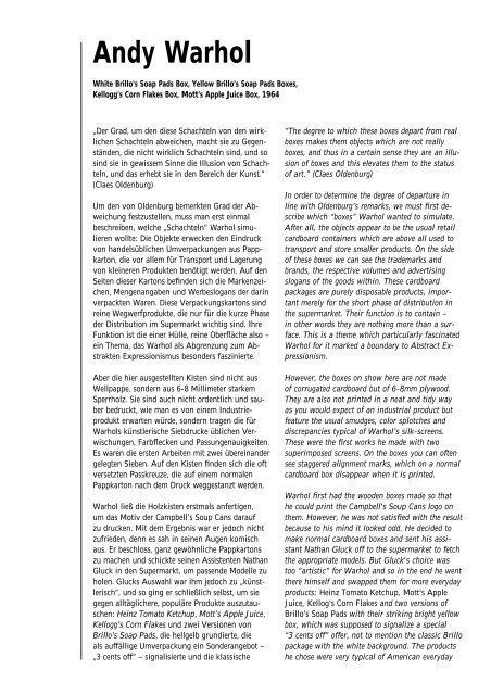
White Brillo’s Soap Pads Box, Yellow Brillo’s Soap Pads Boxes,<br />
Kellogg’s Corn Flakes Box, Mott’s Apple Juice Box, 1964<br />
„Der Grad, um den diese Schachteln von den wirklichen<br />
Schachteln abweichen, macht sie zu Gegenständen,<br />
die nicht wirklich Schachteln sind, und so<br />
sind sie in gewissem Sinne die Illusion von Schachteln,<br />
und das erhebt sie in den Bereich der <strong>Kunst</strong>.“<br />
(Claes Oldenburg)<br />
Um den von Oldenburg bemerkten Grad der Abweichung<br />
festzustellen, muss man erst einmal<br />
beschreiben, welche „Schachteln“ <strong>Warhol</strong> simulieren<br />
wollte: Die Objekte erwecken den Eindruck<br />
von handelsüblichen Umverpackungen aus Pappkarton,<br />
die vor allem <strong>für</strong> Transport und Lagerung<br />
von kleineren Produkten benötigt werden. Auf den<br />
Seiten dieser Kartons befinden sich die Markenzeichen,<br />
Mengenangaben und Werbeslogans der darin<br />
verpackten Waren. Diese Verpackungskartons sind<br />
reine Wegwerfprodukte, die nur <strong>für</strong> die kurze Phase<br />
der Distribution im Supermarkt wichtig sind. Ihre<br />
Funktion ist die einer Hülle, reine Oberfläche also –<br />
ein Thema, das <strong>Warhol</strong> als Abgrenzung zum Abstrakten<br />
Expressionismus besonders faszinierte.<br />
Aber die hier ausgestellten Kisten sind nicht aus<br />
Wellpappe, sondern aus 6-8 Millimeter starkem<br />
Sperrholz. Sie sind auch nicht ordentlich und sauber<br />
bedruckt, wie man es von einem Industrieprodukt<br />
erwarten würde, sondern tragen die <strong>für</strong><br />
<strong>Warhol</strong>s künstlerische Siebdrucke üblichen Verwischungen,<br />
Farbflecken und Passungenauigkeiten.<br />
Es waren die ersten Arbeiten mit zwei übereinander<br />
gelegten Sieben. Auf den Kisten finden sich die oft<br />
versetzten Passkreuze, die auf einem normalen<br />
Pappkarton nach dem Druck weggestanzt werden.<br />
<strong>Warhol</strong> ließ die Holzkisten erstmals anfertigen,<br />
um das Motiv der Campbell’s Soup Cans darauf<br />
zu drucken. Mit dem Ergebnis war er jedoch nicht<br />
zufrieden, denn es sah in seinen Augen komisch<br />
aus. Er beschloss, ganz gewöhnliche Pappkartons<br />
zu machen und schickte seinen Assistenten Nathan<br />
Gluck in den Supermarkt, um passende Modelle zu<br />
holen. Glucks Auswahl war ihm jedoch zu „künstlerisch“,<br />
und so ging er schließlich selbst, um sie<br />
gegen alltäglichere, populäre Produkte auszutauschen:<br />
Heinz Tomato Ketchup, Mott’s Apple Juice,<br />
Kellogg’s Corn Flakes und zwei Versionen von<br />
Brillo’s Soap Pads, die hellgelb grundierte, die<br />
als auffällige Umverpackung ein Sonderangebot –<br />
„3 cents off“ – signalisierte und die klassische<br />
“The degree to which these boxes depart from real<br />
boxes makes them objects which are not really<br />
boxes, and thus in a certain sense they are an illusion<br />
of boxes and this elevates them to the status<br />
of art.” (Claes Oldenburg)<br />
In order to determine the degree of departure in<br />
line with Oldenburg’s remarks, we must first describe<br />
which “boxes” <strong>Warhol</strong> wanted to simulate.<br />
After all, the objects appear to be the usual retail<br />
cardboard containers which are above all used to<br />
transport and store smaller products. On the side<br />
of these boxes we can see the trademarks and<br />
brands, the respective volumes and advertising<br />
slogans of the goods within. These cardboard<br />
packages are purely disposable products, important<br />
merely for the short phase of distribution in<br />
the supermarket. Their function is to contain –<br />
in other words they are nothing more than a surface.<br />
This is a theme which particularly fascinated<br />
<strong>Warhol</strong> for it marked a boundary to Abstract Expressionism.<br />
However, the boxes on show here are not made<br />
of corrugated cardboard but of 6-8mm plywood.<br />
They are also not printed in a neat and tidy way<br />
as you would expect of an industrial product but<br />
feature the usual smudges, color splotches and<br />
discrepancies typical of <strong>Warhol</strong>’s silk-screens.<br />
These were the first works he made with two<br />
superimposed screens. On the boxes you can often<br />
see staggered alignment marks, which on a normal<br />
cardboard box disappear when it is printed.<br />
<strong>Warhol</strong> first had the wooden boxes made so that<br />
he could print the Campbell's Soup Cans logo on<br />
them. However, he was not satisfied with the result<br />
because to his mind it looked odd. He decided to<br />
make normal cardboard boxes and sent his assistant<br />
Nathan Gluck off to the supermarket to fetch<br />
the appropriate models. But Gluck's choice was<br />
too “artistic” for <strong>Warhol</strong> and so in the end he went<br />
there himself and swapped them for more everyday<br />
products: Heinz Tomato Ketchup, Mott's Apple<br />
Juice, Kellog's Corn Flakes and two versions of<br />
Brillo's Soap Pads with their striking bright yellow<br />
box, which was supposed to signalize a special<br />
“3 cents off” offer, not to mention the classic Brillo<br />
package with the white background. The products<br />
he chose were very typical of American everyday
Brillo-Packung mit weißem Fond. Die ausgewählten<br />
Produkte sind sehr typisch <strong>für</strong> die amerikanische<br />
Alltagskultur der 60er Jahre – eine Zeit<br />
florierender Wirtschaft, des Überflusses und der<br />
Konsumbegeisterung. Auf der weißen Brillo Box<br />
leuchtet der blau-rote Schriftzug in den Farben<br />
der amerikanischen Flagge. Sie erinnert an die<br />
Ausstellung „The American Supermarket“, die am<br />
6.10.1964 in der Bianchini Gallery in New York<br />
eröffnet wurde, unter anderem mit <strong>Warhol</strong>s Kisten.<br />
Die treibende Kraft hinter diesem Happening, das<br />
Shopping zur <strong>Kunst</strong>form erklärte, war der Künstler<br />
Ben Birillo. Die Auswahl des im Vergleich zu Kellogg’s,<br />
Campbell’s oder Mott’s Apple Juice nicht<br />
ganz so alltäglichen Produktes der Brillo Soap Pads<br />
war womöglich eine Anspielung auf ihn.<br />
Im Sortiment der ausgewählten Produkte fällt die<br />
grafische Modernität der Brillo Box auf. Sie wurde<br />
in den frühen sechziger Jahren von James Harvey<br />
entworfen, einem Maler des Abstrakten Expressionismus,<br />
der tagsüber als Werbegrafiker sein Geld<br />
verdienen musste. Als Harvey im Frühjahr 1964 in<br />
der New Yorker Stable Gallery seinen Entwurf auf<br />
120 hölzernen Simulationen sah, traf ihn die Ironie<br />
des Schicksals. Harveys Androhung einer Strafanzeige<br />
gegen <strong>Warhol</strong> war wohl eher ein Zeichen<br />
einer künstlerischen Krise.<br />
<strong>Andy</strong> <strong>Warhol</strong>s Kisten sind eine Attacke auf den<br />
herkömmlichen Begriff vom <strong>Kunst</strong>werk mit seiner<br />
Aura von Originalität und Individualität und auf<br />
das „Märchen von der spirituellen Reinheit des<br />
Künstlers“ (Allan Kaprow). Es geht <strong>Warhol</strong> nicht<br />
mehr darum, ein neues Bild zu erfinden, statt dessen<br />
benutzt er bereits vorhandene triviale Motive<br />
aus der Warenwelt, die er im Siebdruckverfahren<br />
auf Holzplatten überträgt. Dieses Medium schließt<br />
die persönliche Handschrift des Künstlers aus und<br />
negiert damit eine weitere traditionelle Maxime der<br />
<strong>Kunst</strong>produktion: Das Anfertigen der Drucke übernahmen<br />
auch <strong>Andy</strong>s Freunde aus der „Factory“ –<br />
so nannte er sein Atelier ab 1963 –, so dass <strong>Warhol</strong><br />
selbst gar nicht mehr Hand anlegen musste. Die mit<br />
dem Siebdruck möglich gewordene Fertigung von<br />
hohen Stückzahlen verunglimpft die Idee vom<br />
<strong>Kunst</strong>werk als Unikat, als einzigartigem Original.<br />
<strong>Warhol</strong> zeigte die Kisten schon bei der ersten Ausstellung<br />
zu hohen Türmen aufgestapelt, eine im<br />
Supermarkt auch heute noch übliche Form der<br />
Warenpräsentation.<br />
Der Aufruhr, den die Ausstellung der Kisten in der<br />
<strong>Kunst</strong>welt damals verursachte – immerhin 50 Jahre<br />
nach Duchamps ersten Ready-mades – war enorm.<br />
Dabei waren nur die Modelle der Kisten Objets<br />
trouvés, aber die Objekte selbst nicht. Die Betrachter<br />
ließen sich von einem dreidimensionalen Trom-<br />
life in the 1960s – a time characterized by surplus<br />
affluence and consumer enthusiasm. On the white<br />
Brillo Box, the writing shines blue and red in the<br />
colors of the American flag, reminiscent of the<br />
exhibition “The American Supermarket” which<br />
opened in the Bianchini Gallery in New York on<br />
October 6, 1964 and which included, among other<br />
things, <strong>Warhol</strong>'s boxes. The driving force behind<br />
the Happening, which described shopping as an art<br />
form, was artist Ben Birillo. The choice of Brillo's<br />
Soap Pads, which was not quite as everyday as<br />
Kellog's, Campbell's or Mott's Apple Juice was<br />
perhaps a play on Birillo.<br />
The modern graphics of the Brillo Box is conspicious<br />
in the selection of products. It was designed<br />
in the early 1960s by James Harvey, an Abstract<br />
Expressionist painter who was forced to earn<br />
money during the daytime as a commercial graphic<br />
artist. In the spring of 1964, when Harvey saw his<br />
design on 120 wooden simulations he was hit by<br />
how ironic fate can be. Harvey threatened to press<br />
charges against <strong>Warhol</strong>, whereby this can be considered<br />
more a sign of an artistic crisis than of<br />
earnest litigation.<br />
<strong>Andy</strong> <strong>Warhol</strong>'s boxes are an attack on the conventional<br />
ideal of the artwork with its aura of originality<br />
and individuality and what Allan Karpow<br />
has termed the “myth of the artist’s spiritual purity”.<br />
<strong>Warhol</strong> is no longer concerned with creating<br />
a new image; instead he uses trivial motifs that<br />
already exist in the product world and then uses<br />
a silk-screen to transfer them onto wooden boards.<br />
This medium excludes any personal touch by the<br />
artist and thus negates a further traditional maxim<br />
of art production: <strong>Andy</strong>'s friends from the “Factory”<br />
(as he called his studio as of 1963) produced<br />
the prints so that <strong>Warhol</strong> himself no longer had to<br />
touch them. Silk-screening enabled high-quantity<br />
production runs, denigrating the idea of the artwork<br />
as a unique original. In the very first exhibition<br />
of the boxes, <strong>Warhol</strong> displayed them stacked<br />
into high towers, a form of product presentation<br />
still common in supermarkets today.<br />
The uproar the exhibition of boxes caused in the<br />
art world at the time was enormous – although it<br />
was 50 years down the road from Duchamp’s first<br />
ready-mades. Yet it was only the models of the<br />
boxes that were found objects, not the objects<br />
themselves. The viewers allowed themselves to<br />
be deceived by a three-dimensional trompe-l'oeil.<br />
<strong>Warhol</strong>'s stacked empty boxes are nothing other<br />
than a simulation of a market still-life in the 20th<br />
century that links the superficiality of the product<br />
world with that of the world of art. What was and<br />
still is really provoking is the way <strong>Warhol</strong> kindles
pe-l’oeil täuschen. <strong>Warhol</strong>s gestapelte, hohle Kisten<br />
sind nichts anderes als die Simulation eines Marktstilllebens<br />
im 20. Jahrhundert, das die Oberflächlichkeit<br />
der Warenwelt mit der <strong>Kunst</strong>welt verbindet.<br />
Die Assoziation von Supermarkt, industrieller<br />
Warenherstellung und den „heiligen Hallen“ des<br />
<strong>Kunst</strong>museums, wo man in einem Prozess der Kontemplation<br />
vor handgefertigten Unikaten nach dem<br />
Sinn des Lebens suchen wollte, war und ist das<br />
eigentlich Provokante.<br />
Doris Schmidt<br />
associations linking the supermarket, industrial<br />
production and the “holy halls” of the art museum<br />
where one hopes to find the meaning of life by<br />
contemplating unique handmade works.<br />
Doris Schmidt<br />
Translation: Jeremy Gaines, Frankfurt am Main
White Brillo Box, 1964<br />
Acryl und Liquitex im Siebdruckverfahren auf Holz<br />
Acrylic and Liquitex, silk-screen on wood<br />
43,4 x 43,4 x 35,7 cm<br />
<strong>Museum</strong> <strong>für</strong> <strong>Moderne</strong> <strong>Kunst</strong>, Frankfurt am Main<br />
Ehemalige Sammlung Karl Ströher, Darmstadt<br />
Former Karl Ströher Collection, Darmstadt<br />
(Inv. 1981/78)<br />
Yellow Brillo Boxes, 1964<br />
Acryl und Liquitex im Siebdruckverfahren auf Holz<br />
Acrylic and Liquitex, screen print on wood<br />
je 33,3 x 40,7 x 29,4 cm<br />
<strong>Museum</strong> <strong>für</strong> <strong>Moderne</strong> <strong>Kunst</strong>, Frankfurt am Main<br />
Ehemalige Sammlung Karl Ströher, Darmstadt<br />
Former Karl Ströher Collection, Darmstadt<br />
(Inv. 1981/79.1-5)<br />
Kellogg’s Corn Flakes Box, 1964<br />
Acryl und Liquitex im Siebdruckverfahren auf Holz<br />
Acrylic and Liquitex, silk-screen on wood<br />
63,7 x 53,4 x 43,4 cm<br />
<strong>Museum</strong> <strong>für</strong> <strong>Moderne</strong> <strong>Kunst</strong>, Frankfurt am Main<br />
Ehemalige Sammlung Karl Ströher, Darmstadt<br />
Former Karl Ströher Collection, Darmstadt<br />
(Inv. 1981/80)<br />
Mott’s Apple Juice Box, 1964<br />
Acryl und Liquitex im Siebdruckverfahren auf Holz<br />
Acrylic and Liquitex, silk-screen on wood<br />
46 x 76,3 x 56 cm<br />
<strong>Museum</strong> <strong>für</strong> <strong>Moderne</strong> <strong>Kunst</strong>, Frankfurt am Main<br />
Ehemalige Sammlung Karl Ströher, Darmstadt<br />
Former Karl Ströher Collection, Darmstadt<br />
(Inv. 1981/81)<br />
<strong>Museum</strong> <strong>für</strong> <strong>Moderne</strong> <strong>Kunst</strong><br />
Frankfurt am Main<br />
1003