

© 2012 Above the Fold
© 2012 Above the Fold
© 2012 Above the Fold

Create successful ePaper yourself
Turn your PDF publications into a flip-book with our unique Google optimized e-Paper software.
UI DESIGN 20<br />
Obey real-world rules<br />
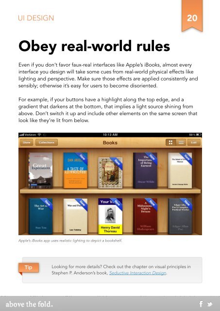
Even if you don’t favor faux-real interfaces like Apple’s iBooks, almost every<br />
interface you design will take some cues from real-world physical effects like<br />
lighting and perspective. Make sure those effects are applied consistently and<br />
sensibly; o<strong>the</strong>rwise it’s easy for users to become disoriented.<br />
For example, if your buttons have a highlight along <strong>the</strong> top edge, and a<br />
gradient that darkens at <strong>the</strong> bottom, that implies a light source shining from<br />
above. Don’t switch it up and include o<strong>the</strong>r elements on <strong>the</strong> same screen that<br />
look like <strong>the</strong>y’re lit from below.<br />
Apple’s iBooks app uses realistic lighting to depict a bookshelf.<br />
Tip<br />
Looking for more details? Check out <strong>the</strong> chapter on visual principles in<br />
Stephen P. Anderson’s book, Seductive Interaction Design.