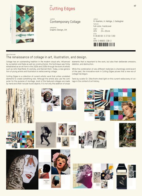
Cutting Edges Contemporary Collage about the book The renaissance of collage in art, illustration, and design. Collage has an outstanding tradition in the modern visual arts. Influenced by surrealism and Dada as well as constructivism, the technique was firmly established as an art form in the 1920s and 1930s through the work of artists such as John Heartfield, El Lissitzky, and Hannah Höch. Today, a new generation of young artists and illustrators is rediscovering collage. Cutting Edges is a collection of current artistic work that unites unrelated elements to create something new. Although the artists also use the computer for the purpose of montage, most of the featured collages are made by hand and often include found objects. It is not only the addition of visual title subtitle editors categories Graphic Design, Art R. Klanten, H. Hellige, J. Gallagher features full color, hardcover pages size 224 isbn 24 × 30 cm price € 39.90 (D) £ 37.50 $ 60 978-3-89955-338-3 elements that is important to the work, but also their deliberate omission, deletion, and destruction. While the combination of very different materials is charmingly reminiscent of the past, the innovative work in Cutting Edges proves that a new era of collage has begun. Texts by curator Dr. Silke Krohn shed light on this current rediscovery of collage in the context of art history. 47
48 48 R. Klanten, M. Mischler, S. Bilz Silja Bilz isbn 384 26 Lines can also be bent and curved (fig. 50). They can be used in a variety of ways. They can connect (fig. 51), determine the outlines of forms by the way they run (free lines), struc- ture areas, condense into structures or hatching (fig. 52), support and emphasize, or point something out such as a direction. An arrow can also make various statements: point straight ahead, towards top right or bottom right. A “turning arrow” is curved and points back in the starting direction (u-turn). A stroke is usually a short, irregular line, essentially the artistic, individual treatment brought about by the way a paintbrush is handled. A spiral is an open line – connected from outside to inside or inside to outside, with a tendency towards strong movement. Note: The eye perceives a line of type, or other line, placed in the mathematical centre of an area as being too low (fig. 53). Hence a distinction is made between the optical and the mathematical centre. The optical centre is the visu- ally satisfying proportion in design. Bars placed horizontally always look somewhat heavier than vertical ones, as the bars in figures 54 and 55 show. The two bars are equal in length and width (* ch. Typography, p. 86, diagonal and bold up- strokes). An area is a closed, two-dimensional figure. It is en- closed by a homogeneous surface that is usually presented in two dimensions, and formally limited by one or several linear segments. Geometrically, an area is usually defined by a sequence of pairs of co-ordinates. Simple design devices can create various effects on an area. A circle has no starting and no endpoint, and is there- fore a symbol of infinity. It is a two-dimensional figure. Geometrically speaking, a circle is a line whose points are equidistant from the centre. Closing this curved line creates a circle. With the exception of the straight line, the circle is the only flat curve with a constant curvature. It conveys less tension than a rectangle or triangle, as it is not pulling in any particular direction. A circle seems harmonious, complete in itself and infinite (fig. 56). A o i m m s c f a r r r o ( c u s c l i t i s “ w i s fi ( 11 Kapr, Albert, Schiller 12 Kapr, Albert, Schiller 3.4 Design / Fundamentals of Design 50 A C D B 51 52 53 54 55 3.4 D 56 58 57 60 59 61 62 63 176 177 Overprinting is the opposite of cut-out. The only colour that should be set to “overprint” is black. If overprinting is used, the colours underneath are not eliminated, but printed over. Tip: Perfect, stitched or stapled binding have different bleed requirements. For perfect binding, it is extremely important that each page is treated individually – the pages are trimmed at all four edges. The inner edge is milled (* p. 201, block glu- ing) and glued. Consequently, pictures that go into the gutter are also bled there so that flashes can be avoided. Adding control devices Feeding marks are printed marks on the edge of the sheet. They show on which page the printed sheet it to be placed so that it can be folded and trimmed correctly for its position. Register marks – also called register crosses (fig. 34) – make it possible to check the register accuracy of the individual colours when they are printed together. Register marks are positioned in exactly the same place in every single colour separation (CMYK or spot colours). If the printing is accurate, the marks in the printed work will be precisely on top of each other. Trimming marks (fig. 35) indicate how the sheet should be cut to the right format. The printing position should always be marked. This is essential for all products that have to be further processed untrimmed or with separation cuts, and for which the type area (* p. 187, keeping to register) of the printed product has to fit on top of another one. The printing position is estab- lished with a set of marks that provide precise orientation for placing the sheets with complete register accuracy in sheet printing (* p. 178, fig. 37). Sheet signatures (fig. 36) are also essential when work- ing on book blocks for establishing the right sequence of sheet parts and staple positions. Artwork and control Artwork is the preparation of the layout (* ch. Design, p. 41) to produce a definitive ready-to-print copy. The artwork involves examining the material produced so far and opti- mising it where necessary. This step is closely linked with the subsequent processes and also takes account of features like the type of printing, the binding, and other finishing processes for the final product. Good artwork can be pro- duced only in dialogue with the printer and/or the book- binder. As a rule, the final artwork product is a file, e.g. an InDesign file or a PDF file (* p. 179). It is compiled at the end of the graphic design process. The artwork files format the final version of all the elements to be printed (e.g. type, colour areas, images). It also sets various technical printing parameters such as col- our mode and trapping. Trapping Flashes are unprinted white areas between adjacent areas of colour in printed products where the paper is visible (fig. 30). This phenomenon occurs because the press is incorrectly adjusted or the shape of the paper has changed during print- ing. The risk of flash formation can be reduced by overprint- ing areas or slightly overlapping them. This process is known as trapping. Trapping should always be used when two different col- ours (other than white) are directly adjacent to each other. Overlapping is achieved by slightly enlarging lines or areas in relation to the colour areas next to them (fig. 31). The lighter colour is usually overlapped. Parts of an object that are hidden under other objects can be eliminated. This prevents one colour mixing with another when this is not required. For example, if an area of yellow is printed over an area of cyan, the two colours will mix to produce the colour green (fig. 32). If the top area is to remain yellow and the background cyan, then the yellow area in cyan must be eliminated (fig. 33). 6.3 Production / Reproduction 6.3 Production / Reproduction 30 31 32 33 34 35 36 202 203 Production in Commercial Practice Sequence of work at the printers 1. The PDF data are checked in terms of basic parameters (e.g. format) and technical suitability. 2. If a proof is provided, the printers will check whether this meets contractual proof requirements, e.g. the pres- ence of a control wedge (* pp. 181, 182) and control strip. 3. The PDF data are converted for the printing process in the RIP (* p. 183). 4. The processed data are imposed electronically (film presentation is now rare), and the digital sheet data produced are later used to create plates. 5. Plots are made from the outputted print sheets, usually in the original format, imitating the subsequent printed sheet. 6. The plots are assembled and folded in the same manner as the printed sheets will be later. The printers can check again whether the output scheme is correct. 7. The plots are presented to the client for final inspec- tion and approval for press. As the printouts are made from the files that have already been processed in the RIP, trapped objects and type are already in the form in which they should appear later in the printed product. Only the reproduction of colour and images should be viewed with reservations: it is not colour-binding for printing, and the picture data are often printed at a low resolution to save time. 8. The client approves the material for press on the basis of the plots, or corrections are made by the client or authors. 9. The plates are made after the plot has been approved. Note: Every correction that is made after this will con- siderably increase costs, as new plates have to be made after every correction. Paperback binding The term paperback is used for a binding process in which the cover is glued, stapled or stitched directly to the back of the block with one or more sets of pages. Usually, the cover takes the same format as the book block and is made of card or of the same material as the pages. A distinction is made between various kinds of paper- back binding, e.g. Swiss (fig. 74), <strong>English</strong> (fig. 75), French (fig. 76) or stiff (fig. 77). Bound books with their book block fastened to the cover with gauze and endpapers are called hardback or hard- cover books. A book cover (fig. 81) is made up of a front cover, a back insert and a back cover made of cardboard (* pp. 162, 163) onto which a covering material such as fab- ric, paper, leather, artificial leather or plastic is applied and glued. The cover and the book block are fastened together by the endpapers. The book block can also be finished with a decorative band (fig. 78) and also have a ribbon bookmark (fig. 79). A coloured edge (fig. 80) is another possible fine finish. Tip: An early decision should be taken about whether the book block is to have a straight or a curved back. Note that the first and last pages will always be 5 – 7 mm narrower – according to how far the bookbinder over-glues. This should also be borne in mind for the layout of these pages, so that elements that are placed centrally will always remain centred. Selective binding is an individual manufacturing process for bound printed products. For example, catalogues can be produced in several versions from a selection of different components and their content matched to the wishes of dif- ferent customer groups. Selective binding makes it possible to provide individual advertising motifs for various sectional editions of magazines (* ch. Marketing, p. 221). Prestigious finishing is the general term for all value-adding post-press processes. As well as varnishing and laminat- ing (* p. 198), finishing also includes dye-cutting (fig. 82), punching (fig. 83) and perforating (fig. 84). 6.6 Production / Production in Commercial Practice 6.5 Production / Post-Press 74 76 77 78 75 79 80 82 83 84 81 120 121 Current SD recording formats are: Digi-Beta, Beta SP (ana- logue) and DVCPro50. Mini-DV, DV Cam and DVCPro25 also feature in the so-called amateur and semi-professional sphere. High Definition format High Definition (HD) is becoming increasingly accepted in Europe. HD has been established for a long time in the USA and in particular in Japan, where legislation has also con- siderably speeded up the introduction of HDTV. At the time of writing, two HDTV formats are available: 720p and 1080i. For 720p the resolution is 1280 × 720 pixels, so the full frame is always transmitted. All picture lines are thus shown at the same time; the “p” after the figure (720p) stands for progressive. The HD format increases the resolution by four to five times over standard definition (* p. 119, SD). Unlike SD, HD works exclusively with square pixels – just like the computer. Here too there are two different standards with two different frame rates in each case. The 1080i format increases the resolution to 1920 × 1080 pixels. However, 1080i works in an interlaced mode like SDTV hitherto. The word interlaced is used because a picture is not shown in full, but two fields are used, one following the other, and the format is called 1080i. The following table compares the TV formats. TV formats SDTV SDTV HDTV HDTV Name PAL NTSC 720p 1080i Picture structure Interlaced/ progressive Interlaced/ progressive Progressive Interlaced Pixels per line 720 720 1280 1920 Lines 576 480 720 1080 Total pixels 414,720 345,600 921,000 2,073,600 Tests have shown that 720p is seen in just as much detail as 1080i, in which ultimately only 540 lines are shown per field. This does however depend on content. For still pictures the higher resolution of the 1080i format is preferred by viewers; for moving pictures, 720p usually makes a better effect. Format Resolution Frame rate Distribution 720p 1280 × 720 25 fps Europe, Australia 720p 1280 × 720 30 fps USA, Japan, Asia 1080i 1920 × 1080 25 fps Europe, Australia 1080i 1920 × 1080 30 fps USA, Japan, Asia How High Definition is perceived There is no question that a picture recorded using High Definition technology shows more depth of detail and brightness – even if it is converted to SD for a standard DVD or for conventional broadcasting using PAL or NTSC, for example. As well as this, the 16:9 picture format (* fig. 6) used for HD, in contrast to the 4:3 side ratio typical of PAL and NTSC, gives an impression of the image that corresponds better with the human field of vision. But 1080i is not necessarily perceived by viewers as the better HD image, even though the resolution is higher than for 720p. In fact, the full frame process used for 720p can make a more cinematic impression, as film cameras also work with full frames. This might suggest that 1080p, the highest possible full frame resolution, would be an ideal compromise. Far from true: this format would place an enor- mous strain on broadcasting technology and bandwidth so it is not likely to become widely accepted. When assessing picture quality, factors such as the source material (sport, fiction etc.), the broadcasting mode (mp2, mp4/H.264 compression etc.) or also the viewing device play a considerable part. This applies particularly when this device (television, projector etc.) has to scale the signal, which is entirely usual for LCD and plasma screens. If the precise resolution of the broadcast signal is not on offer, there can be enormous loss of quality. 5.4 Digital Media / Moving Pictures 5.4 Digital Media / Moving Pictures 154 155 ISO/DIN A series in mm B series in mm C series in mm D series in mm E series in mm 4A0 1682 × 2378 2A0 1189 × 1682 A0 841 × 1189 B0 1000 × 1414 C0 917 × 1297 D0 771 × 1091 E0 800 × 1120 A1 594 × 841 B1 707 × 1000 C1 648 × 917 D1 545 × 771 E1 560 × 800 A2 420 × 594 B2 500 × 707 C2 458 × 648 D2 385 × 545 E2 400 × 560 A3 297 × 420 B3 353 × 500 C3 324 × 458 D3 272 × 385 E3 280 × 400 A4 210 × 297 B4 250 × 353 C4 229 × 324 D4 192 × 272 E4 200 × 280 A5 148 × 210 B5 176 × 250 C5 162 × 229 D5 136 × 192 E5 140 × 200 A6 105 × 148 B6 125 × 176 C6 114 × 162 D6 96 × 136 E6 100 × 14 A7 74 × 105 B7 88 × 125 C7 81 × 114 D7 68 × 96 E7 70 × 10 A8 52 × 74 B8 62 × 88 C8 57 × 81 D8 E8 A9 37 × 52 B9 44 × 62 C9 40 × 57 D9 E9 A10 26 × 37 B10 31 × 44 C10 28 × 40 D10 E10 The strip formats from the A series, e.g. 1/3 A4 = DIN long (DL): 99 × 210 mm, are derived by division. US paper formats do not follow a uniform pattern and were originally based on the inch (unit: in). The conversion values in millimetres (mm) are rounded up or down appro- priately. The following overview shows the most common US and Canadian formats. Name formats US ANSI formats inch mm CAN formats mm P6 107 × 140 Invoice 5.5 × 8.5 140 × 216 P5 140 × 215 Executive 7.25 × 10.5 184 × 267 Legal 8.5 × 14 216 × 356 Letter (US- Standard Letter) A 8.5 × 11 216 × 279 P4 215 × 280 Tabloid (Ledger) B 11 × 17 279 × 432 P3 280 × 430 Broadsheet C 17 × 22 432 × 559 P2 430 × 560 D 22 × 34 559 × 864 P1 560 × 860 E 34 × 44 864 × 1118 E 34 × 44 There are also untrimmed or oversize formats. These are larger, as they are not trimmed to an A series format until after printing, folding and binding. The following overview shows the ISO/DIN RA (untrimmed sheets) series. ISO/DIN RA series in mm RA-0 860 × 1220 RA-1 610 × 860 RA-2 430 × 610 RA-3 305 × 430 RA-4 215 × 305 6.1 Production / Paper Formats 6.1 Production / Paper Formats 174 175 Screen angle In conventional screens, the screen angle indicates the screening direction, which is measured from the vertical. The human brain finds it easy to perceive angles around 0 and 90 degrees; diagonal placings of 45 or 135 degrees are customary for single-colour reproduction. In multi-colour printing, different screen angles are chosen for the vari- ous colours. This avoids superimposition effects (moiré) (* p. 174, fig. 26). In offset printing, the angles 0, 15, 75 and 45 degrees are used for the four colours yellow, magenta, cyan and black (figs. 28, 29) (* p. 189, screen frequency and screen angle meter). When using this screening process, the colour forms have to be shifted in relation to each other at fixed screen angles (* p. 175) when they are being printed together to avoid creating moiré effects (fig. 26). Tip: Advantages of the conventional screen: it is the most widely used, and proves best for reproducing the qualities of previously printed material. It is possible to make a wider range of colour corrections on the press, as the halftone dot admits larger colour fluctuations (greater printed area); grey areas look more even – provided that printing takes place on a screen with at least 70 lines. Disadvantages: larger colour fluctuations can occur. It is harder to control colour evenly in a production run; higher dot gain, more ink used; halftone dots are visible in the printed form (exception: in the case of very high halftone frequencies like for example the 90-line screen); moiré effects (especially in skin tones), saw-tooth effects in halftones. Effect screens are special screen forms and structures such as grain screens, line screens, circle screens or cross-line screens. The frequency modulated screen (FM screen) is a high resolution effect screen (fig. 27). Frequency modulated screening is a process for halftone simulation using halftone dots of the same size. The number of dots in a particular field determines the colour tone. The FM screen is of very high quality, but requires greater care in printing and a differ- ent working approach for printing plate copying and in the printing process. Tip: Advantages of the FM screen: extremely detailed printed product through the “simulation” of photographic grain; minor colour fluctuations; no visible half-tone dots so no undesirable moiré effects (interference effects); separated colours look like special colours. Disadvantages: the details “expose” poor or imprecise image processing; coloured areas can look patchy. Tip: The FM screen is well suited for producing high quality on coated and cast-coated papers. 6.3 Production / Reproduction 6.3 Production / Reproduction 27 26 28 Y = 0 ˚ M = 15 ˚ K = 45 ˚ C = 75 ˚ 90 ˚ 29 66 67 At this time, type increasingly left the realm of the printed word. So, for example, the Elemental Typography of the 1920s experimented with formal clarity of expression and geometrically constructed sans-serif forms without flour- ishes such as Futura (fig. 13) or Gill (fig. 14). In the mid-20th century sans-serif faces enjoyed a revival. They became the basis for new “modulated” alphabets that deviated from the originally constructed formal principle. Adrian Frutiger published his Univers (fig. 15) and Max Miedinger cut his Helvetica (fig. 17) on the basis of Akzidenz Grotesk (fig. 16). A new era of typography began in the 1970s. The opto- mechanical typesetting system (photosetting) was intro- duced, and within a decade, hot metal setting, which had been used for 500 years, had all but disappeared. In the late 20th century the mass media produced a wide variety of universal typefaces and approaches to type (* p. 72, hybrid typefaces). Technical innovations such as desktop publishing (DTP) and the World Wide Web revolutionised the type medium and meant that conventions were re-thought, and new paths embarked on. Type left its traditional vehicles and conquered virtual space. Types were no longer just analogue, but now above all digital (* pp. 90 – 95, font technology, and also ch. Digital Media, pp. 134, 140). Type culture experienced a radical structural change such as had not taken place before, and that was to have a more or less lasting influence on our reading and seeing habits (* pp. 60, 61, Perception and reading behaviour) in subsequent years. Because it could be reproduced at will and had to an extent been dematerialised, it seemed as if everything was possible in the medium of type – and everything was tried out. Design found a new freedom; typography and script were democratised. Hardware and software were available everywhere (* ch. Digital Media, pp. 111 – 113), which ena- bled pretty well anybody to work with a typeface of their own (* pp. 84 – 89, Typeface Design), to generate it or to modify existing material. Typefaces were suddenly popular. Recourse to history meant new typographical adaptations and initiatives; epoch-making type styles were collected like objets trouvés and reassessed. Archaic motifs were illus- trated in a typographically appropriate way, or anticipated. Typeface, typographical technology (* pp. 90 – 95) and the type market clearly showed inflationary traits, but this also triggered new challenges, approaches and technologies (e.g. PostScript Type 1; * pp. 90 – 95, Font Technology). Screen- and pixel-adapted type forms (fig. 18) were created for reading on screen (* pp. 93 – 95, Fonts on a display screen). For economic reasons and because of the aesthetics of the day, typefaces for continuous text (* p. 61) became increasingly narrow and their x-heights (* p. 68, fig. 23) greater; their forms also became more open. The letter The letter is the graphic shape of a grapheme or character used to represent linguistic sounds. In modern desktop pub- lishing, letters are also called glyphs. In typography, a glyph is a graphic depiction of a type character. The letter is the smallest element in forming a word or shaping a text; their arrangement is a key factor in determin- ing the typographic form and legibility of a text. Uppercase and lowercase Capital letters are described as uppercase or more rarely majuscules. Small letters are known as lowercase or more rarely minuscules (* pp. 63 – 67, Origins of type). Uppercase characters are based on three basic geo- metrical shapes: triangle, circle and square (* ch. Design, pp. 26, 27). Here, the forms and directional contrasts are fundamental to the appearance of the letters (* figs. 19 – 21). Fig. 22 shows the structural principle for a Renaissance up- per case “M” according to Albrecht Dürer (1471 – 1528). Hint: See also Typeface Design, pp. 84 – 89. 18 13 14 15 17 16 4.3 Typography / Script 4.3 Typography / Script 22 19 20 21 10 11 Additive colour mixing: red + green = yellow; green + blue = cyan; blue + red = magenta; red + green + blue = white (fig. 2). Subtractive colour mixing: cyan + magenta = blue; magenta + yellow = red; cyan + yellow = green; cyan + magenta + yellow = black (fig. 3). The colour impression a viewer gains of an object is created by the light component that meets the surface of the object and is reflected thereby, while the remainder is absorbed on impact. Here, the reflected light determines the colour of the object. An object that does not reflect any of the component colours of sunlight therefore always looks black. Conversely, an object that reflects all the colours is seen as white. Non-luminous colours are also called sub- traction colours because of absorption. Light temperature. If the temperature of a glowing metal body is gradually raised it radiates different colours of light. The light colour temperatures are derived from this: warm light: 3500 K (Kelvin) 2 , daylight: 5500 K, cold light: 6500 K. Colour theories Important figures from the fields of culture, art and science such as Isaac Newton and Johann Wolfgang von Goethe, as well as Paul Renner, Johannes Itten and Harald Küppers, have addressed the phenomenon of colour in detail. Several theories and doctrines still retain their validity. Two of the most important colour theories are explained below. The Swiss painter and art historian Johannes Itten (1888 – 1967) worked on the basis of three basic colours, the primary colours blue, yellow and red, which produce the twelve part chromatic circle (1961) when mixed (fig. 4). The three basic colours of the first order are found in the middle of the colour circle. Itten largely based his theory on the insights gained by the poet and natural historian Johann Wolfgang von Goethe (1749 – 1832). 2 Boltzmann constant of average kinetic energy, value: 1.380658 × 10 – ²³ joules per kelvin (Ludwig Boltzmann, physicist, 1844 – 1906) According to Itten, complementary colours are two colours that lie opposite each other in a chromatic circle – in other words, which have complementary positions to each other, like for example red and green (fig. 5). Mixing two comple- mentary colours produces grey. According to Goethe and Itten, the colour combination of two complementary colours is seen as “especially harmonious”. The colour expert Harald Küppers, internationally acknowledged in the printing industry and the graphic arts trade, bases his colour theory on six basic colours: yellow, green, cyan-blue, violet-blue, magenta-red and orange-red. He arranges the basic colours in a hexagon, rather than a circle (fig. 6). The elementary colours (violet-blue, green, orange-red) and the basic colours according to Harald Küppers are ex- plained below. In Küppers’ theory, primary colours are the starting point for any colour process. In subtractive mixing (“SubMi”) these are the basic chromatic colours yellow, magenta-red and cyan-blue, and their interaction with the background colour white. In additive mixing the primary colours are the basic chromatic colours orange-red, green and violet-blue, and their interaction with the background colour black. According to Küppers, secondary colours are created by mixing two primary colours, and tertiary colours are created by mixing three primary colours. Colour effects Colours produce their effects in a variety of ways. Colour psychology and colour symbolism offer various interpreta- tions of individual colours. In fact, colours and their mean- ing, or the sensations they produce, are not solely dependent on individual experience, but also on agreed impressions that go back over the centuries. So colours can mean dif- ferent things in different cultures, and the following list of colour interpretations should not be regarded as definitive. 2 3 4 5 6 3.1 Design / Light and Colour 3.1 Design / Light and Colour 3.0 Design / Introduction 3.0 Design 3.1 Light and colour 8 Colour theories 10 Colour effects 11 Colours on the web 14 3.2 Perspective and Spatial Quality 15 Three-dimensional display 1 History of perspective 1 Perspective processes 18 Parallel perspective – parallel projection processes 21 3.3 Illusions 24 3.4 Fundamentals of Design 25 Basic elements 25 Contrasts 28 Rhythm, symmetry and asymmetry 30 Laws of design 31 Figure-ground distinction 33 3.5 Signs and Symbols 34 Types of signs 35 The logo 3 3. Layout and Page Design 41 Layout process 41 The Golden Section and harmonious page formats 42 The design grid 42 3. Creativity 44 Creative techniques 44 3.8 Golden Rules of Design 48 3.9 Tips and Links 49 Welcome to the golden rules of design – and a few pointers on when and how to break them. Whether the style is clean-cut and simple or out-there experimental, whether the project is a hand-sketched record sleeve or a polished corporate identity – great designers tend to draw on their ability for lateral thinking, for unusual combinations, and for bringing a brand new take even to visuals that were among our trusty old favourites. And yet, in order to turn these fleeting flashes of genius into actual, working templates, we require more than just the right tools of the trade and a firm grasp of the necessary skills: what we need is a solid grounding in the fundamental principles of design. In addition to essential elements such as light and colour, perspective and space, signs and symbols, this chapter also sheds light on the psycholog- ical twists of subjective perception that send our synapses into a spin – how to use them to our advantage, conjure up meaning between the lines and reach our very own vanishing point. So don’t fret – in-depth knowledge and understanding of these ground rules will not automatically confine your work and spirit to a strict aesthetic framework, but simply help you fine-tune your inner eye to shape dot, line and area into something entirely your own. 3.0 Design / Contents 68 69 Letter anatomy The sum of all of a letter’s elements conveys the essential qualities of a typeface. The individual letter elements are defined using specific technical terms: In addition to the visible elements, the areas of white between the letters also play a crucial part. The interior of a letter is known as the counter. The alphabet is the visual version of all the sound units of a language in a fixed sequence. The character set The character set, or character stock, of a typeface con- sists “of various types of characters such as letters (sound characters), figures (quantity characters) and an imprecisely defined number of characters for controlling the writing (for example full stops, brackets and inverted commas).” Punctuation and special characters Punctuation and special characters are used to impose structure, order, and value. Punctuation marks reflect the voice‘s ability to modulate. They can reinforce meaning, and draw structure and thoughts, figures and values together. Arabic numerals The individual character for expressing quantity is known as a numeral (or numeric character). A number is produced by combining different numerals (* pp. 63 – 6 , origins of type). In typography a distinction is also made between lower and uppercase figures, which include numerals (* p. 81, table numerals). Ligatures A combination of several letters fused together is called a ligature. One example of this is the ampersand character or commercial and. Jan Tschichold 8 says of it: “… written ‘et’, comes from Latin, means ‘and’ and is a ligature of a very particular kind because it appears in so many forms. It is always an intimate fusion of letters, in which one part of a letter either merges into part of another or forms that part at the same time.” Flusser, Vilém: Die Schrift. Hat Schreiben Zukunft? (2002). Not available in <strong>English</strong>. 8 Tschichold, Jan: The Ampersand. Its Origin and Development (195 ) 4.3 Typography / Script 4.3 Typography / Script 1 Cap height 2 x-height 3 Ascender 4 Descender 5 Baseline, typeline 6 Stem 7 Serifs 8 Counter 9 Bowl 10 Ear 11 Arch, stress 12 Ball 13 Link 14 Terminal 15 Bar 16 Shoulder 17 Kern, overhang, overshoot 18 Arm, hairline 19 Leg, main stroke 23 editors texts title about the book features pages size price € 32 (D) £ 26.99 $ 48 full color, flexicover, bookmark ribbon The updated new edition of the handy reference book for designers. What is a meta tag? What kind of measurement is DIN A1? What kind of clear- ance do you need before using copyrighted material? What does HSDPA mean for smart phones? How do social media influence a marketing mix? This updated new edition of The Little Know-It-All provides the fundamental information designers need to know to thrive in their growing field of prac- tice. It is an indispensable manual of the knowledge currently required of designers as the evolution of media redefines their role and expands the disciplines in which they must be competent. Divided into the seven chapters Design, Typography, Digital Media, Production, Marketing, Law, and Organization, the book offers concise analysis as well as definitions of unique vocabulary. Written for a global audience, it expounds on various international formats and legalities. With its thematic structure and resourceful index, The Little Know-It-All is a clever and comprehensive collection of essential practical information. Complete with graphics and illustrations supplementing the texts, it is both a stimulating reference book for students and newcomers, and a trusty companion for design and media professionals to use in their everyday work. Common Sense for Designers categories subtitle Graphic Design, Typography 12 × 16.5 cm The Little Know-It-All / Der kleine Besserwisser Updated Edition 978-3-89955-348-2