Scala - FontShop
Scala - FontShop
Scala - FontShop
You also want an ePaper? Increase the reach of your titles
YUMPU automatically turns print PDFs into web optimized ePapers that Google loves.
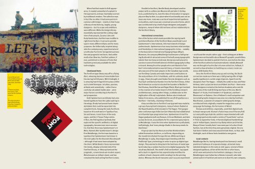
↑<br />
Just van Rossum and<br />
Erik van Blokland were in<br />
Berlin when the Wall<br />
came down, November<br />
1989.<br />
→<br />
FF Dolores by Tobias<br />
Frere-Jones, 1991,<br />
one of the first FontFont<br />
releases,<br />
↘<br />
The original FontFont<br />
logo by Neville Brody.<br />
It was later changed to<br />
yellow and black.<br />
12<br />
When FontFont made its first appearance,<br />
it created somewhat of a splash in<br />
the type world, and was inevitably scorned<br />
by traditional vendors. The collection was<br />
in fact like no other.It had some points in<br />
common with Emigre – mainly in that it was<br />
a library of new fonts by, largely, young<br />
designers – but its scope and ambitions<br />
were different. While the Emigre library<br />
essentially represented the cutting-edge<br />
view of two people, Zuzana Licko and<br />
Rudy Vanderlans, FontFont was multiform<br />
right from the start. It set out to provide<br />
type in many different styles and for many<br />
purposes: the historically inspired alongside<br />
the contemporary; experimental and<br />
unorthodox ‘fun fonts’ alongside businesslike<br />
and pragmatic text faces. And unlike<br />
most other libraries, FontFont seldom, if<br />
ever, published re-releases of fonts that<br />
had been previously available for other<br />
technologies.<br />
Unreleased fonts<br />
The FontFont type library was off to a flying<br />
start, releasing dozens of remarkable families<br />
during its first years. With hindsight, it<br />
is amazing how things fell into place within<br />
such a brief timespan. Intuition, passion,<br />
attitude and serendipity – rather than a<br />
carefully calculated master plan – were<br />
major factors contributing to FontFont’s<br />
early expansion.<br />
Both Spiekermann and Brody had unreleased<br />
typefaces from the 1980s waiting in<br />
the wings; Brody had several hand-drawn<br />
alphabets that could be expanded into<br />
complete fonts. Among the early FontFonts<br />
based on this work were ff Typeface Four,<br />
Six and Seven, iconic faces of the early<br />
1990s, and the ff Tyson/Tokyo series.<br />
ff Blur, the first typeface by Brody that<br />
explored the specific aesthetics of digital<br />
typography, became even more successful.<br />
And then there was Spiekermann’s ff<br />
Meta. Named after Spiekermann’s design<br />
firm MetaDesign, the font was based on a<br />
typeface that Spiekermann had drawn in<br />
the mid-1980s for the Deutsche Bundespost<br />
– although it had never been adopted by<br />
the client. While Brody’s faces represented<br />
the trendy, display-oriented side of the<br />
FontFont library, ff Meta epitomized the<br />
pragmatic, conventional-yet-modern aspect.<br />
Meta became an instant classic and has<br />
remained the best selling FontFont to date.<br />
Parallel to FontFont, Neville Brody developed another<br />
project with co-editors Jon Wozencroft and John Critchley.<br />
fuse, published by fsi, took the idea of innovation in typography<br />
one step further, to a place where functionality was not an<br />
issue any more. fuse was a series of experimental typefaces<br />
and posters; each issue was conceived around a theme, which<br />
was contributed to by a host of type designers and graphic<br />
designers, many of whom did not have a direct relationship to<br />
the FontFont library.<br />
International connections<br />
One of the factors which made possible the rapid growth<br />
and diversification of the FontFont library was Brody’s and<br />
Spiekermann’s international, informal network of design<br />
professionals. Spiekermann has many business relationships<br />
and friendships in international typographic circles – notably<br />
in the Association International Typographique (ATypI).<br />
Moreover, his company MetaDesign had become a fast-growing<br />
studio which attracted some of the best young typographic<br />
talents from Germany and abroad. Brody was well-placed to<br />
convince some of the best talents in British typography to step<br />
on board. Among the other people who contributed to Font-<br />
Font’s internationalization was Ed Cleary, a Toronto-based Brit<br />
who was one of the main players in the Canadian type world,<br />
ran <strong>FontShop</strong> Canada and made important contributions to<br />
the early editions of fsi’s FontBook, until his untimely death<br />
in 1995. Cleary brought unorthodox Toronto designers such as<br />
Paul Sych and Barbara Klunder into the FontFont library. Other<br />
North American contacts included the founders of Boston’s<br />
Font Bureau, David Berlow and Roger Black; Black got involved<br />
in the creation of an Italian branch of the <strong>FontShop</strong> network<br />
and Berlow was, among other things, a collaborator on the<br />
digitization of Brody’s alphabets. Berlow also introduced<br />
Tobias Frere-Jones, who published his very first typeface as a<br />
FontFont – the lively, charming ff Dolores.<br />
A key contribution to FontFont’s early growth was made by<br />
a group of young Dutch designers, many of whom studied at<br />
the Royal Academy of Arts (kabk) in The Hague. The typographer-craftsman-type<br />
historian Gerrit Noordzij had established<br />
an influential type programme here. Spiekermann hired The<br />
Hague graduates Just van Rossum, Erik van Blokland, and later<br />
Luc(as) de Groot, as assistants for his corporate type projects<br />
at MetaDesign. It was the time when Spiekermann postulated,<br />
half-jokingly, that ‘every design studio in Germany needs its<br />
Dutchman.’<br />
A type project by Van Rossum and Van Blokland (who<br />
called themselves LettError, or LetTerror, depending on<br />
the mood) kick-started the type library. While working at<br />
MetaDesign in 1989, they began experimenting with the<br />
PostScript Type 3 technology in order to spice up digital type<br />
design. They wanted to bring back the liveliness of metal type<br />
by introducing a random function into digital typography. The<br />
result was Beowolf, ‘the world’s first randomfont’, equipped<br />
with a built-in algorithm that unpredictably modifies the<br />
outlines of each character while sending it to the printing<br />
device. Whereas the Dutch twosome saw it as pure experiment<br />
13<br />
Record sleeve<br />
by Neville<br />
Brody,<br />
featuring<br />
his own<br />
Typeface 6.<br />
– and found the results rather ugly – their colleagues at Meta-<br />
Design were enthusiastic about Beowolf’s graphic possibilities.<br />
Spiekermann decided to publish the font, even before the idea<br />
of the FontFont collection had materialized. Initially Beowolf<br />
was not thought of as the start of a new collection; instead, it<br />
served to draw attention to <strong>FontShop</strong> as a smart, trend-conscious<br />
distribution firm.<br />
Once the FontFont library was up and running, the Dutch<br />
connection made sure there was a fast growing offer of highquality<br />
typefaces in a wide range of genres. Apart from the<br />
designers from The Hague – initially the LettError duo and Peter<br />
Verheul, later Luc(as) de Groot and Albert-Jan Pool – there were<br />
three designers trained at the Arnhem Academy who contributed<br />
some of the most striking text faces of the era: Martin<br />
Majoor’s ff <strong>Scala</strong>, Fred Smeijers’s ff Quadraat, and Evert<br />
Bloemsma’s ff Balance. One of Holland’s most outspoken and<br />
iconoclast graphic designers was also recruited by FontFont:<br />
Max Kisman, a pioneer of computer-aided graphic design,<br />
contributed fonts originally created for magazines such as<br />
Language Technology, the forerunner of Wired.<br />
Kisman and LettError, especially, used their digital tools<br />
to break new ground. Kisman’s Fudoni was one of the very first<br />
cut-and-paste type hybrids; LettError experimented with selfchanging<br />
type but also made a series of ‘found fonts’ such as<br />
ff Trixie (a typewriter font), ff Hands (digitized handwriting)<br />
and ff InstantTypes, based on toy stamp letters and the like.<br />
Many of these ‘novelty fonts’ now seem part of a short-lived<br />
fashion, but at the time they were genuinely original. No one<br />
had done it before and many would imitate them, so that, with<br />
hindsight, each of these fonts heralded a new genre.<br />
Local contacts<br />
MetaDesign Berlin, having developed into Germany’s most<br />
prominent hothouse of corporate design, attracted many<br />
talented designers in the early to mid-1990s; several of them<br />
designed typefaces, either within the firm or after hours,<br />
which were welcomed to the FontFont catalogue. One such<br />
MetaDesigner was Italian-born Alessio Leonardi, who later<br />
joined xplicit in Frankfurt and went on to start his own company.


