AVIST: A GPU Based Animated Visualization Toolkit for Network ...
AVIST: A GPU Based Animated Visualization Toolkit for Network ...
AVIST: A GPU Based Animated Visualization Toolkit for Network ...

Create successful ePaper yourself
Turn your PDF publications into a flip-book with our unique Google optimized e-Paper software.
<strong>AVIST</strong>: A <strong>GPU</strong> <strong>Based</strong> <strong>Animated</strong> <strong>Visualization</strong> <strong>Toolkit</strong> <strong>for</strong> <strong>Network</strong> Security<br />
Analysts<br />
Peng Mi ∗<br />
Virginia Tech<br />
Yong Cao †<br />
Virginia Tech<br />
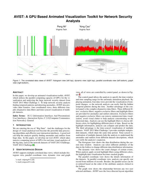
Figure 1: The correlated data views of <strong>AVIST</strong> : histogram view (left top), dynamic view (right top), parallel coordinate view (left bottom), graph<br />
view (right bottom).<br />
ABSTRACT<br />
In this paper, we develop an animated visualization toolkit, <strong>AVIST</strong>,<br />
which utilizes the parallel computing capacity of <strong>GPU</strong>s <strong>for</strong> the visualization<br />
and analyzing the large network security dataset from<br />
VAST 2013 Mini Challenge 3. To help network security analysts<br />
finding temporal patterns and detecting anomalies, <strong>AVIST</strong> also provides<br />
other features: four coordinated views, three different complex<br />
disjunctive data filters and time-synced visualization of multiple<br />
datasets.<br />
Index Terms: H.5.2 [In<strong>for</strong>mation Interfaces And Presentation]:<br />
User Interfaces—Interaction Styles; C.2.0 [Computer Communication<br />
<strong>Network</strong>s]: General<br />
1 INTRODUCTION<br />
We are entering the era of “Big Data”. And the challenges <strong>for</strong> the<br />
design of visual analytical tool become the powerful data processing<br />
algorithms and effective user interaction interfaces. A good tool<br />
can help the analysts quickly finding anomalies and outliers from<br />
huge data. In this paper, we develop our tool <strong>AVIST</strong>, which takes<br />
massive computing power of <strong>GPU</strong>s <strong>for</strong> real time visual analytics of<br />
the big data, such as the network datasets of VAST 2013 Challenge,<br />
VAST 2012 Challenge[1].<br />
2 USER INTERFACES DESGIN<br />
<strong>AVIST</strong> supports multiple correlated data views, which includes histogram<br />
view, parallel coordinate view, dynamic view and graph<br />
∗ e-mail: mipeng@vt.edu<br />
† e-mail:yongcao@vt.edu<br />
view, all of views are controlled by control panel, as shown in Figure<br />
1 .<br />
The control panel allows the analysts to specify the time window<br />
and time sampling range <strong>for</strong> the automatic animation playback. By<br />
playing animation, four data views provide the visualization of temporal<br />
changes, so the network analysts can easily find the hidden<br />
temporal patterns during the time. Another advantage of the control<br />
panel is the complex disjunctive data filters. Three different filters:<br />
exclusive filters, negative exclusive filters and highlight filters<br />
are provided <strong>for</strong> anomalies and outliers detection. Exclusive filters<br />
and negative exclusive filters can remove uninterested data visualization,<br />
avoid visual clutter to help analysts concentrating on the<br />
interested data. Analysts can use the highlight filters to choose different<br />
colors <strong>for</strong> highlighting different piece of data. <strong>Based</strong> on the<br />
highlight in<strong>for</strong>mation, analysts can compare and predict the data.<br />
The third advantage is the time-synced visualization of multiple<br />
datasets. VAST 2013 Mini Challenge 3 provides multiple independent<br />
datasets, which share the same time period. Time-synced visualization<br />
of multiple datasets help the analysts to understand the<br />
anomalies and outliers from different datasets descriptions, which<br />
can verify the analysts’s suspicion.<br />
The histogram view shows the data distribution during the current<br />
time window. Analysts can select different attributes of the<br />
data in the listbox to change different data distribution in<strong>for</strong>mation.<br />
The dynamic view shows the count changes of certain events.<br />
When analysts apply several highlight filters using different colors,<br />
the highlight data visualization becomes stacked graphs.<br />
The parallel coordinate view shows the details in<strong>for</strong>mation of<br />
the datasets. In parallel coordinate view, analysts can specify one<br />
record from millions of records. Besides, the parallel axises can be<br />
re-ordered based on the order of the attributes analysts clicked in<br />
the listbox.<br />
The graph view shows the relationship between any two user<br />
selected attributes. <strong>AVIST</strong> uses the <strong>for</strong>ce directed layout algorithm
to generate the graph. Analysts also can tune several parameters to<br />
make the layout friendly and beauty. Due to the <strong>GPU</strong> power, our<br />
layout algorithm allows the analysts real time editing the graph.<br />
3 SYSTEM DESIGN<br />
To support the real time visual analytics of big data, we develop the<br />
parallel algorithms <strong>for</strong> generating the geometry and rendering data.<br />
Besides, we carefully organize the data flow of the <strong>AVIST</strong> to avoid<br />
duplicated computing.<br />
Finding 2: the peak of network traffic. During the time<br />
06:36:16, 4/2/2013, nearly 4 millions of records flood in the network<br />
in one minute. We choose the source IPs and destination IPs<br />
to generate the graph, and find the graph has three branches and<br />
the IP addresses: 172.10.0.6, 172.0.0.1 are the hubs of the network.<br />
The finding is illustrated in Figure 4 and Figure 5 .<br />
Figure 2: The data flow of the <strong>AVIST</strong>.<br />
Figure 4: In the dynamic view, there are 4435845 records in the network<br />
during the time 06:36:16, 4/2/2013 with the time window size 60<br />
seconds. We use the red color to highlight the records of source IP<br />
172.10.0.6, and green color to highlight the destination IP 172.0.0.1.<br />
From the dynamic view, we learn that there is no records related<br />
about the ip 172.0.0.1 be<strong>for</strong>e the peak time.<br />
Figure 2 shows our data flow design of <strong>AVIST</strong>, which describes<br />
the data process from the raw data to rendering VBOs. <strong>Based</strong> on the<br />
filters, the filtered data is generated, which stores the indices of the<br />
raw data records. In each data views, we develop the parallel algorithms<br />
to generate the geometry data and rendering data. Because<br />
all of the geometry and rendering data are on the <strong>GPU</strong>, so there is<br />
no data transfer from the main memory to the <strong>GPU</strong> in the rendering<br />
stage. This solution scales very well <strong>for</strong> the big data visual analytics.<br />
Now, <strong>AVIST</strong> can support millions of records visualization.<br />
4 CASE STUDIES<br />
In the following, we give two findings of VAST 2013 mini challenge<br />
3 based on the <strong>AVIST</strong>. More detailed explanation can be<br />
found from the uploaded video.<br />
Finding 1: suspicious behaviors of webmail servers. In<br />
the week one network flow dataset, we find the webmail servers<br />
172.30.0.3, 172.20.0.3 using their port 80 to scan the network during<br />
the time from 3:30, 4/3/2013 to 6:50, 4/3/2013 from the visualization<br />
of the parallel coordinate view, as shown in Figure 3 .<br />
Figure 5: In the graph view, we generate graph based on the<br />
4435845 records of Figure 4 by choosing the attributes of source<br />
IPs and destination IPs. And we use red and green color to highlight<br />
the hubs of the network.<br />
Figure 3: In the parallel coordinate view, the webmail servers<br />
172.30.0.3 and172.20.0.3 scan all available ports in the network.<br />
Here, we apply the exclusive filter to UDP and OTHER protocols,<br />
as well as source port 80 and destination port 80. We use the red<br />
color to highlight the source IPs 172.30.0.3 and172.20.0.3, and green<br />
color to highlight the destination IPs 172.30.0.3 and172.20.0.3 .<br />
5 CONCLUSION<br />
To support the big data visual analytics, especially the huge network<br />
security datasets visualization, <strong>AVIST</strong> utilizes the parallel computing<br />
capacity of <strong>GPU</strong>s <strong>for</strong> data processing and rendering. <strong>AVIST</strong><br />
also provides four correlated data views <strong>for</strong> visualization. To avoid<br />
visual clutter, three kinds of DNF filters are provides. At last,<br />
<strong>AVIST</strong> is an animation visualization toolkit <strong>for</strong> temporal pattern<br />
recognition. Future work will include more user friendly interfaces<br />
and more powerful parallel algorithms.<br />
REFERENCES<br />
[1] Y. Cao, R. Moore, P. Mi, A. Endert, C. North, and R. Marchany. Dynamic<br />
analysis of large datasets with animated and correlated views. In<br />
Visual Analytics Science and Technology (VAST), 2012 IEEE Conference<br />
on, pages 283–284, 2012.