Descriptive Statistics: Textual & Graphical (pdf)
Descriptive Statistics: Textual & Graphical (pdf)
Descriptive Statistics: Textual & Graphical (pdf)

Create successful ePaper yourself
Turn your PDF publications into a flip-book with our unique Google optimized e-Paper software.
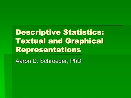
<strong>Descriptive</strong> <strong>Statistics</strong>:<br />
<strong>Textual</strong> and <strong>Graphical</strong><br />
Representations<br />
Aaron D. Schroeder, PhD
In Class Survey<br />
• Call out your height in inches<br />
• Call out your undergraduate major<br />
• I will write on board
<strong>Descriptive</strong> <strong>Statistics</strong><br />
• <strong>Descriptive</strong> <strong>Statistics</strong> is nothing more<br />
than a fancy term for numbers that<br />
summarize a group of data<br />
• In their unsummarized form, data (what<br />
we call “raw data”) are difficult to<br />
comprehend
Three ways to represent<br />
data<br />
• <strong>Textual</strong><br />
• Tabular<br />
• <strong>Graphical</strong><br />
• Numerical
Example<br />
Number of Tons of Trash collected by Sampleton, Ohio<br />
sanitary engineer teams for the week of June 8, 2004<br />
57 70 62 66 68 62 76 71 79 87<br />
82 63 71 51 65 78 61 78 55 64<br />
83 75 50 70 61 69 80 51 52 94<br />
89 63 82 75 58 68 84 83 71 79<br />
77 89 59 88 97 86 75 95 64 65<br />
53 74 75 61 86 65 95 77 73 86<br />
81 66 73 51 75 64 67 54 54 78<br />
57 81 65 72 59 72 84 85 79 67<br />
62 76 52 92 66 74 72 83 56 93<br />
96 64 95 94 86 75 73 72 85 94
Can’t interpret raw data<br />
• Clearly presenting these data in their raw<br />
form would tell the administrator little or<br />
nothing about trash collection in<br />
Sampleton<br />
• For example:<br />
• How many tons of trash do most teams collect?<br />
• Do the teams seem to collect about the same<br />
amount, or does their performance vary?
Frequency Distributions<br />
• The most basic restructuring of raw data<br />
to facilitate understanding<br />
• Definition: a table that pairs data values<br />
(or ranges of data values) with their<br />
frequency of occurrence
Example<br />
Arrests per Police Officer: Crime City, March 2004<br />
Number of Arrests<br />
Number of Police Officers<br />
1-5 6<br />
6-10 17<br />
11-15 47<br />
16-20 132<br />
21-25 35<br />
25+ 7<br />
244
Example, cont.<br />
• The data values are the number of<br />
arrests<br />
• The frequencies are the number of police<br />
officers<br />
• Makes it easy to see that “most” Crime<br />
City police officers made between 16 and<br />
20 arrests in March 2004.
Some definitions<br />
• Variable - Trait or characteristic on which the<br />
classification is based (# of arrests per officer)<br />
• Class – One of the grouped categories of the<br />
variable<br />
• Class Boundaries – lowest and highest values that<br />
within the class<br />
• Class Midpoints – point halfway between class<br />
boundaries<br />
• Class Interval – distance between upper limit of one<br />
class and the upper limit of the next class<br />
• Class Frequency – number of occurrences of the<br />
variable within a given class<br />
• Total Frequency – total # of cases in the table
Constructing a Frequency<br />
Distribution<br />
• Identify the highest and lowest values in the data set.<br />
• Create a column with the title of the variable you are using.<br />
Enter the highest score at the top, and include all values within<br />
the range from the highest score to the lowest score.<br />
• Create a tally column to keep track of the scores as you enter<br />
them into the frequency distribution. Once the frequency<br />
distribution is completed you can omit this column. Most printed<br />
frequency distributions do not retain the tally column in their<br />
final form.<br />
• Create a frequency column, with the frequency of each value,<br />
as show in the tally column, recorded.<br />
• At the bottom of the frequency column record the total<br />
frequency for the distribution proceeded by N =<br />
• Enter the name of the frequency distribution at the top of the<br />
table.
Tons of Garbage Collected by Sanitary Engineer Teams in<br />
Sampleton, Ohio, Week of June 8, 2004<br />
Tons of<br />
Garbage<br />
Tally<br />
50 / 1<br />
51 /// 3<br />
52 // 2<br />
53 / 1<br />
54 // 2<br />
55 / 1<br />
56 / 1<br />
57 // 2<br />
58 / 1<br />
59 // 2<br />
60 0<br />
61 /// 3<br />
62 /// 3<br />
63 // 2<br />
64 //// 4<br />
Crews<br />
(Frequency)<br />
65 //// 4<br />
66 /// 3<br />
67 // 2<br />
68 // 2<br />
69 / 1<br />
70 // 2<br />
71 /// 3<br />
72 //// 4<br />
73 /// 3<br />
74 // 2<br />
75 ////// 6<br />
76 // 2<br />
77 // 2<br />
78 /// 3<br />
79 /// 3<br />
80 / 1<br />
81 // 2<br />
82 // 2<br />
83 /// 3<br />
84 // 2<br />
85 // 2<br />
86 //// 4<br />
87 / 1<br />
88 / 1<br />
89 // 2<br />
90 0<br />
91 0<br />
92 / 1<br />
93 / 1<br />
94 /// 3<br />
95 /// 3<br />
96 / 1<br />
97 / 1<br />
98 0
Grouped Frequency<br />
Distributions<br />
• For better visualization, many times you need to<br />
“group” the data<br />
• Generally between 4 and 20 classes<br />
• Tips<br />
• Avoid classes so narrow that some intervals have zero<br />
observations<br />
• Make all class intervals equal unless the top or bottom class is<br />
open-ended<br />
• An open-ended class has only one boundary<br />
• Use open-ended intervals only when closed intervals would<br />
result in class frequencies of zero<br />
• Usually happens with some data that is very high or very low<br />
• Try to construct the intervals so that the midpoints are whole<br />
numbers
Tons of Garbage Collected by Sanitary Engineer Teams in<br />
Sampleton, Ohio, Week of June 8, 2004<br />
Tons of Garbage Number of Crews<br />
50-60 16<br />
60-70 24<br />
70-80 30<br />
80-90 20<br />
90-100 10<br />
100
Grouped Frequency<br />
Distribution<br />
• Note that the upper limit of every class is also<br />
the lower limit of the next class<br />
• That is, the upper limit of the first class is 60, the<br />
same value as the lower limit of the second class<br />
• This is typical when the data are continuous<br />
• A continuous variable is one that can take on<br />
values that are not whole numbers (e.g. 3.456)<br />
• Interpret the first interval as running from 50 to<br />
59.999 – the next interval starts at 60 and goes<br />
to 69.999
In class task<br />
• Build a grouped frequency distribution<br />
using the height data on the board<br />
• Identify your variable<br />
• List all values of the variable<br />
• Read through the data and make tally<br />
• Come up with class interval<br />
• Make group frequency distribution
Percentage Distributions<br />
• Suppose the Sampleton city manager wants to<br />
know whether Sampleton sanitary engineer<br />
crews are picking up more garbage than city<br />
crews in neighboring Refuseville<br />
• The city manager wants to know because<br />
Refuseville picks up trash at the curb while<br />
Sampleton picks up trash at the house. The<br />
goal is more garbage collected while holding<br />
costs steady
Which town picks up more<br />
trash per crew?<br />
Tons of Garbage Collected by Sanitary Engineer Teams, Week of June 8, 2004<br />
Numbers of Crews<br />
Tons of Garbage Sampleton Refuseville<br />
50-60 16 22<br />
60-70 24 37<br />
70-80 30 49<br />
80-90 20 36<br />
90-100 10 21<br />
100 165
Must convert to compare<br />
• Easiest way is to convert into percentage<br />
distributions<br />
• A Percentage Distribution shows the<br />
percentage of the total observations that<br />
fall into each class<br />
• To convert to percentage distributions,<br />
the frequency in each class is divided by<br />
the total frequency for that category
Which town picks up more<br />
trash per crew?<br />
Tons of Garbage Collected by Sanitary Engineer Teams, Week of June 8, 2007<br />
Percentage of Work Crews<br />
Tons of Garbage Sampleton Refuseville<br />
50-60 16 13<br />
60-70 24 22<br />
70-80 30 30<br />
80-90 20 22<br />
90-100 10 13<br />
100 100<br />
N=100 N=165
Cumulative Frequency<br />
Distributions<br />
• If you add up the percentages, either<br />
from the top down or bottom up, it can be<br />
very useful when making comparisons<br />
• Commonly done when reporting the<br />
result of surveys in the media<br />
• 55% are either satisfied or very satisfied
Which town picks up more<br />
trash per crew?<br />
Tons of Garbage Collected by Sanitary Engineer Teams, Week of June 8, 2007<br />
Percentage of Work Crews<br />
Tons of Garbage Sampleton Cumulative Refuseville Cumulative<br />
50-60 16 100 13 100<br />
60-70 24 84 22 87<br />
70-80 30 60 30 65<br />
80-90 20 30 22 35<br />
90-100 10 10 13 13<br />
100 100<br />
N=100 N=165
In-Class Task<br />
• The fire chief of Metro, Texas is concerned<br />
about how long it takes his fire crews to arrive<br />
at the scene of a fire<br />
• The local paper has run some stories<br />
complaining about slow response times<br />
• Since the times of the calls and time of<br />
reporting on scene are recorded, the data is<br />
available<br />
• The chief wants to know from you the<br />
percentage of calls answered in under 5, 10,<br />
15, and 20 minutes
Response Time of the Metro Fire Department, 2007<br />
Response Time (Minutes)<br />
Number of Calls<br />
0-1 7<br />
1-2 14<br />
2-3 32<br />
3-4 37<br />
4-5 48<br />
5-6 53<br />
6-7 66<br />
7-8 73<br />
8-9 42<br />
9-10 40<br />
10-11 36<br />
11-12 23<br />
12-13 14<br />
13-14 7<br />
14-15 2<br />
15-20 6
Solution<br />
Response Time<br />
Response Times of Metro Fire Department, 2004<br />
Under 5 minutes 27.6<br />
Under 10 minutes 82.4<br />
Under 15 minutes 98.8<br />
Under 20 minutes 100.0<br />
Percentage (Cumulative) of<br />
Response Times<br />
N = 500
The Art of Tabular Design<br />
• What constitutes a good table?<br />
• If you put together a table and leave it<br />
lying somewhere, and someone picks it<br />
up, that person (assuming a moderate<br />
level of literacy) should be able to<br />
comprehend fully what the table is about.<br />
A good table should stand by itself
Bad Table – What’s wrong?<br />
Perceptive Limits by Understanding of Advertisements<br />
Understanding of<br />
Advertisements<br />
Cognitive Ability<br />
Lower (%) Higher (%)<br />
Low 61 42<br />
Medium 39 58<br />
Total Percent 100 100<br />
Total Number 190 250<br />
TOTAL 440
Why is it bad?<br />
• What is meant by perceived limits?<br />
• Where was the sample of 440 people obtained?<br />
• In the U.S.? Japan? Tibet?<br />
• When was it done?<br />
• What kinds of advertisements are being referred to?<br />
• Television? Radio?<br />
• What does “understanding an advertisement” mean?<br />
• How low does cognitive ability have to be for a person not to<br />
comprehend an advertisement “at all”<br />
• Does the sample refer to children or adults?<br />
• This is a basically meaningless table
Simplicity vs. Detail<br />
• In making a good table, you are working<br />
with opposing ideas<br />
• Keep it simple<br />
• Provide as much information as possible<br />
• This is also true of most conversation<br />
• While there are no hard and fast rules,<br />
but there are some general features of<br />
most good tables
Feature 1 - Proper Title<br />
• The title should provide clear information about the<br />
table’s contents<br />
• At the same time, it should be brief<br />
• Within 3 or 4 lines, the title should state the following:<br />
• To whom do the data refer?<br />
• Where were the data collected?<br />
• When were the data collected?<br />
• What kind of information is in the table (Absolute Frequencies?<br />
Relative Frequencies? Some other measure?)<br />
• From what source was the data obtained?<br />
• What categories are involved in the table?<br />
• What is the argument of the table? Does it simply provide<br />
frequency of DWI, or is it a study of the relationship between child<br />
abuse and socio-economic status?<br />
• Handout has pretty good title
Feature 2 – Divides the data<br />
in a way that doesn’t<br />
overwhelm the reader<br />
• As a general rule, this means not having<br />
more than 12 columns or 12 rows<br />
• Of course, sometimes this rule can be<br />
violated for good reason, but remember<br />
that 12 x 12 = 144 cells – that’s a lot<br />
• Handout has 333 cells, but it’s ok – more<br />
of a directory – reader doesn’t have to<br />
pay attention to all the data
Features 3 & 4<br />
• Good spacing<br />
• Handout slightly violates<br />
• Each cell should provide some<br />
information<br />
• If information was not available – then NA
Feature 5 – Clear<br />
Percentages<br />
Grades Men Women Percent<br />
A 33 42 17<br />
B 78 80 33<br />
C 105 96 39<br />
D 43 22 9<br />
F 12 4 2<br />
In the first table, the meaning of<br />
the percentages is ambiguous.<br />
In the second table, even<br />
though it looks more<br />
complicated, the meaning is<br />
less ambiguous and it is easier<br />
to read<br />
Grades Men Women Total<br />
Number Percent Number Percent Number Percent<br />
A 33 12 42 17 75 15<br />
B 78 29 80 33 158 31<br />
C 105 39 96 39 201 39<br />
D 43 16 22 9 65 13<br />
F 12 4 4 2 16 3<br />
TOTAL 271 100 244 100 515 100
Features 6 & 7<br />
• Unless a value is precisely 0, it should<br />
not be represented by a 0<br />
• This goes hand and hand with rounding –<br />
usually good enough to should 1 or 2<br />
decimal places<br />
• Applying both rules, 0.0003 can be<br />
represented as 0.0+
<strong>Graphical</strong> Representation<br />
of Tabular Data<br />
• Often, a public administrator wants to present<br />
information visually so that leaders, citizens,<br />
and staff can get a feel for a problem without<br />
reading a table<br />
• Four common methods are<br />
• Bar Graphs<br />
• Histograms<br />
• Frequency Polygons<br />
• Pie Charts
Graph Basics<br />
• The graphs considered here are<br />
all two dimensional<br />
representations of data that could<br />
also be shown in a frequency<br />
distribution.<br />
• The typical graph consists of<br />
• A horizontal axis or x-axis which<br />
represents the variable being<br />
presented. This axis is referred to<br />
as the abscissa of the graph and<br />
sometimes as the category axis.<br />
This axis of the graph should be<br />
named and should show the<br />
categories or divisions of the<br />
variable being represented.
Graph Basics<br />
• A vertical axis or y-axis which is<br />
referred to as the ordinate or the<br />
value axis. In the graphs we will<br />
be considering the ordinate will<br />
show the frequency with which<br />
each category of the variable<br />
occurs. This axis should be<br />
labeled as frequency and also<br />
have a scale, the values of the<br />
scale being represented by tic<br />
marks. By convention the length of<br />
the ordinate is three-fourths the<br />
length of the abscissa. This is<br />
referred to as the three-fourths<br />
rule in graph construction.
Graph Basics<br />
• Each graph should<br />
also have a title<br />
which indicates the<br />
contents of the<br />
graph.
The Bar Graph<br />
• A bar graph’s bars or columns are separated<br />
from one another by a space rather than being<br />
contingent to one another. Why?<br />
• The bar graph is used to represent data at the<br />
nominal or ordinal level of measurement. The<br />
variable levels are not continuous, therefore<br />
the bars representing various levels of the<br />
variable are distinct from one another.
Bar Graph Example<br />
Hospital Clinic<br />
• A research team collects<br />
data over a period of five<br />
days by interviewing 100<br />
users. They gather data<br />
on waiting times at<br />
different points in the<br />
clinic: waiting to register,<br />
waiting for the nurse,<br />
waiting for the doctor,<br />
and waiting for the lab.<br />
The team creates a table<br />
with the results of their<br />
work:<br />
• What are they doing by<br />
breaking things down by<br />
day of week?
Bar Graph Example<br />
• Next, the team draws a<br />
bar graph using the data<br />
they have collected so<br />
they can visualize the<br />
waiting time problem.<br />
• Looking at the bar<br />
graph, the team agrees<br />
that waiting time for<br />
registration is the<br />
biggest problem. They<br />
decide to look more<br />
carefully into the<br />
registration process to<br />
better describe the<br />
waiting time problem<br />
that occurs during<br />
registration.
Task - Majors<br />
• Make a Frequency Distribution of the<br />
undergraduate majors of this class<br />
• Turn the frequency distribution into a bar<br />
graph
The Histogram<br />
• A histogram is similar to the common bar<br />
graph but is used to represent data at the<br />
interval or ratio level of measurement,<br />
while the bar graph is used to represent<br />
data at the nominal or ordinal level of<br />
measurement.
Clinic Example<br />
• The team decides to look at the waiting time data in a<br />
different way. They decide to create a histogram that<br />
represents the varying amounts of time that users wait<br />
before being registered. To create a histogram, they<br />
must first go back to their raw data and create a<br />
frequency table for the waiting time data they collected.<br />
• According to their raw data, the following waiting<br />
periods (in minutes) were measured for users at<br />
registration: 10, 12, 15, 18, 23, 38, 45, 48, 50, 64, 68,<br />
72, 75, 80, 81, 84, 85, 88, 98, 110, 125, 130, 135, and<br />
140. The team counted the number of data points in<br />
the series, and it is 24.
Clinic Example<br />
• To organize their data, they first determine the range of<br />
the data, which is the difference between the highest<br />
and lowest data points: 140-10=130.<br />
• Next, they decide on the number of categories they will<br />
use to group the data. The manager and the team have<br />
24 data points, so they decide to create 5 categories.<br />
• They determine the interval of the categories by<br />
dividing the range by the number of categories:<br />
130/5=26 minutes (rounded to 30 minutes).<br />
• They determine the range of each interval by starting at<br />
0 and adding the interval each time: 30, 60, 90, 120,<br />
150. So the first interval will be 0-30, the second 31-60,<br />
and so on.
Clinic Example<br />
• Now they look<br />
at their data<br />
and see how<br />
many times<br />
they observed<br />
data points in<br />
each interval.<br />
Then they<br />
construct a<br />
frequency<br />
table:
Clinic Example<br />
• Next, to create the<br />
histogram, the team draws a<br />
horizontal axis and vertical<br />
axis: the horizontal axis (x),<br />
represents waiting time in<br />
minutes, and the vertical axis<br />
(y) represents the number of<br />
users.<br />
• For each data category, they<br />
draw a rectangle. The height<br />
of the rectangle represents<br />
the observed number of<br />
users in each category.<br />
• By looking at the data in a<br />
histogram, it is easy to see<br />
that the majority of users<br />
wait from 61 to 90 minutes<br />
for registration.
Task - Heights<br />
• Build a histogram from the class heights<br />
frequency distribution you already<br />
constructed
The Frequency Polygon<br />
(Line Graph)<br />
• A frequency polygon or “line graph” can<br />
be created with interval or ratio data.<br />
• A line graph can be created with<br />
individual data points or grouped data<br />
(using the class midpoints)
Clinic Example<br />
• The team<br />
hypothesizes that<br />
the waiting time for<br />
registration might<br />
vary depending on<br />
the day of the week.<br />
They look at the<br />
data they have<br />
collected on waiting<br />
times for<br />
registration:
Clinic Example<br />
• Next, they decide to create a<br />
line graph with this data. The<br />
x-axis will represent the days<br />
of the week, and the y-axis will<br />
represent the waiting time in<br />
minutes. They plot the data<br />
points on the graph and<br />
connect the dots to form a line.<br />
Below is the line graph they<br />
create:<br />
• By observing the line graph,<br />
the team can clearly see that<br />
Mondays and Fridays are the<br />
days with the longest wait in<br />
registration, and that Mondays<br />
are the worst days for long<br />
waits.
Task - Heights<br />
• Using your histogram, overlay a line<br />
graph<br />
• Where do the points go?
Pie Chart<br />
• A pie chart is a very simple visual device<br />
for conveying proportions<br />
• It is used with either interval or ratio level<br />
data that has been converted into<br />
percentages
Clinic Example<br />
• If the team had<br />
collected data on the<br />
total time the patient<br />
was at the clinic, then<br />
they could figure out<br />
the proportion of time<br />
waiting vs. interacting<br />
with a person
Task<br />
• Using the majors frequency distribution,<br />
create a percentage distribution and a pie<br />
chart
Assignment<br />
• Welch and Comer, exercises 5-1, 5-2,<br />
and 5-4<br />
• Drawn by hand<br />
• In my mailbox by next Tuesday morning