June 2009 - University of Hertfordshire
June 2009 - University of Hertfordshire
June 2009 - University of Hertfordshire

You also want an ePaper? Increase the reach of your titles
YUMPU automatically turns print PDFs into web optimized ePapers that Google loves.
Temperature (degs. centigrade)<br />
Getting the best from PowerPoint: 2 and 3-dimensional animations<br />
22<br />
Animating Two-Dimensional Objects<br />
Animating two-dimensional graphical objects <strong>of</strong>fers a powerful tool to enhance learning.<br />
Aside from the obvious benefit for visual learners, the animation <strong>of</strong> graphical objects can<br />
assist in the explanation <strong>of</strong> more complex concepts. Some excellent examples <strong>of</strong> the<br />
application <strong>of</strong> graphical animation to the teaching <strong>of</strong> orthodontics are provided by<br />
Halazonetis (2000a and 2000b). In this paper I will use examples from my own teaching<br />
and research in the field <strong>of</strong> glaciology to demonstrate the application <strong>of</strong> PowerPoint<br />
animations. The techniques covered however, are applicable to a vast range <strong>of</strong><br />
disciplines. My interest in applying more advanced animation techniques to graphical<br />
objects came after I was asked to present a series <strong>of</strong> lectures on subglacial hydrology and<br />
dynamics to a group <strong>of</strong> Norwegian undergraduate students. Given that the first language<br />
<strong>of</strong> these students was not English I had to try and make some rather complex and<br />
technical subject matter as accessible and easy to understand as possible; animating<br />
graphical objects in PowerPoint provided one means <strong>of</strong> doing just that.<br />
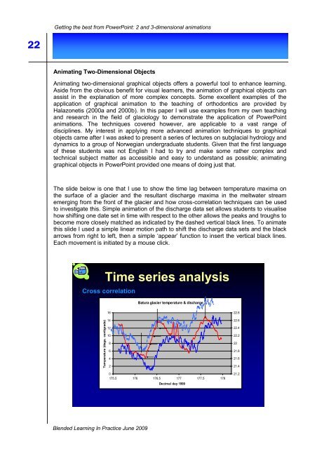
The slide below is one that I use to show the time lag between temperature maxima on<br />
the surface <strong>of</strong> a glacier and the resultant discharge maxima in the meltwater stream<br />
emerging from the front <strong>of</strong> the glacier and how cross-correlation techniques can be used<br />
to investigate this. Simple animation <strong>of</strong> the discharge data set allows students to visualise<br />
how shifting one date set in time with respect to the other allows the peaks and troughs to<br />
become more closely matched as indicated by the dashed vertical black lines. To animate<br />
this slide I used a simple linear motion path to shift the discharge data sets and the black<br />
arrows from right to left, then a simple „appear‟ function to insert the vertical black lines.<br />
Each movement is initiated by a mouse click.<br />
Time series analysis<br />
Cross correlation<br />
Batura glacier temperature & discharge<br />
16<br />
14<br />
22.8<br />
22.6<br />
12<br />
10<br />
8<br />
6<br />
4<br />
2<br />
0<br />
175.5 176 176.5 177 177.5 178<br />
Decimal day 1999<br />
22.4<br />
22.2<br />
22<br />
21.8<br />
21.6<br />
21.4<br />
21.2<br />
Blended Learning In Practice <strong>June</strong> <strong>2009</strong>