

Custom branding Acrobat X Pro's PDF Portfolios using Adobe ... - Ipex
Custom branding Acrobat X Pro's PDF Portfolios using Adobe ... - Ipex
Custom branding Acrobat X Pro's PDF Portfolios using Adobe ... - Ipex

Create successful ePaper yourself
Turn your PDF publications into a flip-book with our unique Google optimized e-Paper software.
080<br />
www.macuser.co.uk<br />
5 November 2010<br />
DIFFICULTY<br />
RATING<br />
<strong>Custom</strong> <strong>branding</strong> <strong>Acrobat</strong> X Pro’s<br />
<strong>PDF</strong> <strong>Portfolios</strong> <strong>using</strong> <strong>Adobe</strong> CS5<br />
How to redesign the new Flash-based <strong>PDF</strong> Portfolio themes in <strong>Adobe</strong><br />
<strong>Acrobat</strong> X Pro without even having to know how to use Flash.<br />
<strong>Portfolios</strong> in <strong>Adobe</strong> <strong>Acrobat</strong> 9 and X<br />
Pro are packaged collections of media<br />
files, sitting together in a single <strong>PDF</strong><br />
container. This makes them simple to<br />
transport and distribute, and, unlike .zip and<br />
.sit files, they provide a friendly browsing<br />
interface for viewing the documents inside,<br />
complete with thumbnails, full previews and<br />
easy single-item extraction.<br />
A <strong>PDF</strong> Portfolio can contain and preview<br />
not just <strong>PDF</strong>s and images but Microsoft Office<br />
documents, Flash animations and both audio<br />
and video media files, too.<br />
With <strong>Acrobat</strong> X Pro, <strong>Adobe</strong> provides a<br />
choice of slick animated layouts for your<br />
<strong>Portfolios</strong>. The good news is that you can<br />
customise the appearance of these layouts<br />
by importing your own ‘themes’ (interface<br />
‘skins’, if you like) that you can create <strong>using</strong><br />
<strong>Adobe</strong> Flash. Well, that’s great for Flash<br />
aficionados, but what about the Flash-illiterate<br />
Creative Suite users? We know you exist, so<br />
you may as well own up.<br />
Luckily for you, there’s a tidy workaround<br />
that lets anyone with some basic <strong>Adobe</strong><br />
Illustrator skills get in on the act. And while<br />
you’ll still need Flash to publish the final SWF<br />
file, you’ll be able to do it even if you have<br />
never run the program before in your life.<br />
As for all you Flashmen, just follow this<br />
tutorial <strong>using</strong> Flash from start to finish,<br />
creating named instances of objects on the<br />
stage instead of Illustrator Symbols. One way<br />
or another, an hour spent in <strong>Adobe</strong>’s CS5<br />
is enough to give custom <strong>branding</strong> to your<br />
organisation’s <strong>PDF</strong> <strong>Portfolios</strong>.<br />
Alistair Dabbs is a freelance journalist,<br />
editorial trainer and <strong>Adobe</strong> Certified<br />
Instructor specialising in print and<br />
digital media publishing. The black belt<br />
in karate comes in handy, too.<br />
Kit required<br />
<strong>Acrobat</strong> X Pro, Flash CS5, Illustrator CS5<br />
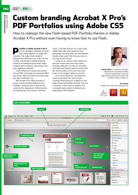
KEY FEATURES<br />
Header<br />
CardTitleBar<br />
NavBackground<br />
InfoIcon<br />
ExtractIcon<br />
Previous Button<br />
Next Button<br />
MiniNavSlammer<br />
Background<br />
NavCard<br />
You will import<br />
your custom<br />
theme here<br />
MiniNavSlammer<br />
icon<br />
Mini Navigator<br />
Mini<br />
NavBackground<br />
MiniNavCard
081<br />
www.macuser.co.uk<br />
5 November 2010<br />
1. Design a background<br />
Create a new Illustrator document for your intended <strong>PDF</strong> Portfolio<br />
interface. We recommend a single artboard of 1280 x 1024 pixels<br />
in RGB colour mode and a default screen of 72ppi. Fill the artboard<br />
with whatever you want to use as the Portfolio background, including<br />
company logos and other artwork. Group the objects. From the<br />
Symbols panel, create a New Symbol from the selected group,<br />
naming it ‘NavBackground’.<br />
2. Add a header bar<br />
Draw a rectangle across the full width of the artboard, snapping it<br />
to the top edge. It should be 100 pixels tall. This will act as the<br />
Portfolio’s optional header bar, which only appears if you add titles<br />
later on in <strong>Acrobat</strong>. Again <strong>using</strong> the Symbols panel, create a New<br />
Symbol from the rectangle and name it ‘HeaderBackground’. Here,<br />
we filled it with white and set its opacity to 50%. Your own header<br />
bar can be more elaborate.<br />
3. Draw the mini navigator<br />
Some Portfolio layouts can call up a row of file thumbnails along the<br />
bottom of the window, so you should design a background for this<br />
‘mini navigator’ bar. We suggest making it no deeper than 185<br />
pixels. Here, we made it slightly transparent and added a shadow<br />
effect along the top: select the object (or group) and add it as a New<br />
Symbol, this time naming it ‘MiniNavBackground’.<br />
4. Design the thumbnail frames<br />
Each file thumbnail in a Portfolio is presented in a rectangular frame,<br />
so design one. Make two duplicates and edit the background fills to<br />
look slightly different. Add these three objects (or groups) as New<br />
Symbols called ‘NavCard’, ‘NavCardOver’ and ‘NavCardSelected’<br />
respectively. This time, however, tick the ‘Enable Guides for 9-Slice<br />
Scaling’ option before clicking on OK. The Over and Selected variants<br />
will later respond to mouse actions in the Portfolio.<br />
5. Set 9-Slice Scaling<br />
Double-click on NavCard in the Symbols panel in order to edit it in<br />
isolation. Drag on the four dashed slice guides so they’re close to<br />
but not touching the frame edges of the NavCard. This will ensure<br />
the card resizes and reshapes itself in the Portfolio to suit the<br />
thumbnail it contains without distorting the frame edges. Exit<br />
Isolation Mode and repeat with the other two NavCards.<br />
6. Create a title bar<br />
Each thumbnail in the Portfolio needs a title bar for its filename, so<br />
create a bar shape to fit neatly at the top of the NavCard. Add it<br />
as a New Symbol called ‘CardTitleBar’ and enable 9-Slice Scaling,<br />
remembering to adjust the slice guides afterwards. Even though<br />
we’ve overlaid all three NavCards on top of each other, this isn’t<br />
necessary: the symbols can be positioned anywhere on the artboard.
082<br />
www.macuser.co.uk<br />
5 November 2010<br />
7. Add navigator frames<br />
Design smaller versions of the NavCards to fit in the mini navigator<br />
bar at the bottom. Again, you’ll need three versions with slightly<br />
different appearances to respond to mouse actions: name them<br />
‘MiniNavCard’, ‘MiniNavCardOver’ and ‘MiniNavCardSelected’<br />
respectively. As mentioned earlier, you don’t have to align them:<br />
here, we’ve put them side by side so we can see how they look.<br />
Each should be set up for 9-Slice Scaling.<br />
8. Go forward and back<br />
Create a pair of left/right directional buttons that will be used to<br />
control the scrolling of the thumbnails in the Portfolio. Add them as<br />
New Symbols <strong>using</strong> the names ‘PreviousButton’ and ‘NextButton’.<br />
You’ll also need mouse-over versions that look slightly different,<br />
naming these symbols as ‘PreviousButtonOver’ and ‘NextButtonOver’.<br />
All four buttons should be 50 x 50 pixels in size.<br />
9. Make the little buttons…<br />
Your Portfolio provides little buttons for calling up file information<br />
and for extracting the selected file from the Portfolio, so let’s draw<br />
their backgrounds. Create two small shapes 30 x 30 pixels in size,<br />
colour them differently and add them as New Symbols named<br />
‘IconBackground’ and ‘IconBackgroundOver’. While you’re at it,<br />
design an information button logo (we used an ‘i’) and add it as<br />
a New Symbol with the name ‘InfoIcon’.<br />
10. …and yet more buttons<br />
Create an extract button (we used a downwards-pointing arrow) and<br />
a delete button (we used a cross) and add them as New Symbols<br />
named ‘ExtractIcon’ and ‘DeleteIcon. You can also create a pair of<br />
‘close’ buttons for closing the file information window in the Portfolio:<br />
these buttons can include their own backgrounds and should be<br />
symbols with the names ‘CloseButton’ and ‘CloseButtonOver’. All<br />
the buttons should be no bigger than 30 x 30 pixels.<br />
11. Create open/close tab-style button<br />
The mini navigator bar needs an open/close tab-style button.<br />
Draw two different versions at 80 x 28 pixels and add them<br />
as New Symbols named ‘MiniNavSlammerBackground’ and<br />
‘MiniNavSlammerBackgroundOver’. Add a small icon for the tab,<br />
make it a symbol and call it ‘MiniNavSlammerIcon’. This will rotate<br />
180°, depending on whether the navigator is open or closed.<br />
12. Design some folders<br />
Finally, if you want a custom look to any folders shown in the<br />
Portfolio, add them in three sizes of symbol, named ‘FolderSmall’,<br />
‘FolderMedium’ and ‘FolderLarge’. The latter can be 285 x 360 pixels<br />
in size. Further, create a small title bar for folder names, adding it as<br />
a symbol called ‘FolderTitleBar’.
083<br />
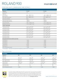
Here’s a rundown of all the objects you need to create for your custom Portfolio theme.<br />
Remember to add each item as a symbol <strong>using</strong> the precise object names given.<br />
CARDS<br />
Object name<br />
IconBackground<br />
IconBackgroundOver<br />
InfoIcon<br />
ExtractIcon<br />
DeleteIcon<br />
NavCard<br />
NavCardOver<br />
NavCardSelected<br />
CardTitleBar<br />
FolderTitleBar<br />
CloseButton<br />
CloseButtonOver<br />
Description<br />
Background image for all icons that appear on the card. InfoIcon, ExtractIcon and DeleteIcon appear on<br />
top of this object. Size: 30 x 30 pixels<br />
MouseOver state for the IconBackground. Size: 30 x 30 pixels<br />
Icon to show metadata. Not present in all layouts. Size: 30 x 30 pixels<br />
Icon to extract file. Not present in edit mode. Size: 30 x 30 pixels<br />
Icon to delete file. Size: 30 x 30 pixels<br />
Background image for the card. Use 9-Slice Scaling<br />
MouseOver state for the NavCard. Use 9-Slice Scaling<br />
Selected state for the NavCard Use 9-Slice Scaling<br />
Background image for the card title area. Size: 54 pixels high Use 9-Slice Scaling<br />
Background image for the folder title area (appears below the folder icon). Use 9-Slice Scaling<br />
Close button on flip size of card. Not present in all layouts<br />
Over state for CloseButton. Not present in all layouts<br />
www.macuser.co.uk<br />
5 November 2010<br />
FOLDER ICONS<br />
Object name<br />
FolderSmall<br />
FolderMedium<br />
FolderLarge<br />
BACKGROUND IMAGES<br />
Object name<br />
NavBackground<br />
HeaderBackground<br />
MiniNavBackground<br />
FILE NAVIGATION BUTTONS<br />
Object name<br />
NextButton<br />
NextButtonOver<br />
PreviousButton<br />
PreviousButtonOver<br />
MININAVIGATOR<br />
Object name<br />
MiniNavSlammerBackground<br />
MiniNavSlammerBackgroundOver<br />
MiniNavSlammerIcon<br />
MiniNavCard<br />
MiniNavCardOver<br />
MiniNavCardSelected<br />
Description<br />
Image used to represent a folder in the MiniNav area<br />
Image used to represent a folder in the FreeForm layout medium card<br />
Image used to represent a folder on most cards. Optimum size: 285 x 360 pixels<br />
Description<br />
Background image for the Portfolio. Note: When part of a theme, the image will always stretch to fill the<br />
available space. Doesn’t use 9-Slice Scaling<br />
Background image for the header area. Note: In <strong>Adobe</strong> default layouts, only appears if there is content in<br />
the header. Size: 100 pixels high<br />
Background image for the MiniNav<br />
Description<br />
Image for the next file button. Size: 50 x 50 pixels<br />
MouseOver state for the NextButton<br />
Image for the previous file button. Size: 50 x 50 pixels<br />
MouseOver state for the PreviousButton<br />
Description<br />
Background image for the ‘Slammer’ button, the button that opens/closes the MiniNav. Size: 80 x 28 pixels<br />
MouseOver state for MiniNavSlammerBackground. Size: 80 x 28 pixels<br />
Icon for the Slammer button. Note: This icon will rotate 180° when the MiniNav is toggled. Design this icon<br />
for the MiniNav open state<br />
Card for the MiniNav. Use 9-Slice Scaling<br />
MouseOver state for the MiniNavCard<br />
Selected state for the MiniNavCard<br />
13. Process with Flash<br />
Save and close your Illustrator document. Launch Flash and create<br />
a new blank file. Go to File > Import > Import To Stage and choose<br />
your Illustrator document. In the Import dialog, tick all the symbols<br />
you created and deselect the option to ‘Import as a single bitmap<br />
image’. Save the Flash file, then choose File > Publish Settings,<br />
make sure ‘Flash (.swf)’ is ticked, and click Publish.<br />
14. Import into <strong>Acrobat</strong><br />
Open or create a <strong>PDF</strong> Portfolio in <strong>Acrobat</strong> X Pro. If necessary, take<br />
the Portfolio into editing mode by clicking on the Edit button in the<br />
tool bar at the top of the program window. In the Layout panel on the<br />
right, scroll down to Visual Themes, click on Import <strong>Custom</strong> Theme<br />
and choose the SWF file you published in step 13. Save the <strong>PDF</strong> to<br />
embed your new theme.


 Change language