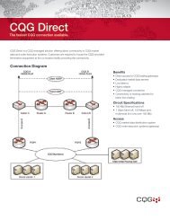
Trading Time. - CQG.com
Trading Time. - CQG.com
Trading Time. - CQG.com

You also want an ePaper? Increase the reach of your titles
YUMPU automatically turns print PDFs into web optimized ePapers that Google loves.
<strong>Trading</strong> <strong>Time</strong>.<br />
A double meaning alluding to actually allocating the time to trade and then understanding<br />
the critical information regarding where you are in time when a trade is placed. This facet<br />
of time has many definitions.<br />
1. The timeframe of the chart that was used and why<br />
2. How critical is the immediate price action directly after the trade is placed<br />
3. How long is the trade expected to last<br />
4. At what point in time is the trade within the trend or are we at the end of the<br />
trend<br />
5. How strong is the trend based on the time it has existed<br />
6. What is the risk/reward in relationship to time<br />
These are all important questions but in my experience of visiting thousands of traders<br />
over the years, they are questions that are rarely asked and for a large number they are<br />
never even considered. One of the first questions I ever ask a trader when we first meet<br />
is, what timeframe charts do you use The answer is always a variation on the same<br />
theme. “Oh I use a 30 min, 60 min daily and weekly”. Not one person has ever said. “I<br />
use the timeframe chart that is relative to my concepts of risk, volatility and range”<br />
For the great trader their success with this somewhat random method is proof enough of<br />
their inherent ability. For the not so great trader this is a recipe for disaster<br />
Therefore obtaining a true measure of expectation in any one period of time is critical to<br />
improving the chances of success. When understanding variations of risk throughout the<br />
day there are many potential problems. The extension of trading hours and the ever<br />
lengthening number of economic data events mean that traditional Technical Analysis<br />
methods that measure momentum on a continual basis are facing increasing challenges as<br />
markets go through periods of low ranges and a lack of direction, followed by bursts of<br />
activity and short term trends. Automated trading seems to have moved into the very low<br />
timeframe, high frequency of trades model to tackle this problem, but this is not an option<br />
for the human trader. In the same fashion that timeframes of charts are often fixed so are<br />
the variables within the momentum-based indicators that are used on charts. If a 10<br />
period moving average is placed on 30 minute chart on Bunds and looked at 11am the<br />
average is likely to have flattened due to lack of activity. This would be the same case on<br />
the opening when it would have reflected the activity or lack of it, in the evening session<br />
of the day before. However, <strong>com</strong>e 4pm and the average could display <strong>com</strong>pletely<br />
different behaviour based on the number of statistics produced that afternoon. Therefore<br />
it is very difficult to use momentum indicators in a predictive manner and we return to<br />
the inherent ability of the good trader to ride the waves of volatility. If you accept the<br />
concepts of continual fluctuation in range and the occasional mutation of a market into a<br />
different environment then the answer must be to make that variable of the average<br />
continually adjustable based not only on the range of any particular bar, but also the time<br />
of day that that bar was created.
Volatility <strong>Time</strong> Averages<br />
Volatility <strong>Time</strong> Averages treats each individual bar only in connection to the same bar<br />
the previous days. The average range is <strong>com</strong>puted over a user defined range. Then the<br />
highest and lowest value of range for that time of day is <strong>com</strong>puted over the last 1000<br />
bars. The difference between the current ranges over n bars is recorded against the<br />
highest range over the last 1000 bars and depending on the difference an exponential<br />
moving average is calculated. This average is given a user defined minimum and<br />
maximum range of average which defaults between a 3 and 21 period. The conclusion is<br />
that if range is narrow in relationship to the history of that time of day the average slows<br />
but if range is large the average speeds up.<br />
Volatility <strong>Time</strong> Bands<br />
Removing the variable of the average and replacing it with a variable that looks at each<br />
specific time of day to previous days, enables a set of bands that maintain there flexibility<br />
to market changes. They are called Volatility <strong>Time</strong> Bands. As soon as the bar opens the<br />
average range for that time of day is <strong>com</strong>puted and 1, 2 and 3 standard deviations are<br />
placed on either side of the market. The use of the opening is critical in that it provides a<br />
predictive framework as the values are fixed and lead to the ability to analyze on a<br />
multitude of concepts.<br />
One of the key criteria is being able to understand what is the limit of range within one<br />
aspect of time. Whilst 1 timeframe can be used in isolation, extra power can be obtained<br />
with multiple timeframe confirmation. The 3 charts on Bunds show a confluence of<br />
extremes as the 30 minute chart has a extreme 3 rd deviation low at 109.90, which is also<br />
the limit of range in the 15 minute and as low as the 5 min. When this is used in<br />
<strong>com</strong>bination with true measure of support and resistance with Market Profile, not only<br />
can day trading turning points be found, but also major strategic turning points in trend.<br />
This is given even more strength when the Kase Peak Oscillator is showing an oversold<br />
scenario as seen in the 15 minute chart. At such times, for both the short term trader and<br />
strategic players risk can be defined as low as 3 ticks on Bunds. This is due to the<br />
connection between macro picture supports and resistance and micro picture limits of<br />
range and allows for far higher volume to be traded as position sizing and subsequently<br />
risk reward ratios explode upwards.
Stochastic Steps<br />
Once a trade has confirmed a major turning point, the next major difficulty is how to<br />
switch such a micro timeframe trade into a position that can be held if the trend then<br />
develops. This is one of the hardest skills in trading and the development of what I call<br />
Stochastic Steps logic attempts to solve this problem. Past analysis shows that there are<br />
some trends in Stock Index’s that began in a 15 minute chart and are still valid 3 years<br />
later and referring to a weekly chart, many thousands of points later.<br />
Stochastic Steps records each crossover of the Stochastic and states whether it was<br />
confirming the continuation of the trend by doing so in a higher or lower contract value<br />
than the previous crossover. Therefore Stochastic Steps will either step up or down each<br />
time the Stochastic crosses depending on the <strong>com</strong>parison in price to the last time the<br />
Stochastic crossed.
The concept is divided into two areas. One records the contract value when the Stochastic<br />
crosses up and the other when it crosses down. In an up trend when the Stochastic crosses<br />
to the downside and from a higher contract value than the previous cross to the downside<br />
the study will step up and confirm that the trend remains strong. Therefore by default it is<br />
an anti divergence indicator.<br />
Trend definition and divergence<br />
However, closer examination of how the Steps interact between the contract value and<br />
the Slow Stochastic value itself reveals how new concepts of divergence can be built<br />
based on the patterns and connections between them. This remains beyond the scope of<br />
this article but it is an important consideration for those who want to investigate the<br />
relationships between the, Stochastic Steps with that theory in mind. This be<strong>com</strong>es<br />
clearer if two more Step studies are created recording the value of the Stochastic itself<br />
when they cross over.<br />
• All the concepts between the Stochastic Steps, either as an anti divergence or a<br />
divergence indicator are true on any market and can be applied to any timeframe.<br />
This means that the study can be used whatever your method of analysis.<br />
Crucially, they also tell us what the focus timeframe is when a trend begins and if it<br />
develops whether the focus timeframe is moving higher. This enables a trade that may<br />
have begun with a short-term bias to be<strong>com</strong>e a long-term trade. This is described below<br />
Confirming the trend<br />
Each time the markets steps in the direction of the trend the trend itself is being<br />
confirmed. Once the relevant indicator has stepped in the same direction 4 times<br />
consecutively this is the trending and focus timeframe, the market is in a strong trend.<br />
When 6 steps are in place we are in a mega trend.<br />
The strongest trend<br />
If both Stochastic Steps are above 6 this indicates the strongest trend of all. The next two<br />
charts show the 15-minute entering a mega trend. This is followed by the 30 minute<br />
doing the same later in the trend. This is an example of how the focus timeframe can be<br />
moved up and allow for trends to be ridden for longer.<br />
This is critical to trends developing as they must move up timeframes in a continuous<br />
fashion or the trend will simply die. Most trends with low beginnings will often end long<br />
before the focus timeframe moves up to a daily chart. This is normally true of Bond and<br />
FX markets which rarely go beyond a half day chart. Even so this would entail a trend<br />
lasting for more than 6 months in most cases. The real power <strong>com</strong>es in Stock markets<br />
where trends can last years. The Dax rally began in 2005 and the two charts show how it<br />
began with a mega trend in the 15 minute before moving up to the 30 minute. This trend<br />
moved up all the subsequent timeframes and now is a weekly trend in spite of the recent<br />
correction. Whilst these dips came seem large the fact the trade had such humble<br />
beginnings means that risk can be wider. For those who would want to maintain tighter
isk, they can use the many methods shown in Chapter 5 in <strong>Trading</strong> <strong>Time</strong> which look at<br />
unique ways of qualifying swing patterns.
Range Deviation Pivots<br />
The main body of the book concentrated more on the Volatility <strong>Time</strong> Bands as many of<br />
the theories or limits of daily range and definition of the trend. Instead concentration was<br />
placed on patterns and probabilities. In order to not have a book full of tables some of the<br />
more rare patterns were left out although there is room here to look at concepts of limits<br />
of movement within a short time span. This is focused on the how many days consecutive<br />
price action can breach the 3 rd Deviation in either direction on an intraday basis or on a<br />
closing basis. The tests reveal critical information with regard to what can expected on<br />
the day after certain patterns and what is the probability of extremes being tested yet<br />
again.<br />
The first set of tables look at how many times price can close beyond the 3 rd Pivot on<br />
consecutive days. It’s important to remember that we are not concentrating degrees of<br />
accuracy but the number of times and therefore the probability of certain patterns
occurring. The first two tables close look at price closing beyond the 3 rd Pivot two days<br />
running. Two portfolios are taken, 1 being 400 stocks in the S&P and the second a<br />
selection of 22 futures and major currencies that cover Index’s, Bonds, Grains and<br />
Precious metals. The tests are done over the last 5 years so represent 1250 bars per<br />
instrument which <strong>com</strong>putes to over 500,000 days in stocks and 27,500 on the futures.<br />
What be<strong>com</strong>es clear is the rarity of how often extremes are actually reached. The first<br />
table on the S&P looks at 2 consecutive closes beyond the 3 rd pivot. In 500,000 days this<br />
happens just over 1500 times which is just one every 320 trading days. The second table<br />
has the same pattern on the futures portfolio and here in 27,500 days there are just 90<br />
trades which is a ratio of once every 305 days.<br />
What is also clear is that once this has happened the trend will often go on a short term<br />
reaction.<br />
Figure 5<br />
The S&P shows reactions are likely early on and the absolute number of trades is low
The futures portfolio has similar ratios and results.<br />
The next table reveals how rare the price closes beyond the 3 rd pivot three days running.<br />
On the S&P it drops to just 75 days out of 500,000 or just once in every 6600 days. On<br />
the futures portfolio it only happened once. This helps to understand the short term<br />
movement on the day after the pattern. The signals are extremely rare
The next test is to look at how often price simply reaches the 2 nd pivot on the 3 rd day.<br />
This will provide insight into whether this area consistently provides and opportunity in<br />
short term trading, considering how rare it is close beyond the 3 rd . This shows a far higher<br />
proportion of trades at 360 times. This means that there is only a 1 in 6 probability of<br />
price moves to the second pivot that it will close beyond the 3 rd .<br />
The portfolio shows 6 times as many trades.<br />
The futures portfolio shows similar pattern
2 Market<br />
Profile®<br />
What you will learn in this chapter<br />
S<br />
Origins of Market Profile®<br />
This study originated in the grain pits at the CBOT in the early 1980s. Peter Steidlmayer,<br />
an exchange local, found that for much of the time price simply ebbed and flowed with<br />
the pit traders. He noted that it was orders <strong>com</strong>ing into the pit that dictated when price<br />
trended. He came to the conclusion that he needed to find a way to distinguish between<br />
the short, medium, and long-term trader, and thus Market Profile® was born.<br />
My own theories came from my time at Fulton Prebon and Dean Witter. I started in<br />
<strong>com</strong>modities and FX at Rudolf Wolff and then found myself trading and broking the<br />
alien T Bond contract. The vast majority of the customers were day traders who traded<br />
large volume intraday, although they would sometimes take a core strategic position. It<br />
was my job to identify the short-term moves, advise clients, and, for some, take<br />
proprietary positions on their behalf. Whilst the touch and squawk boxes were valuable<br />
tools, any other help would be devoured. At the time the buzz was going round the bond<br />
pits that Market Profile® was fast be<strong>com</strong>ing the greatest day-trading tool. Up to that<br />
point, with <strong>com</strong>puters still in the dark ages, daily pivot points were the most <strong>com</strong>monly<br />
used tool. Their dominance in the pit was such that they were successful often because<br />
they were the only reference anyone had. Pivot theory remains a <strong>com</strong>mon method of<br />
obtaining short-term supports and resistances, although the trading structure and<br />
implementation are far more sophisticated today. When these levels coincide with<br />
Market Profile®-based levels the chance of success is increased.<br />
In the absence of software to record and analyze Market Profile®, the voice broker would<br />
give us the range as each 30-minute period <strong>com</strong>pleted and I would keep records manually<br />
on graph paper. At that time, there was no real theory or literature. It was also not<br />
possible to know the values of certain elements such as those associated with volume.<br />
Therefore, all the theories and conclusions I came to were my own and were concentrated<br />
solely in the area of price action. Volume and time information was noted along with the<br />
positioning of the locals. Manually writing the Market Profile® charts led me to<br />
understand how the close of the previous day related to the opening of the current day. In
those days there was also a T Bond contract on LIFFE, and theories that developed<br />
between the differences in London’s morning and Chicago’s opening ended up<br />
transferring their logic to the current overnight session and the regular trading hours. The<br />
conclusions I came to became my road map to short-term movement and this has<br />
developed over the years. The study that can now be found on <strong>CQG</strong> has greatly<br />
simplified matters.<br />
Market Profile® remains my first port of call, whatever asset class or instrument I’m<br />
trading. The theories now extend to methods of scalping, day trading, structured plays,<br />
providing targets, placement of stops, the strength of the trend and optimum points for<br />
where corrections should begin and trends should end. Once the structure has been<br />
understood, the trader can switch their focus to the other studies used in their technical<br />
framework. It can often be the case that, by the time the main strategic trade concludes,<br />
the short-term trades working the core position have made more than if the actual<br />
strategic position was simply left alone from entry to eventual exit. Understanding the<br />
short-term bias when it’s in the opposite direction to the core trade allows the overall<br />
entry point to change to a more advantageous position. For the aggressive, it can<br />
highlight moments when the existing core trade can be pyramided for a day trade, via<br />
Market Profile® techniques, divergence patterns, true measurements of overbought and<br />
oversold, and/or the <strong>Time</strong>-based studies in the previous chapter.<br />
Whilst the ability to shift between short and long-term focus requires practice, discipline<br />
and skill, once mastered it provides the structure to actively manage positions. The full<br />
range of trading techniques are beyond the scope of this book as the concentration is on<br />
time with an emphasis on the short-term movement, although it does touch on the longterm<br />
distribution techniques that are a core element in defining major supports and<br />
resistances. Even so, the section that follows still provides an in-depth guide to some of<br />
the timing techniques. Dedication and effort are required to master the concepts and be<br />
able to trade with great confidence. The majority of the theories apply to most markets<br />
and asset classes but where there are differences they have been flagged.<br />
Briefly, the connection between long-term profiles and the shortterm<br />
<strong>Time</strong> based movements enables low-risk entries with tight<br />
stops. The mantra “the chart tells you don’t tell the chart” means, however, that the<br />
risk/reward ratio cannot be calculated but the exit point is certain.
Linking price, time and volume<br />
Market Profile® has a unique property which helps us to understand price action. It links<br />
price, time and volume. No other study does this so concisely and in one picture. The vast<br />
majority of existing analysis concentrates on the bar or candle pattern or the level of a<br />
momentum indicator based on the closing price. Volume has been the most neglected<br />
aspect of all, and attempts to create meaningful studies have been thwarted simply<br />
because there are so many internal factors that distort the actual volume. Both intraday<br />
and historically, the fundamental setup of a market have a huge impact on volume. In<br />
bond markets the major numbers such as non farms payroll and the trade deficit see<br />
volume reduce in the lead up, whilst in recent years the explosion of statistics at 3 p.m.<br />
London time has meant that large long-term traders have little opportunity to assess and<br />
trade accordingly within the same session. If they do, they find themselves as big fish<br />
in a small pond as the arcades and short-term traders have disappeared by 5 p.m. It is<br />
therefore no accident that the often excess movements late in the afternoon provide clues<br />
to probable price action the following day, as the long-term trader is forced to take<br />
delayed appropriate action. This is why trends still develop throughout London’s morning<br />
sessions. In addition tops and bottoms are often created within this period.<br />
This applies to FX markets as well and especially European stock indices which are held<br />
to ransom by the Dow and S&P. For Market Profile® users, they would often be better<br />
served by trading European indices in the morning and once the American markets open,<br />
simply trailing stops or placing profit targets on any remaining positions. The Dow and<br />
S&P are often so dominant in dictating the short flows of the European indices that it<br />
makes sense to move to trading the primary instrument. The beauty of Market Profile® is<br />
that linking price, time and volume provides a clearer picture of the state of the market.<br />
This can then be used to quantify the more traditional methods of patterns and<br />
momentum and place them in a context of importance.<br />
The first concept to understand is:<br />
Price + <strong>Time</strong> = Market Acceptance<br />
Every time a market trades there is a buyer and a seller. They have made a bargain and<br />
exchanged contracts. At the time of the trade it is impossible to know the circumstances<br />
of the transaction but the aftermath can be analyzed and conclusions drawn.
Market acceptance<br />
We now move onto the next concept.<br />
Price + <strong>Time</strong> = Market Acceptance<br />
This leads us to:<br />
Market Acceptance = Volume<br />
Every time there is a trade the volume associated with market acceptance potentially<br />
provides clues to future direction, although at the moment that it occurs it often provides<br />
little insight. It is only the subsequent price movement that dictates interpretation. That is<br />
unless the volume can be linked to other indicators allowing immediate conclusions to be<br />
drawn. This is a key <strong>com</strong>ponent in analyzing the market and is the reason that from a<br />
Market Profile® standpoint there is no such thing as overbought or oversold. From a<br />
Market Profile® perspective we only know that price displayed that characteristic<br />
afterwards. Many mantras regarding overbought and oversold will be called into doubt in<br />
later chapters. Those perceived rules are a major factor contributing to exiting a trend<br />
prematurely. Therefore it is critical to have a firm grasp of what true measures of<br />
overbought and oversold are, which will be touched on later in the Peak chapter. Let’s<br />
remain with pure Market Profile® theory, with no concept of overbought and oversold;<br />
this leads us to the final building block in theory.<br />
Volume = Market (fair) value<br />
Every time price trades it is fair. This is an important psychological aid. A key<br />
<strong>com</strong>ponent to Market Profile® is that it is long-term players who dictate and end trends.<br />
There are two established theories about how the end is formed:<br />
1. When in an uptrend sellers suddenly match buyers in high volume and prevent further<br />
progress.<br />
2. There is no volume as there is simply no one left to buy, as the final capitulation of<br />
losing shorts has <strong>com</strong>pleted its painful exit. At that point the supply side strengthens,<br />
demand drops and price reverses swiftly back to a point where buyers and sellers feel<br />
value is fair and volume goes back up. The reality is that from a Market Profile®<br />
standpoint both reasons are valid. Therefore, while it’s impossible to know whether a<br />
high or low is being made at that instant, once a reaction has occurred, any subsequent<br />
move back to that area is highly significant. This re-enforces the theory that we have no<br />
idea of the importance of any trade at any price unless we can link it to previous price<br />
action or the day’s extreme deviation points.
Types of activity<br />
If we return to analyzing the behaviour of long-term players, we see that this activity is<br />
split into two areas:<br />
1.Initiative activity<br />
Long-term players dictate trends and when the volume they wish to trade cannot be<br />
satisfied at one price their perception of fair value shifts and price trends.<br />
2. Responsive activity<br />
Long-term traders dictate the end of the trend by withdrawing initiative activity, taking<br />
profits or establishing countertrend positions. They also dictate when the reaction to a<br />
trend has been <strong>com</strong>pleted. Long-term traders are often identified by single letter prints<br />
within a day. These single prints start trends and end them at extremes and at rejections<br />
of value.<br />
So how is Market Profile® displayed
The standard format is that each letter represents the range of a 30-minute period. As the<br />
day progresses, each period is overlaid to provide a horizontal format of the day’s price<br />
action.<br />
Different <strong>Time</strong>frames for different markets<br />
Whilst the vast majority of the Market Profile® users never adjust from 30-minutes,<br />
volatility, range and standard deviations are methods with which to measure what time<br />
frame suits your concept of time and risk. Therefore, short-term scalpers can move down<br />
to 5-minute profiles, whilst for FX traders the 24-hour nature of the market means<br />
creating profiles of 120 or 240 to provide a clearer picture. Especially in Europe, due to<br />
the long trading day, stocks can be used on 60-minute for the day trader or half day for<br />
the intermediate trader as they typically hold a position for a longer time period. The<br />
theories extend to the strategic picture where Market Profile’s® can be based on dailies<br />
or even weekly data sets for the longer-term trader. If using these longer time frames it’s<br />
important to remember that the levels lose some of their pinpoint accuracy. Therefore the<br />
creation of years of data being referenced in, say, a 240-minute timeframe provides the<br />
accuracy needed.<br />
The daily chart gives no real idea of supports in the bottom half of the distribution
The 240-minute chart shows a much clearer picture.<br />
True support and Resistance, the right data is essential!<br />
This brings up another conflict with an established mantra. Commentators and traders<br />
alike will often use short-term charts over the last 3 months of the current front month or<br />
active contract to identify support and resistance. Subsequently, support and resistances<br />
from further back suddenly switch to daily data and simply reference high or low points<br />
in that longer timeframe. Whilst this was understandable for many years as more intraday<br />
data was not available, there is no excuse in the 21st century. True support and resistance<br />
is never at the absolute high or low of a historical bar. There will always have been some<br />
rejection of value ahead of that point whether it is Market Profile® or deviation-based.<br />
<strong>CQG</strong> provides up to 5 years of intraday data; this is invaluable in solving this problem,<br />
allowing risk and exact support and resistance levels to be quantified with precision.<br />
Market Profile®
4 Relative<br />
Strength<br />
Index<br />
RSI as a divergence tool<br />
Now, we tackle the subject of using the RSI as a divergence tool. For the purposes of this<br />
book we will simply touch on some of the concepts and provide some statistics via the<br />
RSI Steps logic. The key to divergence is being able to find patterns that are sufficiently<br />
rare so that the divergence has real meaning. The first pattern I ever produced was called<br />
Ufo for negative divergence and Pops for positive. They simply state that price had to<br />
make a 9-bar high and the RSI 3-bar low for a Ufo to be formed. That theory still has<br />
worth today but has moved on considerably since its inception some 15 years ago. Whilst<br />
that simple pattern still has its place when linked to other analysis, it still follows the<br />
established mantra that for divergence to be visible it has to reference the high or low of<br />
the price action and the change in direction of the indicator. The following sets of tables<br />
take a concept that it is very much a work in progress, but the quality of the statistics<br />
suggests that the problem of cutting signals down to the point where they mean<br />
something can be achieved. In fact, tests have been done on a variety of momentum<br />
indicators and they all perform in a similar fashion, although they don’t create<br />
divergences in the same areas. The principal driver behind the idea has been to create<br />
signals that are not only powerful, but of enough rarity that they could be used on an<br />
individual stock portfolio or a large range of currencies. At this stage the code has simply<br />
been added to the list of viable exit strategies to trends and trend-following systems, but<br />
the possibility that it could be<strong>com</strong>e an entry against the trend remains.
Divergence as an entry point<br />
The sets of tables have all used the S&P 500 daily data and been put through various<br />
times in trends. The first (see fig. 22) takes a perfect scenario for buying stocks by<br />
analyzing the period between 1995 and 2000. It would have been difficult not to win.<br />
However, the code still has to be good enough to capture corrections as it is trying to buy<br />
weakness. In such a rally previous aborted divergence code-building attempts simply<br />
missed too many opportunities. Whilst the percentage profits are obviously good, there<br />
are two key points of interest. First there is the high accuracy figures nudging into the<br />
60% area (after 45 bars) and above. Second, and more important, is the trade count. A<br />
trade count of 680 trades over a 5 year period of 500 stocks means that signals only<br />
average just over one trade every 5 years per stock. Obviously on futures markets this is<br />
pointless but it be<strong>com</strong>es a necessity if you are trading a portfolio of stocks or a basket of<br />
currencies on multiple timeframes with such long holding periods. It suggests that a<br />
portfolio of up to 5,000 stocks could be monitored and the trade count would still be<br />
manageable, as trades would average approximately 5 per day. For big players liquidity<br />
must also be considered when picking stocks for the portfolio so the number of trades per<br />
day would decrease further. Closer examination of the actual individual trades reveals a<br />
much different picture. Signals appear in clusters, which is highly revealing, as even if<br />
the portfolio were not actually traded, it would provide a key timing-point of when stock<br />
markets should reverse. This is extremely useful information and is particularly poignant<br />
if linked to true measure of overbought and oversold discussed in chapter 5.<br />
Signal Evaluation S&P 500 1995 to 2000
The next test (see fig. 23) uses the worst possible period in recent history, from 1<br />
January, 2000 to the day of the post-11th September low that was 21 September. If<br />
allowing for the inevitable fact that any longs going into that final period would have<br />
shown big losses, the statistics are very encouraging. Losses are present over the first few<br />
time segments but the code shows robustness in the face of a strong downtrend and an<br />
ability to pick true divergence. The accuracy remains high as well.<br />
Signal Evaluation S&P January 2000 to 21 September 2001<br />
The next table takes that 21 September low to the present day. The first 5-bar period after<br />
the signal posts a negative and is therefore the first real concern. From then the statistics<br />
remain strong. One encouraging premise is that the statistics improve as time passes,<br />
suggesting this code could be used as part of a buy-and-hold strategy with a wide trailing<br />
stop. Analysis needs to be <strong>com</strong>pleted on what the trigger point for a delayed entry point<br />
is. Evidence gained from equity systems I have already built suggests that stops could be<br />
adjusted once a week. This means that if a 100 stocks were held, it would require 20 new<br />
stops to be added/adjusted each day, which is manageable, even for the non-professional<br />
trader who has to monitor once a day
Signal Evaluation S&P 500 21 September to December 2005<br />
The final test is from 1 January 2004 to December 2005. The picture remains promising.<br />
Signal Evaluation S&P 500 1 January to December 2005
Analysis of eBay shows where signals can appear.<br />
Divergence pattern for stocks<br />
The raw statistics suggest that there is the possibility to create a viable trading system that<br />
would suit a buy-and-hold strategy, for example, pension funds or for the private trader<br />
who wants to track a smaller portfolio for investment purposes. More time will be<br />
required before further progress can be made in order to analyze portfolio risk and the<br />
short signals.<br />
Conclusion<br />
It is not automatically necessary that step method is confined just to the Stochastic and<br />
RSI. It can extend to almost any momentum study; especially in the area of divergence a<br />
suite of indicators can be utilized to spot potential turning points in trends.<br />
Key elements<br />
■ RSI Steps are more sensitive.<br />
■ Cycles do not apply.<br />
■ Steps method is a powerful divergence tool.<br />
■ Steps method can apply to any indicator as long as there is a crossover<br />
point to reference.
5 Peak<br />
What is Peak<br />
Peak is another extremely simplistic study, but it has the advantage that it is dictated by<br />
price swings rather than momentum itself. This means that it is more dynamic to price<br />
action. At its basic level, a Peak is a potential turning point.<br />
Definition<br />
A Peak is defined as a 5-bar pattern that has the middle bar as either the highest or lowest<br />
point. If it is the highest point it is a downward Peak Point. If it is the lowest it is an<br />
upward swing point. Whilst it is essential that the middle bar of 5 is the highest or lowest<br />
point, the other 4-bar patterns can vary.<br />
Peak simply records swing highs and lows. It consists of two <strong>com</strong>ponents:<br />
■ Hi Peak: plots the high swing points<br />
■ Lo Peak: plots the low swing points<br />
Both studies will hold those points until the next change if a swing high or low occurs.<br />
The swing point can be adjusted depending on the degree of sensitivity required, but the<br />
<strong>com</strong>mon setting is a 2 by 2. This means that for a Peak to be created the middle bar of 5<br />
must be the high point for a Hi Peak and the middle bar of 5 the low point for a Lo Peak.<br />
In their basic form and interpretation they simply track an up trend or downtrend as the<br />
two charts show.<br />
TRADING TIME: New Methods in Technical Analysis
Peak tracks the trend and acts as a final trailing stop.<br />
Lo Peak tracks an up trend
As can be seen, the study is very straightforward but that does not do justice to the depth<br />
of information that can be obtained about<br />
■ how strong the trend is,<br />
■ when it is due to correct,<br />
■ whether it will restart, and<br />
■ when it’s overextended.<br />
There are many patterns associated with the change in, or value of the Peak levels in<br />
relationship to price. Among those are:<br />
■ what is the difference between a Peak level and the current price<br />
■ is price above Hi Peak in an uptrend or below Lo Peak in a downtrend<br />
■ how many bars has that been the case<br />
■ how many times has Peak continuously stepped in the same direction<br />
■ how many bars are there between changes in Peak levels<br />
Peak is relevant to all markets in all timeframes. For day-trading sessions with initiative<br />
behaviour, the Peak level will provide a trailing stop that lasts throughout the day. The<br />
regularity with which markets close at the high or low of the day means that maximum<br />
profit on part of your position is possible. This provides a structure to scalpers. If the<br />
trend has been defined via responsive or initiative behaviour, there is an inherent bias to<br />
one side of the market. Therefore, if the trend is up, scalpers must always play from the<br />
long side and only scalp on a proportion of their position as long as price is above the<br />
short-term chart Lo Peak level. This enables the scalper to ride the trend on a proportion<br />
of their position and means big trend days can be captured. This makes a huge difference<br />
to their profit potential!<br />
Peak can track a trend in very low timeframes
Peak and Step theory<br />
Hi Count / Lo Count<br />
The pattern between trend and Peak also helps to understand both Stochastic Steps and<br />
RSI steps. Strong patterns within Peak often occur at the beginning of trends. Therefore,<br />
if the strong trend in Peak is confirmed by the Stochastic Steps moving beyond 65 bars,<br />
this is further indication that a major trend could be beginning.<br />
A new trend<br />
This leads us onto how the Low Peak can also behave at the beginning of a new up trend.<br />
If Low Peak has not changed in value for 15 bars, then this also confirms that we are in a<br />
strong trend. The mere fact that price has not managed to make a 5-bar swing low tells us<br />
that corrections are shallow, short-lived and the market is dominated by long-term<br />
players raising their perception of what fair value is. In a similar vein, but with different<br />
thresholds, if price has held above the Hi Peak level for 6 bars, this also indicates a strong<br />
trend that is due a correction. Often Lo Peak at 15 and Hi Peak at 6 coincide and connect<br />
with deviation studies to highlight not only short-term exhaustion points, but also levels<br />
where the correction should find support. Therefore, although the studies Hi Peak and Lo<br />
Peak simply record the number of bars between changes in Peak levels, they provide a<br />
visualization of trend strength and anticipate corrective periods.<br />
New trends, trend exhaustion and Cycle length<br />
If either Hi Count or Lo Count moves beyond 15 this marks the beginning of a strong<br />
trend. If Steps are over 6, the trend is well developed and if at extremes of deviations and<br />
cycle length, suggests exhaustion. This is especially powerful when linked to true<br />
measures of overbought and oversold.
Lo Count defines the beginning and end of the trend<br />
Concepts of overbought and oversold connect with Lo Count exhaustion
Forex - solving the trailing stop problem in a 24-hour<br />
Market<br />
Whilst Peak lends itself to almost any market or timeframe, FX markets pose a more<br />
pressing problem because they open for 24 hours a day and there are times, especially in<br />
Asia, where the lack of movement means that Peak levels change and often be<strong>com</strong>e very<br />
close to the current value. Therefore a good trade can often be stopped purely due to lack<br />
of movement. When I worked with Paolo Tarranta at Banca Intensa, this showed up as a<br />
perennial problem if we used Peak as a trailing stop in trading systems. Either the system<br />
had to use a wider Peak setting at night, or a higher timeframe, but neither solution was<br />
particularly satisfactory. Often it worked better if the Peak stop was simply not employed<br />
at night. Another question was whether moves in Asia should be ignored, subject to the<br />
currency pair. Often price will just drift slightly or pick off stops before the trend resumes<br />
once London opens. The Dollar Swiss chart (see fig. 106) shows an example of the<br />
problem. The Peak level creates a very tight stop, and then does the same the following<br />
day, and this time creates premature exit.<br />
Normal Peak has problems with a 24-hour market. Stops are activated in quiet<br />
Periods.
Peak Range<br />
Various workarounds were contemplated, but we kept returning to the most obvious<br />
solution. This was to calculate a user-defined moving average of range (1000 periods in<br />
the examples that follow); if the current range is less than the average the Peak level will<br />
not move. Often this means that the trailing stop and step theories remain powerful.<br />
An additional benefit that applies to all markets and timeframes is that it automatically<br />
prevents Peak levels changing just because a market is waiting for a specific news event<br />
and is unusually quiet ahead of the number <strong>com</strong>ing out. The chart (see fig. 107) shows<br />
the Dollar Swiss, which is waiting for a Federal Reserve meeting to declare its hands on<br />
interest rates. The market is moribund during the afternoon ahead of the number and the<br />
normal peak is breached. However, the lack of range means that the modified peak<br />
maintains a wider stop and then trails the rest of the trend once the announcement is out.<br />
On FX this method can be used every night but at other times and on other markets is<br />
reserved for the really important events, like trade deficits, unemployment numbers and<br />
interest rate announcements.<br />
Peak Range avoids stops being hit when markets are quiet.
Appendix<br />
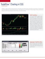
Chapter 1 TradeFlow<br />
Tradeflow theory has moved on considerably since the book was written, as Cqg has<br />
made significant enhancements in terms of its functionality, and as this has evolved, more<br />
studies have been applied to it. One of the key changes has been the ability to aggregate<br />
the number of bid/asks, so that one TradeFlow bar can represent up to 20 changes in<br />
quote. This is particularly applicable to markets such as the S&P and the Dax where the<br />
number of updates continue to rise, and is also useful on Interest Rate markets and FX<br />
futures, especially after economic numbers, when activity increases. This means that the<br />
level of aggregation can change throughout the day. This can be done by monitoring how<br />
long a bar takes to build or can be fixed by analysis of the volume associated with a series<br />
of bars. Alternatively, a less scientific method is simply to shift based on the time of day.<br />
This would mean a high aggregation on the opening and lower one as the morning<br />
develops. It would then move back up once America opens. The real power of TradeFlow<br />
is also evident when quantifying M.Profile based levels as the aggregation does a better<br />
job of confirming levels validity. The daily <strong>com</strong>mentaries often show examples of how<br />
the synergies of what is used in Chapter 1 connects with Profile and provides almost the<br />
entire framework of how markets are analyzed.<br />
The aggregation of bars means that it is now far easier to understand whether buyers<br />
or sellers are dominant. This is done buying building a running sum of the bids hit and<br />
the asks taken. The number of bars to be calculated over is down to the user but I like to<br />
use a relatively high number, so that a trend can be identified. There are many<br />
relationships and patterns that can be identified, but one of the more simplistic is the<br />
theory that in an uptrend more asks will be taken than bid hit.
The blue line is the asks taken and the red line the bids hit. A 60 period average<br />
shows how the shift in power ebbs and flows.<br />
Once buyers match sellers, the following day sees the buyers re-assert<br />
authority.
The next pattern highlights how it not just increased volume at bid and asks that dictates<br />
direction, but also the simple withdrawal of buyers or sellers. After a strong downtrend<br />
hitting of the bid collapses and then the market moves consolidates before rallying.<br />
Fixed Range TradeFlow Bars<br />
It is also possible to adjust the bars so that they have a fixed range instead of a bid ask.<br />
This is particularly useful as the speed of updates continues to increase with the onslaught<br />
of high frequency automatic models. The two charts of the Dax highlight the difference<br />
this makes as both are set at an aggregation of 20.
Using the Range at 20 smoothes the price action