corresponding pdf
corresponding pdf
corresponding pdf
Create successful ePaper yourself
Turn your PDF publications into a flip-book with our unique Google optimized e-Paper software.
Homework 1<br />
Partial Solution<br />
Created integrating L A TEX and R using knitr<br />
February 5, 2013<br />
[1] "Tuesday, February 05, 2013 - 4:09:55 PM."<br />
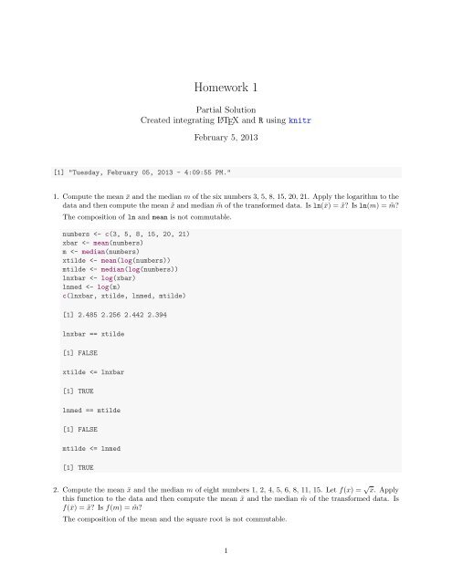
1. Compute the mean ¯x and the median m of the six numbers 3, 5, 8, 15, 20, 21. Apply the logarithm to the<br />
data and then compute the mean ˜x and median ˜m of the transformed data. Is ln(¯x) = ˜x Is ln(m) = ˜m<br />
The composition of ln and mean is not commutable.<br />
numbers
prob2
0 200 600 1000<br />
4-8am 4-8pm 8-Mid 8-Noon Noon-4pm<br />
require(ggplot2)<br />
p
Tue 535 93<br />
Wed 488 76<br />
P2
(c) Create side-by-side boxplots of the lengths of the flights, grouped by whether or not the flight was<br />
delayed at least 30 min.<br />
boxplot(FlightLength ~ Delayed30, data = FD, col = c("green", "red"))<br />
100 150 200 250 300<br />
No<br />
Yes<br />
p
FD$D30
(a) Create a table and a bar chart of the responses to the question about the death penalty.<br />
TA
1500<br />
count<br />
1000<br />
500<br />
DeathPenalty<br />
Favor<br />
Oppose<br />
0<br />
Favor Oppose NA<br />
DeathPenalty<br />
(b) Use the table command and the summary command in R on the gun ownership variable.<br />
additional information does the summary command give that the table command does not<br />
What<br />
table(GSS$OwnGun)<br />
No Refused Yes<br />
605 9 310<br />
summary((GSS$OwnGun))<br />
No Refused Yes NA's<br />
605 9 310 1841<br />
The summary command shows the number (1841) of missing values.<br />
(c) Create a contingency table comparing responses to the death penalty to the question about gun<br />
ownership.<br />
T2
No 0.6533 0.3467<br />
Refused 0.7778 0.2222<br />
Yes 0.8046 0.1954<br />
plot(GSS$DeathPenalty, GSS$OwnGun, col = c("red", "green", "blue"))<br />
y<br />
No Refused Yes<br />
Favor<br />
Oppose<br />
0.0 0.2 0.4 0.6 0.8 1.0<br />
x<br />
with(data = GSS, plot(OwnGun, DeathPenalty, col = c("red", "green", "blue")))<br />
y<br />
Favor Oppose<br />
No<br />
Refused<br />
0.0 0.2 0.4 0.6 0.8 1.0<br />
x<br />
A nice alternative for creating mosaic plots is to use the mosaic() function from the vcd package.<br />
9
equire(vcd)<br />
mosaic(T2, shade = TRUE)<br />
DeathPenalty<br />
Favor<br />
Oppose<br />
Pearson<br />
residuals:<br />
2.34<br />
2.00<br />
OwnGun<br />
Yes Refused No<br />
0.00<br />
-2.00<br />
-3.16<br />
p-value =<br />
1.6e-05<br />
mosaic(t(T2), shade = TRUE)<br />
10
OwnGun<br />
No Refused Yes<br />
Pearson<br />
residuals:<br />
2.34<br />
2.00<br />
DeathPenalty<br />
Oppose Favor<br />
0.00<br />
-2.00<br />
-3.16<br />
p-value =<br />
1.6e-05<br />
The proportion of gun owners who favor the death penalty is 0.8046. This is different from 0.6533,<br />
the proportion of respondents who do not own a gun in favor of the death penalty.<br />
6. Import the Black Spruce Case Study in Section 1.9 into R.<br />
site
(b) Create a histogram and normal quantile plot for the height changes of the seedlings. Is the distribution<br />
approximately normal<br />
# Using base graphs<br />
hist(BS$Ht.change, main = "Histogram", xlab = "", freq = FALSE, col = "pink")<br />
lines(density(BS$Ht.change), col = "red", lwd = 2)<br />
curve(dnorm(x, mean(BS$Ht.change), sd(BS$Ht.change)), 0, 60, add = TRUE, col = "blue",<br />
lwd = 2)<br />
Histogram<br />
Density<br />
0.00 0.02 0.04<br />
10 20 30 40 50<br />
qqnorm(BS$Ht.change, col = "red")<br />
qqline(BS$Ht.change, col = "blue")<br />
Normal Q-Q Plot<br />
Sample Quantiles<br />
10 20 30 40 50<br />
-2 -1 0 1 2<br />
Theoretical Quantiles<br />
12
# Using ggplot2<br />
p
oxplot(Di.change ~ Fertilizer, data = BS, col = c("brown", "red"))<br />
ggplot(data = BS, aes(x = Fertilizer, y = Di.change)) + geom_boxplot()<br />
7.5<br />
2 4 6 8<br />
Di.change<br />
5.0<br />
2.5<br />
F<br />
NF<br />
F<br />
Fertilizer<br />
NF<br />
(d) Use the tapply command to find the numeric summaries of the diameter changes for the two levels<br />
of fertilization.<br />
with(data = BS, tapply(Di.change, list(Fertilizer), summary))<br />
$F<br />
Min. 1st Qu. Median Mean 3rd Qu. Max.<br />
2.91 4.32 4.76 5.27 6.52 8.92<br />
$NF<br />
Min. 1st Qu. Median Mean 3rd Qu. Max.<br />
1.02 1.92 2.71 2.72 3.16 5.71<br />
with(data = BS, tapply(Di.change, list(Fertilizer), sd))<br />
F NF<br />
1.383 1.101<br />
(e) Create a scatter plot of the height changes against the diameter changes and describe the relationship.<br />
plot(Ht.change ~ Di.change, data = BS, cex = 0.5, pch = 19, col = "blue")<br />
p
60<br />
50<br />
Ht.change<br />
10 20 30 40 50<br />
Ht.change<br />
40<br />
30<br />
20<br />
2 4 6 8<br />
10<br />
Di.change<br />
2.5 5.0 7.5<br />
Di.change<br />
14. In this exercise, we investigate normal quantile plots using R.<br />
(a) Draw a random sample of size n = 15 from N(0, 1) and plot both the normal quantile plot and the<br />
histogram. Do the points on the quantile plot appear to fall on a straight line Is the histogram<br />
symmetric, unimodal, and mound shaped Do this several times.<br />
n = 15<br />
Normal Q-Q Plot<br />
Histogram of rs<br />
Sample Quantiles<br />
-1.0 0.0 1.0<br />
Frequency<br />
0 1 2 3 4 5 6<br />
-1 0 1<br />
Theoretical Quantiles<br />
-1.5 -0.5 0.5 1.5<br />
rs<br />
n = 15<br />
15
Normal Q-Q Plot<br />
Histogram of rs<br />
Sample Quantiles<br />
-2 -1 0 1<br />
Frequency<br />
0 1 2 3 4 5<br />
-1 0 1<br />
Theoretical Quantiles<br />
-2 -1 0 1 2<br />
rs<br />
n = 15<br />
Normal Q-Q Plot<br />
Histogram of rs<br />
Sample Quantiles<br />
-1.0 0.0 1.0 2.0<br />
Frequency<br />
0 1 2 3 4 5<br />
-1 0 1<br />
Theoretical Quantiles<br />
-1 0 1 2<br />
rs<br />
n = 15<br />
16
Normal Q-Q Plot<br />
Histogram of rs<br />
Sample Quantiles<br />
-1.5 -0.5 0.5 1.5<br />
Frequency<br />
0 1 2 3 4 5 6<br />
-1 0 1<br />
Theoretical Quantiles<br />
-2 -1 0 1 2<br />
rs<br />
n = 15<br />
Normal Q-Q Plot<br />
Histogram of rs<br />
Sample Quantiles<br />
-2 -1 0 1 2<br />
Frequency<br />
0 1 2 3 4 5<br />
-1 0 1<br />
Theoretical Quantiles<br />
-3 -2 -1 0 1 2 3<br />
rs<br />
(b) Repeat part 14a for samples of size n = 30, n = 60, and n = 100.<br />
n = 30<br />
17
Normal Q-Q Plot<br />
Histogram of rs<br />
Sample Quantiles<br />
-2 -1 0 1<br />
Frequency<br />
0 2 4 6 8<br />
-2 -1 0 1 2<br />
Theoretical Quantiles<br />
-2 -1 0 1 2<br />
rs<br />
n = 30<br />
Normal Q-Q Plot<br />
Histogram of rs<br />
Sample Quantiles<br />
-1 0 1 2<br />
Frequency<br />
0 2 4 6 8 10<br />
-2 -1 0 1 2<br />
Theoretical Quantiles<br />
-2 -1 0 1 2<br />
rs<br />
n = 60<br />
18
Normal Q-Q Plot<br />
Histogram of rs<br />
Sample Quantiles<br />
-2 -1 0 1 2<br />
Frequency<br />
0 5 10 15<br />
-2 -1 0 1 2<br />
Theoretical Quantiles<br />
-2 -1 0 1 2<br />
rs<br />
n = 60<br />
Normal Q-Q Plot<br />
Histogram of rs<br />
Sample Quantiles<br />
-2 -1 0 1 2<br />
Frequency<br />
0 2 4 6 8 12<br />
-2 -1 0 1 2<br />
Theoretical Quantiles<br />
-2 -1 0 1 2<br />
rs<br />
n = 100<br />
19
Normal Q-Q Plot<br />
Histogram of rs<br />
Sample Quantiles<br />
-2 -1 0 1 2<br />
Frequency<br />
0 5 10 15 20<br />
-2 -1 0 1 2<br />
Theoretical Quantiles<br />
-2 -1 0 1 2<br />
rs<br />
n = 100<br />
Normal Q-Q Plot<br />
Histogram of rs<br />
Sample Quantiles<br />
-2 -1 0 1 2 3<br />
Frequency<br />
0 5 10 15 20<br />
-2 -1 0 1 2<br />
Theoretical Quantiles<br />
-2 -1 0 1 2 3<br />
rs<br />
(c) What lesson do you draw about using graphs to asses whether or not a data set follows a normal<br />
distribution<br />
For small n, it is relatively difficult to assess normality. For moderate to large n, the data will<br />
generally follow a normal distribution and the points will follow a straight line in a Q-Q plot.<br />
20


![Graduate Bulletin [PDF] - MFC home page - Appalachian State ...](https://img.yumpu.com/50706615/1/190x245/graduate-bulletin-pdf-mfc-home-page-appalachian-state-.jpg?quality=85)
