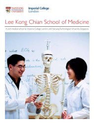
LKCMedicine Corporate Brochure - Imperial College London
LKCMedicine Corporate Brochure - Imperial College London
LKCMedicine Corporate Brochure - Imperial College London

You also want an ePaper? Increase the reach of your titles
YUMPU automatically turns print PDFs into web optimized ePapers that Google loves.
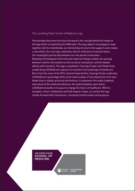
The Lee Kong Chian School of Medicine Logo<br />
Partnerships that move the future forward is the concept behind the shape of<br />
the logo which is inspired by the DNA helix. The logo depicts two polygons clasp<br />
together, akin to a handshake, an interlocking structure that supports and creates<br />
a new whole. Our new logo celebrates vibrant confluence at several levels:<br />
the meaningful partnership between our two parent universities –<br />
Nanyang Technological University and <strong>Imperial</strong> <strong>College</strong> <strong>London</strong>, the synergy<br />
between teacher and student as well as doctor and patient, and the deeper<br />
affinity with humanity. The logo is swathed in ‘Synergy Purple’ and ‘Noble Grey’,<br />
exuberating <strong>LKCMedicine</strong>’s passion to transform the landscape of healthcare.<br />
Born from the union of the NTU red and <strong>Imperial</strong> blue, Synergy Purple celebrates<br />
<strong>LKCMedicine</strong>’s parentage while at the same exudes a fresh dynamism of its own.<br />
Noble Grey is stately, practical and timeless. It represents the noble traditions<br />
and values of the medical profession, the solid foundation upon which<br />
<strong>LKCMedicine</strong> builds in its quest to change the future of healthcare. With its<br />
energetic colour combination and fluid angular shape, as a whole the logo<br />
strides forward with momentum, connoting transformation and progress.