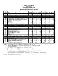
Survey Design and Response Rates: - Cornell University Division of ...
Survey Design and Response Rates: - Cornell University Division of ...
Survey Design and Response Rates: - Cornell University Division of ...

You also want an ePaper? Increase the reach of your titles
YUMPU automatically turns print PDFs into web optimized ePapers that Google loves.
As a final step in our research, we took the survey instrument that resulted from this<br />
process—now dubbed “PULSE”—<strong>and</strong> tested it head-to-head with the original ESS<br />
instrument. In this experiment, we drew a r<strong>and</strong>om sample <strong>of</strong> 300 summer session<br />
students <strong>and</strong> r<strong>and</strong>omly assigned 100 to take the original ESS just as it had been<br />
administered in the spring semester <strong>of</strong> 2007 <strong>and</strong> 200 students to take the new PULSE.<br />
Results from that experiment are described in the section titled, “Did it Work,” below.<br />
<strong>Survey</strong> Redesign: A Look at Page 1<br />
Figures 1 <strong>and</strong> 2 are screen captures <strong>of</strong> the ESS (the original instrument) <strong>and</strong> PULSE<br />
(the revised instrument) respectively. In glancing across the figures, perhaps the first<br />
thing to note is that the first page <strong>of</strong> the ESS is notably longer than the first page <strong>of</strong> the<br />
PULSE. This is partly a reflection <strong>of</strong> the fact that the entire ESS is longer than the<br />
PULSE, but it is also the case that the single longest page <strong>of</strong> the ESS is the first page,<br />
with a total <strong>of</strong> 42 individual items. In contrast, we conscientiously elected to make the<br />
first page <strong>of</strong> the PULSE particularly short in an attempt to signal with the first impression<br />
that the PULSE was not a particularly lengthy or burdensome endeavor.<br />
A second difference between the instruments is that we replaced the simple<br />
mechanical “progress bar” on the ESS with a more elaborate header on the PULSE. The<br />
PULSE header is not navigable; clicking on it will not take you to a different page <strong>of</strong> the<br />
survey. Rather, the goal <strong>of</strong> the header is to alleviate anxiety about “where the survey is<br />
going” by providing a succinct outline <strong>of</strong> the entire scope <strong>of</strong> the instrument.<br />
Third, on the basis <strong>of</strong> student feedback, we replaced the black grid used on the ESS<br />
with a white grid <strong>and</strong> increased the spacing between items.<br />
5