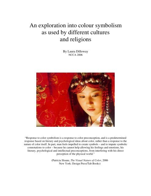
An exploration into colour symbolism as used by - National Centre ...
An exploration into colour symbolism as used by - National Centre ...
An exploration into colour symbolism as used by - National Centre ...

You also want an ePaper? Increase the reach of your titles
YUMPU automatically turns print PDFs into web optimized ePapers that Google loves.
<strong>An</strong> <strong>exploration</strong> <strong>into</strong> <strong>colour</strong> <strong>symbolism</strong><br />
<strong>as</strong> <strong>used</strong> <strong>by</strong> different cultures<br />
and religions<br />
By Laura Dilloway<br />
NCCA 2006<br />
“Response to color <strong>symbolism</strong> is a response to color preconception, and is a predetermined<br />
response b<strong>as</strong>ed on literary and psychological ide<strong>as</strong> about color, rather than a response to the<br />
nature of color itself. In part, man feels impelled to create symbols – and to impute symbolic<br />
connotations to color – because he cannot help allowing his feelings and emotions, his<br />
literary, psychological and intellectual preconceptions, from interfering with his direct<br />
perception of the physical world.”<br />
(Patricia Sloane, The Visual Nature of Color, 2006<br />
New York: Design Press/Tab Books)
Contents<br />
Content<br />
Page<br />
• Abstract 1<br />
• Introduction 2<br />
• Work of p<strong>as</strong>t theorists 5<br />
• Colour throughout history 7<br />
• The influence of flags and heraldry 9<br />
• Colour in religion 12<br />
• Colour in Christianity 12<br />
• Colour in other religions 15<br />
o Judaism 16<br />
o Islam 17<br />
o Hinduism 18<br />
o Buddhism 18<br />
• Colour in culture 19<br />
o Red 19<br />
How red came to be considered lucky 21<br />
o Orange 22<br />
o Yellow 22<br />
o Green 25<br />
o Blue 26<br />
o Purple 26<br />
o Good or bad <strong>colour</strong>s 27<br />
©Laura Dilloway, NCCA 2006<br />
i
o Universal <strong>colour</strong>s 27<br />
o Varying interpretations within a country 28<br />
• Colour in the media 29<br />
• C<strong>as</strong>e Studies 32<br />
o Kill Bill 32<br />
o City of Lost Children 33<br />
o Mulan 34<br />
o Crouching Tiger Hidden Dragon 35<br />
o Hero 36<br />
o House of Flying Daggers 38<br />
• Conclusion 39<br />
• Critique of report 42<br />
• List of Appendices 45<br />
o Appendix A 46<br />
o Appendix B 47<br />
o Appendix C 48<br />
• References 50<br />
• Illustration sources 53<br />
©Laura Dilloway, NCCA 2006<br />
ii
List of illustrations<br />
Illustration<br />
Page<br />
• Fig. 1 – “Stop” signs from around the world 4<br />
• Fig. 2 – Post-boxes of the world 4<br />
• Fig. 3 – Diagram showing the “code of law” that forms the b<strong>as</strong>is of<br />
8<br />
Chinese law and philosophy, showing the <strong>as</strong>sociation of <strong>colour</strong>s with<br />
the elements, se<strong>as</strong>ons and points of the comp<strong>as</strong>s<br />
• Fig. 4 – European flags displaying the Christian cross 10<br />
• Fig. 5 – Illustrating the influence of the Dutch flag on that of the<br />
10<br />
French, and how Italy adapted the design a step further<br />
• Fig. 6 – Flags of Muslim countries showing the traditional <strong>colour</strong>s of<br />
11<br />
Islam<br />
• Fig. 7 – The Great Seal of the United States 11<br />
• Fig. 8 – The Pact of Jesus <strong>by</strong> Giotto 13<br />
• Fig. 8b – The Liturgical se<strong>as</strong>ons 14<br />
• Fig. 9 – The traditional Jewish prayer shawl, or “tallit” 16<br />
• Fig. 10 – The Israeli flag, which echoes the <strong>colour</strong>s of the tallit 16<br />
• Fig. 11 – Depicting the Prophet Mohammed, dressed in green which<br />
17<br />
is the <strong>colour</strong> of Islam<br />
• Fig. 12 – Whirling dervishes in white robes representing resurrection 17<br />
• Fig. 13 – The Hindu god Krishna, who h<strong>as</strong> blue skin and wears<br />
18<br />
yellow-orange clothes<br />
• Fig. 14 – Buddhist monks in their traditional brightly <strong>colour</strong>ed robes 18<br />
©Laura Dilloway, NCCA 2006<br />
iii
• Fig. 15 – A red poppy, commonly <strong>used</strong> <strong>as</strong> a symbol of remembrance 19<br />
• Fig. 16 – The Tudor rose, which combines the distinctly <strong>colour</strong>ed<br />
20<br />
emblems of the Houses of Lanc<strong>as</strong>ter and York<br />
• Fig. 17 – The UK Labour party logo 20<br />
• Fig. 18 – A sign warning about mines in Mozambique 20<br />
• Fig. 19 – A Chinese bride dressed in traditional red 21<br />
• Fig. 20 – The Chinese flag, which is red due to China’s history of<br />
21<br />
communism<br />
• Fig. 21 – Dutch supporters wearing orange at a football match 22<br />
• Fig. 22 – A yellow flag, often raised in times of quarantine 23<br />
• Fig. 23 – Egyptian funerary art, showing a woman in a yellow dress 24<br />
• Fig. 24 – The Arnolfini Wedding <strong>by</strong> Jan Van Eyck 25<br />
• Fig. 25 – A Turkish “Nazar Boncuk” charm, believed to provide<br />
26<br />
protection against the Evil Eye<br />
• Fig. 26 – Traditional characters from Japanese theatre 27<br />
• Fig. 27 – Example of <strong>colour</strong> use in Kill Bill 32<br />
• Fig. 28 – Examples of <strong>colour</strong> use in City of Lost Children 33<br />
• Fig. 29 – Example of <strong>colour</strong> use in Crouching Tiger Hidden Dragon 35<br />
• Fig. 30 – Example of <strong>colour</strong> use in Hero 37<br />
• Fig. 31 – Example of <strong>colour</strong> use in House of Flying Daggers 38<br />
©Laura Dilloway, NCCA 2006<br />
iv
Abstract<br />
As any visual artist will know, the use of <strong>colour</strong> plays an extremely important part in a piece<br />
or work whether we are dealing with still or moving images. However, throughout history the<br />
way that <strong>colour</strong> is <strong>used</strong> h<strong>as</strong> evolved in a way that can be seen to vary greatly between<br />
different nations, continents and religions. Colour does not follow a unique, universally<br />
recognisable code, and we must be aware of this not only <strong>as</strong> viewers, but perhaps more<br />
importantly <strong>as</strong> artists and directors. The <strong>as</strong>sociations that we make with any form or media<br />
that involves <strong>colour</strong> are dependent upon the culture in which we have been raised. Therefore<br />
problems may arise when we are dealing with media that is intended to be shown across a<br />
range of cultures. You could, for example, choose a <strong>colour</strong> palette in such a way <strong>as</strong> to encode<br />
a hidden message that would provide extra information to the viewer who w<strong>as</strong> able to<br />
interpret the signs. However if you do so, it is important that you are aware that depending on<br />
the cultural or religious background of your audience, the signs and thus the message that you<br />
wish to convey, may be misinterpreted or even completely overlooked.<br />
©Laura Dilloway, NCCA 2006 1
Introduction<br />
Colour can serve <strong>as</strong> a powerful visual element that acts <strong>as</strong> a code that provides a deeper level<br />
of meaning to those who are able to interpret the signs. Consider how much less information a<br />
map would provide if it were in black and white – the different types of road would not be so<br />
distinguishable, and you may even confuse contour lines for rivers and streams. The simple<br />
yet effective use of <strong>colour</strong> provides a visual code that allows us to correctly interpret the<br />
image that we are seeing (Zettl 1999).<br />
For centuries, people from all over the world have <strong>used</strong> <strong>colour</strong> to symbolise particular beliefs<br />
or events, from the ancient art of Feng Shui to the liturgical se<strong>as</strong>ons of the church year.<br />
However, the <strong>as</strong>sociations that people have made with certain <strong>colour</strong>s are <strong>by</strong> no means fixed.<br />
Depending on the culture or the part of the world that we are from, the <strong>symbolism</strong> of a <strong>colour</strong><br />
varies according to our habits, traditions and even myths. Within a culture, <strong>colour</strong>s may also<br />
symbolise different things in different contexts, and have been subject to change over the<br />
years. White <strong>as</strong> a religious symbol is <strong>as</strong>sociated with purity, joy and glory; but a white flag<br />
seen during times of war would be viewed <strong>as</strong> a signal of surrender (Zettl 1999).<br />
In some situations such <strong>as</strong> this, certain <strong>colour</strong> symbols are recognised all over the world.<br />
<strong>An</strong>other example could be the traditional octagonal red “stop” road-sign that we in the West<br />
are accustomed to and which can also be seen in Arabic countries, <strong>as</strong> far away <strong>as</strong> China, and<br />
in remote places such <strong>as</strong> Mongolia (see Figure 1). Similarly yellow is generally <strong>used</strong> to mark<br />
hazards and dangerous substances because it is brightly <strong>colour</strong>ed and <strong>as</strong> such is visible and<br />
stands out. On the other hand, if you were to look for something <strong>as</strong> simple <strong>as</strong> a post-box in a<br />
country different to your own you may well be conf<strong>used</strong> because not everywhere uses the red<br />
©Laura Dilloway, NCCA 2006 2
specimen to which we in the United Kingdom are accustomed. They may not even be the<br />
same recognisable pillar-box shape. In Spain for example they are yellow, in the United States<br />
blue and somewhat box-shaped, and in the Gion district of Japan you may even see one<br />
<strong>colour</strong>ed orange (see Figure 2).<br />
a) Tyendinega Mohawk Territory, b) Seoul, Korea c) Mongolia<br />
Canada<br />
d) Tunisia e) China f) The English version<br />
Figure1: “Stop” signs from around the world<br />
(See end for all image references)<br />
a) United Kingdom b) Spain c) Gion district, Japan d) USA<br />
Figure 2: Post-boxes from around the world<br />
©Laura Dilloway, NCCA 2006 3
The strength of a <strong>colour</strong>-related symbol is incre<strong>as</strong>ed further when <strong>colour</strong> is combined with<br />
form. In Japan, white carnations signify death, and if you were to give a married Chinese man<br />
a green hat you would be telling him that his wife had been unfaithful (Kyrnin 1/3/06).<br />
Colour <strong>symbolism</strong> h<strong>as</strong> even been integrated <strong>into</strong> the languages that we speak. English<br />
speaking countries have expressions such <strong>as</strong> “blue blood”, “black sheep”, “green-eyed<br />
monster” and “red-light district” to name but a few. However when translated <strong>into</strong> other<br />
languages some <strong>colour</strong>-related phr<strong>as</strong>es can take on an entirely different meaning. One<br />
example of this is that in English when we say that someone is “blue”, we mean that they are<br />
feeling sad or depressed, but in Germany “to be blue” means “to be heavily <strong>into</strong>xicated” (Zettl<br />
1999).<br />
This paper aims to look <strong>into</strong> the way that the <strong>symbolism</strong> <strong>as</strong>sociated with <strong>colour</strong>s varies from<br />
culture to culture, and religion to religion. It discusses the evolution of <strong>colour</strong> <strong>symbolism</strong> <strong>as</strong><br />
according to various theorists from history, and then moves on to look at the influence of<br />
heraldry, before outlining the <strong>as</strong>sociations that are made with the main <strong>colour</strong>s of the<br />
spectrum, attempting to focus on the differences between the E<strong>as</strong>tern and Western worlds. I<br />
have then looked at how <strong>colour</strong> <strong>symbolism</strong> and its varying interpretations have had an impact<br />
on the field of visual media, including some specific examples that can be seen in film <strong>as</strong> well<br />
<strong>as</strong> the real world. Ultimately I aim to highlight the key are<strong>as</strong> for concern when producing any<br />
piece of work that is intended to convey a message through use of <strong>colour</strong>, and to provide a<br />
point of reference for anyone who wishes to enhance the impact of their work using the<br />
<strong>as</strong>sociated <strong>symbolism</strong> that <strong>colour</strong> provides.<br />
©Laura Dilloway, NCCA 2006 4
Work of p<strong>as</strong>t theorists<br />
In order to understand the <strong>symbolism</strong> that is <strong>as</strong>signed to a <strong>colour</strong>, we have to consider how the<br />
meanings that have come to be <strong>as</strong>sociated with that <strong>colour</strong> have evolved throughout history.<br />
Since antiquity many prominent scientists, philosophers and theorists have attempted to<br />
investigate the development of <strong>colour</strong> <strong>symbolism</strong>. Others, such <strong>as</strong> Sir Isaac Newton (1643-<br />
1727) and more recently, Johannes Itten (1888-1967), also carried out extensive studies and<br />
research, but they were only interested in the physics of <strong>colour</strong>, and not its emotional or<br />
psychological significance. Not all developed their own conclusions, some merely expanded<br />
on the work of others who had gone before them, adding to it or disagreeing with it <strong>as</strong> they<br />
saw fit. Below I have outlined some of the most notable contributors, in the chronological<br />
order that they were active.<br />
As far back <strong>as</strong> <strong>An</strong>cient Grecian times, <strong>colour</strong>s were <strong>used</strong> <strong>as</strong> a mark of social respect or<br />
suspicion. The Pythagoreans had a marked aversion to <strong>colour</strong>, where<strong>as</strong> Empedocles (c. 490<br />
BCE – c. 430 BCE) considered it to be “the soul of life and the root of all existence”,<br />
<strong>as</strong>signing the key natural elements of earth, air, fire and water to be represented <strong>by</strong> the <strong>colour</strong>s<br />
yellow, black, red and white respectively (Brusatin, 1991).<br />
In the second century CE, Artemidorus Daldianus wrote that in dreams red clothes are a sign<br />
of “good fortune and fame”, and that white clothes signify “great calamity” and uncertainty<br />
due to the <strong>as</strong>sociation with the white shrouds in which the dead were clothed when they were<br />
buried (Brusatin 1991 cited Daldianus). He went on to say that black is a symbol of mourning<br />
and slavery, but in a dream it represents only “minor misfortunes”. He also mentions violet,<br />
describing it <strong>as</strong> a “shade of separation” and a “sign of detachment and widowhood”.<br />
©Laura Dilloway, NCCA 2006 5
During his extensive studies, Galileo Galilei (1564 - 1642) also carried out some research <strong>into</strong><br />
<strong>colour</strong>, remarking that:<br />
“Colours, like odours and t<strong>as</strong>tes, become mixed according to the variability of who is<br />
perceiving them and can only reveal themselves to be ‘secondary’ phenomena of<br />
scientific interest with respect to those considered ‘objective’, such <strong>as</strong> form,<br />
movement and numbers.”<br />
(Galileo 1623 cited Brusatin 1991)<br />
A little later, in his “Treatise on Painting” (published in 1651) Leonardo Da Vinci’s studies<br />
led him to rank the main <strong>colour</strong>s in order of importance, <strong>as</strong>signing them <strong>as</strong> representatives of<br />
the natural elements, including light and darkness:<br />
• White - Simplest <strong>colour</strong>, representing light<br />
• Yellow - Earth<br />
• Green - Water<br />
• Blue - Air<br />
• Red - Fire<br />
• Black - Total darkness<br />
(Da Vinci 1651 cited Feisner 2000)<br />
Johann Wolfgang von Goethe’s “Farbenlehre” (“Theory of Colours”) w<strong>as</strong> published in 1810<br />
and is considered to contain some of the earliest and most accurate observations about <strong>colour</strong>,<br />
the way it is perceived, and its affect on the emotions. Even today it is still widely accepted to<br />
be one of the most comprehensive works on <strong>colour</strong> theory ever written.<br />
©Laura Dilloway, NCCA 2006 6
Also in the nineteenth century, Frédéric Portal wrote a particularly thorough work on the<br />
symbolic value of <strong>colour</strong>s, entitled “Des Couleurs Symboliques dans l’antiquité, le Moyen-<br />
Age, et les tempes modernes”, which w<strong>as</strong> published in 1857.<br />
In fact, whilst many studies have been made <strong>into</strong> all <strong>as</strong>pects of <strong>colour</strong> including the natures of<br />
various hues and their symbolic values, it remains to be seen that, even though the results do<br />
in most c<strong>as</strong>es show signs of some correlation, some of the greatest minds this world h<strong>as</strong> ever<br />
seen could never manage to agree on one single, definitive “<strong>colour</strong> code”. It is unlikely that<br />
this will ever be possible, save <strong>by</strong> the unification of all countries, cultures and religions.<br />
Colour cannot, and will not be organised <strong>into</strong> a fixed system of symbols (Brusatin 1991). Due<br />
to its subjective nature, what a <strong>colour</strong> represents to us is wholly subject to variation, and is<br />
dependant on the part of the world that we are from.<br />
“Astrologers called Saturn brown, Jupiter blue, Mars red, yellow the Sun, green<br />
Venus, <strong>as</strong>hen Mercury, white the Moon. Others bestowed the <strong>colour</strong>s upon them<br />
otherwise, Saturn black, Jupiter green, white Venus, variegated Mercury, yellow the<br />
Moon, and on Mars and the Sun all are in agreement: the meanings of <strong>colour</strong>s for<br />
Italians, Spaniards and French vary in certain places.”<br />
(Equicol 1525 cited Brusatin 1991)<br />
Colour throughout history<br />
For the Chinese, the relationships between audio and visual matters and their connections<br />
with certain <strong>colour</strong>s are not only part of their educational system, but they are also actually<br />
incorporated <strong>into</strong> the code of law (Eisenstein 1986). These relationships are derived from the<br />
principles of Yin and Yang, which form the b<strong>as</strong>is for the whole of Chinese philosophy and<br />
their entire world-outlook. This “code of law”, according to Sung tradition (ho t’u), w<strong>as</strong><br />
©Laura Dilloway, NCCA 2006 7
ought to the world in the form of a diagram, held in the mouth of a dragon-horse that<br />
emerged soaking wet from a river (see Figure 3).<br />
Figure 3: The diagram that the dragon is believed to have brought,<br />
showing the <strong>as</strong>sociations of specific <strong>colour</strong>s with the<br />
comp<strong>as</strong>s points, se<strong>as</strong>ons, and the natural elements<br />
In the E<strong>as</strong>t, the influence of the ancient cultures may have had a greater longevity on the<br />
<strong>symbolism</strong> attached to certain <strong>colour</strong>s. However in the Western world meanings of <strong>colour</strong>s<br />
have been far more subject to change over the years. For example, green <strong>used</strong> to be a popular<br />
<strong>colour</strong> for automobiles until in the nineteenth century a number of deaths were ca<strong>used</strong> <strong>by</strong> the<br />
green pigment. The offending <strong>colour</strong>, “Paris Green”, contained arsenic and is also thought to<br />
be a contributing factor to the decline of the health of many artists. Paul Cézanne, who <strong>used</strong><br />
the <strong>colour</strong> extensively in his work, developed severe diabetes which is a symptom of arsenic<br />
©Laura Dilloway, NCCA 2006 8
poisoning. Monet’s blindness and Van Gogh’s mental instability are also likely to have<br />
resulted from their use of this and other arsenic-b<strong>as</strong>ed pigments. However since then green<br />
h<strong>as</strong> since come back <strong>into</strong> f<strong>as</strong>hion, aided <strong>by</strong> incre<strong>as</strong>ed medical knowledge and the development<br />
of new pigments that are safe to use and do not cause harmful side effects (Feisner 2000). It is<br />
now in some c<strong>as</strong>es considered to be the <strong>colour</strong> that is e<strong>as</strong>iest on the eye, and its calming,<br />
relaxing effects are well documented. (Freisner 2000).<br />
The influence of flags and heraldry<br />
Flags such <strong>as</strong> a country’s national flag have come to play a significant role <strong>as</strong> patriotic<br />
symbols. The citizens of the United States provide perhaps the strongest example, with many<br />
families proudly displaying the Stars and Stripes inside their homes or in their front gardens.<br />
The design of most national flags is derived from the history, culture or religion of the<br />
country in question, and <strong>as</strong> such their <strong>colour</strong>s either reflect or have an influence on the<br />
<strong>as</strong>sociations we make with <strong>colour</strong>s in general. Many designs of European flags originate from<br />
heraldry in medieval warfare, when the bold designs on shields were <strong>used</strong> do distinguish<br />
friends from enemies on the battlefield. The oldest flags, such <strong>as</strong> those of England, Norway,<br />
Finland, Denmark and Switzerland are distinguishable because they all depict the Christian<br />
cross, dating from when they were <strong>used</strong> during the Crusades (see Figure 4). Curiously, within<br />
Europe the flag of the Netherlands h<strong>as</strong> had perhaps the most impact, despite it not being a<br />
particularly large or prominent country. It w<strong>as</strong> <strong>used</strong> in the war of independence against Spain<br />
and <strong>as</strong> such it became linked to notions of freedom and a republican government. This<br />
<strong>as</strong>sociation w<strong>as</strong> further strengthened after the French Revolution of 1789, when the country<br />
took on the same <strong>colour</strong>s and stripy design, only they exchanged the horizontal stripes for<br />
©Laura Dilloway, NCCA 2006 9
ones that were vertical. Italy also adopted this arrangement, except the blue w<strong>as</strong> replaced <strong>by</strong><br />
green (Feisner 2000, see Figure 5).<br />
a) Finland b) Norway c) Denmark d) England e) Switzerland<br />
Figure 4: European flags that still show the Christian cross<br />
a) The Netherlands b) France c) Italy<br />
Figure 5: Illustrating the influence of the Dutch flag on that of the French,<br />
and how Italy adapted it one step further<br />
Since then, the <strong>colour</strong>s white, green and red have come to symbolise the three fundamental<br />
values of faith, hope and charity respectively, <strong>as</strong> exemplified in Dante’s “Divine Comedy”.<br />
“Three women in a circle next came dancing<br />
At the right wheel; the first one w<strong>as</strong> so red<br />
She scarcely would be noticed in a flame;<br />
The second seemed <strong>as</strong> if her flesh and bone<br />
Had been cut out of emerald; and the third<br />
Appeared to be of freshly fallen snow.<br />
<strong>An</strong>d now the white one seemed to lead them round<br />
<strong>An</strong>d now the red, and from their leader’s song<br />
The others took the me<strong>as</strong>ure f<strong>as</strong>t and slow.”<br />
Dante Alighieri, The Divine Comedy (Part 2: Purgatory), Canto XXIX: The<br />
Earthly Paradise, lines 121-129<br />
©Laura Dilloway, NCCA 2006 10
In Medieval times, flags of Islam were either plain black, white or red in <strong>colour</strong>. Black w<strong>as</strong><br />
<strong>as</strong>sociated with vengeance, and w<strong>as</strong> also believed to be the <strong>colour</strong> of the Prophet<br />
Mohammed’s banner. In the Middle E<strong>as</strong>t, the Islamic religion restricted the traditional <strong>colour</strong>s<br />
to red, white, green and black with the result that these are the main <strong>colour</strong>s seen in flags of<br />
Arabic countries, usually in combinations of three (Feisner 2000, see Figure 6).<br />
a) Afghanistan b) United Arab Emirates c) Iraq d) Egypt<br />
Figure 6: Flags of Muslim countries,<br />
showing the four traditional <strong>colour</strong>s of Islam<br />
When the early leaders of the United States first designed the Stars and Stripes, they b<strong>as</strong>ed the<br />
<strong>colour</strong>s on those of the Union Jack. Furthermore, the <strong>colour</strong>s of the Great Seal were<br />
specifically selected for their symbolic values: white stands for innocence and purity; red for<br />
hardiness and valour; and blue for vigilance, perseverance and justice (Feisner 2000, see<br />
Figure 7).<br />
Figure 7: The Great Seal of the United States<br />
©Laura Dilloway, NCCA 2006 11
Colour and religion<br />
The meaning of a <strong>colour</strong> can be seen not only to vary between religions, but to times <strong>as</strong>sume a<br />
completely opposite meaning altogether. White for example, is not only linked to joy and<br />
festivity, but it can also signify death and sadness. Similarly red relates to both life and death<br />
(Feisner 2000). The following outlines the usage and symbolic value of <strong>colour</strong> within some of<br />
the main religions in the world today.<br />
Colour in Christianity<br />
With the development and spread of Christianity, ancient pagan traditions slowly became<br />
extinguished, along with the old <strong>as</strong>sociations that the pagans made with certain <strong>colour</strong>s. Green<br />
for example, w<strong>as</strong> banned <strong>by</strong> the Christians at first, because it w<strong>as</strong> <strong>used</strong> in pagan ceremonies.<br />
It is now however affiliated with the liturgical se<strong>as</strong>on, “Ordinary Time”. Yellow w<strong>as</strong> also<br />
unfavourable, because Greek gods were often portrayed with yellow hair or wearing yellow<br />
clothes (Feisner 2000). According to Havelock Ellis’s article, “The Psychology of Yellow”,<br />
early Christians not only had a strong aversion to the cl<strong>as</strong>sical world of the <strong>An</strong>cient Greeks<br />
and so on, but also they rejected everything that w<strong>as</strong> a symbol of joy and pride (Ellis 1906<br />
cited Eisenstien 2000). The cl<strong>as</strong>sic world held the <strong>colour</strong>s red and yellow in high favour: red<br />
in particular, with the result that even Christianity could not overcome its popularity. Yellow<br />
on the other hand proved less of an obstacle and hence became the <strong>colour</strong> of envy, jealousy<br />
and treachery. The apostle Jud<strong>as</strong> w<strong>as</strong> portrayed wearing yellow clothing (see Figure 8);<br />
traitors in sixteenth century France had their doors painted yellow; and Spanish heretics who<br />
recanted were made to wear a yellow cross <strong>as</strong> penance (Eisenstein 1986). Thus until about the<br />
fourth century CE, Christianity decreed that white w<strong>as</strong> the only <strong>colour</strong> that w<strong>as</strong> really<br />
considered acceptable for use.<br />
©Laura Dilloway, NCCA 2006 12
Figure 8: The Pact of Jud<strong>as</strong> <strong>by</strong> Giotto<br />
Two priest’s discus Jud<strong>as</strong>’s betrayal, while the third plots<br />
with Jud<strong>as</strong> (in yellow), who is in the clutches of the devil<br />
It w<strong>as</strong> not until many years later that other <strong>colour</strong>s began to play a significant role in the<br />
Christian religion. Pope Innocent III (reigned 1198-1216) w<strong>as</strong> the first to introduce other<br />
<strong>colour</strong>s <strong>into</strong> common use. B<strong>as</strong>ed on interpretations of <strong>colour</strong>s and flowers in Scripture,<br />
alongside white he established the use of red, green, and black for general purposes, reserving<br />
violet for special occ<strong>as</strong>ions (Feisner 2000). Violet h<strong>as</strong> since become significant for the<br />
Catholic Church <strong>as</strong> the <strong>colour</strong> of f<strong>as</strong>ting and prayer. In Christianity, violet is said to be a sign<br />
of “the temporary death that occurs in a state of sin while awaiting baptism and penitential<br />
liberation” (Daldianus cited Brusatin 1991).<br />
<strong>An</strong>other of the main <strong>colour</strong>s of Christianity is green. It is <strong>as</strong>sociated with “agape”, the<br />
Eucharistic love fe<strong>as</strong>t, the white robe worn <strong>by</strong> a novice, and with the sacramental white of<br />
communion. Violet is believed to create a triangular balance with white and green, signifying<br />
©Laura Dilloway, NCCA 2006 13
“the reawakening of conscience in every rite designed <strong>as</strong> an act of penitence, forgiveness and<br />
remission of sins” (Brusatin 1991).<br />
The <strong>colour</strong> that resisted the influence of religion for the longest w<strong>as</strong> black. It is now the<br />
<strong>colour</strong> worn <strong>by</strong> members of the clergy and is a symbol of a minister’s devotion, but for a long<br />
time it remained a pagan symbol of hell and eternal damnation. It w<strong>as</strong> seen <strong>as</strong> a negative<br />
<strong>colour</strong> that represented the denunciation of sin, and w<strong>as</strong> held in stark contr<strong>as</strong>t to the green<br />
“fertility” of m<strong>as</strong>s (Brusatin 1991).<br />
Since Pope Pius V (reigned 1566-1572) however, the five <strong>colour</strong>s of red, white, green, violet<br />
and black have been officially denoted for use within the Roman Catholic Church, with each<br />
<strong>colour</strong> having a specific symbolic significance. The most obvious place this can be seen is in<br />
relation to the liturgical se<strong>as</strong>ons of the church year (see Figure 8b). Red, for example,<br />
represents the language of fire and blood, and indicates burning, charity, and the sacrifice of<br />
martyrs. It is <strong>used</strong> at Pentecost and is intended to raise connotations with the “fiery tongues<br />
that descended on the Apostles when they received the Holy Spirit” (Feisner 2000).<br />
The other se<strong>as</strong>ons are <strong>as</strong> follows:<br />
• Advent<br />
• Christm<strong>as</strong><br />
• Ordinary Time<br />
• E<strong>as</strong>ter<br />
o Pentecost<br />
- Violet<br />
- White or gold<br />
- Green<br />
- White or gold<br />
- Red<br />
Figure 8b: The Liturgical se<strong>as</strong>ons<br />
The Roman Catholic religion also uses <strong>colour</strong>s to indicate the rank of its officials. Cardinals<br />
are second in rank only to the Pope, and dress fully in red when they are in choir. At other<br />
times their black robes are decorated <strong>by</strong> a red s<strong>as</strong>h and trim. This is symbolic of the bearer’s<br />
©Laura Dilloway, NCCA 2006 14
willingness to die for his faith. The Pope himself is always to be seen in white, and when the<br />
new Pope is elected white smoke is sent up from the Vatican, which in our Western culture<br />
raises connotations with purity and goodness (<strong>An</strong>on Wikipedia 5/3/06).<br />
As mentioned in the previous section, it w<strong>as</strong> during the Crusades that the use of heraldic<br />
<strong>colour</strong>s (tinctures) first became popular. At first the leaders of the Crusades <strong>used</strong> a wide range<br />
of tinctures, but gradually the impact of the <strong>as</strong>sociations made with one particular<br />
combination began to stand out. The result w<strong>as</strong> that early Christian emperors generally took<br />
gold and blue <strong>as</strong> their <strong>colour</strong>s, because these <strong>colour</strong>s had come to be symbols of the power,<br />
dignity and rank of whoever bore them. Their influential significance h<strong>as</strong> since spread beyond<br />
the bounds of Christianity and <strong>into</strong> everyday life, and can e<strong>as</strong>ily be seen even today (Brusatin<br />
1991).<br />
Although the Christian religion h<strong>as</strong> many variants, they have all generally followed the lead<br />
set <strong>by</strong> the Catholic Church. However, in latter years there h<strong>as</strong> begun to be more deviation<br />
from the long-established traditions. Since the Second World War the old <strong>symbolism</strong>s that<br />
have been p<strong>as</strong>sed down from the Middle Ages have begun to be discarded, and greater <strong>colour</strong><br />
variation h<strong>as</strong> started to be seen in vestments and church decorations (Feisner 2000).<br />
Colour in other religions<br />
In my research I discovered that the use of <strong>colour</strong> in religions w<strong>as</strong> most documented for<br />
Christianity, perhaps because the texts on other world religions were not available in English.<br />
However the information that I did manage to find is presented below.<br />
©Laura Dilloway, NCCA 2006 15
Judaism<br />
In the Jewish religion, the various levels of “moral conduct” expected of Jewish priests are<br />
correlated to precious stones, the <strong>colour</strong>s of which are exclusively linked to the twelve ancient<br />
Tribes of Israel (Brusatin 1991):<br />
Stone Colour Association<br />
Red<br />
Green<br />
Yellow<br />
Orange<br />
Dark green<br />
Blue<br />
Purple<br />
Pearl grey<br />
Violet<br />
Golden yellow<br />
Azure<br />
Pink<br />
Sardonyx<br />
Emerald<br />
Topaz<br />
Carbuncle/Garnet<br />
J<strong>as</strong>per<br />
Sapphire<br />
Zircon<br />
Agate<br />
Amethyst<br />
Chrysolite<br />
Beryl<br />
Onyx<br />
Courage<br />
Curative powers<br />
Gentleness<br />
The force of life<br />
Fertility<br />
Purity<br />
Strength<br />
Happiness<br />
Relief of sadness<br />
Protection against envy<br />
Calmness<br />
Ch<strong>as</strong>tity<br />
Like the Egyptians, the Jews dress their priests in white, in stark contr<strong>as</strong>t to the sombre black<br />
attire of the Christian clergy (Brusatin 1991). Furthermore the “tallit”, the traditional Jewish<br />
prayer shawl is mainly <strong>colour</strong>ed white, representing earth, and trimmed with blue, which<br />
represents heaven (see Figure 9). White is also a symbol of purity, and is traditionally worn<br />
on Yom Kippur (the Day of Atonement). The Israeli flag, which is also white and blue, w<strong>as</strong><br />
designed to echo the <strong>colour</strong>s of the Jewish tallit (Feisner 2000, see Figure 10).<br />
Figure 10: The Jewish Tallit<br />
Figure 11: The Israeli flag,<br />
Designed to echo the tallit,<br />
blue represents heaven and<br />
the white represents earth<br />
©Laura Dilloway, NCCA 2006 16
Islam<br />
The Islamic religion does not have a specific order of priests <strong>as</strong> such. Instead their teachings<br />
are delivered <strong>by</strong> “those that are learned in the Law”. However this is not to say that the<br />
religion does not show signs of <strong>colour</strong> <strong>symbolism</strong>. The Prophet Mohammed is believed to<br />
have been attended <strong>by</strong> angels wearing green turbans, and hence green is thought of <strong>as</strong> the<br />
<strong>colour</strong> of Islam (see Figure 11). A green turban indicates that the wearer is a descendant of the<br />
Prophet, known <strong>as</strong> a “sharif” (Feisner 1991).<br />
Figure 11: A depiction of the<br />
Prophet Mohammed showing<br />
a predominant use of green<br />
Figure 12: Whirling dervishes in white,<br />
having c<strong>as</strong>t off the black outer robes<br />
that are representative of the grave<br />
It is also to be seen that many of the mysterious dervish orders (Sufi Muslim religious<br />
fraternities, who are renowned for their extreme poverty and austerity) wear characteristically<br />
<strong>colour</strong>ed clothing during ritual dances (<strong>An</strong>on Wikipedia 6/3/06, see Figure 12). Their outer<br />
robe is black to symbolise the grave, and during the dance the black robe is discarded and c<strong>as</strong>t<br />
<strong>as</strong>ide to reveal a white robe that is meant to represent the white shroud of resurrection<br />
(Feisner 1991).<br />
©Laura Dilloway, NCCA 2006 17
Hinduism<br />
There is little differentiation between the clothes that Hindus wear in everyday life, and those<br />
which they wear for religious purposes. However, <strong>colour</strong> <strong>symbolism</strong> can be found in other<br />
are<strong>as</strong> of their religion. The deity Krishna (otherwise known <strong>as</strong> the eighth incarnation of<br />
Vishnu, who is believed to be the “Ultimate Reality”) is usually blue or dark blue in <strong>colour</strong>,<br />
and wears yellow or orange clothes (see Figure<br />
13). The blue represents the sky and ocean and<br />
is the <strong>colour</strong> of the infinite, while the yellow<br />
represents earth. Thus in combination the blue<br />
figure of Krishna in yellow clothes is symbolic<br />
of the “transcendent, infinite reality reduced to a<br />
finite being” (Feisner 2000). Furthermore his<br />
name also means “black”, which explains why<br />
he is depicted with such an unusual skin tone<br />
(<strong>An</strong>on Wikipedia 6/3/06).<br />
Figure 13: The Hindu god Krishna<br />
Buddhism<br />
Buddhists wear <strong>colour</strong>s such <strong>as</strong> orange and<br />
brown (see Figure 14) because they avoid<br />
wearing the primary <strong>colour</strong>s. During rituals<br />
such <strong>as</strong> purification ceremonies, Japanese<br />
followers of the “Shugen-do” tradition wear<br />
white clothing, which symbolises purity<br />
Figure 14: Buddhist monks in their striking attire (Feisner 2000).<br />
©Laura Dilloway, NCCA 2006 18
Colour in Culture<br />
Colour does not only change connotations between religions. More importantly, and perhaps<br />
more obviously, it changes in meaning between different cultures. This section attempts to<br />
outline just a few of the many differences, concentrating on the main <strong>colour</strong>s of the spectrum<br />
in order.<br />
Red<br />
Red is an extremely provocative <strong>colour</strong>, and h<strong>as</strong> many conflicting meanings. In the Western<br />
world we would <strong>as</strong>sociate it with danger and fire, but also with things such <strong>as</strong> love, p<strong>as</strong>sion<br />
and sex. In the days leading up to Valentine’s Day, shops surround us <strong>by</strong> a barrage of red<br />
hearts, flowers and decorations. Similarly at Christm<strong>as</strong>, along with green, red is thought of <strong>as</strong><br />
a traditional <strong>colour</strong>. Interestingly, Father Christm<strong>as</strong> himself, who today is always depicted<br />
wearing a red outfit, <strong>used</strong> to be dressed in green until the early twentieth century when the<br />
Coca Cola Company decided it would be a good advertising ploy to <strong>colour</strong> him in their<br />
distinctive red (<strong>An</strong>on 6/3/06).<br />
<strong>An</strong>other common red-<strong>colour</strong>ed symbol is the poppy, which h<strong>as</strong> been taken <strong>as</strong> the emblem that<br />
is <strong>used</strong> for Remembrance Day (see Figure 15). Poppies are to be found in many locations<br />
throughout Europe, including Flanders Field in Belgium<br />
where there is a well-known military cemetery (<strong>An</strong>on<br />
Wikipedia 6/33/06). As such they stand <strong>as</strong> reminders not only<br />
of the blood that w<strong>as</strong> shed in the World Wars, but also <strong>as</strong> a<br />
literal reference to where some of the dead are buried.<br />
Figure 15: Red poppies are commonly <strong>as</strong>sociated<br />
with Remembrance Day in the Western world<br />
©Laura Dilloway, NCCA 2006 19
This <strong>as</strong>sociation of red with blood is a somewhat obvious one, and can be seen elsewhere in<br />
the world. According to Hebrew tradition, the name “Adam” (i.e. the first man) means “red”<br />
and “alive” – red being the <strong>colour</strong> of blood, without which human life would be impossible.<br />
Similarly red v<strong>as</strong>es are <strong>used</strong> in Chinese sacrificial rites and are <strong>as</strong> such a sign of the living<br />
(Brusatin 1991). In the West, wearing red to a funeral would be considered in bad t<strong>as</strong>te and<br />
many people would see it <strong>as</strong> disrespectful to the dead; however in South Africa it is the <strong>colour</strong><br />
of mourning (Howard Bear 1/3/06). This can be seen <strong>as</strong> another example of how <strong>colour</strong><br />
sometimes h<strong>as</strong> completely opposite meanings depending on our country of origin.<br />
Red h<strong>as</strong> long been viewed <strong>as</strong> an opposing <strong>colour</strong> to white, even before the War of the Roses<br />
(see Figure 16) in the fifteenth century cemented this affiliation with the conflict between the<br />
House of Lanc<strong>as</strong>ter (represented <strong>by</strong> a red rose) and the House of York (whose emblem w<strong>as</strong> a<br />
white rose). Red and white have since come to be <strong>as</strong>sociated with opposing parliamentary<br />
situations – “left” and “right” wing politics. In Britain red is the <strong>colour</strong> of the Labour party<br />
(see Figure 17). Elsewhere, in both the French and Russian Revolutions white w<strong>as</strong> the symbol<br />
of the legitimists, whilst red h<strong>as</strong> traditionally been that of the revolutionaries (Eisenstein<br />
1986). Red also h<strong>as</strong> strong <strong>as</strong>sociations with communism, because it w<strong>as</strong> the main <strong>colour</strong> of<br />
the flag of the Soviet Union (<strong>An</strong>on Wikipedia 28/2/06).<br />
Figure 16: The Tudor Rose, Figure 17: The red rose logo Figure 18: A sign warning<br />
comprising of the white rose of York <strong>used</strong> <strong>by</strong> the UK’s Labour party about mines in Mozambique<br />
and the red rose of Lanc<strong>as</strong>ter<br />
©Laura Dilloway, NCCA 2006 20
Red is also commonly <strong>used</strong> on traffic and warning signs (see Figure 18), due to its <strong>as</strong>sociation<br />
with danger and its high visibility. However for the Chinese, bright <strong>colour</strong>s are considered to<br />
be lucky and to scare away evil spirits, red in particular. Traditionally red is worn <strong>by</strong> the bride<br />
at a wedding to bring good luck (see Figure 19), and also on Chinese New Year it is believed<br />
that wearing red will bring you luck and prosperity for the coming year. At this occ<strong>as</strong>ion<br />
money is traditionally given <strong>as</strong> a gift, wrapped in a red packet. The Chinese flag is also red,<br />
but this is due to their historical connections with communism (<strong>An</strong>on Wikipedia 28/2/06), see<br />
Figure 20).<br />
Figure 19: A Chinese bride dressed in<br />
traditional red<br />
Figure 20: The Chinese flag<br />
How red came to be considered lucky<br />
In China the <strong>as</strong>sociation with red being a lucky <strong>colour</strong> originates from a very long time ago. It<br />
is told that a great be<strong>as</strong>t called “Nian” wrought dev<strong>as</strong>tation on a village, killing the inhabitants<br />
and their livestock. Soon the be<strong>as</strong>t had eaten all of the livestock, and returned to the village<br />
looking for more food. A brave man decided to try and put an end to the be<strong>as</strong>t’s reign of<br />
terror, and went to attack the be<strong>as</strong>t. He w<strong>as</strong> wearing red clothing, and <strong>as</strong> soon <strong>as</strong> the be<strong>as</strong>t saw<br />
him it immediately shied away. The man realised that the be<strong>as</strong>t w<strong>as</strong> afraid of bright <strong>colour</strong>s<br />
like red and orange, and he shouted to the other villagers to find <strong>as</strong> many brightly <strong>colour</strong>ed<br />
objects <strong>as</strong> they could and together they were able to scare the be<strong>as</strong>t away. Since then, at New<br />
Year people have worn red and hung up brightly <strong>colour</strong>ed decorations to bring luck and keep<br />
evil away (<strong>An</strong>on 28/2/06).<br />
©Laura Dilloway, NCCA 2006 21
Orange<br />
The national <strong>colour</strong> of the Dutch is orange (see Figure 21) in honour of William the Silent<br />
(1533-1584), who w<strong>as</strong> the Prince of the Dutch province of Orange, and founder of the House<br />
of Orange-N<strong>as</strong>sau. William w<strong>as</strong> the main leader of the revolt against the Spanish that<br />
developed <strong>into</strong> the Eighty Years’ War and<br />
resulted in the unification of the Dutch<br />
provinces in 1648. The flag of the Netherlands<br />
is b<strong>as</strong>ed upon the so-called “Prinsenvlag”<br />
(“Prince’s Flag”), which <strong>used</strong> the <strong>colour</strong>s of<br />
William’s coat of arms and w<strong>as</strong> popular with<br />
the Dutch rebels (<strong>An</strong>on Wikipedia 6/3/06).<br />
Figure 21: Dutch supporters at a football match<br />
Orange is also an important <strong>colour</strong> in Ireland. Its use dates from the reign of the Protestant<br />
king, William of Orange (also known <strong>as</strong> William III of England), who lived from 1650 –1702.<br />
Since then, orange is the <strong>colour</strong> that h<strong>as</strong> come to be <strong>used</strong> <strong>by</strong> the Irish to represent the<br />
Protestant religion. It is featured on the Irish flag, along with white for peace and green for<br />
Catholicism and “the Emerald Isle” (<strong>An</strong>on Wikipedia 6/3/06).<br />
Yellow<br />
In his book, “A Film Sense”, Sergei Eisenstein (1986) writes extensively on the significance<br />
of the <strong>colour</strong> yellow, and throughout history, many important artists such <strong>as</strong> Kandinsky,<br />
Gauguin and Van Gogh, have commented on the influence of this <strong>colour</strong>, particularly on the<br />
psyche. It is to be noted that Van Gogh had a particular affinity for the <strong>colour</strong>, a fact that<br />
becomes poignant when you consider the psychological <strong>as</strong>sociation of yellow with madness<br />
©Laura Dilloway, NCCA 2006 22
(Walker 2004). Yellow is also known for its connotations with sickness and illness. For<br />
example the medical condition of jaundice<br />
causes the skin to turn a distinctly yellow<br />
<strong>colour</strong>, due to liver malfunction; and a<br />
yellow flag h<strong>as</strong> often been raised during<br />
epidemics and is <strong>used</strong> to indicate are<strong>as</strong> of<br />
quarantine (see Figure 22).<br />
Figure 22: A quarantine flag, in this c<strong>as</strong>e displayed<br />
on a ship to indicate there is sickness onboard<br />
Goethe wrote that yellow w<strong>as</strong> the <strong>colour</strong> “nearest the light” and that the pure hue had a<br />
serene, uplifting quality On the other hand he also noted that it w<strong>as</strong> also e<strong>as</strong>ily susceptible to<br />
becoming tainted, upon which occurrence its qualities become reversed to those of “ignominy<br />
and aversion” (Goethe 1840 cited Eisenstein 1986).. This negative connotation w<strong>as</strong> also noted<br />
<strong>by</strong> Frédéric Portal, who later described how the <strong>colour</strong> yellow came to be affiliated with<br />
tre<strong>as</strong>on and sin, whilst at the same time being <strong>as</strong>sociated with more positive emotions such <strong>as</strong><br />
happiness and well-being.<br />
“Divine and sacred languages designated with the <strong>colour</strong>s of gold and yellow the<br />
union of the soul with God and, <strong>by</strong> opposition, adultery in a spiritual sense.”<br />
“The golden apple w<strong>as</strong>, for the Greeks, the symbol of love and concord and, <strong>by</strong><br />
opposition, it represented discord and all the evils in its train; the judgement of Paris<br />
proves this. Likewise Atalanta, while gathering golden apples picked in the Garden of<br />
the Hesperides, is beaten in the race and becomes the victor’s prize.”<br />
(Portal 1857 cited Eisenstein 1986)<br />
The works of the writer T.S. Eliot (1888 – 1965), particularly his earlier poetry, make<br />
frequent references to the <strong>colour</strong> yellow:<br />
©Laura Dilloway, NCCA 2006 23
“The yellow fog that rubs its back upon the window-panes,<br />
The yellow smoke that rubs its muzzle on the window-panes<br />
Licked its tongue <strong>into</strong> the corners of the evening,<br />
Lingered upon the pools that stand in drains…”<br />
(Eliot cited Eisenstein 1986)<br />
In all mythological writings to do with yellow, the meanings that are <strong>as</strong>sociated with the<br />
<strong>colour</strong> are not only varied but often contradictory. As already mentioned, Portal explained<br />
that this stems from the way the symbolic value of the <strong>colour</strong> developed. In the early stages of<br />
the evolution of <strong>colour</strong> <strong>symbolism</strong>, the same <strong>colour</strong> would often represent two mutually<br />
exclusive opposites (Eisenstein 1986). We can also see this in the <strong>as</strong>sociations made with<br />
other <strong>colour</strong>s. Hence for example red is <strong>as</strong>sociated equally to both life and death.<br />
Portal also explains that the symbolic <strong>as</strong>sociations with yellow did not arise from the <strong>colour</strong><br />
itself, and that its negative connotations stem from the<br />
Middle Ages due to “…the sum of <strong>as</strong>sociative and no<br />
longer narrowly <strong>colour</strong> indications”. In essence, people<br />
saw only the “bad” side of its character, never its “good”<br />
side: the Arabs for example saw the <strong>colour</strong> <strong>as</strong> pale rather<br />
than brilliant (Eisenstein 1986). Furthermore, in Egypt<br />
yellow is the ancient <strong>colour</strong> of mourning (Kyrnin 6/3/06),<br />
which is in stark contr<strong>as</strong>t to the positive <strong>as</strong>sociations that<br />
it h<strong>as</strong> in the Western world.<br />
Figure 23: Egyptian funerary art, depicting a<br />
mourning woman pouring <strong>as</strong>h over her head,<br />
dating from 525-405 BCE<br />
©Laura Dilloway, NCCA 2006 24
Curiously, many of the <strong>as</strong>sociations that we relate to yellow come from those characteristics<br />
<strong>as</strong>signed to green, the <strong>colour</strong> next to which it lies in the spectrum. Green is <strong>as</strong>sociated not<br />
only with symbols of life, but conversely it can also be related to symbols of death and decay.<br />
Foliage, young sprouting plants, and greenery in general all raise connotations with life;<br />
where<strong>as</strong> things like leaf mould and slime remind us of death (Eisenstein 1986).<br />
Green<br />
It is generally believed, <strong>by</strong> the Chinese, Christians and Muslims alike, that the <strong>colour</strong> green is<br />
representative of new life, regeneration and hope. In<br />
“The Arnolfini Wedding” <strong>by</strong> the painter Jan Van Eyck<br />
(see Figure 24), the bride is depicted wearing green to<br />
symbolise her fertility (Freisner 200). The pose in which<br />
she stands, with her dress gathered and held in a way that<br />
makes her abdomen look like it’s swollen, is also<br />
ambiguously suggestive of pregnancy, which further<br />
emph<strong>as</strong>ises this symbolic link.<br />
Figure 24: The Arnolfini Wedding<br />
<strong>by</strong> Jan Van Eyck (1434)<br />
However there are a number of conflicting <strong>as</strong>sociations related to this <strong>colour</strong>, some of which<br />
are considerably less positive. Whilst it may often be seen <strong>as</strong> a <strong>colour</strong> of hope, in some<br />
circumstances green is also seen <strong>as</strong> a symbol of hopelessness and despair. Furthermore, under<br />
certain circumstances in traditional Greek theatre a dark green sea h<strong>as</strong> menacing connotations,<br />
and similarly in Japanese theatre evil or sinister figures were often clothed in blue, one of the<br />
primary additive hues that are combined to make green. Portal stated that green w<strong>as</strong> a<br />
©Laura Dilloway, NCCA 2006 25
“…symbol of the soul’s regeneration and of wisdom…”, but also “…<strong>by</strong> opposition, moral<br />
degradation and madness” (Portal 1857 cited Eisenstein 1986).<br />
Blue<br />
In the Middle E<strong>as</strong>t, blue is thought of <strong>as</strong> a protective <strong>colour</strong>. People have been known to paint<br />
doors blue to ward off so-called “evil spirits” (Freisner<br />
2000), and in Turkey the “Nazar Boncuk” is a<br />
particularly popular charm, usually made of blue gl<strong>as</strong>s,<br />
and which is believed to protect against the “evil eye”<br />
(see Figure 25). For the Chinese, blue is <strong>as</strong>sociated with<br />
immortality (<strong>An</strong>on Wikipedia 6/3/06).<br />
Figure 25: A Turkish “Nazar Boncuk” charm,<br />
believed to protect against the Evil Eye<br />
Purple<br />
The ancient Greek world can be held considerably responsible for the tendency in the Western<br />
world to <strong>as</strong>sociate the <strong>colour</strong> purple with fame and wealth. Important members of state were<br />
decorated with the <strong>colour</strong>, and it w<strong>as</strong> also seen <strong>as</strong> a sign of “personal and political<br />
productivity”. The Romans reinforced this tradition further: It w<strong>as</strong> <strong>used</strong> <strong>as</strong> a symbol of respect<br />
to the extent that it became the “color officialis” – a <strong>colour</strong> that w<strong>as</strong> reserved for use <strong>by</strong> the<br />
imperial Caesars, and which became a kind of emblem for the Augustan family (Brusatin<br />
1991).<br />
The other main connotation <strong>as</strong>sociated with purple is that of death and mourning. Max<br />
Nordau (a physician and social critic) wrote that violet is chosen <strong>as</strong> the <strong>colour</strong> of mourning<br />
©Laura Dilloway, NCCA 2006 26
my many countries because “…the unple<strong>as</strong>ant feeling evoked <strong>by</strong> it induces dejection in a<br />
sorrow-fully disposed mind” (Nordau 1895 cited Eisenstien 1986)<br />
Good or bad <strong>colour</strong>s<br />
It is interesting to note that the <strong>colour</strong>s which we <strong>as</strong>sociate with ide<strong>as</strong> of “good” and “bad”<br />
also change depending on where in the world we are from. In the Western world, we see the<br />
<strong>colour</strong>s white and black <strong>as</strong> good and bad respectively. These <strong>colour</strong>s have regularly been <strong>used</strong><br />
to indicate good or bad characters in films, theatre<br />
and other visual media. Indeed, their usage h<strong>as</strong> been<br />
so consistent and widespread that in some c<strong>as</strong>es they<br />
have come to be features of satirical and comedic<br />
productions. On the other hand, the Japanese for<br />
example see the <strong>colour</strong>s red and blue <strong>as</strong> good and bad<br />
(see Figure 26), <strong>as</strong> reflected in the costumes <strong>used</strong> in<br />
their traditional theatre (Eisenstein 1986).<br />
Figure 26: Characters from traditional<br />
Japanese theatre<br />
Universal <strong>colour</strong>s<br />
As already mentioned, under some circumstances some <strong>colour</strong> symbols may be globally<br />
recognised. It is usually the c<strong>as</strong>e that these symbols have simply been established <strong>by</strong> some<br />
international agreement, be it official or unofficial. However, in recent years, it h<strong>as</strong> become<br />
more and more common that some ancient traditional <strong>colour</strong>s are also being abandoned in<br />
favour of those that have a more global significance. As a result, white for example, which is<br />
traditionally worn <strong>by</strong> brides in the West, is being incre<strong>as</strong>ingly <strong>used</strong> at weddings all over the<br />
©Laura Dilloway, NCCA 2006 27
world. Even some countries that would otherwise <strong>as</strong>sociate white with death and mourning<br />
can be seen to be mimicking the Western world and its traditions.<br />
Varying interpretations within a country<br />
The meaning of a <strong>colour</strong> may also vary within a country, particularly if the country in<br />
question h<strong>as</strong> a number of separate sub-cultures. Among the Native Americans there are strong<br />
<strong>as</strong>sociations of <strong>colour</strong>s with the four points of the comp<strong>as</strong>s. For example the Cherokees<br />
<strong>as</strong>sociate <strong>colour</strong>s with directions <strong>as</strong> follows:<br />
Direction Colour Associations<br />
North Blue Cold, defeat, trouble<br />
South White Warmth, peace, happiness<br />
E<strong>as</strong>t Red Sacred Fire, blood, success<br />
West Black Problems, death<br />
(<strong>An</strong>on 1/3/06)<br />
In contr<strong>as</strong>t, the White Mountain Apaches not only relate a different <strong>colour</strong> combination to the<br />
comp<strong>as</strong>s points, but also in some c<strong>as</strong>es the <strong>colour</strong>s have completely opposite <strong>as</strong>sociations.<br />
Direction Colour Associations<br />
North White Source of snow<br />
South Green -<br />
E<strong>as</strong>t Yellow Where the sun comes up<br />
West Black Where the sun sets<br />
(<strong>An</strong>on 1/3/06)<br />
The misunderstanding of these ancient cultures is a common occurrence that h<strong>as</strong> happened<br />
many times in this modern day and age. When the Americans attempted to force some tribespeople<br />
to vote in an election, they <strong>as</strong>signed each of the candidates a <strong>colour</strong> to <strong>by</strong>p<strong>as</strong>s the<br />
problem of illiteracy among the voters. However, what they didn’t realise w<strong>as</strong> that, for the<br />
tribes-people, certain <strong>colour</strong>s had strong <strong>as</strong>sociations with being “good” or “bad”. Hence they<br />
©Laura Dilloway, NCCA 2006 28
voted according to the <strong>colour</strong>s that the candidates wore, and not on their suitability for the<br />
position (Brusatin 1991).<br />
This <strong>as</strong>sociation of <strong>colour</strong>s with social standing can also be seen within other tribes elsewhere<br />
in the world, such <strong>as</strong> those in Africa. For example, girls from the Zulu culture are taught<br />
traditional bead work and the meaning of the <strong>colour</strong>s and symbols created therein. Their<br />
creations are usually worn <strong>as</strong> ornamental head or neck bands, and because only the women<br />
make them and their knowledge is only p<strong>as</strong>sed on to the next female generation, the men of<br />
that culture do not understand what the <strong>colour</strong>s are representative of and so rely on their<br />
female kin to reveal the hidden meanings. The patterns and <strong>colour</strong>s can explain things like the<br />
region the wearer comes from, what her social standing is, and even messages or reprimands<br />
(<strong>An</strong>on 1/3/06).<br />
Colour in the media<br />
Within any project, <strong>colour</strong> should always have a purpose (Freisner 2000). Even the choice of<br />
whether to produce a piece of work in <strong>colour</strong> or black and white should be an informed<br />
decision, b<strong>as</strong>ed upon what we are trying to convey <strong>by</strong> the use, or lack, of <strong>colour</strong>.<br />
Due to the way that the symbolic meaning of a <strong>colour</strong> changes depending on the context and<br />
culture within which it is viewed, when using <strong>colour</strong> <strong>as</strong> a symbol in your work it is important<br />
to first establish who your audience is. Using a symbol that is unfamiliar to your audience, or<br />
which causes them to make different <strong>as</strong>sociations to what you intended could have an<br />
extremely detrimental effect on the impact of the piece. Symbols that are misinterpreted or<br />
misunderstood are of no purpose at all.<br />
©Laura Dilloway, NCCA 2006 29
The usage of unusual or unexplained <strong>symbolism</strong> is particularly something to avoid in<br />
television or film. Paintings, drawings and other still images allow for e<strong>as</strong>y examination: if<br />
the viewer is unsure or unclear about the message that the artist is trying to convey, then they<br />
are able to closely study the piece in question in order to <strong>as</strong>certain what the <strong>symbolism</strong> is<br />
intended to say. On the other hand, moving images do not lend themselves for detailed<br />
analysis without some effort on the behalf of the viewer. As such, if the artist wants to use<br />
<strong>symbolism</strong> that is conveyed <strong>by</strong> <strong>colour</strong> then they must ensure that the message is instantly<br />
recognisable. Furthermore, if you wish to establish a <strong>colour</strong> <strong>as</strong> a symbol for something other<br />
than what convention dictates, then your chosen audience must be provided with sufficient<br />
clues so <strong>as</strong> to enable them to learn the new <strong>as</strong>sociation (Zettl, 1999).<br />
The symbolic use of <strong>colour</strong> should be orchestrated such that the viewer will be able to<br />
understand the intended message, b<strong>as</strong>ed upon their culture and experience. Colour can<br />
therefore be seen <strong>as</strong> a logical process, where<strong>by</strong> a symbol or idea can be understood through<br />
our experience of the world around us (Brusatin 1991).<br />
“Since <strong>colour</strong> occupies so important a place in the series of elementary phenomena…<br />
we shall not be surprised to find that its effects are at all times decided and significant,<br />
and that they are immediately <strong>as</strong>sociated with the emotions of the mind.”<br />
(Goethe 1840 cited Brusatin 1991)<br />
Colours can also be specifically selected in order to make us feel a certain way (Zettl 1986).<br />
They can provide a very useful method of establishing a particular mood, or even signifying<br />
the essential quality of an object or event. In industry, package designers are very careful in<br />
the choice of <strong>colour</strong>s they use to represent a particular product (Zettl 1986). For example if<br />
you wanted to purch<strong>as</strong>e a variety of tea that w<strong>as</strong> intended to have a calming and relaxing<br />
©Laura Dilloway, NCCA 2006 30
effect, you would probably choose a tea packaged in a pale green box over the variety<br />
packaged in a bright red box. The <strong>as</strong>sociations that we automatically make with certain<br />
<strong>colour</strong>s have been learned over a period of time and ingrained <strong>into</strong> our culture, and <strong>as</strong> such are<br />
inherently difficult to disregard.<br />
As visual artists we need to think about how <strong>colour</strong> affects the impact of our work: does it<br />
reflect our cultural background and the message that we are trying to communicate Who is<br />
our intended audience, and will they be able to interpret our intended message correctly,<br />
b<strong>as</strong>ed on their own understanding of <strong>colour</strong> <strong>symbolism</strong><br />
As artists and designers we have control over what our audience sees, and we need to be<br />
aware that, unless we are careful, we may be sending the wrong messages because of the<br />
influence that we can have over the way that they respond (Freisner 2000). <strong>An</strong> example of the<br />
way that the inappropriate use of <strong>colour</strong> can have the completely wrong effect on an audience<br />
is the original design of the signs at the Euro Disney theme park. The bright <strong>colour</strong> scheme<br />
w<strong>as</strong> meant to visually compete with the red <strong>used</strong> <strong>by</strong> Coca Cola, and the <strong>colour</strong> purple featured<br />
prominently. However this turned out to be a serious error because much of Europe is<br />
Catholic, and <strong>as</strong> such purple is a symbol of death and the Crucifixion. It then emerged that the<br />
only re<strong>as</strong>on the <strong>colour</strong> w<strong>as</strong> chosen in the first place w<strong>as</strong> because the CEO liked purple (<strong>An</strong>on<br />
27/3/06). It is therefore to be seen that the consideration of how <strong>colour</strong>s are <strong>used</strong> is<br />
particularly important when dealing with media that potentially will be viewed all over the<br />
world, such <strong>as</strong> films or websites.<br />
When dealing with media viewed on computers it is also necessary to take <strong>into</strong> account the<br />
way that there is an extremely wide variation in the way that monitors are calibrated. Thus if a<br />
©Laura Dilloway, NCCA 2006 31
company such <strong>as</strong> an airline had a elegant dark blue background on their website, it may in fact<br />
appear to be black to some people. As the <strong>colour</strong> <strong>as</strong>sociated with death, particularly in the<br />
Western world, this is not the <strong>colour</strong> you would want to be suggestive of the dependability<br />
and safety of your airline (<strong>An</strong>on 27/3/06).<br />
C<strong>as</strong>e studies<br />
Let us take a closer look at some films from both the Western and E<strong>as</strong>tern worlds, bearing in<br />
mind their target audiences and countries of origin.<br />
Kill Bill<br />
(USA)<br />
In the media furore surrounding the rele<strong>as</strong>e of Quentin Tarantino’s “Kill Bill”, one could<br />
hardly have avoided noticing the bright yellow posters and adverts that were displayed<br />
everywhere from bus shelters to on our televisions. This is the nature of yellow however: its<br />
high visibility grabs our attention, and while its extreme use in the advertising of “Kill Bill” is<br />
likely to have been a media stunt to do just that, it is possible that the <strong>colour</strong> may have had<br />
another purpose too. I will admit to not<br />
having actually seen the film, but from<br />
what I do know, and from the clips I have<br />
seen, Uma Thurman’s character is<br />
dangerous and extremely vengeful. What<br />
better <strong>colour</strong> to represent her with than<br />
that which is commonly <strong>as</strong>sociated with<br />
Figure 27: Uma Thurman’s character in Kill Bill<br />
©Laura Dilloway, NCCA 2006 32
caution and dangerous hazards (see Figure 27). Furthermore, <strong>as</strong> previously mentioned<br />
yellow is renowned for its impact on the psyche and h<strong>as</strong> been linked to mental instability and<br />
madness. Thurman’s character is so intent on the destruction of her enemies that one would be<br />
forgiven for thinking that she were at times more than a little deranged.<br />
City of Lost Children<br />
(France)<br />
Throughout “City of Lost Children” there is a very distinct <strong>colour</strong> scheme. The two<br />
complimentary <strong>colour</strong>s red and green are <strong>used</strong> extensively, both in the <strong>colour</strong>s of the<br />
costumes <strong>as</strong> well <strong>as</strong> for the environment. The use of <strong>colour</strong> highlights two distinct types of<br />
environment within the film (see Figure 28). The first is the City itself, which is depicted in<br />
very reddish tones including browns and oranges. This raises connotations with danger and<br />
caution, which is echoed in the actions and emotions of the few children that remain in the<br />
City. The second type of environment relates to the sea and the evil character Krank. It is not<br />
hard to <strong>as</strong>sociate the distinctly green <strong>colour</strong> palette with the menace and eeriness of Krank’s<br />
world.<br />
Figure 28: Examples of stills showing the two distinct <strong>colour</strong> themes in City Of Lost Children<br />
©Laura Dilloway, NCCA 2006 33
Mulan<br />
USA<br />
The use of <strong>colour</strong> in “Mulan” is not <strong>as</strong> straightforward to analyse <strong>as</strong> it may seem at first. This<br />
is because the film is an American product and aimed at mainly Western audience, but it is set<br />
in China and attempts to deal with some of the traditional values and customs of that country.<br />
As a result, the <strong>symbolism</strong> is mixed. In order to be at le<strong>as</strong>t a little authentic, the producers<br />
could not avoid using <strong>colour</strong>s that are traditional to China. However to a Western audience,<br />
not all the <strong>symbolism</strong> that is inherent would be obvious to someone who w<strong>as</strong> not familiar with<br />
some of the more common <strong>colour</strong> <strong>as</strong>sociations of China. Problems may therefore arise in<br />
situations such <strong>as</strong> this, where the <strong>colour</strong> that is necessary to use for re<strong>as</strong>ons of authenticity<br />
may in actual fact give rise to connotations that are completely undesirable. Fortunately, it<br />
appears that the directors of “Mulan” have successfully managed to satisfy their audience.<br />
The first main use of symbolic <strong>colour</strong> comes at the beginning of the film when the prospective<br />
brides are being put through their paces. They are all dressed in shades of red, which <strong>as</strong><br />
already discussed is the <strong>colour</strong> traditionally worn <strong>by</strong> brides in China. However a symbol<br />
which is less obvious is the yellow flag that is born <strong>by</strong> the messengers calling the men of the<br />
village to arms. Yellow is the national <strong>colour</strong> of Old China, and <strong>as</strong> such w<strong>as</strong> sacred to the<br />
Emperor. To the more attentive viewer this connection is further established later in the film,<br />
when we actually meet the Emperor, who is dressed in yellow.<br />
The <strong>colour</strong> red is of course also <strong>as</strong>sociated with being lucky, and notably Mushu the dragon,<br />
who is sent to protect Mulan, is a bright red. Furthermore, one of the soldiers shows us that he<br />
h<strong>as</strong> a tattoo of a red dragon, which he actually says is for good luck.<br />
©Laura Dilloway, NCCA 2006 34
Crouching Tiger Hidden Dragon<br />
(China)<br />
Perhaps the most obvious instance of <strong>colour</strong> <strong>symbolism</strong> that occurs in this film is the wedding<br />
procession, which is resplendent in its use of red. However were you not already aware that<br />
the Chinese traditionally dress their brides in this <strong>colour</strong>, you may well have wondered what<br />
the procession w<strong>as</strong> in aid of. To a Western audience, even this strikingly bold use of <strong>colour</strong><br />
could in fact appear meaningless, particularly if the reference to the main character’s recent<br />
engagement earlier in the film w<strong>as</strong> missed.<br />
There are however plenty more symbols that are more subtle and perhaps not apparent to all<br />
viewers. The Green Destiny sword for example holds an<br />
important significance. Green is the <strong>colour</strong> of life, and to<br />
the Chinese it represents growing energy and thus<br />
regeneration and transition. This is appropriate to the<br />
changes that the main characters undergo, particularly the<br />
young girl Jen. Furthermore, the use of green jade for Jen’s<br />
comb and the in name Jade Fox is significant because to<br />
Taoists jade symbolises perfection and immortality.<br />
Figure 29: The characters Jen and Lo<br />
before they have fallen in love<br />
When she is depicted in the desert, we see Jen dressed in white (see Figure 29), but after she<br />
falls in love with Lo (“Dark Cloud”) she appears in red. In the West this particular <strong>colour</strong><br />
transition from white to red is often <strong>used</strong> <strong>as</strong> a symbol of innocence being lost or tainted, and is<br />
seen in many films such <strong>as</strong> “The Go-Between”. This prominent use of the <strong>colour</strong> red can be<br />
©Laura Dilloway, NCCA 2006 35
thought to symbolise her energy and fiery personality, but also the evil that she could fall prey<br />
to, should she allow it. The character Lo, or “Dark Cloud” <strong>as</strong> he is known, is also shown<br />
wearing almost entirely red when we first see him in the desert. However later in the film he<br />
wears more subdued <strong>colour</strong>s from the blue end of the spectrum, which can perhaps be seen <strong>as</strong><br />
a symbol of his rejection <strong>by</strong> Jen and the way that his vitality is diminished.<br />
The other main character, Yo Shu Lien, is almost invariably shown wearing purple or lilac<br />
clothes, which I am sure also bears some significance. The Chinese see purple <strong>as</strong> a <strong>colour</strong> of<br />
“yin shui”, and it represents energy approaching its peak latency. There is also the fact that<br />
the poison that ultimately kills Li Mu Bai is called “Purple Yin poison”. Its use could perhaps<br />
be reflective of the power that both Yo and the poison have ready to be unle<strong>as</strong>hed. In the<br />
West, it is likely that it would be linked to death and mourning, however it is debateable <strong>as</strong> to<br />
whether this w<strong>as</strong> intended, since the white is traditionally the Chinese <strong>colour</strong> of mourning and<br />
diminishing energy.<br />
Hero<br />
(China)<br />
If you read any review of “Hero” it will undoubtedly mention the extremely powerful and<br />
effective use of <strong>colour</strong> in this film. The director Yimou Zhang h<strong>as</strong> clearly identified four key<br />
themes, and these are symbolised through <strong>colour</strong> (see Figure 30). P<strong>as</strong>sion is represented <strong>by</strong><br />
red: the <strong>as</strong>sociation of this <strong>colour</strong> with love is recognisable all over the world and cannot be<br />
missed no matter where you are from. Blue can be seen to represent sacrifice, and death is<br />
represented <strong>by</strong> white. These however may not be so clear to audiences of all nationalities. As<br />
previously explained, white is the <strong>colour</strong> that the Chinese <strong>as</strong>sociate with death and mourning,<br />
©Laura Dilloway, NCCA 2006 36
so an audience in China would e<strong>as</strong>ily pick up on this <strong>as</strong>sociation straight away. Elsewhere this<br />
would not necessarily be the c<strong>as</strong>e. The fourth <strong>colour</strong> is green, which represents new life, hope<br />
and a fresh beginning.<br />
Figure 30: Montage of stills illustrating the use of <strong>colour</strong> to symbolise the main themes of the film<br />
Interestingly, not all sources agree with the above <strong>as</strong>sociations made with the <strong>colour</strong>s of the<br />
four sections of “Hero”. Some reviews state that the green stands for peace for example<br />
(<strong>An</strong>on 7/3/06), and that instead of p<strong>as</strong>sion the red is representative of fire (Heiter 7/3/06).<br />
This is a clear example of the way that <strong>colour</strong>s can be interpreted depending on what country<br />
you are from.<br />
<strong>An</strong>other online review (Tran 7/3/06) lays claim to further <strong>symbolism</strong> within the film. It states<br />
that the First Emperor of China w<strong>as</strong> a scholar who believed in the five elements of fire, water,<br />
metal, earth and wood. Since the Emperor believed that he reigned in the cycle of water,<br />
hence the palace is completely black because of its <strong>as</strong>sociation with the element of water.<br />
©Laura Dilloway, NCCA 2006 37
House of Flying Daggers<br />
(China)<br />
“House of Flying Daggers” uses <strong>colour</strong> extensively to great visual impact. However unlike in<br />
“Hero” the <strong>as</strong>sociated <strong>symbolism</strong> is not always so clear. The majority of the shots lean<br />
predominantly towards the use of one <strong>colour</strong> in particular, and nearly all are of exterior<br />
environments. We see brilliant rusty-<strong>colour</strong>ed autumnal forests, yellow leafy glades, and are<br />
surrounded <strong>by</strong> the cold whiteness of silver birch tree trunks and snow. Most striking of all<br />
however, is the use of green particularly in the scenes that are shot in the bamboo jungle.<br />
Colour also plays a role in the costumes of the characters, with the soldier Jin wearing dark<br />
blue or purple, and the members of the House of Flying Daggers resplendent in vivid green<br />
(see Figure 31).<br />
Figure 31: The character Xiao Mei, a member of the “Flying Daggers”,<br />
in the bamboo forest<br />
However, whilst there is a strong use of <strong>colour</strong> to be seen in this film, it is not entirely<br />
obvious <strong>as</strong> to what the symbolic connections are, if indeed there are any. The only one that<br />
can be seen to be of any significance, is the staging of the final fight to the death, which takes<br />
©Laura Dilloway, NCCA 2006 38
place in the snow: white being the <strong>colour</strong> of course, that the Chinese <strong>as</strong>sociate with death,<br />
however most Western viewers would probably have been unable to interpret this symbol.<br />
<strong>An</strong>y other use of <strong>colour</strong> is of course open to interpretation, but personally it is hard to<br />
conclusively link any of the <strong>colour</strong>s to a particular symbolic value. Green for example, despite<br />
its very strong presence does not seem to connect to the traditional <strong>as</strong>sociations with life,<br />
hope, regeneration and so on. Nor does it really fit with the more negative symbols with<br />
which it is <strong>as</strong>sociated. The only obvious link is that of nature, reflecting the Flying Daggers’<br />
supreme awareness of their environment. Indeed it is widely acknowledged in many reviews<br />
that “Hero” demonstrated a far more m<strong>as</strong>terful command of the use of <strong>colour</strong>.<br />
Conclusion<br />
Colours imply different things for different people. The meanings that a <strong>colour</strong> suggests to us<br />
are b<strong>as</strong>ed on many things including our experiences, but our perception is perhaps most<br />
significantly affected <strong>by</strong> the cultural background that we come from. This is not only<br />
determined <strong>by</strong> the traditions and customs of country that we live in, but also those of the main<br />
religions active in our area.<br />
The <strong>symbolism</strong>s that have been mentioned in this paper are <strong>by</strong> no means definitive. Colour is<br />
a subjective phenomenon; we all interpret it in different ways. Indeed, on a number of<br />
occ<strong>as</strong>ions during the compilation of this paper sources gave conflicting opinions on the<br />
<strong>as</strong>sociations made with a <strong>colour</strong>, and it w<strong>as</strong> necessary to select only the most common<br />
attributes. The field of <strong>colour</strong> is still evolving even today, with old traditions being replaced<br />
<strong>by</strong> more widely accepted and predominantly Western symbols.<br />
©Laura Dilloway, NCCA 2006 39
As producers, artists and film makers, it is our duty to delivery <strong>colour</strong> <strong>symbolism</strong> correctly<br />
and appropriately, in a manner that is comprehensible even if it requires some effort on the<br />
part of the viewer. In order to do so, it is imperative that we are aware of who our target<br />
audience is. Without establishing this, any symbolic use of <strong>colour</strong> that we chose to include<br />
would be pointless. Not only is it likely that we would include mixed and perhaps<br />
contradictory symbols, but most significantly our audience would be unable to interpret these<br />
symbols in the manner that we desired. In order to be truly safe, we would need to use <strong>colour</strong><br />
in a way that w<strong>as</strong> globally accepted, however this could be seen to have a detrimental effect<br />
rather than a positive effect. Symbols that are internationally accepted can be considered too<br />
obvious or over<strong>used</strong>, and hence lose their impact. Furthermore, it is known that most<br />
audiences like to feel clever. Presenting information to them plainly and clearly may be<br />
appropriate in some c<strong>as</strong>es, but at other times it is better to make people work to gain a better<br />
insight <strong>into</strong> the action. This h<strong>as</strong> the added effect of guaranteeing that a film will hold an<br />
audience’s attention. If an audience feels that they have correctly interpreted an unobvious<br />
symbol, then the positive feeling gained from this enlightenment is likely to have a positive<br />
influence on their enjoyment of the film<br />
However it is also important that <strong>as</strong> viewers we do not try to over-analyse what we see. If you<br />
were to go <strong>into</strong> a cinema bearing in mind everything that this paper contains, then you would<br />
be forever looking for “hidden” meanings that simply did not exist. Not every single <strong>colour</strong> is<br />
a symbol, and we must be rational in the way we separate out those which are intended to be<br />
symbolic from those which is merely p<strong>as</strong>sively included <strong>as</strong> <strong>as</strong>pects of design.<br />
The use of <strong>colour</strong> in film, television, art and other forms of media can be extremely powerful<br />
– but only if it is <strong>used</strong> correctly. In order to do so we first need to identify our main audience,<br />
©Laura Dilloway, NCCA 2006 40
and then match the symbols that we wish to include to the relevant <strong>colour</strong>s to which our<br />
audience would <strong>as</strong>sociate those symbols. If we want to create a piece of work that is designed<br />
to be aimed at or depict a culture other than our own, then we should first make sure that we<br />
are aware of the <strong>symbolism</strong> <strong>as</strong>sociated with that culture. This will enable us to avoid making<br />
mistakes and should help enhance the impact of our work.<br />
If on the other hand we are aiming at a global audience, we should be aware that not all<br />
symbols may be recognisable. This could perhaps explain why most American or Western<br />
film makers do not use <strong>colour</strong> in a considerably adventurous or innovative way. The big<br />
studios are less concerned with film <strong>as</strong> an art form, more <strong>as</strong> a money-making machine. Their<br />
productions are hence aimed at <strong>as</strong> wide an audience <strong>as</strong> possible, and <strong>as</strong> such cannot use<br />
<strong>symbolism</strong> that is unlikely to be re<strong>as</strong>onably universally recognisable. In some other<br />
circumstances it would also be advisable to use <strong>colour</strong>s with a more universal significance,<br />
for example media such <strong>as</strong> websites that could potentially be viewed <strong>by</strong> anyone all over the<br />
world.<br />
Colour without purpose is meaningless, <strong>as</strong> is <strong>colour</strong> presented to an audience that will not<br />
understand its intended interpretation. In order to understand how our audience will react we<br />
must first gain at le<strong>as</strong>t some insight <strong>into</strong> their culture, for the <strong>symbolism</strong> <strong>as</strong>sociated with<br />
<strong>colour</strong>s is inextricably bound to our background and experience.<br />
©Laura Dilloway, NCCA 2006 41
Critique of report<br />
Originally when I set out to compile this paper, I intended to make a product <strong>as</strong> well, instead<br />
of just writing an essay. I wanted to look at how artists had <strong>used</strong> <strong>colour</strong> to create different<br />
effects, and then my aim w<strong>as</strong> to produce some networks in Shake that would emulate their<br />
style. As part of my research I w<strong>as</strong> also going to look at how artists had also <strong>used</strong> <strong>colour</strong> for<br />
its symbolic value, because <strong>symbolism</strong> is an area that h<strong>as</strong> always particularly interested me<br />
and I usually try to incorporate it <strong>into</strong> my work in some way.<br />
However it soon became apparent that the field of <strong>colour</strong> is extremely v<strong>as</strong>t, perhaps more so<br />
that I realised, and I became so involved with my research that I lost focus of what I set out to<br />
do. Hence my project changed <strong>into</strong> a research paper. In retrospect however, it is clear to me<br />
that my heart w<strong>as</strong> not really in producing something to show the application of my research,<br />
because I w<strong>as</strong> far happier simply to read and learn. If I can impart in someway the knowledge<br />
that I have gained, then that is all that matters. I do not think it is important that I did not<br />
manage to produce anything to demonstrate the topics that I have discussed. I honestly found<br />
the research far more interesting that I expected, and there are numerous examples of the use<br />
of effective <strong>colour</strong> <strong>symbolism</strong> already to be seen, such <strong>as</strong> in “Hero”.<br />
If I had had time, I would have liked to produce a short film or animation to demonstrate the<br />
differences in the way that <strong>colour</strong> is perceived <strong>by</strong> different cultures and religions. One idea I<br />
had w<strong>as</strong> to focus on the use of a specific <strong>colour</strong>, and its use in the Western world versus the<br />
way it is <strong>used</strong> in China. The <strong>colour</strong> I w<strong>as</strong> going to use w<strong>as</strong> red because it is such a provocative<br />
<strong>colour</strong>, and I wanted to show the way that in the West we <strong>as</strong>sociate it with things like love and<br />
p<strong>as</strong>sion; then showing its universal <strong>as</strong>sociation with fire and danger; and finally illustrating its<br />
©Laura Dilloway, NCCA 2006 42
use <strong>as</strong> a traditional Chinese bridal <strong>colour</strong>, and the way it is believed to bring good luck.<br />
However I could not think of a way to tie the three sections together. Something that I have<br />
thought of now, is to produce two short pieces of animation, portraying an event such <strong>as</strong> a<br />
wedding for example, and display them in split screen format. One side would be set in a<br />
Western environment and the other in an E<strong>as</strong>tern or Oriental environment so that direct<br />
comparisons could be made between the use of <strong>colour</strong>. Each animation would have to be<br />
timed so that similar things were happening at the same time with regards to the action. I<br />
think this is an idea that I would perhaps like to experiment with in the future.<br />
The most important thing that this project h<strong>as</strong> made me realise is just how essential a role<br />
<strong>colour</strong> can play in any kind of media, be it a moving or still image. I w<strong>as</strong> aware of its use, <strong>as</strong> I<br />
am sure is everyone, but I think that now I have a much better understanding of how powerful<br />
a device it can be. I learnt a lot during my research and I would hope that anyone reading this<br />
report would learn something that they didn’t know before <strong>as</strong> well. The use of <strong>colour</strong> cannot<br />
be treated lightly, and if we want to use it for a specific re<strong>as</strong>on I think it is important that we<br />
first understand what our intentions are. I want to stress that firstly it is vital that we identify<br />
who our target audience is, because this h<strong>as</strong> such a great influence on what <strong>symbolism</strong> it is<br />
appropriate for us to use in out work. Secondly, if we are portraying or even aiming our work<br />
at a culture other than our own then in order to use <strong>colour</strong> symbolically we must find out<br />
about the <strong>as</strong>sociations that the people of that culture would make, because they may not<br />
necessarily match our own perceptions.<br />
I feel that I have definitely learnt a lot from this project, and I will take this knowledge with<br />
me and apply it to my other work. I had already considered the symbolic use of <strong>colour</strong> in my<br />
©Laura Dilloway, NCCA 2006 43
Major Project, but knowing what I do now I am going to go back to it and check that the<br />
<strong>colour</strong>s I have <strong>used</strong> lend to the mood that I want to convey.<br />
If I were to start over again, I would from the outset have chosen a specific area in which to<br />
conduct my research, because I feel this lack of direction could have had a detrimental on my<br />
final paper. When I first began this project I set myself too wide a target, which meant that I<br />
w<strong>as</strong>ted a lot of time researching things that ultimately were unrelated to what I have<br />
produced. To some extent this is not an issue, <strong>as</strong> I w<strong>as</strong> interested in what I w<strong>as</strong> learning about,<br />
but I should have foc<strong>used</strong> my efforts more towards a certain topic. This is something that I<br />
will make sure that I do the next time I undertake a similar project. I almost wish that we had<br />
more time to carry on with Innovations, because there is so much more that I could have<br />
researched on the topic of <strong>colour</strong> <strong>symbolism</strong>. I would have liked to focus more on a specific<br />
country or culture that w<strong>as</strong>n’t my own, and look at how the use of <strong>colour</strong> in their films and<br />
artwork differed to that from my own experience. I have done this to some extent, but there is<br />
so much that could be said about the use of <strong>colour</strong> even in one country that I could not include<br />
everything. After all, <strong>colour</strong> is a subjective medium and one person’s perception of it may<br />
differ from the next, whether they are from the same country or not.<br />
©Laura Dilloway, NCCA 2006 44
List of Appendices<br />
Appendix A<br />
Table compiled <strong>by</strong> Apple in the 1980’s describing some common <strong>colour</strong> <strong>as</strong>sociations.<br />
(Marcus 1986, Apple Computer, Inc.1986 cited Pribadi 1990)<br />
Appendix B<br />
Table describing some common <strong>colour</strong> <strong>as</strong>sociations in Western World.<br />
(Compiled from Freisner 2000)<br />
Appendix C<br />
Table showing some <strong>colour</strong>s <strong>used</strong> in the art of Feng shui, and their meanings <strong>as</strong> would be<br />
interpreted <strong>by</strong> both the Chinese and Western world.<br />
(Compiled from <strong>An</strong>on 1/3/06 and Sibagraphics 1/3/06)<br />
©Laura Dilloway, NCCA 2006 45
Appendix A<br />
Common Western affiliations with <strong>colour</strong>s (Marcus, 1986, Apple Computer Inc., 1986).<br />
Colour<br />
Red<br />
Yellow<br />
Green<br />
Warm Colours<br />
Cool Colours<br />
Greys, White, Blue<br />
Denotions<br />
Stop, Danger, Hot, Fire, Failure, Error<br />
Caution, Slow, Test, Delay, Warning<br />
Go, OK, Clear, Ready, Power On<br />
Action, Response Required, Spatial Closeness<br />
Status, Background Information, Spatial Awareness<br />
Neutrality<br />
©Laura Dilloway, NCCA 2006 46
Appendix B<br />
Some common Western <strong>colour</strong> <strong>as</strong>sociations in language and emotion.<br />
Colour Positive/Negative Associations<br />
Black +ve Sophistication (f<strong>as</strong>hion), power, sexuality<br />
-ve<br />
Death, emptiness, depression, disproval (black mark), bad<br />
luck<br />
White +ve Purity, birth, cleanliness, innocence, peace, empowerment<br />
-ve<br />
Surrender, cowardliness (white feather), perversion of justice<br />
Grey<br />
Confusion, lack of distinction (grey area), intelligence (the<br />
brain’s grey matter), technology<br />
Red +ve Love, luck ,p<strong>as</strong>sion, sex, festivity (Santa Claus), memorable<br />
things (red-letter day), important (red carpet), comp<strong>as</strong>sionate<br />
(Red Cross)<br />
-ve<br />
War (red uniforms disguised blood from wounds) revolution<br />
and anarchy (red flag), prostitution (red-light district), the<br />
devil, danger, fire, debt (to be “in the red”), bureaucracy (red<br />
tape)<br />
Pink<br />
Healthy (“in the pink”), pretty, feminine<br />
Orange +ve Warmth, fruitfulness, brightness, cheerfulness<br />
-ve<br />
Br<strong>as</strong>hness, danger<br />
Brown +ve Comfort, security<br />
-ve<br />
Gloom , boredom, melancholy<br />
Earth, wood, coffee/chocolate<br />
Yellow +ve Cheerfulness, the sun, gold, happiness, vitality, hope,<br />
-ve<br />
optimism<br />
Caution, sickness (jaundice, yellow flag of quarantine),<br />
betrayal, cowardice (“yellow-bellied”)<br />
Green +ve Environment, growth and renewal in spring, fertility (the<br />
green man w<strong>as</strong> a pagan fertility symbol), freshness, nature<br />
(“green-fingered”), youth, health, peace and calm (the green<br />
room in a theatre/studio), things that are cool/refreshing<br />
-ve<br />
Poison, envy, gullibility, immaturity, eeriness, nausea,<br />
sourness<br />
Blue +ve Royalty/aristocracy (blue blood), heaven, truth, tranquillity,<br />
conservatism, loyalty and dependability, security, nautical<br />
things (the Navy wear blue uniforms)<br />
-ve<br />
Introversion, sadness, depression, winter, the unexpected<br />
(“out of the blue”), things that are cold, indecency (“blue”<br />
jokes)<br />
Purple +ve Bravery, aristocracy, spirituality, mystery<br />
-ve<br />
Conceit, pomposity, mourning, death, rage<br />
©Laura Dilloway, NCCA 2006 47
Appendix C<br />
Colours <strong>used</strong> in the ancient art of Feng Shui and their interpretations in both the Western and<br />
Chinese cultures.<br />
Direction Colour Interpretation Western Chinese<br />
South Red Fame Traditionally on the<br />
shields of many heroes<br />
and high-achievers (e.g.<br />
Hannibal)<br />
Means generosity in<br />
European heraldry<br />
Symbol for things such<br />
<strong>as</strong> anger, alertness,<br />
p<strong>as</strong>sion and sexuality<br />
Celtic <strong>colour</strong> of death<br />
and the otherworld<br />
Marriage and the birth of<br />
sons<br />
“Happiness red” is a distinct<br />
hue<br />
The Chinese emperor wrote<br />
his decrees in a kind of red<br />
called vermilion<br />
In Chinese science and<br />
philosophy red signifies<br />
spice, vitality, and energy at<br />
its peak level<br />
Fire, good luck, money,<br />
respect, recognition,<br />
Southwest Pink Partnership,<br />
Marriage<br />
West White Children,<br />
Ple<strong>as</strong>ure<br />
<strong>An</strong>cients of the Western<br />
world believed girls<br />
were born inside pink<br />
roses<br />
Gentle <strong>as</strong>sociations<br />
such <strong>as</strong> love, beauty<br />
and health<br />
A pink triangle w<strong>as</strong><br />
<strong>used</strong> in Nazi Germany<br />
to indicate<br />
homosexuality<br />
Innocence and the<br />
young<br />
In heraldry white stands<br />
for purity and truth<br />
Magi and Druids are<br />
often depicted wearing<br />
this <strong>colour</strong> in Western<br />
art, <strong>as</strong> is Jesus after the<br />
resurrection<br />
protection, vitality<br />
Love<br />
Things do to with the<br />
absence of life, including<br />
death, mourning, ancestral<br />
spirits and ghosts from the<br />
land of the dead<br />
Also diminishing energy<br />
(“yang chi”)<br />
Metal, death, mourning,<br />
ancestral spirits, ghosts,<br />
poise, confidence<br />
North Black Career Dignity and solitude The <strong>colour</strong> of bruises, and<br />
therefore is unpopular <strong>as</strong> it is<br />
thought to be a sign of evil<br />
In science it is “yin shui”,<br />
latent energy that is about to<br />
©Laura Dilloway, NCCA 2006 48
Northe<strong>as</strong>t Blue Knowledge Traditionally the <strong>colour</strong><br />
of the European Great<br />
Goddess Sophia, and<br />
Divine Wisdom<br />
(Chokma)<br />
Supposedly worn <strong>by</strong> the<br />
deities of the Neolithic<br />
period and the Virgin<br />
Mary<br />
Used in many countries<br />
to ward off evil<br />
E<strong>as</strong>t Green Family The <strong>colour</strong> of life,<br />
growth and youth<br />
Signifies joy and<br />
abundance in European<br />
heraldry<br />
Southe<strong>as</strong>t,<br />
Northwest<br />
Purple<br />
Wealth,<br />
Helpful<br />
people<br />
(patrons)<br />
Generally symbolic of<br />
wealth, royalty,<br />
mysticism and power<br />
Also linked to death<br />
and mourning<br />
<strong>Centre</strong> Yellow Health Caution and<br />
information<br />
Warns of sickness and<br />
quarantine<br />
Also <strong>as</strong>sociated with<br />
happiness and creativity<br />
become active<br />
Water, money, income,<br />
career success, emotional<br />
protection, power, stability,<br />
bruises, evil<br />
The <strong>colour</strong> that w<strong>as</strong> <strong>used</strong> for<br />
the chairs of high-ranking<br />
Chinese officials<br />
Indigo is meant to be the<br />
<strong>colour</strong> favoured <strong>by</strong> pe<strong>as</strong>ants<br />
Like black it represents “yin<br />
shui”, but <strong>as</strong> energy on the<br />
decline<br />
Water, calm, love, healing,<br />
relaxation, peace, trust,<br />
adventure, <strong>exploration</strong><br />
Used for the chairs of minor<br />
officials<br />
The royal <strong>colour</strong> of the Ming<br />
Dyn<strong>as</strong>ty (1368-1644)<br />
Green is also “yin shui”, but<br />
represents the growing ph<strong>as</strong>e<br />
of energy<br />
Wood, refreshing, nurturing,<br />
balancing, harmony<br />
normalising, healing, health,<br />
peaceful, calming<br />
Worn <strong>by</strong> the literati and<br />
grandsons of the emperors of<br />
<strong>An</strong>cient China<br />
Represents “yin shui” <strong>as</strong><br />
energy approaching its peak<br />
latency<br />
Spiritual awareness, physical<br />
and mental healing<br />
Popular use within religion<br />
Yellow w<strong>as</strong> the national<br />
<strong>colour</strong> of Old China, and <strong>as</strong><br />
such w<strong>as</strong> sacred to the<br />
emperor: only him and his<br />
linear descendants were<br />
permitted to wear it<br />
The royal <strong>colour</strong> of the<br />
Qings (1644-1911)<br />
In science it represents<br />
“yang chi”, energy in<br />
balance<br />
Earth, auspicious, sunbeams,<br />
warmth, motion<br />
©Laura Dilloway, NCCA 2006 49
References<br />
<strong>An</strong>on. Appropriate Colours for Occ<strong>as</strong>ions [online]. Available from:<br />
http://library.thinkquest.org.C004179/occ<strong>as</strong>ions.htm<br />
[Accessed 28 February 06].<br />
<strong>An</strong>on. Blue [online]. Available from: http://en.wikipedia.org/wiki/Blue<br />
[Accessed 6 March 06].<br />
<strong>An</strong>on. Cardinal [online]. Available from: http://en.wikipedia.org/wiki/Cardinal<br />
[Accessed 5 March 06].<br />
<strong>An</strong>on. Coke and Father Christm<strong>as</strong> [online]. Available from:<br />
http://thegreenman.net.au/mt/archives/000546.html [Accessed 6 March 06].<br />
<strong>An</strong>on. Color [online]. Available from:<br />
http://www.princetonol.com/groups/iad/lessons/middle/color2.htm<br />
[Accessed 1 March 06].<br />
<strong>An</strong>on. Color, the Chameleon of the Web [online]. Available from:<br />
http://www.colormatters.com/chameleon.html [Accessed 27 February 2006].<br />
<strong>An</strong>on. Dervish [online]. Available from: http://en.wikipedia.org/wiki/Dervish<br />
[Accessed 6 March 06].<br />
<strong>An</strong>on. Hero [online]. Available from: www.epinions.com/content_153562615428<br />
[Accessed 6 March 06].<br />
<strong>An</strong>on. Hero [online]. Available from:<br />
www.tiscali.co.uk/entertainment/film/reviews/hero/2 [Accessed 7 March 06].<br />
<strong>An</strong>on. Krishna [online]. Available from: http://en.wikipedia.org/wiki/Krishna<br />
[Accessed 6 March 06].<br />
<strong>An</strong>on. Liturgical Year [online]. Available from:<br />
©Laura Dilloway, NCCA 2006 50
http://en.wikipedia.org/wiki/Liturgical_year [Accessed 2 March 06].<br />
<strong>An</strong>on. Orange [online]. Available from: http://en.wikipedia.org/wiki/Orange<br />
[Accessed 6 March 06].<br />
<strong>An</strong>on. Poppy [online]. Available from: http://en.wikipedia.org/wiki/Poppy<br />
[Accessed 6 March 06].<br />
<strong>An</strong>on. Red [online]. Available from: http://en.wikipedia.org/wiki/Red<br />
[Accessed 28 February 06].<br />
<strong>An</strong>on. What are “Feng Shui Colors” [online]. Available from:<br />
http://www.qi-whiz.com/McFengShui/color.html [Accessed 1 March 06].<br />
<strong>An</strong>on. William of Orange [online]. Available from:<br />
http://en.wikipedia.org/wiki/William_of_orange [Accessed 6 March 06].<br />
<strong>An</strong>on. William the Silent [online]. Available from:<br />
http://en.wikipedia.org/wiki/William_the_Silent [Accessed 6 March 06].<br />
BIRN, J., 2000. Digital Lighting and Rendering. USA: New Riders Publishing.<br />
BRUSATIN, M., 1991. A History of Colours. USA: Shambhala Publications Inc.<br />
City of Lost Children, 1995. DVD. Directed <strong>by</strong> Marc CARO and Jean-Pierre JEUNET.<br />
France: Sony Pictures.<br />
COLLOPY, F., 2000. Colour, Form, and Motion. Leonardo, 33 (5), 355-360.<br />
Crouching Tiger Hidden Dragon, 2000. DVD. Directed <strong>by</strong> <strong>An</strong>g LEE. China: Sony Pictures.<br />
EISENSTEIN, S., 1986. The Film Sense. London: Faber and Faber Limited.<br />
FEISNER, E.A., 2000. Colour. London: Laurence King Publishing.<br />
FLETCHER, A., 2001. The art of looking sideways. London: Phaidon Press Limited.<br />
HEITER, C. Film Review: Hero [online]. Available from:<br />
http://www.things<strong>as</strong>ian.com/goto_article/article.2915.html [Accessed 7 March 06]<br />
Hero, 2002. DVD. Directed <strong>by</strong> Yimou ZHANG. China: Miramax.<br />
©Laura Dilloway, NCCA 2006 51
House of Flying Daggers, 2004. DVD. Directed <strong>by</strong> Yimou ZHANG. China: Sony Pictures.<br />
HOWARD BEAR, J. Red [online]. Available from:<br />
http://desktoppub.about.com/cs/colorselection/p/red/htm [Accessed 1 March 06].<br />
KHOUW, N. The Meaning of Color for Gender [online]. Available from:<br />
http://www.colormatters.com/khouw.html [Accessed 27 February 2006].<br />
KYRNIN, J. Color Symbolism Chart <strong>by</strong> Culture [online]. Available from:<br />
http://webdesign.about.com/od/color/a/bl_colorculture.htm<br />
[Accessed 1 March 06].<br />
MILLER, H., 2001. Experience of color [online]. Available from:<br />
www.hermanmiller.com/hm/research_summaries/wp_Experience_of_Color.pdf<br />
[Accessed 5 March 06].<br />
Mulan, 1998. DVD. Directed <strong>by</strong> Tony BANCROFT and Barry COOK. USA: Walt Disney<br />
Pictures.<br />
PRIBADI, N.S., 1990. Findings on Color: A Summary of Literature Search on Color for<br />
Computer Interfaces. Carnegie Mellon University.<br />
SIBAGRAPHICS. The Meaning of Colours [online].<br />
Available from: http://www.sibagraphics.com/<strong>colour</strong>.php [Accessed 6 March 06].<br />
The Go-Between. 1970. DVD. Directed <strong>by</strong> Joseph LOSEY. UK: Sony Pictures.<br />
TRAN, J. Hero [online]. Available from:<br />
http://www.spcnet.tv/reviews/review.phprID=117 [Accessed 7 March 06]<br />
WALKER, L., 2004. Visual Studies lecturer, Bournemouth University.<br />
ZETL, H., 1999. Sight Sound Motion: Applied Media Aesthetics. 3 rd ed. USA: Wadsworth<br />
Publishing Company.<br />
©Laura Dilloway, NCCA 2006 52
Illustration sources<br />
Cover<br />
http://www.studentsoftheworld.info/sites/misc/1456.php<br />
[Accessed 3 March 06]<br />
Figure 1<br />
a) http://www.boldts.net/album/TyendinegaStopSign.shtml<br />
b) http://languitro.com/seoul/signs.htm<br />
c) http://www.geog.okstate.edu/users/lightfoot/stop/page/stop34.htm<br />
d) http://www.friedmanarchives.com/China/Page3<br />
e) http://www.6916th.org/archive.htm<br />
f) http://www.angmedia.com/freephotos<br />
[Accessed 3 March 06]<br />
Figure 2<br />
a) http://www.stockdill.freeserve.co.uk/oldyorks/<br />
b) http://www.mjausson.com/collections/collection_postboxes.htm<br />
c) http://www.hyperkit.co.uk/japan/<br />
d) http://people.brunel.ac.uk/~mepgjdf/gallery/usa.html<br />
[Accessed 3 March 06]<br />
Figure 3<br />
EISENSTEIN, S., 1986. The Film Sense. London: Faber and Faber Limited.<br />
Page 79. Originally reproduced from the “T’u Shu Chi Ch’eng, a small reprint<br />
of the “K’ang His” encyclopaedia. Vol. 1116, Chapter 51.<br />
Figure 4<br />
a) http://www.33ff.com/flags/worldflags/Finland_flag.html<br />
b) http:// www.33ff.com/flags/worldflags/Norway_flag.html<br />
c) http://www.cc.utah.edu/~joseph/genealogy/<br />
d) http://www.ncl.ac.uk/sparcle/Denmark/Home%20page.html<br />
e) http://consciousdesign.splinder.com<br />
©Laura Dilloway, NCCA 2006 53
[Accessed 4 March 06]<br />
Figure 5<br />
a) http://arthur.iea-coal.co.uk/files/IEACLE001/Flags/Netherlands-flag.jpg<br />
b) www.33ff.com/flags/worldflags/France_flag.html<br />
c) http://shop.mariuana.it/images/bandiera_italia.jpg<br />
Figure 6<br />
a) http://www.33ff.com/flags/worldflags/Afghanistan_flag.html<br />
b) http://www.33ff.com/flags/worldflags/United-Arab-emirates_flag.html<br />
c) http://www.33ff.com/flags/worldflags/Iraq_flag.html<br />
d) http://www.33ff.com/flags/worldflags/Egypt_flag.html<br />
[Accessed 4 March 06]<br />
Figure 7<br />
http://www.biblewheel.com/GR/GR_GreatSeal.<strong>as</strong>p<br />
Figure 8 http://www.mystudios.com/gallery/giotto/27a.html [Accessed 2 March 06]<br />
Figure 8b http://www.stlukesmethodist.org/<strong>An</strong>nounceDetails.<strong>as</strong>px<strong>An</strong>nounceId=2491<br />
[Accessed 28 February 06]<br />
Figure 9 http://www.jewishsource.com/images/p0023083B.jpg [Accessed 3 March 06]<br />
Figure 10 http://www.geosymbols.orb/world/mid/isr/ [Accessed 3 March 06]<br />
Figure 11<br />
http://www.oranous.org/Image/High%20Quality/Prophet%20Mohammed.jpg<br />
[Accessed 2 March 06]<br />
Figure 12 http://www.merhabaturkey.com/1HAMMG/index.html [Accessed 3 March 06]<br />
Figure 13 http://studentorgs.utex<strong>as</strong>.edu/hsc/index_hinduism.html [Accessed 3 March 06]<br />
Figure 14 http://www.artoftraveworldwide.com/gallery.phf [Accessed 3 March 06]<br />
Figure 15 http://erik.nerim.net/photo/poppy/ [Accessed 3 March 06]<br />
Figure 16 http://tudorcommunicatinos.tripod.com/Tudor1.gif [Accessed 5 March 06]<br />
Figure 17 http://www esg-gib.net/elects.htm [Accessed 3 March 06]<br />
Figure 18 http://www.ravelgrane.com/pix/fun/signs/ [Accessed 3 March 06]<br />
Figure 19<br />
http://www.studentsoftheworld.info/sites/misc/1456.php<br />
©Laura Dilloway, NCCA 2006 54
[Accessed 3 March 06]<br />
Figure 20 http://www.33ff.com/flags/worldflags/China_flag [Accessed 3 March 06]<br />
Figure 21<br />
http://www.users.globalnet.co.uk/~sarahx/portugal/port89.jpg<br />
[Accessed 5 March 06]<br />
Figure 22 http://www.celebratecruising.com/P1070033.jpg [Accessed 3 March 06]<br />
Figure 23 http://www.liveauctioneers.com/s/lot-49212.html [Accessed 5 March 06]<br />
Figure 24<br />
http://gallery.euroweb.hu/html/e/eyck_van/jan/15arnolf/15arnolf.html<br />
[Accessed 3 March 06]<br />
Figure 25 http://www.diamy.com [Accessed 3 March 06]<br />
Figure 26 http://www.blog.lide.cz/djkylca/ajkido/ [Accessed 5 March 06]<br />
Figure 27 http://www.hollywoodjesus.com/kill_bill_photo.htm [Accessed 5 March 06]<br />
Figure 28<br />
http://www.rottentomatoes.com/vine/journal_view.phps=&journalid=194719<br />
http://www.jahsonic.com/Krank.jpg<br />
[Accessed 5 March 06]<br />
Figure 29<br />
http://theca.com/au/review/c/images/crouchin-tiger-hidden-dragon-800.jpg<br />
[Accessed 5 March 06]<br />
Figure 30 http://www.dailycollage.com/category/movies/hero/ [Accessed 5 March 06]<br />
Figure 31 http://cdc.ziyi.org/fimography/flyingdaggers [Accessed 5 March 06]<br />
©Laura Dilloway, NCCA 2006 55