
You also want an ePaper? Increase the reach of your titles
YUMPU automatically turns print PDFs into web optimized ePapers that Google loves.
Using <strong>Excel</strong> <strong>2007</strong> to Construct a <strong>Histogram</strong><br />
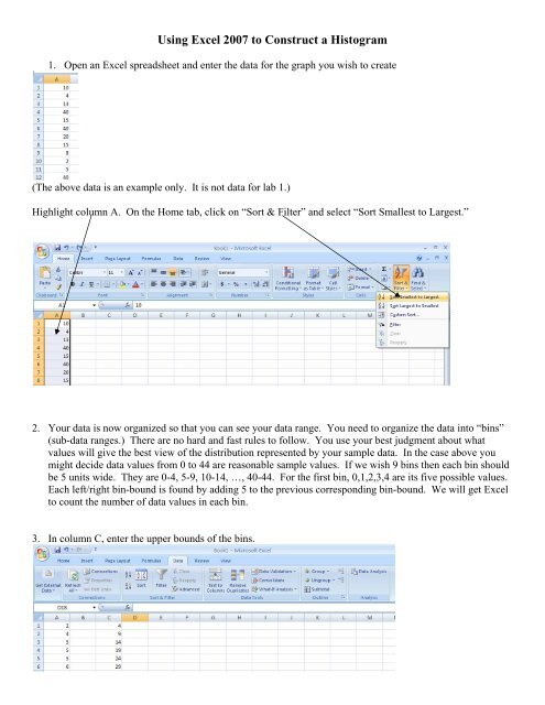
1. Open an <strong>Excel</strong> spreadsheet and enter the data for the graph you wish to create<br />
(The above data is an example only. It is not data for lab 1.)<br />
Highlight column A. On the Home tab, click on “Sort & Filter” and select “Sort Smallest to Largest.”<br />
2. Your data is now organized so that you can see your data range. You need to organize the data into “bins”<br />
(sub-data ranges.) There are no hard and fast rules to follow. You use your best judgment about what<br />
values will give the best view of the distribution represented by your sample data. In the case above you<br />
might decide data values from 0 to 44 are reasonable sample values. If we wish 9 bins then each bin should<br />
be 5 units wide. They are 0-4, 5-9, 10-14, …, 40-44. For the first bin, 0,1,2,3,4 are its five possible values.<br />
Each left/right bin-bound is found by adding 5 to the previous corresponding bin-bound. We will get <strong>Excel</strong><br />
to count the number of data values in each bin.<br />
3. In column C, enter the upper bounds of the bins.
4. Click “Data Analysis.” In the dialogue box, select “<strong>Histogram</strong>” and click “OK.”<br />
5. Click in the white “Input Range” box. Click and drag down column A to include all your sorted data.<br />
6. Click in the white “Bin Range” box. Click and drag down column C to include all of your upper bound bin<br />
values.<br />
7. Select “Output Range.” Click in any empty cell. This is where your output will be placed. The dialogue<br />
box should look similar to the one below. Then click “OK.”<br />
8. <strong>Excel</strong> produces the Bin Distribution table.<br />
Bin Frequency<br />
4 2<br />
9 6<br />
14 8<br />
19 7<br />
24 6<br />
29 3<br />
34 2<br />
39 0<br />
44 4<br />
49 0<br />
More 0
9. We are now going to make labels for the bar chart’s columns. In cell D1 enter an apostrophe followed by<br />
0-4. Press the enter key to go to cell D2 and enter an apostrophe followed by 5-9. Continue in this fashion<br />
until all the bin labels are listed. Ignore the “More” bin.<br />
10. In column E, enter the counts for each bin from the Bin Frequency table.<br />
A lot of what we have had <strong>Excel</strong> do for us we could have done manually for such a small data set, but for a very<br />
large data set, the skills we are practicing can save a tremendous amount of time and energy.<br />
Creating the <strong>Histogram</strong><br />
11. Highlight the labels and the frequency numbers from cell D1 through E10. Click on the “Insert” tab. We<br />
will create a 2-D column chart. Select the first one.
12. <strong>Excel</strong> will create your chart, but you are not finished. At the top in “Chart Tools Design,” You will see a<br />
variety of formats for bar charts. Click on the down arrow and select the chart that has a Title bar and both axes<br />
bars.<br />
13. Right click on “Series 1” and select “Delete.”<br />
14. Right click on the Title bar and select “Edit text.” Type in the title of your histogram. Repeat this process<br />
for each axis.
15. Right click on any bar in your chart and select “Format Data Series.” In the dialogue box, move the Gap<br />
Width slider to 0 and click on “Close.”<br />
You are finished creating your histogram. Click in any cell and save /print your histogram.
Appendix A<br />
You can make many other types of charts very quickly now that our data is all organized. Select the data you<br />
want to use. Then select the “Insert” tab from the top menu, choose “chart”, and select the type of chart you<br />
want. As <strong>with</strong> the histogram, you may need to make additional choices to get the graph to be just the way you<br />
want it.<br />
Remember, your data usually consists of a column of labels and next to it a column of the data (or organized<br />
data: see the table below.) Below is a pie chart. You should see this in color!<br />
0%<br />
5%<br />
8%<br />
15%<br />
10%<br />
5%<br />
18%<br />
21%<br />
4 0-4<br />
9 5-9<br />
14 10-14<br />
19 15-19<br />
24 20-24<br />
29 25-29<br />
34 30-34<br />
18%<br />
39 35-39<br />
44 40-44<br />
0-4 2<br />
5-9 6<br />
10-14 8<br />
15-19 7<br />
20-24 6<br />
25-29 3<br />
30-34 2<br />
35-39 0<br />
40-44 4
Appendix B<br />
1. Click the Microsoft Office Button , and then click <strong>Excel</strong> Options in the bottom right –hand corner of the drop-down box.<br />
2. Click Add-Ins, and then in the Manage box, select <strong>Excel</strong> Add-ins from the left-hand column.<br />
3. Click Go located on the bottom of the screen.<br />
4. In the Add-Ins available box, select the Analysis ToolPak check box, and then click OK.<br />
Tip If Analysis ToolPak is not listed in the Add-Ins available box, click Browse to locate it.<br />
If you get prompted that the Analysis ToolPak is not currently installed on your computer, click Yes to install it.<br />
5. After you load the Analysis ToolPak, the Data Analysis command is available in the Analysis group on the Data tab.