
You also want an ePaper? Increase the reach of your titles
YUMPU automatically turns print PDFs into web optimized ePapers that Google loves.
Appendix A<br />
You can make many other types of charts very quickly now that our data is all organized. Select the data you<br />
want to use. Then select the “Insert” tab from the top menu, choose “chart”, and select the type of chart you<br />
want. As <strong>with</strong> the histogram, you may need to make additional choices to get the graph to be just the way you<br />
want it.<br />
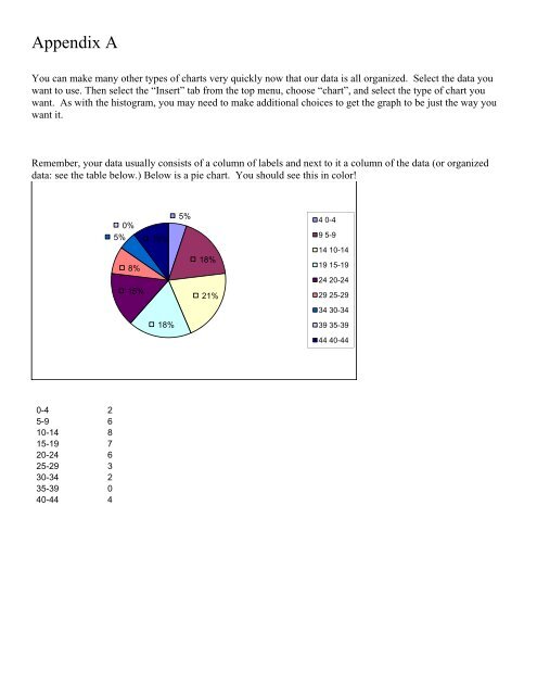
Remember, your data usually consists of a column of labels and next to it a column of the data (or organized<br />
data: see the table below.) Below is a pie chart. You should see this in color!<br />
0%<br />
5%<br />
8%<br />
15%<br />
10%<br />
5%<br />
18%<br />
21%<br />
4 0-4<br />
9 5-9<br />
14 10-14<br />
19 15-19<br />
24 20-24<br />
29 25-29<br />
34 30-34<br />
18%<br />
39 35-39<br />
44 40-44<br />
0-4 2<br />
5-9 6<br />
10-14 8<br />
15-19 7<br />
20-24 6<br />
25-29 3<br />
30-34 2<br />
35-39 0<br />
40-44 4