AP Biology Summer Packet
AP Biology Summer Packet
AP Biology Summer Packet

You also want an ePaper? Increase the reach of your titles
YUMPU automatically turns print PDFs into web optimized ePapers that Google loves.
Figure 2.6 illustrates a well-executed graphThe most commonly used forms of graphs are line graphs and bar graphs.*While this assignment does not give any examples of Pie Charts, they are also very useful tools forpresenting data that represents percentages or relative amounts of something. They are not consideredgraphs because they do not plot independent and dependent variables against each other.The choice of graph type depends on the nature of the independent variable being graphed.Continuous variables are those that have an unlimited number of values between points. Line graphs areused to represent continuous data. For instance, time is a continuous variable over which things such asgrowth will vary. Although the units on the axis can be minutes, hours, days, months, or even years, valuescan be placed in between any two values. Amount of fertilizer can also be a continuous variable. Althoughthe intervals labeled on the x-axis are 0, 200, 400, 600, 800, and 1000 (g/100 m2), many other values can belisted between each two intervals.In a line graph, data are plotted as separate points on the axes, and the points are connected to each other.Notice in Figure 2.7 that when there is more than one set of data on a graph, it is necessary to provide a keyindicating which line corresponds to which data set.
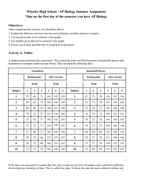
Discrete variables, on the other hand, have a limited number of possible values, and no values can fallbetween them. For example, the type of fertilizer is a discrete variable: There are a certain number of typeswhich are distinct from each other. If fertilizer type is the independent variable displayed on the x-axis, thereis no continuity between the values.Bar graphs, as shown in Figure 2.8, are used to display discrete data.In this example, before- and after-exercise data are discrete: There is no possibility of intermediate values.The subjects used (basketball players and nonathletes) also are a discrete variable (a person belongs to onegroup or the other).
What is the difference between the two graphs?Which way would be better to convey the results of the experiment?Explain why.What can you infer from these results?Activity C: Graphing PracticeUse the temperature and precipitation data provided in Table 2.6 to complete the following questions:1. Compare monthly temperatures in Fairbanks with temperatures in San Salvador.Can data for both cities be plotted on the same graph?What will go on the x-axis?
Table 2.6Average Monthly High Temperature and Precipitation for Four Cities(T = temperature in °C; P = precipitation in cm)Jan. Feb. Mar. Apr. May June July Aug. Sept. Oct. Nov. Dec.Fairbanks,AlaskaSan Francisco,CaliforniaSan Salvador,El SalvadorIndianapolis,IndianaT -19 -12 -5 6 15 22 22 19 12 2 -11 -17P 2.3 1.3 1.8 0.8 1.5 3.3 4.8 5.3 3.3 2.0 1.8 1.5T 13 15 16 17 17 19 18 18 21 20 17 14P 11.9 9.7 7.9 3.8 1.8 0.3 0 0 0.8 2.5 6.4 11.2T 32 33 34 34 33 31 32 32 31 31 31 32P 0.8 0.5 1.0 4.3 19.6 32.8 29.2 29.7 30.7 24.1 4.1 1.0T 2 4 9 16 22 28 30 29 25 18 10 4P 7.6 6.9 10.2 9.1 9.9 10.2 9.9 8.4 8.1 7.1 8.4 7.6Source: Pearce, E. A., and G. Smith. Adapted from The Times Books World Weather Guide. New York: Times Books,1990.How should the x-axis be labeled?What should go on the y-axis?What is the range of values on the y-axis?How should the y-axis be labeled?What type of graph should be used?2. Compare the average September temperature for Fairbanks, San Francisco, San Salvador, and Indianapolis.Can data for all four cities be plotted on the same graph?What will go on the x-axis?How should the x-axis be labeled?What should go on the y-axis?What is the range of values on the y-axis?How should the y-axis be labeled?What type of graph should be used?
3. Graph the temperature and precipitation data for San Francisco.Can both sets of data be plotted on the same graph? *See pg 1148 in your <strong>Biology</strong> Textbook beforeanswering and drawing the graph.What will go on the x-axis?How should the x-axis be labeled?What should go on the y-axis?What is the range of values on the temperature axis?How should this axis be labeled?What is the range of values on the precipitation axis?How should this axis be labeled?What type of graph should be used?
EXERCISE 2.4Interpreting Information on a GraphObjectiveAfter completing this exercise, you should be able to1. Interpret graphs.Once you understand how graphs are constructed, it is easier to get information from the graphs in yourtextbook as well as to interpret the results you obtain from laboratory experiments. For the graphs below,write a sentence or two describing what each graph shows, and answer the questions.Interpret this graph: What patterns or trends to you see?What was the world's population in 1900?Predict the world's population in 2000.Why does this graph change from a solid line to a dashed line at the end?
3. A team of students wants to study the effect of temperature on bacterial growth. They put the dishes indifferent places: an incubator (37°C), a lab room (21°C), a refrigerator (10°C) and a freezer (0°C). Bacterialgrowth is measured by estimating the percentage of each dish that is covered by bacteria at the end of a 3-daygrowth period.What type of graph would be used to present these data? Explain whySketch the axes below. Mark the intervals on the x-axis, and label both axes completely. Write a title for thegraph.4. A team of scientists is testing a new drug, XYZ, on AIDS patients. The scientists monitor patients in the studyfor symptoms of 12 different diseases. What would be the best way for them to present these data?Explain why5. A group of students decides to investigate the loss of chlorophyll in autumn leaves. They collect green leavesand leaves that have turned color from sugar maple, sweet gum, beech, and aspen trees. Each leaf is subjectedto an analysis to determine how many mg of chlorophyll is present.What type of graph would be most appropriate for presenting the results of this experiment? Explain why