- Page 3 and 4:
A Handbook ofStatisticalAnalysesUsi
- Page 5 and 6: DedicationTo our wives, Mary-Elizab
- Page 7 and 8: Preface to First EditionThis book i
- Page 9 and 10: List of Figures1.1 Histograms of th
- Page 11 and 12: 6.8 Normal probability plot of resi
- Page 13 and 14: 12.2 R output of the linear mixed-e
- Page 15 and 16: 18.7 Within-cluster sum of squares
- Page 17 and 18: 4.6 Lanza data. Misoprostol randomi
- Page 19 and 20: 15.2 BCG data. Meta-analysis on BCG
- Page 21 and 22: 6 Simple and Multiple Linear Regres
- Page 23 and 24: CHAPTER 1An Introduction to R1.1 Wh
- Page 25 and 26: INSTALLING R 3One can change the ap
- Page 27 and 28: DATA OBJECTS IN R 5http://CRAN.R-pr
- Page 29 and 30: DATA OBJECTS IN R 7R> help("Forbes2
- Page 31 and 32: DATA IMPORT AND EXPORT 9As a simple
- Page 33 and 34: BASIC DATA MANIPULATION 11The funct
- Page 35 and 36: BASIC DATA MANIPULATION 13name sale
- Page 37 and 38: COMPUTING WITH DATA 15Max. : 20.960
- Page 39 and 40: COMPUTING WITH DATA 17Error in quan
- Page 41 and 42: COMPUTING WITH DATA 19R> layout(mat
- Page 43 and 44: © 2010 by Taylor and Francis Group
- Page 45 and 46: SUMMARY 23examples of these functio
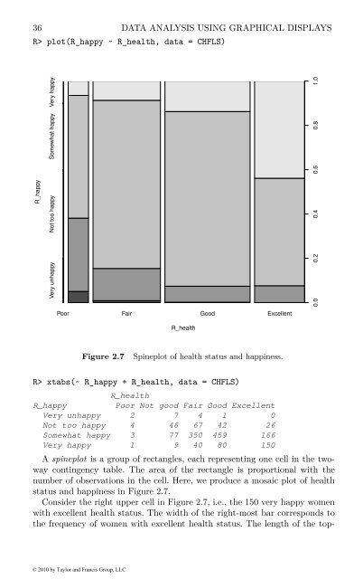
- Page 47 and 48: 26 DATA ANALYSIS USING GRAPHICAL DI
- Page 49 and 50: Table 2.2:CHFLS data. Chinese Healt
- Page 51 and 52: 30 DATA ANALYSIS USING GRAPHICAL DI
- Page 53 and 54: 32 DATA ANALYSIS USING GRAPHICAL DI
- Page 55: 34 DATA ANALYSIS USING GRAPHICAL DI
- Page 59 and 60: 38 DATA ANALYSIS USING GRAPHICAL DI
- Page 61 and 62: 40 DATA ANALYSIS USING GRAPHICAL DI
- Page 63 and 64: Table 2.5:USstates data. Socio-demo
- Page 65 and 66: CHAPTER 3Simple Inference: Guessing
- Page 67 and 68: INTRODUCTION 47table. Here there ar
- Page 69 and 70: STATISTICAL TESTS 49Table 3.4:pisto
- Page 71 and 72: STATISTICAL TESTS 51assumed to have
- Page 73 and 74: ANALYSIS USING R 53procedure is McN
- Page 75 and 76: ANALYSIS USING R 551 R> layout(matr
- Page 77 and 78: ANALYSIS USING R 57R> wilcox.test(I
- Page 79 and 80: ANALYSIS USING R 59R> t.test(moorin
- Page 81 and 82: ANALYSIS USING R 61R> cor.test(~ mo
- Page 83 and 84: SUMMARY 63R> mcnemar.test(rearrests
- Page 85 and 86: CHAPTER 4Conditional Inference: Gue
- Page 87 and 88: INTRODUCTION 67Table 4.4:Lanza data
- Page 89 and 90: CONDITIONAL TEST PROCEDURES 69and x
- Page 91 and 92: ANALYSIS USING R 71R> hist(meandiff
- Page 93 and 94: ANALYSIS USING R 73R> wilcox_test(y
- Page 95 and 96: ANALYSIS USING R 75For the first st
- Page 97 and 98: SUMMARY 77R> mh_test(anomalies)Asym
- Page 99 and 100: CHAPTER 5Analysis of Variance: Weig
- Page 101 and 102: INTRODUCTION 81The data in Table 5.
- Page 103 and 104: ANALYSIS USING R 83set out in the f
- Page 105 and 106: ANALYSIS USING R 85being far more t
- Page 107 and 108:
ANALYSIS USING R 87R> plot.design(f
- Page 109 and 110:
ANALYSIS USING R 89always be the ca
- Page 111 and 112:
ANALYSIS USING R 91The cbind statem
- Page 113 and 114:
ANALYSIS USING R 93Df Roy approx F
- Page 115 and 116:
SUMMARY 95Table 5.4:schooldays data
- Page 117 and 118:
CHAPTER 6Simple and Multiple Linear
- Page 119 and 120:
SIMPLE LINEAR REGRESSION 99hours be
- Page 121 and 122:
MULTIPLE LINEAR REGRESSION 101The e
- Page 123 and 124:
ANALYSIS USING R 1036.3.1 Regressio
- Page 125 and 126:
ANALYSIS USING R 105R> layout(matri
- Page 127 and 128:
ANALYSIS USING R 107R> data("clouds
- Page 129 and 130:
ANALYSIS USING R 109R> summary(clou
- Page 131 and 132:
ANALYSIS USING R 111R> psymb plot(
- Page 133 and 134:
SUMMARY 113R> plot(clouds_fitted, c
- Page 135 and 136:
SUMMARY 115R> plot(clouds_lm)Cook's
- Page 137 and 138:
CHAPTER 7Logistic Regression and Ge
- Page 139 and 140:
INTRODUCTION 119Table 7.2:womensrol
- Page 141 and 142:
LOGISTIC REGRESSION AND GENERALISED
- Page 143 and 144:
ANALYSIS USING R 123R> data("plasma
- Page 145 and 146:
ANALYSIS USING R 125R> summary(plas
- Page 147 and 148:
ANALYSIS USING R 1277.3.2 Women’s
- Page 149 and 150:
ANALYSIS USING R 129R> myplot(role.
- Page 151 and 152:
ANALYSIS USING R 131R> role.fitted2
- Page 153 and 154:
ANALYSIS USING R 133R> summary(poly
- Page 155 and 156:
ANALYSIS USING R 1357.3.4 Driving a
- Page 157 and 158:
SUMMARY 137Table 7.5:bladdercancer
- Page 159 and 160:
CHAPTER 8Density Estimation: Erupti
- Page 161 and 162:
DENSITY ESTIMATION 141The Hertzspru
- Page 163 and 164:
DENSITY ESTIMATION 143rectangular:
- Page 165 and 166:
DENSITY ESTIMATION 1451 R> plot(xgr
- Page 167 and 168:
ANALYSIS USING R 1478.3 Analysis Us
- Page 169 and 170:
2.2ANALYSIS USING R 149R> library("
- Page 171 and 172:
ANALYSIS USING R 1510.360891 54.612
- Page 173 and 174:
ANALYSIS USING R 153The results are
- Page 175 and 176:
SUMMARY 155R> layout(matrix(1:2, nc
- Page 177 and 178:
SUMMARY 157Table 8.4: birthdeathrat
- Page 179 and 180:
SUMMARY 159Table 8.5:schizophrenia
- Page 181 and 182:
162 RECURSIVE PARTITIONINGTable 9.1
- Page 183 and 184:
164 RECURSIVE PARTITIONINGBoth sets
- Page 185 and 186:
166 RECURSIVE PARTITIONINGR> librar
- Page 187 and 188:
168 RECURSIVE PARTITIONINGR> DEXfat
- Page 189 and 190:
170 RECURSIVE PARTITIONINGOne way o
- Page 191 and 192:
172 RECURSIVE PARTITIONINGR> librar
- Page 193 and 194:
174 RECURSIVE PARTITIONINGR> plot(g
- Page 195 and 196:
CHAPTER 10Scatterplot Smoothers and
- Page 197 and 198:
INTRODUCTION 179Table 10.2:USairpol
- Page 199 and 200:
SMOOTHERS AND GENERALISED ADDITIVE
- Page 201 and 202:
SMOOTHERS AND GENERALISED ADDITIVE
- Page 203 and 204:
SMOOTHERS AND GENERALISED ADDITIVE
- Page 205 and 206:
ANALYSIS USING R 187R> plot(time ~
- Page 207 and 208:
ANALYSIS USING R 189R> x y men150
- Page 209 and 210:
ANALYSIS USING R 191R> USair_gam l
- Page 211 and 212:
ANALYSIS USING R 193R> layout(matri
- Page 213 and 214:
ANALYSIS USING R 195ter 9) where th
- Page 215 and 216:
198 SURVIVAL ANALYSISTable 11.1:gli
- Page 217 and 218:
200 SURVIVAL ANALYSISspect to time
- Page 219 and 220:
202 SURVIVAL ANALYSISHazard0.00 0.0
- Page 221 and 222:
204 SURVIVAL ANALYSISIn the Cox mod
- Page 223 and 224:
206 SURVIVAL ANALYSISExact Logrank
- Page 225 and 226:
208 SURVIVAL ANALYSISR> summary(GBS
- Page 227 and 228:
210 SURVIVAL ANALYSISR> layout(matr
- Page 229 and 230:
212 SURVIVAL ANALYSISmodels includi
- Page 231 and 232:
214 ANALYSING LONGITUDINAL DATA Iti
- Page 233 and 234:
216 ANALYSING LONGITUDINAL DATA ITa
- Page 235 and 236:
218 ANALYSING LONGITUDINAL DATA Iot
- Page 237 and 238:
220 ANALYSING LONGITUDINAL DATA IR>
- Page 239 and 240:
222 ANALYSING LONGITUDINAL DATA IR>
- Page 241 and 242:
224 ANALYSING LONGITUDINAL DATA IR>
- Page 243 and 244:
226 ANALYSING LONGITUDINAL DATA IKe
- Page 245 and 246:
228 ANALYSING LONGITUDINAL DATA Ido
- Page 247 and 248:
CHAPTER 13Analysing Longitudinal Da
- Page 249 and 250:
METHODS FOR NON-NORMAL DISTRIBUTION
- Page 251 and 252:
METHODS FOR NON-NORMAL DISTRIBUTION
- Page 253 and 254:
METHODS FOR NON-NORMAL DISTRIBUTION
- Page 255 and 256:
ANALYSIS USING R: GEE 239R> summary
- Page 257 and 258:
ANALYSIS USING R: GEE 241R> summary
- Page 259 and 260:
ANALYSIS USING R: GEE 243R> summary
- Page 261 and 262:
ANALYSIS USING R: GEE 245R> layout(
- Page 263 and 264:
ANALYSIS USING R: RANDOM EFFECTS 24
- Page 265 and 266:
ANALYSIS USING R: RANDOM EFFECTS 24
- Page 267 and 268:
SUMMARY 251Table 13.3:schizophrenia
- Page 269 and 270:
254 SIMULTANEOUS INFERENCE AND MULT
- Page 271 and 272:
256 SIMULTANEOUS INFERENCE AND MULT
- Page 273 and 274:
258 SIMULTANEOUS INFERENCE AND MULT
- Page 275 and 276:
260 SIMULTANEOUS INFERENCE AND MULT
- Page 277 and 278:
262 SIMULTANEOUS INFERENCE AND MULT
- Page 279 and 280:
264 SIMULTANEOUS INFERENCE AND MULT
- Page 281 and 282:
CHAPTER 15Meta-Analysis: Nicotine G
- Page 283 and 284:
SYSTEMATIC REVIEWS AND META-ANALYSI
- Page 285 and 286:
STATISTICS OF META-ANALYSIS 271Sele
- Page 287 and 288:
ANALYSIS USING R 273the parameters
- Page 289 and 290:
ANALYSIS USING R 275R> plot(smoking
- Page 291 and 292:
PUBLICATION BIAS 277R> summary(BCG_
- Page 293 and 294:
SUMMARY 279R> summary(BCG_mod)Call:
- Page 295 and 296:
SUMMARY 2811 / standard error2 4 6
- Page 297 and 298:
Table 15.4:aspirin data. Meta-analy
- Page 299 and 300:
CHAPTER 16Principal Component Analy
- Page 301 and 302:
PRINCIPAL COMPONENT ANALYSIS 287nie
- Page 303 and 304:
ANALYSIS USING R 289R> score plot(
- Page 305 and 306:
ANALYSIS USING R 291R> score plot(
- Page 307 and 308:
ANALYSIS USING R 293Yuping (CHN) Ha
- Page 309 and 310:
SUMMARY 295R> biplot(heptathlon_pca
- Page 311 and 312:
SUMMARY 297rainJuly: rainfall in Ju
- Page 313 and 314:
Table 17.1:watervoles data. Water v
- Page 315 and 316:
302 MULTIDIMENSIONAL SCALINGn in nu
- Page 317 and 318:
304 MULTIDIMENSIONAL SCALINGwill be
- Page 319 and 320:
306 MULTIDIMENSIONAL SCALINGR> x y
- Page 321 and 322:
308 MULTIDIMENSIONAL SCALINGR> libr
- Page 323 and 324:
310 MULTIDIMENSIONAL SCALINGR> plot
- Page 325 and 326:
Table 17.3:eurodist data (package d
- Page 327 and 328:
CHAPTER 18Cluster Analysis: Classif
- Page 329 and 330:
INTRODUCTION 317mass, mass), the pe
- Page 331 and 332:
CLUSTER ANALYSIS 319x 20 2 4 6 8 10
- Page 333 and 334:
CLUSTER ANALYSIS 32141031678925Figu
- Page 335 and 336:
CLUSTER ANALYSIS 3231. Find some in
- Page 337 and 338:
ANALYSIS USING R 32518.3 Analysis U
- Page 339 and 340:
ANALYSIS USING R 327R> pottery_sing
- Page 341 and 342:
ANALYSIS USING R 329R> rge planet.
- Page 343 and 344:
ANALYSIS USING R 331R> plot(planet_
- Page 345 and 346:
ANALYSIS USING R 333R> scatterplot3
- Page 347 and 348:
BibliographyAdler, D. and Murdoch,
- Page 349 and 350:
BIBLIOGRAPHY 337Chambers, J. M. and
- Page 351 and 352:
BIBLIOGRAPHY 339Everitt, B. S. and
- Page 353 and 354:
BIBLIOGRAPHY 341Heitjan, D. F. (199
- Page 355 and 356:
BIBLIOGRAPHY 343Leisch, F. and Ross
- Page 357 and 358:
BIBLIOGRAPHY 345Proudfoot, J., Gold
- Page 359 and 360:
BIBLIOGRAPHY 347Stevens, J. (2001),