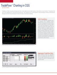
Mapping Your Voyage of Discovery - CQG.com
Mapping Your Voyage of Discovery - CQG.com
Mapping Your Voyage of Discovery - CQG.com
- No tags were found...

You also want an ePaper? Increase the reach of your titles
YUMPU automatically turns print PDFs into web optimized ePapers that Google loves.
2. What is the Average True Range on the chart you are analysing?For me, risk and its relationship to volume is one the critical relationships that have to beplaced in a consistent framework. A key element in achieving this is to clarify the timeframechart and the Average True Range that it is currently displaying. A <strong>com</strong>mon mistake is toreference an intraday chart that has a range that is far higher than your concept <strong>of</strong> risk interms <strong>of</strong> ticks. Picture yourself as a trend follower. <strong>Your</strong> predefined risk on any trade isnever more than ten ticks, but you are analysing <strong>of</strong>f a 60-minute chart that has a range <strong>of</strong>fifty ticks. At what point can you truly clarify that your trade is wrong based on a bar thatcan move five times more than risk?When visiting traders, one <strong>of</strong> the first questions I ask them, are what timeframe charts doyou use? The answer is always a variation <strong>of</strong> “oh I use a thirty, sixty, plus the daily andsometimes go down to the five or two minute”. No one has ever said, “I use the timeframechart that fits with my concept <strong>of</strong> risk and volatility”. If you do this, then you have created afluid framework that rides the waves <strong>of</strong> volatility in a consistent manner, and provides astructure for which your momentum indicators <strong>of</strong> choice can be utilised. The basic rules areas follows.- If the Average True Range is below your concept <strong>of</strong> risk in ticks then the timeframechart is too low, and the information is irrelevant.- If the Average True Range is more than double your concept <strong>of</strong> risk, in terms <strong>of</strong>ticks then the timeframe chart is too high.To put this in some sort <strong>of</strong> context, during the craziness <strong>of</strong> 2011, there were times when thetimeframe I was referencing on crude oil was down to a one-minute chart. In contrast,during the moribund period in early 2012, this had risen to a ten minutes at its lowest, androse to as high as a sixty minute.