chapter twelve tables, charts, and graphs - SurgicalCriticalCare.net
chapter twelve tables, charts, and graphs - SurgicalCriticalCare.net
chapter twelve tables, charts, and graphs - SurgicalCriticalCare.net

You also want an ePaper? Increase the reach of your titles
YUMPU automatically turns print PDFs into web optimized ePapers that Google loves.
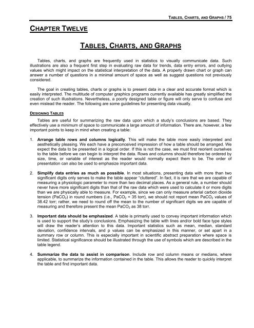
TABLES, CHARTS, AND GRAPHS / 75CHAPTER TWELVETABLES, CHARTS, AND GRAPHSTables, <strong>charts</strong>, <strong>and</strong> <strong>graphs</strong> are frequently used in statistics to visually communicate data. Suchillustrations are also a frequent first step in evaluating raw data for trends, data entry errors, <strong>and</strong> outlyingvalues which might impact on the statistical interpretation of the data. A properly drawn chart or graph cananswer a number of questions in a minimal amount of space as well as suggest questions not previouslyconsidered.The goal in creating <strong>tables</strong>, <strong>charts</strong> or <strong>graphs</strong> is to present data in a clear <strong>and</strong> accurate format which iseasily interpreted. The multitude of computer graphics programs currently available has greatly simplified thecreation of such illustrations. Nevertheless, a poorly designed table or figure will only serve to confuse <strong>and</strong>even mislead the reader. The following are some guidelines for presenting data visually.DESIGNING TABLESTables are useful for summarizing the raw data upon which a study’s conclusions are based. Theyeffectively use a minimum of space to communicate a large amount of information. There are, however, a fewimportant points to keep in mind when creating a table:1. Arrange table rows <strong>and</strong> columns logically. This will make the table more easily interpreted <strong>and</strong>aesthetically pleasing. We each have a preconceived impression of how a table should be arranged. Weexpect the data to be presented in a logical order. If this is not the case, we must first reorient ourselvesto the table before we can begin to interpret the data. Rows <strong>and</strong> columns should therefore be ordered bysize, time, or variable of interest as the reader would normally expect them to be. The order ofpresentation can also be used to emphasize important data.2. Simplify data entries as much as possible. In most situations, presenting data with more than twosignificant digits only serves to make the table appear “cluttered”. In fact, it is rare that we are capable ofmeasuring a physiologic parameter to more than two decimal places. As a general rule, a number shouldnever have more significant digits than that of the raw data which were used to calculate it or more digitsthan we are physically able to measure. For example, since we can only measure arterial carbon dioxidetension (PaCO 2 ) in round numbers (i.e., PaCO 2 = 35 torr), we should not report mean PaCO 2 values of38.42 torr; rather, we need to round off the mean to the number of significant digits we are capable ofmeasuring <strong>and</strong> therefore present the mean PaCO 2 as 38 torr.3. Important data should be emphasized. A table is primarily used to convey important information whichis used to support the study’s conclusions. Emphasizing the table with lines <strong>and</strong>/or bold face type styleswill draw the reader’s attention to this data. Important statistics such as mean, median, st<strong>and</strong>arddeviation, confidence intervals, <strong>and</strong> p values can be emphasized in this manner, or set apart in asummary row or column. This is especially important in scientific abstract preparation where space islimited. Statistical significance should be illustrated through the use of symbols which are described in thetable legend.4. Summarize the data to assist in comparison. Include row <strong>and</strong> column means or medians, whereapplicable, to summarize the information contained in the table. This allows the reader to quickly interpretthe table <strong>and</strong> find important data.
76 / A PRACTICAL GUIDE TO BIOSTATISTICSTo illustrate these points, consider the appearance of the following table:RVEF > 40% RVEF 30-39% RVEF < 30%RVEDVI 0.802 0.823 0.586CVP 0.169 0.235 0.482PAOP 0.221 0.050 0.304Without any accompanying text, this table is uninterpretable as well as misleading. From the table, thereis no way of knowing that these are the correlation coefficients (r values) from a study comparing cardiacindex with right ventricular end-diastolic volume index (RVEDVI), pulmonary artery occlusion pressure(PAOP) <strong>and</strong> central venous pressure (CVP) at various levels of right ventricular ejection fraction (RVEF).A table should be self-explanatory <strong>and</strong> self-supporting. It should be easily understood apart from itsaccompanying text. It is unclear in the above example exactly what is being presented <strong>and</strong> why.Abbreviations are not defined, data are not arranged logically, <strong>and</strong> there is no statistical analysis given.Furthermore, the table appears to be comparing RVEF with RVEDVI, CVP, <strong>and</strong> PAOP <strong>and</strong> is thereforemisleading.1. No Title2. Abbreviations not defined 3. Data not arranged logicallyRVEF > 40% RVEF 30-39% RVEF < 30%RVEDVI 0.802 0.823 0.586CVP 0.169 0.235 0.482PAOP 0.221 0.050 0.3044. No statistical analysis 5. Too many significant digits6. Comparison of data is misleadingConsider the revised table after the above problems have been addressed:Correlation with Cardiac Index at Various Levels of RVEFRVEF < 30% RVEF 30-39% RVEF > 40%n 46 48 55RVEDVI 0.59*** 0.82*** 0.80***PAOP 0.48** 0.24 0.22CVP 0.30* 0.05 0.17*p < 0.05 **p < 0.01 ***p < 0.001(Linear correlation compared to cardiac index)n - number of observationsRVEF - right ventricular ejection fractionRVEDVI - right ventricular end-diastolic volume indexPAOP - pulmonary artery occlusion pressureCVP - central venous pressureThis table is easily interpreted apart from its accompanying text. The title clearly defines the informationthat is being presented. Abbreviations are explained in the accompanying legend. Data are logically arrangedby increasing RVEF. The number of observations in each group is reported. The statistical significance foreach group is presented <strong>and</strong> the statistical methods used described. The important values are set apartthrough the use of bold-face type. The data are also simplified to the appropriate number of significant digits.Careful design of <strong>tables</strong> in this manner makes the conclusions of an abstract or manuscript more easilyrecognized <strong>and</strong> applicable to clinical use.SUGGESTIONS FOR CHART AND GRAPH DESIGN
TABLES, CHARTS, AND GRAPHS / 771. Charts <strong>and</strong> <strong>graphs</strong> should be simple. In the past, <strong>charts</strong> <strong>and</strong> <strong>graphs</strong> were simple by necessity. Theywere often drawn by h<strong>and</strong>, requiring hours of work. With the widespread use of computers, creatingelaborate <strong>and</strong> colorful <strong>charts</strong> is now quick <strong>and</strong> easy. Complicated, colorful, <strong>and</strong> intricate <strong>charts</strong> <strong>and</strong><strong>graphs</strong> are not necessarily better, however, <strong>and</strong> may only serve to confuse or mislead the reader. Chartsshould therefore be kept as simple as possible.2. Maximize the data in each chart. One of the real advantages of using visual representations of data isthat a maximum of information can be conveyed in a minimal amount of space. It is possible, however, toinclude too much data <strong>and</strong> create a graph that overwhelms the reader by trying to answer severalquestions at once. Charts <strong>and</strong> <strong>graphs</strong> should be designed to be easily understood at first glance. At thesame time, using multiple <strong>graphs</strong> to present data that could just as easily be presented in a single graphis an inefficient use of space.3. Label rows <strong>and</strong> columns concisely <strong>and</strong> accurately. Numbers by themselves are meaningless.Accurate labeling of the data is essential if the reader is to interpret the data correctly.4. Use legends to explain the data being illustrated. Legends should be used to define which studygroups are being illustrated <strong>and</strong> in what manner.5. Use an appropriate scale. The type of data variable <strong>and</strong> the statistical methods used to analyze the datawill frequently determine the way is which data is displayed. Data which is binary or dichotomous willmost likely require a nominal scale (i.e., disease vs no disease). When the data is ordered in categories,such as in tumor staging, an ordinal scale consisting of several categories is appropriate. The majority ofdata encountered in medical research is continuous <strong>and</strong> requires a numerical scale.Manipulating the scale can make any data look better, even if there is no significant difference todemonstrate. At the same time, using an inappropriate scale may minimize the appearance of asignificant difference or may hide clinically useful variations in the data. Thus, the scale utilized canprofoundly affect the way in which the data is interpreted.One common mistake in creating <strong>charts</strong> <strong>and</strong> <strong>graphs</strong> is changing the scale in mid-axis. This maydistort the graphical representation of the data <strong>and</strong> can be misleading to the reader. Another commonerror is beginning the scale at a point other than zero. This is known as suppression of zero error <strong>and</strong>can also result in distortion of the data.6. Arrange data logically. As with <strong>tables</strong>, the reader will expect to see data presented in a logical order. Ifthe data has a natural order, rearranging that order may result in a confusing graph. Although it mightseem natural <strong>and</strong> helpful, displaying data alphabetically or numerically from smallest to largest may thusupset the natural order of the data <strong>and</strong> make it less clear.7. Use the same baseline for multiple <strong>graphs</strong> of the same type. If multiple <strong>graphs</strong> are being used todisplay data, use of a common baseline will allow the <strong>graphs</strong> to be compared much more easily <strong>and</strong> willmake them less confusing. It can also allow multiple <strong>graphs</strong> to be condensed into one graph thus savingspace.8. Use significant digits appropriately. As described above for <strong>tables</strong>, only use as many significant digitsas are appropriate.9. Avoid using “double Y-axis” <strong>graphs</strong>. These <strong>graphs</strong> are commonly used to display two or more groupsof data which are measured on different scales. Unfortunately, they can easily be misunderstood. It maynot be immediately obvious, for example, which Y axis belongs to which data set, especially if multipledata sets are being presented. In such a situation, it may be better to display the data in two separate<strong>graphs</strong>, each with a different scale on the Y axis.10. Avoid logarithmic scales (or other transformed scales) unless the data analysis required transformation(i.e., the data did not assume a normal distribution). Logarithmic scales can similarly distort the data <strong>and</strong>make it confusing.
78 / A PRACTICAL GUIDE TO BIOSTATISTICS11. Error bars should be used to convey variability. Most <strong>charts</strong> <strong>and</strong> <strong>graphs</strong> provide information about themean of the data. We are also interested, however, in the variability associated with the data mean. Errorbars, as illustrated in the graph below, provide a way of displaying this variability in the data.CARDIAC INDEX VS RVEDVI DURINGFLUID RESUSCITATIONRVEDVI (mL/m2)15012510075502504 4.5 5 5.5 6CARDIAC INDEX (mL/min/m2)COMMON USES OF VARIOUS CHARTS AND GRAPHSVarious examples of <strong>tables</strong>, <strong>charts</strong>, <strong>and</strong> <strong>graphs</strong> have been illustrated in previous <strong>chapter</strong>s as listed below:• frequency histogram Chapter 2• data <strong>tables</strong> Chapters 3, 4, 5, 6, 9, 11• contingency <strong>tables</strong> Chapters 4, 5• ROC curves Chapter 4• X-Y scatter <strong>graphs</strong> Chapter 8The following are examples of other types of <strong>charts</strong> <strong>and</strong> <strong>graphs</strong> which are commonly seen in the medicalliterature along with their uses.• Bar <strong>charts</strong>- used to display nominal or ordinal dataCHO mg/kg/min6543210Carbohydrate (CHO) Administration Rate5.344.313.5A7/D21 A4.25/D25 A5/D35TPN formula
TABLES, CHARTS, AND GRAPHS / 79• Histograms− used to present information about ordinal datathe measurement of interest is graphed on the X axis <strong>and</strong> the number or percentage of observations onthe Y axisMEXICOITALYSWEDENU.S.ENGLANDNEWZEALAND0 5 10 15 20 25Death rate/100,000 population• Dot plots-used to display binary or nominal data10080Arterial Oxygen Tension by SexPaO26040200MaleFemale• Scattergrams or Scatterplots- also known as bivariate plots- the risk factor is placed on the X axis <strong>and</strong> the characteristic or outcome to be explained is placed on theY axis-different subgroups can be represented by different symbols maximizing information exchange withoutan increase in space150Cardiac Index vs RVEDVIRVEDVI1005000 2 4 6 8Cardiac index
80 / A PRACTICAL GUIDE TO BIOSTATISTICS• Survival Curves− used to illustrate survival rates at various periods of time.− Kaplan-Meier survival curves plot the proportion of patients still surviving each time a patient dies.Survival Following Tumor Resection100Percent Survival8060402000 1 2 3 4 5Time in years to death−Actuarial survival curves are curvilinear as they plot the proportion of patients still surviving at specifictime intervals since the study began, averaging the occurrence of death during the previous time period.Survival Following Tumor ResectionPercent Survival1008060402000 1 2 3 4 5Year of DeathSUGGESTED READING1. Wainer H. Underst<strong>and</strong>ing <strong>graphs</strong> <strong>and</strong> <strong>tables</strong>. Educ Research 1992;21:14-23.2. Wainer H. How to display data badly. Am Stat 1984;38:137-147.3. Altman DG. Statistics <strong>and</strong> ethics in medical research: VI - Presentation of results. Brit Med J1980;281:1542-1544.4. O’Brien PC, Shampo MA. Statistics for clincians. 2. Graphic displays - histograms, frequency polygons,<strong>and</strong> cumulative distribution polygons. Mayo Clin Proc 1981;56:126-128.5. O’Brien PC, Shampo MA. Statistics for clincians. 3. Graphic displays - Scatter diagrams. Mayo Clin Proc1981;56:196-197.