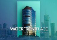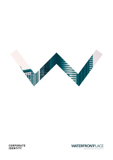
Waterfront Place - Brand Guidelines

You also want an ePaper? Increase the reach of your titles
YUMPU automatically turns print PDFs into web optimized ePapers that Google loves.
CORPORATE<br />
IDENTITY
LOGO AND USAGE<br />
The <strong>Waterfront</strong> <strong>Place</strong> logo combines three<br />
elements: the logotype, the tagline and a<br />
graphical element. These elements should<br />
never be changed. Position, size and colour<br />
along with the spatial and proportional<br />
relationships are predetermined and should<br />
not be altered.<br />
Used consistently, they will reinforce<br />
public awareness of the company.<br />
THE LOGO<br />
Word mark<br />
Tagline<br />
DARK VERSION<br />
LIGHT VERSION
BLACK, WHITE<br />
AND GRAYSCALE<br />
If needed, the logo can be reproduced in<br />
greyscale version using a light colour type<br />
on dark background or in a dark colour type<br />
on a light background.<br />
The logotype and symbol must be clearly<br />
distinguishable from the background colour.<br />
100% Black<br />
80% Black<br />
100% White<br />
Symbol
LOGO<br />
CONSTRUCTION<br />
The <strong>Waterfront</strong> <strong>Place</strong> logo requires<br />
separation from the other elements around<br />
it. The space required on all sides is<br />
roughly equivalent to the cap height of the<br />
logo type. It should never be less than that.<br />
The logo must always fit into the clearspace<br />
area and can not be intervened by other<br />
graphical elements which could hinder the<br />
legibility of the brand.<br />
The logo must be surrounded by clear space<br />
to ensure visibility.<br />
The icon must always be surrounded by clear white space all<br />
around to ensure visibility.
MINIMUM<br />
LOGO SIZES<br />
There are no predetermined sizes for the<br />
<strong>Waterfront</strong> <strong>Place</strong> logo. Scale and proportion<br />
should be determined by the available<br />
space, function and visibility. In print the<br />
minimum size is 34 mm width, for the<br />
symbol it is 10 mm width.<br />
For digital use the minimum size for the<br />
standard logo is 120px. This is the smallest<br />
size apart from when using an ICO. The size<br />
for the ICOs is 16px.<br />
LOGO<br />
SYMBOL<br />
ICON<br />
34 mm 34 mm 16px<br />
INCORRECT USE<br />
DON’T rotate the logo<br />
DON’T add a drop shadow<br />
DON’T rearrange elements<br />
DON’T stretch the logo<br />
DON’T use different colours<br />
DON’T place the logo over a<br />
complex image
COLOUR SCHEME<br />
A comprehensive colour palette has been developed to provide<br />
flexibility while creating unified, recognisable appearance<br />
across all communication.<br />
LIGHT GREY<br />
RGB<br />
CMYK<br />
HEX<br />
243 243 243<br />
4 2 2 0<br />
#f2f2f2<br />
COLD GREEN<br />
RGB<br />
CMYK<br />
HEX<br />
0 169 157<br />
78 9 46 0<br />
#00a99d<br />
DEEP BLUE<br />
RGB<br />
CMYK<br />
HEX<br />
15 68 111<br />
100 78 32 17<br />
#0f446f<br />
OIL BLUE<br />
RGB<br />
CMYK<br />
HEX<br />
6 59 75<br />
97 71 48 43<br />
#05364b
This palette has been selected for use in<br />
<strong>Waterfront</strong> <strong>Place</strong> communications. The primary<br />
colours include a cold green that embodies the<br />
innovative and dynamic business environment of<br />
<strong>Waterfront</strong> <strong>Place</strong>.<br />
The additional colours are light grey for<br />
backgrounds and two different tints of blue that<br />
underline the corporate attitude.
CORPORATE ALPHABET<br />
PANTON LIGHT CAPS<br />
AA<br />
Panton Light Caps is <strong>Waterfront</strong>’s primary typeface.<br />
Used for headings.<br />
A B C D E F G H I J K L M N O P Q R S T U V W X Y Z<br />
/!?{}”^%&*$#@~+=-():;’|\<br />
1 2 3 4 5 6 7 8 9 0<br />
DIN REGULAR<br />
Aa<br />
Din is <strong>Waterfront</strong>’s primary typeface.<br />
Used for body copy.<br />
Aa Bb Cc Dd Ee Ff Gg Hh Ii Jj Kk Ll Mm Nn<br />
Oo Pp Qq Rr Ss Tt Uu Vv Ww Xx Yy Zz<br />
/!?{}”^%&*$#@~+=-():;’|\<br />
1 2 3 4 5 6 7 8 9 0<br />
DIN BOLD<br />
Aa<br />
Din is <strong>Waterfront</strong>’s secondary typeface.<br />
Used for emphasis, headings and<br />
alternate applications.<br />
Aa Bb Cc Dd Ee Ff Gg Hh Ii Jj Kk Ll Mm Nn<br />
Oo Pp Qq Rr Ss Tt Uu Vv Ww Xx Yy Zz<br />
/!?{}”^%&*$#@~+=-():;’|\<br />
1 2 3 4 5 6 7 8 9 0
Aa
IMAGERY<br />
<strong>Brand</strong> image is the overall impression in consumers’ mind that is formed from all sources<br />
Good imagery helps to reinforce our values. Any photography needs to be professional in<br />
its approach and engaging in its content. It is essential for our brand to covey a consistent<br />
message throughout all our communication.<br />
REQUIREMENTS<br />
1 - Use desaturated colours with cold colour style<br />
2 - All photos should be light and clean
3 - Use CMYK (RGB for web) when the background is white or the colour scheme fits with the<br />
brand palette.<br />
4 - Use grayscale images when the colour scheme doesn’t fit with the background<br />
5 - Use a dark/coloured overlay on image when writing text on it
WATERFRONT PLACE<br />
1 Eagle St - 4000<br />
Brisbane - QLD