Pottery In Australia Vol 38 No 3 September 1999

You also want an ePaper? Increase the reach of your titles
YUMPU automatically turns print PDFs into web optimized ePapers that Google loves.
particularly in relation to colour combinations, it also<br />
added the levity, the little bit of theatricality which I had<br />
been looking for (see picture below).<br />
At the time I also began to investigate the works of the<br />
contemporary designers from the Alessi group and<br />
Phillipe Starck. I was impressed by their indifferent<br />
attitudes to questions of 'high' or 'low 'art' and their<br />
concerns rather with communicating with an audience<br />
within familiar idioms. I was particularly impressed with<br />
Starck's designs, his ability to make a building or a<br />
toothbrush equally interesting objects, and I could see<br />
that same concern for elemental spatial relationships that<br />
Brancusi and Arp understood. I returned frequently to his<br />
Asahi building, with its tilted 'flame ' sculpture poised<br />
weightlessly on its black roof, and attempted to<br />
infuse some of this dramatic element into<br />
my later jars (see pictures on pages 5<br />
and 6).<br />
<strong>In</strong> settling on two core shapes,<br />
I attempted to fulfil my core aim<br />
of producing an interrelated<br />
body of work, regardless of the<br />
function ·of individual elements.<br />
This concept, from British Keith<br />
Murray at Wedgwood in the thirties, to<br />
American Russell Wright in the forties<br />
and fifties , used the notion of<br />
'matching' to entice consumers to buy<br />
further items. I have adopted Murray's<br />
simple device of lines and proportions,<br />
and Wright's use of internal and external<br />
colour to 'mix and match' items. Colour and<br />
glaze development have been a critical<br />
element of exploration in the project.<br />
The Masters of Fine Art by research project was a<br />
challenging and rewarding focus leading to a new body<br />
of work. It proved interesting seeing my traditional<br />
chuns, copper reds on new forms.<br />
The project led me to invent new ways of construction,<br />
often cutting and reassembling, or using multiple pieces.<br />
I wanted to avoid an overly forced or contrived look and<br />
for the functional forms to have an unassuming<br />
simplicity, yet hopefully a sense of engagement. The<br />
success or failure of my aim to assimilate traditional<br />
reduction glazes with a more overt Western based form<br />
rests with the final pieces. oo<br />
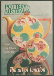
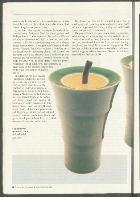
Copper green<br />
glaze with black<br />
and yellow lid.<br />
W16 X 25h.<br />
8 POTTERY IN AUSTRALIA + <strong>38</strong>/3 SEPTEMBER <strong>1999</strong>