

Obscura Process Book

You also want an ePaper? Increase the reach of your titles
YUMPU automatically turns print PDFs into web optimized ePapers that Google loves.
BRANDING + DESIGN<br />
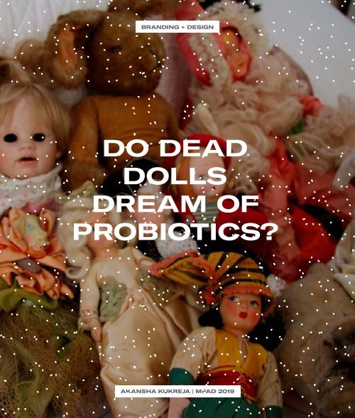
DO DEAD<br />
DOLLS<br />
DREAM OF<br />
PROBIOTICS?<br />
AKANSHA KUKREJA | MFAD 2019
CONTEN<br />
PART 1<br />
BRANDING<br />
01<br />
PROCESS<br />
Picking The Brand<br />
Store Visits<br />
Competitors<br />
Target Audience<br />
The Story<br />
Inspiration & Thoughts<br />
Initial Sketches<br />
Digital Iterations<br />
02<br />
OUTCOME<br />
<strong>Obscura</strong>, Revised<br />
Identity System<br />
Visual Assets<br />
Applications
TS<br />
PART 2<br />
PACKAGING<br />
03<br />
PROCESS<br />
A Hot, Saucy Conflict<br />
Kombucha, Please<br />
The Brand + Product<br />
Current Label Analysis<br />
Line-Up & Competition<br />
Target Audience<br />
Understanding The Philosophy<br />
The Story<br />
Visual Inspiration<br />
Initial Sketches<br />
Digital Iterations<br />
04<br />
OUTCOME<br />
GT’s Logomark, Revised<br />
New Label Design<br />
Visual Assets<br />
Product Photography<br />
Communication Style<br />
Packaging Guidelines
“<br />
PART 1<br />
Brands exi<br />
minds of t<br />
who intera
st in the<br />
he people<br />
ct with them.<br />
- BRIAN COLLINS<br />
BRANDING<br />
“
INCLUDES<br />
PICKING THE BRAND<br />
STORE VISITS<br />
COMPETITORS<br />
TARGET AUDIENCE<br />
THE STORY<br />
INSPIRATION & THOUGHTS<br />
INITIAL SKETCHES<br />
DIGITAL ITERATIONS
PART 1<br />
BRANDING<br />
01 | PROCESS
PART 1 | BRANDING<br />
PICKING THE BRAND<br />
CURRENT IDENTITY<br />
<strong>Obscura</strong> is a store that houses antiques<br />
and obscure keepsakes that are<br />
indescribably odd (a.k.a oddities).<br />
The store’s employees search flea<br />
markets, personal collections, auctions,<br />
and antique shows for unique and<br />
unusual artifacts. When I walked<br />
into the store as a happen-stance of<br />
exploring East Village, I wanted to<br />
spend more than a normal amount of<br />
time there. The cabinets and drawers<br />
and nooks of the store have more to<br />
offer than the store-front proposes.<br />
WHY?<br />
WEIRD OBJECTS FROM THE 1800s<br />
DISCOVERY BECOMES COLLECTION<br />
STUFFED SQUIRRELS ON A FERRIS WHEEL<br />
UNDISCOVERED EAST-VILLAGE GEM<br />
CURATED ODDITIES<br />
STORE VISITS<br />
I happened to chance upon their store in East Village, by Avenue A. The<br />
intentional messy curation of non-traditional antiques really pulled me in.<br />
This isn’t a run-of-the-mill antique store that everyone feels comfortable in.
OBSCURA
PART 1 | BRANDING
OBSCURA
PART 1 | BRANDING
OBSCURA
PART 1 | BRANDING
OBSCURA<br />
COMPETITORS<br />
EVOLUTION, OLDE GOOD THINGS, ECLICTIC COLLECTIBLES, THE HUNT<br />
In New York, a lot of the antique stores<br />
offer their own special twist. Some<br />
offer really great Historic Artefacts,<br />
Jewellery, Antique Furniture and Decor.<br />
None of these directly compete with<br />
<strong>Obscura</strong> on the following factors:<br />
INTENTIONAL MESSY CURATION.<br />
TIMELY REARRANGEMENTS.<br />
DISCOVER = NOVELTY.<br />
OPEN 7 DAYS.<br />
FLEA MARKET PRESENCE.<br />
OFFER EXPERT ADVICE & CURATION.
PART 1 | BRANDING<br />
CUSTOMERS<br />
COLLECTORS<br />
DECORATORS<br />
SET DESIGNERS<br />
PROP COLLECTORS
OBSCURA<br />
“<br />
It’s part museum, part<br />
attraction. Some people want<br />
to come in and look but not<br />
touch or take anything.<br />
Like a car accident.<br />
“<br />
MIKE ZOHN, STORE OWNER
CURIOS<br />
PART 1 | BRANDING<br />
THE ST<br />
Incite d<br />
into<br />
CABI
ORY<br />
OBSCURA<br />
isovery<br />
the<br />
N OF<br />
ITIES.A conversation with the owner<br />
allowed me to identify that when<br />
people come into obscura, they<br />
want to dig through the objects<br />
to find their own kind of oddity. It<br />
always makes a good story when<br />
you can take credit for that weird<br />
thing that’s staring at the guests<br />
that walk into your home.
PART 1 | BRANDING<br />
INSPIRTATION AND THOUGHTS<br />
MOODBOARD 1 | THE SOUL DOES NOT EXIST<br />
KEYWORDS<br />
DEAD INSIDE<br />
TAXIDERMY<br />
THINGS THAT ONCE LIVED<br />
THE EXPRESSIONS OF RELICS<br />
LIVING IN FEAR<br />
WAITING FOR NOTHING<br />
DEATH ON A SHELF
OBSCURA<br />
MOODBOARD 2 | DETAILS WITHIN MATTER<br />
KEYWORDS<br />
INNER STRUCTURE<br />
TINY DISCOVERIES<br />
DIAGRAMS<br />
THE INSIDES OF THINGS<br />
STRUCTURE<br />
MOLECULES<br />
DETAIL BECOMES DISCOVERY
PART 1 | BRANDING<br />
MOODBOARD 3 | LOOKING FOR IMPERFECTION<br />
KEYWORDS<br />
MISFITS<br />
SKEWED<br />
GRITTY<br />
IMPERFECT EDGES<br />
TYPOGRAPHIC<br />
TEXTURAL<br />
AWKWARD
OBSCURA<br />
REACTIONS AND REFLECTIONS<br />
After my intial moodboards, I started<br />
to open up a bit more in terms of how<br />
I could step out of the run-of-themill<br />
antique store realm. This idea of<br />
discovering things to combine with<br />
others you find at <strong>Obscura</strong> led to this<br />
idea of duality. Combining weird things<br />
together - that was at the essence of an<br />
<strong>Obscura</strong> takeaway.<br />
The previous moodboards (1 and 2)<br />
seemed too safe to carry forward. This<br />
idea of the undead object combined<br />
with something it would never relate<br />
to started to sit with me as I collected<br />
images from old books / British Library<br />
Flickr archives over the internet.<br />
At this point, I also started to consider<br />
the various types of logos I could<br />
explore for <strong>Obscura</strong>.
PART 1 | BRANDING<br />
INITIAL SKETCHES
OBSCURA
PART 1 | BRANDING<br />
DIGITAL ITERATIONS<br />
ROUND 1<br />
REACTIONS AND REFLECTIONS<br />
With mixed reactions, I was a bit<br />
unsure about this route - another<br />
peer of mine was designing for<br />
<strong>Obscura</strong>’s competitor ‘Evolution.’<br />
This was too close to art-history and<br />
the aesthetics of an apothecary.
LABEL SYSTEM<br />
OBSCURA
PART 1 | BRANDING<br />
DIGITAL ITERATIONS<br />
ROUND 2<br />
REACTIONS AND REFLECTIONS<br />
The idea of duality in terms of the<br />
visual collage was well received<br />
but the logomark was still too<br />
generic. I started toying with this<br />
idea of a dual label-system.
LABEL SYSTEM<br />
OBSCURA
PART 1 | BRANDING<br />
DIGITAL ITERATIONS<br />
ROUND 3<br />
REACTIONS AND REFLECTIONS<br />
“Sed ut perspiciatis unde omnis iste<br />
natus error sit voluptatem accusantium<br />
doloremque laudantium, totam rem<br />
aperiam, eaque ipsa quae ab illo<br />
inventore veritatis et quasi architecto<br />
beatae vitae dicta sunt explicabo.<br />
Nemo enim ipsam voluptatem quia<br />
voluptas sit aspernatur aut odit aut<br />
fugit, sed quia consequuntur magni<br />
dolores eos qui ratione voluptatem<br />
sequi nesciunt. Neque porro quisquam
OBSCURA
INCLUDES<br />
OBSCURA, REVISED<br />
IDENTITY SYSTEM<br />
VISUAL ASSETS<br />
APPLICATIONS
PART 1<br />
BRANDING<br />
02 | OUTCOME
PART 1 | BRANDING
OBSCURA
PART 1 | BRANDING
OBSCURA
PART 1 | BRANDING<br />
REVISED IDENTITY
OBSCURA
PART 1 | BRANDING<br />
IDENTITY SYSTEM<br />
WITHOUT TAGLINE<br />
WITH TAGLINE<br />
The ‘+’ mark remains<br />
attached to the<br />
typeface as part<br />
of the logomark<br />
and is consistent<br />
throughout the<br />
identity system.
OBSCURA<br />
TYPOGRAPHY<br />
COLOURS<br />
This gives an idea of the umbrella coloe<br />
palette that the brand communication<br />
should be basked under.
PART 1 | BRANDING
OBSCURA<br />
The constant<br />
change of display<br />
allows for a<br />
constant change of<br />
labels and naming.<br />
The more obscure<br />
the combination,<br />
the better!
PART 1 | BRANDING<br />
APPLICATIONS<br />
STORE SIGNAGE<br />
LEVEL 1<br />
LEVEL 2<br />
On further expansion into signage, I will<br />
need to identify from the owner and<br />
curators of the stores what the different<br />
levels of signage are.
POSTCARDS & COMMUNICATION<br />
OBSCURA
PART 1 | BRANDING<br />
APPLICATION ON STATIONERY
Due to the complexity of the items bought in the store, the takeaway<br />
apparatus offers a simple aesthetic using only the identity<br />
OBSCURA
PART 1 | BRANDING<br />
WEBSITE DESIGN
OBSCURA
PART 1 | BRANDING<br />
COMPA
RISON<br />
OBSCURA
PART 2<br />
“<br />
In the absenc<br />
any other ma<br />
packaging i<br />
communic<br />
brand
e of<br />
rketing,<br />
s the sole<br />
ator of the<br />
essence.<br />
- PHILIP MORRIS<br />
“<br />
PACKAGING
INCLUDES<br />
A HOT, SAUCY CONFLICT<br />
KOMBUCHA, PLEASE<br />
THE BRAND + PRODUCT<br />
CURRENT LABEL ANALYSIS<br />
LINE-UP & COMPETITION<br />
TARGET AUDIENCE<br />
UNDERSTANDING THE PHILOSOPHY<br />
THE STORY<br />
VISUAL INSPIRATION<br />
INITIAL SKETCHES<br />
DIGITAL ITERATIONS
PART 2<br />
PACKAGING<br />
03 | PROCESS
PART 2 | PACKAGING<br />
A HOT, SAUCY CONFLICT<br />
To start off the packaging assignment,<br />
I picked hot sauce as it seemed like<br />
an interesting challenge. Tapatio Hot<br />
Sauce was my brand of choice. After a<br />
few weeks of research and iterations,<br />
I realised I was too far away from the<br />
culture and any interaction with the<br />
sauce or the state it comes from. All my<br />
knowledge of the culture was coming<br />
from the internet. My ideas didn’t seem<br />
to do justice to the sauce that came<br />
with a strong cultural history.<br />
STRUCTUAL EXPLORATIONS
GT’S KOMBUCHA<br />
LABEL DESIGN ITERATIONS<br />
REACTIONS AND REFLECTIONS<br />
The labels weren’t well-received and both labels seemed too generic to be<br />
attached to this particular brand of hot sauce. It could go onto any hot sauce or<br />
food & beverage product made of chillies and tomatoes.
PART 2 | PACKAGING<br />
KOMBUCHA, PLEASE.<br />
After rethinking Tapatio, I was a little<br />
lost in terms of how to go about<br />
picking what to package next. It’s<br />
hard because when you look at good<br />
packages, it’s a bit intimidating to<br />
package them. My teething problems<br />
with Tapatio were that I didn’t feel like I<br />
was connected to the brand.<br />
I was (and still am) in designing<br />
graphics for aeronautic applications and<br />
considered food packaging for NASA.<br />
However, there would be no way to<br />
identify pain-points in this scenario.<br />
After a bunch of explorations, I decided<br />
to repackage a product I actually<br />
used, liked and believed in. I picked<br />
my favorite brand of Kombucha - not<br />
just because it’s healthy, but also it<br />
tastes delicious. My classmate Michael<br />
brought me his homemade kombucha<br />
to taste - that really pushed me to pick<br />
kombucha as my choice of product to<br />
design for!
GT’S KOMBUCHA<br />
THE BRAND + PRODUCT<br />
So, in 1995, at the age of 15, GT<br />
Dave began bottling his Kombucha in<br />
the kitchen of his parents’ Southern<br />
California home.<br />
Over 22 years later, GT’s Kombucha<br />
has stayed true to the sacred brewing<br />
process of this ancient elixir.<br />
Using heirloom cultures from that<br />
Himalayan Mother SCOBY, they<br />
handcraft our Kombucha in the same<br />
size small batches that GT brewed back<br />
in his family kitchen.<br />
PRODUCT STRUCTURE<br />
To this day, our founder is still very<br />
hands-on, continuing to sample every<br />
single batch before it’s bottled.<br />
100% RAW,<br />
ORGANIC, AND<br />
RICH WITH LIVING<br />
PROBIOTICS<br />
SPIRITUAL<br />
HEALING<br />
NATURAL<br />
ELIXIR
PART 2 | PACKAGING<br />
CURRENT LABEL ANALYSIS<br />
INDIAN MOTIFS<br />
The spiritual nature of the<br />
brand is depicted using<br />
generic “Indian” motifs<br />
along with silver foiling<br />
and handcrafted fonts. This<br />
problem arises within the<br />
logo as well.<br />
TOO MUCH<br />
INFORMATION<br />
Altough the product embodies<br />
healthy elements, the bottle<br />
displays too much information<br />
that takes a new drinker too<br />
long to absorb.<br />
OVER THE TOP<br />
The front and back of the<br />
bottle uses words such<br />
as “Enlightened, Repair,<br />
Rebirth, Rediscover.” to a<br />
point where they almost<br />
seem exaggerated.
GT’S KOMBUCHA<br />
LINE-UP + COMPETITION<br />
With Kombucha becoming easier to<br />
brew at home and the trend spreading<br />
world-wide, GT’s Kombucha competes<br />
with a range of best-selling brands with<br />
varying levels of sugar and varieties of<br />
flavor. The quality of GT’s Kombucha is<br />
still amongst the top selling but often,<br />
it’s overseen by new drinkers due<br />
to over-crowding. The quality of the<br />
product surpases the appearance.
PART 2 | PACKAGING<br />
TARGET AUDIENCE<br />
HEALTH-CONSCIOUS<br />
YOGA-GENERATION<br />
COLD-BREWED-TEA-DRINKERS<br />
ATHLETES<br />
WORKING PROFESSIONALS<br />
PEOPLE LOOKING TO LOSE WEIGHT
GT’S KOMBUCHA<br />
“<br />
It is our purpose to bring<br />
Beautiful Living Things<br />
together, helping people live<br />
happier, healthier lives.<br />
“<br />
GT DAVE, FOUNDER
PART 2 | PACKAGING<br />
UNDERSTANDING<br />
THE PHILOSOPHY
GT’S KOMBUCHA
SCIEN<br />
SPIRITU<br />
PART 2 | PACKAGING<br />
THE ST<br />
Living<br />
combine
ORY<br />
GT’S KOMBUCHA<br />
things<br />
through<br />
CE &<br />
ALITY.Upon reading between the lines of<br />
the company philosophy, two main<br />
factors tstand out; Their scientific<br />
knowlege and practiice and their<br />
belief in aligning our mind body<br />
and soul to discover healthier and<br />
happier lifestyles.
PART 2 | PACKAGING<br />
VISUAL INSPIRATION
I started to look at the molecular structures of living probiotics<br />
and comparing centering oneself with the universe and cosmos.<br />
GT’S KOMBUCHA
PART 2 | PACKAGING<br />
INITIAL SKETCHES
GT’S KOMBUCHA
PART 2 | PACKAGING<br />
DIGITAL ITERATIONS<br />
I PICKED THE ENLIGHTENED<br />
KOMBUCHA RANGE TO REDESIGN
GT’S KOMBUCHA<br />
REACTIONS AND REFLECTIONS<br />
A set of mixed reactions was received on the extremely geometric typeface. It still seemed to lack a<br />
connection to the brand. Most people / friends who had tried the product seemed to connect a little<br />
more to the visuals of the cosmos. The pastel colours were received as organic and fresh.
INCLUDES<br />
GT’S BRAND REFRESH<br />
REVISED LABEL DESIGN<br />
VISUAL ASSETS<br />
PRODUCT PHOTOGRAPHY<br />
COMMUNICATION STYLE
PART 2<br />
PACKAGING<br />
02 | OUTCOME
PART 2 | PACKAGING<br />
GT’S BRAND REFRESH<br />
CURRENT LOGO<br />
Outdated-gradients, Irrelevant Motifs, Bulky<br />
CURRENT VISUAL LANGUAGE<br />
Repeated Mandala patterns. No synergy in the colours and patterns used.
GT’S KOMBUCHA<br />
PROPOSED NEW LOGO<br />
Clean, fresh, light aesthetic with simpler fonts.<br />
PROPOSED VISUAL LANGUAGE<br />
Fresher Colors, Refreshed visuals that speak of science and spirituality.<br />
The essence of the patterns and motifs is retained.
REVISED LABEL
PROPOSED INFORMATION ARCHITECTURE<br />
With a subtle resemblance to the previous packaging, this revised labels aims at<br />
establishing a fresher, more modern connection with the drinker. Most Kombucha<br />
drinkers are loyal to their flavours - the colour coding aims to assist that. GT’s<br />
brand has trademarked names for their drinks that sometimes don’t explicitly<br />
state all the flavours. Below the main circle, the flavour is broken down so as to<br />
communicate to the drinker what he / she’s buying.<br />
FRONT<br />
BACK
FLAVORS
VISUAL ASSETS
VECTOR ILLUSTRATIONS IN PLAYFUL COLOURS<br />
USES: COMMUNICATION + PHOTO ACCENTS
PHOTOGRAPHY STYLE
CLEAN<br />
SIMPLE<br />
ILLUSTRATION INTERACTS<br />
WITH THE INGREDIENTS
Th<br />
EN
e<br />
D
A PROCESS BOOK